
Don't wanna be here? Send us removal request.
Statistics
We looked inside some of the posts by ahuttonarts245-03 and here's what we found interesting.
Average Info
Notes Per Post
0
Likes Per Post
0
Reblog Per Post
0
Reply Per Post
0
Time Between Posts
10 days
Number of Posts By Type
Text
10
Last Seen Tumblr Blogs


Fun Fact
The average Tumblr user visits about 67 pages every month.
Text
ARTS 245 Final Blog Post
During my semester in Arts 245, I feel that I learned to better appreciate the process when I am designing. This class was the first class that valued craftsmanship and I learned how much I truly struggle when it comes to hand crafting my designs. Throughout the semester I began to focus more on time management, and giving myself more time to focus on the process of each project and not jumping straight onto my computer to design. I think this class taught me to not be satisfied with the idea that my projects were "good enough" and to continue to push my concepts to their limit. I wish I could continue forward with this class and keep learning and improving with more projects and feedback from the class. I feel I grew so much more as a designer within 245 then I did in 246 last semester, despite struggling much more.
0 notes
Text
Pan Am R&D
Pan Am was founded by Juan Trippe on March 14, 1927 and played an important role in shaping the global airline industry into what we have today. Pan Am was originally founded as a small air mail and passenger service that operated between Key West, Florida and Havana Cuba, but quickly expanded its routes to the other parts of the Caribbean and South America. In 1939 Pan Am became the first airline to routinely fly passengers across the Atlantic Ocean, flying from New York to Marseilles, France. In 1958, Pan Am was one of the first airlines to introduce jet travel with the Boeing 707, which made international travel faster and even more comfortable. This move sparked the Jet Age in commercial aviation. Pan Am would continue to be a juggernaut in worldwide travel, and would even dabble in the Space Age by partnering with NASA, playing a role in the early stages of the Apollo moon missions, including the development of the Lunar Module. In the early 1990s Pan Am experienced a mix of financial, operational, and competitive issues leading to its bankruptcy and liquidation in the early 1990s.
On October 30th, 1977 Pan Am flight 50 was a historic flight held to celebrate the airline’s 50th anniversary. This flight was the first commercial airline flight to fly over both the North and South Poles. The flight started in San Francisco, flew over the North Pole, stopped in London, flew over South Africa, flew over the South Pole, stopped in New Zealand, and then returned to San Francisco. The flight took a total of 54 hours and 7 minutes to complete. During the flight, passengers were treated to special meals, fine wines and Gucci fashion shows as they headed towards the North Pole. Unlike previous polar flights, which were primarily for the wealthy, this flight was accessible to a wider range of passengers allowing many more people to see the beauty of the poles. (Project Assumption) On March 14, 2027, Panam will return to the Airline scene with Pan Am 100 to celebrate its 100th anniversary, creating a unique flight experience with unique branding to kick off the return of Pan Am in the 21st century.
The marketing objective of Pan Am 100 is to create an exciting “kick off” event for the return of the airline, raising awareness and generating excitement for the return of the airline. Pan Am’s goal will be to return to the top international airline. Success will be measured in the short term by the number of customers who buy tickets to fly in Pan Am 100, and going forward it will be measured by the number of countries passengers can travel to amenity quality, availability of non stop flights, and the speed of flights. Competition includes: Singapore Airlines (Singapore Airlines Official Website | Book International Flight Tickets), Qatar Airways (Book Flights with a World-class Airline | Qatar Airways), Eva Air (Homepage - EVA Air | North America (English)), and Emirates (Book a flight | Emirates United States). The target audience for the event and the airline is commercial, we want the highest number of people to ride and have it be accessible. It is very important to provide safe and convenient international travel. Pan Am 100 will generate excitement for the return of the Pan Am airline as a whole by showcasing the airline's mastery in international travel and on flight experience. We will present an experience to the customer that is something that they do not want to miss, with an excited yet refined tone.
Must haves - Pan Am 100 event, return of the Pan Am Airline, Original Lapis Lazuli blue, Unique yet familiar rebrand.
Could have - Bookings of flights & hotels together, New color(s) such as silver, Globe Branding, Flight terminal design references.
Won’t have - Boat Planes, Space Travel / Theming

0 notes
Text
During week 8 of ARTS245 We displayed our 27th Letter project and got critique from the class.

I always love seeing my artwork printed out and hung up next to all of my classmates’ to compare and contrast. Most of the feedback I received involved that my two spreads didn’t seem to fit together very well. I think looking at many of the other projects it was interesting to see how many had a easier flow between their color schemes. From the start I set out to have 2 unique designs and color schemes for each half rather then just mirroring one design, which I think was effective but I wish I had taken their connection on spread 2 into more consideration.

During this week I also finished up the extra credit project. I chose to do one of my favorite football players, George Kittle, as the first design because I thought it would be an interesting and unique multimedia content piece. The 3 elements include his name, the team he plays for, and his position. Maybe this project will propel him to the same level of stardom as fellow star tight end Travis Kelce.
Finally, we got into our groups and began to discuss PanAm Airlines - The airline I was assigned to rebrand. we have discovered that the brand is very distinct and we’ll known so it’ll likely be more of a update to many things rather than a full overhaul. I am excited to see all of the things we get to design for this project!
In the reading this week we read the appendix. It was interesting that it carried warnings and these were my favorite part of the chapter to read. Particularly “Destiny is the New White Space” I have been working more to make sure every element on my page carries meaning, rather then just being there to “look cool”.
0 notes
Text
during week 7 of ARTS245 we continued to work on project 3, having two more stages of critique.


During this week I worked to really learn into the themes of each spread of my project, focusing on the water and pirates / adventure theme. My final steps for the project are to update Pallof to its new version that includes the full stroke of the Z (see below) and play a little more with the "anatomy" word art. During this week I worked to really learn into the themes of each spread of my project, focusing on the water and pirates / adventure theme. My final steps for the project are to update Pallof to its new version that includes the full stroke of the Z (see below) and play a little more with the "anatomy" word art.

During this week we also heard about our next project which involves redesigning a flight company. I was sad to hear that the sports rebrand project was cancelled as it was the project, I was most excited for this year, but I am excited for its replacement and hope to make a very interesting project. Recently the ufosc_design Instagram posted projects of the interaction design class who also redesigned planes and it looks like a very interesting project! In the reading this week, we read about hierarchy. I think hierarchy is something many people do at least partially correctly without thinking about it too much. For example, it's obvious that a title would be larger or bolder than body text. Despite that, It was cool to learn more about the intricacies of hierarchy, including spacing, line breaks changing fonts etc.
0 notes
Text
During week 6 of ARTS245, we moved into InDesign with our letters and started working on our spreads to display them. We also had a chance to receive critique in class!


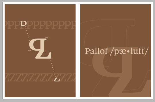
I think I have gotten my spreads to a good starting point so far and I have really enjoyed the opportunity to design digitally in this project. My current idea is to make my sans serif a bright shiny almost floaty design, where as my serif design is a more minimalist but still effective. I think my color choices reflect these ideas. Unfortunately in class I did not get much feedback from my classmates, but I focused on listening to the feedback that others received that I may share similar issues with. I think many students struggled with having too many elements for the eyes to follow, So I want to focus on having clear places for the eyes to go, while still maintaining interesting imagery. My "Sole Serif" pages feel a little empty, and I plan on focusing my tinkering on them over the weekend in time for the next deadline. (Potentially a texture in the background?). In the reading this week we read the "Letter" chapter which is timely considering the project we are working on. My favorite parts of the reading was learning about Bitmap fonts, which are built out of pixels. They look like / the fonts used in old time video games, and fonts have evolved over the years digitally because now screens have more pixels per inch. At the end of the chapter it included a letter exercise which involved trying to make a letter on a grid by placing one pixel at a time and I attempted it with my "Pallof"!

0 notes
Text
During week 5 of ARTS245 I finished creating my letters for the 27th letter project. I also started thinking about my grid and how I am going to build my spreads within Indesign.

I ended up using the black letter forms at the top, and the colored versions were letters I didn’t go with. I chose the letters at the top because I think they fit best when displayed next to the rest of the alphabet in the typeface. On the left i used a capital “P” and “Z” while the left is g & k. My next step is making sure i used meaningful parts of the letters I chose so that i can label them on my breakdown. My last step for these letters is thinking about their names and the sounds they make.
In the reading this week we read about Kearning, Tracking, Line spacing & alignment. While I had heard about these terms before It was a great refresher going through them again. These are definitely things that I will need to take into consideration once i get into InDesign and start building my spreads. Specifically I need to think about the Kerning i am going to use when I do different titles on my spreads. The spacing could also be important to try and fit into certain parts of the grid!
0 notes
Text
During week 4 of ARTS245 we completed project 3, Flowering type. Despite being assigned “I”, which I deemed the “least dynamic letter” in my last blog post, I believe my project was still effective.

For my color I chose Coral because it was a similar red to the tips of the Indian Paintbrush. This was overall a very fun project and I think that the flower I chose and having a vision of what I wanted to do going into Illustrator definitely helped me enjoy the project more.
We also began working on our next project which involves creating the 27th letter in the alphabet. I have been looking through the greek alphabet in addition to the regular one to receive additional inspiration as to how I want my letter to look. I’ve also began to look at many fonts and am excited to narrow it down to 2.
During the reading this week we began the chapter on “Text”. It is very interesting to me how text and type are considered two different things and while they do share many similarities the reading helped me notice the differences. I was also excited to read about HCI (human computer interaction) because that is a class I am in right now and something i hope to continue pursuing with my career.
0 notes
Text
During week 3 of ARTS 245, we completed Project 2 and began project 3. Project 3 involved using the copy machine to acquire many unique types of text from various media sources. I focused on gathering different letter weights, on various different backgrounds. Having a wide variety of text options allowed me to be more creative with my layouts.

For my first layout (top) I wanted to go with a simple column style. This is a grid that I have used before, and I like splitting my text into multiple columns. Because this grid is simple, I focused on making each cell unique. For the second grid, I chose to use diamonds. I thought this design would be interesting as some of the diamonds will be "hanging" off the edge. Using this method, I managed to have unique shapes while still strictly following a grid. For my final grid I wanted to try and make a board inspired by a chess board. When I was trying to decide I thought it would be best to go for the full 64 squares, even though it would be much more difficult and time consuming. A short glance at the board may reveal the checkered pattern but if you take the time to look at it you may realize the "pieces" on the left and right sides of the board. On the far-left row (black) and right (white) I tried to use bold lettering colors to signify the major pieces King, Queen etc. This was difficult to do while also trying to maintain the correct background color. The row in front of each of these was meant to signify the pawns of each color. If I could do this project again, I would probably just play it safe and do another simple board for my third one because it would have been much easier to have better craftsmanship. I wish we could have had critique for this project because I would have liked to have seen my classmates work and I wonder if anybody else did a unique design such as my chess board. During this week, we also got to start project 3 and finally get to start designing digitally! Project 3 involves in cooperating a flower of our given letter into the letter itself. Last year in arts246 i did a similar project, instead with a dog. I thought the letter "J" I received last year was tough to work with because it was just one curved line. This year though, I got "I" which in the Montserrat Black font is just a vertical rectangle. I think that the letter I was assigned will be tough because it has no inherent negative space to begin with. Below are my 16 sketches of the Indian Paintbrush. I think I am going to proceed with a design similar to the top right sketch because I think wrapping around the I is dynamic.


In this weeks reading we read about the golden section which was my favorite part of the reading last week as well! It was cool learning more about it and I wish I would have found some way to in cooperate it into my project 2.
0 notes
Text
During week 2 of ARTS 245, we completed our first project, and I was able to participate in critique with the class! This project was very difficult to me as I am used to designing digitally, but it was fun to break out of my comfort zone and try my hands at something new. I think my lack of experience can be seen clearly with the craftsman ship, as my application of the rubber cement was too light in some parts causing the paper to come up and too heavy in other parts causing stains.
I think my textured square was my most effective, and I think it was interesting incorporating two different textures being visible through the orange.
When it comes to the colors, I thought out everything that I was doing with it.
Gold / Reflective Black : Las Vegas Aces (WNBA)
Garnet / Dark Red : Gamecocks (NCAAWB)
Orange / Gold / “Wood” : Basketball as a whole
Flipped & Inverted : Two way player (offense & defense)
Colored Square : Reuse all colors so far & add “comic” esc lines to her

Overall despite my poor craftsman ship holding me back, I am proud of this project and am excited to keep working on more projects as the year goes on.
In the reading this week, we read all about grids. This part of the reading is very useful to read right now because it ties directly into our project 2 which was also assigned this week. In the reading I learned that grids can be more then just the normal boxes, and the artist can break the grid in impactful ways. Also, Grids can be super complex, but sometimes a more simple grid can be even more dynamic if used correctly. I also enjoyed reading about the golden section, something that I have head about but never really understood. The image of a website being designed based on the golden section stood out to me as web design is something I am very interested in. Overall I feel like now thanks to the lecture and the reading I have a much better understanding of how grids work and how to use them to make my projects better.
0 notes
Text
During the first week of ARTS 245, We began assignment 1, Designing 9 images of a famous person of our choosing using a copy machine as the only allowed technology.
The person I chose is Aja Wilson, WNBA superstar and former gamecock.

So far in the project, I have completed the first row and i part of the second row!

I have some exciting materials for my third cutout as well and I am excited to get started on it!

Overall so far this project has tested my patience as I am not the best when it comes to pen & paper craftsmanship and prefer designing digitally. However I think I have learned a lot of interesting things and I am happy to now own lots of new materials to continue using in future projects.
In the reading this week We learned about letters. I think it’s interesting that many of the fonts share their same names as their creators from years ago. I always enjoy the imagery within the reading for my art classes and it was very cool seeing so many unique fonts laid out. I often struggle with picking fonts so i wonder if there is a way that they could be displayed so they are easier to see and understand.
0 notes