
A small blog where I will post articles, little pieces of text and just about anything that catches my attention in the broad sector of culture, art and the larp world. (basically an excuse to share research)
Don't wanna be here? Send us removal request.
Statistics
We looked inside some of the posts by alfsghedroch and here's what we found interesting.
Average Info
Notes Per Post
99K
Likes Per Post
57K
Reblog Per Post
42K
Reply Per Post
106
Time Between Posts
2 months
Number of Posts By Type
Text
3
Photo
1
Last Seen Tumblr Blogs


Fun Fact
When “GIF” was named word of the year in 2012, Oxford Dictionaries U.S.A. credited Tumblr for pushing the word.
Text
there's only one thing worse than an awful book, and that is an awful book with ONE tantalisingly compelling element
58K notes
·
View notes


Text
KMSKA Antwerpen fails to put together a coherent museum
In this essay I want to argue that the KMSKA fails in properly connecting the maker, the exhibitor and the viewer in the way described by Michael Baxandall in his essay ‘Exhibiting Intention: Some Preconditions of the Visual Display of Culturally Purposeful Objects’. This essay is mostly about anthropological exhibitions, but is also very applicable to the KMSKA. I also want to prove that the museum mostly focuses on the museum effect, a term coined by Svetlana Alpers in her essay ‘The Museum as a Way of Seeing’.
The first thing you notice when you enter the KMSKA is the monumental architecture. Outside you have the very classical structure reminiscent of the old Greek and Roman temples, whereas inside you are greeted with blinding white walls and floors. The KMSKA pride themselves on the intersection of old and new architecture in the different collection rooms. They also named their own staircase the ‘Stairway to Heaven’, as it is fully white and seemingly goes on until high up in the sky.
Another part of the museum that creates a long waiting line is an installation called ‘2 Conflict Paintings + Colour Method in 7 Layers’ by Boy + Eric Stappaerts. The KMSKA itself describes this long passageway (that falls right under the stairway to heaven) as a “tsunami of colours”[2]. At the end of the passageway there’s an archive of colours fitted into a cabinet, as a sort of display of colour.
The old masters part of the museum has a big empty room where projections inspired by details of paintings get shown on the walls, and seem to move around you. It was extremely disappointing that one of their projectors apparently is already broken, as a pretty big part of the wall did not have any projections on it, but the video did seem to move on to that piece of wall. It gave off the feeling that they had a room that they couldn’t adequately fill with artwork, so they decided to make it an installment.
In this way, it almost feels like the KMSKA is mainly focusing on photo opportunities to gain some free advertising on Instagram, than it is on actually creating fine museal architecture. The stairs, projection- and rainbow room get almost more attention than the artworks themselves, because they make it easier for the visitors to take an Instagram worthy picture.
The KMSKA prides themselves on their James Ensor collection, even going as far as giving the artist a few rooms all to himself. These rooms were accompanied by small ‘chambers’ where his sketches were exhibited. The Ensor exhibition raised a few questions, but the two most important ones will be discussed below.
The first is, if this part of the museum is a part you are so proud of, then why did you make the chambers so small and the pathways so annoying to follow? There were so many people inside these rooms, as it is also the logical first part of the museum to enter. This is, of course, not inherent an issue of the KSMKA, but more of too many people wanting to see the same thing, but I do feel like the display could have been different and helped somewhat. The chambers are divided into little corners where two walls are used by two television screens, but as you barely have any space to relax and read the information on the screens, it was almost useless. At the end of the Ensor labyrinth, we get a few big white halls, which are way better to appreciate the art in peace. But why was there a random freestanding wall in this room, with nothing on the back and nothing behind it? I can get doing that to make the room feel smaller than it actually is, but this wall was placed on the longest side, and didn’t even span the whole width.
My second Ensor related question is, why is some of his art exhibited among the old masters? Since when is this symbolist painter a master of old art? He was not the only one who was exhibited in the wrong time period, as the KMSKA does divide their museum in modern and old masters, but throws art of both divisions in both sections. A Bruegel was happily lounging next to a painting by Theo Van Rysselberghe. A Basquiat was put right in the middle of a few 17th century busts. The non-chronological display of paintings has been an upcoming trend in many museums, and I can understand curators choosing this approach – going for a theme instead, for example. But if you explicitly divide your building in old and modern masters, perhaps don’t mix them around inside the exhibition rooms, it just makes it look like you don’t really know what you’re doing.
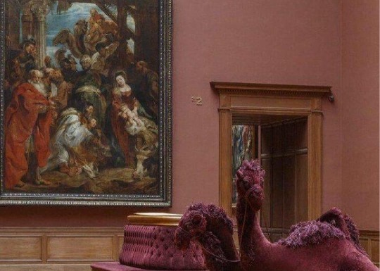
And thus, a lot of this museum remains a mystery for the viewer. Why did they put these things together? Why is there an Ensor next to an old master? And – I’m never going to let this go - please explain to me why there is a camel made out of a sofa.
[1] Svetlana Alpers, The museum as a way of seeing, 26
[2] ‘With the support of the National Lottery | KMSKA’, geraadpleegd 20 december 2022, https://kmska.be/en/support-national-lottery.
[3] Baxandall, Exhibiting intention. Some preconditions of the visual display of culturally purposeful objects, 39
[4] Baxandall, Exhibiting intention, 37
0 notes