
Technical Analysis by J.C. Parets Founder and President of Eagle Bay Capital
Don't wanna be here? Send us removal request.
Statistics
We looked inside some of the posts by allstarcharts and here's what we found interesting.
Average Info
Notes Per Post
19
Likes Per Post
6
Reblog Per Post
13
Reply Per Post
0
Time Between Posts
23 days
Number of Posts By Type
Text
17
Last Seen Tumblr Blogs


Fun Fact
Tumblr was created by web developers David Karp and Marco Arment.
Text
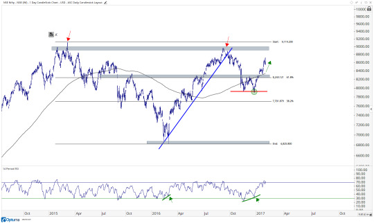
About That Bull Flag in Small-caps
I’m not sure if you guys noticed what’s been going on in Small-caps over the past couple of weeks, but I think it’s worth pointing out. First of all, remember this has been a tremendous leading indicator for a long time. I was pounding the table in November about that historic breakout when the Russell2000 Futures engulfed the prior 18 weeks. That was nuts. I said then that we would likely be talking about that event for decades to come. More recently I pointed out the fresh breakout after a period of consolidation. Each of these came along with stocks as an asset class in a healthy environment. They’re in an uptrend and they’re all in one together. Small-caps have been a great tell for the trend of the markets. If you’ve been bearish or not as long as you should have been, it’s probably because you haven’t taken the Russell2000 seriously enough.
What we’re seeing right now appears to be a healthy consolidation within an ongoing uptrend. Chart observers might call these “Bull Flags”, because they actually look like a flag on a flagpole. After the shorts got their faces ripped off the past 2 months, that rally looks exactly like a flagpole. The tight range that ensued appears to be the flag itself. Technicians give funny names to patterns. It’s a thing. Anyway, historically these are often the mid-points of the entire move. So the presumption is a repeat of the rally that got us here from early August. This is what it looks like currently:
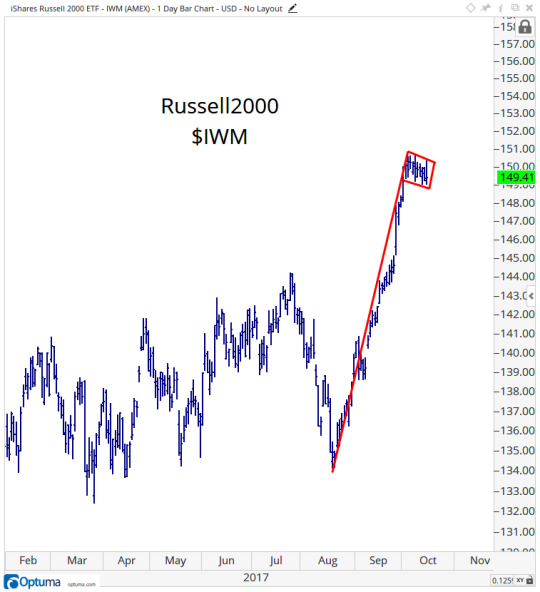
We are looking for an upside resolution to this consolidation. These patterns are high and tight, like a military fade. A breakout above the upper end of the range this month would confirm that this is what it appears to be. We not only want to stay long, but we want to be adding to positions. I still think the Russell2000 gets above 1700, or 14% higher than current levels. That has not changed. The ETF equivalent for $IWM has been a $170 target. I see no reason to change that.
I still do not think this is the time to be conservative. I firmly believe we want to be pressing longs.
I’ve laid out a long list of stocks (Premium Members see Here Here and Here) to take advantage of this uptrend. I don’t see anything, yet, to suggest changing our approach. To the contrary, everything we’re seeing is confirming what we’ve already been noticing. The current action was to be expected. When something unexpected happens, then we’ll reevaluate the situation and act accordingly. But that hasn’t occurred. In my opinion, there is no reason to be taking the foot off the pedal.
Cheers,
JC
Go To Advisors Corner
4 notes
·
View notes
Text
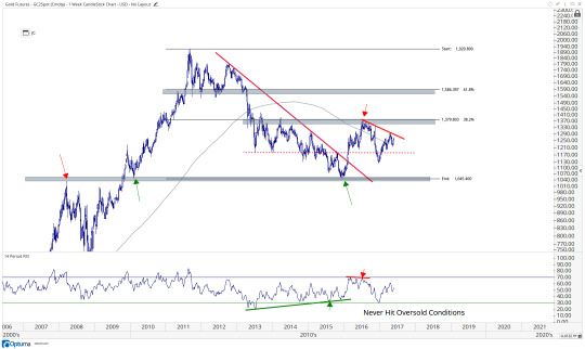
Is It Time To Buy Gold Again? No
It’s hard being a gold bug. They rarely ever get to be right. But why don’t they ever change their mind when the data changes? I don’t get it. There is nothing wrong with being bullish gold, but there is something wrong withalways being bullish gold.
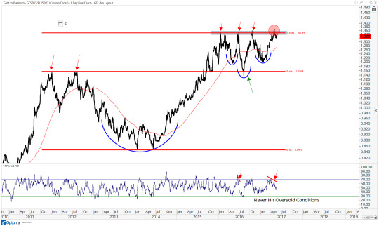
The first chart is Gold from a longer-term perspective. You can see the major top in 2008 and the successful breakout and retest of that level in 2010. After the peak in 2011, prices came all the way back towards that former resistance and support to ultimately find a bottom last January. This retest sparked a counter-trend rally towards 1380 last Summer. It’s been dead ever since.
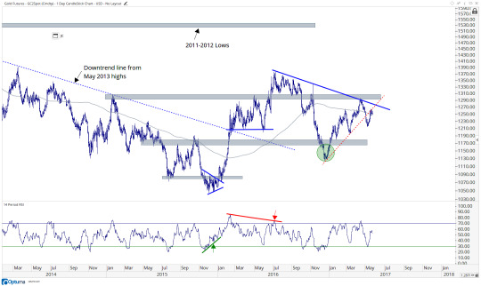
Gold
Now here is gold in the short-term. Please find me a hotter mess. We’re right near a flat 200 day moving average, which if you know me, that means run away, don’t walk away. Even if we do rally here, we have to worry about all of that overhead supply around 1300 that goes back to early 2015. There is no reason to be involved in this mess from the long side:
Gold
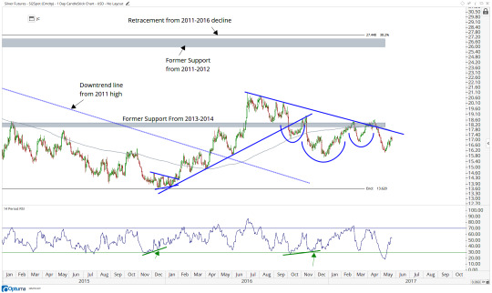
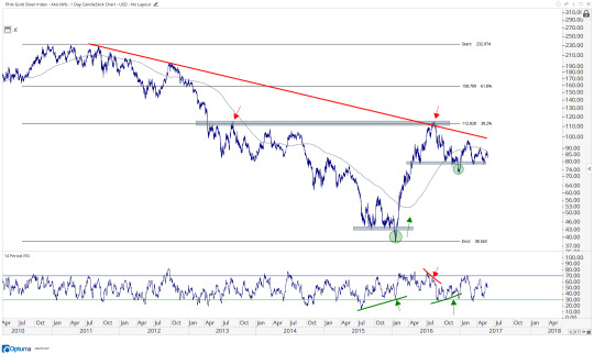
I suppose this pattern could resolve higher, but it’s not going to be something I want to be betting on. Momentum hit oversold conditions on this decline, which is a bearish characteristic, not a bullish one. So even if we do rally here, which I think is the lower probability outcome, then we still run into resistance near $18. This is still a fade:
Silver
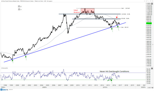
Here is a chart I always like to reference. This is an equally-weighted index of Gold, Silver and Platinum. It really helps gives perspective on risk appetite for precious metals. We’re flirting with an important trendline going back to the 1999 lows. There is certainly overhead supply on any strength, so at best it goes no where for longer. Worst case scenario this trend breaks and the downtrend from the 2011 high resumes lower. It’s too early to make that kind of call right now. But it’s important to lay out the options.
ASC Equal-weight Precious Metals Index
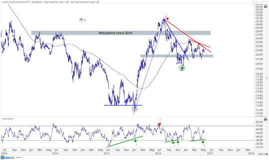
The Gold chart that screams “HOT MESS” the most is probably the Gold Miners Index ETF $GDX. This is still below a downward sloping 200 day moving average, below downtrend lines from the 2016 highs and from the February 2017 highs. Even if we do break out here towards 26, which I think is the much lower probability outcome, there is still overhead supply that’s been resistance since 2014. This is ugly:
Gold Miners $GDX
A good tell to see if the precious metals space is going to be a good short once again is whether or not the PHLX Gold Silver Index holds on to this support near $78. If this breaks, in all likelihood precious metals are going a lot lower as a group: metals and stocks:
PHLX Gold Silver Index $XAU
Here is an equally-weighted index of Gold Miners that I created. It’s the 20 largest gold and silver companies each represented equally. This is a mess. That failed breakout in the second half of last year really stands out. That was above a downtrend line from the 2011 highs and former support in 2010 & 2012.
ASC Equal Weight Gold & Silver Miners Index
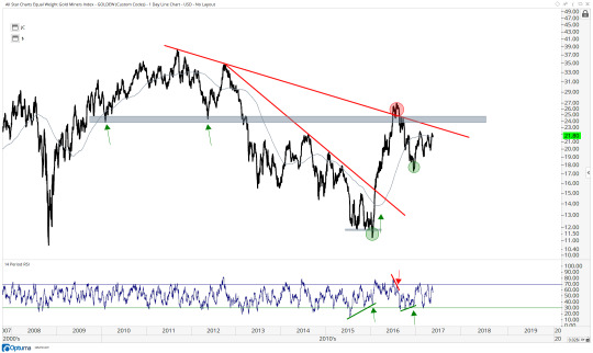
There is so much overhead supply that it makes me sick. The higher probability outcome here is sideways or lower. The only remedy here is time. So we’re better off just not being long gold and silver. That’s how I see it.
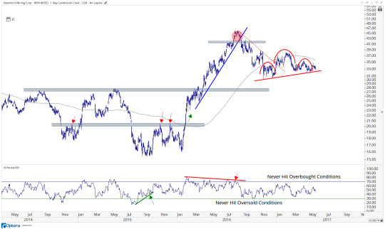
One of the big daddy’s Newmont Mining looks like a great tell here. This to me looks like a higher probability of a downside break than an upside break. With that downward sloping 200 day moving average….it’s ugly. I would need to see a decisive break above 38 and an upward sloping 200 day moving average before getting involved on the long side. So to me it’s either a no touch or a short. I think if we’re below the uptrend line from those November lows then we can be short to take advantage of a more severe break. But if $NEM is above $32.25 then it’s a no touch. It can probably go to $27
$NEM
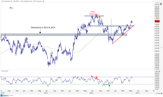
A standout in terms of relative strength is certainly Franco Nevada. This Royalty Stock hit the highest levels since last September this week. This is a lot more than I can say for the rest of its peers:
$FNV
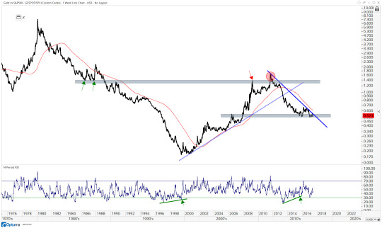
Here is Gold relative to the S&P500. In other words, the answer to the Gold or Stocks question. This is still a downtrend. Ever since that nasty failed breakout in 2011 it’s been all downhill: Stocks over Gold. If this ratio breaks above it and consolidates further then maybe we can talk about a change in trend. But the higher likelihood is a continuation of this trend which is lower. A break below 0.5 in this ratio and we’re likely to see an acceleration of selling, or Stocks winning some more over Gold.
Gold vs S&P500
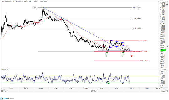
Here is a shorter-term look at that ratio. To me the higher probability is we go lower. A break of this support should just about do it. That looks like another 20% lower, which means the S&P500 would dramatically outperform Gold moving forward upon this break:
Gold vs S&P500
An interesting ratio that I can’t wrap my head around is the Gold vs Platinum line. Look how we literally kissed the 161.8% extension of the 2012-2014 decline and it has not been able to surpass it since. Is this a massive continuation pattern that is about to explode higher? Or was that the failed attempt and down we go. I’m not sure. But it’s worth watching to see how this sets up.
Gold vs Platinum
In general, we’re just not seeing uptrends in gold or gold stocks. We’re seeing plenty of uptrends in a lot of other places. So it simply becomes a question of whether you want to get cute and try to pick bottoms in strong downtrends or you if you’d rather participate in things that are already working. I prefer the latter.
You can see the entire list of precious metals charts in the Gold Workbook.
Cheers,
JC
1 note
·
View note
Text
No, This Is Not An 8-Year Bull Market For The S&P500
I’m sure by now you’ve had the time to digest the never ending headlines about an 8-year anniversary of a bull market for the S&P500. The problem with all of them is that the S&P500 has NOT been in a bull market for 8 years. In fact, there is a very strong argument to make that it could have just hit its one-year anniversary. Also, let’s remember the motivations of the people who are suggesting that the S&P500 is entering the 9th year of a single bull market. In a majority of cases they are purposely misleading you for personal gain.
It’s important to identify that the one single reason these people are using is actually a small technicality that they are irresponsibly pointing out and choosing to isolate as the sole basis for this conclusion. The single reason they are using to suggest that the S&P500 is entering its 9th year of a bull market is because in 2011 the S&P500 fell only 19.38% from peak to trough on a closing basis and not 20%. Again, let me stress that this is the ONLY data point they are using to claim we are in an 8-year bull market. And to make matters worse, their reasoning is because it fell 19.38% on a closing basis and not 20%? WHAT??
Let’s address the issues here one by one. First, 20% is a completely arbitrary number. I’m not sure who made this up, but there is zero logical reason why a 19.999% correction is considered still a bull market while a 20% correction is considered a bear market. It’s obvious to us as market participants how clinically insane someone needs to be to make this claim with a straight face.
Next, let’s point out the fact that anyone claiming that this is a bull market in the S&P500 is blatantly choosing to ignore reality. They are trying to convince you that this is a bull market simply because the S&P500 Cash Index fell only 19.38% while the S&P500 futures fell over 22% and on an intraday basis the S&P500 Cash Index also fell over 20%. They are cherry picking this one specific vehicle to make outlandish claims that are self-serving. They get to lie in a headline so you either click/watch/listen or in other cases they skew their “research” to help achieve their own goals, like get attention and/or help raise assets. It’s unfortunate, but their motivations clearly do not align with ours as market participants and they make it obvious.
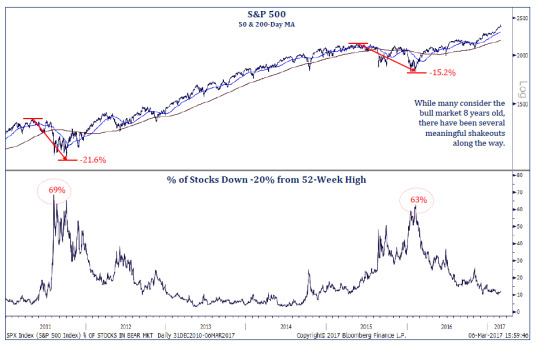
Bear markets are an extended period of stock index declines where over time the majority of stocks in that index participate to the downside. In other words, this is a market of stocks, not just a stock market. In 2011, almost 70% of stocks in the S&P500 had corrected over 20% from their peaks. Also, by the beginning of 2016, 63% of stocks in the S&P500 had corrected by over 20% from their top. So twice, a majority of components in the S&P500 had corrected dramatically, arguably entering bear markets. To suggest that these periods were bull markets is not only incorrect, but I would argue is an irresponsible statement to make by anyone who experienced trading in those markets. Here is a good chart showing these bear markets sent to me by Todd Sohn over at Strategas:
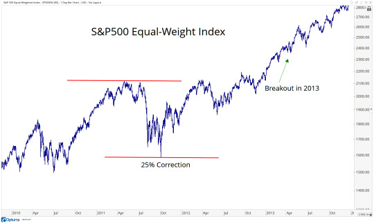
To continue with this theme of cherry picking indexes that fit your narrative while blatantly ignoring the important facts, let me direct you to the S&P500 Equal Weighted Index. This treats each component in the index exactly the same, giving us a much better gauge of market breadth. Remember, in order to maliciously try to mislead you, they are choosing to use the S&P500 Market Cap-Weighted Index to determine Bull & Bear Markets using their arbitrary 20% level as the threshold. Meanwhile, in 2011, the S&P500 Equal Weighted Index fell over 25% from peak to trough. They conveniently leave that point out in their “research”. Also, if you really want to be picky and use only closing prices, once again the S&P500 Equal Weighted Index fell over 23% from peak to trough on a closing basis in 2011. But the irresponsible parties will look at you in the face and tell you this doesn’t count: “We must only use the S&P500 Market Cap Weighted Index, and we must only use the cash market, not futures”:
Next, let’s remember that the S&P500 is not “the stock market”. These people cherry picking this one single index, and only the S&P500 Cash Index, not S&P Futures (how convenient), are blatantly ignoring the rest of the world. While a majority of S&P500 stocks were getting killed throughout most of 2015 (because we were in a bear market), the rest of the world was selling off by much more. By January of 2016, Emerging Markets were down 45% from their peak in 2011. Was that a bull market too? Europe and Japan each fell around 30% from their 2015 highs. Were those bull markets? The Russell3000, which represents approximately 98% of all investable assets in the United States equities market fell 23% from the 2011 highs. Was that a bull market? The ACWI (All Country World Index) fell 27% in 2011 and 22% in 2015. Bull markets also?
The bottom line is that we’ve had plenty of bear markets since 2009. This is NOT the 9th year of a bull market. So when did it begin you ask? I think there are a few good arguments to make, much better ones than cherry picking this one S&P500 index (and only cash, not futures). One that I like is the breakout in 2013, when prices finally got above the 2000 and 2007 highs. A valid argument can be made that this was the start of a new secular bull market and the end of a 13-year bear market that began after the boom of the late-90s. Here is that chart:
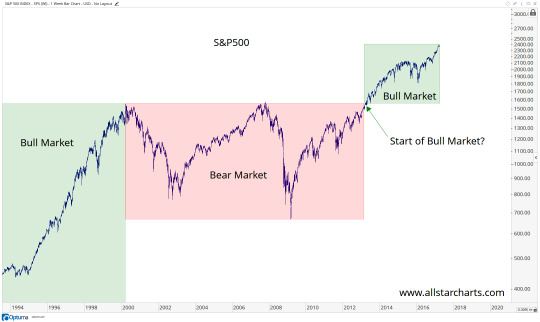
Another argument can be made that a bear market for stocks ended in the first quarter of 2016 and a new cyclical bull market began. This is when Emerging Markets bottomed out after 5 years of declines. The entire metals and energy complex also put in their bottoms during this time (not a coincidence). Japan, Europe and the United States (S&P500) bottomed in February of last year, right around the same time. Credit spreads, which we look to for confirmation of ongoing trends in stocks put in their bottom at the same time. This was NOT one big giant coincidence. This was when market participants globally reached a point where demand finally was able to exceed the selling pressure that we had seen persist for a long time, which some might refer to as “a bear market”.
Playing devil’s advocate, you might say, “Well JC the S&P500 represents America and American investors, so we use that index”. OK, let’s go with that for a second remembering that you are specifically cherry picking the S&P500, ignoring every single other US Index and International Index and also ignoring the fact that intraday the S&P500 fell over 21% in 2011 and the futures market also fell over 20%. But to suggest that the S&P500 represents American investors is also wrong. This is money coming from all over the world, not just the United States. With each day that passes, the stock market is is becoming more and more global. So if you want to know what the stock market is doing, it would be irresponsible to focus on just one cap-weighted index in just one country.
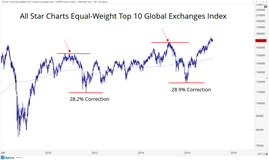
In order to help identify the direction of the underlying trend in stocks I have taken the top 10 exchanges from all over the world, and created an equally-weighted index of all 10 of the world’s largest exchanges, including both developed and emerging markets. We’re talking not just U.S., but Germany, UK, Japan, Canada, Brazil, China, etc. You can see that twice over the past 8 years we have seen corrections in global equities of over 28%. These are not characteristics of bull markets when stocks lose nearly a third of their value TWICE over the period you are claiming is an 8-year bull market. Shame on you.
So when you see people trying to convince you that we are in the 9th year of a bull market, this is further evidence that their goals are NOT aligned with ours as market participants. The media loves the headline, and don’t care whether it’s correct or not. Then there is the sell side trying to make you feel bad for not keeping up with this “bull market” so you can move your assets to their firms. There are also examples of people commentating that are just wrong, and don’t actually have any malicious intent. But I would argue that is the rare exception, not the rule. More often than not, people are trying to fool you for their own personal gain, whether dollars or clicks (that lead to dollars). I live my stock market life assuming everyone is completely full of it, and then give them the chance to prove me wrong. Most don’t.
The irresponsible don’t let facts get in the way of their narratives. Winners ignore that noise and instead focus on reality. Data mining and cherry picking to create an alternate reality is not for us.
I invite you to join our community where all of our goals are exactly the same: to make money in the market. Start a 30 Day risk Free Trial Today. If you check out my research and decide that it is not for you, send us an email and we will refund you every penny guaranteed.
Cheers,
JC
2 notes
·
View notes
Text
South Korea Leading Emerging Market Stocks Higher
Emerging markets have been a real laggard. While developed markets around the world have been making new highs, it’s just now that emerging markets are catching up. This week the MSCI Emerging Markets Index Fund $EEM broke out to the highest level since the summer of 2015. This comes after 7 months of sideways consolidation:
Emerging Markets $EEM
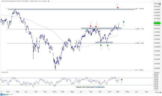
I think this breakout is for real and we want to be long if EEM is above $38 with a target above $44 which was the high back in the Spring of 2015. The leader here is South Korea, which represents the largest component of the Emerging Markets Fund. $EWY, the South Korea Index Fund, is also breaking out to new 52-week highs this week:
South Korea $EWY
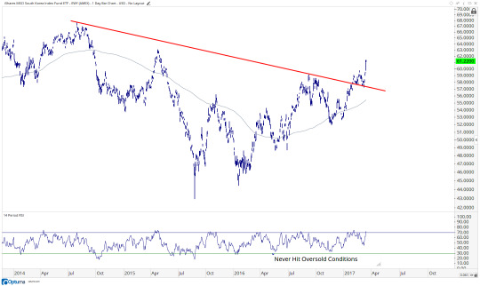
Notice how South Korea is not just hitting new highs, but is also resolving higher above a downtrend line from those 2014 highs. We want to be buying weakness in both South Korea and emerging markets as a group. If EWY is above $59, we want to err on the long side with a target back up towards those 2014 highs above $67.
Emerging Markets are hitting new 52-week highs. This is not something we usually see in downtrends.
JC Parets, CMT is the founder of All Star Charts, a technical analysis blog and premium research platform. He spends his days analyzing hundreds of charts to find the best risk vs. reward opportunities in the world. To learn more about All Star Charts, click here.
0 notes
Text
A Bullish Outside Day For Airlines
It’s hard to ignore certain market moves that tend to be very rare. Bullish outside days that engulf the prior period are one of those. I think this is exactly what we saw this week in the AMEX Arline Index and it is something we want to respect. This is especially the case if you consider where this bullish reversal took place, just below important support.
Here is the Chart of the AMEX Airline Index opening up at a new low on Wednesday, but then rallying throughout the day to engulf the real bodies of the prior 5 periods:
AMEX Airline Index $XAL
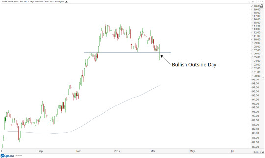
Why does this matter? Well, on Tuesday Airlines broke down below support from February that had been resistance in November. So this is evidence of strong demand where it really needed to show up. The sellers had their chance and they could not take advantage. I would consider this a bullish characteristic for sure.
Here is a longer-term version of this chart so you can see just how important this $108 area really is. This index put in an important top near this level in early 2015, well before the S&P500 made its peak 4 months later. Notice how this index also bottomed in January, the month before the S&P500. We look at at the Airline Index (and Transportation stocks) as a leader:
AMEX Airline Index $XAL
I think if $XAL is above 108, we can be long Airlines. From a risk vs reward standpoint, it is certainly skewed in favor of the bulls here. From a probability standpoint, the failed breakdown this week and momentum holding up very well in a strong bullish range, favors the bulls for sure. Also See $JETS
Specific Trade Ideas for Airlines can be found in the Chartbook - Start your 30-day risk FREE trial today
Cheers,
JC
1 note
·
View note
Text
[Chart Of The Week] Banks And Real Estate Point To Higher U.S. Interest Rates
Intermarket Analysis is a fantastic tool that is available to us as technicians regardless of our time horizon. Certain gauges of risk appetite, or risk aversion, can be seen simultaneously throughout various asset classes. We use these correlations as confirmations or divergences from data we’re getting elsewhere. Today I want to focus on the direction of the U.S. Interest Rate Market and compare it to the data we’re getting from Regional Bank Stocks and Real Estate Investment Trusts. The relationship between Banks and REITs is similar to the tug of war going on between investors in the Bond Market.
Here is a chart of the Regional Bank Index ETF $KRE vs the Real Estate Investment Trust (REIT) ETF $IYR. You can see a nice breakout in the 4th quarter last year followed by a 8-10 week consolidation of those gains. Plotted below is the U.S. 10-year yield showing an eerily similar breakout in the 4th quarter followed by exactly the same consolidation as that in the ratio above:
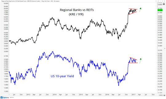
You see, when investors believe interest rates are going higher, they are more inclined to put money into Regional Banks who, in theory, benefit directly from higher rates and spreads. Meanwhile, if rates are rising, there is less need to invest in higher dividend paying REITs, and more reason to focus on growth stocks. On the flip side, if the market believes rates will fall, there is less incentive to invest in Regional Banks and much more reason to buy higher dividend paying REITs in order to lock in that yield. These are a few big reasons why the ratio between the two sectors looks exactly like US Interest Rates.
If you think rates are going higher, you want to see this spread between Regional Banks and REITs resolve to the upside of this consolidation since the end of last year. If prices are above the December highs in both of these plots, I would argue Bonds are likely in for their next leg lower.
If you’re looking for a turn lower in rates, I think this spread will likely be the best heads up. If we start to see a rollover in the ratio between Regionals and REITs, interest rates will likely follow and Bonds will catch a bid. But based on the weight of the evidence in front of us, I think this is the lower probability outcome. I expect this trend to continue higher in both of these plots above. An upside resolution from these consolidations will confirm that thesis.
Cheers,
JC
Click Here to learn more about how to receive weekly updates on this chart
1 note
·
View note
Text
Stay Away From Stocks Near Flat 200 Day Moving Averages
I'm lucky that I get a chance to read a lot and converse with really smart market participants all the time. So there are many lessons that I've gotten to learn the easy way, from my predecessors and colleagues. But there are some lessons that damn it you just need to learn on your own. For me one of those lessons was trading stocks near flat 200 day moving averages. And when I say "stock", this can refer to an ETF, Commodity Futures, Index, etc. But when they're near their directionless longer-term smoothing mechanism, you're begging for trouble. If you like headaches, trade stocks near flat 200 day moving averages.
A more recent example can be seen in Gold Miners. This was a group that I loved early last year but our upside targets were hit in the summer. More recently it's been a no touch for me. You can see a very clear downtrend through the end of last year, and now we've just had a counter trend rally. The problem was it rallied right to a flat 200 day simple moving average. I told everyone last week that it's not for us, stay away. This week we are quickly reminded why:
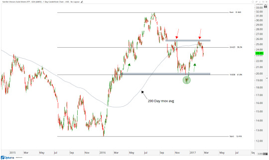
You can see the rally that began late last year ended abruptly right at former resistance from November under $26 over the past couple of weeks. This area of overhead supply just happened to be right at a flat 200 day simple moving average. I've learned the hard way over many years to stay away from these situations. By definition, there is no trend. Our job is to find markets that are trending. The way I approach things, this is priced to perfection. Near these areas you get vicious swings without an identifiable direction. It's a hot mess.
Over the last 2 days, Gold Miners $GDX fell 6.2% while the Junior Gold Miners $GDXJ fell 11.4%. Not only should this not come as a surprise, but in fact should be expected. Violent swings without any trend are commonplace.
So if you take anything away from me or this website it should be this: Stay away from stocks near flat 200 day simple moving averages. Trust me. Save yourself the headache. Also, some people have asked me how to quantify this and what exactly constitutes a flat 200 day moving average, or and how close price needs to be to qualify? Let's just say that if you even need to think about it, it's probably too close. Go find something else!
Cheers,
JC
Interested in Gold and Gold Miners? Click Here to learn more about how to receive weekly updates on over 50 Gold related assets and gold and silver stocks.
1 note
·
View note
Text
[Chart of the Week] The Global Stock Market Breaks Out To All-Time Highs!
I’m lucky in that I learned early in my career that we’re in a global market place. The United States, while it is certainly important, is just one country within a massive interconnected global market. We see this more and more every day. Many choose to focus on US Stocks, and that’s fine. But I think even if that’s the case, approaching the market globally is not only an advantage, but becoming more of a necessity with each day that passes.
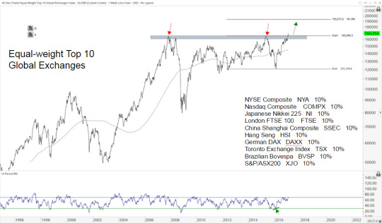
Today I want to share a chart that really tells an interesting story about what is actually happening in stocks around the world. I’ve taken the 10 largest exchanges in the world, including both developed and emerging markets, and equally-weighted each of them to create an All Star Charts Top 10 Global Exchanges Index. You can see embedded in the chart, the exact list of components:
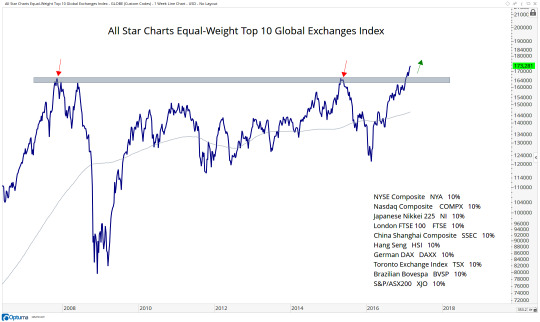
Notice how we peaked in October of 2007 and then retested those highs the following summer when some of these markets still had one last gasp of breadth, particularly in Energy and Emerging Markets. This index then peaked near that same level in the Spring of 2015. After 18 months of further digestion of supply, this equally-weighted basket of global indexes is now breaking out through that resistance to new all-time highs.
Anyone who tells you that new highs are a bad thing is lying to you. Stocks in downtrends, by definition, do not close at all-time highs. Watching this massive breakout occurring over the past month is one of the things that has kept me more structurally bullish towards equities as an asset class.
Looking shorter-term, here are prices of this index breaking out above both the Spring 2015 and October 2007 highs. Again, new highs are a characteristic of uptrends, not downtrends. Momentum has not hit oversold conditions in over a year since putting in that bullish divergence in early 2016, which is also a characteristic of uptrends, not downtrends:
The way I see it, if prices of this index are above the 2007 highs, it is awfully difficult for be to be bearish of equities. I think this is heading another 10-12% higher towards 193,000. Let’s remember that this includes, not just the U.S., but Europe, Japan, London, Australia, Hong Kong, China, Canada and Brazil. In my opinion, this is just another feather in the hat for the stock market bulls. From a risk management perspective, if we see the price of this index falling back below the 2007 highs, then we’ll have to reevaluate this bullish thesis. I believe this is the lower probability outcome, and a continuation of trend is much more likely. But I pride myself in keeping an open mind and the market has given us a clean level to use as a reference. For now, I still want to be a buyer of weakness, not a seller of strength.
For updates on this chart and each of these markets, sign in or start a risk FREE trial.
Cheers,
JC
1 note
·
View note
Text
A Top/Down Analysis of Global Markets: Stocks, Commodities, Forex & Rates
This weekend was one of the most amazing professional experiences of my life. I’m fortunate that I have friends who are really smart and willing to give up some of their time on a Saturday to share their knowledge and wisdom with investors all over the world. The turn out for Chart Summit exceeded all expectations and the feedback has been tremendous. This week, videos of all the presentations will be sent out to anyone and everyone who registered for the event www.chartsummit.com
As an added bonus to this amazing event, I wanted to walk everyone through my top/down approach to markets. From my perspective, unless you include global stock markets, commodities, forex and interest rates into your analysis, you’re really selling yourself short. It’s 2017. Even if you just trade or invest in U.S. stocks, taking a global intermarket approach to the marketplace is extremely beneficial. This is with respect to both idea generation and risk management. In addition, we first want to take a long-term view to get structural perspective and then look at daily charts showing just the past year for more short-term tactical opportunities. This process of using multiple timeframes can be seen throughout every asset class we analyze, whether it’s individual stocks like $AAPL, sectors like $GDX, currencies like the US Dollar, commodities like Crude Oil or indexes like the S&P500.
Step 1 of this process is to go around the world looking at every single major stock market. This list includes, all U.S. Indexes like the S&P500, Dow Jones Industrial Average, Russell2000, Euro Stoxx 50, London FTSE 100, Japan Nikkei 225, Belgium 20, China Shanghai, and the list goes on and on. I’ve taken the weight of the evidence here to conclude that stocks as an asset class are in an uptrend. Click to see the list of all the US Indexes and entire list of International Indexes index in my Chartbook. These are a few of the charts the led me to this structurally bullish conclusion:
First, here is the S&P500. We have been long and pounding the table bullish since early July. Our target of 2335 still has not been hit, but the series of higher highs and higher lows gives me little reason to change our approach:
Click on Charts To Zoom In
S&P 500
The NYSE Composite holdings above the 2015 highs is another feather in the hat for the bulls. Remember that this market-cap weighted index has much more international exposure than the other US-based Indexes. Over half of the largest 100 companies in the NYSE Composite are foreign stocks. The longer we remain above 11,000 the more constructive this becomes. The path of least resistance here is still higher:
NYSE Composite
Looking at some smaller-cap companies, here is the Russell2000. I still see a breakout above the 2015 highs and a sideways consolidation digesting those gains. Our bullish approach still seems appropriate. We want to be buying weakness in this index with a target above 1500:
Russell 2000
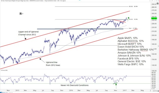
Here is an index I created with the top 10 largest stocks in America. I call this the All Star Charts Super-Mega Cap Index and is equally weighted. A breakout to all-time highs here is not bearish:
Super-Mega Cap Index
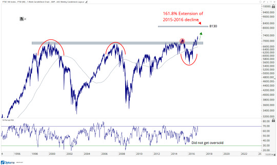
Looking more Internationally, if the London FTSE 100 is breaking out of a 17-year base to all-time highs, it’s hard for me to be bearish stocks as an asset class. This has to be one of the top 5 most important stock indexes on earth, maybe even top 3. How can I possibly look at this is anything less than constructive?
London FTSE 100
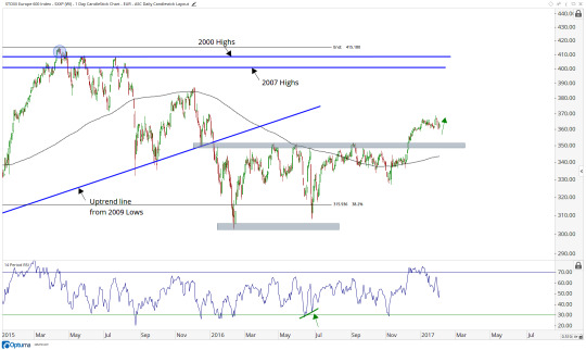
Europe still looks like it is breaking out from a year long base and we want to be buyers of any weakness. I think we see 400 in this Index soon:
Euro Stoxx 600
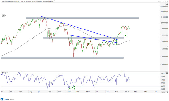
Japan looks like an eerily similar breakout doesn’t it? 21,000 is still our target.
Nikkei 225
These are not downtrend folks.
The Nifty50 in India is on its way to retest this overhead supply near 9000 for the 3rd time. The more times that a level is tested, the higher the likelihood that it breaks out. I believe we see this breakout during the first half of this year and we achieve our upside objective of 10,450 at some point this year:
India NIFTY 50
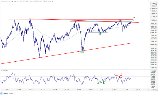
The structural strength can be seen all over the place. Here is the Taiwan Stock Exchange Index testing this 10,000 level for the 5th or 6th time, depending on how you count it. But this is not bearish. I think a structural breakout after a 20-year base is imminent here:
Taiwan
This is an index I created where I take the top 10 largest stock exchanges in the world and equally weight them. This is the Allstarcahrts Equal-weight Top 10 Global Exchange Index breaking out of a 9-year base to new all-time highs. This is not a bearish characteristic for stocks as an asset class:
Equal-weight Top 10 Global Exchanges
This gives us bigger picture macro perspective. Based on everything I see, we know a) we do not want to be short equities and b) we would rather be buying weakness than selling into strength.
The next thing we want to do is look to see where the strength is in stocks, but on a relative basis. Which sectors are standing out as the leaders and which are the weak laggards? If we believe stocks are in an uptrend, which we do, then we want to be buying the strongest sectors, not looking for mean reversions in the weakest ones.
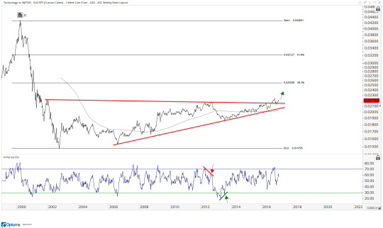
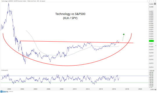
The one that stands out the most to me is Technology which is breaking out of a 15-year base relative to the S&P500. I can’t ignore this:
Technology vs S&P500 (XLK/SPY)
Meanwhile, Healthcare is hitting multi-year lows relative to the S&P500 as indexes all over the place keep hitting all-time highs. See the difference?
Healthcare vs S&P500 (XLV/SPY)
Finally, Industrials are still within a longer-term range going back to 2010. But this consolidation comes within the context of a longer-term uptrend in Industrials relative to the S&P500. I would expect an upside resolution soon. When it does break out, we want to make sure we’re all over it it because it can be vicious to the upside:
Industrials vs S&P500 (XLI/SPY)
Once we see where the leadership is and where the weakness lies, we want to look through every single sector and important sub-sector within the US Stock Market on an absolute basis. You can see the entire list in here: US Sectors & Sub-Sectors.
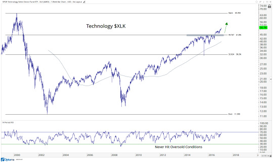
One sector that definitely stands out as a leader is Technology. It’s a killer combination when what you’re seeing on a relative basis fits in perfectly with the absolute strength. I believe Technology is one of those cases. Here it is looking longer-term. After breaking out of a 2-year base, prices are now attempting to retest those all-time highs from March 2000. That is still a long way from current levels:
Technology $XLK
After looking at a longer-term chart, we can then break things down shorter-term. Here is Technology on a daily timeframe breaking out again in December and heading towards our intermediate-term target near $54:
Technology $XLK
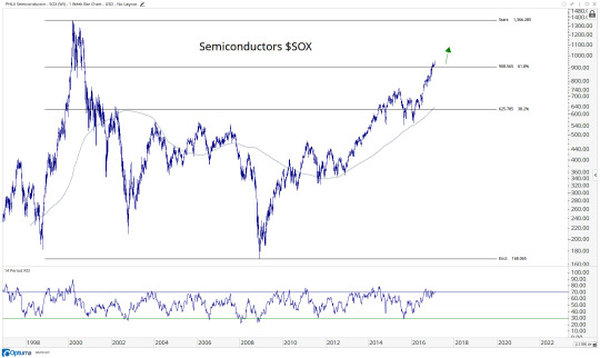
The way I see it, Semiconductors are a leading indicator for Tech. It is also one of the most important sub-sectors on my list. If semi’s are above 905, we need to be aggressive buyers. I don’t see an environment where Tech continues to lead the market higher and Semi’s do not participate. To the contrary, I would expect semi’s to lead us higher:
Semiconductors Index $SOX
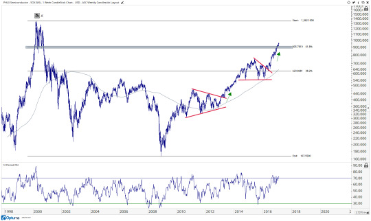
Here is a shorter-term look with a target near 1088, which is based on the 261.8% extension of the 2015 decline:
Semiconductors Index $SOX
Click Here to keep reading: A Top/Down Analysis of Global Markets
#$GSPC#$spy#$iwm#$nya#$ewu#$fez#$dxj#$ewj#$epi#$pin#$ewt#$xlk#$xlv#$xli#$smh#$sox#$socl#$xlf#$iak#$msft#$intc#$de#$nflx#$all#$adi#$swks#$powi#$uso#$gld#$corn
0 notes
Text
Is Technology Making A Run Towards All-time Highs?
While so many people seem to be focused on the major US Indexes like the S&P500 or the Dow Jones Industrial Average reaching the irrelevant 20,000 level, I prefer to focus on individual stocks and sectors. There are areas of strength, like Technology obviously, and areas of weakness like Healthcare and Consumer Staples. Stocks are like investors, there are winners and losers. I prefer to be a winning investor focused on winning stocks, wouldn’t you? Today we’re taking a look at Technology as it quietly breaks out again to new highs.
First, here is the Technology ETF $XLK breaking out last July above the key $44.75 area that represented overhead supply over the prior year. The trade has been to be long Tech if we are above that level and we continue to grind higher. The answer to the question, “How high can it go?” seems to be back to the all-time highs in March of 2000: $65. Why not?
Momentum is in a bullish range and prices are above key resistance. We want to continue to be a buyer of any weakness in Technology.
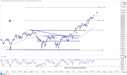
We want to look at Semiconductors as a leading indicator for Tech as a group. Here is the PHLX Semiconductor Index breaking out to new 16-year highs this week. If Tech as a group is going to to retest those all-time highs from March of 2000, I would expect Semi’s to do the same. This is going to continue to be our tell. If we’re above 908 in the Semiconductor Index, we want to continue to err on the long side of chip stocks:
I think we’re heading back up towards 1366 in this index. The line in the sand is very clear.
Finally, here is one of my favorite charts in the space. This is Technology relative to the S&P500 breaking out of a decade and a half long base. “The bigger the base, the higher in space”, is how I learned it:
If all of the stars are aligning: Tech breaking out, Semi’s breaking out and Tech breaking out on a relative basis, it’s hard for me to argue against a final leg higher in this space to retest the all-time highs from March of 2000.
When you talk about the individual components in the Tech sector, it’s not like they’re breaking down. To the contrary, Apple $AAPL is going out at new 52-week closing highs, Microsoft $MSFT is at new all-time highs, Google $GOOG is at new all-time highs, Facebook $FB is flirting with new all-time highs and Cisco $CSCO and Intel $INTC are coming out of decade plus long bases.
The largest components are suggesting that these are all in uptrends and the indexes that track them are confirming both the absolute and relative strength in Tech. Until something changes, I’m not going to fight this trend.
This week I will be sending Allstarcharts Premium Members a list of stocks to profit from these trends. If you are not a member, you can start your risk FREE trial here today: Allstarcharts Risk Free Trial
1 note
·
View note
Text
Is Netflix The Most Recent Example Of A Gap & Go?
When we look at stocks that continuously sell off when they hit a specific area, we call that “resistance”. But all that really means is that the market is suggesting there are more sellers than buyers near a given price. There is overhead supply of shares, for whatever the reason. We’re not interested in knowing why, we just want to know if there is resistance or not. In some cases, stocks will “break out” above that overhead resistance, proving to us mathematically that the overwhelming amount of sellers at that given area has now been absorbed by an overwhelming amount of buyers for the stock.
Sometimes prices take a while to break through resistance. But other times, they just gap up above it and go on to make much higher highs. We call that a gap and go. I think that’s what we have here in shares of Netflix.
First of all, here is the longer-term picture:
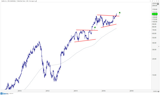
This to me looks like an upside resolution from an 18-month base. Remember this also comes within the context of a longer-term uptrend that cannot be denied. So if the market has taught us anything over the last 150 years is that stocks trend. Resolutions out of consolidations within uptrendsshould resolve higher. So it makes perfect sense.
Looking shorter-term, this is what I mean about the “gap and go”. Look at all of this overhead supply from the past 18 months near $130-133. The market here is suggesting that this has now been enough time to absorb all of the overhead supply from all of those sellers. The fact that prices are above resistance tells me that we want to be in the direction of the buyers. So if prices are above $133 we want to be buying all day with a target near $166.
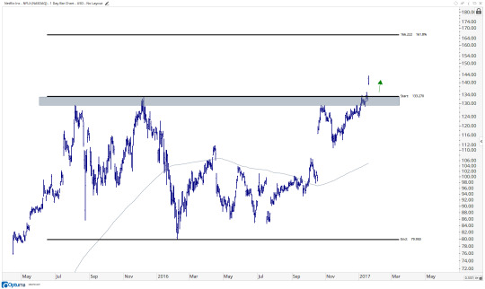
This level represents the 161.8% extension of this 18-month range and markets historically rally towards these levels, and in many cases beyond. It. But for now, we’ll stick with that target and reevaluate at that point once we have more information. From a risk management standpoint, I see little reason to own this if we’re below those former highs from the past 18 months. I think the risk/reward is very well-defined here and in my opinion skewed very much in favor of the bulls.
Register Here For Weekly Updates On These Charts and over 500 More
1 note
·
View note
Text
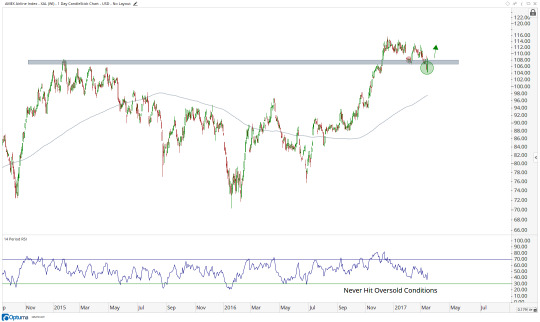
Wall Street Hates J.P. Morgan As It Rips To New Highs
I like buying stocks that are going up. If there is anything that the market has taught us over the past hundred years is that market prices trend. The major averages, individual sectors, stocks, commodities, currencies, interest rates, they all trend. Sometimes these are uptrends that last years or even decades, sometimes they’re downtrends, and sometimes there is no trend and it’s just a sideways mess. Remember, recognizing a lack of trend is just as important as the first two. What I like even more is while a stock is going up the sell side likes it less and less. It’s completely counter intuitive to us who specifically look for trends to follow. They don’t think like us as market participants because they have different motivations.
Here is a chart of J.P. Morgan stock. Plotted below price is the percentage of buy recommendations by wall street sell side analysts. Only 17 buys out of the 36 wall street firms who cover it. Notice how as prices break out of a 15-year base, the sell side hates it more and more taking $JPM off their buy lists:
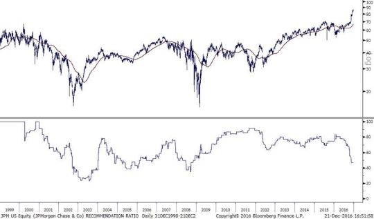
By the time the sell side does all of their earnings revisions (that’s when they’re wrong and get to change their answers) the price of the stock has already ripped in their faces. Eventually they come around and chase price, which we have been following all along, and we’re selling it to them, or their clients for that matter. That’s the way this cycle works. And I’m not just speaking about myself, this is just the cycle of markets, with or without me. Regarding the strategy of fading sell side consensus, I don’t mean to pick on just them. Wall Street Economists are also a great consensus fade and newsletter writers are definitely excellent fades.
The reason the sell side is usually behind the curve is because they have other motivations. As market participants we have 1 goal: to make money. It really is just that simple for us. But for analysts and sell side firms, it’s different. There is career risk involved. To be that one guy with a sell recommendation when the other 37 firms have buys? You better be right or you’ll quickly be looking for a new job. So between the cushy salary, benefits for your wife who doesn’t work and kids, comfort of a nice career, what’s the point of risking all that? Just chase like everyone else when you’re wrong. So they tend to travel in herds, like a bunch of sheep.
As market participants we can take advantage of this conflict of interest. We know there’s a whole slew of wall street sell side analysts who have to raise price targets on JPM if this thing keeps ripping. So if you’re asking, who is left to buy? I’d say the most amount since 2009….
This chart above comes from a smart buddy of mine who prefers to remain nameless. We’ll call him Mr. T. But here is my personal chart of J.P. Morgan $JPM. To me, this looks like a breakout from a 15-year base. Any way you look at it, we’re making new all-time highs. If I’m writing down bearish characteristics for stocks, new all-time highs does not make it on that list. Momentum never hit oversold conditions when price made new lows over the past year. This is all structurally bullish and points to $110.
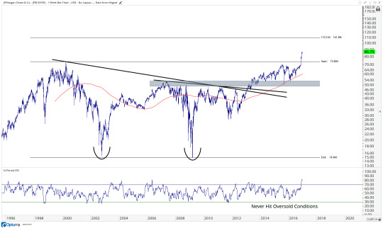
I have a funny feeling we’re going to be approaching that $110 at some point in the first half of next year. Considering how bearish the sell side has gotten as we break out to new highs, I think there is a lot of juice left to the upside. We want to be buyers of any and all dips, especially if we some how get down towards 80. Nothing suggests that will happen, but weakness here needs to be bought to take profits next year.
A lot of you guys know I’ve been talking about this one for a while. But for you knew comers, you can see here Nov 9th $JPM how positively correlated JP Morgan is with the S&P500 and has been for many years. I think if I’m right about JP Morgan stock, then the S&P500 is likely going a lot higher as well.
Register Here For Weekly Updates On These and 500 More Charts
1 note
·
View note
Text
[Chart Of The Week] Banks And REITs Are Pointing To Higher Rates in 2017
I love technical analysis. I really do. There’s no question that finding a nice chart brings a great amount of joy to my life. Today I want to share with you what I think is one of the most important developments to occur over the past couple of months. Interest rates have been ripping higher, yes we know this. But to me it’s what is happening in Banks and Real Estate Investment Trusts that continues to grab my attention. These groups of stocks are doing the exact opposite today that they were doing at the beginning of 2016, when I was pounding the table about rates going a lot lower.
Interest rates have exploded higher into year-end from a low near 1.37% on the 10-year yield up to over 2.6%. But one of the big reasons that had me so bullish rates since July was that while the 10-year was making lower lows into the summer, the ratio between Regional Banks and REITs held the early 2015 low and started to rally:
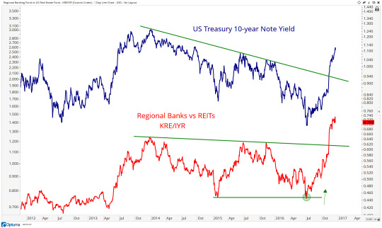
To me, this has been the best tell for where rates are going, and for a long time. Who cares what the fed thinks? They’re not our problem. We’re not theirs. Regional Bank stocks are rallying because markets are pricing in higher rates and REITs are falling relative to Banks stocks because markets are pricing higher rates. If rates rise, there becomes less demand for stocks with higher dividends, like REITs. So there is direct market behavior here that has been suggesting higher rates since early July.
At this point, we now have broken above downtrend line from late 2013 highs, which marked the highs in rates and this ratio between Regional Banks and REITs. Since the spread has been a great leading indicator for rates, I would have to argue that the ratio taking out its late 2013 highs is a positive sign and suggests rates can do the same.
Technician John Roque, one of my personal favorites, was a recent guest onMasters In Business with Barry Ritholtz on Bloomberg Radio. I thought the way that he explained financials was dead on. Roque compared Financials right now, particularly on a relative basis, as a great professional athlete who has just sprinted and needs a breather. But after some time to catch his breadth, the athlete will be back on his feet and can keep going. I think right now, Financials just had a monster move, but need to take a breadth. This was super powerful coming out of this base and I think both of these charts above have room to run higher in 2017.
Click Here for weekly updates on these charts and access to a list of trade ideas to profit from them.
1 note
·
View note
Text
[Chart Of The Week] Is General Electric Ready For Its Next Leg Higher?
One of the more impressive moves that we've seen in 2016 is in the Industrial space. While we came into the year near multi-year lows on a relative basis (XLI/SPY), we entered December hitting new all-time highs relative to the S&P500. You want to talk about a dramatic change in relative strength? This is something we take very seriously, and definitely not something to ignore. We also want to keep in mind is that this relative strength started well before any election, US or otherwise. This got going in January.
Today we're taking a look at the largest component in the Industrial sector: General Electric $GE, a stock that broke out earlier this year above a downtrend line from the all-time highs in 2000 and is still 30% below the 2007 highs. I think this is where we want to be looking.
Here is the weekly chart of $GE showing the breakout late last year followed by a 14 month consolidation. With prices making higher lows and higher highs above an upward sloping 200 week moving average, we know at the very least that this is not a downtrend:
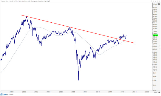
So the question is, when/where do we buy it and how high can it go? Well, the easier one to answer is the latter: I think we get to the 2007 highs above $42. As far as entry points go, if you have a longer-term horizon, $28 is a solid level. I would not want to be long if we're below that. If you're a little more nimble and aggressive, $32 is a more tactical level I'll be watching:
To me, this is one we want to look to buy on weakness, not sell on strength. With a strong US Stock Market, Strong Industrial Sector on both an absolute and relative basis, the wind is at our backs in General Electric $GE. I like it.
For weekly updates on these charts, Click here to start your 30-day risk FREE trial.
1 note
·
View note
Text
The Irrelevance Of Dow 20,000
Most of us are here to try and make money in the market. Some others are just here to make noise and create content they think will help them drive traffic to sell ads. The importance of the Dow Jones Industrial Average hitting 20,000 is one of the biggest lies of the year. I’m lucky to be good friends with some of the smartest traders and analysts in the world. We email each other all the time privately to share ideas and discuss some of the things we’re seeing out there. If there is something worth watching, I’m likely to get an email about it, or at least be included in an email discussion on the topic. So far, zero mention of this arbitrary 20,000 level, but double digit emails from media asking me what I think. See the difference?
Last year, the big lie from the media was the importance of the Nasdaq Composite hitting 5000. There were parties being thrown on the tv, emails going out to massive lists trying to drive traffic based on nothing: the importance of Nasdaq 5000. Here is how that Nasdaq hitting 5000 last year worked out. Based on what I see, the market did not give a damn about your Nasdaq 5000:
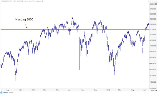
And I was vocal about it at the time too. It was clear to me then how irrelevant the Nasdaq hitting the arbitrary 5000 level was, and was more focused instead on what the NYSE Composite was doing. As it failed to breakout, down went the NYSE Composite and the Nasdaq straight down with it:
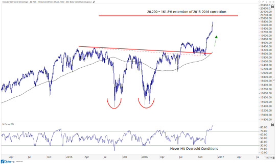
At this point, here we are approaching 20,000 for the Dow Jones Industrial Average. Once again, I see little evidence that 20,000 means anything to anyone relevant. The spectators love it because they can create content. But to those who actually matter, market participants, there’s nothing there. To me, the 20,200 level is the one we actually want to watch. This level represents the 161.8% extension of the 2015-2016 correction:
So ask yourself: Who is writing/saying what you’re reading/listening to? What are their objectives? Is their job to make noise and try to drive traffic? Or are they trying to make money in the market. There is a disgusting conflict of interest that exists daily. This Dow 20,000 nonsense is just another good example. The good news is that the more they push the importance of this arbitrary number, the more clear they are making it to you and me that their best interests highly conflict with your best interest as a market participant trying to make a profit. So we know who is who…..
I invite you to join me in a more official capacity. Start your 30-day riskFREE trial today
1 note
·
View note
Text
Dow Theory Has Nothing To Do With Buy And Sell Signals
For someone who uses Dow Theory every single day, it’s not something that I write about much. I may indirectly reference certain tenets all the time, but rarely do I write specifically about the 130 year old Dow Theory. I think I pretty much laid it all out earlier this year in my post: 5 Things Every Investor Should Know About Dow Theory. The simple minded choose to stick to the Dow Jones Transportation Average and Dow Jones Industrial Average either confirming each other or diverging from one another. And while this may in fact be a one of Charles Dow’s tenets (although they were Railroads back then, not the Transports we have today), it does not even make it into my top 5 most important tenets.
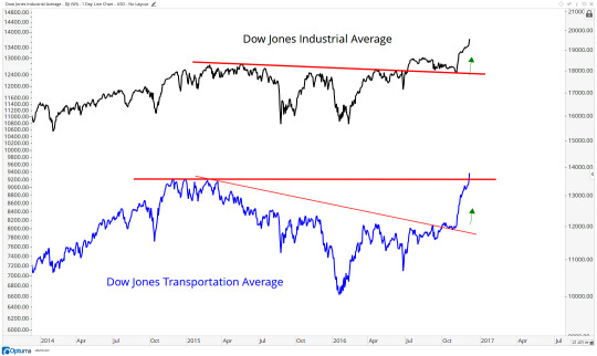
The reason that, to me, the Dow Theory tenet regarding Transports and Industrials isn’t as important as many of the others is because it’s not designed to give buy and sell signals. It’s for trend identification. So while price is the most important indicator to recognize a trend, Dow Theory can certainly be used as a supplement to that. But it’s important to understand that it’s only that and nothing more. So while you might hear people saying that it’s a Dow Theory Buy or a Dow Theory Sell Signal, it’s not. The new highs we saw this week in the Dow Jones Transportation Average finally confirmed the new highs that we’ve already been seeing in the Dow Jones Industrial Average. So yes, it’s confirmation that stocks are in an uptrend. But I think you need to be ignorant at this point to not recognize that, yes indeed, U.S. stocks are and have been in an uptrend.
So let’s review. Yes the Dow Transports confirmed the highs from the Dow Industrials. So yes, we are in an uptrend. Does it mean it’s a buy signal? If you’re job is to create misleading headlines, then yes. For sure. However, if your job is to make money in the market, then no, absolutely not. In fact, there is zero evidence that suggests the Dow Jones Industrial Average does any better in the short-term after both Averages first close at new highs, thus confirming their uptrends. You can even dig a little bit deeper into the data if you’d like and you’ll find that stocks actually do worse over the next month on average (and median) after the Averages first confirm one another.
More Most importantly, let’s remember that I appreciate and certainly incorporate Dow Theory into my regular process. It very much works today. But it doesn’t mean that we need to turn it into something it’s not for the sake of page views and click bait. This particular Dow Theory Tenet of Industrials and Transports confirming one another is simply a supplement to price action to help identify trend. It is no different than a moving average or a trendline in that respect. These are all far seconds to price itself in the importance hierarchy of trend recognition.
In addition, I definitely recommend reading: 5 Thing Every Investor Should Know About Dow Theory to give you a better idea of the more important tenets, and also some of the others that I keep towards the bottom of my list, like volume.
Click Here to join me on a more official capacity RISK FREE to see how I incorporate Dow Thoery every single day.
2 notes
·
View notes
Text
What If Amazon Was A Technology Stock?
One of the things that impresses me the most about Technology is the fact that Amazon, a stock up over 70% since February, isn’t even a tech stock. While some people like to argue that Amazon is a Technologycompany, and that may be true, it is not a Technology stock. In fact, $AMZN represents a 0% weighting in the S&P Technology Sector Index or in the ETF. Instead, it spends its days holding up the serial underperforming Consumer Discretionary Sector with a 13% weighting.
We trade and invest in stocks, not companies. So we’ll focus on the supply and demand dynamics of stocks, and ignore the noise surrounding “companies”. The big question I want to ask is, what would the Tech sector look like if Amazon was included?
First, let’s open up the hood in the Technology sector. The top 10 holdings of the Technology Select Sector Index represent 60% of the entire index, which is approximately $3 Trillion in market capitalization. Here is the breakdown of the traditional Technology Sector:
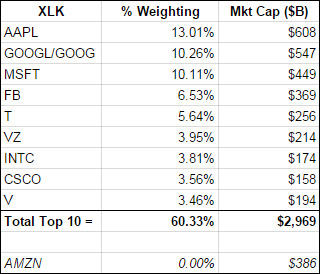
The historic outperformance from the Tech Sector recently as it breaks out to 14-year highs to be extremely impressive. But what if Amazon was also part of that group?
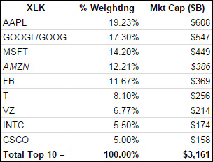
Here is what the top 10 holdings of the Technology Sector would be if Amazon was included in this cap-weighted sector index:
This is what the chart looks like based on a re-weighted technology index that includes Amazon in its calculation:
Click Charts To Zoom In
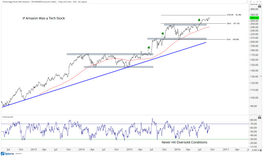
It looks to me like there is more upside coming towards 280 based on the 161.8% extension of the consolidation since last year. After that, it can go to 300, which is the measured move of the amplitude of that consolidation.
The next chart is the Amazon-included Tech Sector Index compared to the Amazonless Tech Sector Index:
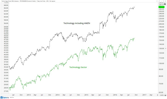
Although the scales aren’t equal, the point here is to show that Tech including Amazon broke out last summer while Tech without Amazon didn’t breakout until July of this year. If you’re one of those people that thinks $AMZN should be considered a Tech stock, then you can see up here how the relative strength in Technology actually got going last year and is really nothing new.
Finally, here is the Amazon-included Tech Sector Index vs the traditional Tech Sector Index Fund (TECHwAMZN vs XLK):
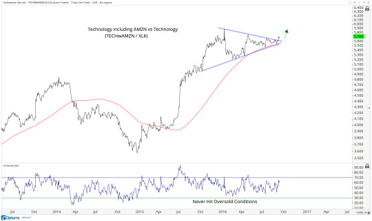
To me this looks like Tech with Amazon is breaking out above a 10-month consolidation within the context of a longer-term uptrend.With momentum in a bullish range and prices above an upward sloping 200 day moving average, we need to be buyers of this chart for a move to new all-time highs.
So what why this all does matter? Who cares? Well, I think this analysis helps in a number of ways. First of all, as is obvious, you can just own this basket of stocks (or short them if this was in reverse). Second, you can use this to really see where the relative strength lies and where things are weak. For example Tech is on fire, has been for months. But during that time and even before that, Consumer Discretionary (including Amazon up 70% in 7 months) has been struggling relative to the S&P500. We’re making new lows on a relative basis there even with $AMZN on fire. So it’s the next largest components dragging it down. Sure enough, there goes Nike this week getting clobbered and continuing its downtrend that can also be seen throughout the internals of the sector itself.
This sort of top/down approach is what I do every day. Understanding the construction of the data that you’re analyzing, I believe, is just as important as the analysis itself. This process allows me to start at the top, with the major U.S. and Global Index, and then break things down to the individual sector, sub-sector level and ultimately down to the stocks and ETFs for execution. To learn more about that approach, you can find more information here.
So this is what it would be like if Amazon was a Tech stock. Many argue that Amazon is a Tech stock. But it is not. Far from it, in fact, as it represents 0% of the Technology Sector and 13% of the Consumer Discretionary Sector (it’s biggest holding).
I hope this adds some value to your process and answers some questions as to what the market would look like if Amazon was a Tech stock. I think it helps reiterate the strength we’ve seen in Tech as a sector lately.
Click Here to learn more about All Star Charts Research
0 notes