
Hi! My name is Adam Cohen and I am a second-year advertising student at the University of Florida. This blog was made for my class MMC 2100 and looks to outline communication strategies used by brands.
Don't wanna be here? Send us removal request.
Statistics
We looked inside some of the posts by alwaysbranding and here's what we found interesting.
Average Info
Notes Per Post
0
Likes Per Post
0
Reblog Per Post
0
Reply Per Post
0
Time Between Posts
21 minutes
Number of Posts By Type
Text
5
Last Seen Tumblr Blogs


Fun Fact
The most popular pages on Tumblr are about Minecraft, GIFs, and David J. Peterson.
Text
Alphabet: Google this and Google that
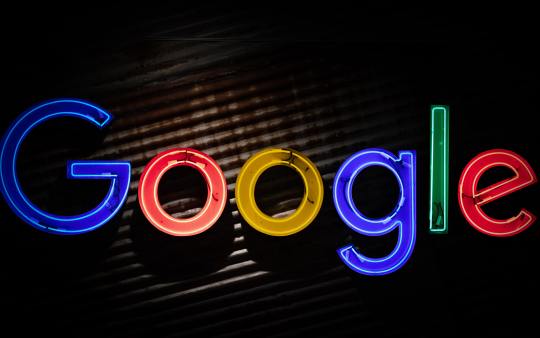
Photo by Mitchell Luo on Unsplash
Brand architecture is the management of different brands housed within one larger brand. Google is one of the best at this.
Google was once nothing more than a search engine trying to compete with Yahoo, but it’s hard to remember those days. As Google expanded and established itself in different areas of the digital world, it made sure to be consistent.
For Google, consistency across brands is key so that the associations from the original brand can carry through to the newer brands. This is why Google focuses so much on their brand architecture.
Each app owned and operated by Alphabet, Google’s parent company, has a similar design. The icons are all simple designs and they all utilize the same color pallet of red, blue, yellow and green.
Google puts a lot of time into this to ensure that the brand messaging is clear and to avoid confusion among consumers. It is important that consumers know when they use a Google application. If a consumer unknowingly uses a Google product they will not build associations with the brand.
By having a uniform brand architecture, Google is able to quickly and effectively communicate with consumers. Google Maps, Google Mail, Google Photos and Google Home all work in tandem to build a brand image and gain consumers’ trust. If a person likes one Google app they will likely try another one.
For more information on why Google became Alphabet visit: https://link.springer.com/chapter/10.1007/978-3-030-13005-3_11.
0 notes
Text
Amazon: the power of packaging

Photo by Hello I'm Nik on Unsplash
With the help of Turner Duckworth, one of the most successful branding agencies in existence, Amazon was able to use packaging more effectively than any other brand. The best brands communicate with consumers every chance they get. This includes packaging.
Nothing is more unappealing than a brown cardboard box, regardless of what’s inside. For this reason, Amazon designed their boxes in a way that sends a happy message to each person that receives one. A smile.
The amazon logo has a line connecting the A and Z in the word Amazon, and it’s no mistake. Jeff Bezos named his company after the Amazon River because the sites selection mirrored the scale of the world’s biggest river.
The line goes from A to Z to communicate that Amazon sells everything from A to Z, but it’s more than just a line. It’s a smile. Turner Duckworth designed the logo so that it was quite literally smiling at the customer.
Amazon embraced the smiling logo, and it became so recognizable that the smile can stand alone and consumers will still identify Amazon. Through branding and design, Amazon was able to associate itself with the universal symbol for joy.
Billions of packages are shipped by different companies every year. In 2019, Amazon alone shipped over three-billion packages. The biggest difference is that Amazon quite literally delivers smiles to people’s doorstep.
This commercial by Amazon shows how the brand leverages its packaging design to communicate an idea to consumers: https://www.youtube.com/watch?v=q94iQYuFPy0.
0 notes
Text
Logo design: less is more

Photo by Brian Jones on Unsplash
Perhaps the most important aspect of any good brand is a responsive brand logo. Nowadays, a good logo has to be able to scale and adapt to various forms of media. For this reason, the best logos are simple.
The newest Budweiser logo, for example, is a simplified version of the previous one. View the before and after images from this case study: https://www.underconsideration.com/brandnew/archives/new_logo_and_packaging_for_budweiser_by_jones_knowles_ritchie.php.
Budweiser determined that the logo needed to be simplified in order to be more effective across all media platforms. The previous version of the logo was too cluttered and the bevel in the font was unappealing.
To clean the logo up, Budweiser made use of only the most important aspects of the logo: the bow tie shape and the typeface. By stripping the logo of all unnecessary decoration it becomes easier to use on digital media, print media and packaging alike.
One of the most common design mistakes is trying to do too much. Putting too many elements into a design can take attention away from the important aspects.
Think of some of the best logos. In my opinion, Apple and Nike have two of the best logos for any brand and they are both as simple as can be. Logos like Apple’s and Nike’s work on phone apps, packaging, commercials, clothing and everything in between.
0 notes
Text
Red Bull: a high-energy drink for high-energy people

Photo by Fonsi Fernández on Unsplash
Red Bull is one of the best examples of how powerful branding can be. The energy drink category is flooded with competitors like Monster and Bang. Still, though, Red Bull maintains a market share of between 70 percent to 90 percent in over 100 countries. With such control over their industry, Red Bull must taste the best, right?
Wrong. Red Bull actually performs poorly in taste tests. Most consumers prefer the taste of Monster to Red Bull. So, how does Red Bull sell more product than Monster?
The honest answer is branding. Red Bull doesn’t just sell energy in a can. They sell the idea of energy.
By positioning its brand to be the master of adrenaline, Red Bull is able to reach an extremely wide audience. They position their brand to the adrenaline junkie so that all the wannabe adrenaline junkies will buy their product.
Remember in 2012 when Australian daredevil Felix Baumgartner freefell from space? If not, here’s a video of it: https://www.youtube.com/watch?time_continue=85&v=FHtvDA0W34I&feature=emb_title
Felix broke a skydiving world record by jumping from a capsule at the edge of the stratosphere, thousands of feet higher than a plane. The video has earned over 45 million views, and on whose channel? Red Bull’s. The stunt was completely sponsored and backed by Red Bull and was one of the most successful branding efforts of the past decade.
For more info on Red Bull’s branding, visit this case study: https://mwpdigitalmedia.com/blog/building-a-strong-brand-with-association-red-bull-case-study/
0 notes
Text
Associations build brands

Photo by: Mae Mu
Source: https://unsplash.com/photos/z8PEoNIlGlg
Branding is an amazing tool. Not just because it’s effective at maximizing sales, but because of its power. Good branding creates very real associations in the minds of consumers.
When someone says the word Coke, what do you think of? Do you see the color red? Or maybe picture a smile? These things that come to mind are called brand associations.
Brand associations are, quite literally, things that consumers associate with brands. The best brands spend years and hundreds of thousands of dollars to properly build associations.
Branding is all about differentiation and building a relationship with consumers through constant brand interaction. Branding encompasses everything from packaging to social media posts. It is important for brands to be consistent to send a clear message to the consumer.
The Coca-Cola logo, for example, is the same logo Frank Robinson originally designed in 1886. By using the same logo for over one-hundred years, the Coca-Cola brand was able to build both brand recognition and trust. Think about how you might react if Coca-Cola suddenly had a different logo design or even a different color.
This blog will take a deeper look into the ways brands attempt to differentiate themselves from their competitors, as well as their strategies for communicating with consumers. You might be surprised to learn how much brands do aside from making commercials.
For more info on the Coca-Cola logo: https://www.coca-colacompany.com/au/news/trace-the-130-year-evolution-of-the-coca-cola-logo
0 notes