
Currently serving as the Creative Director for a consumer packaged goods company, I spend my professional time working on new ways to communicate with consumers. I am driven by the enigma of the consumers mind. What are the ques and stimuli that drive things like impulse purchases and a desire to try something out for the first time, just because they were drawn in by its appearance. My goal is to become one of the leading minds in the field of Creative Marketing. LinkedIn Profile: www.linkedin.com/in/andrea-andrew-laudicina-30bba257 Portfolio: http://andrewlaudicina.com
Don't wanna be here? Send us removal request.
Statistics
We looked inside some of the posts by andrewspursuitofmastery-blog and here's what we found interesting.
Average Info
Notes Per Post
3
Likes Per Post
3
Reblog Per Post
0
Reply Per Post
0
Time Between Posts
22 days
Number of Posts By Type
Text
14
Photo
3
Last Seen Tumblr Blogs


Fun Fact
28.6 is the average number of monthly visits per US mobile user.
Text
The culmination of a twelve month journey
Course One – Mastery
The Mastery course provided me with a clear understanding of the high level in quality required by me in the coming months in order to achieve the highest level of quality in the work I produce. This understanding allowed me to prepare for the educational road ahead both on an emotional level as well as from a project management point of view. Through understanding what will be required of me, I was able to prepare myself to think innovatively by using the methodologies that are a part of each month’s course requirements.
Course Two – Defining Client Needs
Defining Clients needs began with the logo development process. For me, Reykjavik was the location in which I would continually build in the coming month as part of the development process of their brand image. This specific course began with the research process that took shape as the Mind Mapping process. What I learned from this course that I took forward into future projects was how to create detailed documentation that will lend itself to more focused outcomes within the work I create. In this case, it took the form of sketching to eventually create a branded image for the city of Reykjavik, Iceland.
Course Three – Brand Development
As a continuation of the work started in course two, brand development focused on refining the logo ideas developed for the Reykjavik brand by vectorizing and exploring color palettes while leveraging peer reviews to establish the identity that represented the city in the most relevant and significant way. What I learned in this course through the peer review system is that complex design doesn’t necessarily translate to better design. It was the simplest of representations developed for the Reykjavik brand that made the most profound impact when subjected to the constructive criticism of my peers. The numerous peer reviews also provided the opportunity to understand and receive such feedback in a constructive way rather than take the multiple different points of view in a critical negative manner. Finally, course three also initiated the brand vision board by establishing a voice and tone through color, imagery, and copy writing that communicated the Reykjavik brand.
Course Four – Effective Copy Writing
Then copy writing course was enormously eye opening and beneficial for me on a personal and professional level. One of the areas that I don’t get to practices often as an artist in my professional life is copy writing. This course provided me with the necessary tools to effectively communicate with consumers through the written word. Basically, by providing an understanding of proper structure in significance for headings and body copy along with the ways in which to use them effectively within different mediums refined and projected my level of understanding forward. The coursework itself consisted of designing ads built to entice and stimulate consumer reactions by using the methods presented within the course reading assignments. The refining process behind developing these ads along with the peer reviews all aided in my growing understanding and use of copy writing within the continuing coursework.
Course Five – Design Research
Course five focused on the research required to make informed and calculated decisions with the design process. Covered in the course was research in color psychology which aided in choosing a strong color palette that effectively communicates the brand unique qualities. The research also aided in establishing a visual hierarchy for the brand. Implementing this hierarchy was executed within the vison board started in course three. As a continuation of that work course five was all about refining through research and applying the overall voice and tone developed within design across platforms that would be applicable to the established design elements. One such place is the brands digital footprint. For my project I decided to lead with what my Reykjavik brand would look like as a website for a mobile device. Being that the mobile environment is turning into the primary place consumers first experience a brand, I thought it relevant to start there with the development of the wireframe that would represent the mobile Reykjavik website. This course finalized with an infographic that fully represents the established voice and tone I developed for the Reykjavik brand through a story telling format that illustrates the journey through the development process and expresses each of the separate parts of the brand like narrative through copy writing, color, imagery, and more.
Course Six – Organizational Structures
Course six is by far the most rewarding learning experience for me yet. The introduction of motion into our story telling process opened new avenues of expression for me on a professional level. Until now, my use of motion was extremely limited to critiquing others work and working with agencies to create a final motion project. This month’s course work familiarized me with the process behind creating captivating moments through motion and sound. It gave me a glimpse into the movie making world. I say a glimpse because there is so much to making movies but, it all comes down to telling an emotionally captivating story that consumers really connect with. I tried to capture this same effect within the story I told for the Reykjavik brand I have been developing since course number two. Learning how to use new pieces of software was an enormous challenge. After Effects being the platform of choice for me this month has opened up some avenues of expression for me. As a matter of fact, it made such a profound impact that I am planning to continue by becoming a profession with motion graphics through the use of After Effects. While I learned several techniques to create effects and transitions within the motion piece I was working on, my main focus was about telling a story that captures an audience. All of the techniques I learned through my own research were the means to achieving a strong communication piece but, it was the small nuances that I feel really sold the story as a whole. Sound was critical in achieving that. For example, showing a woman observing a sunset is a great visual but, including a sound effect where she is exhaling in the cold climate really drives and allows the audience to feel what she is feeling in that moment. I tried to repeatedly capture the audience by communicating through the entire 30 second story in that same way. It was the overall experience created by the combination of sound and visual effects that communicated Reykjavik as an experience like no other to be had. A wondrous experience.
Course Seven – Design Strategies & Motivation
Course seven marks the beginning of a new branding project. This time around it’s a project that hits a little closer to home, creating relevance in a realistic market for me. The project took the shape of branding a local municipality that could use the benefit of a branding initiative. As we were encouraged to find a city that does not have the benefit of an already executed branding effort, I made it a point to find the city closest to me that could benefit from a branding campaign. For me, it was the city of Dunnellon, Florida with a population of less than 2,000 residents to connect with. One of the biggest take-aways for me in this course was the concept of empathy mapping. In my career I have either led or played a central role in over 50 quantitative and qualitative consumer studies. While qualitative consumer studies are close to empathy mapping, it does not compare to how close to the consumer empathy mapping brings you. For example, qualitative studies I have conducted in my career were held with a team behind a one-way mirror observing the reactions of focus groups to products we were seeking feedback for. As Cao (2018) explains it, empathy maps are most successful and beneficial when based on supporting data. Empathy mapping brought me closer to a more focused solution through one-on-one interviews with consumers that allowed for a more personal and emotional perspective significantly increasing the quality of every response for the subject by the interviewee. By using meaningful emotional points of view along with socioeconomic information acquired through demographic research, a solution that addresses the specific needs of this community materialized into representation that speak to the target audience it was created for.
Course Eight – Design Integration
Course eight covered one specific and extremely important part of the design process. Mainly, the process of presenting all of our research findings and recommendations moving forward as a result of interpreting those findings to develop a product that answers the initial design problem we were hired to solve. Our presentation of the solution in the form of a design brief. As explained by Chapman (2011), a comprehensive, detailed brief becomes the guiding document for the entire design process, and spells out exactly what you, as the designer, need to do, and the constraints within which you need to do it. It defines the objectives and goals of the new design, budget and schedule, target audience, Scope of the project, available materials/required materials, overall style/look and any definite “Do nots”. Every design initiative, especially for those in a position of leadership driving the project, will need to present their proposal in the form of a design brief for consideration by a company’s executive leadership team. For Dunnellon, contained in the design brief is a summary of all the primary and secondary research like a SWOT analysis and empathy map executed along with the design solution proposed to answer the design problem established at the beginning of the project. Contained in the design brief are elements that express voice and tone like copy writing style, the vision boards static and dynamic representing the overall look and feel of the new brand, the logo as the symbol to represent the city, and a list of defined characteristics and values that represents the cities community.
Course Nine – Multi-Platform Delivery
Multi-Platform delivery represents the execution of the brand once the brand image has been established. IN this phase of the design solution, yet again there is quite a bit of research that had to be conducted. This time it is to determine the most effective way to communicate with the consumer the creative campaign initiative was designed for. Identifying the most effective mediums for delivery was deliver through understanding the best ways to reach the community with consideration to the budget available for the project. According to Dansalg (2018), diversifying your strategy will allow for a multi-channel approach, which proactively pushes your campaign to new heights. A focused multi-channel approach for the city of Dunnellon included advertising within mediums of communication that are most experienced by the community. So, advertising through pole banners, billboards, wayfinding signage, printed material like brochures, magnets, and stickers along with communicating through social media and a website were the primary ideal methods to communicate for the community of Dunnellon.
Course Ten – Measuring Design Effectiveness
Measuring design effectiveness is a design strategy that I am enormously familiar with through my professional work experience. The Dunnellon branding project is no exception to the beneficial information acquired through testing the results of design direction created through multiple avenues of research. While some may not consider this a necessary step in the design process, I see it as a curtail step that determines whether or not my interpretation of all the research I did into an aesthetic that connects with the audience I designed it for is correct and accurate. This step of validation can save time and money that might be lost in the execution phase if the brand aesthetic is not effective and lacks the elements necessary to connect with its audience. According to Best (2016), to evaluate the design, the wider context of the community must be understood. This is what measuring effectiveness provides. Establishing that the brand aesthetic connects on a wide spectrum. Conducting quantitative and qualitative consumer studies provided me confirmation that all the touchpoints of communication like the idea of family, fun and happy were present and being communicated strongly within the design aesthetic.
Course Eleven – Presentation of Design Solution
Presenting my design solution in the manner specified by the course requirement was by far the most comprehensive way I have ever presented a design solution. In the professional world, one would not create a website to present their argument for what they have delivered as the recommendation for a design campaign but, being that this is a thesis for scholastic accomplishment I can understand why presenting in such a manner would be effective, straightforward, and easily communicated. One of the greatest benefits of the thesis process for me in month eleven was the increased use of peer reviews. It stood out as a fantastic way to make sure my work was understood broadly across various minds over just relying on one mind (the professor’s) feedback. By getting feedback by multiple students at different turn-in points of the assignment made sure the work was accurate and communicated my thought process in a strong manner.
Course Twelve – Professional Practice

The experience map depicted demonstrates the emotional journey I experienced through the coursework for the achievement of mastery. The use of expressional emoji faces demonstrates my emotional state through the roller-coaster ride of completing coursework in relation to emotional challenges as well as things like managing time to get all coursework done while also working in a profession setting and managing responsibilities to my family.
References:
Best, K. (October 31, 2006) Design Management. Publisher: AVA Publishing. Retrieved from: https://ce.safaribooksonline.com/book/design/9782940439782/firstchapter#X2ludGVybmFsX1BGVmlldz94bWxpZD05NzgyOTQwNDM5NzgyJTJGMTcyJl9faW1hZ2VwYWdlcmVzb2x1dGlvbj0xMDAwJnF1ZXJ5PQ==
Cao, J. (2018, June 15). The Guide to Empathy Maps: Creating 10-Minute User Persona. Retrieved July 31, 2019, from https://www.uxpin.com/studio/blog/the-practical-guide-to-empathy-maps-creating-a-10-minute-persona/
Chapman, C. (2011, March 17). 7 basics to create a good design brief. Retrieved July 31, 2019, from https://www.webdesignerdepot.com/2011/03/7-basics-to-create-a-good-design-brief/
Dansalg. (2018, March 9). A Marketer's Guide to Branding a City or Municipality. Retrieved April 3, 2019, from https://www.visualfizz
0 notes
Text
Thesis Presentation Month - 3 Takeaways
Takeaway #1 – Giving & Taking Feedback – Peer Reviews
My first greatest takeaway for month eleven is understanding and appreciating the value of peer reviews. As a professional in the world of graphics for over 20 years, I came into the Media Design program at Full Sail University with a great deal of experience giving feedback but not so much with taking it. As the leader of a creative team, I have learned to frame feedback in such a way that is constructive while addressing needs for improvement delicately as every individual possesses diverse comfort levels in the way of receiving critiques for their work. What I have gained from this month’s peer reviews and peer reviews all the way back to course number one is how to construct a review for someone’s work in a constructive and objective way. Cox (2012) explains, the designer needs to hear the truth and understand the reasons why a design is either working or not. While an objectivity is the goal of the review, most find it easier to deliver good feedback over those that suggesting revisions. I have learned how to deliver the good along with the so called ��bad”, in a positive and constructive way. By starting a review with pointing out the greatest parts of a body of work, then diving into the areas that need improvement with an explanation that is suggestive rather than criticism based, and then offering suggestions that may improve the work has proved to be successful in peer reviews. I base the success rate on the responses I receive after I deliver a review and on whether or not the designer uses the suggested improvements. In most cases, I noticed the reviewee did apply the suggestions offered for improvement.

Peer review feedback request
Taking feedback was a bit tougher for me when I started the program. Over time I developed an appreciation for peer reviews as many of the suggestions received were great ones and did in fact improve my work. Admittedly, it is tough hearing your own work needs improvement but, if you can get past that bit of pride, usually the suggestions are valid. I have learned to take the feedback constructively without reacting to it personally.
Takeaway #2 – Time Management
Time management has been a challenge since the very first course. Adjusting time management to fit my family, professional, and scholastic life was tough at first but, I developed a great routine that allowed me to get it all done. Month eleven was the most challenging month with the amount of work all due in the same month. The thesis presentation, on top of a portfolio presentation, along with 3 peer reviews was the largest workload yet compared to the work loads of months one through ten. What really made month eleven such a challenge with time management is the all of the background work needed in order to build out all the parts to each of the assignments. Basically, building two web sites from scratch (the thesis site and portfolio page) along with the three peer reviews was a copious amount of work when you consider all of the copy and media assets that have to be developed to build everything out. A method I use for time management includes nine steps as explained by Simpson (2016).
1. Start your day right. 2. Have a plan for what you want to accomplish. 3. Break tasks into reasonable units. 4. Prioritize tasks and refuse inessential tasks. 5. Delegate if possible. 6. Plan time for meals, exercising, and socializing. 7. Follow a big push with relaxation. 8. Practice the 10-minute rule. 9. End each day with a plan for tomorrow.
This process allowed me to follow through and deliver quality work on time every month, especially during month eleven’s hefty workload.

example of content creation for month eleven’s deliverables
Takeaway #3 – Telling A Story
This month’s thesis presentation started off rocky in relation to my thought process in the way information was to be presented. One of the biggest setbacks was my initial approach in telling the story that would demonstrate mastery over the Design Learning Outcomes. My initial approach in story telling focused on describing the importance behind the process applied to creative thinking. After some really helpful critiques, I developed a better understanding that the story should be about the journey as it applied to learning how to deliver effective design solutions. Basically, using story telling methods to describe the journey from research through development and finally production and presentation for how and why I came to the design solution I offered at the endo of the entire creative cycle. Telling the story from the perspective of the execution of each decision based on data to support the direction is how to effectively carry out a concept and present it to a potential client.

examples of research to concept
Airey (2014) explains that your design must be relevant to the industry, your client, and the audience to which you’re catering. Providing a comprehensive explanation through this process demonstrates to a potential client that the design solution offered for their business problem will be the most effective solution for them. Simply going in with a great looking design solution without any research to back up the rational for the solution will result in lost opportunities as it does not demonstrate how and why it is relevant to their industry or the client and their audience.
References:
Airey, D. (2014, August 20). Chapter three. Elements of iconic design. Retrieved June 20, 2019, from.safaribooksonline.com/book/branding/9780133812589/part-i-the-importance-of-brand-identity/ch03_html
Cox, P. (2012, October 15). The unwritten rules of a great design critique. Retrieved June 28, 2019, from https://tympanus.net/codrops/2012/10/15/the-unwritten-rules-of-a-great-design-critique/
Simpson, C. (2016, August 02). 9 rules for successful time management. Retrieved June 28, 2019, from https://www.entrepreneur.com/article/278133
0 notes
Text
Measuring Design Effectiveness
Month ten, Measuring Design Effectiveness was all about testing. The purpose of the research is to suggest a new perspective for the city branding strategy and create a brand aesthetic that resonates with the community in an emotional and meaningful way that will ignite a sense of community pride with its citizens and stimulate an increase in their participation within their town’s government, whereas testing the design aesthetic itself as well as the concepts and message created to represent the voice and tone for the city I am rebranding is to measure the effectiveness of what has been developed. The research conducted for the new brand concept was executed via a survey launch through Survey Monkey with a questionnaire which measured the emotional responses of 100 respondents that fit within the same demographic of the community in Dunnellon, Florida.


To gage and acquire meaningful responses that validates or questions the creative direction take on the brand message from a visual perspective through graphic media assets and copywriting, a questionnaire was constructed asking 10 focused questions in an open and closed-ended manner. The survey goal was to acquire quantitative and qualitative data. According to Best (2006), qualitative information can help determine if the design cold be improved to better conform to the location’s image or communicate more efficiently with the target audience. The questions asked are designed to measure specific emotional responses to the graphic elements and copywriting developed to represent the city of Dunnellon.

The results of the survey produced a positive outcome to the brand aesthetic created for the city. The primary goal of the new brand was to communicate fun, family, and an overall feeling of happiness. The results of the questionnaire produced a response of over 60% of the respondents agree that the brand elements produced create the three aforementioned characteristics. While the quantitative data revealed the media elements successfully communicated in the way the designer intended them, the qualitative responses helped in understanding how the graphic elements could be improved to further drive those three characteristics more successfully. According to Best (2006), qualitative can help determine if the design could be improved to better conform to the location’s image or communicate more efficiently with the target audience. While many of the qualitative responses were anticipated, there were some that revealed some areas of improvement. For example, one specific response that did this was in reference to the tag line. The question asked if the tagline communicated the aforementioned characterizes well enough in comparison to the graphic elements it was paired with. The responses to this question was a 50:50 split, meaning some improvements need to be made in order to solidify better communication.

The entire process of the survey research was critical in producing a viewpoint of the brand from a consumer standpoint. This is essential to the production process as it would be a costly mistake to launch a brand that may not be accepted by its community as an accurate representation of who they are. What was learned through the process of conducting a survey is that there are both advantages and disadvantages to this process of information gathering. According to Debois (2019), advantages to a survey are things like cost effectiveness, practicality, fast results, scalability, comparability, easy analysis, validity and reliability, and respondent anonymity. Basically, it is a fast way to get large scale results with ease. The disadvantages to the survey process are that it can provide dishonest answers, the way questions are interpreted will vary from person to person, and the possibility of receiving unconscientious responses. Overall, the survey results should be used as a guide for a designer to make improvements in areas that that produce strong results in opposition to the initial thought process or direction.
References:
Best, K. (2006, October 31). Design Management. Retrieved June 2, 2019, from https://ce.safaribooksonline.com/book/design/9782940439782
Debois, S. (2019, March 08). 10 Advantages and Disadvantages of Questionnaires. Retrieved May 31, 2019, from https://surveyanyplace.com/questionnaire-pros-and-cons/
0 notes
Text
Multi-Platform Delivery
This month is all about building assets to represent an entire brand. I find this to be one of the most fun parts of being an artist. The time spent sketching, illustrating, and photographing is one place an artist shines as each artists methodology and thought process varies from person to person. This is where an artist true style comes out. Airey’s (2014) seven elements of iconic design, as well as all the articles read on how to strategically create a brand through research in design was central to the successful outcome of this month’s branding project.
Connecting/Synthesizing/Transforming
This month was all about creating an aesthetic that accurately represents the characteristics put in place for the city I am branding. For Dunnellon, these characteristics are being represented by imagery that communicates family and friendship, pride in history and tradition, a welcoming disposition and compassion for all. While these characteristics and values have been captured in copywriting with a tagline that states “Here, Everyone is Family” and a mission statement built to rally the community by celebrating pride in their traditions and history as a close knit family.
Creating the logo for Dunnellon consisted of a copious number of preliminary sketches that embodied at least several of the characteristics and values defined for the city. Using Airey’s (2014) seven elements of iconic design allowed me to construct imagery using aesthetic choices that were precise in nature to the subject matter. By holding each concept up to each of the elements he described like, keep it simple, make it relevant, and aim for distinction to name a few, I was able to craft various representations for the city and then further narrow down each of those choices based on feedback in peer reviews and more assessment by re-evaluating several times. Eventually it was this process that led to a successful logo as well as an overall brand image through multiple imagery, illustrations, and video.
Final Logo Designs

Problem Solving
Without question, problem solving is at its peak during the process of deciding a brand aesthetic. Deciding what direction to take is critical for the job at hand but, more importantly for the client the work is being done for. Making bad decisions during this process will eventually lead to the client being dissatisfied with a brand that does not truly communicate who they are and fails to connect with the target audience it is intended for. In this stage of development, problem solving takes the form deciding what the best direction will be for the logo design, deciding the kinds of imagery and illustrations that effectively communicate the brands characteristics and values of the community, deciding what the copywriting will sound like in trying to establish voice and tone, and deciding the best mediums that will maximize communication of the new brand for the city. These are all critical decisions that need to be made carefully, with precision. If done incorrectly, it can cost the customer dearly in failed capital investments.
The design problem being faced is trying to create a brand image that accurately and effectively represents that characteristics and values of the Dunnellon community. The mediums that were chosen to communicate the brand were strategically selected based on maximizing communication as well as considering cost effectiveness. For example, Dunnellon is filled with billboards. For the city, this is a great way to communicate with its community members without going to each member individually. The unique power of billboard ads (and indeed, all billboards) lies in their tactile nature. Unlike some mediums such as TV or radio ads, which can often seem ethereal or ‘not real’, billboards on the other hand are physical structures that are part of the environment and our everyday lives, which constitute a part of our cultural landscape (Luke, 2014).
Advertising Mediums
Billboard and Social Media

Innovative Thinking
Through this assignment, I have performed an extensive amount of research. Along that journey in research, I have not seen another execution to represent a town that is in any way similar to my own. Even in comparison to my peers in class, my own logo and brand aesthetic was quite different in approach. While in many cases the characteristics may have been similar as well as values, the resulting aesthetic representation was quite different. Innovation was achieved by way of capturing more than just one characteristic within the entirety of the brand aesthetic. For example, the logo itself does more than just represent a fun time at a popular watering hole, it communicates family moments created within the community. It utilizes bright and vibrant color that complement each other taken from the environment. It pays tribute to the history of their famous and historic river during their mineral mining days. It encompasses four of the defined 6 characteristics and values. Incorporating so much communication within imagery that is simple and minimalistic is how the subject of innovation was approached in this project.
Acquiring Competencies
While I did not learn any new software, I did acquire a much better handle on communicating effectively through design. What I mean by that was covered in my previous explanation with innovative thinking. Communicating a wide range of characteristics and emotions through a design aesthetic that is simple and appealing can be difficult to do well. This month I feel that I overcame that challenge by creating a brand that effectively communicates the emotional pulse of the community in Dunnellon, Florida. What confirmed that for me was not the reviews received in class, but the feedback received from some of the community members. This past month I shared out my concept with some friends from Dunnellon and they loved the entire thing saying, “This says Dunnellon to me. I can see a lot here that connects with me in so many different ways.” For me, this was affirmation that I created something real. A symbol that can rally the community.
References:
Airey, D. (2014, August 20). Logo Design Love, Annotated and Expanded Edition, Second Edition.
Retrieved April 5, 2019, from https://ce.safaribooksonline.com/book/branding/9780133812589
Luke. (2014, June 9). Ad Impact is a full service Advertising & Digital Agency. Retrieved April 3,
2019, from https://www.adimpact.com.au/blog/the-benefits-of-billboards
0 notes
Text
Overview of the material and concepts learned this month
This month turned out to be one of the most challenging classes yet. The size of the final assignment was the largest yet but, it delivered a deeper understanding of the creative process involved in delivering a creative brief to a client that is thorough and accurate with and extensive amount of supporting information that guided the process. In its entirety, this month was about learning about individual parts of research that must be accomplished to create a comprehensive and well-prepared design brief. Some of the specific learning consisted of developing a strong problem and solution statement, conducting research in demographics that helped define the problem statement, the SWOT analysis is learning from past courses but a great re-visit into creating one, empathy mapping derived from connecting with the community through interviews, and development of a brand voice through establishing characteristics for the brand that will be created. Furthermore, developing a media matrix and asset plan was new for me on such a broad scope and much learning happened during the process of putting that assignment together.

Connecting/Synthesizing/Transforming
The research conducted in this course was more intense than any other up to this point. Research in demographics provided some broad variables to the age groups and type of population I would be working with and interviews with the community provided a personal pulse on what the townsfolk thought was important to them. It provided a frame of reference as to what the community really needed to see for a branding effort to be successful. This was all captured within the empathy map created to outline their feelings toward their city. The online research conducted to construct a personality to the voice and tone of the city all came to life within the SWOT Analysis and Brand Voice Chart. In its entirety, the research led to color palettes, stylized typography selections, and specific imager that convey the emotional standpoint of the city. The overall transformation of information collected this month took the form visually and audibly as the static and dynamic vision boards. The voice and tone were even carried over to the final design brief that explains this process as well as demonstrates the aesthetic within the document itself.
Static Vision Board

Dynamic Vision Board– Video Link: https://youtu.be/ZtBfDgktrtU

Problem Solving
Problem Statement The city of Dunnellon needs a way to rally its citizens. They feel disconnected from their community because the perception of the town discourages people from playing a more active role within their community.
Solution Statement The creation of a unified brand identity that communicates the City of Dunnellon as a place of small-town charm with traditional southern hospitality for the purpose of stimulating a sense of unity and pride within its community.
As described in the problem statement, the city of Dunnellon is lacking in community participation. While they are a proud and welcoming community, the sense of unity is not felt on a city level. There is a disconnect from city and community. The medium I chose to pursue in the design effort was an emphasis on small-town charm and classic southern hospitality. This angle was apparent within various visits to different parts of the community. In every instance, the first noticeable characteristics were extremely friendly and welcoming, and once some dialogue was exchanged during interviews, pride of themselves as a people and their historic roots became a reoccurring theme. The design problem I have solved was to bring out those qualities into a visual and audible image consisting of a color palette plucked straight from the environment as well as imagery and video of the true character of this small town. The problem is solved by creating a voice and tone within the branding initiative that communicates their character and values.

Innovative Thinking
During much of my research, I came across many articles demonstrating other work on developing a brand for a city. Some of the cities were New York City with their famous tag line of “I Love NY” or “I Heart NY”, Albuquerque, New Mexico, and Amsterdam, Netherlands. While my work is not on the scale of the work that has been done to rebrand those hub cities, the method was similar. Research in various areas including demographics, empathy map creation, SWOT analysis, and media planning we all useful in creating a city brand in the same way it was done for the cities aforementioned. Innovation came in the form of personalization. Understanding what would work for the small town of Dunnellon in a more personal way. For example, the characteristics chart is a reflection of the voice of Dunnellon. Other cities, especially the big ones like N.Y., cannot claim the same kind of personality. Second, innovation came in the form of developing a media plan with a custom fit for Dunnellon. As stated earlier, innovation has been applied to this rebranding project in the for of personal customization. If one were to take the media plan for Dunnellon and apply it to a neighboring town, many of the elements would not work for them in the same way they would for Dunnellon.
Acquiring Competencies
There was no new software learned through this month’s process. The projects worked on required the use of software used previously on other projects through the course. The biggest learning I acquired through this process was on the process of creating a strong and thorough design brief that can be used to present creative strategy to potential clients in a professional environment. Bringing it all together into one brief that communicates with precision was the biggest accomplishment and learning experience for this course.
The experience I had in this course was revealing. What I mean by that is that I now have a clear understanding of everything involved in thoroughly researching a brand from a creative perspective. As a Creative Director by profession, the experiences in this course and all previous ones has improved and sharpened my skill as a strategic leader for the company a work for and for me within my profession. As I advance within the professional environment, I will be able to deliver profound and hard-hitting reasons to why my way may be the right way in creative strategy.
0 notes
Text
Month 7 - Design Strategies & Motivation
Connecting/Synthesizing/Transforming
As this month’s course began with a change in subject matter, the goal identified itself as the construction of an effective and thorough Design Brief. Every good design brief begins with properly researched factors that will come into play in creating a good design brief. Research took various forms this month. Week one began with initial research into the location I will be covering in the form of online searches and visits for photo-documentation to various points of interest within the location. Week two was a continuation of research with added interviews of the local townsfolk within my chosen location and an online search identifying a demographic outline that would aid in future decision making. In order for any creative campaign to be effective, extensive and accurate research must be performed in order to internalize and connect with the subject matter on an intimate level.
For my chosen town, Dunnellon, Florida, initial research in week one provided various angles that would lend themselves well to a re-branding effort for the location. For example, what I kept finding over and over again through online searches, was the connection with nature the town people communicated within social posts. As I continued my research, week two presented a different perspective. As I began interviews with Dunnellon residents during week two a quality began emerging that wasn’t something communicated by the town’s folk. It was a hidden gem that people in Dunnellon just perceive as every day life. As I began speaking to each interviewee in Rainbow Springs State Park and Dunnellon’s Historic District, two unique qualities came to life within everyone I spoke with. The first being a genuine care for one another, and me for that matter. It was that classic southern hospitality you often hear of in conversations. Being from a northern state myself, I may have noticed it very quickly because it is not something, I am accustomed to experiencing. Southern hospitality is a marketable quality and definitely something a designer can bring to life aesthetically. The second quality that fits alongside the first is that Dunnellon is a very small town with a population of less than 2,000 residents. What fits right in with that small fact is that I discovered during one of my interviews in a local shop in the historic district is that everyone in the town knows each other for the most part. The second hook that can be marketed in this case is a small-town feel.

While the citizens of Dunnellon voiced their emotions for their quaint little town quite loudly, it was the unspoken everyday life I discovered during the interview process that is their biggest strength as a community. In a campaign to attract visitors to a town, emotional experiences are what people on vacation want to experience. For example, Disney is wildly successful because they create emotional experiences for all of their visitors.
Problem Solving
As stated by Devos (2018), for designers and creative problem solving, a problem is an unmet need that, if met, can satisfy the user’s purpose. In this case, the unmet need for the city is getting more people to visit their town. Solving this problem will require much of the research already conducted like the demographic outline, the empathy map that includes the perspectives accumulated through interviews, the 4 W’s as outlined by Devos (2018), and a SWOT analysis that will provide key information in reducing weaknesses and outline ways to exploit and turn threats into opportunities.
The cities problem is a slow economy and poor government funding due to their size. While I cannot directly affect those factors, a marketing campaign that includes a completely new image for the city advertised aggressively through all forms of media including print, broadcast, and digital can provide the solution to the city’s deeper need that its citizens may not be able to articulate.
The way in which I solved the problem is by analyzing all of the data I have accumulated and developing a final problem statement that clearly and effectively brings focus to the insights I have uncovered (Devos) 2018.
Innovative Thinking
As a professional working in the creative field for the past 20 years, I have worked with various agencies specializing in marketing, creative, both marketing and creative. What I have seen is the different styles pitches they each come to the table with. I have seen that model change various times over the span of 20 years, but one thing always remains constant. They always come in with an abundance of preliminary research done on the particular item for discussion. For example, if the topic at hand was for a website re-design, each of them would present a complete analysis of our current website and all of the things that each agency can offer our company that would improve every aspect of business. I have used this prior knowledge and experience in developing the work I have to this point. Enormous amounts of research and a final pitch video that uses the elevator pitch methodology to communicate what I have to offer the city in relation to their problem. My innovation in this project took the form of approaching the problem from multiple perspectives. What I mean by this is, I approached the problem from the standpoint of the citizens, and then going beyond that and trying to deliver a solution that addresses the end user’s deeper need.

Acquiring Competencies
What was learned overall through this process is how to affectively accumulate data through research that will build a story in the form of a problem statement that identifies how I can solve the problem of a potential customer by delivering on their deepest need. As a Creative Director of 8 years, I have created design briefs before, but never in this manner with this much research. I believe this may be because I have worked in a corporate environment the entirety of my career and have focused on brands that already exist. I can see the application of all of this research especially in an agency environment. With competition increasing rapidly in the market, detailed and thorough research can make the difference between winning and losing a potential client. I have definitely learned many new ways of conducting research through this course especially in the area of the empathy maps. As a corporate designer working on established brands every day, I have to always imagine myself in the consumers shoes. Empathy mapping in my field often take the form of qualitative studies within the brands I work on as we gather groupings of consumers and ask them very personal question in relation to the brands we work on. One thing I have learned through experience is that you cannot always take what a consumer tells you at face value. Often you have to read into certain things they say because they often answer questions not by what they actively would do in a store environment but, what they would like to do in a given situation.
This month’s course was a significant challenge for me as some of the tasks for me were a first time. While I did have some trouble understanding and correctly interpreting what was needed for some of the assignments, especially the design brief, I believe I ended this month in strong position to move forward into the next phase of this project.
References:
Cao, J. (2018, June 15). The Guide to Empathy Maps: Creating 10-Minute User Persona. Retrieved March 3, 2019, from https://www.uxpin.com/studio/blog/the-practical-guide-to-empathy-maps-creating-a-10-minute-persona/
Devos, J. (2018). Design Problem Statements – What They Are and How to Frame Them. Retrieved March 3, 2019, from https://www.toptal.com/designers/product-design/design-problem-statement
1 note
·
View note
Text
Motion Graphics
Overview
Reykjavik is a destination of continuous wonder. Time will seem to stand still in Reykjavik as each experience delivers on its promise to enthrall. Within its cosmopolitan culture lies an audaciously designed cityscape overflowing with epic architecture. Around every corner and within every thrilling expedition of this volcanically sculpted artic playground, your senses will be overwhelmed by the enormity of each discovery. Reinvigorate your soul with an immersion canopied by the Aurora Borealis as you unravel to the wonders of Reykjavik. Bringing this energized environment to life through motion and sound create an added layer of depth to this campaign that the static cannot achieve. The material covered this month has opened up new possibilities in was to reach and tug at the emotional strings of viewers. Creating an animated environment will give the audience a superior visual and audio perspective of the unique experience that characterizes the audacious city (Blazer, 2015).
Connecting/Synthesizing/Transforming
The research conducted this moth within Blazer’s book and numerous web links in relation to the subject matter provided an in depth understanding in the fundamentals of motion graphics as well as generated some ideas of what kind of execution would create a successful sequence of communication through my attempt at bringing the originally static expression of Reykjavik to life through motion and sound. One of the decisions for this motion graphic representation of Reykjavik is to advertise brand. With a tremendous amount of experience in the retail space in both value and luxury products, brand has proven to be a key component in advertising that drives success for products if used correctly within a products image. According to Pike (2013), branding is a source of growth and carries the meaning of value through its prominence and reputation in a marketplace. In this case, the motion graphic both opens and closes with brand, making brand one of the strongest pieces of communication. The voice and tone of the brand is carried forward through the motion sequence along with sound, which together create a mood that represents the brand.
For the motion poster project, several factors were taken into consideration for the choice in style as well as how the poster was brought to life. In researching the benefits of a motion poster execution, there were several factors that stood out that lent themselves well to the reason for going with this style. The primary one is that according to McGregor (2017), one of the core properties of a motion poster is that all of the animation comes from the elements within the scene of the poster. For example, in this rendition of the Reykjavik brand, the setting is in nature. Elements in nature often have some kind of movement, like a flower blowing in the wind or rain falling and bouncing off of a rooftop. For Reykjavik, this movement takes the form of the Northern Lights shifting nature. If one were to witness it in person, they would see this movement in the sky. Second, this all takes place in the ocean, also a moving element in this scene. Bringing these two natural elements to life as they would be in nature, will allow a viewer to experience it for those few seconds they are absorbing the message the poster is projecting. Finally, sound is also a factor. Since motion posters can contain sound, including the sound of the ocean along with a sound affect that stimulates excitement can generate further emotional stimulus from the viewer. As McGregor (2017) explains, you end up looking at the poster for those extra few seconds, possibly walking away with a more defined idea of what the image of film is about.
Problem Solving
The design problem that needs to be solved is creating a feeling of grandeur and wonder through the animated imagery of the story board. To solve this problem, utilizing the Story Arc was central to the solution. Constructing a preliminary story that fit the arc was the first step in the process. Next, comparing that story to the story arc and making adjustments to individual parts to enhance the preliminary story into a more emotionally captivating sequence introduced an emotional journey for the viewer. Within the story board, the story began with the introduction of the logo. A short sequence that created something for the viewer to anchor their experience to. Quickly following the logo sequence, the motion graphic creates an experience for the viewer by placing them at the location. Witnessing the northern lights as the sun goes down on the coast line looking out into a vast frigid ocean. The sounds associated with this scene are minor but powerful. Some background sounds of seagulls and waves crashing softly while the dominant sound of a female exhaling with steam in her breath as she takes it all in. Following the introduction scene is the climax of the story arc where the viewer experiences much more of what Reykjavik has to offer through various images and video clips playing to an epic and wondrous sound that excites. The story arc concludes with a return to the logo as a reminder of the brand that can make it all happen.

Innovative Thinking
Innovation was brought into this project in the form of realism. The sequence created for this brand of Reykjavik is meant to immerse the viewer in the location’s environment. There is a tremendous difference between reading about an experience and experiencing it for yourself. Reading and seeing static imagery can only paint a small part of a story. Motion adds the element of a story experienced over time in a similar way that you would experience it if you were there. Within this window of time, the journey that can be created for a viewer can entangle them into what they could expect within the experience itself. Things like the sound of the ocean and seeing a whale in movement as it breaches the oceans surface. Only motion can capture the true essence of this. Companies like Disney have gone as far as stimulating one’s sense of touch by spraying a mist of water in a viewer’s face as they are entertained by pirates battling it out on an ocean voyage during a 3D movie sequence. These further attempts to stimulate as many senses as possible help give the viewer a sense of realism in what they are experiencing. Within this Reykjavik piece, a woman breathes into the frigid air with a visible steamy breath as she exhales with an audible huff from her lungs. A humpback whale visibly breaches the ocean as it leaps and then splashes back down with both a visible and audible water splash.
Acquiring Competencies
The craft of storytelling is an old one for me as I have been practicing this in my current career for the past twenty years. The primary difference between my career and this course is that my experience is in static graphics. While I have dabbled some in video production, the lion’s share of what I do is in package design. Outside of storytelling, every part of this process was a new experience for me. The software I chose to execute motion in was After Effects. I went from knowing absolutely nothing about it, to becoming a descent novice at manipulating it to achieve the overall ideas I wanted to bring to life. Working within a timeline to create a story that communicates through sound and motion was exhilarating for me. I can think of countless applications for this skill within my professional life that will expand the breadth of what I can offer as a Media Designer.
Reflection
This course has opened up a new world of possibilities for me as a Media Designer. Motion Graphics is a form of communication that can truly make impactful connections with audiences. One unforeseen positive outcome from this course has to do with the story journaling. As I may have seen this previously a waste of time, it has turned out to be a source of focus, rationalization of ideas, a stimulating playground for creative through processes. The motion project offered new challenges to be overcome. Not only for creative problem solving but, also in the form of learning new software that will lend itself to further advancement in my career.
References:
Blazer, L. (2015, November 19). Animated Storytelling: Simple Steps For Creating Animation and Motion Graphics. Retrieved January 20, 2019, from https://ce.safaribooksonline.com/9780134133812/cover_html#X2ludGVybmFsX0h0bWxWaWV3P3htbGlkPTk3ODAxMzQxMzM4MTIlMkZjaDA2bGV2MXNlYzNfaHRtbCZxdWVyeT0=
McGregor, L. (2017, July 13). Bring Your Film Marketing To Life With a Motion Poster - PremiumBeat. Retrieved February 2, 2019, from https://www.premiumbeat.com/blog/create-marketing-motion-poster/
1 note
·
View note
Text
Design Research Reflection
Synthesizing
Early in its stages of conception, when the Reykjavik project was merely an exercise in branding, very little attention was placed on development with a focus on the end user. Month 5, Design Research began a shift in focus to designing for consumer usage. To put it plainly, the focused shifted from designing for me to designing for everyone else. The connection that I arrived at this month in the branding project is connecting the research that I have done thus far with meeting the needs of potential travelers within the target consumer category for the city of Reykjavik.
Research attributed to the consumer uncovered that tourism to Reykjavik and Iceland as a whole is steadily increasing. According to the Boston Consulting Group (2013), tourism grew from 4.6% in 2004 to around 6% in 2012. It is expected that it will continue to grow from 700 thousand visitors in 2012 to nearly 1.5 million in 2023, with 95% of the visitors traveling directly to Reykjavik. Also defined by the Boston Consulting Group (2013) is the target visitor groups that meet the criteria of being Adventurers, Older Relaxers, Emerging Market Explorers, and City Breakers.The appeal of Iceland is typically greatest to travelers motivated by discovering distinctive nature; experiencing Iceland's unique culture; and enjoying its authentic, warm-hearted welcome.

What this connection meant to me is a way to focus the graphic and aesthetic choices made based on my previous research to meet the expectations and needs of the target consumer. It was these observations that guided the decision-making process in graphical aesthetics and copywriting choices for this month’s development of Reykjavik’s branding initiative. Application to my work took the form of using Reykjavik’s most stunning and unique geographical qualities such as the aurora borealis, whale watching in the artic Pacific Ocean, and monumental discoveries within sights and activity experiences inside and outside the city. Adaptation and application of an overall voice and tone of Wonder and Audaciousness was created both graphically and with copywriting choices.

Problem Solving
The primary design problem I encountered was within the color palette. My choices in imagery were all based in night time settings to make use of a piercing color palette that brings a provocative nature to all the imagery use in the layout. The problem I encountered with the graphical execution was the balance of typography within a dark, night-time setting. The typical and often used solution for a dark background is to use white typography to create contrast but, the challenge there is to avoid the strenuous on the eyes vibrating effect created by this stark contrast. According to Anthony (2011), Forcing users to fixate on the white text for a long time can strain the user’s eyes. This is because white stimulates all three types of color sensitive visual receptors in the human eye in nearly equal amounts. This makes reading white paragraph text on dark backgrounds stressful on the eyes. Below, the first example demonstrates the stressful effect caused by white text on a black background. The second example demonstrates a solution to that problem.

Solving this problem required both adjustments to the darkness of the background and not using white text in areas that are close to black in their backgrounds. I made use of two techniques in my layouts that solve each problem. In some areas, the background color was adjusted to be lighter and the text that lives on top of that color was made to be a light blue instead of white.

My secondary solution for this was to create boxes for text to live in. By consistently using this treatment for text on dark or busy backgrounds, it creates a stylistic feature that can be associated with the brand and provide a high degree of legibility without irritating the viewers eyes.

The common practice for digital platform development usually starts with creating a website for desktop or laptop computers, then adapting and minimizing that content for mobile platform applications. The strategy that is part of this campaign literally turns that thinking on its head. For the digital aspect of this branding initiative, I have worked that typical process backwards by designing the platform to the most used mobile device for booking travel, the smart phone.According to the United States Census Bureau (2018), over the past 10 years the number of people accessing the internet through a mobile device vs. a desktop or laptop device has risen steadily and is continuing to rise. At this time, more than two-thirds of the population access internet through a mobile device. Smart phones are quickly overtaking stationary computing devices as the leader in internet access. Equally of importance is according to Shaul (2016), 85% of Travelers Use Mobile Devices to Book Travel Activities. Additionally, those same travelers will continue to primarily use their mobile devices during the entirety of their trip. Based on this data, a mobile site is what makes the most sense as the primary and first digital platform created for Reykjavik. While the innovation in design may be at a minimum for this decision, the execution of mobile platform before all other digital mediums can create cost savings by omitting the creation of a desktop version of the site. Time can be the test for this proposal. If the mobile site proves to be wildly successful, the savings in capital will be of great value in short and long term for the investor. According to Enge (2018), mobile devices have taken the lead in 2018 as the primary device used to access the internet.

A competency that I learn most from during this month’s assignments was developing and building an effective voice and tone. When combined with my learnings of copywriting in month four, using that knowledge in month five to create a solid and powerful narrative Reykjavik was extraordinary for me as a designer and leader in the creative industry. This is an enormous point of differentiation in the professional environment because being able to offer copywriting as a service on top of expertise in research and design is extremely valuable to every company. Copywriting has long been a profession in itself. With companies now tightening their spending and looking for talent that can deliver more than just one service is in high demand. This is especially true when it comes to creative leadership roles like Creative Director and Chief Creative Officers.
Another competency I have learned that is very useful is wireframing. In the past, I have designed several websites always bypassing the wireframe step and diving straight into layout on screen. I also remember consuming a great deal of time in revisions with adjustments to layouts that didn’t quite work out initially. Wireframing has proven to be an enormous benefit in two ways. The first being that it has created an environment where I can save time in development by utilizing the sketching process that defines the method of wireframing. The second is also a time saving benefit but, in the scenario of wireframing across all digital platforms before I execute the digital layout. With a preliminary complete and cohesive view across all platforms, I can confidently move into the digital layout phase with confidence that I will not have to backtrack and waste time redesigning ideas that don’t work properly in layout.
Finally, Krug’s concept of Don’t Make Me Think was a reality check on website design in general. There are countless websites out there today that suffer from poor execution and even worse communication. Krug (2013) explains that a viewer should not have to think at all when landing on a website. The more they have to think, the more likely they are to leave the page out of frustration or confusion. This kind of thinking goes beyond just web site design. It holds true for layout in general, be it digital, print, or broadcast. The example below is how Krug demonstrates this concept.


References:
Anthony. (2011, April 28). When to Use White Text on a Dark Background. Retrieved November 18, 2018, from http://uxmovement.com/content/when-to-use-white-text-on-a-dark-background/
Enge, E. (2018, October 19). Mobile vs Desktop Usage in 2018: Mobile widens the gap. Retrieved November 18, 2018, from https://www.stonetemple.com/mobile-vs-desktop-usage-study/
Krug, S. (2013, December 24). Don't make me think, Revisited. Retrieved November 7, 2018, from https://ce.safaribooksonline.com/book/web-design-and-development/9780133597271/guiding-principles/ch01_xhtml#X2ludGVybmFsX0h0bWxWaWV3P3htbGlkPTk3ODAxMzM1OTcyNzElMkZjaDAxX3hodG1sJnF1ZXJ5PQ==
Shaul, B. (2016, June 15). Infographic: 85% of Travelers Use Mobile Devices to Book Travel Activities. Retrieved November 2, 2018, from https://www.adweek.com/digital/infographic-85-of-travelers-use-mobile-devices-to-book-travel-activities/
The Boston Consulting Group (2013). Northern Sights: The future of tourism in Iceland. Retrieved from: http://www.icelandictourism.is/servlet/file/store36/item699669/version1/report%20from%20bcg%20on%20the%20future%20of%20tourism%20in%20iceland.pdf
United States Census Bureau. (2018, August 30). More Than Two-Thirds Access Internet on Mobile Devices. Retrieved November 2, 2018, from https://www.census.gov/library/stories/2018/08/internet-access.html
0 notes
Text
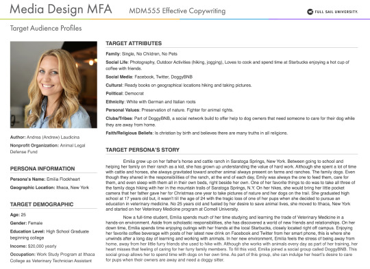
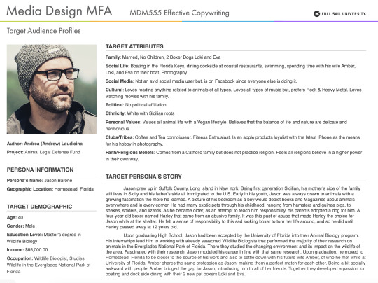
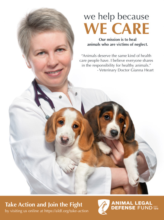
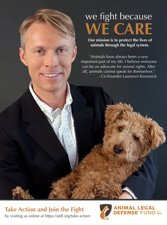
Effective Copywriting
Personas Development:
The nonprofit foundation I selected for this course the Animal Legal Defense Fund. Primarily an organization comprised of lawyers who fight for animal rights within the legal system, research uncovered this category represents a broad spectrum of personalities. Caring for and defending animal rights touches everyone in one way or another but, for those closely involved, they do so because it fulfills a sense of nurturing. According to Felton (2013), this is the need to provide care for others, to have and protect. Parallel to that basic need, being associated with this organization also fulfills a sense of affiliation. The need to be closely associated with others, the need for relationship (Felton, 2013).
With such a broad spectrum of people to choose from for this project, I decided to create two persona’s that are closely tied to the subject of helping animals and belonging to a community of supporters but, differentiating them by their age groups, interests, and positions in their professional life. The first of the persona I created is tied to the cause based on her roots as an animal farmers daughter. At the age of 25, she is modern, trendy, and highly into social media as a form of communication. At such a young age, I made her a college student just starting out in pursuit of a career in Animal Medicine. The second persona I used as a target audience was someone with a bit more experience. He is a male, 40 years of age, that is not as connected to the digital age as the previous younger example. This person is very much into reading books, magazines, and is already well established in his careers as a Wildlife Biologist. Understanding these two individuals in the context of a target audience for the ad campaign allowed me to develop copy and imagery for the ads that speak directly to them in an organic way that connects with who they are and their interests.
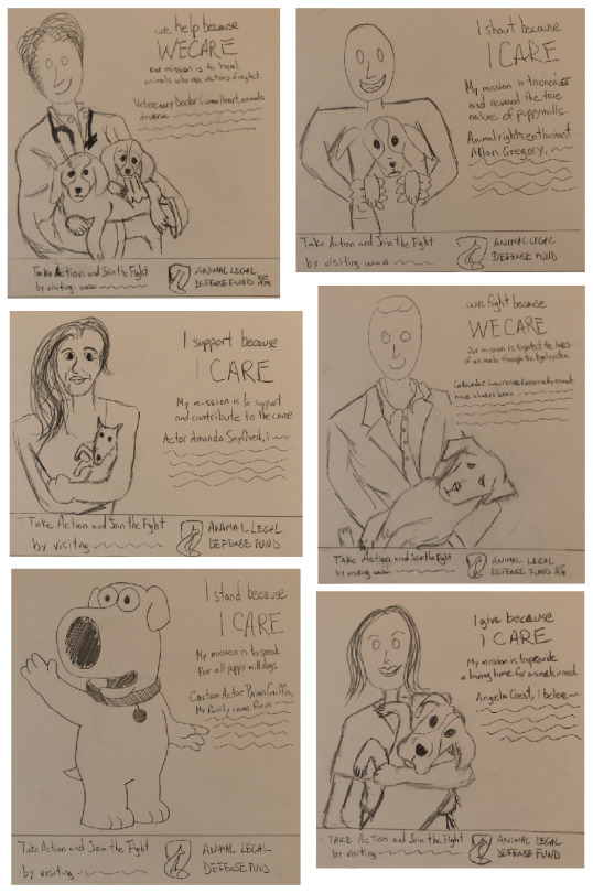
Testimonial Sketches:
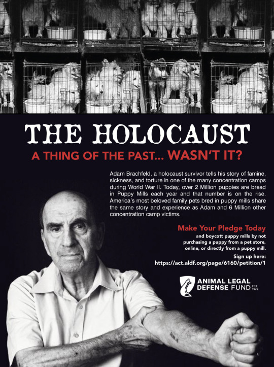
The first round of sketches I created were a very rough start for me in deciding how I would communicate to my audience. My first ideas were a bit too dramatic as I used the idea of Puppy Mills being like Nazi War camps with comparisons to the Holocaust. While the idea has a big shock factor too it, it was too far of a departure from what the message of my nonprofit organization should be. With a bit more thought placed into how the nonprofit foundation needed to be perceived, I dialed down the drama from my original sketches to a message that will represent the organization from a position of caring and perseverance. The testimonial positions I decided to use were that of:
1. Extreme User– someone who is highly involved with animal rights and always present at demonstrations.
2. Expert– a person that has achieved a high degree of recognition in the field of animal medicine that will bring a trusted standpoint on the issue.
3. Founding Member – of the organization to give a human face to the brand of the organization.
4. Celebrity – to stimulate interest from those who are highly media driven and follow the careers of these media stars.
5. Historical Figures, Unreal People – a character with an unusual connection to the cause.
6. Just Plain Folk – to show the issue from the point of view from someone who has been affected of touched by the issue in some way (Felton, 2013, pp. 241-246).
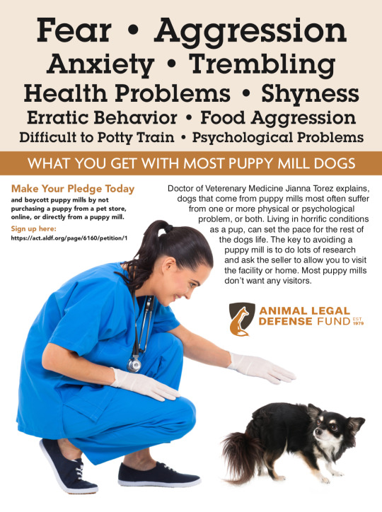
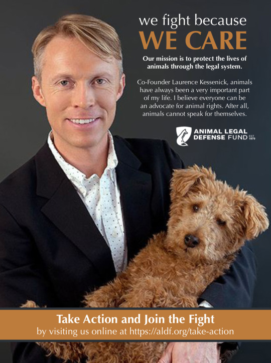
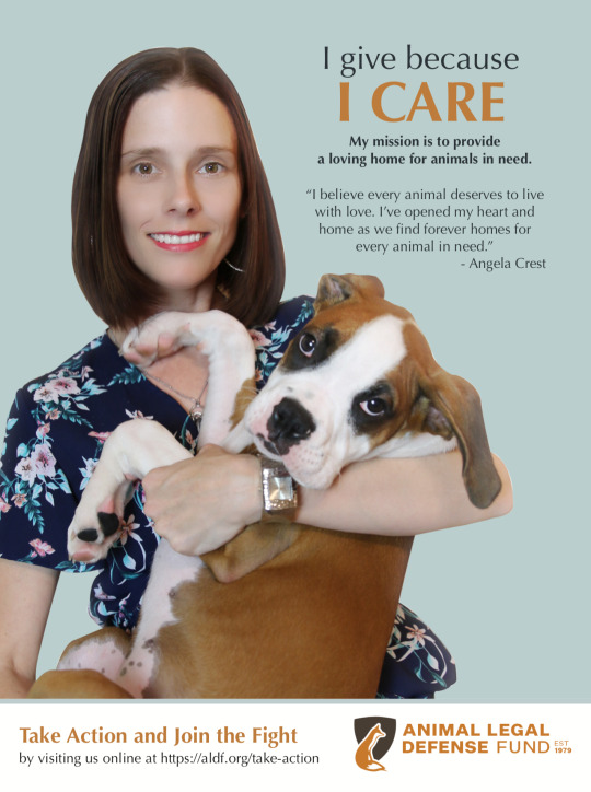
Out of the 6, I chose to move forward with an Expert, Founding Member, and Just Plain Folk. The reasons for this are because they possess the more real and believable connection to what the foundation stands for. Also, they have the closest relationship with the two persona’s I created for the target audience. Both of my persona’s are plain folk, one of them on their way to becoming a professional and the other already as a professional in a field related to animals. I created an ad with the founding member so that my audience can relate better to the company on a personal level. While the remaining three would make great ads as well, the 3 chosen ones had a higher probability of connecting with the target personas I developed.
3 Initial Compositions:
As we handed in our three initial comps in tandem with our original 6 sketches, my entries revolve around the ideas I developed for the Holocaust. As demonstrated by my initial 3 comps., the direction I decided to take was not in line with the idea of the overall exercise. I communicated messages that were outside of the character for Animal Legal Defense Fund and I stimulated emotions that could have created a negative response from supporters. My initial messages did not speak directly and relate to my target audience. Felton (2013) says “The essential rule is to always understand that your job is to create a bridge between the brand or the company you’re talking about and the people you’re trying to talk to. Another of my mistakes is that I said too much. The copy in all of my initial comps were too wordy and communicated information that could easily overwhelm a reader. Felton (2013) also demonstrates this in his example of Parallelism. He begins with a long wordy phrase description, shortens it by focusing on key words, then shortens it once again to make it parallel by only using words necessary to communicate the idea, and nothing more. Finally, my initial ads are too different from one another. They do not affectively communicate the brand the same way. If you saw the ads separately, the only thing that would tie them together is the use of the company logo. The treatments in composition and aesthetics do not work together from ad to ad.
3 Revised Compositions:
My three revised comps. paint a much different picture than my original three. They work by themselves as well as a group. The overall message is about the way Animal Legal Defense Fund “Cares” for animals. The message communicated from the perspective of three uniquely different perspectives always delivers the idea of caring but, through the eyes of the foundation and supporters. Each idea of caring is delivered in a personal way coming from the standpoint of each person’s testimonial and supports in the specific way they are able to for the cause. The foundation cares so, “they fight”. The Veterinarian cares so, “she heals”. The average person cares so, “she provides”. What creates the brand voice in these ads is the layout of the ads. They are all aesthetically treated the same. In all 3 ads, the supporter is positioned in the same manner holding a puppy or two to show their emotional connection to the cause. The backgrounds, typography, and color palettes are also repeated within each of the ads, creating a branded style that can be connected to the personality of the organization. What was also improved on from the preliminary versions was the simplicity in communication. Very direct and shortened messages that deliver what is intended without any extra wording that may cause a reader to move past this ad quickly.
3 Take Aways:
The first thing I learned in Effective Copywriting is to always keep the brand as a whole, front of mind. As I began the process of developing ideas and ad copy for this project, I tried to deliver something that was highly impactful. Something that will stimulate and even shock a reader by drawing their attention with a powerful hook. In doing this, I lost sight of the brand message. I became so focused on creating stimulating copy, that it veered outside of what the brand represents. Keeping my mind focused and always aware of the brand character is something I learned to do much better through this project.
Second, I learned how to develop copy in a more effective manner. Currently a Creative Director for a consumer-packaged goods company, I usually am executing with copy provided by copywriters. Through my career, I have always focused more on composition of copy rather than creation of copy. I have developed a new respect for the difficulty level of doing this well. I also have learned how to spot when copy is not working for the brand the way it should. By making the mistakes myself, I learned what not to do.
Finally, I learned how difficult but, fun creating taglines can be. Out of all the projects this month, I had the most fun with taglines. I found myself thinking about taglines through the day that entire week. I also found myself looking at every tagline I could find in real time driving, reading, watching TV and online. While creating great impactful taglines that describe the essence of a company’s missions and visions is not a simple task, I have learned what bad taglines look like. For me, knowing what not to do, can always lead to the correct answer.
References:
Felton, G. (20130805). Advertising: Concept and Copy (Third Edition), 3rd Edition. [VitalSource]. Retrieved from https://bookshelf.vitalsource.com/#/books/9780393733921/
0 notes
Text
Lessons in Time Management
The first week of my copywriting course was quite the challenge. While the course material was highly interesting and I am looking forward to what I will be learning this month, time was against me in week one. It just so happened that in week one of this new class, I had to travel for one of the brands I direct. Its a Halloween brand I was pitching innovation for in a meeting with the executive team for Target in Minneapolis. Overall the meeting went phenomenally, with many compliments on how amazing our innovation is this year along with our new drive in digital advertising. What I was not expecting was being invited out to explore the city with the Target team. The trip was three days long, and I had planed to spend nights working on the assignments for week one. All three days turned out to be very successful with Target but, disappointingly unproductive in terms of working on my assignments. I typically am very good with managing my time but, this week I learned that any schedule can easily be turned on its head without notice.

Luckily, the creative Gods were watching me that week and magically created an extension on some of the projects due dates that allowed me to get the job done with a high degree of quality. I am never one to put only partial effort into my work. The extension really made the difference for me. What I learned is that no amount of planning can every fully prepare you for anything. At any moment in time, things can change in ways one can rarely anticipate.
Reference:
Time management training, stress management. (n.d.). Retrieved October 4, 2018, from https://teambuild.ie/time-management/
0 notes


Text

Diagram from: A Designer’s Research Manual by Jenn & Ken Visocky O’Grady
I consider week one, the introduction phase. Basically, introduction of company A (the Design Firm) to company B (the company with the design problem looking to commission company A). Once commissioned for the job, company A begins with their research phase. For us, week 2 was the research phase for this project. The mind maps we developed for the Reykjavik, Marrakesh, and Kyoto was the research needed to develop an in depth understanding of the problem we were commissioned to solve for company B. In a real business environment, solving company B’s problem would involve research in all the areas we covered in our assignment and developing an intimate understanding of the company itself. Mission and Vision statements are but two of the elements needed for that intimate understanding of what company B represents.


Week three represents the Concept Development phase of O’Grady’s diagrams. For us, this amounted in sketches that build upon the ideas researched. Bringing this imagery to life in the form of sketches is what allows the designer to visualize what may or may not work visually. It also allows the artist to enhance and evolve what does work. My work in religion and geography demonstrate this evolution. For example, in the category of geography you can clearly see how I begin with a more straight forward simple line illustration making note of the form and including ice caps of Reykjavik’s mountains and gradually changing its form into more diverse line representations, moving into an abstract style, then moving back into line art and introducing secondary elements like the whale.

Week 4 of our project is represented by the Prototyping phase of O’Grady’s diagram. The feedback in the form of critiques we received from our peers in the beginning of week 4 is what we will use to jump back to the research phase to refine our sketches in a second Concept Development phase. As we refine our designs according to feedback received or research findings we may have subjected initial sketches to for learning, we move into the Prototype phase that will conclude our week 4. For us, the prototype phase represents the refinements made to our sketches in the form of more advanced and highly detailed sketches that capture all of the wants and needs of our client and consumer.
Month three, our Brand Development class is where we will be finalizing the prototype process and moving into the Design + Production phase.
Reference:
OGrady, J. V., & OGrady, K. (2009, February 01). A Designer's Research Manual: Succeed in Design by Knowing Your Clients and What They Really Need. Retrieved from http://ce.safaribooksonline.com/book/graphic-design/9781592535576
Critiques:
Overall, the critiques I received this month from my peers pointed to exceptional work in embodying the ideas researched in all three categories of geography, modern culture, and traditions. The main points that were mentioned were the high quality of my sketches and their ability to communicate without a need for notations or descriptions explaining the concept of each sketch. Several pointers offered were to include typography within my sketches and to combine ideas to increase the strength of the connection with the subject matter. These are both high quality suggestions and is a part of my process behind logo creation and problem solving as well. Taking these suggestions into consideration, I continued to develop my final set of sketches with the idea of combining typography along with a fusion of different ideas represented in the imagery. I’m looking forward to moving into the phase of laying my work out digitally in month three of Full Sail.
0 notes

Text
What will Impact Me the Most
One thing that has become crystal clear to me about my time at Full Sail is keeping up and trying to stay ahead of the work. While week one of month two has begun a bit slower than I anticipated, the second weeks work load easily makes up for that slower start. I have prepared myself mentally to expect the challenge level to continually increase as I progress through each course throughout the 12-month program. Working 60 hours a week as a Creative Director for a consumer-packaged goods company, along with taking care of a disabled wife can be quite difficult on its own. Adding the responsibilities that come along with pursuit of Mastery with Full Sail can seem like a daunting challenge with what I already have on my plate. That is precisely it though. It is the difficulty of the challenges that drive me. I am one of those individuals always in search of the challenge within. Without it, the rewards of completion just do not feel as significant. Based on what I have explained, keeping up with and staying as far ahead of the work as possible, is and will be one of my biggest challenges.
One question that I have about the program is about the course descriptions. While I feel this will have little impact on my ability to succeed in the Media Design program, I have wondered as to why the course descriptions are so short. From their online descriptions to the description provided in the downloadable course catalog, the explanations for each of the courses is very brief. They don’t do a good job at describing what will be covered in each of the courses. A more in-depth description of what a student can expect within each class would allow a student to understand specifically what they will be taking away from each of the courses.
Finally, what I am most excited about is the challenge of doing design-based research and how that will interpret into writing a paper. Until now, all of the research I have done within a scholastic setting has involved reading a text book, using it and many other scholarly references to write about a specific topic. I would like to think that I am particularly good at this since I always produce a high score. What I am excited about is doing this in a different way in relation to the world of graphics. I believe the information available in this field is considerably smaller when compared to fields like the sciences and psychology. While the description of the “Thesis” course in month 11 is limited, I anticipate this is where I will be truly challenged most in the area of research in the field of design and graphics.
0 notes
Text
Tribute to Chester Bennington
I would like to conclude this class with a tribute to one of the most talented Masters of his craft. His expression is deep and you can feel his soul in every one of his songs. His words got me through a lot of my own tough times and his memory remains as a beacon for peace and hope in this world we all share.
His band recently posted a heart felt tribute for their deeply missed band member as a memorial to their first year without him.
https://people.com/music/linkin-park-chester-bennington-tribute-one-year-anniversary-of-his-death/
0 notes

