
Statistics
We looked inside some of the posts by anstey5345969 and here's what we found interesting.
Average Info
Notes Per Post
85
Likes Per Post
42
Reblog Per Post
0
Reply Per Post
43
Time Between Posts
6 days
Number of Posts By Type
Text
11
Last Seen Tumblr Blogs


Fun Fact
The Tumblr app for Google Glass was released on May 16, 2013.
Text
Week 10 - Reflection
IDES1262 has proved to be very beneficial to me and has created a great learning experience where I have seen myself develop. It has been great working a long a process of different kinds of drawings, to model making, to digital model making, to 3d printing. It is a process that I see as crucial to design which drove me to work harder at learning more about each step which I am happy about working through.
I’m happy to say that I am proud of the work I have created, but more importantly what I have learned from them which I have tried my best to convey in each of my weekly posts. The most important lesson I found from this experience was the growth found through failure. Especially during the last weeks which I found most painful and failure was prevalent, it forced me to research more, learn more, ending with me creating much cooler things than I thought I would.
I really enjoyed the weekly task format of this course. It made each step a lot easier to digest as there was time to make up for any shortcomings before the next class. Also, it was extremely helpful to start each task in class with the teachers present to help guide the process and get things started so I could really start experimenting with ideas later. I think it showed how valuable the in-class experience was during the last weeks, when due to lots of people having technical issues getting things set up, not a lot of time was dedicated to helping people with the work. This for me led to a lot more time being spent struggling, and a lot of extra time spent looking for helpful resources which in the end isn’t all bad.
If I had the opportunity to do things differently with the knowledge I now have, I would want to challenge myself even more. The course is a great introduction to a lot of the steps of the design process, but generally things are kept simple so they can be better understood and absorbed. So I think I would really enjoy further and refining the skills I developed by challenging them more, especially in 3ds Max which I see a lot of potential for making cool stuff in.
Experimentation and researching what others have already achieved are my biggest takeaways from this course. Its been able to get me through each task by furthering my understanding through personal and external means. I will be utilising this plenty in the future as well as advocating for it to my peers. Very happy with how this class has gone and the development I have made on improving my design process as well as myself in general.
6 notes
·
View notes
Text
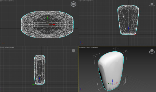
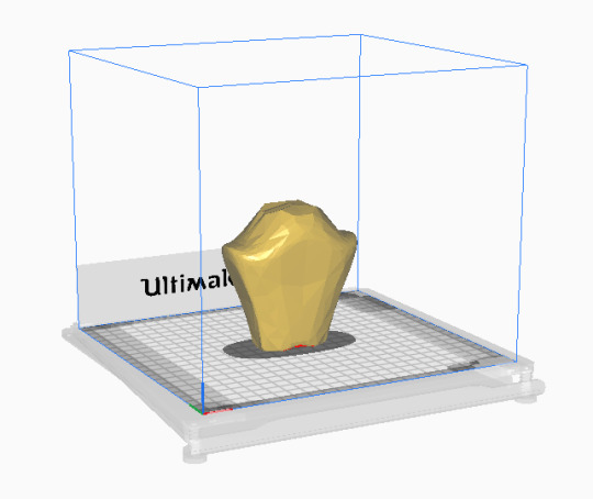
Week 9 - Preparing a 3d scan for printing
The final task, utilising the model making skills we have learnt throughout the end of IDES 1262. The aim is to turn a 3d scan of a bottle into a refined model, then be able to 3d print it. Doing this off the back of all the experimenting on 3ds that went into week 8 made this somewhat easier to do, however there were still plenty of new challenges I would end up finding through the process.
Part 1 "Getting the scan into 3ds Max":
The process started by getting the scan of the bottle over to Rhino 7 to be quad remeshed and then sent over to 3ds Max. This ended up being a huge hassle purely because of the old laptop I was working on causing things to be slow and crash. I am definitely looking at newer laptops after this exercise as it is going to be well worth it in the long run.
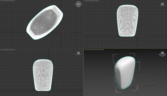
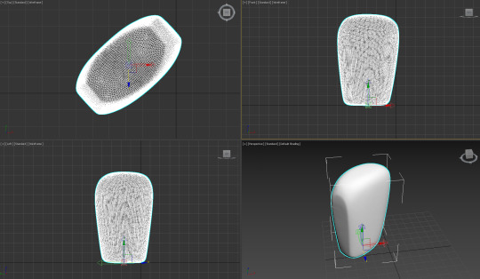
Part 2 "Bottle refinement and experimentation":
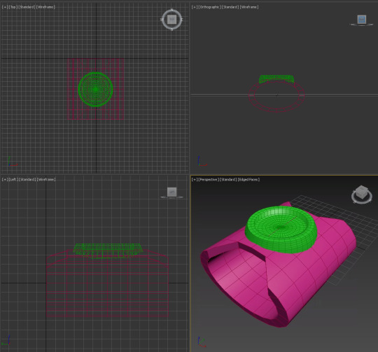
Moving the bottle model over to 3ds Max wasn't the end of the refinement needed before 3d printing. The task of aligning the the bottle with the grid was a mixed experience. Following the instructions given I found it easy to attach the bottle to the grid. However, making the bottle nice and inline required further researching. I ended up using the symmetrical tool to make the bottle perfectly even, creating the exact effect I wanted and something I'd recommend as a quick fix. Following this, I needed to refine the bottles indents which was accomplished with the optimize tool. This step was initially really frustrating as there are so many tools that sound like they should fix the problem such as "smooth" or "melt". I even tried manually pulling each of the polygons which I would not recommend at all.
After creating the refined bottle, I went back into having more fun playing around with the tools I liked as well as some new ones to make a new bottle shape. I'm quite happy with the learning that has been achieved as a result of this despite all its complications.

Part 3 "3d printing":
Finally the design was ready to be exported to an stl file to be brought into cura for 3d printing. Unfortunately I didn't get the opportunity to 3d print and might have to give it a go when I can. But by following all the necessary setup steps for it, this should be good to print at any time. Overall, I'm glad about now being more familiar with the process despite all the difficulties, as I can see how valuable it is for design.
6 notes
·
View notes
Text
Week 8 - Digital Iteration
The focus for this week was experimenting and developing our CAD skills specifically with 3ds max. This was achieved through a series of steps that helped me to better understand the program somewhat. However I ended up finding that my own research into tutorials was most beneficial.
Watching Andrew Simpson's video on the development of a razor, its clear the importance of the design process of testing out lots of different elements and ideas to best create a solution. It was informative to hear about the ways different materials effected the weight and ergonomics of the product and is something to always have in mind. Andrew talks about low-fidelity and high-fidelity as different levels of the model making quality. This is in context to an explanation about how the design process isn't always linear with the development of quality and sometimes lower quality models can be made after higher quality models to test out different ideas.
Part 1 "The introduction":
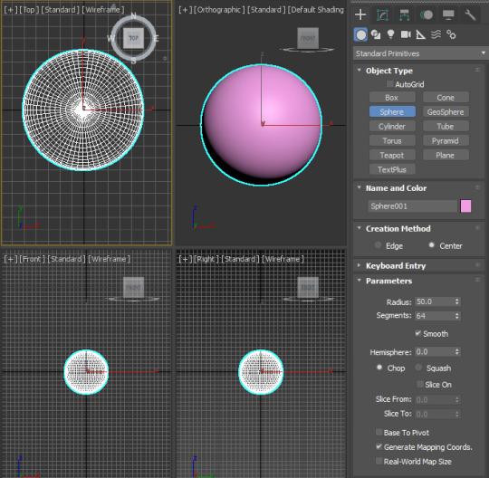
For the first part of this task, we made a simple sphere (done with the sphere tool) which we then played around with in order to explore the effects of the different tools available on 3ds. Personally I find there to be an initially overwhelming amount of different commands that made it difficult to work with. It was interesting seeing what some of them did, but frustrating trying to figure out how to do anything you wanted to achieve. This process was a lot of trial and error, just throwing myself into the depths of this program.
Part 2 "The learning":
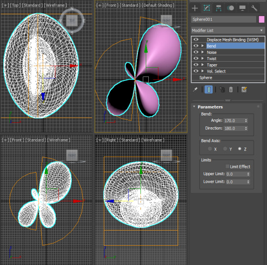
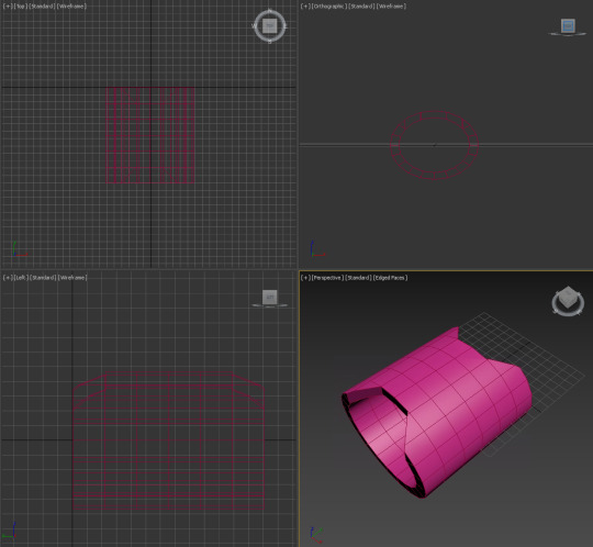
Part 2 is where I really took the initiative on figuring out how to make even the most basic of things I could normally create in a few seconds on other CAD programs. I started out creating a bottle like shape, trying to use everything I had learnt from my experimentation of the different tools with the sphere. The result was something very organic and asymmetrical. Fairly happy with this as a basis, and it definitely looks wieldable so that's nice too.

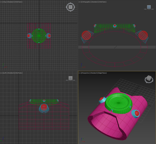
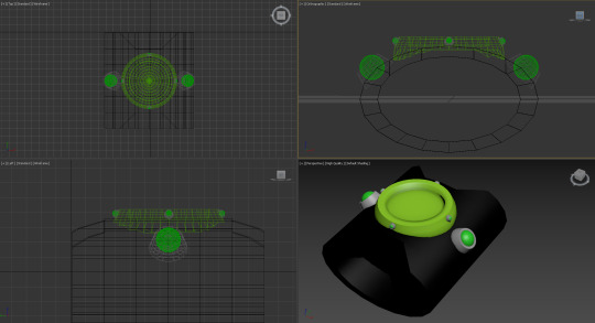
I wanted to move onto something that looked like it had more intention and structure behind it. I ended up looking through numerous youtube tutorials that better explained the process of making different kinds of objects. I would highly recommend just following a tutorial like this as it helped me a great deal to better understand the specific tools which are actually helpful for average tasks. I ended up following a tutorial to create an omnitrix which I thought of as a complex shape that would require a diverse use of tools to further my learning. I figured out how to properly warp shapes how I wanted to as well as combining/subtracting new parts to add to the form. I also finished the design by adding more fitting colours and am really happy with both how it turned out, and how much I learned from the process. Its very evident the difference in level of intentional design between the bottle and the omnitrix as a result of the research done for it.

7 notes
·
View notes
Text
Week 7 - Physical model making
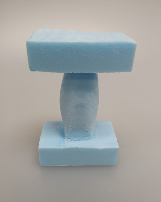
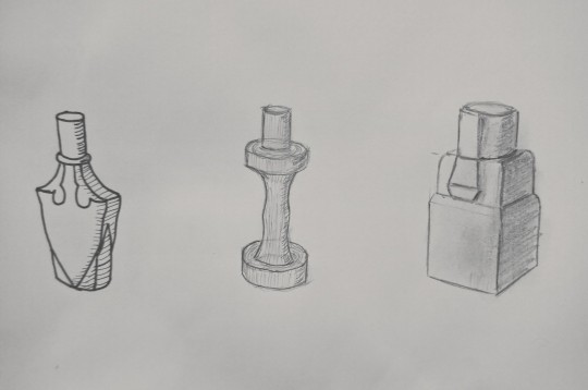
I was quite keen to get into model making this week and developing some ideas I've had into physical form. I created a variety of designs to give myself different kinds of challenges through the model making experience.
Model 1:
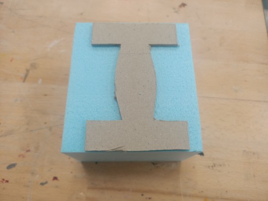
For the first model I started fairly simple and so I made a very square template out of card. This template was based on the orthographic views of the design so I could stick them to the foam in order for me to accurately cut into the foam with hot wire.

After cutting out the basic shape, I got to work sanding and refining where needed. This is my favourite part of the process as it's where you get to really see the product take its final shape and make any precise changes to improve aesthetics and ergonomics.
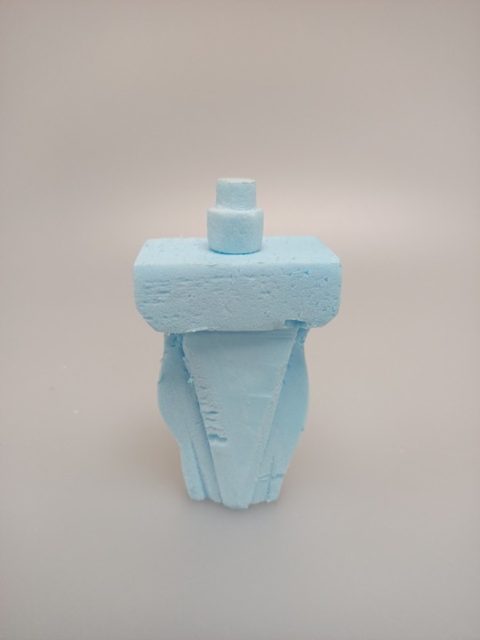
Model 2:
For my second model I went for a more difficult design involving different layers and curves. The aim was to find the best tools/techniques to craft the foam into the design.

Once again I started with some sketches to give me something to follow. Then I created a simple template of just the outline to guide me when using the foam cutter. In order to achieve the effect of different layers I used a knife, following an imprint I made in pencil of the design. This worked fairly well however there were noticeable cut marks in the foam where there didn't need to be and also sometimes the foam would get caught on the knife causing tears. I found that having a fresh blade and using more of a back and forth cutting motion helps to stop the tearing, however this isn't really an option when working in tighter spaces as I found in later models. I finished off with some sanding which I could have spent more time doing to improve the model, however I was more set on trying out different things. I also believe that creating the parts individually and assembling the bottle with glue would give a way cleaner look but would take a bit longer.
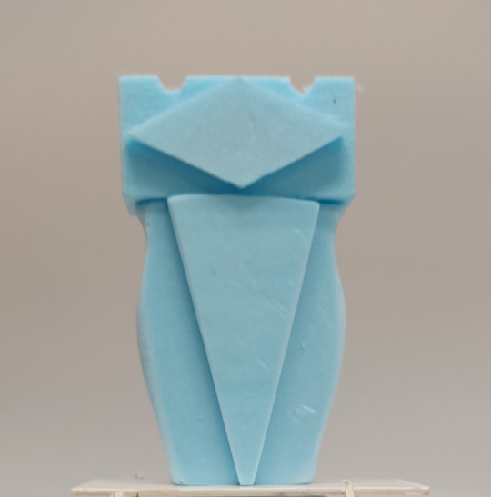
Model 3:
For my third model I tried really hard to build on the second and try new techniques that would improve the quality of the design. The biggest difference was making each part individually, then using double sided tape which worked very effectively at sticking the foam pieces together. I also used different types of files such as a rounded one to make the indents in the lid. The bottle was finished with a 1500 grit sandpaper giving it a very clean and more professional look.
Models 4-10:
I had a lot of fun coming up with a variety of designs and ended up getting a bit carried away. I tried to be really diverse in the designs, requiring different problems to solve which I believe I've achieved. The hardest problem I faced was definitely in the more curved shapes where I had to try and cut foam out from very tight spaces. As mentioned before, a much better method to achieve these kind of designs would be to cut the parts out individually and glue them.
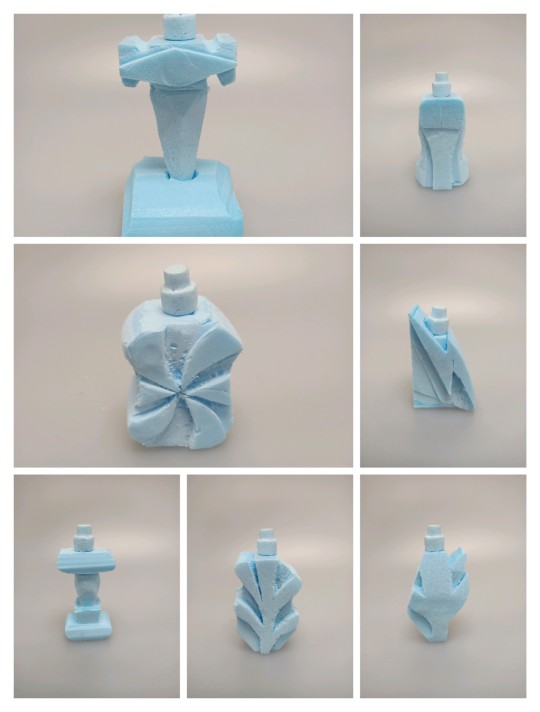
In the end I believe I've learnt a lot from this exercise, the most important of which is the value of sanding properly for creating a much nicer and cleaner finish. A lot of my designs suffered from lack of refinement but I was able to learn a lot through my plethora of testing and really enjoyed the experience.
11 notes
·
View notes
Text
Week 6 - Digital Rendering
Week 6 was a continuation of week 5, moving from the physical pencil/pen sketches we did of the Olay bottle and now making digital sketches. This was done on Photoshop being the first time I've used it in a while and I found myself enjoying it quite a lot.
This task had a series of steps for us to follow which made the whole process really easy to follow and achieve for me. Starting with very basic rectangles and then removing parts to get the desired curves and shapes I wanted.

Then by using a black brush for the shading and a white brush for the highlights (both at 1% opacity) I layered in the shading to best represent the lights effects on the bottles shape. This was a great improvement but after also using the Gaussian blur it really smoothed everything out. I also duped the shading layer to make it twice as dark as it was without doing double the work.
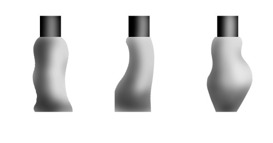
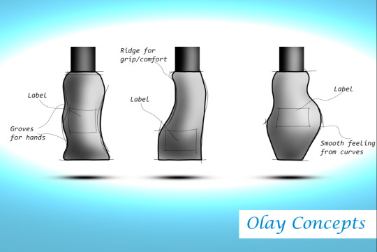
The next step I did was adding the sketch lines, giving it a nice concept aesthetic as well as adding emphasis on the curves/tapers. I also added a shadow below each bottle to add to the depth
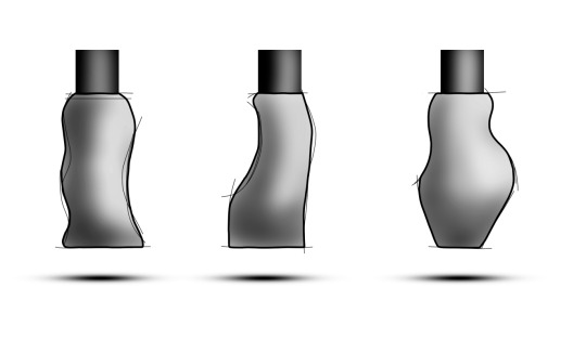
Moving onto making everything more presentable, I created a blue background which I faded to white in the middle with a large eclipse brush. Thought this would be a nice and different way of focusing the attention on the product.
Lastly, I annotated the bottles and added a title. The annotations provide extra details on the shapes of the bottles as well as showing where the label would go, outlined with a sketch of a box area.
This task might be my favourite so far, it was really great moving onto using technology. I found it super easy to pick up and follow along and it was also really satisfying making the shapes 3D.
P.s A fun way to get better at drawing with a mouse is a free browser game called gartic phone which you can play with mates. Turning down mouse sensitivity also helps :)
8 notes
·
View notes
Text
Week 5 - Sketching
This week was all about improving our ability to sketch quickly and effectively as well as leading into digital sketching. In order to help us warm up our sketching abilities we first did a series of sketching drills. After this we did a progression of drawing detailed concepts for our own redesigns of an okay moisturiser bottle.
Warm-up task:
The first exercise was simply drawing straight lines as best we could on a folded A3 page. The left side shows my first go and the right is my second. I was glad to see noticeable improvement as I figured out what was most comfortable to achieve straighter lines.
The second warm-up was making 20 dots randomly on a page and then connecting them. As was suggested, by looking at where you want the line to end I found it easier to create straight and accurate lines.
Thirdly was drawing circles consistently and adding ellipses to add form. Circles are something I'll just need to practice more however the bottom line does appear to be fairly neat and even so it was nice to see the warming up working a bit.
Studio tutorial:
Part 1:
The first task was to create 12 box's at a 1:2 scale which will be used as a guide for the concept sketches.
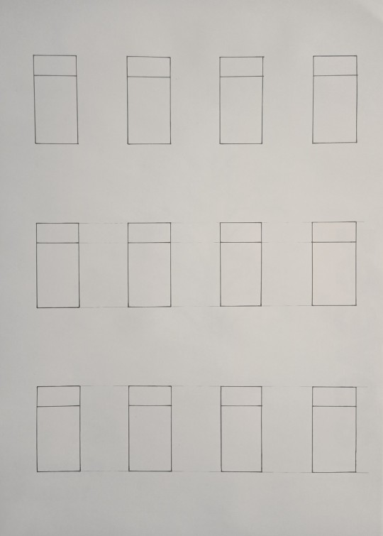
The 12 box's shown above were initially sketched in pencil, then traced in thick pen. This would be used under a fresh page which I taped together at the corners and used to make consistently sized concept sketches.
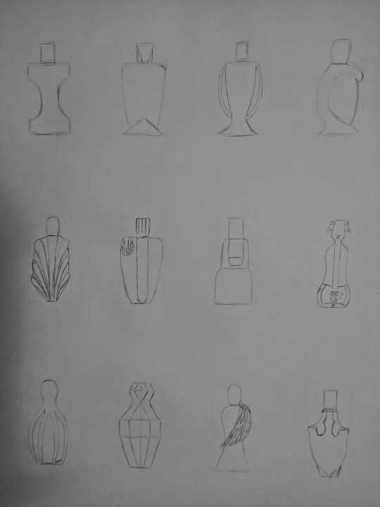
I started the sketches with simple a 2D view. They're pretty bland atm but it was useful for me to play around a little bit and simplify the ideas in my head which would be developed further later.
When the tone/shading was added, it brought a lot more life to the bottles. I experimented with 3 different ways to show off the depth and lighting. Personally I think the 3rd rows method is best suited for this task as it looks very clean but still very conceptual.
Part 2:
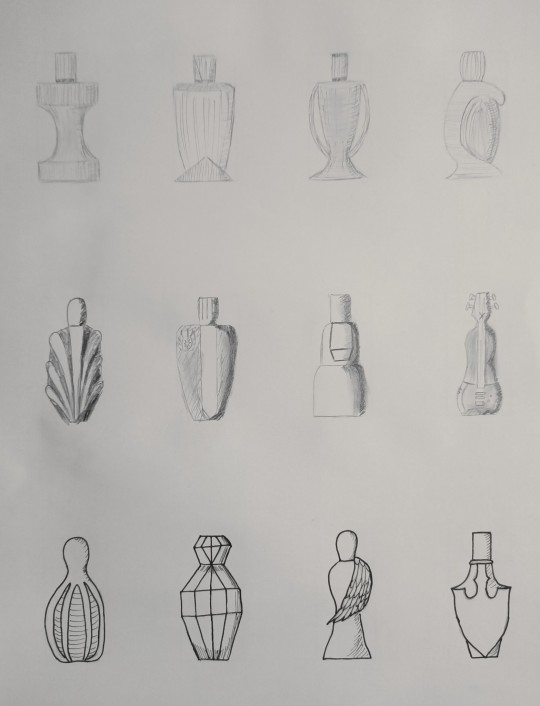
Next was sketching our bottles in a perspective view while still trying to be as accurate as possible.
I used the same method for 2 point perspective that we learnt in week 4. I used a thick pen to outline the box which would be used under a fresh page as my reference. I reused the same box for each of my perspective sketches unlike in the previous part as a) I'm not too worried about spacing the 3 perspective drawings apart perfectly and b) it would be an inefficient use of time.
I continued my experiment with the different tone/shading methods and this time I like the method I used for the third bottle more. The third bottle has a nicer looking gradient and shading, adding the most to the overall form out of the 3 methods. Overall I'm happy with how the perspectives worked out other than the first bottles cap being slightly slanted. Was fun playing with some different concepts and then seeing them progress into more detailed sketches. I also found the experimenting to be helpful and I'm curious about what other people prefer out of my sketches as well as useful tips for improving them.
8 notes
·
View notes
Text
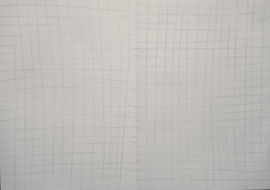
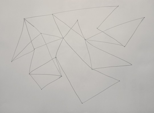
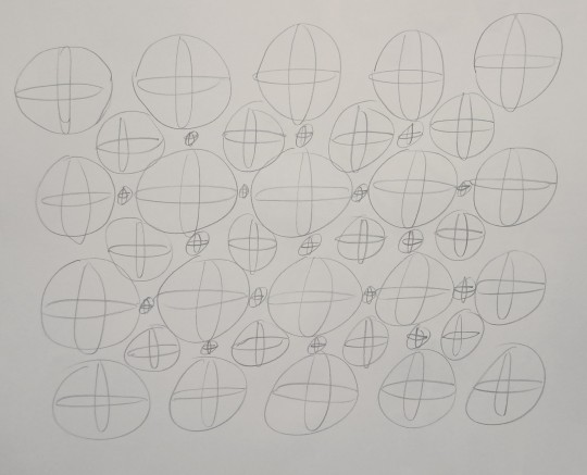
Week 4 - Perspective Drawing
Week 4 involved creating a 3D shape out of card in order to help us visualise the following perspective drawing we would do of it. This was done with 3 slightly different tasks using the 2 point perspective method.
Part 1:
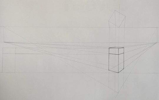
The first task had us simply create the 2 point perspective grid we would make our perspective drawing on.


At first I wasn't too sure about the specifics on what worked best for the spacing between the different lines (Picture Plane, Horizon Line, Base Line). However, I was told to just give it a go, so I made an effort to change it up a little for each task to see what changes it would make. Overall I found this task a bit finicky initially but satisfying once I had accomplished the perspective drawing.
Part 2:
Next we repeated the process of making the perspective drawing however we made the shape a simple box without the chamfer. Additionally we used a technique which made use of the original perspective view and allowed us to replicate the same shape as if it was attached to the originals faces.

This felt very weird to do and as evident by all the pencil construction lines, required a fair bit of trial and error. I also shrank the gap between the Horizon Line and the Base Line slightly which I found changed the perspective as though you were looking at it more face on rather than at an elevation. The Station Point is also slightly higher which makes the perspective look closer. I found this task very helpful in learning how to use the drawing techniques a lot better.
Part 3:
Once again we made a perspective drawing of a simple box. This time the aim was to add a circle to each face in perspective.

This was initially a super crowded drawing, requiring a lot of construction lines to help keep the circles consistent.

Here I made the Station Point much lower which was great for showing more of the faces as it is from a further perspective. However, I wish I had also made the Base Line lower as it would have shown more of the top face. I found the technique for creating the circles really weird at first, almost unnecessary. But when I was drawing in the circles and using the major and minor axis lines as a guide, I found them quite helpful for consistency. I ended up being surprised with how decent the circles ended up despite being hand drawn and am pleased with the results.
5 notes
·
View notes
Text
Week 3 - Section and Auxiliary View
In this week the class further practiced the skills we have been learning so far, as well as incorporating sectional and auxiliary views into our technical drawings. This was done by following a guide of a tapered block which had a variety of measurements. We started by planning out the layout of the drawing to make sure it would fit on the A3 page, which was important as a 1:1 scale only just fits. Then we had to draw it in pencil, using a combination of a ruler, t-squares and set squares to keep everything accurate and neat. To finish we went over it again in pen and annotated it with measurements and details.

Overall I found this a good practice to develop my skills and it's nice to see to improvements I'm making such as the neatness of the measurements, keeping everything consistent and the picture editing. Unfortunately it's not perfect as I stuffed up the angle on the auxiliary view, drawing the bottom line 10mm too far to the left initially which is why there are multiple lines. In order to fix this physically, I considered using a knife to cut out the error if this were to be mounted on a white background. Digitally it could be fixed easily. I kept it in for now just so I could bring it up and ask for any other thoughts on how to fix this in the future? Other than that I'm happy with my work and keen to keep progressing.
9 notes
·
View notes
Text
Week 2 - Orthogonal Projection & AS1100 Standards
For week 2 we looked at the principles of orthogonal projection,
AS1100 drafting standards, applying them through exercises based around sketching a simple object. It was nice to be able to build upon what was learnt in week 1, using the tools and lessons learned in order to replicate an object onto paper in an Orthogonal format.
Part 1:
For this task, we had to measure our object and create a slightly bigger box that would fit over it. This was to help visualise turning a 3D object into a 2D drawing. I chose an 80x40x29 (mm) foam Lego brick to draw due to it being less tedious to draw but still having some interesting details such as the studs and holes in the bottom to fit other studs.

Marking out the initial box was fairly easy, using a combination of my ruler and T-squares in order to keep it neat have accurate lines and right angles.

After cutting it out using a knife and steel ruler, I used some double sided tape on the fins for a clean and neat method of keeping the box together. The tape is shown on the fins in the picture above however its hard to see as it is clear. The double sided tape proved very effective and I would recommend for this or similar uses.

Finally the box was assembled and was marked out to show what side was representing what. I'm pretty happy with how it turned out and it was a little sad putting all that effort in and then realising there was no way I was getting it home intact.
Part 2:
This step was quick and easy, serving more as a start to assist with part 3. It involved a freehand sketch of the sides of my Lego brick, which I then annotated with measurements to act as instructions for my accurate and detailed orthogonal drawing. This step also allowed me to consider adding the excess material cause from the imperfect manufacturing process. I decided to go without in my final drawing as it was extremely minimal, adding mess to the final drawing, and it is not an intentional addition that would be true to what the Lego brick is meant to be.

Part 3:
Using what we had just done in part 2, we now started making our orthogonal drawing of our object. This was to be done by first marking in pencil and then in pen, which while it takes longer, reduces the risk of permanent mistakes.

In the pic above you can see all my construction lines and everything together done in lead pencil. It looks messy atm but serves as a good template for me to go over again in pen and clean things up.

I am pretty happy with my final drawing though there is still some things to improve mostly through practice. This part took the longest for me as I took a lot of effort to be more careful than I had been in the drawing tasks of week 1. As a result I only made 1 small mistake which is the extra line on the right side of the side profile. I think I could also make my writing nicer in the future and also solving the paper warping in the pic which makes my border look wonky even though it is straight.
10 notes
·
View notes
Text
Week 1 - Drawing Instruments Exercise
In the first week we got an introduction into using tools such as a compass, T-square, set squares, circle template, ruler and eraser shield. This was achieved through following a plan to accurately replicate shapes by utilising these measuring tools.
Figure 1:

Figure 1 shows the first task which made use of the T-square, compass, set squares and circle template. The star on the left turned out quite nicely as I really took my time drawing things out. I made sure to keep the construction lines light, making them easier erase when needed and easy to trace over with pen. The circle on the right was a bit more finicky as it had a lot more individual steps which I should have taken slower for a cleaner outcome. I am confident I could make it a lot better if I were to do it again now that I understand the tools and process better. One other important thing to note is the compass I was using had a fairly blunt tip and using the single sheet of paper on the hard table made it easy for the compass to slip. Having something underneath the paper that isn't so hard will make things a lot easier.
Figure 2:


Figure 2 had us draw up 30mm equilateral triangles that form together to make a gem-like pattern. This was a lot simpler than the previous tasks as it only involved straight lines and could be marked up fairly easily. I completed this by measuring and drawing the shape in one corner of an a3 paper. Then, as I needed 4 of the shape in total, I folded the paper twice and cut into it using the shape I had drawn as a a guide. This resulted in a quick and accurate way of producing 3 additional shapes that all fit together very nicely.
10 notes
·
View notes
Text
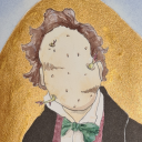
It's a me
Hey I'm Anstey, a guy who's keen to get into design. I can sometimes do handstands also.
5 notes
·
View notes