
Don't wanna be here? Send us removal request.
Statistics
We looked inside some of the posts by artg476-cbrand and here's what we found interesting.
Average Info
Notes Per Post
0
Likes Per Post
0
Reblog Per Post
0
Reply Per Post
0
Time Between Posts
7 days
Number of Posts By Type
Text
11
Last Seen Tumblr Blogs


Fun Fact
Tumblr was acquired by Yahoo for $1.1B in 2013.
Text
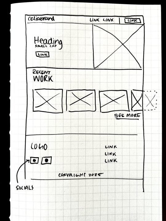
Blog Post #11 - Going Live


pages: project page, home, about.
0 notes
Text
Blog Post #10 - Case Study Refined
Liftoff is an app and website I designed and developed to help recent graduates, especially women, take control of their financial futures. Many young adults face financial uncertainty and overwhelm when they first enter the workforce, and often lack the education or resources to understand important topics like budgeting, saving, and investing. The challenge and goal for this project was to make financial literacy more accessible, engaging, and less intimidating.
I took on the role of both designer and developer, handling everything from research to the final product. The process began with research, where I surveyed Gen Z to understand their financial concerns, while also reviewing current literature. This research highlighted key pain points, including difficulty understanding budgeting and the fear of investing. With this information I moved on to presenting the pitch, which focused on how Liftoff could address these challenges by simplifying complex financial concepts and making learning feel less overwhelming.
I created user personas based on my research to better understand the target audience. This helped me refine the app’s features and be sure the design aligned with the needs of recent graduates. I then brainstormed different ways to present financial content in a way that would feel approachable and not overwhelm. During this phase, I also developed the branding and logo for Liftoff. The logo and brand identity used the theme of "lifting off" to symbolize starting a new financial journey, with a fresh, friendly aesthetic designed to resonate with Gen Z.
With the branding in place, I moved on to app wireframes and design, working in Figma. This phase was focused on creating a simple, intuitive user interface (UI) that made financial concepts easy to navigate. I incorporated simple, calming visuals, interactive elements, and a warm colour palette to make the experience engaging and not overwhelming.
Finally, I designed and developed the website with Webflow. The website extends the brand and serves as a marketing tool to drive traffic to the app. It introduces visitors to the Liftoff concept and provides easy access to the app for download. With the website, I also created a case study booklet to showcase the process and results of the project, highlighting the app’s design, functionality, and branding touchpoints.
The result was an app and website that successfully addressed the financial concerns of new graduates. Key takeaways from this project include the importance of understanding your audience's emotional needs. Gen Z for example, values empowerment and control over their financial futures, especially with political and climate uncertainty that they commonly feel. Equally important, the value of iterating on design based on user testing/feedback and the maintaining consistency between the app and website for a positive brand experience.
Liftoff is a digital solution that makes financial literacy more approachable, engaging, and empowering for young adults. Through this project, I learned that good design can simplify complex topics and help users feel confident about managing their finances.
0 notes
Text
Blog Post #9 - Rationales Refined
The Breakfast Shop
Creating a mural & icon set for an iconic Victoria restaurant.
As a Junior Designer at Leap XD, I had the exciting opportunity to create illustrations for a new breakfast restaurant opening in Downtown Victoria, BC. I approached the project with an emphasis on composition, clarity, and the overall flow of the mural, while ensuring the illustration style aligned with the brand’s iconography. The result was a set of custom illustrations used on signage and various branding touch points, along with a mural that has become a standout feature in the restaurant’s Victoria location.
Saigon Kitchen
Rebranding a local Nanaimo restaurant.
Saigon Kitchen is a family-owned Vietnamese restaurant in Nanaimo, BC. The goal of this project was to revitalize the brand with a fresh logo and design system to be applied across all branding touchpoints. From the start, I aimed to update the brand in a way that would still connect with their core audience (families) while fostering a sense of warmth and community. With a new logo and comprehensive brand guidelines, I crafted an identity that reflects the authentic, welcoming spirit of their cuisine.
Europa Mission Event
Designing a Poster and Event Website for NASA's Europa Clipper Mission to Explore Life on Jupiter's Moon
I designed and developed an event website and promotional poster to generate excitement for NASA's 2024 Europa Clipper mission to Jupiter’s moon. I wanted to avoid the typical space clichés and opted for a minimalist, modern approach instead. For the poster, my goal was to tell the story of the Europa Clipper spacecraft and its mission. In 2030, it will approach the icy moon and perform multiple flybys to explore its potential for habitability, ultimately crashing into the moon’s surface at the end of its journey. Given the mission’s long duration, I wanted the design to reflect the passage of time, showing a blur of space as the spacecraft moves forward, with a clear window revealing the final destination. Event Poster Dimensions: 24" x 36"
0 notes
Text
Blog Post #8 - Case Study Rough
Case study:
Liftoff
An app that teaches Gen-Z about Financial Literacy.
Liftoff is an app designed to make financial literacy accessible and engaging for recent graduates, helping them take control of their financial futures. Through a literature review and survey-based research into Gen Z’s interests, I identified key concerns for this generation: general financial literacy, investing, and budgeting. Focusing primarily on a female audience, I crafted a brand identity that captures the feeling of embarking on a new (and often intimidating) journey, symbolized by the concept of "lifting off."In addition to the app, I designed and developed a Webflow site that extends the brand identity and drives traffic to the app. The result is a cohesive digital experience that combines playful visuals, a calming color palette, and interactive design elements, all aimed at encouraging users to explore financial topics with confidence. Liftoff’s app and website work in harmony to make learning about finance less intimidating, more engaging, and easily accessible.
0 notes
Text
Blog Post #7 - Rationale Roughs
Illustrations & Mural, The Breakfast Shop
As a Junior Designer at Leap XD, I approached the project with a focus on composition, clarity and flow of the mural, while using an illustration style that could be consistent with the icons. The Breakfast Shop is a new Victoria Restaurant created by the owners of 3 Staple Restaurants in Victoria: Jones BBQ, Discovery Coffee and The Ruby. Communicating with the owners, we chose to illustrate their own dogs in the mural and decided on three items that represented the shop best to create icons of (a sandwich, a record player, and a coffee cup). The result was a set of custom illustrations to be used across multiple branding touchpoints and a mural that is an iconic piece in their Victoria restaurant.
2. Rebranding A Local Restaurant: Saigon Kitchen
Saigon Kitchen is a family-owned Vietnamese restaurant in Nanaimo, BC. The goal with this project was to reimagine the brand and create a new look with a fresh logo and design system to be used across branding touchpoints. I wanted to refresh the brand in a way that will still resonate with their current demographic of families and a feeling of fostering connection. With a new logo and set of brand guidelines, I created a brand identity that feels warm and authentic like their cuisine.
3. Europa Clipper: Launch Event Site & Poster
To build excitement and curiosity around the 2024 launch of NASA's Europa Clipper Mission, I created a poster and website that advertise the event. With an aversion to space design clichés (but an adoration for movies like Interstellar), I chose to gravitate towards minimalist, grotesque styles with my typography and illustrations. I aimed to make this website feel real, giving it a clean and professional design.
0 notes
Text
Blog Post #6 - Identity and Moodboard

For my moodboard/swatchboard I included imagery that feels professional and creative, using black and white and high contrast to feel more crisp. When I reflected on my existing portfolio and hearing feedback from others, I realized that I used a specific typeface in my current logo that I don't use anywhere else on the site. Thi smay not be super important, but I love typography and it makes more sense to myself to include more instances of the typeface thorughout the site to connect it to the logo.
Using examples of web layouts, I want to restructure some feature sin my site. I want to lean more towards the clean, minimal look, to put more focus on my work and less on the aesthetics of the site - of course I want it to look great, but I feel that with my existing portfolio I experimented with a lot of animations and layouts that may be unnecessary in this new version. I'd like to incorporate more of the rusty orange colour I have in my branding, and continue to refine my typography in the site.
With mockups, I'd like to revisit some projects and (if accessible on my budget) use mockups that feel more realistic and human - using more photography rather than the sterile, floating, ai-feel that many mockups have.
Lastly, I would like to organize the written content of my projects to be more clear and concise. I know that employers will want to be able to scan through my work and quickly understand the project goals, deliverables, visuals (context), and results. I think that the writing I have currently is okay, but it isn't as focused as it could be.
0 notes
Text
Blog Post #5 - Ideals and Planning
Part 1: Ideal Workspace & Ideal Client
Identify your Ideal Workspace
Ideal Client: I imagine I will go directly into freelance to gain experience in design and working with clients. My ideal client would be looking to hire a local designer (like myself), and will be in a stage of growth in their business. Maybe they have some packaging or a logo that needs a fresh new look, with potential of expanding their business into a new area once the existing one is established.
Create a profile of your Ideal Workplace/Client
Answer these questions to help you with your profile:
Who are they?
Bruinwood Distillery, https://www.bruinwood.com/
How are they a good fit for you?
As a small local business, Bruinwood Distillery would be my ideal client because they are seeking a youthful, creative perspective to revamp their business without breaking the bank. As I work to gain experience I am willing to offer a slightly lower rate to a small business if it opens the door to more work down the road as they expand in a different area.
How are you a good fit for them? What skills and unique qualities do you bring to the table?
as a human being, I can offer empathy and curiosity to get to know the owner, Danise, and her business on a deeper level. I also bring a youthful perspective to improving their brand which they are seeking.
as a new designer, I come with a freshly educated background, a drive for success, and an excitement for something new. I am also willing to go the extra mile to impress new clients with my drive to secure future projects with them to continue building experience. Additionally, I am able to offer a lower price point than a designer with more years of experience, though I can provide a high-quality service.
What are you offering to them, specifically?
I am offering Buinwood Distillery a youthful perspective, a eye for typography and timeless design, and strong communication skills to fullyunderstand and execute their vision.
Seeing as they have a specific timeline for their business expansion, I bring punctuality and professionalism to my work.
Part 2 –Weekly Production Schedule
Deadline: March 25
Febuary 11: Revisit image exports and reduce sizing where possible
Feb. 17-24: Content Revision & Structural Updates (Check for consistency in tone and messaging across all pages.)
Feb 24-Mar 3: Breakpoint and Responsiveness Checks (Test site responsiveness, fixing any issues with layout or design for smaller screens.)
Mar. 3-10: Final Revisions & Polishing (Review all content and make any final adjustments.)
Mar. 10-17: Final Review & Testing
Mar. 17-24: Quality Testing, checking breakpoints. Pre-Launch Preparation & Launch
Mar 24: Review and share link for Proof 1
0 notes
Text
Blog Post #4 Self Audit
Domain Name: Celiabranddesign.ca - This name is good for what I'm currently pursuing and makes my name/business recognizable. By using my own name, clients will be able to refer to my site and my business and there may be better retention when passed along (hopefully). For the meantime I'd like to work with smaller projects and business' to gain traction in the community ( I think of the show "Better call saul" sometimes when thinking about this, how he uses his new name on billboards/movie ads and other marketing materials, people instantly recognize him by his name and character. Probably not the best example but it works for him and it's an interesting wya to market oneself).
The platform I will/have been using for this project is Webflow. I chose webflow so that I can improve my understanding and skills with the software and widen possibilities for future projects. Webflow also has a major supply of educational content to help learn the software (as well as youtube resources that show how to go from figma to webflow) which helped me make this decision.
Menu Links: Home, Work, About, Contact. (Footer: Home, Work, About, Contact, Privacy Policy)
4-6 projects to showcase: The Breakfast Shop Mural and illustration set, Saigon Kitchen, BITE App, Europa Clipper event, The Nav, Portal
In my portfolio I want to gear my content towards more UI/UX jobs and less illustration/print jobs that I've done previously. I think I need to fill these gaps in my showcase by creating more UI/UX and webflow-specific projects to show. To do this I will need to work on some new mockups, even simple projects to fill these gaps or supplement.
Lo-fi wireframe/sketch.
0 notes
Text
Blog Post #3 Creative Brief
Part 1: Creative Brief

Part 2: How to Get a Job at...
Examples I explored: Bobbi Brown, Pentagram, Spotify
Standouts:
BB: Referalls are the best. Reach out/email a company first thing in the AM to make sure your message is seen with fresh eyes. An online presence is a huge plus to accompany your portfolio. Willingness to learn goes a long way. writing skills. Go after a job you’ll enjoy doing and work your way up. Be Confident.
P: "I am just as interested by how curious and articulate the applicant is.". Present your [portfolio] work with care and intelligence. Watch Spelling/Grammar. "specific experience is less meaningful than someone’s ability to learn and capacity for growth". Reach out - there will never be a job posting. Communication is key.
S: "[A good portfolio] can open all kinds of doors". Show [interviewers] why you're the best candidate for the role. Show who you are outside of your work/your other passions. Ability to communicate your thinking. Be someone, Say something, don't say too much. Never forget your user. "Choose the work that tells your story best—be deliberate about what you share." "I’d love people to share more of themselves: What made an impression on you recently? What objects do you own that you love or hate? What are you reading?"
Commonalities:
Be prepared for several interviews or a lengthy process. Most places don't do design exercises. Skills>Cultural fit, though it does help. Context in portfolio projects is vital. Have grit and stay passionate, but be your own persona and have interests outside of design. Be well-rounded. If there's a job listing then apply, but if not, take a chance and reach out - show that you're interested and have a curiosity and excitement for the work. Curiosity and a willingness to learn go a long ways.
0 notes
Text
BLOG POST #2 - INSPIRATION
SITE #1: https://www.dtampe.com/


Inspiration takeaways: menu design/button, parralax scroll effect on images, left-right project cards as you scroll
SITE #2: https://www.studiomaker.nl/

Inspiration takeaways: the modular header, illustration/line
SITE #3: https://www.danielvaszka.com/contact

The animations, the typography and the simplicity/functionality of this site are inspiration.
Fromt hese three sites, I'd like to incorporate the folowing three principles into my portfolio site: simplicity, functionality and subtle animation.
I really appreciate that though each of these sites are very different that they each have a theme of clean typography and sizes, intriguing homepage hero's and a simple interface that is easy to navigate and understand.
0 notes
Text
BLOG POST #1—INTERESTS/TALENTS/PASSIONS


This class we explored ideas to try and define what our personal "Pixie Dust" is (interests, talents and passions). Working with another classmate to understand how we're perceived by them, and compiling a list of our strengths. For this first exercise I chose these words for my final 5: Reliable, Curious, Positive, Organized, and Punctual to describe my professional self.
A few words on my creative work so far: I feel that over the past 4 years I've gained a variety of skills to keep in my toolbox, though in just the past year I have refined my skillset to a more professional standard. I think that the "pixie dust" that I bring to my design work overall is my work-ethic, curiosity, and my ability to push ideas further. I want to keep building upon these skills and I think that will help me grow as a designer.
0 notes