
Statistics
We looked inside some of the posts by artintrospection-blog and here's what we found interesting.
Average Info
Notes Per Post
8
Likes Per Post
7
Reblog Per Post
1
Reply Per Post
0
Time Between Posts
2 days
Number of Posts By Type
Photo
8
Text
9
Last Seen Tumblr Blogs


Fun Fact
Mobile Tumblr US users spend an average of 4.04 minutes per session on the app.
Photo

PORTRAIT OF A YOUNG GIRL: IMPRESSIONISTIC STYLE
0 notes
Photo

BLOND FAIR-SKINED FEMALE PORTRAIT: IMPRESSIONISTIC STYLE
0 notes
Text
COLOR MIXTURES
PURPLE:
White + (ultramarine and alizarin) → Lavender
Add cadmium red→ Plum colors
GREENS:
Viridian Green (very weak color) + Cad. Yellow Orange
Ultramarine Blue + Cad. Yellow Orange (this produces a lower key of chroma color and you can get a brighter color that is weak)
Viridian Green + Ultramarine Blue with a touch of White → Cerulean Blue
SKIN COLORS:
First set up your Blue/White color and add a touch of orange
Then, to the side of that mixture, combine Cad. Red and Cad. Yellow
Add whites to the now orange mixture to lighten
Finally add the blue/white/orange mixture to neutralize the orange you have created with the cad red and yellow.
HAIR COLORS:
Alizarin + Ultramarine =Black
Ultramarine + Cad. Red = Brown
Green + Cad. Red + Yellow= Golden brown
0 notes
Text
STARTING AN OIL PAINTING
HOW TO SET UP YOUR PAINTS
Put the Titanium White farthest to the right, then going left you put Cadmium Yellow Orange, Cadmium Red Light, Alizarin Crimson, Ultramarine Blue, Viridian Green, and just under the green, you make a light blue color by mixing ⅓ Ultramarine Blue and ⅔ Titanium White.
METHODS AND TECHNIQUES
Start painting from the center and work outwards
Use angular lines, don’t use curves in the beginning
Fill in the masses first and ignore the little things
Don’t begin by picking the darkest or lightest values, rather look at a mass and pick the middle value so you can fill the mass with the best possible color and value
Once you have the color, add a touch of turpentine so you have enough color for coverage, stir it like a whisk, then load up both sides of the brush, and finally using the sharp edge of the brush to fill in the masses
Take a step back after every stroke and squint your eyes so you can focus on the masses, the shapes, and the blocks of color, and the values
If you can’t get the color, first get the value
Holding your brushes:
Hold the brush you are painting with like a cutting knife
Keep all of your other brushes in your left hand so they are easily accessible
Most importantly, stay in the preliminary stages for the longest
0 notes
Text
KEY OF CHROMA
“The chroma of a color is a measure of how pure or intense it is, how saturated the color is. You reduce the chroma of a paint color by adding a neutral gray with the identical value as the color you’re wanting to change… Colors have three attributes- hue, value, and chroma. In non-art speak terms, these are generally simply called color, darkness/lightness, and intensity/saturation.” - thoughtco.com
HIGH KEY OF CHROMA: more pure unmixed colors + glowing effect
If you are painting in a high key of chroma you have to see where the original colors are coming from.
Color examples:
Ultramarine blue is not at its maximum key of chroma (in this case specifically, adding white will increase the key of chroma)
Generally however, white kills color and brings about a lower key of chroma
LOW KEY OF CHROMA: more neutralized color using blacks and grey
When mixing colors, anytime you skip a color (in the order designated above) you grey it down a little and it will never be as powerful if it is more greyed down
Mixing colors from the right side (Yellow, Orange, Red) with the colors on the left side of the palette (Alizarin, Blue, Green, White-Blue) will neutralize the color and grey it down- creating a lower key of chroma color.
Color examples:
To get a neutral red- mix Alizarin (contains more ultramarine) and Cadmium (contains more yellow)
Blue already has a color in it so adding color makes it a lower key of chroma - when using blues you have to whiten them in order to get a high key of chroma
To make a lower key of chroma color use the blue white color
MIDDLE KEY OF CHROMA: In between bright and neutralized/grey
If the mixture is too high in its key of chroma then you should generally neutralize it and grey it down a little.
Visa versa, if it is to low a key of chroma, then you add more pure color to the mixture to brighten it up since you always want to be able to know what the pure color is, even if it is greyed down.
0 notes
Text
MATERIALS
From Raye Anne’s lessons I have learned many lessons about how to create oil paintings and the tricks that my grandpa used and had passed on to her in his own lessons. From just the first day of our classes, I have learned the following:
WHERE TO BUY MATERIALS:
Jerry’s Artarama (online) or Artist Craftsman and Supply
WHAT MATERIALS TO BUY:
Davinci Oil Paints (Six Colors)
Cadmium Yellow Pale
Cadmium Yellow Orange
Viridian Green
Cadmium Red Light
Alizarin Crimson Permanent
Titanium White
Brushes (Rosemary &. Co.)
Classic Filbert - long
Get fifteen of the #4’s and five of the #2’s
Windsor Newton- Brush Cleaner and Restore
Linseed Oil
0 notes
Text
PAINTING LESSONS
LEARNING THE IMPRESSIONISTIC TECHNIQUES OF MY GRANDFATHER
This week I am so blessed to be taking individual painting lessons from Raye Anne Marks, one of my grandpa’s most dedicated and talented students. She now teaches her own classes and passes on the lessons that my grandfather once taught her. Having studied alongside him for years, Raye Anne knows all of my grandpa’s painterly techniques and his individual style better than anyone else. And now, in our lessons, when she talks passionately about painting and the joy it brings her, I hear grandpa’s voice in every word. I feel more close to my grandpa now than I have since his passing.
When I was younger and I used to take my grandpa’s painting classes with all of his regular students including Raye Anne. I was just a beginner back then, and while my grandpa did pass along the ‘painting gene,’ I still had, and have, a lot to learn.
I have regretted not taking more classes from my grandpa since the day that he passed away. I can not count the number of times that I have wished that I had devoted more time to absorbing all of the knowledge my grandfather had to teach. He was so instrumental in my growth as an artist. So much so that, whenever I pull out my brushes, I can hear his words of wisdom in the back of my head. Up until this week, I thought that those small memories were all I had left of my grandpa’s talents, knowledge, and experience with painting. However, I have now realized that his lessons are not gone forever, that they live on through his students.
Raye Anne is my grandfather’s living legacy. She speaks with the language that my he used when talking about things like brushstrokes, low and high keys of chroma, values and colors, and so much more. She handles her brush the same way he did and sets up her paints in the same manner and order as he had. She even jokes about the jokes he used to make to her and is always telling me about the most amazing memories she and all of her students had with my grandpa. With every lesson, I am not growing in my painting capabilities, but I also feel like I am growing closer to my grandpa. I know he is no longer here with me physically, but his spirit is ever present.
These past few days with Raye Anne have been so precious to me. The pure joy I see in her when she speaks about passing on my grandfather’s legacy to me touches my heart. She has the deepest appreciation and admiration for my grandpa, not just an amazing painter, but as an insightful and engaged teacher, as a caring mentor, and as a wonderful person overall. My grandpa did not paint for himself, he painted for everyone around him. He painted to share the beauty he saw all around him.
When I was young, my grandpa taught me how to paint. As I grew up, he inspired me to follow my passion. And now, he is showing me that being passionate about painting is only a means to being a genuine and caring person who follows what they love and shares that with the world.
0 notes
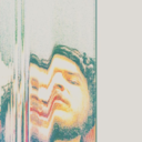
Photo

FEMALE PORTRAIT- LEARNING TO PAINT IN THE IMPRESSIONISTIC STYLE
0 notes
Photo

0 notes
Photo

1 note
·
View note
Photo


2 notes
·
View notes
Photo

2 notes
·
View notes
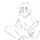
Photo


SKETCHBOOK: Practicing Anatomy and Figure Drawings
3 notes
·
View notes
Text
KRISTIN KOSSI
Kristin Kossi incorporates a vast array of mediums to form pieces that make bold statements about society in the 21st century. She is based in Germany and grew up studying Academy of Fashion Design in Hamburg, Germany. Her diverse interests in fashion, painting, photography, and spray paint art all come together to enhance the versatility and yet cohesive nature of her multimedia portfolio. In a semi-pop art style, she contrasts the realistically rendered human subjects with a vibrant mirage of spray painted words, photographs, designer logos like chanel, newspaper clips, written text, along with a number of other unique and symbolic elements. Each piece is completely unique, and yet at the same time fits in perfectly with the rest of her portfolio due to her stylistic inclinations.
Her art makes a statement; it is not simple or subtle, instead it hits you right in the face. It is impossible to look at her pieces and not notice her blatant critique on society. As a German based artist who draws inspiration from the urban city in which she lives, both the street art and daily social interactions shape the intentionality behind each piece. Through the extreme contrast in hues and values between the abstracted background and central subject, Kossi somehow creates both an illusion of depth and yet a sense flatness. By using shapes, forms, and color combinations that would otherwise not be found together in a piece of art like this, Kossi brings new meaning to the term ‘portraiture.’ Her art is bold, it is striking, and it challenges her viewer to take a step back and reflect on the inequities of the culture we find ourselves bound to. Through stark imagery, she demonstrates how, as a society, we shackled by the chains which we ourselves have created.
Kossi herself asserts that she is “here to make a statement, to be a force, and to entice the viewer to think, to feel, and to be here and now.” Through her own subjective artistic lense, Kossi brings forth a message which can be understood universally.

Namaste. Acrylic, Spray Paint, and Paper on Canvas.
“The free soul is rare, but you know it when you see it -basically because you feel good, very good, when you are near or with them.”

Neo Soul. Oil, Acrylic, and Spray Paint on Canvas.
“There are heroes in Evil. As well as in Good.”

She. Acrylic and Spray Paint on Canvas.
“She’s the kind of girl Together like a lion The kind everybody wants to know She can fool you with her ways Leave you with nothing much to say And you try not to hang around But you really don’t want to see her go away..”
0 notes
Text
AGNES-CECILE
youtube
Silvia Pelissero, better known as agnes-cecile, is an Italian self-taught artist who, with a steady hand and a deep understanding of the sensitivity and nature of how watercolor functions a medium, is able to fully capture the depth, proportions, values, and hues of each individual subject. While she is able to accurately convey the essence of the form, she is even more impressively able to capture the humanity in her subjects; the raw and pure emotions at the core of their beings. An element that plays well for her painting style is how she is able to save the whites from the initial sheet of paper throughout the painting process. Her ability to do so demonstrates to me that she has a clear idea in her mind of exactly what she wants to portray and has planned it out both on paper. In general, the contrast between the simplicity of form in the receding facial features and the highly rendered more distinctive features like the eyes, nose, and lips forms the undeniable sense of depth and reality. The stark contrast brings emphasis to those unique features, especially the eyes. She constructs her subject’s eyes delicately and with such grace that it captures not only reflections and luminosity of the simple shapes, but also acts as a window into the soul of the person and evokes profound introspection on the part of the viewer. Her brilliant style is matched by her mastery of the material (to the point where she makes painting watercolor portraits look easy, which is a miracle in itself). I find her skill level and her means of capturing the emotionality of her subject inspiring. Watching her videos not only gives me insight into how to work with watercolors, but it also stirs in me a yearning to grow in my understanding of the human form as well as the human condition.


0 notes
Text
THE ESSENCE OF THE SUBJECT
Working through the basics of how to paint portraits that accurately depict the overall form, I am coming to an impasse where I realize I have yet to uncover how to capture the essence of the individual themselves; their personality, what makes them unique and distinct as human beings. In taking on the task of researching portraiture I realize that there is much to be learned technique-wise, but I also need to make sure to not be so focused on the forms that I lose sight of the person standing before me.
I am currently researching the life and artwork of Henri de Toulouse-Lautrec. As a young boy he broke both legs in two different tragic accidents. From then on, his life changed not only in his physical appearance but in his mental outlook on life. Having grown up in the aristocratic world, Lautrec no longer saw himself fitting into the same world from which he came. He found friends in the less reputable and the more unconventional. From prostitutes to pimps, circus members, and frequenters of local dance and music halls These new acquaintances became Lautrec’s new subject matter. Lautrec’s art was not separate from his daily life, he brought his paints along side with him painting those with whom he felt most at home. In his paintings, he would obsess over one upcoming actress or dancer, musician or star, and he would repeatedly paint and portray them until he felt he had completely captured their essence.
All of this to say, that after spending so much time looking through the paintings of Lautrec, I not only see the accuracy of form of each person which he paints, but I am able to spirit, the exuberance, and the soul of each unique individual.
In my process I want to learn how to not only capture the form of my subject, but go further and capture their essence.
0 notes
Text
CLAUDE MONET: IMPRESSIONISM
The process and techniques of the great impressionist painters, like Monet, Renoir, Degas, Cézanne, Pissaro, Sorolla, Morisot, Bazille and many more, are extremely inspirational for me personally. Growing up learning impressionist techniques from my grandfather, I am constantly aware of the little lessons that he instilled in me when I was only a young girl. These lessons have shaped my painting style into what it is today. Looking more deeply into the processes and purposes behind some of the greatest impressionist paintings throughout time, I find that I am able to put the pieces together of the lessons which my grandfather originally taught me.
Impressionism focused on capturing the fleeting moment with a keen interest in the effects of natural lighting and color. The movement itself began when a series of artists who, due to public scorn and criticism, had been denied from the Salon in Paris, the hot spot for the most highly acclaimed artists. As a reaction, they came together to form their own separate exhibition ‘L’Exposition des Révoltés.’ The artists’ featured in this exhibition were highly criticized, as their ‘sketchy’ style of painting was drastically different from the classical romanticized and realistic paintings that came before them. Following the exhibition opening, an art critic, Louis Leroy, wrote about his negative reaction to the paintings in an article entitled “Exhibition of the Impressionists.” This article title was a direct insult on Claude Monet’s painting Impressionism, Sunrise. Little did Leroy know that his judgmental critique of Monet would coin the term for the movement itself. Impressionism was focused on capturing the essence of the subject, and the impression that the painter had of the scene from which he was being inspired.
IMPRESSIONISM SUNRISE:

Claude Monet, Impressionism Sunrise, Oil on Canvas, 1872.
Completed in 1872, Impressionism, Sunrise depicted the Le Havre harbor from Monet’s hometown. The painting featured two row boats in the foreground, fishing boats in the middleground, and ships with tall masts along with steamboats in the background. This scene held significance in its innovative artistic style, but also in its nationalistic nature. Following the French defeat in the Franco-Prussian war, many French citizens united to rebuild their nation. With the Le Havre port becoming a thriving center of industry and commerce, Monet’s painting represented the regeneration of France.
As I mentioned above, Monet placed great importance on capturing the core essence of the subject, he did so by focusing on the values and colors of the major forms he saw, rather than attempting to create an exact replica of the scene itself. He described this notion when he stated “When you go out to paint, try to forget what objects you have in front of you, a tree, a field... Merely think here is a little square of blue, here an oblong of pink, here a streak of yellow, and paint it just as it looks to you, the exact color and shape, until it gives your own naive impression of the scene”-Monet.
Monet’s style was one focused on color harmony and the effects that the time of day had on the values and hues of the painting. Like many other paintings of Monet, this piece was completed in a series along with five other paintings of the same scene at different times of the day as a means of understanding the atmospheric effects of a specific moment in time had on the value and color of the subject. Creating the essence of natural lighting, Monet mixed his base colors with pure white and brushed the color atop the painted canvas to form distinct highlights. In terms of his application of those base colors, he placed bold unmixed colors side by side rather than simply blending all of the mixtures out on his palette, this was an unheard of technique at the time. With the combination of the white tinted colors and the bold contrast of the vivid orange against the blue/grey shades, Monet was able to beautifully capture the nature of the water in the harbor with the reflections of the sun and the numerous boats while also creating a piece that gave a sense of depth and harmony.
My journey as an artist began by learning the foundations of paintings from my grandfather, a World-Renowned Impressionist Oil Painter. He taught me the basics of color and value and constantly reminded me of the importance of painting using natural lighting. His style was inspired by a number of impressionist painters, namely Joaquin Sorolla. Looking back at impressionism as a movement, I not only learned how the impressionist style of art came to be, but also gained deep insight into how my own style of painting came about.
For more information about Monet’s piece check out blogs.longwood.edu/incite/2012/01/.../analysis-of-claude-monet’s-impression-sunrise/
0 notes