
Don't wanna be here? Send us removal request.
Statistics
We looked inside some of the posts by audreygallegoba2b and here's what we found interesting.
Average Info
Notes Per Post
0
Likes Per Post
0
Reblog Per Post
0
Reply Per Post
0
Time Between Posts
2 days
Number of Posts By Type
Text
9
Photo
4
Video
4
Last Seen Tumblr Blogs


Fun Fact
The KCSC sent more than 20K requests to delete posts related to prostitution and porn to Tumblr from January to June 2017.
Text
Visual Essay - Final Stretch
During submission day, our group were still waiting for two members to finish their animated sequence so the editors could input their part in the overall film and bible. One of them managed to finish it early in the morning, giving the editors still some time to work with. However, the other one kept delaying their animation and finally not making it to the final cut.
I know I should not take uni projects personally, but it hurt me that we were waiting until the very last minute for a person to finish their work and include it with ours and, in the end, this wasn’t the case. I knew about this person's situation during the last hours due to other members continually checking on them, rather than this person saying anything to the group themselves.
It was passed submission time that I knew that this person had an extension and so they didn't really care or were stressed about our submission. If their plan was not to include their cut until for our submission, they could have made it clear to us at least a few hours before the hand in.
I tried not to stress about this topic and just have everything prepared so that as soon as I got their part, I would include it to the bible, export it and share it with my groupmates so that they could include it in their submission folders. However, not everyone in the group could deal with this situation, and so I was around other people already stressed during this day. And saw their stress increase while I was trying to stay out.
During this day there were submissions of every course going on at the same time, resulting in every computer in every building to be already taken and the servers having a hard time with some software. No one should be working during a hand in so that this is not a problem.
By the time my group decided not to include the animation missing and just export everything as it was, it was already hand-in time. Then, we encountered that some people in the group didn’t know about the square version that we were also supposed to hand in too. We lost some more time explaining and exporting this last version too, plus it got upset the people that were unaware of this the whole time they worked on their animations.
And, to finish it off, I exported the bible which also came along some issues. As I was the one in charge of this and felt like it was too late, I decided not to fix it and I am regretting it since then. But we had to submit already, and I had my own personal problems to attend.
I usually would never use google drive to share final assets, however, this was the group’s chosen shared storage. I did not count with the compression that this method would provide to some files and at the end, the final PDF looked like a big mess with different sized pages. The ones that didn´t go through the drive were the right size while the rest of them were significantly smaller and compressed. This really bothered me as I previously have worked on a template for everyone to use, specifically to avoid this type of problems. However the case, I would have fixed this with pleasure if it was literally any moment other than hand in time already.
So, by the time this - insignificant issue in any other moment - happened, the stress of others plus being in a busy media lab hit me. *Disclaimer that I feel forced to do: even though I can handle my anxiety etc. pretty ok daily, every time that submissions come around, and I have to stay in a very stressed and busy media lab for more than the bare minimum, it hits me like a truck.* And so that happened when my groupmates came to me to quickly fix the look of that PDF. I just said that it was too late and that I would not do it. I told them how to do it in case they wanted to, but I was done with that. Cause, to be honest, I was already shaking due to the anxiety of the whole environment hitting me. And so that made some of them upset with resulted in a sweet, sweet panic attack that left me out for the next forty-five minutes.
When I was able to come back to my seat, I finished putting together my submission folder and left asap. The person that we were waiting for the whole time was sitting just behind me, chilling with the rest of the unbothered group members while they were helping them put together their animation for their submission. While the other editor was also stressed and having a hard time downstairs. I did not hear a single word of apology or explanation to anyone in the group from that last person or concern for the other editor or I from anyone except for one group members. The group happily left home with their complete versions of the film and after chilling with this person as if nothing happened.
The thing that triggers me the most right now is that if this person would have told the group that they were not going to submit that day or what is it that they needed for their animation to be finished we could have helped and fixed it weeks ago! They were having some simple issues due to their inexperience which is completely fine!!! We all were trying to help everyone as much as possible cause that would benefit everyone, however, we cannot push someone to tell precisely what is it that they need and force them to allow us to help. But during the last weeks, I kept hearing the same excuse that they needed help!! If they only allowed us to help!! Cause, the cherry on top is that that's what my group mates were doing after submitting, helping them and they finished in less than an hour later!!! Cause many heads are better than one!!!
But yeah, now that I got that off my chest too... the animation is looking better than I expected and I am particularly happy of some bits and bobs that we were able to accomplish throughout the whole film! The group managed to put together the films available along with the voice over, sound effects and soundtrack. The film captures the sense of the film and the child-like fantasy behind the scenes that was our main goal. The dialogue flows nicely from one concept to another, and each bit of animation matches the style, aesthetic and form of the chosen quote. The film is looking good, and it only makes me wish we had some more time and put some more effort into it as I see a lot of potential in it.
However, I must admit that this whole experience was rather bittersweet. I usually prefer not to be in any management role or such and prefer to be just another individual producing in the lowest bit of the pyramid. And this whole experience confirmed it and helped me learn a lot about dealing with other people rather than anything more animation related.
I learned what type of people I would rather stay away from as well as who is potentially a good coworker for me and I would love to work with. And, of course, I also learned how should I act and work around and with other people based on what I would want or expect from them.
Overall, I think we are all ready for a well-deserved summer break, and I am the first one ready to recharge the batteries and come back prepared for the Year 3.
0 notes
Text
Proposal Evaluation
For this project, I did some research and find some resources that I am quite pleased with. I also think that I found an interesting and original topic to talk about and it is about two topics that I am really passionate about. And I am really excited about working on it next year. I managed to make a plan for the summer + BA3a that looks like it could work out.
Areas of development: don’t write the whole thing during the previous two days. I could have done some deeper research and use it to structure my ideas for my research report better. I feel like I didn’t identify that well the potential outcomes of it and I could give it a better thought. I also want to give a second thought to the report type, as I went for the basic extended essay but I could actually try something else for next year if I prepare it correctly, by doing research and following the plan properly. I also want to work on my chapter a bit and see what could be the best structure for it.
0 notes
Text
Personal Branding Evaluation
So, for this project, I am quite proud of the outcomes. I am pleased with the last version of my showreel, I like the new layout of my CV, and I like how my website is looking now too. I look forward to it being a year later and seeing how they're looking by then.
I think my website shows is appropriate and fits into the vision that I had for it. After many weeks of tweaking and trying what could work the best for every little detail, I ended up coming with the current version that works nicely worth the work that I want to show and has an easy to use interface. I also really like how the blog page is looking and the colour scheme I chose for it. I think my whole website and everything else radiates a positive character that you might enjoy more or less than others, but it’s an overall friendly website for anyone that comes across it.
Something that I want to work on - now that I have a ready to use website that I like the layout and interface of - is the ‘amount creativeness’ that my website shows by itself. For now, it hosts my other pieces of work effectively, but it is not a creative piece of work itself just yet. And this is something that I want to work on during this summer and my third year.
I personally look up to artists such as https://stevekirby.co.uk, http://www.benjaming.co.uk and http://milliewoodcock.com. My goal for next year is to have a website that shows my personality as much as these artists show theirs on their websites. Moreover, they all look stunning and work really well. I have to research further on websites like this and come up with my own one.
Another thing I want to keep working on is my Showreel. It took me a long time to finally export a version that I was proud enough to show in my LinkedIn or spam it in my Instagram. And however I like how it is looking now, I have to add the new projects now and tweak its timing and maybe change up the song so that it matches better my work. I got some constructive feedback of this during the last couple of weeks and haven’t had the opportunity to have a better look at it since.
During this project, I also got to send quite a few emails and cover letters. And I feel like this project also integrated our personal and creative development with an understanding of our skills to employment in the industry. So, I had to work on the emails and letters at the same time than on the website to keep it consistent and to show the same energy. I gained a lot of experience on this topic.
0 notes
Text
Weekly Summary 9/5 - W8
Proposal
This week I conducted the majority of my research for this proposal as well as I finished writing it. I decided on my final question and that I wanted to go for an extended essay report. I read few books on Impressionism history, about their painting techniques and bout tradition animation history and their methodology too. I found some opinions that support my opinions on the topic and took note of searching for contrary ones for my final research report. I worked out the overall aims of my research report and, with it, the table of contents too. I also used a website to create my timeline and completed my background and bibliography making use of the previous research.
0 notes
Text
2D Animation & Impressionism Research
I have been doing some research and reading and found some interesting quotes that could be useful for both my proposal and dissertation.
Goodman (2012, quoted in Jones, 2012, p. 6) states that ‘animation is all about fooling the eye - making the eye see what’s not really there. Nothing about it is real, but you make the eye think it is real. In traditional animation, it’s really easy because the eye is really easily fooled’.
Goodman (2012, quoted in Jones, 2012) discusses that 'The Jungle Book’ is one of his top five animated films ever due to the tons of visual ‘mistakes’ it contains such as not perfect drawn anatomy and roughness in the lines. He calls it real magic while he finds ‘The Jungle Book 2′ perfect and thus boring, a little too ‘perfect’. Goodman finds pleasure in the imperfection.
Kriger J. (2012) ‘Animated Realism: A Behind The Scenes Look at the Animation Tools and Techniques of Award Winning Films’. UK: Elsevier.
'If you get too close to it, you are reminded that it is no more than an agglomeration of coloured brush strokes on a canvas surface; but step back a pace or two and suddenly the same brush strokes become a startlingly convincing illusion of light-flooded reality' (Hook, 2012, p.13)
'The brush strokes were the evidence of the artistry; proof that the work of art was created not by a machine, but by a human hand expressing a human temperament' (Hook, 2012)
Hook P. (2012), ‘The Ultimate Trophy: How The Impressionist Painting Conquered The World’. Munich: Prestel.
-'Each brush stroke for an impressionist painter asks for reappraisal in terms of its relation to some other brush stroke. The more strokes, the more possibilities of new meanings.' (Van Gunsteren, 1990, p.62)
Van Gunsteren J. (1990) ‘Katherine Mansfield and Literary Impressionism’. Amsterdam: Rodopi.
'Sensation demands that techniques be constantly transformed, created anew, in order that sensation be expressed in its true intensity. One should not try to make sensation fit within a preestablished technique, but one should put one's genius for inventing expressive techniques at the service of sensation' (Cezanne reported by Bernard, 1904, quoted in Shiff, 1984, p.130).
Shiff R. (1984) ‘Cézanne and the End of Impressionism’. USA: The University of Chicago.
0 notes
Text
Personal Branding - WIP
For this project, we were asked to have a web-based online portfolio, a CV and a showreel. During these last weeks, I have been working in all of these, starting from my website: https://albamingogallego.wixsite.com/hello
I used Wix as my website building platform cause I felt like it was the one which would help me get that clean look that I was going for much easier.
I actually started working on my website from the very first day that we hat the brief for this project as I was that excited about it. However, even though it went through tons of changes, I didn't keep track of almost anything of it. And, cause this is a website that is in constant evolution, I can't just open an older version and check out how was it looking. So, I will try to go through some of the processes here:
I began with this simple home/title:

I chose a picture from a character design from my first year that I like in look and colour. And decided to use my complete name ‘Alba Mingo Gallego’ rather than any other combination Alba Mingo (most used in Spain), Alba Gallego (plausible here) or Audrey Gallego (kinda artistic name that I started using a few years ago). I thought using my full name would work better in the UK as it would be more memorable/recognisable. Maybe someone wouldn't remember my full name, but they wouldn't forget that it was three non-English words together - idk perhaps?
I was also thinking about a catchy and nice tagline to have. I knew I wanted to mention that I was specialised in 2D as well as something colour related, however, I was also looking for a third thing to add maybe.
Then I kept adding the sections I wanted for my website underneath, all together in one page, as I saw some people used this method before and I liked it. I also added a header that would redirect you faster to the selected section from the very top of the page.
Some inspirations that I had for that idea of having everything together on the same page flowing one thing to the next were websites such as:
http://rafaelpizzo.com
or http://corentin.strikingly.com
I included an About Me just after the title card, then my showreel + a playlist with my most recent work. I also added a header that contained some of my social media links and that later on would include a menu to the different sections.
If I remember correctly, after these sections, I included some digital images in a photo gallery that you could see scrolling side to side. Another one but for traditional work and finalised the strip with a brief representation of my Instagram account at the very end.
I was kind of digging this whole long, and flowy aesthetics, however many things were just not working out for me.
A few weeks later, after tons of little changes almost made daily, I got closer to what it is now and worked much better. I decided to separate the main sections and also worked out better the style of website that I wanted to have. I liked the cleanness of the constant white background that allows the work to pop up by itself. And so I had this sections in my header to go to:
Home
ALBA MINGO GALLEGO
Colour enthusiast. 2D Animator.
Image of an old character design
Reel & Film
Showreel and a playlist of all my audiovisual work altogether
recent projects section
three recent projects explained briefly with links to pages dedicated to them
Gallery
Digital work (mostly related to animation projects rather than illustrations and such)
Traditional art (actual drawings etc)
About
photo of moi
a small bio that was still a work in progress
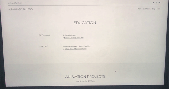
an also work in progress CV - just some skills and education for now
Contact
the city where I am based
email
social media links
contact form
Then the CV went out of the About page to have its own page. Also, I made a PDF version of it, which I am quite proud of for now - I will talk about it more in depth later.
I was every day coming back to my website and seeing that some things were not quite right just yet, and I could not work out what it was... until I did! I came across this website while doing my daily research: http://alimacdoodle.com and really liked the menu that she used. All words with four letters. The clicked something in my brain and led me to almost the final look of my website - for now anyway.
I ditched my ‘home’ page as it was a bit useless. It was only giving the first impression and showing my name. However, my name was already on the header, and after that first impression, you were forced to go somewhere else as there was nothing to see there. Before entirely ditching it, I tried to add my Tumblr account at the bottom, but I did not like it after a few days of considering it. So I got rid of that.
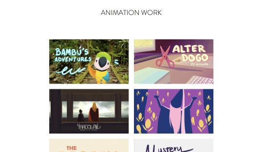
I changed the name of the page were my reel was for ‘reel’ and later for just ‘work’ because of not only my showreel but my whole animation work was going to be in here. I figured out that cause I already had some hidden pages dedicated to some projects, in particular, I thought it would be a good idea to actually separate them all. I put the showreel at the top of the page and then the eight videos that I wanted to show. When you clicked on them, they would open on expand, while having on the left a bit of info about them. However, I had these three extra pages for those three more significant projects in particular. So, after working it out for a few days, I actually created a page for each one of the videos/projects that I wanted to show and linked each video to those. During my first tutorial with Mhairi, a classmate pointed out that it would be more fitting those links to be images rather than a video, cause when you clicked on them, they would not open a video on expanding anymore but a whole new page. And so I changed that too, which also got me working for a few days on a nicer cover for all of my videos. I updated them both on Vimeo and on my new website.
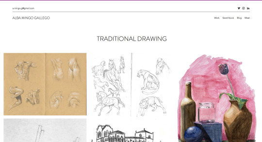
For my gallery, I decided to get rid of the digital bit as it was mainly style frames, character sheets, etc. for the projects that were on my work page. I put those images in the pages about their projects making them a bit more enjoyable too. And so only this page only my traditional work and life drawing were left, Mhairi helped me decided how to call it which ended up being ‘sketchbook’. This longer word broke the idea that the previously mentioned website inspired me of having this short words in the header. However, I do like the name for that section, and so I went for it anyways.
For my About and Contact page, I actually put them together as ‘Meet’, following the short-words idea. I put it so that if you click on it, you will go to my About Me page, but if you just hover, you would also get the choices: contact and CV. During one of the tutorials, it was also suggested to me to put the CV somewhere else, so I later on decided to include it at the end of my Bio text. We also discussed whether the contact page was too hidden there. However, the header that appears in every page contains both my email and my social media, so it should not be really a problem to find my contact even if someone is in a rush. I also added a Contact button along to the CV one after my bio.
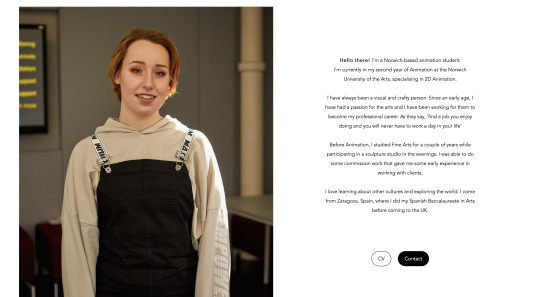
My bio took weeks to write as I tried different approaches and saw what people thought about each one of them. I asked a few lecturers and got great feedback from them. In the end, my about me says:
Hello there! I'm a Norwich-based animation student.I'm currently in my second year of Animation at the Norwich University of the Arts, specialising in 2D Animation. I have always been a visual and crafty person. Since an early age, I have had a passion for the arts and I have been working for them to become my professional career. As they say, 'find a job you enjoy doing and you will never have to work a day in your life’ Before Animation, I studied Fine Arts for a couple of years while participating in a sculpture studio in the evenings. I was able to do some commission work that gave me some early experience in working with clients. I love learning about other cultures and exploring the world. I come from Zaragoza, Spain, where I did my Spanish Baccalaureate in Artsbefore coming to the UK.
Which I think that summarises well the topics I wanted to mention, gives a warm and somehow interesting feeling and does not feel like a cv 2.0.
I also decided to keep the photo I included there after checking on many people that it was ok and didn’t bring out weird reactions. People agreed on it being a professional photo, and so it was fitting.
The contact page stayed pretty much the same. While the CV got a complete change of style. I did my cv both on the website and in a downloadable PDF.

I included the same info in the same order. I will soon have to update the Ponyo project, both here and everywhere else on my website. Mhairi liked the layout and overall look of it. The only things that pointed out were that: in the printed cv, the first things that she would look at would be the software that I know and use; and something that would make her go ‘uuuhhh’ would be the languages. So she suggested me to put these two on top of the education even, rather than at the very end of the page however that might mess up the layout. I understood what she meant, but for now, I prefer it as it is. Another thing that she mentioned was the cv on the website was only black and white + some light grey. She suggested me to add some hits of colour or small drawings that connect it better with me and my work.
Then, I came back to my ‘work’ page and removed my showreel from there, I did a home page again and put it there along with my name again. I thought about the layout and colours of this front page for a long time and arrived at this last final version were my name is all in one line, the tagline is now ‘- 2D Animator & Colour Enthusiast -’ and the showreel is in the middle and does not open in expand neither plays automatically.
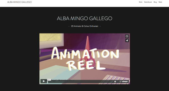
As you can see, I also designed a nicer cover for my reel and actually updated it and changed it once more so that I am happy with it now:
vimeo
I got rid of some bits that were bothering me since Christmas and went straight to the point. Now I am really proud of it!
For my home page, I had this idea of having a darker background rather than a white one cause I wanted to keep that clean and minimalistic look while not making it look too empty or boring. I choose specifically something dark so that it acts kind of like a cinema, the colours would pop up better against a black rather than a white background too. Though, I avoided using pure black.
What Mhari had to say about these decisions were that she liked it but that she had some prejudices about the colour choice particularly. She told me that not choosing a pure black is a good choice but that the grey that I went for looked out of a template and not like if I did all the mental process of deciding it etc. She suggested two ways of fixing these issues: to use this grey somewhere else on the website so that it would look more consistent and as a conscious choice. Or the one that she really encouraged me to do: to change the grey for a lighter one so that it would look less trendy and more like a personal and original choice. I personally thought about the first choice, and I still do. As for the second one... I chicken out cause I am scared to use an ugly grey tbh.
Now, the only thing it is left mentioning is the blog. I decided to include a blog on my website halfway through the making of my website, and since then everyone has been continuously asking me ‘are you sure about that????’. I decided to have a blog on my site because:
I think it’s a way of getting to know me better - pop in a post and read a couple of paragraphs
It is a good practice for me to keep up to date with exciting topics about the animation industry, and it prepares me for future conversations where I can bring them out
It shows some consistency as well as activity on my website
And some other reasons - such as having the perfect excuse to go to film premieres more often
In a nutshell, I think a blog is fitting for me - cause as you can see I don't really mind typing and typing if I have to - and has some potential. The only downside is that if for some reason I stop being consistent and publishing there it would give an awful image, in which case I would hide that page until it is alive again.
I worked in my blogs for a few weeks now, and I wanted to do something else with it, and so I came up with this:
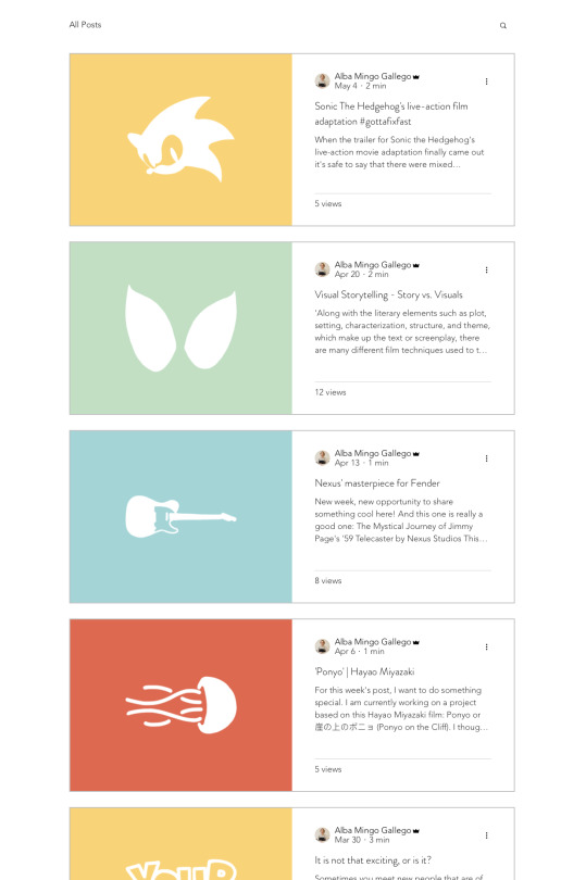
I decided to write every Saturday - or every two Saturday when very busy - and add an illustration of mine using iconography related to the subject and using the same four colours over and over for it. For now, I am digging the looks of it, and I have been able to keep up with it, so I am really excited and proud of it.
But yeah, I hope this can kind of make it up to not having posted more regularly all my progress etc. I tried to cover every relevant change that I made, but I am sure there were more than I could have mentioned if I did my daily blogs on this project too etc. This last term I had a really hard time organizing my work, my life and my mind. But I tried to do my best in every project, so I hope that can save me just for this time!
0 notes
Photo


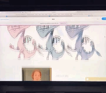
Today, three more animation clips were finished! I helped a lot with some parts of one of them and learned a lot on the process. Filling in the gaps with those three new animations and opening an Adobe Acrobat file for the Bible was pretty much all my progress of today. However, I stayed from 9:30am to 9pm in uni, worked a lot and learned even more. I love to work alongside others more and more every day, even when I am helping with someones’ else’s work rather than we are both working on mine.
0 notes
Photo


Today I completed my iterative process page and the synopsis and team identity. I did a first draft of the synopsis to save time and passed around the whole group to make sure everyone had the opportunity to do any changes. After a few tweaks, everyone was happy with it. We also decided to add some colour to the background so that it would also match the playfulness of the film, and somehow we all agreed on a gradient.
The colour script is still a wip as I am waiting for everyone to finish their animations.
0 notes
Text
Project Bible Progress
The group and I have decided that I would be the one putting the Bible together as I was already working on the ‘sypnosis & team identity’, the colour and composition script’ and I also did the template for the team member iterative process’. The only thing left was the cover which another group member decided to do for the group.
For the colour and composition script, I decided to wait until my group member finishes their animation and will take some key frames from them. The initial idea was to use the style frames for it. However, there were some inconsistencies in the way each one does their style frames, and some also had some difficulties doing them while keeping up with the rest of their work.
I believe this method will be the easiest for everyone as well as will make it look the colour script nicer - cause of the frames are actual finalised pieces from the final film. We’ll see how this work out!
Concerning the team identity, I had a chat with Millie as well as my group mates as I wasn’t comfortable with putting that some people did some roles that they never ended up playing. I don’t think I am in the position of deciding who did more or who did less, but we all agreed that some people barely collaborated within the group and that that was the fairest way of putting the team identity together. Tell exactly what they did rather than what their roles were assigned the first day.
0 notes
Photo


Today, other than finish my personal animation, I have been working on some of the Project Bible sheets. I created a .psd template/guideline that we all can follow for the iterative process pages. As for the colour and composition script, it is still a work in progress until everyone finishes and uploads their style frames.
As you can see, there are only nine sections on the script, even though our group consists of ten. Today is Thursday, and we will have a session tomorrow where we will decide whether we keep it like it is now or not. However, I went ahead and guessed this to be the most likely option. The missing member is a groupmate who hasn’t shown yet any progress on his part in this project and barely showed up on half of our meetings.
There’s only a week left, and we know for a fact that the only thing that he might do is to show up with animation on Monday - as he told his friend. However, Monday is a bank holiday, and we have not seen any progress and have no idea of his animation style or quality. I don’t think he’s up to date to our group’s motifs or common goal, and he has not collaborated with the group for it either. Moreover, if he shows up on Tuesday with an animation, we could make an effort to fit it in the final film; however, that would only give us a couple of days to also edit the Project Bible to include his work in it - but he never showed any intentions of doing any style frames or his iterative process sheet.
These are just some personal thoughts that I believe it is important to communicate at some point. I have zero intentions of roasting someone, but I believe in being fair with everyone else who is working hard within the group. In fact, I am really pleased with the group I was given, and I feel like I am learning a lot as well as getting to know my classmates better!
0 notes
Video
tumblr
I think I have finished my animation... on time... and I am still in disbelief.
0 notes
Video
tumblr
So, I have progressed quite a lot since the last time I uploaded here.
What I did was:
I did a big background in photoshop - roughly five times taller than the screen and same width
I also did in photoshop a couple of elements that I would later add to the animation referencing significant symbols of the film: a green bucket and a toy boat
I animated the waves in two layers:
the blue/green one that defines the shape and movement of the waves
a white one on top adding that extra of texture and interest in the foam
I animated the water of the puddle appearing from the botting and filling it in
Once I had all of these things I composed them all together in after effects, deciding the position of the three added elements: bucket, boat and fish and made sure to adjust them so that they would also look nice in a 1:1 aspect ratio
I noticed that something was missing, during the panning down, the screen looked somewhat empty
I went back to Photoshop and this line or winding path that would lead some water from the sea to the puddle
Then I animated on top of it the actual water going down, adding some white touches there too
And also put these two things in after effects
All this process did not go that smoothly, but instead, I kept the three software opened and kept jumping from one to the other, fixing small details and problems one at a time.
I think it is looking good, however, I plan to do a few more tweaks:
I might want to dissolve the foam on the sides of the puddle once it ‘calms down’
I want to integrate better the added stream of water to the water inside the puddle cause right now it’s looking too disconnected
Add the final bit of animation - a lot of small Ponyos jumping directly to the screen until it becomes completely red
0 notes
Text
Personal Branding Tutorial
- Black / grey - algo sobre los disenadores de hoy en dia y las modas y que no era una opcion sino el template
- CV order: languages and skills next to them
- quiza poner primero el pdf
- showreel ritmo quiza mas rapido y que las piezas bien elegidas
- fonts - template
- el contraste del gris en el cv esta guay
- el nombre es interesante??
- consistent colour palette
0 notes
Video
tumblr
So, I forgot to save/export any of the waves experimentations that I have been doing today trying to find the perfect aesthetic for it - cause I was really concentrated on it, not going to lie. But basically, I am working on having something simple, clean, but dynamic as they're sea waves. I want the waves to have a real wave feeling - the strength of the pushing out, the slow and exhausted feeling of the coming back in...
I will search for more videos of potential references for the movement itself too.
Also, a bit unrelated, but while doing my random times of animation research of the day, I found this animation
vimeo
I love the idea of most of it being monochrome having a few little hints of colour. Something around those lines was one of the goals I had when I know we would be able to decide our own style for this animation etc. And however I did briefly explored along with other approaches, it didn’t turn out to be a likely outcome of my animation. I guess what I am trying to say is that I will do explore this approach in the future whether it is for a uni project or a personal one.
0 notes
Photo

Instead of animation the pan down in TVPaint, as I have done before, I thought I could animate the different bits and then compose them in post-production. I believe this method will save me a lot of time as well as will allow me to play with the speed and pacing more comfortably.
The idea is to divide the whole sequence in four different shots that will later create one. These would be:
the sea in between Oyku’s fishes
where the sea meets the sand
sand
sand with a hole in the shape of a fish
I went to TVPaint and put the style frames that I did in Photoshop in the timeline. I tweaked them a bit so that they would concord with the audio. And then I was thinking about how to create similar visuals using the TVPaint tools as I usually do. I quickly realised that I could paint the backgrounds on Photoshop, this would also help me in dividing the scene and putting it back together.
I will create a background piece of 16 x (9x4) and will animate it wiping down in after effects afterwards. As for the waves and other animations I would do them in TVPaint, static, and compose them later on top of the background.
0 notes
Video
tumblr
I put the style frames on TVPaint and adjusted them to the timing to see how it would look, and I really liked it! I am going to start working hard on this!
Also, I better come out with an idea for that last sentence before submission day arrives... cause it is taking me way too long - for a change.
0 notes
Text
Texture references/inspiration


I used these images alongside other very similar ones in order to create the textures and foam of both the waves and the sides of the puddle - smaller waves. I, indeed, only intend to recreate a much more simplified version of it.
0 notes