
Don't wanna be here? Send us removal request.
Statistics
We looked inside some of the posts by breemerts and here's what we found interesting.
Average Info
Notes Per Post
0
Likes Per Post
0
Reblog Per Post
0
Reply Per Post
0
Time Between Posts
9 days
Number of Posts By Type
Text
17
Last Seen Tumblr Blogs


Fun Fact
Tumblr has a 66 index score for customer satisfaction in the US.
Text
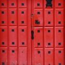
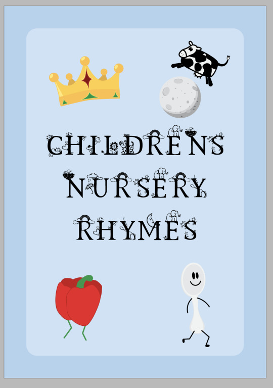
Children's Nursery Rhymes Book.
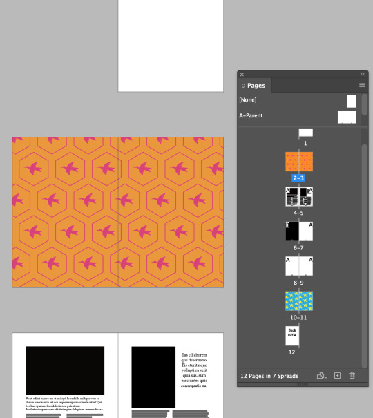
Creating a 12 page InDesign children's book for Fundamentals.


To start my book I created a 12 page book, pages 1 and 12 being the covers, 2-3 and 10-23 endpapers, 4 content page and 5-9 story pages. I then found 5 rhymes I wanted to use for my pages and copied and pasted them in where I wanted them and created a content page to match these.
I picked nursery rhymes that I liked that weren't too long or too short, I was aware that my book was going to be made up of A5 pages and didn't want it to be too complex to my target readers.

By going layout -> margins and columns I added custom margins.
I wanted simple one column since the book pages are small A5 and children's books are often simple and large text in one column. I created a margin of 16mm left, right and top and a larger bottom margin of 20mm for room for the page number to stand out as well as picture books historically having a higher bottom margin.


Here I created my paragraph and character styles. I had seperate paragraph styles for my main content text, this was simple easy to read font Gill Sans in regular size 18pt with a 21pt leading centred, with a 5mm space after hard return. My song titles style was the larger text above the rhymes, this was in Kids Alphabet font free download, in regular size 26, centred. This was a capitals only font with decorative images for each character. (these font sizes were changed later.)

A handy tip is when you add a ruler line to your parent pages it shows up on all pages that have been assigned that parent page, I did this to create a line where I wanted my titles to be so that they were all the same on every page.
I had added page numbers onto my parent page using a special character insert. As well as a neutral beige colour to the background to soften the page colour.
Using soft returns I formatted my rhymes in a logical way to remove widows and orphans to increase the overall readability of the rhymes.


These were my vector asset creations. I wanted to create images that related to each of my rhymes to help the story telling for the children. I used the pen tool to create my images and coloured them using simple bright colours to bring life to my book. I then added these to their own seperate Illustrator file for easy placement into my InDesign file.

This was my endpaper creation I took my assets and put them all together into a repeatable pattern. I added a darker neutral background similar to my page colours to help the images all stand out bright.
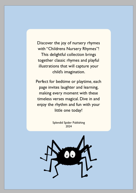
Simple front and back covers in a basic light blue for a calm feeling.

I found that for clarity since my Kids Alphabet text was all decorative characters, it was hard to read. Instead I changed these to only have the first letter of each word as that font as and the rest of the characters in Cochin regular which matched nicely, I also increased this font size to 30 for contrast.
Overall I am very happy with how my children's book turned out, it was a nice simple refresher to InDesign and Illustrator and even with the short time frame I felt like I did a good job.
0 notes
Text
Day 9, InDesign Page Numbers, Margins & Columns. Illustrator Patterns.

Today we started by creating an A5 page document and making multi pages by opening the Pages window in the top toolbar. You click the plus button at the bottom to create more pages, 12 in total.
On the first and last page we created a text box and added Cover in the first and Back Cover in the end.
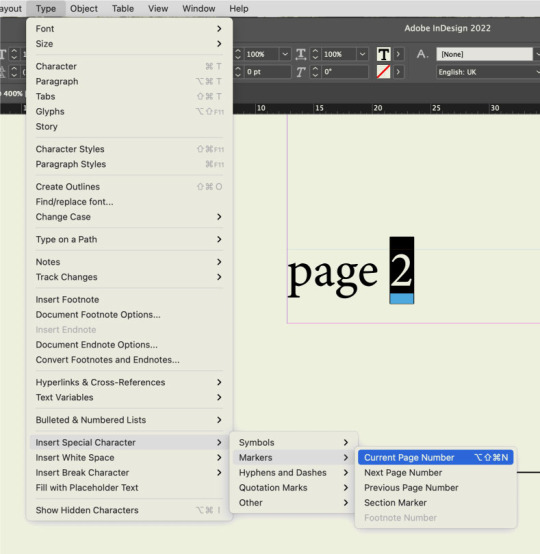
We added page numbers to our inside pages, to do this we created text boxes on the parent pages, highlighted the number went into Type -> Insert special character -> markers -> current page number. Then we applied this parent page A to all of the pages we wanted the numbers on by dragging the parent page onto them. (Our cover and end cover are pages that are seperate so we want the NONE parent page applied to those).
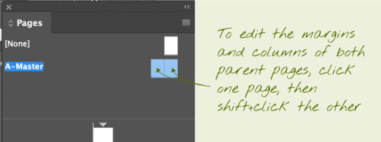
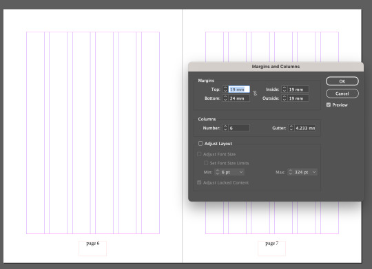
We added margins to our parent pages to do this you select the parent pages. (Make sure they are both highlighted in blue), and open margins and columns from the layout top toolbar. For mine I unlinked the margins, had a top, left and right margin of 19mm and bottom of 24mm. I also centre aligned the page numbers on the A parent pages.
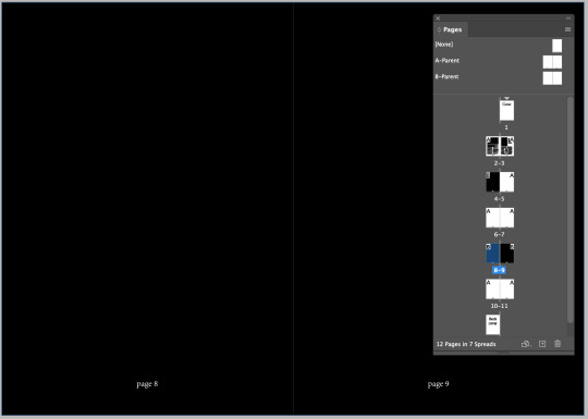
I made three black pages but my page numbers on A parent were black too so I couldn't see them. To fix this I duplicated A parent pages by clicking and dragging it onto the plus button and within that those parent pages I changed the text colour of the characters to white. To apply this to my black pages I simply clicked and dragged my B parent pages down onto the black pages.
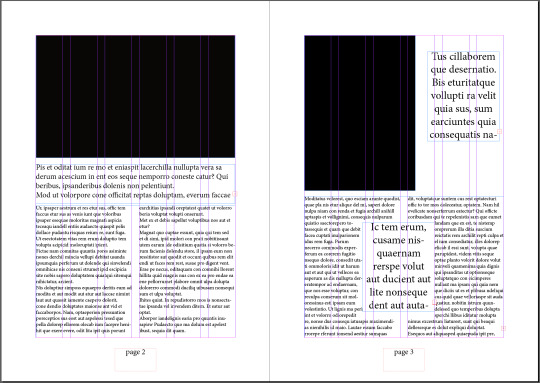
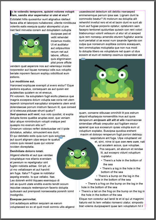
Here I completed two pages of my twelve. To show some formatting. Using black rectangles for image placeholders and place holder text in different sizes. Like our frog on a log images in the last exercise, you are also able to format text boxes around other text. I did this with the text in the middle of page 3, it has a wrapping around the bounding box setting.
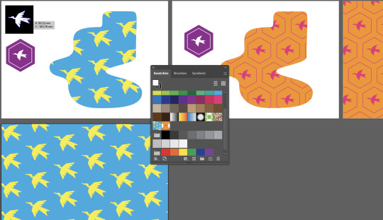
Next we created Endpapers which are the cool patterned pages inside the cover of a book especially hardcovers.
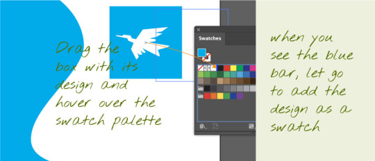
To do this we created a Illustrator file and using the pen tool created a pattern we liked. We put this on top of shape and grouped them, using this we are able to drag this into our swatches panel and it creates a pattern. From there we added a new art board and using the rectangle tool dragged to fill the whole art board and filled it using our made swatch.
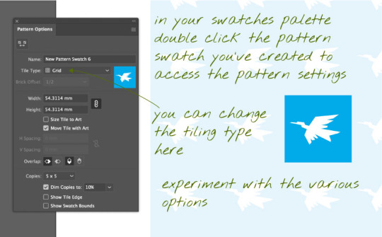
In swatches double click your swatch and you can change the effects of your pattern, changing the size of the shape, colours how the image is repeated or not.
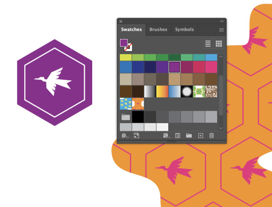
You can create these patterns with different shapes like hexagons and edit the swatches colours, sizes and positions the same way like I did with mine above.
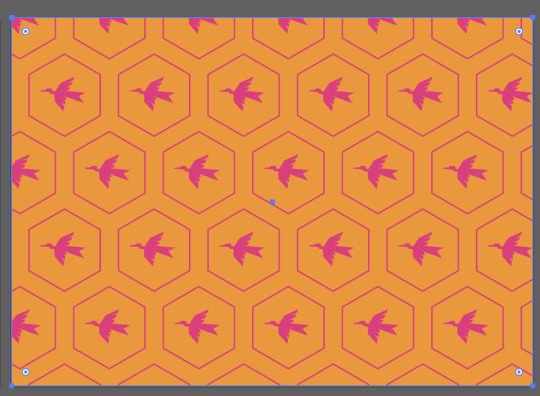
When adding an image like an end page pattern made in Illustrator, InDesign doesn't recognise a swatch pattern. If you have your pattern as a fill swatch you must select the pattern -> Object -> Expand -> okay. This turns the pattern back into objects so when you copy and paste into your InDesign file it is able to be recognised as an image.
You can move your pages around by simply dragging and dropping their positions in the pages windows, because you have an applied parent page to these with the page number it will automatically recognises which page it is and adjust these numbers.
When I added my Endpapers to pages 2-3 and 10-11 it also added page numbers to the bottoms, this isn't needed and looks scruffy so to fix this I simply dragged the [NONE] parent page onto these pages and it removed the page numbers.
0 notes
Text
InDesign Day 8, Styles and Image Placement.
Today we started on InDesign. In InDesign we can combine both Photoshop and Illustrator images, we can use InDesign to create magazine spreads or books among other things.
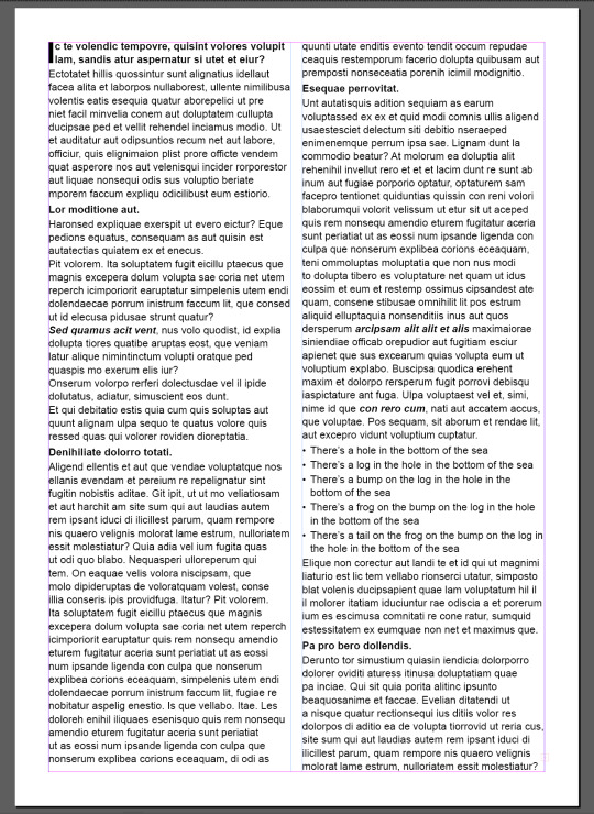
Today we started by creating a document, and creating a text box within the margins of the page. (To toggle between workspace and print view you can press W). We added place holder text by going Type -> Fill with Placeholder Text. Pressing escape then V to get into select mode again we selected the text box and using the workspace bar at the top changed the columns to 2.
We started by looking at character styles and paragraph styles, these can be accessed by the Windows -> Styles, on the top tool bar.

Character styles changes the characters that you have selected, you can use this to easily bold or italic your characters. These are applied by selecting the characters and selecting the style you want from the window.
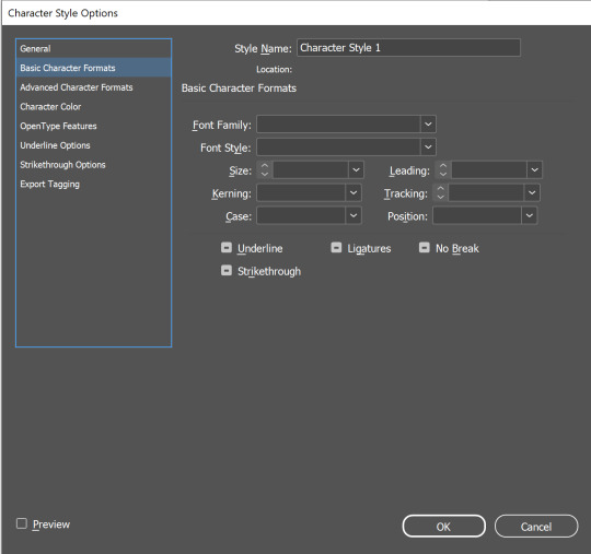
You can add a new character style using the little plus button at the bottom of the window. Double clicking on it will bring up the editable window, in this you can change everything, font family, size, style, colours, etc.
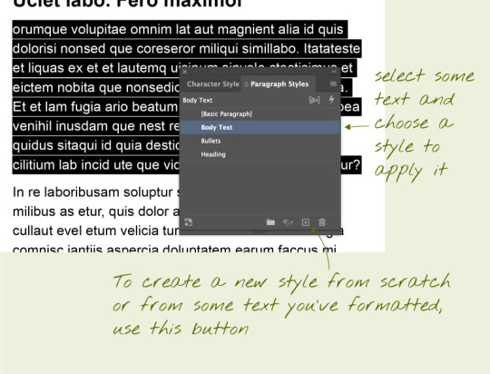
Paragraphs work a little different. A paragraph in InDesign is when return is used when typing, it creates a new paragraph which you are able to edit. Character styles are for changing characters, words or or collections of words within a paragraph, paragraph styles will change the whole paragraph.
We created a new style named Headings, in the basic character formats we changed the font style to bold, and added a leading of 14pt. Leading is the space above the paragraph this gives the look that the heading is for the paragraph below and separate from the one above.
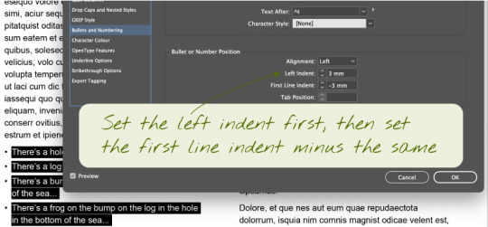
Next we added text we wanted to bullet point. To do this we had to put a carriage return after each piece we wanted bullet pointed. Then we created a new paragraph style and named it bullet point. When editing the style in the bullets and numbering tab you can change the alignment and indents, to set the indent you have to set the left one first, then the first line second as the same number minus to work.
I also made a new paragraph style and called it drop caps. Using the drop caps and nestled styles I added a drop cap on one letter two lines big. This created a cool drop cap on the first letter on the page.
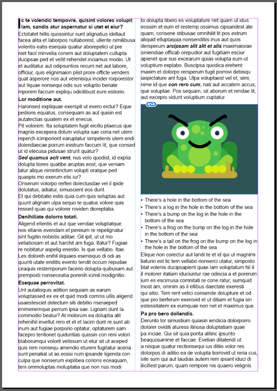
Next we started linking our image of a frog on a log.
InDesign stores images as links, it references the image on the disk. When you change the image file, InDesign will give you the option to update it in the file.
This means that you have to store the images with your InDesign file as well as sending them together.
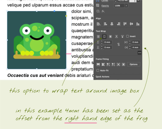
After we linked our frog image file we placed it into our text. To format the text around the image we used text wrap on the top tool bar when selecting the image. For my frog I made him the size of my column and wrapped the image around the bounding box.
I added two more images of the frog and formatted them differenely.
The first one I resized placed in the first paragraph and added a 3mm right offset to push the text of the boarder of the image.
The second one I put into a circle frame, in InDesign an image consists of an image inside a frame. Instead of having a sqare frame I used a circle. For this image I wrapped the text around the objects shape and placed it in the middle of the page. Because a circle has no left and right, top and bottom sides you can only change the offset around the whole image for this I added 4mm.

My finished page.
0 notes
Text
InDesign Shortcuts
Space = pan
Z = zoom
V = select
A = direct select
command + click = exit text edit mode
T = text tool
command + A = select all
W = toggle preview mode
! When adding an image like an end page pattern made in Illustrator, InDesign doesn't recognise a swatch pattern. If you have your pattern as a fill swatch you must select the pattern -> Object -> Expand -> okay. This turns the pattern back into objects so when you copy and paste into your InDesign file it is able to be recognised as an image. !
Parent Pages
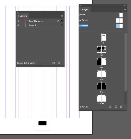

You can create and apply parent pages to any of your pages. You can make multiple parent pages with different styles. An example is we have some pages white and some pages black, our parent pages A have black page numbers but they disappear on the black pages. To fix this we duplicated our parent pages, by clicking and dragging on the A-Parent page to the plus at the bottom. This created a B-Parent page group where we selected the page number text and changed it to white. Using the B-Parent we dragged the pages to the black ones we needed the white page numbers on.
Creating Page Numbers

Creating this on the parent page creates a place holder A, this allows for the pages to be numbered on the specific pages. By dragging the none cover in Pages
Columns and Margins
Layout -> Margins and columns
To fill text boxes with placeholder text is in Type -> fill with placeholder text.
When in the selection tool on a text box you can split the text box into different columns with the toolbar at the top.
Overflow text
To move overflow text into another text box using the select tool click on the text box with the overflow and click the red box on the left then add it to your free text box.
Shift Selection with curser in text
Shift + left/right arrow = select characters
Shift + command + left/right arrows = select whole words
Shift + up/down = select lines
Shift + command + up/down arrows = select whole paragraphs
Shift + return = soft return
! When using the text tool you are editing the text inside the box, when you select the box with selection tool you are editing it as an object not text !
Terms
columns are the columns of text
gutter is the empty space between the column
0 notes
Text
A bit more composition - continued
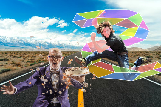
I felt like something was missing from my finished image so I added a little more.


To make the image more cohesive I added white lines around my shapes like I had in my jumping man snake. To do this with these I selected my shape copied it, used control + shift + v to paste the image directly on spot I changed the stroke colour to white and increased the line weight until I was happy with how much white I could see.
For my bird wiggle I swapped the colours in the gradient to white and kept the transparency at the ends. Saving these updated them in my photoshop file.

I feel like this makes the image work better, pulling the additions in with the original jumping man.
0 notes
Text
A bit more compositing
For this task we added to our day 6 composite image creation.
We needed to add two raster images and two vector images linking Illustrator files like we did with the snake.

I started by adding this image of a man with cake flying, I liked this image because it was a busy background with the pieces of cake flying around. I started off by creating a copy of my image in photoshop, I locked and hid the background layer to keep from changing it. I used the selection tool to select the majority of the image and made a mask of the selection on my background copy.


I started off by creating a copy of my image in photoshop, I locked and hid the background layer to keep from changing it. I used the selection tool to select the majority of the image and made a mask of the selection on my background copy. I created an overlay copy of the background so I could fix up the edges. While on the layer mask I cleaned up the missing sections in the middle of my man using the brush tool with white.

Using the colour selection tool I selected the orange pieces of the cake and tried to get a decent amount of the cake in my image. I found the result was too vague, so I tried a new tool called the quick selection tool. Clicking the prominent chunks of cake I selected them. I tidied up the edges using my brush tool on lowered opacity.
I then added him to my original image moving my jumping man around where I liked them, and started on my Illustrator file.


Using the pen tool I created two pointy explosions on different layers over the image layer. I used the stroke window to change the stroke weight and alignment. I make the two different explosions different colours and changed the opacity as I wanted the background to be showing through on my final image.

Moving back into photoshop, going file -> place linked -> selecting explosion.ai I added my explosion. I placed that layer behind my cake man as I wanted it too look like it was happening behind him.

The next raster image I wanted to add was this parrot, this was a simpler selection than the cake man as the parrot stands out mostly clear on the background.

This was bird after a simple object selection. You can see the green in-between his wings. The selection also shaved off some of his head.

I used the pen tool, and poly lasso tool to remove the green sections from his body using the layer mask with black and white. I used the brush tool lighten and darken to fix the highlights on the top of him and the shadows underneath. I also used the blur tool to create a soft edge under his wings and a little bit on his tail since he is meant too look in motion.
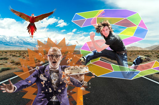
This is where I placed him on my image. I placed him behind the other two people, so some of the cake would be over him.

In Illustrator I opened my photoshop file as an Illustrator file. Using the pen tool I created a wiggle line shaped around the wings of the bird. I then changed the stroke weight to 40pt (This is a lot smaller than the weights of the cake man and jumping man as they are larger parts) For the wiggle I wanted to try a gradient stroke, I wanted the ends to be transparent for a faded effect and colourful to contrast with the red of the bird.

Doing the same thing as my cake man, I linked my birds wiggle.ai to my photoshop file. I started off by creating a copy of this link, and placing one above and one below the bird layer, on the top linked layer I selected my wiggle and created a layer mask. Using control + click on the bird layer mask I selected the bird, then clicking back onto layer mask of the wiggle using the brush tool in black and white I added and removed the areas I wanted so the wiggle would weave around the bird.

This is my finished image. Overall I like it, to make it better I could have made all the light sources the same to make the image more cohesive. I would in the future change the shake shape around my jumping man I feel that there would be better shapes to extenuate the shape of his jump.
0 notes
Text
Photoshop Composite Images and advanced selecting, Day 6

Today we started looking into image compositing, I have this image of a guy jumping in front of a busy background. He has come clear edges and some blurry edges like his hair that is making if difficult to remove him from the background.
We started by duplicating and locking the background, we are going to be using the background copy as the layer to work on. Using the object selection tool to select most of him off the background. We created a layer mask from this so we can easily add/remove areas from him to help get a clean separation.
Between the background layer and the layer mask we created a solid background for easy distinguishing when we tidy his edges up. To do this we created a new layer above the background and selected a nice easy to work on contrast colour for me this was green, we then used command + delete to fill the background of the layer with this colour.

Now when we toggle the layer visibility of the background we can see what areas we need to tidy up on him. The underside of his body where the shadows sit are clean lines this is because of the contrast between them and the background. But the spots around his pink skin and light highlights are rough because of how close the colours are to the background.

Here I have tidied up his legs and arms, I started by creating another copy of the background layer and adding at the top of my layers naming it overlay, this was I was able to lower the opacity of it and see the areas that I might need to add back into my mask. Using the pen tool, I went around the guy and tidied up his edges, using the option + delete and command + delete I added and removed the areas in my mask I wanted using black and white (black being invisible and white being visible).

Here I used a new tool by going select -> colour range -> selecting the colour off the background I wanted to isolate and changing the fuzziness I selected the colour pieces to help get clearer hair, I then went in with the brush tool again on my layer mask and added/unadded sections I liked.

I found a cool background of a road and replaced my background with it.


Here I created an Illustrator file, I started by creating a grey background and a backwards S shape using the pen tool. Going back into my photoshop file and going; file -> placed link -> selecting my snake.ai file -> okay, I linked a live version of my snake into my photoshop file so any work done on it in illustrator will be reflected into photoshop. Back in illustrator I added a stained glass effect, to do this I used the pen tool with a white stroke and no fill. I roughly drew the outline of the shape with straight lines, as well as a rough centre line inside. From the points on the outside lines connecting the inside points.
Using the pen tool with no stroke and a colour fill I created coloured panels to go inside the gaps. Using the colour window to change the colour of these shapes and the stroke window to lower the opacity of them to 40%. Saving this updated it in photoshop.


I duplicated the snake link layer placing it above my jumping man and created a layer mask on the copy. I control + clicked on my background copy layer to select the outline of my man, then on the snake copy layer mask using the brush tool in black (removing the foreground) I removed the snake sections where I wanted my jumping man to be in front of. At the end I added curves adjustment layer to make the image a little bit brighter to match the background more.

This is my finished image, I am very happy with how this turned out, I feel like I got my head around the tools and actions pretty quickly much quicker than Illustrator. I feel like I could have picked a better background with more light shinning from above to match the light source bouncing off the jumping man.
0 notes
Text
Photoshop Shortcuts
! In the move tool photoshop will move what is under your pointer !
B = Brush
Z = Zoom
Space = Move
E = Eraser
] = Increase tool
[ = Decrease tool
option + delete = fill selection with foreground colour
command + delete = fill selection with background colour
command + A = select all (delete clears selection)
option = colour picker/eyedropper
command + D = deselect
shift + command + Z = redo
shift + option = copy and paste selection
command + J = copy selection to new layer
shift + command + I = select invert
command + 2 = lock object
option + command + 2 = unlock object
When Selecting
Shift = add to selection
option = subtract from selection
space = move/reposition
Select by colour range
make an overlay copy - select - colour range - apply layer mask- add another layer mask - make it black - brush tool with white to add back in the areas you want.
For Paths, to create a selection
Create with pen, use select to tidy.
Widow -> Paths
command + click + path thumbnail
Layer Mask
White pixels = visible
Black pixels = invisible
Removing the stray points when using the join option
Select -> objects -> stray points
0 notes
Text
Layers, Masks and Selecting

Today we learnt about Layers, Masks and Selecting. In the first image we used the rectangle select tool to select the boat, we pasted it on a second layer and created a layer mask. While on this mask, we used a soft brush in black to remove the background of the boat to blend with the environment.

In the second image we used the select tools to select a piece of fruit. We did this using the ellipse tool and the lasso tool and the object selection tool. To add more area to your selection you hold shift while making your selection. Then we created a mask and within that mask we used colour balance to change the colour of our fruit.

Sometimes the image is too complex for the object selection tool to work, when this happens you can use the pen tool. Bezier curves are good for selection in photoshop you can adjust them to your needs.


For the finial image we took a hummingbird and placed it onto another photo. The issue was that the wings were too blurry to tidily use the object selection tool for the whole body. We created a mask and instead we used the pen tool around the wings. We compared this to our object selection and filled in the mask area with white then selected the inverse and removed the leftover edges we didn't want with black. Then using the blur tool and a large brush we blurred the wings of the bird and tail, then pasted it onto our background piece.
0 notes
Text
Simple Image Adjustments - Photoshop
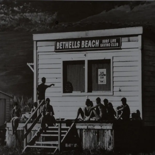
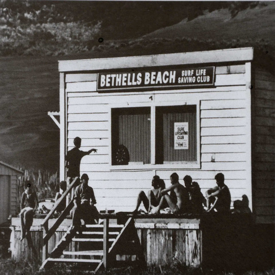
For my first first image I found a dark black and white image of the Bethells Beach Club house. I used the curve mode to lighten the shadows of the image as I wanted to bring out some of the background, as well as slightly raising the brightness and lowering the contrast of the image.
I found that this image was already very black without many light points other than the building.
https://www.bethellsbeach.com/about/our-history
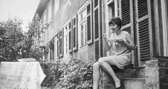
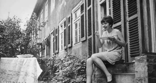
This image there is a simple lady eating off a plate, I found that it was too light and over blown out in some areas, for this I only changed the curves of the image to darken the shadows this gave more clarity to the plants and building.
It was difficult to find unedited black and white images online.
https://lagar.vamtam.com/our-story/
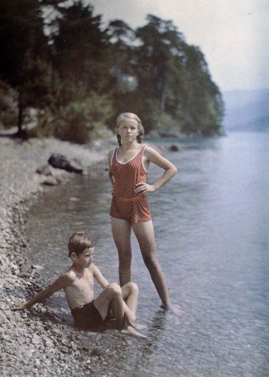
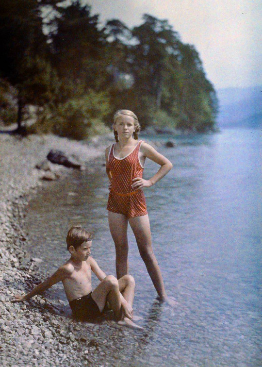
This coloured image is of two children playing in the water, the original is slightly washed out quite grey/blue. To correct this I changed the colour balance of the midtones - a little red and some yellow, then I raised the saturation and vibrance of the image this made the colours pop more rather than be washed out. Also added another layer of colour balance to add more cyan, a little magenta and more blue. This livened the blue back up again, kept the skin of the children pink.
https://www.boredpanda.com/first-color-photos-vintage-old-autochrome-lumiere-auguste-louis/
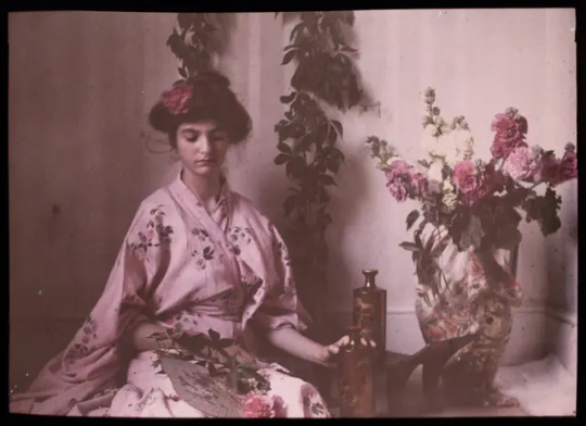
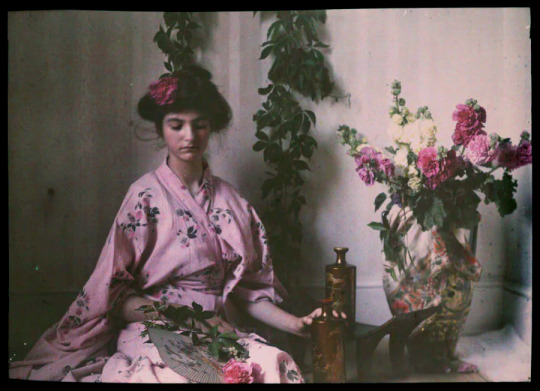
My last image I picked a pink hued image. I wanted to create more contrast between the background and foreground. I did this by changing the colour balance adding a lot of cyan and a little yellow in my midtones and adding a little bit of red to the shadows. I increased my saturation by 50% and lightened some of the shadows with the curves tool. Lastly increased the saturation slightly to make the remaining picks pop.
https://allthatsinteresting.com/autochrome-old-color-photos
0 notes
Text
Adjustment Layers

The curves tool uses tone range (black -> white) to change the brightness and contrast of your images.
the y axis is the output image range, black up to white. This shows how far the image can be brightened/darkened to.
The x axis is the input image range, black -> white.
Adding more points to the line lets the brightness and contrast be changed while keeping the tone range unchanged.
!Be careful not to blow out the image!

The colour balance tool allows for the colour tones of the midtones, highlights and shadows to be changed in your images. This can help to neutralise bad lighting and bring out other colours. It can also be used to give the image or selected object a completely different colour.
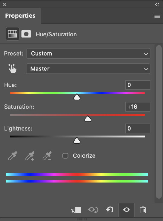
Hue/saturation can be used to change the hue, the overall tone of the image, saturation is used to change how intense the colours are in the image 0 being the neutral/original. Increasing this will intensify the colours lowering this will wash out your colours. And the lightness will effect the black to white scale again, lighten or darkening the image.
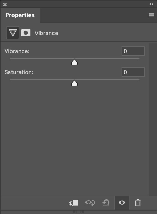
Vibrance tool will allow you to change the vibrance and saaturation in another way.
!A lot of these tools will do the same things but through different tools, you are able to layer these tools on each other through layers or single selections using layer masks!
0 notes
Text
Photoshop Image Adjustments, Day 4


We were given two images to fix one being too light and the other being too dark, to correct this we used the curves tool. For the light image we lowered the threshold of the shadows so more black would show since the image was predominantly white. We didnt want to push the image to the point where the highlights of her face and collarbone were lost.


In the darker version we since most of the colour was on the blacker side, we used the curves tool to bring the lower side of them back to white, we didn't want to over expose the image with the risk of blow out on the lighter points of the image.


In this image we have a very dark washed out photo of a cat, to try and correct this we used the curves tool to lighten the image, as well as using the hue/saturation tool to increase the saturation, this intensifies the colours in the image already bringing out the yellows and oranges in the cat.


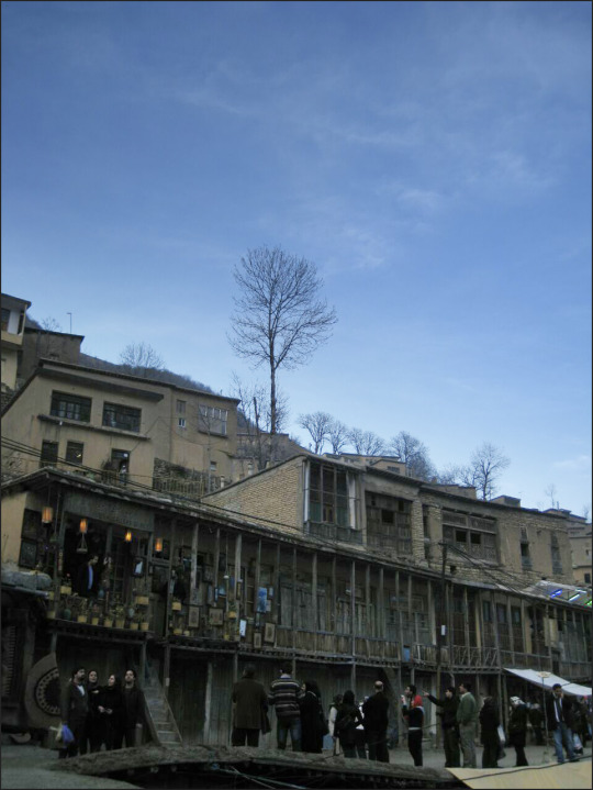
In this image the sky and houses are very dark and moody, we started by using the curves tool, to lighten the image and create some contrast between the buildings and trees. Then we used the hue/saturation tool and increased the saturation to bring out the warm colours in the houses and the greens of the trees.


In this image we have a very blue landscape (I like this because it feels moody, like it was a sene in Twilight.) To correct this we used colour balance, because this image is very blue we wanted to neutralise this and bring back the natural browns and greens. To do this I increased the red and yellows of the midtones and added a little dark blue back into the shadows. I added another layer of colour balance aimed at the highlights of the image, adding a little more red to keep the ground red and more blue to bring out the green of the bush and blue of the sky. I then used curve tool and added two more points to the line to make the shadows more intense and the sky brighter.


In this image there isn't must to correct, the image itself is nice. We played around with the colour balances in it, added some red in the shadows to deepen the colours.


This image is quite washed out, very orange in places and the charm off all the coloured fabric is lost in it. To try and help this I added colour balance to add more cyan and blue to the midtones bringing the image away from the red orange colouring. I also added more a lot more cyan to the shadows. I then used the hue/saturation tool to increase the saturation of the image to make the colours more intense in the fabrics. Then finally using curves to lower the light in the image making the shadows darker.


In the final image we used a different technique using the curves tool. we lightened the image in curves so there was more contrast in the shadows of the building showing more details, but found that the sky started to blow out and lost the details of the trees on the skyline. To fix this we added a gradient to our curves edit. To do this we selected the canvas on the curves tool layer and used the gradient tool (G) to tell the layer where to add the curves edit. Black being the shadow and white being the light. This gave us a nice gradient to make the light still look natural while allowing the buildings and people to be more clear.
0 notes
Text
Illustrator Day 5 Penguin Project

Day 3 - Today was our Illustrator Penguin project, we used all of our pen techniques we learnt to make this. This is my penguin, Banjo.
1.We started off by creating his body, I learnt to use the join tool (command J) by selecting the two points with the direct selection I wanted to join. To create his hair and tail I added points using the + key from there I was able to add handles and create the points.
2. Next we made the eyes using the ellipse tool I filled the eyes with a gradient of black to blue and moved the origin point, added a smaller white ellipse over the top to create a light point.
3. Then we created the beak. I made a rectangle roughly the size I needed then I rounded the edges using the small handles inside the corners of the shape until I achieved a beak shape.
4. To create the wing we used the pen tool and created curves.
5. Next was the feet, I started by creating the top half of the foot, one and a half toes the first and last anchor points needed to be vertically aligned so that we could reflect it. To reflect you use the tool (O) and click on the right lower point. Then hold shift + option and click the left lower point. This gives us a whole foot.
5.1. We then made the foot shorter horizontally and created a copy beside it. Deleting certain lines selecting them using the direct selection tool, we then copied that shape and option + shift + drag down and created the width of the toes, used join to add lines.
5.2. We coloured the top of the foot lighter and the bottom darker then put them together to create a 3D foot. Then created the ankle using our pen tool. I also added a lesser saturated shape to create shading on the feet. We duplicated the foot and rotated it too look like Banjo is walking.
6. For colouring we added layers until we had 6; back stuff, body colour, chest colour, body shadow, body outline and front stuff. I individually coloured Banjo on these layers. This was an easy way to colour him in blocks to be able to individually play around with opacity and such.
7. Using the pathfinder tool I created Banjos front feather pattern and the shadow on the bottom of his body, picking a darker colour desaturating it and lowering the opacity until I liked it.
8. To finish off I added a round shadow under Banjo.
Overall I should have taken more progress pictures to show what I was doing. I found hard when we were progressing very quickly in class but I am very happy with how Banjo turned out overall.
0 notes
Text
Illustrator Object Drawing


One of the things I cannot live without is coffee, so for my object drawing in illustrator I decided to make an Iced Latte. I wanted to incorporate some movement rather than just liquid in a glass and to do this I wanted to have it spilling.
To simplify this I separated it into the glass, straw, puddle and ice cubes.
The glass was to be transparent, with shadow on the underside and a highlight on the top, as well as on overall shadow under the glass.

Here I had made my basic shapes, just using the pen tool, using a mixture of corners and curves.

I added a freeform gradient using coffee colours to make the liquid feel more realistic. I created the ice puddles the same way but with a solid fill, as well as using the same puddle for under the straw.

For the glass I set the opacity to 30% so it created a tint. Using pathfinder I made the bottom shadow on the glass, I darkened the colour and set the opacity to 50% so it was still able to be seen through. The highlights on the glass were made with the pen tool, I added a gradient of white to transparent so they would be chunky but blend out. Finally I added the shadow under the glass to help show it is flat on a surface.
If I was to improve this I would add a small shadow under the straw too.
I struggled to use the pen tool for a start, I completed this on my windows pc at home which has different keys than the Macs we are learning on. I found it difficult to use the join tool as it didn't work when I wanted.
I would like to work more on the pathfinder tool, I find it helpful but sometimes touchy to use.
0 notes
Text
Software Fundamentals Curves and Straights

In the 6th practice we created a shape that used both corners (click) and curves (drags) in it. To do this you can click, click + hold + option.
These are quite fiddley to get right I often find myself releasing option before my mouse this causes my lines to go back to being straight.
0 notes
Text
Software Fundamentals Single and Multi-Arc Curves

We graduated to harder curves, drawing these was again easy. These curves have multi arcs.

With these shapes we used a shift drag when creating the handles for the curves, this locked them on to stay vertical/horizontal grid. This helped to create smooth curves. I also made an effort to keep my handles smaller to stop the shapes from getting out of control.
0 notes
Text
Software Fundamentals Closed Curves

For the 5th shapes practice we did closed curves, drawing these was awkward hard to make them symmetrical.

When I created these shapes I made them rough and then fixed the individual points after with the direct select tool. This is the easiest way to do it I find.
On the 4th and 6th shape I should have extra handles, in the gizmo box all slide of the shape touching the Apex should have individual handle curves.
0 notes