
Don't wanna be here? Send us removal request.
Statistics
We looked inside some of the posts by bummerneverends and here's what we found interesting.
Average Info
Notes Per Post
3
Likes Per Post
2
Reblog Per Post
1
Reply Per Post
0
Number of Posts By Type
Photo
1
Last Seen Tumblr Blogs


Fun Fact
In 2020, Tumblr had 29.4 million users in the US.
Photo

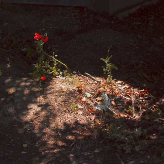
Everything We Had
thought id put something on this empty blog and see if i can find something to talk about. ive done a few shitty streams on my twitch channel ( https://www.twitch.tv/vape__dad ) in which i talked a little bit about how i made some songs and how i made a music video but i havent yet talked about my cover art at all nor have i uploaded them in high resolution anywhere.
in june 2018 i met up with a friend to take some photos to possibly use as art for my music. i try to do as much as i can myself but all i had at the time to take pictures with was this shitty old nokia phone and, while i had used it to take the photos used for earlier projects, i wanted the visual quality to improve alongside the quality of my music. so we walked around and i was pointing out things that i thought would be cool to take photos of and giving some feedback on stuff like angle and framing, we did this for a few hours and took about 240 photos, i had a lot of fun and it was nice to be out in the sun for once.
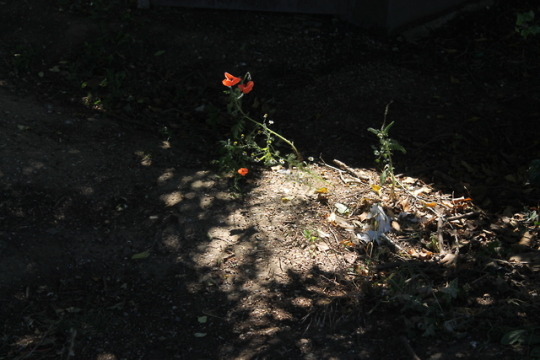
the first image is the raw photo. we saw this little spot that was mostly secluded by fences and flora so there were a few little puddles of sunlight on the ground, one of them had this little red flower sitting in it so we’re like “ooh thats pretty *snap*”.
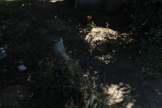
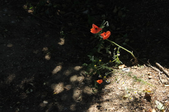
the second to fourth images are the other photos from that day of this specific object which i also considered using.
the fifth image is the art for the song. so i had made this song in march 2019 and i was like ok cool, what the heck am i gonna use for the track art, so i looked through all the possibilites i had on my hard drive and saw this photo and was like “perfect!”. i brought the image into photoshop and began working on it. ive used adobe photoshop cs2 since my early teens but havent really ever pushed my skills in it, barely looked anything up and figured out how to do a few things by just trying stuff out. my skillset with it is basic but its enough to get the results i want. anyway, i spent probably too long, not that it mattered since i had no deadline, cropping the image to have a 1:1 aspect ratio and carefully making sure i had exactly what i wanted exactly where i wanted. i then duplicated the base layer and added some chromatic aberration, the image immediately looked warmer because of all the shifted red but it didnt look like you needed to be wearing those old school 3D glasses or anything, it was a nice subtle touch. even though its like something thats “wrong” i think it can look nice, Grand Theft Auto V on PC is a visually beautiful game which has chromatic aberration that is noticable around the edges of the screen but it isnt intrusive and it doesnt result in an unsightly blurriness. the next layer i added was a -8 ° hue shift with 75% opacity. now the reds on the flowers were more red and less orange, and the yellow leaves became more orange, of course everything in the image had been changed but these were the most noticable differences. next layer was +25% color saturation at 43% opacity, the reds popped more and overall the image was less dull. next layer was selective color, which allows you to adjust cyan/red, magenta/green, yellow/blue, and black/white levels within indivudual color ranges. i was trying to make this look pleasant and dope rather than realistic or how a human eye would percieve it, so i went adjusting everything to be just how i wanted it and when i was done it no longer looked liked it was the middle of a summers day but more like an autumn sunset with orange leaves scattered on the ground and warm feel to the whole image. i really liked how it was looking but i still wanted to change a bit more, while i wanted the flower and spot of sunlight to be the main focus of the image i thought the contrast between that area and the shadowed parts was too high and that some detail was kinda getting lost. so what i did next was i merged the layers i had so far and just generated fake film grain which gave it some texture and brightened the image up but it looked a bit too like sharp and crispy so i resized the image to probably like 50% or something then sized it back up to the original size which made it blur together which gave it a kinda retro-aesthetic too. very simple thing but it really changed a lot, and i love how the final image turned out. judging by the date created/modified timestamps in the metadata of the PSD it took me about one and a half hours to edit the photo.
high resolution: https://imgur.com/a/004CtlA
i hate sounding like a pretentious wank but i dont wanna say what i think the art represents or how it links to the song because id like to not influence anyones interpretation.
you can check out the song here:
https://soundcloud.com/bummerneverends/everything-we-had
3 notes
·
View notes