
Don't wanna be here? Send us removal request.
Statistics
We looked inside some of the posts by buzzybox and here's what we found interesting.
Average Info
Notes Per Post
0
Likes Per Post
0
Reblog Per Post
0
Reply Per Post
0
Time Between Posts
3 days
Number of Posts By Type
Text
6
Last Seen Tumblr Blogs


Fun Fact
Tumblr has 4 main sources of revenue.
Text
Entry 6
Making another update before finishing up this project soon as realistically I only have two days left before it’s done and there still a lot to do before it’s due in.
And even though I wish I have more user feedback regarding my wireframe prototype, this is just the best I can do for now. I’ll write up some notes down in the link below and my next steps to get this project finished!
User Feedback for Wireframe Prototype and Survey :
So from the response that I did receive where more or less positive or though some where confused as I didn’t mention the “Lorem ipsum” for place holder text. Most of them thought it was a different language, which was a mistake on my part but I’ll make sure to let them for next time.
I’ll be going through each part of the survey and I’ll be responding to it for what to do next when it comes to my high-fi prototype design and navigation wise.
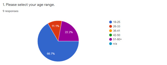
1. So this is self-explanatory as I wanted to know how old the user is while testing the wireframe prototype for the cupcake game, this will essential as for all users of any age to understand the layout of the app and navigate through it with no issue. So most users who took the survey/ tested the prototype are around 18-25 years of age, while only a few were 26-33 years and 51-60+
-


2. So this question is about how the user felt with the overall experience the low-fi wireframe and navigating through it, was it good? Was it bad? That sort of thing. So I let them rate their experience by a score rather then comment down their thoughts, only because I have individual questions about which elements more in detail later on. And by the looks of it most people did enjoy their experience with the wireframe, most landed on a score of 6, but there were a few where they landed on a score of 3 which probably was more of a mix experience with the low-fi wireframe. So it’s important to keep that in mind regarding their comments during the later on in the survey.
-

3. This question is technically the second part of question 2, it was meant to be for someone who had a really bad experience with the low-fi wireframe, So it wasn’t compulsory but some of the users did leave interesting comments regardless.
Most of their comments were probably referring to the gameplay rather than the menus of the app, as most of them found the tutorial area confusing and hard to play (bare in mind, I did use “Lorem ipsum” most for this area so I understand their confusion) But now when I think about it more, it will probably be better if I further explained the prototype before they start testing it, as this was not a finished project hence the missing colour but other then that this will be important when I finish the final high-fi prototype later on
-

4. What the users really enjoyed the most from the experience was the graphic element and the flow to it, which is great! As I probably did spend a long time thinking about how things were going to flow through out the app and how the design was going to look at the end, which means I can implement most of the detail and colour over top without changing anything to much design wise. Also some do like the element of baking the entire cupcake rather than decorating it too.
-

5. So this question does refer to how users did have some issues regarding the language within the tutorial of the game, which again I don’t blame them for. Also I think some had issues with regarding to Figma as well as they weren’t to familiar with the program.
Also one user did comment about the multiplayer element of the low-fi design as they where confused by how there was an offline mode for it. By what they said if it’s something one on one or playing the game in real life with others, were my idea for it would be the player will play against the ai and can chose the difficulty of the gameplay. But that is a good idea to consider though as I didn’t think about people playing against each other in real life or one on one, so something to keep in mind for later on.
-

6. The consensus for question 6 that almost everyone found what they are looking for within in the low-fi prototype with only a few saying either maybe of kind of. Given what most people said in question 4 explains that most of them didn’t have issues regarding the flow or design of the app and that indicates to me that people will have no issues finding what they want within the final prototype.
-

7. So for this question is basically asking if the user was confused at any point within the prototype testing. This question required people to leave their thoughts about it, but if a couple of people said something in twice google form will set the results up as a chart which makes it hard to read the rest of the comments that others left behind, so I’ll make a short list underneath of what everybody said below.
. “No” x 3
. “offline 'multiplayer' and also couldn't grab all the in ingredients”
. “Not really”
. “Language”
. “Lack of Instructions”
. “No options were clearly labeled and easy to navigate”
. “Yeah, I think having everything out and displayed would be easier.”
So most of the users didn’t feel like that they were confused while navigating the wireframe prototype, besides of the language, someone mentioning the multiplayer element again as well. With a few new responses such as making sure that everything was clearly labeled and if someone can grab all the ingredients before they start mixing them together.
-

8. (Have to write this paragraph again as I lost the old version as Tumblr had a meltdown with it’s page) This question ask given the opportunity if there was anything that the user would change next time with the low-fi wireframe regrading the game and it’s menu. Most people mention what was stated before within the other questions (the language, issues with Figma) but some also mention a few other things as well such a being less pages/words for the tutorial area of the game and focusing more on the visual element. Also one user mentioned about how the customer could also eat the cupcake within this prototype as well (while I don’t think I have time to implement this into the final product, it’s still a nice idea to think about.)
-
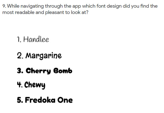

9. So now this is the area where I asked the user which of the fonts and colour palette they liked when it came to the style guide. And this question I asked them is which of style of font they found easiest to read and most pleasant to look at, and to my surprised it was the “Handlee” font!
I don’t know if it’s just me, but if I had more people involved for testing the prototype and taking the survey I don’t think that most of them would’ve chosen the Handlee font. I just don’t think the font is bold enough when scaling it down into a smaller screen and I don’t think it actually capture a lot of people’s attention like the others do. So I think I personally will go with the second best option which is “Cherry Bomb” font which is my number one favorite font.
But then other thing is I consider how one font is going to look through out the entire app, so I might end up using the Handlee font, you never know how these type of things go...
-

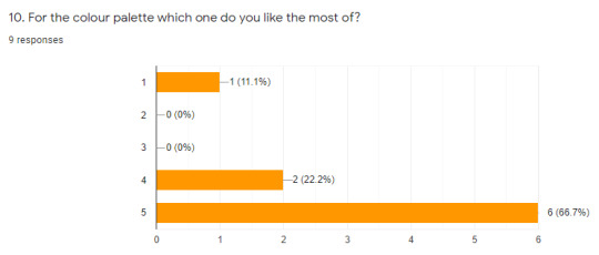
10. This question is basically the last one from the survey as question 11 is leaving any final thoughts about this experience as a whole. But this is pretty much explanatory as stated before and what colour palette the user think will suit best for game. it is a multiple choice question so people can chose more than one colour palette.
So the best one from out of all of them was number 5 which didn’t really surprise me as it has more of the brighter and softer tones with yellow, red and orange while the others had more earth tones, while the second best was 4. as it had that extra green and blue in it as well. This will come in handy when I create the high-fi prototype!
-
Final thoughts / What’s next :
Okay so as much I wished to had more responses to my survey and low-fi wireframe testing, I am still very pleased with the results. I would have allowed people more time to responded but sadly it isn’t my reality to wait on them anymore, as I have to have my final project up and ready by monday night! So it is my best interest now to focus on the final product for the high-fi prototype for both mobile and tablet devices, and also to finish writing up that report as well! Which in saying I probably don’t have the final user test when it comes to high-fi prototype but if I can try and finish most of my stuff by monday morning I’ll try and make another survey for user testing. But I do have to say that blog entries have been really good for me though as they help organise my thought and then I can restructure them later on for my report or another possible future project as well!
Cheers~
#update#blog entry#blog#project#projects#assignment#assignments#figma#wireframe#low-fi#survey#long post#very long post
0 notes
Text
Entire 5
It took my a couple of days to get everything completed for the wireframe but I did it!! The menu and game tutorial for the wireframe is now completed. So what I need to do next is to get user feedback for navigating through the wireframe of the menu and game. To see whether or not that they can navigate through it, if they are confused about anything and if they are entertained by it. This area will be important when creating the final high-fi prototype and I will also create another survey to receive all this information and also get a judge upon my style guide sheet at the same time because that will be important as well!
0 notes
Text
Entry 4 : Beginnings for Project 2
Hey! So this is the official update for my second project. I know it took me a few days to get started but I finally have something off the ground that I can show! I’ll try and be updating this blog more regularly now as this I want to try and document all my work that I’ve recently completed and where to go to next! You can click the link below to see the example of on my project!
Design & Prototype, Part 1: Style Guide
So my second project is linked from my previous assignment where I had to report on my research findings and concepts for creating a new a app game for Android devices. The idea I landed with is a baking themed game where the player has to create and bake cupcakes under a time limit before the level ends. The game is single and multiplayer aimed at a young audience. Also I used “Figma” to create the images that I provided in this post and for this project.
Mood Board:
For my mood board I’ve collect a bunch of images from both Pinterest and across the web (as well for a few images from mobile games).I wanted to see what aesthetics worked with each other and what didn’t.
For example, the colours how some of them are bright and constructing them with the warmer colours? The different design styles such as the lines and shapes and whether they would mesh together well or not? And the over all mood for the game and player. Since it a fast paced game that requires the player’s attention, it’s important that I have colours that are not too dull but aren’t too bright either as I want to bring more atmosphere to the game. And the lines and shape have to be not overly complicated style with a lot of sharp edges to it. The mood board is also based from viewer feedback regarding of my recent survey and what they personally think it would be great to see in mobile game and this is the example I have here:

(Beware these images do not belong to me as it just provide an example of inspiration and ideas for my project)
Colour Palette:
So the colour palette is something that will probably be really important for my project it’s going to be the main appeal for people as they will want to see nice colours relating to baking with a cute and fun style. I used the website “
Coolors
” to create these colour palettes with some of the images from the mood board as a rough guide from above:

Fonts:
So I have experimented and used a wide variety of fonts to se what would potentially be best suited for my game. I knew I didn’t want the serif/gothic type fonts as I don’t think they would be appealing to younger players and might be difficult for someone to read on their mobile devices. And I also thought a bold font would work for this case to, since it game requires the attention and fast reaction time from the players they need to be able to read the text in-game or other wise they might miss it entirely:

Top Five Fonts:
So now I managed to whittle down from my font list from above, I have also colour in the font in different varieties from the colour palettes I’ve made so I can see what works well and what doesn’t. I am still deciding what will be my final font that I will use for the game, so far my favorite is between “Fredoka one” and “Cherry Bomb” but that of course might change as well (Also I cropped them down a bit as this post is already getting long and I need too move onto other things soon as well):


“Handlee”
-


“Margarine”
-


“Fredoka One”
-


“Cherry Bomb”
-


“Chewy”
-
Next Steps:
Okay while I think my style guide is pretty much done I think I can move onto next part for my project. Considering that I have a presentation tomorrow I have to keep that in mind as well. I don’t think I’ll make another post this long again I might just try and demonstrate in smaller parts next time as I don’t have a lot of time.
0 notes
Text
Entry 3
Hello just update of where I am at currently with both projects. Right now, I am still trying to finish the first project which really needs a lot of work on before it’s due in soon. Which is a shame as I would like to get started with the next project as that one will only have a very short timeline before it’s due date as well. But good news is that I did the presentation for my first project yesterday! Personally it could’ve been a little bit better, when it came to the organization and speaking about the project it was clunky as hell! But I am happy that part is now completed now and the notes will come in handy incase I end up stuck on anything. So my goal is to actually get this first project out of the way before Friday, and only then I can update this blog more frequently regarding my other project. Well that’s the goal for it anyway!
0 notes
Text
Entry 2
Okay, so here’s the thing. In order for me to continue updating this blog, I do have to mention some of the current assignment that I am working on right now which does link into the next assignment and for this blog. And it wouldn’t be a bad idea to do so anyway, it will help me to remember to keep this blog semi active and probably help with my next assignment too... Okay, today I managed to get some survey results back about how people feel about mobile games, multiplayer games and games directed towards a younger audiences. This will be important information when it creating towards my next project. I probably wont share the link or any photos here but the results were a good mix of opinions especially how they felt with multiplayer element part. So yeah, that’s the update I have so far, I’ll try and keep this updated if any changes pop up or anything like that but yeah
see ya!
0 notes
Text
Entry 1
Hello welcome to my tumblr blog where I’ll be posting updates of my latest assignment which I’ll work on very soon. This should only take a few weeks, but if everything goes well I might upload future projects to this tumblr as well. Cheers~
0 notes