
Hi! My names Charlotte Halsall and I'm a History Of Art student at John Moores University. Feel free to join in any discussions on my blog
Don't wanna be here? Send us removal request.
Statistics
We looked inside some of the posts by charlottehalsallart and here's what we found interesting.
Average Info
Notes Per Post
48K
Likes Per Post
19K
Reblog Per Post
29K
Reply Per Post
22
Time Between Posts
2 months
Number of Posts By Type
Text
13
Photo
3
Quote
1
Last Seen Tumblr Blogs


Fun Fact
US Tumblr user growth rate is estimated to slow down to 4.1%.
Text

My room is making Uni work a bit easier
6 notes
·
View notes
Text
My minimalist ‘Cut-outs’ series


Since the start of lockdown I have been challenging myself to expand on my own artistic practice, experimenting with different mediums. To begin, I first made a minimalist series of Henri Matisse inspired ‘cut-outs’ which all feature seaweed shapes Matisse included in his own work so heavily.

As my chosen media, I cut out pieces of colored paper for the first three I worked on (the three to the left of the image above) I wanted to follow the large shapes whilst including individual elements for each of the forms, such as the oranges for a complimentary pop of colour, and the cheeky face placed at the bottom of the piece.
For the next piece, (the blue piece to the right) I decided to experiment with acrylic pens, coloring the white paper a bright blue tone to allow the white shape to contrast greatly.
For the last piece, using bright neon green and milenial pink, I used acrylic paint in block colour, to create a bright abstract seaweed design. As a final touch for this painting, I also decided to add the detail of green toned gold for a boarder, and following the slight shadow of the form.


I first created these as a way for me to dip my feet into the pool of creating art again after my break from making A-level artwork, to a less practical University course. However, this series was also a great way for me to decorate my room, creating a space of relaxation during the Covid-19 pandemic. Working as great print outs for a room, I plan on continuing the work, possibly creating a responsive series post lockdown; using the work to analyze my emotive response to the times.
#art#design#student#aesthetic#cutout#room decor#room design#bedroom#crafts#painting#henri#henri matisse#matisse
36 notes
·
View notes
Text
How to get out an art block: Tips and tricks that helped me overcome years of artistic neglect
If you’re like me, doing art in school felt like two things: a lot easier than anything you try create today and million years ago. Going from creating new work everyday, doing at least an hour on practical work (sometimes spending all day on a large piece!) to purely essay based academic writing is something no one talks about when considering young artists. Personally, I’ve found it extremely hard to slot back into my art routine since going to university. Going from doing Art A level to a History Of Art course meant I felt encouraged to almost entirely cut out practical work. Multiple times since starting my course, I have tried to throw myself back into the deep end of creating art, starting big pieces that have failed spectacularly, and ultimately put myself off trying again. However, since being quarantined, I have been able to overcome my mental block and restart my art journey.
1. Starting fresh
The first Tip I would encourage would be to start back at the beginning. Unless you are one of these few lucky people who can effortlessly pickup where they left off in their own artistic practice, starting back at square one could be the best way to rebuild your skill. Being able to rewind to more simplistic drawings will ensure your skills are rebuilt and practised. I always find art is something that needs constant attention, and can take years of practice to build up, therefore, it is not unusual that after years of neglect, you will need that time to familiarise yourself with the basics, before jumping into the deep end.
2. Don’t wait for Inspiration
Waiting for specific inspiration before starting any artistic practise held me back for months whilst doing my degree. Do not fall victim to believing in the fantasy that one day you will suddenly become inspired to start a wonderful new piece of art out of the blue. Start small with random subjects, and allow yourself to begin creating art whilst still actively seeking for a muse or specific theme, and don’t worry, inspiration will come!
3. Don’t be a perfectionist
Another way to get you out of a funk will be to take up a more fluid approach to your work. If this comes naturally, or takes more effort, try to give yourself room for error, and remember to not criticise yourself for making mistakes. This is not to say you shouldn’t make changes to try and improve your art, but try to maintain a positive outlook and remember to give yourself credit and remind yourself that this isn’t an easy thing to do. If you are struggling with your piece and find that it doesn’t look right, another way to gain a new perspective is to hold up your work against a mirror, or prop it up at a distance. This allows for a fresh set of eyes and can point out errors in proportion you didn’t see before.
4. Don’t Compare your work
Expecting your work to come out at the standard it was before you stopped practising is extremely unrealistic, and will only create a negative outlook on your new work. Allow room for difference, and embrace starting a new style or including a new technique within your art that you have never tried before. This also goes for comparing your work to other people’s. Being only a few clicks away from millions of professional art blogs on social media platforms such as Instagram, it can be easy to become disheartened that your work does not embody the same skill that you see on your computer/ phone screen. However, it is key to remind yourself that this work is often completed by professionals who have years of practice behind them. There is no reason why your own art can not reflect the same amount of skill in the future!
5. Trust in the Process
You become your own worst enemy when looking critically upon your work, and it can become tempting to paint over a canvas or rip up the paper you are working on when it doesn’t look how you want immediately. However, take time to consider the layering process, and the huge amount of time that goes into creating great works of art. Nothing comes easy, and it might even mean resorting back to a large planning process of composition sketches, media and colour trials. Trust in the work you are producing and give yourself time to reflect on your piece. Waiting days in between painting will let your paint dry and allow a fresh new perspective.
6. Take up a new medium
Try and see this as an opportunity to begin a new skill, such as printing, collage, graphic design, illustration, etc. Or it could even be as minor as involving a different medium, for example switching to oil paint if you are most comfortable with watercolour. This isn’t necessary in getting back into your own practice, however, it might be a good way to embrace the change. Unless you are able to, and want to slot back into your old method of creating, a change in material might be the best way to proceed in your own practice.
7. Show off your work
To rebuild confidence in your art, go out into the world and exhibit what you have created. For example, putting on your own exhibition, sharing it on social media or even just showing friends and family, no step is too small. This will be a great way to take ownership and gain appreciation for your work. It will also allow you to get out of your own mind, taking a step back and admiring what you have created as if for the first time.
I hope these Tips and Tricks help you to begin your artistic journey again, be it after years out of school or even without any artistic background at all. Remind yourself that this isn’t an easy thing to do, as it can be frustrating and difficult to find the effort to begin the process again, but trust me it will be worth it. Please comment and share your own experiences and how you got out of your own Funk.
2 notes
·
View notes
Text


Images from the ‘Alexis Teplin: It’s My Pleasure to Participate’ Exhibiton
2 notes
·
View notes
Text
Alexis Teplin
Alexis Teplin: ‘It’s My Pleasure to Participate’, Bluecoat Gallery (26/10/2019 - 23/02/2020)
Throughout the post, I will reference the A4 text I received as context to Alexis Teplins’ narrative explaining more depth towards her work under ‘Bluecoat, 2019′.
On Friday, October 25th I took a different approach to my Friday nights as a uni student: usually either watching Netflix with my housemates with a selection of snacks or a night out getting drunk at the student union. Instead, I got in an Uber and headed down to the Alexis Teplin opening night at the Bluecoat. Teplin’s first major UK exhibition was launched with a collection of her friends, colleges, art critics, connoisseurs and me, a History Of Art student awkwardly perched at the end of the room. The busyness of the 7pm live performance and narrative of poetic reflection to “a present moment, a time of malaise, excess and uncertainty” [Bluecoat, 2019] took over to create a buzz in the gallery space.
The show engulfed the lower level floor and top room of the Bluecoat Gallery, including an array of multimedia art, such as ceramics, her more familiar large scale Tapestries, clothing which the actors proudly displayed and paintings on Canvas. With the focus point of the opening show upstairs- the Mural that Alexis and colleague worked on consecutively, finishing in only two days. As I entered the second, and largest room, one of her pieces stood out to me the most, titled “The Absent Author, 2019” Using ‘Glass, porcelain, terra cotta, painted steel’. It is a minimalist vase filled with white sand and an orange ball placed inside with a palm leaf protruding out the end. This caught my eye because of the simplistic design, it’s complementary colors and overall beauty. All of the work displayed followed the recognizable style of her mismatched colors and shapes, working together to tell a story. I found that this was a great opening night for the exhibition, allowing insight and arguably needed context for the exhibition.
2 notes
·
View notes
Text
Yorkshire Sculpture Park
As part of our course, we were able to visit the Yorkshire Sculpture park. Travelling the 3 hour journey to the park from Liverpool felt like hard work, but was well worth it in the end as we arrived.
One of the sculptures made my Guisseppe Penone was especially exciting to see close up. He completed his piece titled ‘Matrice’ in 2015, aiming to draw attention to climate change and global issues surrounding nature. The sculpture features a 30ft long tree split in two halves. Perfectly displaying the separated sap and inside of the oak tree. Penone also displayed various other sculptures involving a coalition of modernism and naturalism. He focuses on combining tree with man made forms such as a stone circular sphere which he then places harmoniously inside the tree. This creates a facade behind the true nature of the tree, immediately blending seamlessly into the landscape with careful use of material; and then upon realisation from the audience, a sudden separation, or new understanding of the objects included in his work.
I also really enjoyed seeing the work by Juame Plensa who created a sculpture entitled ‘Wilis’ 2016, which emulated the 3D form of a face, whilst still using a relatively 2D metal base. He did this by careful shading and tones used in the face, involving movement as a key feature in his work. The further you move into the sculpture, the quicker you come to the realisation that the face displayed is in fact an illusion, tricking the naked eye into believing it was largely three-dimensional, when in fact it’s quite flat. I found this piece particularly engaging, as I myself felt the confused by his work first hand, only later feeling a greater understanding of the piece.
The park was different to how I first imagined, spreading out the numerous sculptures across the vast land of the park. This got me thinking about placement of sculptures, and how, by placing the pieces around the park, such as on the grass, on the river bank, and in the muddy areas, it gave them a greater depth. The sculptures, such as a piece by Henry Moore, titled ‘Two large forms’1966-69, is made out of stone, an earthy, and natural material. Having this displayed on the grass bank, overlooking the river gives the piece a greater meaning. It also adds a new perspective. As the piece is rather tall, if put into a typical gallery space, like the white cube, it would absorb the entirety of a room. Whereas, placing it outside, makes it appear small, in contrast to the large park, and river. This I feel is important in giving depth to a piece, which is why placement and location are key aspects to consider when exhibiting and curating a sculpture.
1 note
·
View note
Text
Trip to the Victoria Gallery & Museum collection
The Victoria Gallery & Museum collection opened in 1892, built by Alfred Waterhouse in a Gothic style, particularly new to the Era. Initially built to be part of the University of Liverpool. The building has only recently become a gallery space, just ten years ago in 2008. Since, it has been open on the University of Liverpool campus, open to the public, and exhibiting a range of both artistic and scientific exhibitions.
Amanda Draper
When visiting the Victoria Gallery, we were lucky enough to have a talk first hand by curator Amanda Draper, surrounding her work curating an exhibition following Eleanor Rathbone and the Suffragist movement, and a special exhibition celebrating women artists. I felt that displaying such an important exhibition for Eleanor Rathbone was crucial in maintaining her legacy. The careful placement of the empowering work included how the women of the Holt family- whom helped fund the building, created a special wing for women, to ensure they were safe whist studying at the university; the ground-breaking introduction of the Family Allowance; and her intuitive suspicion surrounding Hitler, which she wrote various letters to Winston Churchill himself about. This iconic woman and the movement which she upheld politically felt ideally placed in relation to the exhibition in the following room, surrounding contemporary women artists.
The exhibition, titled ‘She’s Electric’ encourages the audience to absorb a range of contemporary wok, following the mid 20th century all the way to the 21st . Consisting of women artists of the VG&M collection, the collection works well to involve a range of dynamic works of contemporary art. When looking at this collection, I saw how key including such an exhibition would be to display such talent by these women artists. I particularly liked the piece titled ‘Nest in a goats Beard’ 1970 by Carmen Garcia for its simplistic design, and links to surrealism. I also loved a piece by Liliane Lijn titled ‘Koan-Cuts II’ 1971. This piece struck me as interesting with the use of forms included, almost looking as figures, or even women. I then decided to think critically about the impact of women creating such new types of art in the 1970’s, a time where women still felt widely oppressed by a male dominance in the workplace. I though more into how difficult it must have been for all the women in the collection to put themselves forward and find a place in the art world. Making mine, and anyone elses appreciation of the work, ever more important.
Jasmir Creed
Whilst at the Gallery, we looked at an exhibition of Jasmir creeds work, capturing her envision of a ‘dystopolis’. She’s painted numerous works on canvas using oil, which focus on busy spaces and architecture. After exploring her work first hand, we were lucky enough to receive a presentation by Creed herself describing her work.
Creed focuses on 'psyco-geographical art’, choosing colour intentionally to portray a theme, e.g. in her piece titled ‘smog’ 2015 she involves grey and a dirty yellow tone, yellow representing the chemicals in the smog. She uses multiple artists as inspiration for her work, looking at psycho- geographical scenes. ‘Shadow’ 2016 explores the cultivation of space, including multiple viewpoints to increase the feeling of isolation. She also includes monochromatic colour schemes to represent this. The inclusion of architecture in Creed’s paintings are carefully thought out. For example, she wanted to include St. Pauls Cathedral at night to show a new perspective. She also forms the building in cohesion with the surrounding painting- in fragments. Creed talks of how fragmentation's represent fragmented memories people have. Therefore, the purposefully misshapen sharp point of the Cathedral in Creed’s painting would introduce a greater understanding of the place, building, and memories there.
Creed involves a link with surrealist artists such as Salvador Dali, or Rene Magritte, with her style of painting. She creates montages from images of contrasting environments, such as a landscape of greenery, or waterlilies in a pond- such as in ‘Aquatank’ 2017, and city scenes. Creed encapsulates her work with urban life. Fixating on the juxtaposition against natural, organic forms and urban, artificial structures.
After listening to Creed’s presentation and learning more about how to juxtapose landscape, I had to think of the impact of her pieces and her personal influences on social understanding. Her pieces may also be a great stepping stone for creating political art. If Creed included the same distorted, fractured style in her work, against urban life, she could argue the destruction of nature. Using an angle of environmental change and the impact that the result of it is having on our earth, such as ‘Smog’. Though Creed did not include this angle in her presentation, she can easily include the aspect in her work by description; as to me, they already tell a story of confusion, and a battle to survive. My initial depiction of the collection was one highlighting a conflict to coexist, between the two very different worlds. Creed paints the two worlds as a somewhat fantasy, exaggerating features such as Lilly pads, and an over layer of people as to enforce the connotations of urgency. Though to some this may take away the links to reality, I feel it was intentional in fulfilling Creeds brief of including both psychology and geography to create an entirely new concept, one Personal to Jasmir Creed.
1 note
·
View note
Photo
Wow I love this photograph by Martin Parr!

Martin Parr
3K notes
·
View notes
Photo
Amazing!
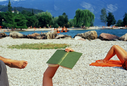
Italy. Lake Garda | Riva del Garda (1999) by Martin Parr
45K notes
·
View notes
Text
BA (Hons) History Of Art Symposium
Duality: Confronting Contemporary Perceptions
Going to the BA (Hons) History of Art students Symposium yesterday helped me to understand more into the topics they discussed, split into the three sections of Hypocrisy and Hope; Humanity and Hyperrealism; and Location and Interaction. Attending the symposium also gave me a great insight into what I will be expected to accomplish in my third year and what level of standard is required.
I was really interested in learning more about Laura Higgs subject matter of ‘Psychoanalysis and Hyperrealism’ following work by Ron Mueck. It focused on hyperrealist sculptures by Ron Mueck, and his chosen methods and techniques of manipulating the sculptures so to control an audience response. For example, Mueck would either enlarge or reduce a piece so it would appear less alarming life size. Laura spoke of how she uses Sigmund Freud's theory of the Uncanny to comprehend the ways the Australian born sculptor uses psychoanalysis to monitor the behaviour of an audience. She then discusses the importance of the Gallery space and how sculptures can be influenced by the room space they’re in, using Baudrillard's theory. He discussed the simulacrum in relation to its pertinent role in reality, discussing how to understand hyper-reality in a contemporary postmodern society. She uses his work to debate the importance of Mueck’s sculptures in varying locations, such as the white cube, or a space more specific to the theme of the sculpture itself. She used the piece ‘Couple Under An Umbrella’ as an example, questioning this enlarged hyper-realist sculpture in such an artificial space such as the white cube, and not instead placed on a natural landscape such as a beach. I found this debate very interesting as it discussed the white cube- a topic which I had already explored in a previous lecture this year.
I also found the paper by Francesca Pullinger, surrounding the Perceived Hypocrisy by multi-million dollar company Unilever and their adverts surrounding women, specifically, Dove and Lynx very interesting. Even though I had already debated this concept in depth previously during my A levels in English Language, I still found that her deliberation of the topic was very interesting, sharing strong points against the objectification of women. Though the specific Lynx adverts she used in her presentation have since been taken out of circulation, and banned in many parts of the Uk, later replaced with less objectifying content; The fact that these were once approved for public observation is a highly alarming issue that Francesca successfully highlights. I found in particular the Skin whitening in South Asian countries such as India extremely interesting. Discussing how this is considered a normality in these cultures. A subtle form a colourism commonly practiced and subconsciously enforced on young women. As a follow up from the symposium, I really want to look further into this issue, and become more aware of the reasons behind such casual colourism; and how globalized the issue is; looking into new solutions of how to combat the issue so ingrained on different cultures.
2 notes
·
View notes
Text
Crosby Beach
Anthony Gormley’s Iron Men/ ‘Another Place’
On Thursday I was lucky enough to go to Crosby beach with my course. Though I’d never been, I felt it was a worthwhile trip as I was able to see Anthony Gormley’s ‘Another Place’ or the ‘Iron Men’ first hand. The 100 sculptures are spread along 3 kilometres, all emulating Gormley’s physique, and 6”2 height.
After my walk around the beach observing the Iron Men, I began to think more critically about their existence. Such as, what they represented in the art world; and controversies surrounding their permanent move to Crosby beach; and what impact they can bring socially and politically to the world.
When they were moved to the Merseyside bay in 2005, they initially held exiting connotations. This was, however, until their scheduled visit to New York got interrupted, and bids for a permanent stay at Crosby was accepted. This not only went against the initial purpose of the iron men, shown in their name ‘Another Place’ representing their intended continuous move; it also highly alerted local residents, as they feared high rates of tourism, and a breach of what they once described there scenic, peaceful home. It is a large topic of discussion now surrounding, as it brings question to the importance of an audience, in an artist's decision. Bringing both Gormley and the council under scrutiny under there decision for the structures permanent move. It also makes me wonder on a larger scale if an artist should always consider its audience when making a piece of art, and if there reaction is in fact what should be the drive behind a piece. For example using the shock of an audience to heighten the value of a piece, such as Edouard Manet with pieces such as ‘Olympia’ 1863; or in fact, aim to change a piece so to not distress an audience, such as Ron Mueck, who ensures his hyper-realist sculptures are not to scale.
The Men themselves embody an inherent connection to climate change, merely by existing on the sea front, the natural weathering caused by the harsh winds and crashing sea of Crosby are reflected on the iron. Though this may have only been a factor in the purpose behind the men, it still attracts attention surrounding the issue, now arguably more relevant than when Gormley first exhibited the sculptures in Cuxhaven, Germany 1997. Gormley accepts this weathering as a natural development of the work, stating to the Liverpool Echo newspaper that he is “just delighted by the barnacles!”, often revisiting the work to monitor and be in awe of their development through the years.
However, though Gormley is accepting of the weathering seen on the men today, he has had some controversies surrounding the human interaction of the sculptures. As stated in a Guardian post, Gormley reacts poorly to the sight of the iron men being involved with human interaction. Gormley ‘directly contacted the council requesting the removal of the paint’ [Guardian] which was, in that case a pink and spotty bikini which had been spray painted on one of the hundred figures, on Crosby beach. This brings on the critical debate between vandalism and art, and if one is equal to the other. One view is that vandalism in the art world is a destruction of an intended piece; whereas, others argue that it adds to the art itself, and not destroying the piece adds to its value. This concept was recently explored by world renown artist- Banksy, with his piece ‘Girl with a balloon’ 2002. He arranged for the piece, encapsulated in an outrageous gold frame, to ‘self-destruct’ after bids for the piece took place at the London Auction House. The piece instead supposedly ‘malfunctioned’ and only shredded the bottom half of the print. This of course, added a larger value to the piece, and could be used as an argument for using a style of vandalism in art. However, there are of course, complications with that analogy, stating that Banksy intended this to occur, installing the shredder in the frame himself, and later showing in an instagram video how he did so. Art critics argue if Gormley should be so against human interaction on the beach, and that he should instead embrace the ‘vandalism’ on the iron men as a secondary part of the weathering process. That human interaction, and natural interaction come hand in hand.
1 note
·
View note
Photo


I was unable to take my own pictures of the exhibition, so instead I include a few of my favourite pieces which were in the exhibition.
2 notes
·
View notes
Text
Fernand Leger exhibition review
As part of my course, we went to Tate liverpool to see and write a quick museum review of the Fernand Leger exhibition. I decided that as part of my blog I would try and perfect this, including some references for my research at the end, and using Harvard referencing when needed.
Fernand Leger: His life through art
The exhibition at Tate Liverpool, running 23 NOV 2018 - 17 MAR 2019 was a dedicated exhibition taking time to reflect Leger’s art, including his transformative style and the careful detailing regarding the context of his work- post WW2. It was curated by “Darren Pih, Exhibitions and Displays Curator and Laura Bruni, Assistant Curator, Tate Liverpool. The Exhibition was initially developed by Lauren Barnes, formerly Assistant Curator, Tate Liverpool” [Tate, 2018].
Fernand Leger, FEB 1881 - AUG 1955, grew up in Argentan, France. He began his artistic practices in the early 20th century. Initially “attending the Paris School of Decorative Arts, whilst being unofficially mentored by two École des Beaux-Arts professors, a prestigious school which he was rejected from” [Biography, 2019]. Prior to building experience, Leger adopted a blended style of Impressionism and Fauvism. Before seeking influence by Paul Cézanne, and taking up the beginning technique of his developing style, creating his own interpretation of cubism. He was always inspired by modern art, expressing his own work through the mechanical age, as a vibrant and fresh take on the world post war.
Throughout the exhibition, I felt it was with great clarity that Tate have portrayed both realities of life in the era, and how Leger wanted to represent it. Along with Leger’s paintings was also a display of video footage scattered alongside the work, along with Leger’s photography including his work surrounding the inauguration of the german and Russian pavilion paris world fair. The historical importance this carries is well represented within the exhibition, however, I do feel that more attention with description could be placed on the photography section- as it only extends along a small corner of walls. From a curatorial perspective, I thought that involving the photography work that Leger has done was a crucial factor in making the exhibition successful. By using mixed media, it engages both an old and young generation. Allowing a somewhat nostalgic bond with older people, whilst engaging young children with moving images, such as the 21st century tool of TV; an advanced mechanism for him to have included in the early 20th century. When I was engaging with the exhibition myself, I witnessed what I assumed to be a grandmother with her two young grandchildren, approx 4-6 years old. Both generations absorbed by the films. I found it was important that Tate made sure to include black cube rooms to separately show these films, allowing a special untethered engagement to occur away from the larger rooms of the exhibition, also successfully representing Legers intentions with his work.
The use of control seen within the order of the exhibition carried a somewhat confused tone. Though each section displays his development in style, through the eras, It still does not follow a strict chronological order. I would have valued the use of this order as I feel that it would be a great asset in making the exhibition more beginner friendly, and help those who aren’t as familiar to his work, to fully grasp his own transition through time.
To challenge the concept of ‘The White Wall’ The exhibition involves the block colour of Red carefully chosen in certain sections to enhance some of his work, whilst also successfully breaking up the studio space. This technique extends to the opposite rooms, including a block blue colour to a temporary ‘cube-like’ space. The curators have specifically and successfully broken up the standard, arguably boring concept of having all the walls white in an exhibition. The bold choice to include these block colours works not only to subconsciously engage with the viewer, but also tie in with Leger, and his work. Also bold, and different, it compliments the pieces of art hanging on top, and therefore being a great asset to the exhibition.
When first analysing the content of the exhibition, it is a shame that a vast amount of work is missing from the collection. Simply as this would enhance the exhibition, allowing it to hold greater value as a collective. Though I feel the exhibition worked well in including a large variety of Leger’s art, and would be expected when curating such a large exhibition, under such a famous artist. Overall, Tate Liverpool has been successful in translating Fernand Leger’s legacy, being successful in allowing for engagement with the public in cleaver curatorial choices, and the careful placement and descriptions of the artwork themselves. I would recommend everyone reading this to visit the exhibition before it closes, so that you can too enrich yourself with the versatile, breakthrough styles of Fernand Leger.
I also gained research help from Hannah Ellison, who is also on my course, as we went through the exhibition together and compared notes.
1 note
·
View note
Text
PUNK!
We were able to have a tour by John Moores Prof. Colin Fallows around the ‘Punk’ exhibition which he curated himself in the Central Library of liverpool. I found his tour of the exhibition really interesting from a curatorial point of view, as he was very good at going through in detail how he pieced it all together, and the reasoning behind why he did so.
One section I found Particularly interesting was his inclusion of sound in one of the rooms in the library. This room was originally used to keep valuable historic books, such as ones from the early 20th century. Prof. Fallows installed a machine which withheld a vast amount of classic hits of the Punk era, many which he viewed with closer detail in the previous room of the exhibition. The machine allowed for any of these to be played aloud in the room. Prof. Fallows also included physical copies of the album covers to be placed within the cabinets around the room, which still contained the many historically important books of the library. I felt that he used an ingenious transition between mediums, linking the music to the physical covers, and carefully choosing to place them next to the books, as to create a stark contrast in genres. I thought that it was key Prof. Fallows involved these technological aspects of the modern world to tie together the punk movement, originating in the mid 70’s, and the modern world we live in today- both contrasting to the setting of the exhibition, the Central Library.
I will be able to use the information I gained on this visit when answering my essay, specifically targeting the use of different exhibitions in museums and galleries, in my module of ‘An introduction to Museum and Gallery studies’. Making this trip a well worth experience for both personal and educational gain.
1 note
·
View note
Text
Manchester City Art Gallery
Martin Parr
Today at the Manchester City Art Gallery, I saw numerous exhibits and interesting pieces of art. I found the Martin Parr exhibition very interesting, it surrounded his photography throughout his life, beginning with his photography from the 1970’s on wards.
He begun by displaying photographs of social meetups such as pubs in Manchester, showing a somewhat Flaneur approach, merely observing his subjects. It displayed his work in various series’ o the walls, to represent Parr’s transgression through different styles and techniques. Also presented was his series photographing the families of June Street, or ‘Coronation Street’. Parr humanised the families to show them as more than just the houses they lived in, as they were subject to being knocked down soon after. Seeing his collection of ordinary families gave me an insight to how people of the era lived, all photographed in their living rooms, perhaps chosen by Parr as it is sometimes regarded as the most social area of the house. His work is crucial in ensuring significance behind photography, successful in carrying underlying meaning throughout his work. As an addition to this, Parr also made a series reflecting the inside of a Mental Hospital, a taboo subject of the time. This would help in challenging society's view of not only the hospital, but also it’s patents, as Parr depicts them as ordinary people within his images.
Parr’s work continues to the present day, currently aged 66, the photographer continues to push boundaries with his work. As some of which was also show in his exhibition. I found that seeing this exhibition gave me a greater appreciation for photography, witnessing first hand its significance in revealing parts of life not often shown to the public eye, and how this can affect societal views.
Sonya Boyce
I was also lucky enough to have a guide through Manchester City Art Galleries other art works, which held a less contemporary edge. Holding numerous Victorian, Pre-Raphaelite and Renaissance paintings, one particularly shone out as it has recently gained a new modern identity.
The piece titled ‘Hylas and the Nymphs’, John William Waterhouse, 1896 depicts seven prepubescent girls enticing ‘Hylas’ (who, according to some greek Mythology, was in fact Hercules’ companion and lover) into a pond, and ultimately, to his death. The piece was removed from the Gallery on the 26th January 2018 without explanation. It was then revealed that the removal of the painting was in fact a political performance piece, by OBE RA British Afro-Caribbean artist Sonia Boyce. The whole point of doing this was to create conversations debating the lack of diversity within the piece, and also questions surrounding a feminist position, most importantly “It was about giving people a say in what’s on show” [Boyce, 2018].
When reading the painting critically, we would have to separate our views to both a modern perspective, and one from the late 19th century. When reflecting on the piece as if in the 1890’s, it could be argued that the modern day challenges of the painting wouldn’t be considered as significant or problematic. However, it is key that the concept of the painting is analysed, and questions surrounding Waterhouses intentions arise.
It is clear to see that the composition involves the same one model adapted into seven varying poses, and depicted as seven different girls. One analogy as to why Waterhouse did so may surround his availability of models, perhaps only being able to get one girl to pose for the painting. Or if looking from a more cynical perspective, it may be intended as a way to reflect his ideal image of a women suggesting that only one type of women is seen as beautiful. Extremely problematic as it neglects women of different races, and completely demolishes any thought of diversity and inclusion within the painting. Boyce wanted to provoke the response of the audience of the Manchester City Art Gallery by the removal of this piece, questioning each and every visitors morals. If they would themselves be questionable of these young girls, and the connotations they hold; and more importantly, upon the arrival of the piece back into the gallery, if we, as a collective, will be more alert of the other works presented around us.
1 note
·
View note
Text
Trip to the Bluecoat


As one of our final museum visits, we went to the Bluecoat gallery. I thought it was really interesting as one of the pieces (in the second image I've attached) Is actually a piece of work from an artist that came into the school of art for a lecture- Jade Montserrat. Although this one wasn���t made with Jade being naked! I really liked the chill mood in this gallery. As a part of their work, they hire out their facilities to artists, and a local disabled group that come in every week or so to carry out their own work. This is displayed in the first image, as many of the group came together to work on a print, which was repeated in a wallpaper pattern. I think that in the new year I may try to do some volunteering at the Bluecoat for my CV, because I really enjoyed the ambience in the gallery, and what they do the Liverpool society.
1 note
·
View note