
Don't wanna be here? Send us removal request.
Statistics
We looked inside some of the posts by chennuooooo and here's what we found interesting.
Average Info
Notes Per Post
0
Likes Per Post
0
Reblog Per Post
0
Reply Per Post
0
Time Between Posts
3 days
Number of Posts By Type
Text
17
Last Seen Tumblr Blogs


Fun Fact
Tumblr was created by web developers David Karp and Marco Arment.
Text
Final Installation

Layout Aesthetic-
I placed the vibrant one in the center to separate the other two, which looks balance and harmonious.
The printing turns out well. I really like the orange one, the color works really wen in the final printing.
0 notes
Text
Labels
Noreen Chen, “Lemon Cleanser”, Photography and Digital manipulated. 420*297. Auckland, New Zealand. 2020.
Noreen Chen, “Berry Body Cream”, Photography and Digital manipulated. 420*297. Auckland, New Zealand. 2020.
Noreen Chen, “Botanical Luxury Serum”, Photography and Digital manipulated. 420*297. Auckland, New Zealand. 2020.
0 notes
Text
Gloss/ matte print & test print
Gloss-
Photos printed with glossy finish have a natural shine to them. The gloss is added as an extra layer, to specifically add shimmer to a photo. The colors of glossy photos seem more deep and vibrant.
Matte
One of the greatest differentiators between matte photos and glossy photos is this extra layer of shine - so a glossy photo is actually a matte photo with an added layer of gloss.
My Idea
I can choose to print my final in Matte or Gloss, I wasn't sure which one suites my photo styles more, so I decided to do a test print to see the result. Through test print, I found that I like the matte on better. Although the color does not look as vibrant as the gloss one, but as my photos focus on presenting a calm, quiet, peaceful tone, the matte print can present this concept better. And I discovered that the matte print make the negative space of the photos look more wide and spacious without too much emotion, and it is what i want, as it make the photos look calm and meaningful. So I decided to go with the matte.
A3 - Matte - inkjet printed
I decided to print my photos in A3. As it is a great size that is not too small or too big for my photos. As product is a small object, it will be impropriate to be on a big size, but if the size of print is too small, it can distract the viewer from seeing details, and convey the style I want. Therefore, A3 is big enough to reveal all the details on my product and also can help to enhance my negative space, and present the photo in a spacious and calm way.
0 notes
Text
Manipulate through post production
Before
After

The post production of this photo is the most difficult one compares to the other two, which takes me 5 hours or more to finished. I want to fix the press mark and make it seems like a completely new one through post production. I used the clone tool and healing brush together. On the one hand absorb the nearby color which I want to cover, and apply it, and blend it with healing tool. However, it is very challenging, as the packaging is a shiny surface, and it will create a hard edge at the area where is being pressed. And what’s even difficult is that it has glitters on it, using healing brush or clone tool too hard can flatten all the glitters and make the products seems fake and artificial.
I tried really hard and do it over and over again to avoid this from happening. And finally get the result that is ok and does not look fake. It still not look perfect, but I really try my best. What I’ve learn from this, except from the editing skill, the most important thing is that whenever possible, always get the perfect product before shooting, as that can save many times and effort on trying to fix it.
I also fix the horizontal line on the left side created by the two pieces of paper. I used clone tool to make it seems straight. Finally, I do the cleaning job to clean up all the dirt and juice created by the blueberry.
0 notes
Text
Manipulate through post production
Before
After

For the post production of this photo, I focus on cleaning and correcting job. As I’m happy with the color and tone I did in lighting room, and there is no things i would like to change.
The black color paper does not fit with the frame completely. So I use clone in photoshop to absorb the dark color and cover the grey area.
The leaf is a fake leaf, so there are some artificial mark on it. I used the healing brush to fix the unwanted area and make it seems more natural and real.
Finally I used healing brush to clean up scratch and dust on the bottom backdrop.
0 notes
Text
Manipulate through post production
Before

After

It is important not to alter the color and tone of the product. So when doing product photography post production, always need to make a selection of the product, so it can be isolated and will not be alter when changing the color of background etc. I learn from Cornelius to use the path panel and pen tool to create careful selection that base on the shape of the object.
I used clone tool and healing brush to get rid of the small triangle shadow next to the lemon. As I feel it distracting, and the blur big shadows of the cleanser is better and clean without the unknown triangle.
I want to bring back the original color of the product. As it is transparent that reflect the orange color background. Therefore, I used the selection I made to isolate the product, and choose the yellow color, and adjust it by dropping the magenta color. By doing so, i get rid of some orange color and bring back the original yellow. I also brighten it a little bit to stand out from the background color.
The lemon is too dark that looks not fresh. So I use pen tool to make a selection of the lemon, and increase the brightness of it.
After I’m happy with the adjusting of the elements, I select both product and lemon, and reverse the selection to select the background without these two object. And I darken the background to make it looks more calm and moody.
0 notes
Text
Chosen 3 photos & Row File edited


I chose these three favorite photos for my final.
I don’t want all the final photos to look similar in style and tone. As I want to present a composition that each photo feel unique and interesting, but also feel harmonious when present together. Although they look quite different, but they all share a calm tone, which feel harmonious when present together. The color composition feel interesting, as they are not all in same tone. Orange(bright), grey(neutral), brown(dark). I might edit the orange darker in post production to better fit with others.
After choosing final ones, I went to Cornelius and learned how to do Photoshop RAW editing. When editing I didn’t want to make too many unusual or big editing changes, as all the elements like lighting, color or feel it’s been through careful consideration in the lighting room when photoshoote, and I’m quite satisfied with them. So I focus on my normal alternation, correcting the tone, and make sure the photo can be print properly.
Tools in the raw camera and photoshop to allow you to hover over anywhere in the photo and see the RGB values for that area. Modify them in order to make sure that at least 2 RGB values of the darkest lights are not less than 5 and that 2 RGB values of the lightest lights are not higher than or about 240. This is to prevent any clipping during the process of printing from happening.
0 notes
Text
photoshoot 7
Lighting Room
10/14
12:00- 4:00
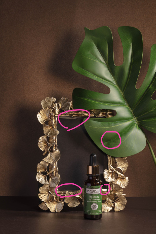
Product- Luxury Botanical Serum

For my final photoshoot, I decided to photo the product I photoed in the formative. As at that time, due to lock down, I don’t have the chance to come to lighting room, the composition and background element is good, but the result is not very ideal to me. Therefore I want to challenge myself to recreate this photoshoot of a botanical serum.
For this Photoshoot I am wanting to explore the idea of bold, luxury style photo, to represent the lifestyle of this product. I noticed that most luxury product photography shoots take place in a studio with a dark backdrop, minimal aesthetic with negative space. By doing so, it allow the product to be the hero in the frame, and avoid the frame and become crowded.
For the set up of my photoshoot, I used two hard lighting. One I lift it high above the background paper to lighten up the whole scene, and the other is lower for brighten the product and creates a meaningful blurry shadow on the background. I then experimented with different angles and compositions of camera and light until I was happy with the outcome. I also manipulate the image through staging and cropping in an aesthetical way that convey a bold and luxury felling, as well as a guide for the eye to draw it towards the product.
I also put a black card into the frame, as it’s originally grey, while with black, it can blend well withe the background color, as well as make product stands out more. The best final composition that I satisfied with- The product stands in the front near to the camera with frame behind it. The product is slightly off center while the frame is right at the center of the frame, this create an imbalanced aesthetic, which avoid all things being dull that set in center of frame. The leaf is used to reflect the botanical ingrediants of the serum. It set high above the frame and cropped in a way that it didn’t take away the attention of the product and frame. With it set in a high level, it extent the form of the product, and make it seems bold, confident. Leaving negative space on the right create room for breathing and enhance unbalance aesthetic, that creates more depth and interest to the photo.


0 notes
Text
photoshoot6
Lighting Room
10/18
1:00- 4:00
product- luxury body cream

In the previous photoshoot, i photoed the body cream to create a calm tone, while this time, I want to create a luxury feeling. As the purple shiny packaging looks luxury and i want to challenge myself to manipulate the meaning through visually conveying different emotion and feeling with the same product.
I chose a dark brown paper background with golden glitter on it because I noticed some luxury product photography mostly use a darker background, and a dark background can make my purple products stand out. The golden glitter on the paper also reflect with the glitter on the packaging. I use three golden vase in different sizes to add a luxury feel to the product.
the reflection of golden van on the shiny paper background creates a luxury feeling, so When shooting it tried to manipulate the images by taking them at a higher angle to catch the reflection, also it looks like a significant figure under a spotlight make the product stands out. I also tried to use soft lighting and reflector to hide bumps and soften the press mark on the packaging. I also use staging and cropping technique to tried different arrangement to make the products seems like surrounded by the luxury golden vase, made sure to frame my product in a way that it remains as a hero in the image.


This photoshoot wasn’t as successful as the others as it’s challenging to get the reflection I want, but at the same time, make the press mark less obvious, and maintaining a soft even lighting on the vase. And also compares to other photos, this does not share with similar style, as it’s crowded without lots of breathing room, and it’s a high angle. In order to get a better final results, I decided to do one more photoshoot.
0 notes
Text
Photoshoot 5
Lighting room
10/14
1:00pm- 4:00pm

For my third photoshoot, I choose the soft tube of body cream as my object. The reason I chose it is because I think the purple shiny glitter packaging can look beautiful and luxury in the photograph, and also because it’s a quite different form compares with the previous cleanser, and I want to challenge myself experience different texture and product.
Following two photos are my research and inspiration for this photoshoot.
On this photoshoot, I’m wanting to explore the idea of a calm, peaceful quiet product photography style. Like these two research photos, using earthy, neutral tone, with some natural object like rock and wood, leaf. Placing products in the frame with plenty negative space, that make the spatial look wide, and the products seems even more quiet.
Research and Inspiration

Co, Maki. Skincare product, digital photography, Vietnam, Accessed oct. 2020.
http://www.maki.vn/luxury-perfume.

Co, Maki. Perfume, digital photography, Vietnam, Accessed oct. 2020.
http://www.maki.vn/luxury-perfume.
Plan before shooting
Object: Product, Blueberry, Hibiscus Flower, rock, color background
The back background and bottom background will be the same color, grey. As grey can work well to create a calm and peaceful emotion I want, and it can make the purple product stands out. Through the lighting, The back background will be darker than the bottom one with shadow blur and grow from the side, it also enhance the quiet and lonely emotion I want.

Difficulties
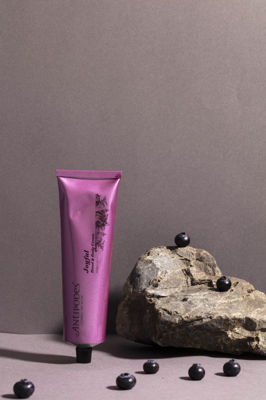
One of the problem I experienced was that I found the Hibiscus Flower at my house in northcote, but during the way I bring it to school, the flower will turn dark and looks dying. To have a fresh flower is very important, as it make the viwer feel like the product smells like the fresh bloom flower. I didn’t find ways to overcome this, as I couldn’t found this type of flower near uni. So at the end, I choose the image without flower, only include the berry. I’m not too worry about this, as this is also a way of manipulate the meaning of the product, make it’s original scent looks like the other through visual element setting.
Another problem: Before I photoshoot, I didn’t realize the packaging of this product is so difficult to keep. The soft tube packaging is very easy to press, and it will remain a press mark on it. And the mark is very obvious, as the packaging is shiny and glitter texture. So after I damage by accidence, I bought a new one for my photoshoot. I didn’t change to another product as I really want to experience with it. However at the day when shooting, I found that there is still a little press mark on it, so the whole photoshooting process, I working hard to manipulate it through lighting and reflector to try to soften the press mark and fix this problem, but at the same time, keep my initial plan for shooting a calm emotional style photo.
Process


At first i was using one small soft box light with the height about at the level of the product and coming from the side. However the result is not ideal (following photo). As the position and perspective of the light is too low that it amplify imperfection of the packaging. And the lighting is not bright enough for lightening the whole scene.
Therefore, i replaced the soft box light with a hard light. And lifting it up to high above the background paper. By doing so I can brighten up the whole image and get the brightness I want but not over exaggerate the imperfection on the packaging. In order to soften the hard light and shadow created by the hard light, I use a huge soft box light in front of the product. The brighteness of the soft box is dropped to very low, as I only want it to soften the product without effect the overall brightness.
On the other hand, I used two reflector. A white pollylon foam board at the front bottom to reflect light to the product. By doing so, it allows me to soften the hard edges on the packaging created by press mark. I also use a grey color paper on the side of the product to soften the dark edge. I’ve tried using white foam board, white paper, but the product is overexpose. So grey is a good color that reflect small amount of light I need.

//The setting of two lights- hard light control overall brightness- 3.8. Soft box light set to really low to only soften the product.//

//Failure- using on smaller soft box light//

//Replace soft box light with hard light to brighten up the whole scene.//

//Add huge soft box light at the front to soften,make press mark pump up//

//Add two reflectors//
After fixing the light, I play around with different staging to get the calm, elegant, quiet style i want.


0 notes
Text
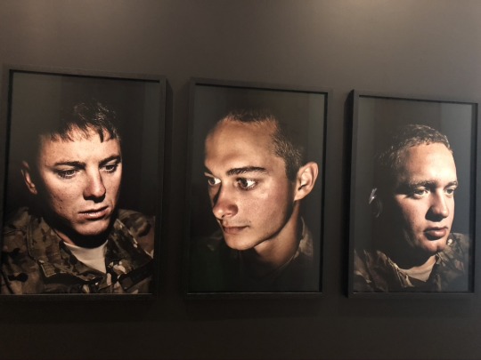
Photography exibition
Photos that stands out for me in the exibition.


0 notes
Text
Photoshoot 4

The product For my 2 Photoshoot is a lemon cleanser. I want to use it as my object, as I really like this product and it’s scent. I always feel refreshing and energetic with the lemon scent , and it make my skin bright and shine after using it in the morning.
I am wanting to explore to convey my experience of using this product, and the feeling I get through this photoshoot. Cause I often use it in the morning, but I also want to play around and convey with different time using this product through photograph. Beside conveying a sence of refreshing, I also want to manipulate the image, and try to convey other emotion and feeling to the audiance, as they might experience using this cleanser.
I was inspired by my previous research of product photography. So I want to aim for minimal, leaving negative space, and conveying the lifestyle product photography. This shot took me 4 hours in the lighting room.
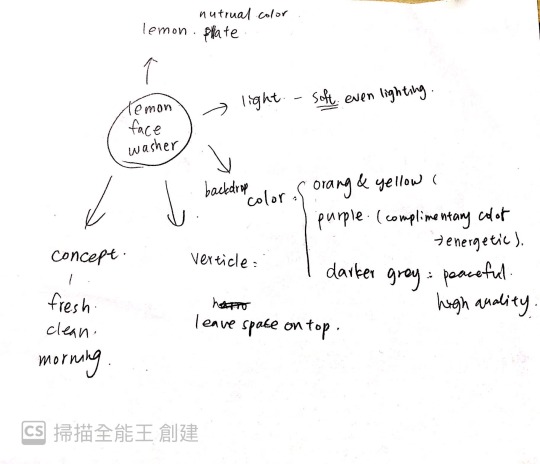
Plan & Idea before the shot
Context- Lemon facial wash
Form- yellow, orange background, the products are small in the photo, leaving negative space
Process- how does it make? technical quality
Concept (& emotion)- Summer, morning, refreshing, make skin radiant, playful

Process
The white table is used as the base for placing the products, and a glass plate is clamped with a clip as the background. Color papers are only glued on with tape.The final photos is shot by using two different effects of light, one is softer, and the other is harder.
youtube
Selected photos
At first, I shoot according to my plan, and then I started to play around with different arrangement, angle, lighting, etc to try using different manipulate technique to convey different emotion.
//selected photo 1

//selected photo 2

This photo is my favorite one from this photoshoot, cause i like the emotion
From the 1 photo to 2 photo, I change the lighting, lighting perspective, staging, camera angle to create depth, and add emotion into the photo.
The 1 photo is clean and fresh whereas the 2 convey a moody, and peaceful, calm feeling, and the product seems lonely.
In 1 photo I use light with soft diffuser on it, while 2 photo I change to a harder light without diffuser. A hard lighting creates contrast, and make background color darker and gradient, it add more emotion into it compares to the solid vibrant color. Also because I want 2 photo feel like sunset time, as sunset often associated with deeper emotion like lonely, moody calm feeling compares to daytime. And the orange and yellow gradient fulfil that.
I change the position of light, to create a big dark, blur shadow on the wall. This add emotions to the products, which make it seems lonely. Having shadow on left also creates unbalance, and thus break the harmonious feeling and add more story to the product itself.
Zooming out the camera to make the product smaller, to contrast with lots of negative space around the product. It make the product in some points seems insignificant and powerless. Also I place it slightly to the left to create more space for the shadow, and enhance the unbalance composition.
//selected photo 3

Different from the previous photos, which looks calm, this photo convey a playful tone.
Perspective and cropping- a close up with high angel shot, will make the photo look casual, informal, and playful.
Staging- lemon on top of the product (playful staging), blue plate (contrast color with orange, to create interest and energy to the photo)
//selected photo 4

This photo I try to focus on the lemon itself. I use a close up shot with slightly high angle, play around with the placement of the lemon. By doing so, tension is created which make the viewer feels strange and uncomfortable as the lemon is going to fall down. The concept I attempt to convey is a abnormal and playful.
//selected photo 5

This is a extreme close up of the tension lemon. It is a strange angle to show the lemon like this. And placing the lemon to the edge of the bottle, it creates more tension to the image.
0 notes
Text
Photoshoot 3 experimental photoshoot in lighting room.

After lock down, I can finally come to lighting room. This photoshoot I’m focus on experience how to use the facilities in the lighting room, and understand important things in product photography.
I learned many things from Cornelius today. There are basically two types of product photography. One is clear cut and the other is a square format. During the process, I learned to use different lighting, and manipulate the images through lighting, reflector, staging.
0 notes
Text
Idea for formative
In T4, i will focus on image making. I will not use any of my previous photoshoot for my final, as I want challenge myself to use this opportunity to develop my skill in lighting room.
I want to experience to manipulate different products, to create different emotion, tone, and style.
I want to focus on the kind of product photography that present the lifestyle of the products. Life style product photography mostly appear in the magazine. It focus on present the aesthetic style to promote the product.
0 notes
Text
How photoshoot related to readings
Readings are heart of the paper, which teach us how to manipulate image through a culture lens.
In the first reading we discussed about what’s authentic and what’s not authentic. Through different technique, we can make the representation look authentic to a reality or past event, we can also actively create a event or scene through our manipulation.
In product photography, The key to selling a product is selling the idea of the product. In my experiment photograph, I tried to use different element, staging, perspective, cropping to manipulate the meaning behind the product.
To relate to the second reading, we talked about the different types of photo aesthetic in instagram. Most of the content focus on the design photos, which is the most commonly photo in the reading. Therefore, I tried to reflect that through the composition of the frame. Such as in design photo, it is often to see objects like hand holding coffe cup etc that are being cropped on the edge to reflect a flat scene. And the shampoo photo, and the serum with leaf reflected that aesthetic.
0 notes