Don't wanna be here? Send us removal request.
Statistics
We looked inside some of the posts by chloeunit6 and here's what we found interesting.
Average Info
Notes Per Post
0
Likes Per Post
0
Reblog Per Post
0
Reply Per Post
0
Time Between Posts
37 seconds
Number of Posts By Type
Text
17
Last Seen Tumblr Blogs


Fun Fact
In February 2021, Tumblr had 518.6 million blog accounts.
Text
SketchBook flip through (Slowed):
Here is my slowed down version of my full sketchbook tour. This video is shown to show and highlight the details of my work with my experimentation, layout designs and my illustrations. This sketchbook shows my journey through my project to form my collection "Blossoming into Japan". I started my project with an introduction page, mind map of ideas to help me start my initial ideas and inspiration, my research pages where I discovered various of themes and topics related around Japan and incorporating textile pieces made from my research, I moved onto exploring and creating my own original prints, I researched into Japanese illustrators to help me develop my own illustration style to create my fashion illustration designs inspired by my research and experimentation, I moved on to created my own illustration style with developing my own fashion illustration faces and poses to help start my designs, I created a mood board to show my collection inspiration which is a collection based of my theme of Japan in a Harajuku Streetwear style, it continues to show my initial designs then to my final eight ideas for my design boards including my specification drawings, it shows my colour palette to build my collection together closely followed by my fabric choice, to my media experimentation for my final designs including various medias, to my technical file to support my garment the pink petal, it nearly finished to show my photoshoot planning mood board to my photoshoot results and to finish with my post cards to finalise my sketchbook journey.
0 notes
Text
Full Sketchbook Flip Through:
youtube
Here is a quick flip through of my sketchbook which is uploaded on my YouTube channel to show a fast-paced preview of my sketchbook journey showing how I built my collection "Blossoming into Japan". I wanted to show a sped-up version to show how much development and journey I did as I had two sketchbooks full of work. I have slowed down version of my sketchbook on the post above.
0 notes
Text
My Action Plan:


During my FMP, I had my action plan to help me plan out and set tasks as I only have twelve weeks to start and finish my project. I started writing out the tasks I wanted to achieve before my project started to help me go through the weeks to keep me on track. I used this every day in my project, and it helped keep me focused on what I wanted to achieve in a set deadline. This helped with constructing my garment as I wanted a few weeks to focus on my garment with my textiles and making sure my dress was made of high quality and not rushing to finish it leaving it in poor standard. I will continue to use this system in my future projects as it helps me to keep track on what I have finished and what I need to finish or make a start on.
0 notes
Text
Press Release:


For my press release I described my collection "Blossoming into Japan" to show how my collection was designed for giving my collection a story and it explains why I have designed my collection. In the second paragraph I have explained one of my garments in detail which is my final garment I constructed the pink petal. I wanted a description for people who have not viewed my garment to envision it before seeing it. I think my press release flows nicely and collects my Blossoming into Japan collection. To finish my press release I have added my logo, and my social media links. Before finalising my press release, I had made a draft and a mind map to include words and description I wanted to include. I finished my last paragraph with three hashtags to show my press release was finished and it is for immediate release as my collection is for next year spring summer.
0 notes
Text
My Post Card:


For my FMP, I finalise my work with an exhibition to show my result of my journey. Therefore, I wanted to create a piece to support my work at my exhibition. I made a post card using my garment description as I have never made one of these before and I wanted to try something new to present my work. I used inspiration from seeing these post cards at university with third years final catwalk shows. These post cards included a picture of their favourite garment and a small but detailed description of their garment. I had taken a few of these home after viewing some of their work on the runway. After seeing these I wanted to try and create one of these for my final garment for my exhibition. I went on PowerPoint to create a base of a rectangle and added a border and Sakura flowers (from Canva) to match my collection theme. I used the same colour theme and tried to match my design boards. I added my favourite photo from my photoshoot and added this in the middle of my post card. For the back I used the same border and added my garment description and my dress name. For my first time creating and designing one of these post cards, I was pleasantly surprised with the result. One area I was worried about was printing it out with one being larger or smaller than the other to avoid this I copied the same rectangle design for the front of the post card. I shall place this on the wall of my exhibition next to my dress. I have placed another copy in my sketchbook as well.
0 notes
Text
Garment Description:
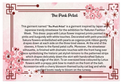
"The Pink Petal"
This garment named "The Pink Petal" is a garment inspired by Japan and Japanese trendy streetwear for the exhibition for Rakuten Fashion Week. This dress pops with Lotus flower inspired prints painted in pinks and burgundy with white touches. Decorated with petit precious Sakura flowers embellished with pearls as organza pink ribbon gently drapes down at each side on the three tired sleeve. At the end of the sleeves, it flows to the flared petal cuffs. Moreover, the streetwear silhouette, is finished with dramatic touches with the front hang over piece symbolizing the historic yet stylish kimon to the patterned strips which drapes delicately down the skirt with handcrafted Sakura flowers on the edge of the skirt. To an oversized bow coloured by Lotus flowers with a preppy pink bow to match on the front of the belt. Accoriissed with a cherry blossom themed lucky cat bag and white quilted boots ready to bloom on the runway.
0 notes
Text
Updated Japan Themed Mood Board:

To support my collection "Blossoming into Japan" I created a new mood board to show my inspiration for my collection. I had created an initial board of ideas, but this mood board helped me show my research and experimentation for the start of my project. I have used some of my research images onto this board but updated some areas. I added my colour palette, my illustration style, my Japanese Streetwear looks inspiration, my final original print and some of my textile pieces. I believe the fresh look of my mood board completes the look and is like my result for my final design boards and my collection. It shows my project in one idea I am happy with my result from start to finish.
0 notes
Text
Updated Customer Mood Board:
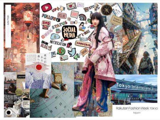
Customer synopsis:
My customer is a Japanese and American full-time senior journalist for Fashion United, but a part time social media influencer showing her lifestyle and gives advice to younger ambitious to be journalists. She posts regular behind-the-scenes from her jobs and her life behind the camera with posts such as a day in the life of. She is well known worldwide for becoming a young successful fashion journalist and has pre-booked events to write about from around the world. Her hobbies include cooking, writing, blogging, traveling with her friends, shopping, and using social media to scroll through the latest trends. To start her career, she graduated from London College of Fashion where she had an opportunity to work for Fashion United from her final piece in her exhibition. This leads to her journalist role at Fashion United where she works in New York and travels to write about her favorite subject street ware at only the age of twenty-eight years old. She has previously attended fashion weeks and shows from Paris, London, Milan and more. Her next fashion week is in Rakuten Fashion Week for the Autumm Winter 2024. Consequently, to her hiring me to design a collection of street wear fashion inspired by Japan for her next job interviewing and writing about Tokyo fashion week.
0 notes
Text
Design Boards:


For my final design boards, I wanted a design to match my concept of my street wear looks with a dramatic effect but still intertwine with my collection. At first, I started with using pages from my sketchbook, my prints, using my fabrics, ribbon, my samples, and buttons. I photocopied my work to experiment with layout and proportion. I tried assorted colour cards however it did not make my collection flow together as it was too much of a colour block. I decided to keep my print for the background for all my boards as it kept a distinctive look and kept my designs in a collection. I did decide to use burgundy and white card for the border as these colours are used in my colour palette and made a simple pop to reflect the print. For each board I wanted to keep them layered to be like my deigns so I made each of my boards uniquely different. I did keep some similar features such as my fabric flowers and buttons as it gave me the final addition I wanted. I finished off each board with its specification drawing to support each garment design. I am proud of my designs, and I think it will look perfect for my exhibition stand as my ideas and theme intricately link together from start to finish. I think each design corresponds to each of my fashion illustrations nicely as it gives my ideas of the Harajuku Streetwear style but still the traditional Japanese geisha look.
0 notes
Text
Design Board Experimentation:


This is my continuation of my design board experimentation. I had kept the same idea from before but making some slight changes as I had innovative ideas to develop before deciding on my result of my design boards. This time I thought to introduce something new from using my garment as inspiration. I decided to start using ribbons as an idea and cutting out pieces of my pattern and prints to add to my fabric flowers. I used the ribbon as a strip similar to card to accent the pattern background. I found a cream with golden sparkle thick ribbon and created a small ribbon for the corner of the page to link my oversized print back bow and my petit pink bow on my garment onto my boards. From the bow I thought instead of leaving the middle plain I thought to add a final addition of adding another fabric bow in the middle to add a small touch. From these final ideas and experimentation with layouts and background, I was ready for my final design boards. I found this process helpful for me to create some key ideas and understanding what to keep or change until my fashion illustrations was completed in my board. I shall use my fabric flowers, the buttons, and the faded-out print as a background for my final design boards. I will support my illustrations with specification drawings. However, I want divergent backgrounds for each of my design in my collection as they are all uniquely diverse but like represent my ideas. I shall have similarities but have them still be original and individual to display my final collection for "Blossoming into Japan".
0 notes
Text
Design Board Experimentation:


Before finalising my design boards, I wanted to experiment with a couple of ideas to highlight my full potential and have a finishing result to end my "Blossoming into Japan" collection. I started off by photocopying prints, drawings, samples, and fabrics as this was a main idea to support my illustrations. I had even photocopied some of my backgrounds in the different coloured inks on the printer like my hand drawn prints from before to see how I could adapt the result for the better or worse. My idea was to closely match the idea of my designs which is adding layers and a 3D effect by adding texture and decoration but not creating a messy look. I made strips of paper and used tracing paper to dull out my print as it was very bold with my fashion illustrations on top of them. From this experimentation, I did not want to lose my fashion illustration in the background, so I had to produce several solutions therefore it was the right decision to experiment with the layout and colour. I used card as a border for each one I did try silver, but it did not leave the pop I wanted to tone down the print background. I used white and burgundy coloured card instead. After this I started to use my other papers to see different results to see features I liked. For my final design boards, I know I wanted each board to have similar features, but all have different layouts and background. From this I started to add some texture and 3D elements to my boards such as my fabric flowers which I had made for my decorative technique for my dress and using buttons as these was a simple but effective finish to my boards. I collect buttons with a range of sizes but the same colours to my colour palette. From these I thought to include a button onto each flower compared my pearls which I used on my dress to keep them similar but uniquely different. For each of my design boards I shall include my fashion illustration and my specification drawings to support each design. I shall continue to develop some more design ideas and then choose my final ideas to finish my fashion illustrations to display my collection "Blossoming into Japan".
0 notes
Text
Final Media Application:
After my media experimentation and understanding my colour palette for my collection I began to work on my final eight design fashion illustrations. From my media experimentation, I knew my final media was using Pro markers, gel pens, pencil, and paint. I wanted to use the colours from my media experimentation on this specific design but make slight subtle changes. For example, in my media experimentations I used yellow but instead I used gold as it has the original colours from my inspiration for this design. As this design was inspired by Kintsugi a tradition Japanese technique to fix broken pottery. I wanted to include this in my final media. I wanted to use the cloudy grey blue colour as it represented the blue pottery well. I quite like the greys to blues, but I wanted to accent the design with touch ups and detail of gold. For this I used a small brush and a gold gel pen to highlight. For each of my final designs adding the media was a lengthy process due the prints and textile pieces I wanted to recreate. I wanted a clean finish as I used inspiration from traditional Japanese Geisha illustrations but in a trendy Harajuku twist. For the hair and faces, I used these two ideas and produced the solution. I kept the faces quite plain but highlighting their eyes with eye shadow and their lips as I used inspiration from my research into Japanese Streetwear makeup which is quite minimalistic but having blush, lip colour which consisted of pale pinks and reds and with their eyes with soft eyeshadow being a key feature. For the hair I continued to use paint and Pro markers and added the detail to represent the traditional hairstyle from the geisha illustrations. I used a small brush to add dots to recreate pearls, strokes for ribbons and painting small flowers for the clips. In total it took me five days to complete all these fashion illustrations as I wanted them to be realistic and detailed. I am pleased with the colours and overall look to my designs. They give a strong result for my Japan inspired collection "Blossoming into Japan". My next task is to create my design board to support my illustrations after my hours to finish them.
0 notes
Text
Final Media Application:
On this specific design I have used the same media for my final media choice which is Pro markers, gel pens, pencil, and paint. From my media experimentation, for this design I had made quite a few changes as from my media design, I had used collage with fabrics, coloured pencils, gems, and tissue paper. Additionally, I wanted a distinctive look for this design instead of using blues which I used in my media experimentations on this design. I went for a pink and red tones for this design. At first, I was unsure how this would work with the Lily pads as this design is inspired by the lotus flower and Kyo fish. I had left my Lily Pads until last and decided to paint them red which was surprisingly complimented the skirt from the top. I wanted to capture the movement in the skirt as it was a ra ra skirt design, so I began to add different tones and mixture of my paint pallet and added highlights with using my white paint to add shine to add to the effect. But for each of my final designs adding the media was a lengthy process due the prints and textile pieces I wanted to recreate. I wanted a clean finish as I used inspiration from traditional Japanese Geisha illustrations but in a trendy Harajuku twist. For the hair and faces, I used these two ideas and produced the solution. I kept the faces quite plain but highlighting their eyes with eye shadow and their lips as I used inspiration from my research into Japanese Streetwear makeup which is quite minimalistic but having blush, lip colour which consisted of pale pinks and reds and with their eyes with soft eyeshadow being a key feature. For the hair I continued to use paint and Pro markers and added the detail to represent the traditional hairstyle from the geisha illustrations. I made four of my hair coloured black and the other four brown. Then I continued to use a small brush to add dots to recreate pearls, strokes for ribbons and painting small flowers for the clips. In total it took me five days to complete all these fashion illustrations as I wanted them to be realistic and detailed. I am pleased with the colours and overall look to my designs. They give a strong result for my Japan inspired collection "Blossoming into Japan". My next task is to create my design board to support my illustrations after my hours to finish them.
0 notes
Text
Final Media Application:
On this specific design I have used the same media for my final media choice which is Pro markers, gel pens, pencil, and paint. From my design I was unsure how I was going to react to the result as this design is inspired by Samurai armour and in the original image it was coloured in bronze, browns and touches of gold. However, in my colour palette for my collection "Blossoming into Japan" I had chosen a range of blues, greys, gold, pinks, reds, and burgundy as these was used in quite a lot of my research they were seen in a lot of my ideas and inspirations for my initial design creations. I knew from my media experimentation, that my grey and blue palette would present a better finished look compared to if I went for the pink finish. I still wanted to use the original concept from the image which is adding touches of gold to the detail which is shown in the video above. I add gold paint to the flowers, button, and textile pieces. I was not sure how it would look with the pleated trousers as I thought it might end up looking like jeans but with my own development of my illustration style with the media of paint. It worked quite well, and I was pleased with the overall look as the greys and blues were complimented by the golds. I am glad that I did not try and use the bronze tones as it would have looked unusual and not be a part of my collection. This is because I had unique design for each design board, but I wanted the look of my fashion illustrations to work together with looking like help me present my collection. Therefore, for each of my final designs adding the media was a lengthy process due the prints and textile pieces I wanted to recreate. I wanted a clean finish as I used inspiration from traditional Japanese Geisha illustrations but in a trendy Harajuku twist. For the hair and faces, I used these two ideas and produced the solution. I kept the faces quite plain but highlighting their eyes with eye shadow and their lips as I used inspiration from my research into Japanese Streetwear makeup which is quite minimalistic but having blush, lip colour which consisted of pale pinks and reds and with their eyes with soft eyeshadow being a key feature. For the hair I continued to use paint and Pro markers and added the detail to represent the traditional hairstyle from the geisha illustrations. I made four of my hair coloured black and the other four brown. Then I continued to use a small brush to add dots to recreate pearls, strokes for ribbons and painting small flowers for the clips. In total it took me five days to complete all these fashion illustrations as I wanted them to be realistic and detailed. I am pleased with the colours and overall look to my designs. They give a strong result for my Japan inspired collection "Blossoming into Japan". My next task is to create my design board to support my illustrations after my hours to finish them.
0 notes
Text
Final Media Application:
On this specific design I have used the same media for my final media choice which is Pro markers, gel pens, pencil, and paint. From my design I was unsure how I was going to react to the result as this design is inspired by Rice fields and in the original image it was coloured in a range of greens but also had some blue with the water in the rice fields. I knew from my media experimentation, that my grey and blue palette would present a better finished look compared to if I went for the pink finish so I could create the rice field water effect. In the video above, it shows my development of trying to capture the blue and grey colours to represent the effect of water. I tried several shades of blues and started to add white and grey to make new shades and tones. Unfortunately, I did not notice my recording stopped whilst I was working on this piece. I started my media using the Pro marker as a base coat and started to add shades of blues using paint. I tried to represent the layers by adding shade to create a tiered skirt. I was surprised by my result as it took several coats and shades, but it gives the effect of water but still looking like fabric. For the textile pieces the Oryza sativa (rice grain plant), I decided to highlight these in silver to stand out but still match my colour palette. For the bodice of the skirt, I continued to use the silver and grey to give it some contrast but for the sleeves I decided on finalising with blue but leaving the rice fields pattern white with a light shading of grey with pencil shading. For the hair on this illustration, I decided to make the colour black as it matched well with the grey and blues. I added small detail to her hair to represent my ideas of the traditional Japanese Geisha look illustration, I used a small brush to add small paint drops of gold and white to recreate pearls. I painted the chopsticks and the tassel in the gold to reflect on the rice plant original colour as well. It did take a lengthy time to complete this design however it looks perfect to display my result for my collection "Blossoming into Japan".
0 notes
Text
Final Media Application:
For this design, I had previously used the same media from my media experimentation which was using the medias of paint, pencil, gel pens and Pro markers. I began to use the same colour from my media experimentation as I did not want to use the pink palette as this design is inspired by Japanese lanterns and temples with the scrolls and print on the layered maxi skirt. However, from the media experimentation, I did not want to use the dark blue acrylic paint as this was too dark and I decided not include this in my design as I wanted to use the colours of silver and blues. Additionally, in my media experimentation the ribbon was coloured int he dark blue acrylic paint however I updated it to silver with working into it with pencil and white paint to add highlights. I used pencil to add shade to my skirt as I wanted to try to show the layers of my skirt. This worked well compared to adding no shading it did take a while as I had added many layers of my chosen medias. For the under skirt, I decided to use black for a contrast as I thought if I added silver, it would lose it effect of the 3D skirt. I used silver for the bodice as I wanted to add a contrast to the skirt as if I did it all in the shades of the blue to the bodice, I thought I would lose the dramatic skirt look I captured before. I did a similar idea for the shoes of this design as well as I had made the shoes in a silver palette. But I decided to have the hair colour as brown to keep the inspiration photo reference as some of the temples which inspired this design had brown shades intertwine them. Overall, I am happy that I did not use the dark blues and kept the grey and blue colour palette from my previous experience in my media experimentation as it keeps my collection and designs like my perfecting touches.
0 notes
Text
Final Media Application:
For my final designs, I had begun my final media applications for my design boards to show my final collection for this project my FMP "Blossoming into Japan". After using my media experimentation, understanding my colour palette and my fabric choice, I started in my final media. This design shown in the video is my chosen design for my garment named the "Pink Petal" from this I used my cjosen media and used the colours from my garment and applied this using my media of paints and Pro markers. It was quite challenging to trt to represent the right colours to closely match my dress I constructed with the burgundy cotton as I had to make my own custom colour with paint and using the closely matched Pro marker shade. I used a red and purple and white to create the colour to match my dress. I found trying to represnt the satin hard for my fashion illustration as it was white I tried using white and light grey to represent the shine. After a few attempts on the side of my page I finally chose my correct colour. It was difficult to colour in my print as it was small therfore I used a small brush and painted in the small details I add some highlights with a gel pen. After some time, my fashion illustration closely matched match my fabric and final dress whcih I was quite surprised from as it was challenging to recreate the right shade. For the shoes I decided to colour them grey but make the bows of the shoes light pink to match my front bow on my belt. For my hair I decided to colour it black as pink and black was contrast instead of brunette hair. I want to have some detail on the hair and so I made a flower clip and two chopsticks in the hair with gold and pinks.I am proud of my final look with making my illustration looked similar to my final dress I constructed but also giving the detail with the prints and the decorative technique on the dress. I tried to make my dress habe a realistic finish with capturing movement in the fabric with shading and highlights. I shall cut all of my illustrations out and create design boards to showcase these after my hard work and determination.
0 notes