
Statistics
We looked inside some of the posts by chrisdaleixd and here's what we found interesting.
Average Info
Notes Per Post
0
Likes Per Post
0
Reblog Per Post
0
Reply Per Post
0
Time Between Posts
2 days
Number of Posts By Type
Text
15
Video
2
Last Seen Tumblr Blogs


Fun Fact
Tumblr’s reach among the 26-to-35-year-olds in the US is 11%.
Text
Moving Forward with portfolio site and elements
Portfolio site:
Moving on with my portfolio site I will add more case studies to it so that I have a good range of work to show potential employers. I will also add a link too my digital project website so that I can market both my sites in the same place and maybe get work of sales off each respective site.
Atomic app:
Moving on with my atomic app I could build it out more and start adding more elements to it. I have also been toying with the idea of designing my app to work on a iPad or Mac to see how it would work on a bigger device and I know my app was created for convenience but some people do travel with these devices and when they get to uni they would use a MAC or iPad there.
0 notes
Text
IXD301 presentation
Below is a link to my 301 presentation on dropbox
301 presentation
0 notes
Text
Project links
Here are the links to my two projects for IXD301
Portfolio Site:
cdaledesign
Elements link:
Atomic app
0 notes
Text
Style Guide
This is my style for my atomic app. It takes you through my logo, the font and typography hierarchy, all the colours I use, all the images & assets, the icons that I created and then all the sizes of boxes that I used within the elements pages.


0 notes
Video
tumblr
Elements project - Apple Watch recording
0 notes
Video
tumblr
Elements project - iPhone prototype video
0 notes
Text
Elements Project - watch Mockups
These are what the screens on my apple watch app looks like the layout is much the same as it is on the phone only it is smaller to make it fit the watch. Like I said on my sketches I have made the cards smaller and have made the entire card clickable so the user can access the element easily.
For the elements pages I put the content in a list form so that they can still be read easily. I did not add the login and signup page to the watch app cause from my experience you use the watch app after you create your account on an iPhone app so the watch app just has a tap to enter button.

0 notes
Text
Usability Questionnaire
Below is a usability questionnaire that I created and sent to a friend who is studying chemistry at Uni. After using the app I got him to fill out the form so I could get some feedback on how easy my app is to use, to navigate and to understand. He also said he found the brand and name was good and that he would definitely use it again and would like to see it developed further with more of the elements of the periodic table.
After looking at the results I found that my app was easy to use, easy to understand and it was consistent throughout each page and that would be useful to anyone who is currently studying chemistry at uni.

0 notes
Text
Elements Project - final mockup
These are my final screens of my elements app. Not much has changed from the previous mockups. I decided to get rid of the search bar as I thought it was not really needed as I have the navigation button along the top of the home page. I also decided to get rid of the icons at the top of each section on my elements pages and just have them at the top to serve as a navigation bar to that page, each icon is a link that will take the user to the specific section on the page.
I also added an up arrow that when the user taps on it, it will take them to the top of the page so they can go back of choose the different section they want, instead of having to scroll up or down. I also changed the font and wait of the titles in each box to Catalpa extrabold so that it stands out and the user can see the difference to the title and to the body copy.


0 notes
Text
Elements project - updated sitemap
This is an updated sitemap for my elements app

0 notes
Text
Elements project - Mockups 2
After receiving feedback on my first designs, I took that feedback on board and after I created a few new sketches and then went back to Figma and created some new mockups. I decided that I wanted to add in a login and sign up section so users could create an account and track their progress.
The sign up screen asks them to create a username, add and email and then a password, The login page just asks them to use either their username or email and then their set password to login. I added in a welcome page that the users will see after they login to the app, it tells about the app and what they can do within it. The cards on the home screen are much the same.
On the element page I have decided to show the content in separate boxes in each of the categories and the boxes will be a different colour for each section, I also created different icons for each section and added them to the top of each section. At the bottom of each element page i have added in left and right arrows so the user can click to the next element without having to go back to the top of the page, there is also little circles at the bottom so users can see what page they are on.


0 notes
Text
Elements Project - Watch sketches
After I had finished creating my mockups of the iPhone version of my watch I decided to go back and quickly sketch out the new logo and home page to see how it would fit in the Apple Watch, I redrew the home page for the watch and made the cards smaller so that they fit the watch and look aesthetically pleasing and instead of having an arrow to click I will create the entire card as being clickable cause the arrows where too small for the watch face.
For the elements pages I have decided that on the watch instead of having the content in a grid I will have it in a list cause the grid would make the content too small and unreadable where as if I do it in a list I can make it big enough so that it can still be read.


0 notes
Text
Where to go next
Over the past 12 weeks I have enjoyed creating these posters from thinking of designs, to sketching them and the creating them and tweaking them digitally on illustrator to get them perfect. I enjoyed researching my target market and researching other minimalistic posters online to see who may buy my posters and what other people where selling. When I created my first posters i did not think that they would turn out that good but now I am happy with the way they turned out as they are of good quality and standard. A I have seen many movies and there are many movies out there and ones yet to be released I will not be short of posters that I could create in the future. I had fun creating these posters and will definitely do more in the future. I have plans to create more posters in the future for the variety of different genres but this will depend on how successful my product is.
0 notes
Text
Big Screen Visuals Website
Click here to see my landen site and where I am selling my posters
0 notes
Text
Big Screen Visuals sitemap
This is the site map I created for my promotional site so I could see and understand how users see and navigate through my website. The red box is my home page the blue poster list is the poster list page and the blue purchase button is the link to my gumroad page where customers can buy posters. As I only have two pages in my website it as a very small sit map. This was helpful too see what pages I needed and how they would link together.

0 notes
Text
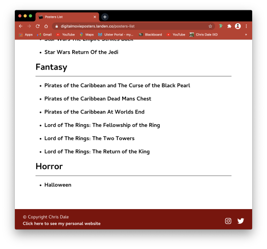
Big screen Visuals final site
I decided to add another page to my website that I called poster list where I added a list of all the different posters I have made, I categorised them into the different genres action, adventure, comedy, sci-fi, fantasy and horror. I will update this as I go on and start making more posters.
My promotional site is now done and I think it is good as it gives users the information they need to know about the posters and allows them to click a link that will take them to my Gumroad page where they can purchase my posters.


0 notes
Text
Elements project - wireframes 2
After receiving feedback and coming up with new ideas of ways to show the content. I have designed a welcome screen that users will see once they tap on the enter button. I have also decided to display my home screen using cards to show off what the element is. In the element page itself I have decided that each bit of content will be shown inside a coloured box and each box will be a different colour depending on what section it is. I think this is a better way to show the content as it will be easier and more aesthically pleasing for the reader to read.


0 notes