chrismalcolmhnd1d
Chris Malcolm HND1D
City of Glasgow College HND1D Photography
37 posts
Don't wanna be here? Send us removal request.
Last Seen Blogs

bestdressedchuuya
Welcome to Sintracorp

roachmeatz
yaoimancer

richardleedsint
Richard Leeds International

chat--noirz
✨interests time✨

Text
Welcome to our new HN1 Students class of 2020
Welcome to the NQ class of 2019 and to those of you new to the course! We look forward to meeting you all at our induction event early September!
Like this post and follow your new classmates studying HN1 photography 2020. You may also follow those that have just completed HN1 (class of 2019)
58 notes
·
View notes
Text
Illuminate
Project: Illuminate. #illuminate

Overview
Photography comes from the Greek words phos (“light”), and graphis (“stylus”, “paintbrush”) or graphí, together they mean “drawing with light”.
This project will introduce you to new techniques and help you to have a better understanding of the essential concepts of photography: Light and Time.
Create
Explore how the environment changes at dawn, dusk and night.
What light illuminates the environment around you?
Create images that use artificial light in the environment at dawn, dusk or night. The environment must be illuminated both with existing light and supplementary flash and/or torch light you have added.
Produce
1. Five Relevant research images. Planning and development of your work.
Five methods, pre & post edit, by which the effects of ‘Noise’ can be minimised. 2. Original RAW file & One full res 300ppi, optimised jpg file uploaded to Moodle
submission area.
3. One A3 optimised portfolio Quality print.
4. A minimum 500-word evaluation of the project.
Links to 1 & 2
https://chrismalcolmhnd1d.tumblr.com/post/612214292224327680/digital-noise-in-photography
https://chrismalcolmhnd1d.tumblr.com/post/612214194865045505/dark-frames-reducing-digital-noise
https://chrismalcolmhnd1d.tumblr.com/post/612214165340389376
https://chrismalcolmhnd1d.tumblr.com/post/612213335064297472/digital-noise-removal
https://chrismalcolmhnd1d.tumblr.com/post/612213175807524864/illuminate-research-task
https://chrismalcolmhnd1d.tumblr.com/post/612212920930156544
Shoot 1
I decided to use my back garden for my first shoot, as the sun sets behind cottages at the bottom of my garden and I hoped to capture some detail in the sky and light the shrubs and lamppost in the foreground with a Maglite. The kit I used was a Maglite, Nikon D5600, 18-55mm lens, tripod and remote shutter release. My camera settings were: 30 sec exposure, F5.6 and ISO 100.
Contact sheet from first shoot

Best shots from shoot 1
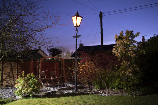

Unfortunately, these images aren’t as sharp as I had hoped and the security light that came on when I was lighting the scene has spilled too much lighting on the left of the frame, so I will re-shoot tonight.
Shoot 2
Contact sheet from shoot 2

Best shots from shoot 2

I think this shot was quite successful and the focus is much better.

Crop of above shot

I used the same setting on the camera to take this shot looking up the garden at the back of the house. I think the warm tones give the shot a kind of 1970′s feel.
Evaluation
We were originally given the brief for this project a few weeks ago so I re-visited the PowerPoint and reference links on My City to refresh my memory. I also extensively researched the best way to capture the images required on the internet and watched many informative videos on You Tube showing the best methods for “painting with light”.
I decided to use an area at the bottom of my garden where the sun sets as this would hopefully create a dramatic backdrop with my intention of illuminating some shrubs and a small tree in the foreground that are currently beginning to bud.
The kit I used was a Nikon D5600, 18-55mm lens, tripod, MAG lite and a shutter remote to avoid any camera shake at the start of the exposure. The settings I used were: F5.8, 30” exposure and an ISO of 100 with my focus set to manual. With such a long exposure, the sunset looked like daytime, so I had to wait for another 20/30 minutes until the sky started to give me the effect I was looking for, a nice graduation in colour along with some detail in the clouds.
On reviewing the shots on the larger screen of my iMac, I noticed the focus wasn’t as sharp as I would have liked so decided to shoot again the following evening. There was also an outside security floodlight that kept getting set off when I was illuminating the shot and this led to excessive light pollution in the left of the frame so I switched off the breaker to this before my second shoot.
The following evening, I set up the same kit with the same settings and experimented by taking a variety of shots at different locations in the garden, however, my original location gave the most pleasing results.
I checked the images in Bridge on my Mac and this time, the focus was perfect and exactly where I wanted it to be and the lighting was much more balanced without the additional light from the security flood. I optimised the best shot in Photoshop by increasing the exposure and clarity a small amount in Camera Raw. I also cropped the image to show only the central area I had illuminated then realised that it had lost the effect I was looking for as this area now didn’t stand out from the darker areas in the garden, so I re-cropped the image a very small amount to crop out a star which was quite distracting.
I have really enjoyed this project and the images it has taught me how to make and is something I would like to try out at a variety of locations with different props once the lockdown has ended. The research for this was also very enjoyable and introduced me to a wide variety of photographers who are very skilled at achieving these kinds of images. I think the next time I take shots like this, I would invest in a brighter torch, perhaps an LED one, which would also let me change the colour temperature of the lamps and light the subjects in both warm and cool light. I think I have been quite successful in my final image as I have conveyed a slightly “other worldly” quality in the image, which is what appealed to me from the images created by the photographers I had researched.
0 notes
Text
Personal Project
Project: Personal Project # Personal

Overview
The Personal Project is an opportunity for you to exercise creative and professional freedom, making the images you really want to make, working in a photographic genre or specialism that you may have always loved or which you have recently discovered. You should be exploring the work of photographers which inspires you and using the time available to develop a project which may produce, potentially, your best images so far.
Create
You will be asked to research, plan, develop then evaluate a photographic project of your choice.
Produce
1. Research and write about three photographers who have worked in a genre, specialism or on a project similar to that which you would like to undertake (approach essay minimum of 750 words)
2. Produce a plan which outlines the concept, timescales and production resources which you expect are needed to make your project (this should include your research from step1)
3. Make a workbook which records the details of how you make your project and importantly your decisions and thought processes throughout its development
4. Make your project, selecting and retouching at least 10 images (you must use time with your project supervisor to discuss and consider the choice of images)
5. Print 10 images to exhibition standard (A3 Minimum size, maximum size as appropriate, discuss with supervisor)
6. Write a report evaluating all parts of your project and your approach to project managing its production and the creative approach you developed
7. Upload 10 Digital full res 300ppi un-flattened PSD files to My City
Where to start?
Stage 1 Workbook
Exercise A good starting point in deciding what your project will be about, is to review the work you have made up to this point in time and perhaps reflect on the successes you have enjoyed and progress you have made in photography? To allow such a review to be discussed with your project supervisor you should create a workbook for “Personal Project”, in which you should post a selection of ten of your best images from your course and personal work to-date. Consider what it is that makes a ‘good’ image: Subject matter? Technique? Colour/ Tone? Atmosphere? Expression? Context? Concept? And so on…When writing your workbook comments consider the following questions: What was successful and why? What did you enjoy and why? What are your strongest images and why? What was your greatest photographic achievement and why? Use the answers to these questions to write about your images. If you already have an idea you are considering for your Personal Project add details of this to your Workbook. Discuss what the subject would be? Which skills and techniques would you need to successfully complete the project and do you have them? Include an example of the kind of images you would want to make? This exercise is about ensuring that you choose a project that you are personally invested in and willing to work on for an extended period of time and which will allow you to make images that you value.
Stage 2 Planning (15% of your final grade)
Your written “Action Plan” is part of the project work which you carry out which contributes directly to your final grade. Please be aware that your plan is a good “starting-off” point and that you will be expected to review and possibly change parts of the plan as your project developsWithin your plan you should explain the following:· A possible market, purpose or context for your images· Detailed timetables for producing the work, outlining each stage· Equipment and resources, you might need (studio access, models, locations)· Research information which supports your initial creative approach (You should research and write about a minimum of three photographers who have shot the same subject you intend to photograph in your approach essay, this can be used in your plan)· Justification of the techniques or approaches you intend to take including at least capture and retouching· A risk assessment for your shoots (Risk assessment document is available from MYCITY)· Reference to the final scale or method of presentation of your printed images. Your “Action Plan “will be submitted in the form of a typed word or pdf file to MYCITY and as a printed document, which includes a cover page showing your class, name and a title for your project. Submission of both versions MUST be made by the deadline given· You must pass the Planning stage before starting your project· You should proceed with making your Personal Project after you have received feedback and the mark awarded for your plan.
Stage 3 Development (70% 0f our final grade)
Please make sure that you attend your feedback session and read your written feedback for your Personal Project plan. Please remember that the plan is just a starting point for your project. If tutor feedback suggests that you need to do more research or consider creative or technical approaches differently, please do continue to research, but also begin experimenting with making images, remember to record everything related to your Personal Project in a workbook which will be submitted with the final images. Include your initial ideas and a copy of your submitted plan to begin with, but be aware that as you work you will discover lots more about your project and will have new ideas about it. This is GOOD!!! Your workbook should contain:· Web research· Sketches/outlining shots you wish to make· Contact sheets and optimised versions of test images/ final shots· Recce images of locations, weather forecasts, maps etc. for location shooting· Details of organisation, shoot schedules, design and styling of your shoots lighting plans, equipment lists etc· Details of any costs incurred· Reference to what you set out to do in your plan and changes of technical or creative direction in relation to these· Final presentation methods (Framing, mounting and layout and size of your images)· Risk assessments for your shoots. You need to record the creative development of your project, including changes of direction or approach to those in your plan, but more importantly record your comments, observations and thoughts at each point in your project. Record any time you devote to working on your project and include copies of any correspondence e-mails, letters etc. with any third parties if applicable. Final presentation: A really important aspect of developing your plan will be how you intend to display the images. Explore various layout options and clearly identify any postproduction techniques employed. Research print options, supplier’s/paper types etc. All work must have been originated specifically for your graded unit and created with-in the period of time given for this project.
Stage 4 Evaluation (15% of your final grade)
Evaluation of and reflection upon your work is an important activity contributing to your growth as a photographer. Stages one, two and three should generate the majority of knowledge and information for the final element of Stage 4. The evaluation structure (500 words minimum):· An outline of the project· An overview of the planning and developing stages of the project· Identification of areas of the action plan that have been modified during the course of the project· Positive aspects of project· Identification of areas that have been successful· Opportunities for improvement (to planning, shooting, retouching, presentation etc)· A conclusion (record your own thoughts and feelings on how this project felt and what the biggest lessons you learned were ) It is important that you consider the following points when creating a conclusion for this evaluation:· What changes and alterations did you have to make during the planning and shooting of the project? Why did these happen?· Did your expectations of what was possible change during the process? What caused this?· Were the logistics of the project easy to manage, did access problems, models not turning up, technical faults etc. hamper you? How did you solve these issues? Why did they come up? Your evaluation must be submitted as a word or pdf file to MYCITY and as a printed copy both by the deadline date set. Printed evaluations must be put into your workbook and have a cover showing your name and class Assessment and Grading. The Personal Project is an opportunity for you to plan and make some of the most successful images you have created so far.
Workbook

Approach Essay
“Seven Deadly Sins”
Lust, Gluttony, Greed, Sloth, Wrath, Envy, Pride
I have decided to base my Personal Project around the theme of the “Seven deadly sins”. I haven’t been able to find any well known professional photographers who have shot images for this, however, I have found a few photographers who have shot around this theme on the internet and the three listed below have all taken different approaches to the theme.
In class, we were asked to pass our workbook containing the first exercise, a self-critique on our ten best shots from our portfolio, to another student who was asked to identify our strongest work. Mine contained a variety of shots including landscapes, still lifes and portraits. Having reviewed my images, my classmate thought my best images were my portraits.
Ricky Davis
Ricky Davis is an American photographer who shoots on both digital and film. For his “Seven deadly sins” series, he shot on film using the same model for all his shots. I like his use of lighting which, along with the images being in black and white, add a real sense of timeless drama to his images.

Pride
I like the idea of writing the “sin” on different parts of the model’s body to help convey which particular sin the photographer is attempting to demonstrate. Without this device, it would be a lot harder to show each sin without the use of different models or props. I’m not convinced this shot really depicts “pride”, however, I think the pose and low-key lighting work really well as an engaging image.

Greed
I feel the comments above are also applicable to this shot, however I can see the photographer has attempted to convey this particular sin (albeit subtly) by including sparkly jewellery on his model.

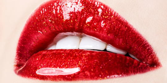
Lust
I think this shot works well in demonstrating its particular sin, with the wording in pin sharp focus on the lips of the model contrasting with the soft focus of the hand on the shoulder which fills the majority of the frame.

Envy
This shot is perhaps too subtle and may have worked better in colour, where the eye could perhaps be green, the colour used to symbolise “envy” however, colour wouldn’t work in the black and white series of images.

Gluttony
Again, another nicely lit and posed shot, however, as the model is really thin, I don’t think this portrays the sin of gluttony at all.
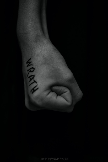
Wrath
I think this shot works well and conveys the sin of wrath by showing the tightly clenched and dramatically lit fist.
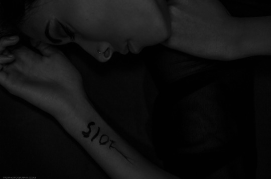
Sloth
I feel this shot is too dark and the model looks as though they may be sleeping, which really doesn’t convey the sin of sloth to me.
Seven x1 - A Seven Deadly Sins Project - Model Lauren Dunham - TRD Photography
Source: http://trdphotography.com/blog/sevenx1sevendeadlysinstrdphotography
Bethany Parkin
Bethany Parkin is currently a third year graphic and communication design student, studying at the University of Leeds. Her passions include many areas within graphic design, marketing, advertising and photography. Presently, she is working as a graphic design intern at a full-service international marketing agency called GMA, before returning to complete her final year at Leeds University.
I like Bethany’s approach to conveying the seven deadly sins through architectural photography, as shown below. Her use of black and white really helps bring out the texture in the buildings, while tying all the images together in the series.

Pride
This is an interesting shot which reasonably conveys the sin of pride and is well composed, with the clock tower occupying the upper right third.

Greed
Again, another reasonably pleasing shot which conveys the sin of greed by showing an ornate bank building. I feel there could have been a more dramatic angle to take this shot to help better convey the message, a much wider angled lens could possibly have helped with this.

Envy
I think this is shot is quite well thought out and the leading lines from the rather run-down building on the right of the frame draws the viewer’s eyes along the rooftops to the more opulent domes that occupy the bottom left lower third of the shot.
Lust
I quite like the graphic shape of the building in contrast to the tower behind it but don’t really see the connection between the hotel and the sin of lust. I think there are other architectural representations that could have worked better.
Gluttony
I think this is possibly too literal and obvious a choice to convey the sin and also think a more interesting angle of the building would have helped, possibly taken from the opposite angle which may have led to some interesting shadows from the strong sunlight.
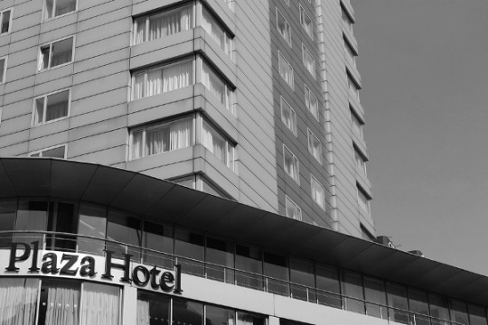
Wrath
I do like the shapes and textures in this image but feel it has been let down a bit by cutting the text off on the left of the frame. It would have perhaps been better if the photographer had been able to find a more graphic symbol, such as a logo, to identify the building.
Sloth
I quite like the visual representation for this sin, however, feel it’s leading lines let the viewer down as they don’t lead to anything and abruptly cut off the left-hand side of the frame. I think as per some of the images above, a wider angled lens would have helped with this.
Source: https://www.behance.net/gallery/33336353/7-Deadly-Sins-Photography-Project
David Sandell
David Sandell is a Swedish photographer, re-toucher and 3D artist.

Gluttony
I like the idea of using still lifes to portray the seven deadly sins and given the current restrictions of COVID 19, think that this may be the best way to move forward and plan for my Personal Project. I had hoped to go down the route of using portraits, however, I just can’t see this being possible without access to a decent sized studio, not to mention the issue around distancing with a model, hair and make-up artist and an assistant. It may also not be possible to take the architectural route either, due to the restrictions.
I really like the simple but effective Rembrandt lighting used in the image above and it conveys a very “painterly” and classical quality.
Source: https://www.flickr.com/photos/kaptenboelja/4328938644/in/photostream/
Dave Nitsche
Dave Nitsche is a professional American photographer who mainly shoots still lifes.
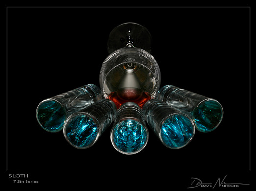
Sloth
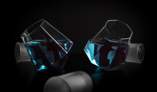
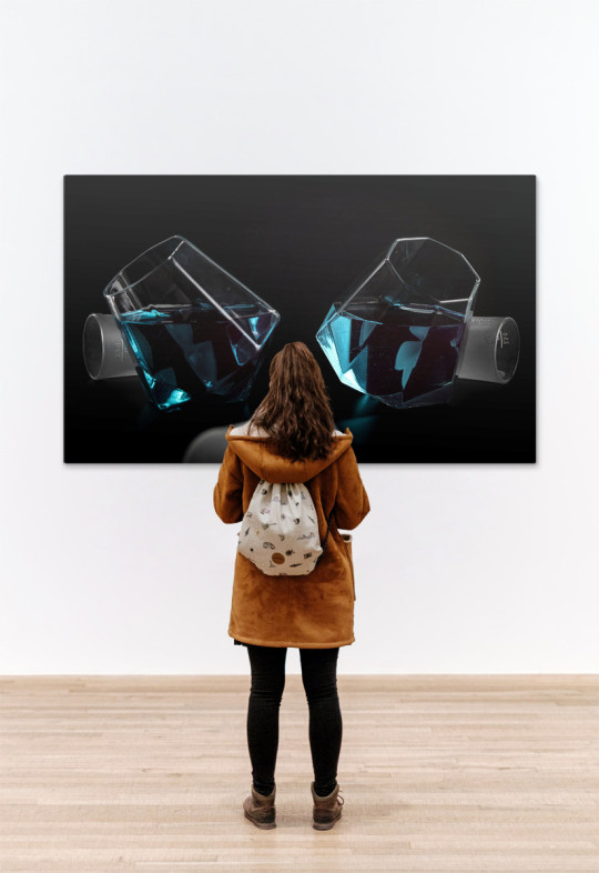
I love the way this shot is lit and think the red liquid in the wine glass at the back helps convey the sin of sloth as it appears to be very slowly and lethargically oozing out towards the blue filled glasses in the fore ground which in turn, are arranged in such a way as to suggest they are slowly approaching the viewer. I think the composition in the shot is really good.

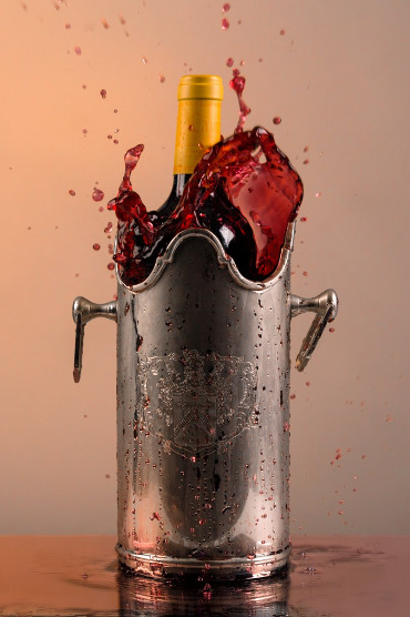
Greed
Again, I really like the lighting and composition in this shot and think it does a good job at conveying its sin, with all the high-ball glasses lining up to be filled up.

Envy
Composition and lighting are great in this shot and the emerald liquid in the glasses conveys the sin really well.

Lust
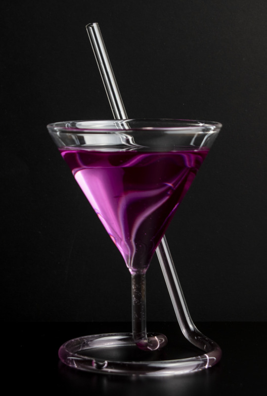
I think this shot works really well in terms of composition, lighting and colour. The back-lit red liquid looks sumptuous and conveys the message perfectly and the glass in the foreground puts the viewer in mind of many clinch scenes from movies over the years. A really strong and successful image.
Source: http://amolife.com/image/art/7-deadly-sins-by-dave-nitsche.html
Feedback
Below is the mark and feedback I received from my lecturer:
13/15 86.67 %
Chris, this is a well thought out submission and as such it has scored well. Where you could have scored further points would have been in offering more specific detail upon the impact of technical and practical approaches on the meaning of your images. David Nitsche’s images are good examples to discuss in this context. The very clean almost metallic tonality of the objects/ subject in each image has been achieved by very specific lighting and background choices? These have allowed the depth and saturation of colours to really sing out and strengthens the denotation of the specific sins, Lust and Envy. You should continue your research into how these effects are achieved in a home studio (lots of big broad soft lights and additional diffusion materials) that said this is a strong project plan and your note upon its' practicality is sensible. Well done.
Further Research
I have researched many different shapes and kinds of glasses and found some I think I can use to subtly convey some of the sins. Some of the designs were too literal and didn’t leave anything for the viewer to work out, such as a whisky glass with a bullet embedded in it, which could symbolise “Wrath”, so I discounted using anything this obvious and instead would like to really concentrate on using colour to portray the emotions of the sins.

Overly literal glass that could portray “Wrath”

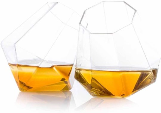
Glasses that could work well for portraying some of the sins.
Research on colours and the messages they convey to the viewer
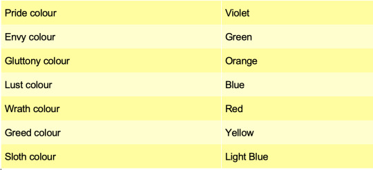
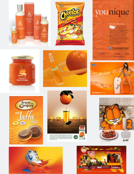
I don’t really agree with all the above chart’s suggestions so have further researched colours and the meanings they convey.

An emotion a character is experiencing can be identified by what colour the character, or whatever they have is or turns in to. A character might turn red when they are angered or embarrassed, yellow when happy, or blue when sad. The background might even change to the same colour the person is. Sometimes, a character will change clothes to reflect what they feeling that particular day. Someone with an Aura Vision might be able to tell what mood another person is in by the colour their aura emits.
The trope is pretty old as the Seven Deadly Sins originally had colors associated with them. Envy is green (yes, that's where the whole Green-Eyed Monster idea came from), Lust is blue (in some languages, a porno is actually called a "blue film" and a horny person is said to have a "blue mind"), Pride is purple (the color of royalty), Wrath is red, Gluttony can be pink or orange, Greed is gold, and Sloth is light blue or cyan.
Here's a list of colours commonly used to identify several emotions:
· Red: Anger, embarrassment, passion, or lust.
· Blue: Shyness, sadness, or calmness.
· Yellow: Cowardice, happiness, or caution.
· Green: Disgust, envy, friendliness, or greed.
· Purple: Pride, fear, or courageousness
· Grey: Depression, regular sadness, or stoicism.
· Black: Coldness or mournfulness.
· Pink: Cheeriness, embarrassment, or love.
· White: Shock, fear, coldness, or mournfulness.
Source: https://tvtropes.org/pmwiki/pmwiki.php/Main/SevenDeadlySins
Envy
Aka Jealousy, green is the obvious theme colour: Jealousy is supposed to be the ‘green-eyed monster’ and naturally there are special coloured contact lenses available which can change your eye colour. With Envy ‘looks could kill’, so your would-be personification of jealously might be armed with a fake knife and scabbard – just right to back up cutting comments, which are so much a feature of jealousy.
Role models for Envy are Iago, Othello’s treacherous second-in-command; Jezebel, either the biblical one or the shameless hussy portrayed by Bette Davis.
Greed
Gold is the obvious colour choice here, although with money also being the alleged root of all evil, there are opportunities for the ‘mean green’ also. (Although British banknotes, with more colour variation than their American counterparts, don’t work in this context, many off-the-peg costumes incorporate money elements of American origin and are based on the dollar anyway, so no problem). For some, of course, money is a little passé, so one can accessorize with credit-card replicas, including costumes.
Role models for Greed are King Midas (who turned everything he touched, including his daughter, to gold) and his modern-day equivalent, the Bond villain Goldfinger. Also a little too greedy for their own good is Gordon Gekko (from the film ‘Wall Street’) and Cruella de Vil, taking up mass dog-napping in her desire for a dalmation fur coat!
Sloth
Potentially the most difficult of the seven to portray: One option is for the party-goer to turn up exactly as they are because they can’t be bothered to buy, hire or make a costume! The obvious theme colour is grey and if we really need to look for role-models and suggestions, we have the Couch Potato, in one form or another, a Snail or Slug (although off-the-peg costumes for these are, strangely, hard to find, although Star Wars’ Jabba the Hutt comes close) or a furry creature with three amphibians on its back – a three toad sloth! More basic (and less bother) is to turn up in some kind of sleepwear.
Pride
Pride equates to vanity and in this context, we suggest Silver as the theme colour, reflecting (so to speak) the mirror-element which can be so essential to those of a vain disposition. There are plenty of role-models from literature and film – from Titania (Midsummer Nights Dream) to Scarlett O’Hara (Gone With the Wind) and Ming the Merciless (Flash Gordon) to Satan himself (Pride goes before a Fall, as the poet John Milton might have put it). Alternatively, for costumes to portray Pride, the choice is probably between a Peacock (technically a male, although many of the costumes on the market are made for females) and a Beauty or Prom Queen. Those looking to go as a couple or group might consider lion costumes as, of course, in a group, they are a pride.
Wrath
No problems with the theme colour for Wrath – Red. Of course although he’s already been mentioned above Satan or the Devil can work well here, and aside from His many names and manifestations (Beelzebub, the Horned One, etc.), He can equally well be a She (as portrayed by Elizabeth Hurley in ‘Bedazzled’). There are those who feel that the Devil is more devious than wrathful and that it’s the God of the Old Testament who was more disposed to wrathful smiting and vengeance. However, rising above religious considerations (although we are considering the Seven Sins here), we can consider the case of Carrie, the eponymous heroine, who gets to work with two of the Deadly Sins – firstly the Pride of the Prom Queen (even if the vote was rigged) and then a deadly form of Wrath once she discovers the truth. A Carrie-style Prom Queen outfit is available, albeit not the most glamorous ensemble, and certainly somewhat different from the traditional Beauty Queen. For males, there’s always The Hulk, prone to legendary temper tantrums.
Gluttony
A yellow theme colour might symbolise the fat-related issues involved, but one can equally well argue for candy-floss pink, chocolate brown or an assortment of colours of those things people find most tempting to eat! A knife and fork might prove useful costume props, and one might even run (or walk slowly) to other dining-related items as part of the ensemble. In terms of costumes, the ‘Jolly-Wobbly’ styles of outfits can prove useful (a role model is Mr Creosote, the gourmet diner who explodes in Monty Python’s ‘Meaning of Life’) but equally well one can mention Henry VIII who had something of a reputation for eating, as well as his predilection for wives.
Lust
Purple could be an appropriate theme colour (as in ‘purple passion’), but in theory most of our customers should not need much guidance here, given the current trend for short ‘n’ sexy costumes for females. Those who feel they can carry off such costumes are therefore spoilt for choice and one might add that there are also some novelty costumes on the market, primarily designed for males, featuring buxom versions of objects of ‘lust’ such as Hula and Harem girls and the ever popular French Maid. For males not favouring the ‘drag’ angle, one can choose between the options of the street-cred slicker, lounge lizard or pimp (although in a couple scenario, this might involve the debatable option of the other half in the ‘ho’ (street girl) role), or one of the multitude of superheroes (especially as many come equipped with an in-built ‘six-pack’).
There are always the Screen Idols to explore – Valentino in his ‘Sheik’ role had the ladies swooning, Clark Gable’s Rhett Butler sent many hearts a-flutter, and even nowadays, there are many stars who give good box-office. The opportunities for females are more varied – the Silent Screen had its Theda Bara (the original cine Cleopatra), Betty Boop was touted as an early sex-symbol (even though she was a cartoon) and her popularity still endures. Dietrich (‘The Blue Angel’) and Monroe (‘Seven Year Itch’ and ‘Gentlemen Prefer Blondes’) are also potential choices. When it comes down to it, if one’s trying to portray Lust. are you looking to dress-up in what works for you or what is going to get the appropriate response from others?:
Objects that could possibly be used to portray the sins
Lust - Apple (temptation), Lips
Gluttony - Plate, cake, burger, cutlery
Greed - money, designer logos, super-car badges, shopping bags
Sloth - bed, TV, recliner, playstation
Wrath - gun, poison, broken home-wares, cut up clothes,
Envy - Green eyes, designer logos - shoes, bags, cars, jewellery etc,
Pride/Vanity - Mirror, Powder puffs, cosmetics, perfume, bloody scalpel, papparazi camera, celebrity magazines, jewellery/finery
Examples of a photographer’s series depicting the deadly sins in glassware (Not particularity successful in my opinion)
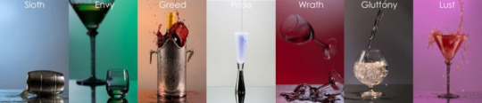
Sloth

Envy

Greed
Pride

Wrath

Gluttony
Lust

The Psychology of Color: A Designer’s Guide to Color Association & Meaning
Posted by Rikard | Feb 28, 2015
“The subject of color seems to have almost endless ramifications
and to touch upon life in almost every quarter, for color is rich in lore,
rich in meaning and purpose.” – Faber Birren
There is a large array of emotional responses that are associated with colors. Some of these are obvious, some obscure. Certain associations are specific to a country or region, while others are universally recognized—being rooted in human anatomy or observable natural phenomena. Some colors can have different meanings, even opposing meanings, based entirely on context and application.
While there are many, many factors that come into play when coming up with a design’s color, this should certainly be one of them. By knowing that red and yellow are the most visually attention-grabbing colors, you might design a better billboard. Knowing that blue signifies knowledge may help decide the color of a library’s logo. Like most things related to design, these aren’t rules set in concrete but rather one more tool that you can use or intentionally violate to deliver your intended message.
In this article, I’ve collected and summarized the emotions and concepts associated with the six basic colors, plus black and white. I’ve tried to make it as definitive as possible and included numerous examples, but the more you study this subject, the more you will find. The most definitive texts on the subject, in my opinion, are the books of Faber Birren, who was a consultant on color and color theory and put out numerous books on the subject.
With that caveat, you should find this article comprehensive and useful in design, photography and illustration.
RED

“At once, red is the passionate and ardent hue of the spectrum, marking the saint and the sinner, patriotism and anarchy, love and hatred, compassion and war.” – Faber Birren
Warmth, anger, crudity, excitement, power, strength, love, passion, fire, blood, extreme emotions, battle. Red is supposed to prompt impulse buying. It has been used by the church to give the feeling of pomp and circumstance. In history it represents royalty, majesty and triumph. Usually thought of as a violent and exciting color.
Emotional Response
Red is a very emotionally intense color. It enhances human metabolism, increases respiration rate, and raises blood pressure. It has very high visibility, which is why stop signs, stoplights, and fire equipment are usually painted red. In heraldry, red is used to indicate courage. It is a color found in many national flags.
Use in Design & Advertising
Red brings text and images to the foreground. It is used to stimulate people to make quick decisions; it is a perfect color for ‘Buy Now’ or ‘Click Here’ buttons on Internet banners and websites. In advertising, red is often used to evoke erotic feelings (red lips, red nails, red-light districts, ‘Lady in Red’, etc). Red is widely used to indicate danger (high-voltage signs, traffic lights). This color is also commonly associated with energy, so would be appropriate when promoting energy drinks, games, cars and other items related to sports and high physical activity.
Associated Meanings
· General Appearance: Brilliant, intense, opaque, dry
· Mental Associations: Hot, fire, heat, blood
· Direction Associations: Danger, Christmas, Fourth of July, Valentines Day, Mother’s Day, Flag
· Objective Impressions: Passionate, exciting, fervent, active
· Subjective Impressions: Intensity, rage, rapacity, fierceness
· Signifies: strength, health, vigor, lust, danger
· Holiday: Yule
· Planet: Mars
· Day: Tuesday
· Astrological: Scorpio
Character Study
Here is the vital color. Love red in a big and generous way and you have real courage before life. You are vigorous and given to action, for life means much to you. Do you like sports? Are you inclined to be very positive in what you have to say?
In affairs of the heart you are rather likely to be fickle. Because of your eagerness for excitement you may break many old hearts in your glamorous efforts to win new ones. But people who understand you recognize that you are a very human person, after all, and will more readily forgive your faults than you will forgive theirs.
You are quick to judge people. First impressions count with you and very often cause you to act emotionally rather than mentally.
Related Colors
· Light red represents joy, sexuality, passion, sensitivity, and love.
· Pink signifies romance, love, and friendship. It denotes feminine qualities and passiveness.
· Dark red is associated with vigor, willpower, rage, anger, leadership, courage, longing, malice, and wrath.
· Brown suggests stability and denotes masculine qualities.
· Reddish-brown is associated with harvest and fall.
Examples


GREEN

Spring, the macabre, freshness, mystery, envy, hope, eternal life. Being composed of yellow and blue, green presents the feeling of light and coolness, cheer and restraint. It is the color of nature as usually seen. Green alleviates tension and implies restfulness.
Emotional Response
Green supposedly has healing power. It is the most restful color for the human eye; it can improve vision. Green suggests stability and endurance. Sometimes green denotes lack of experience; for example, a ‘greenhorn’ is a novice. In heraldry, green indicates growth and hope. Green, as opposed to red, means safety; it is the color of free passage in road traffic.
Use in Design & Advertising
Green is used to indicate safety when advertising drugs and medical products. Green is directly related to nature, so is used to promote ‘green’ or natural products. Dull, darker green is associated with money, the financial world, banking, Wall Street.
Associated Meanings
· General Appearance: Clear, moist
· Mental Associations: Cool, nature, water
· Direction Associations: Clear, Saint Patrick’s Day
· Objective Impressions: Quieting, refreshing, peaceful, growing
· Subjective Impressions: Repulsiveness, disease, terror, guilt
· Signifies: finances, fertility, luck, success, charity, growth, rejuvenation, ambition, greed and jealousy, plant kingdom, herbal healing
· Planets: Venus, Mercury
· Days: Friday, Wednesday
· Holidays: Spring Equinox, Beltane, Saint Patrick’s Day
· Astrological: Taurus
Character Study
This is nature’s color, preferred by human beings who are likewise fresh and natural in personality. If you like green, you are sure to have a rather broad interest in the world, to be aware of the problems of life, to be tolerant and somewhat liberal.
Because your mind is clear and full of varied attentions, you are an agreeable person. You like to play bridge, to shop, to read all the best-selling books. You respect money and are anxious to improve your standard of living. In this, perhaps, you are like many others. Yet the chief difference in you is that you delight in friends, travel, sensible luxuries, without being either miserly or inclined to put on a false front. You are good and normal, and relish the scandals of others while carefully avoiding them within your own household.
Related Colors
· Dark green is associated with ambition, greed, and jealousy.
· Yellow-green can indicate sickness, cowardice, discord, and jealousy.
· Aqua is associated with emotional healing and protection.
· Olive green is the traditional color of peace and ironically a color common in military uniforms.
Examples


YELLOW

Value, sunlight, the Orient, treachery, brilliance, joy. Being nearest to sunlight, it is connected with cheer and springtime. Yellow claims attention first and fastest and sits alongside red as the most obvious and vibrant color.
Emotional Response
Yellow produces a warming effect, arouses cheerfulness, stimulates mental activity, and generates muscle energy. Yellow is often associated with food. Bright, pure yellow is an attention getter, which is the reason taxicabs are painted this color. When overused, yellow may have a disturbing effect; it is known that babies cry more in yellow rooms. Yellow is seen before other colors when placed against black; this combination is often used to issue a warning. In heraldry, yellow indicates honor and loyalty. Later the meaning of yellow was connected with cowardice.
Use in Design & Advertising
Use yellow to evoke pleasant, cheerful feelings. You can choose yellow to promote children’s products and items related to leisure. Yellow is very effective for attracting attention, so use it to highlight the most important elements of your design. Men usually perceive yellow as a very lighthearted, ‘childish’ color, so it is not recommended to use yellow when selling prestigious, expensive products to men—nobody will buy a yellow business suit or a yellow Mercedes. Yellow is an unstable and spontaneous color, so avoid using yellow if you want to suggest stability and safety. Light yellow tends to disappear into white, so it usually needs a dark color to highlight it. Shades of yellow are visually unappealing because they loose cheerfulness and become dingy.
Associated Meanings
· General Appearance: Sunny, incandescent, radiant
· Mental Associations: Sunlight
· Direction Associations: Caution
· Objective Impressions: Cheerful, inspiring, vital, celestial
· Subjective Impressions: High spirit, health
· Signifies: knowledge, learning, concentration, persuasion, charm, confidence, jealousy, joy, comfort
· Planet: Mercury
· Day: Wednesday
· Astrological: Gemini, Leo
Character Study
This hue is often picked as a favorite color by very intelligent people. If you like yellow, you are probably high-minded and, perhaps, a person who is drawn into reforms or strange groups.
You have a beautifully controlled temper. Yet the temper is there, nonetheless, and you are quite capable of putting people in their places if you feel so moved. People you meet for the first time may not always think you the most friendly soul in the world; but those who know you intimately will respect and cherish your profound character.
You long secretly for the admiration of others. While you outwardly resist flattery, you inwardly glory in it. You are inclined to live alone mentally. You are a true friend and a rare soul who can keep secrets.
Related Colors
· Dull (dingy) yellow represents caution, decay, sickness, and jealousy.
· Light yellow is associated with intellect, freshness, and joy.
Examples


BLUE

Blue is usually associated with knowledge and serenity. Coolness, ethereality, the infinite, significance, repose, formality. It is associated with the sky, the ocean and ice. It has always been the symbol of truth and purity. Loyalty, compassion, connotes serenity.
Emotional Response
Blue is considered beneficial to the mind and body. It slows human metabolism and produces a calming effect. Blue is strongly associated with tranquility and calmness. In heraldry, blue is used to symbolize piety and sincerity.
Use in Design & Advertising
You can use blue to promote products and services related to cleanliness (water purification filters, cleaning liquids, vodka), air and sky (airlines, airports, air conditioners), water and sea (sea voyages, mineral water). As opposed to emotionally warm colors like red, orange, and yellow; blue is linked to consciousness and intellect. Use blue to suggest precision when promoting high-tech products. Blue is a masculine color; according to studies, it is highly accepted among males. Dark blue is associated with depth, expertise, and stability; it is a preferred color for corporate America and by survey is the “favorite” color.
Avoid using blue when promoting food and cooking, because blue suppresses appetite. When used together with warm colors like yellow or red, blue can create high-impact, vibrant designs; for example, blue-yellow-red is a perfect color scheme for a superhero.
Associated Meanings
· General Appearance: Transparent, wet
· Mental Associations: Cold, sky, water, ice
· Direction Associations: Service, flag
· Objective Impressions: Subduing, melancholy, contemplative, sober
· Subjective Impressions: Gloom, fearfulness, secrecy
· Signifies: tranquility, understanding, patience, health, truth, devotion, sincerity, honor, loyalty, peace, wisdom, protection during sleep, astral projection
· Planets: Moon, Venus, Saturn, Jupiter
· Days: Monday, Friday, Saturday, Thursday
· Astrological: Libra, Sagittarius
Character Study
Here is the color of conservatism and dignity. You are sensitive to others, sensitive to yourself. You have real weight to your character and never enter into any silly enthusiasms without careful thought.
You are not one to monopolize conversations, although you can hold your own when you once make up your mind to do so. You are cautious in word, dress and action. What troubles you most, however, is an inability to let go in moments of excitement. Perhaps situations and personalities bother you unduly.
When you sin, your conscience is bothered, but you will sin just the same. This is because you have a rational mind and know how to justify yourself.
Related Colors
· Light blue is associated with health, healing, tranquility, understanding, and softness.
· Dark blue represents knowledge, power, integrity, and seriousness.
Examples
BLACK

Death, gloom, sorry, hidden action, evil, mourning, disorientation through absence of light. Black denotes strength and authority; it is considered to be a very formal, elegant, and prestigious color (black tie, black Mercedes).
Emotional Response
Black is a mysterious color associated with fear and the unknown (black holes). It usually has a negative connotation (blacklist, black humor, ‘black death’). In heraldry, black is the symbol of grief.
Use in Design & Advertising
Black gives the feeling of perspective and depth, but a black background diminishes readability. A black suit or dress can make you look thinner. When designing for a gallery of art or photography, you can use a black or gray background to make the other colors stand out. Black contrasts well with bright colors. Combined with red or orange—other very powerful colors—black gives a very aggressive color scheme. Black also communicates elegance and prestige and thus is commonly used in high-end products, such as smartphones, limousines, formal suits and Jack Daniel packaging.
Associated Meanings
· General Appearance: Spatial—darkness
· Mental Associations: Neutral, night, emptiness
· Direction Associations: Mourning
· Objective Impressions: Funeral, ominous, deadly, depressing
· Subjective Impressions: Negation of spirit, death
· Signifies: Negation without reflecting, unlocking when stuck, banishing evil or negativity
· Holiday: Samhain
· Planet: Saturn
· Day: Saturday
· Deities: The Crone
· Astrological: Scorpio & Capricorn
Examples
WHITE
Snow, delicacy, purity, cold, peace, cleanliness, elegance, frailty, mourning, enlightenment, faith, glory, salvation. Orientation through light. In war, white means surrender.
Emotional Response
White is associated with goodness, innocence and virginity. It is considered to be the color of perfection. White means safety, purity, and cleanliness. As opposed to black, white usually has a positive connotation. White can represent a successful beginning. In heraldry, white depicts faith and purity.
Use in Design & Advertising
In advertising, white is associated with coolness and cleanliness because it’s the color of snow. You can use white to suggest simplicity in high-tech products. White is an appropriate color for charitable organizations; angels are usually imagined wearing white clothes. White is associated with hospitals, doctors, and sterility, so you can use white to suggest safety when promoting medical products. White is often associated with low weight, low-fat food, and dairy products.
Associated Meanings
· General Appearance: Spatial—light
· Mental Associations: Cool, snow
· Direction Associations: Cleanliness, Mother’s Day, flag
· Objective Impressions: Pure, clean, frank, youthful
· Subjective Impressions: Brightness of Spirit, normality
· Signifies: purity, consecration, meditation, divination, exorcism, the full moon, healing, peace, spiritual strength, may be substituted for any other color
· Planet: Moon
· Day: Monday
· Astrological: Cancer
Examples
ORANGE

Being made of yellow and red, orange gives the idea of light and heat. It is the color of pride and ambition. Associated with sunshine and warmth, considered cheerful.
Emotional Response
Orange combines the energy of red and the happiness of yellow. It is associated with joy, sunshine, the tropics. Orange represents enthusiasm, fascination, happiness, creativity, determination, attraction, success, encouragement and stimulation.
Use in Design & Advertising
To the human eye, orange is a very hot color, so it gives the sensation of heat. Nevertheless, orange is not as aggressive as red. Orange increases oxygen supply to the brain, produces an invigorating effect, and stimulates mental activity. It is highly accepted among young people. As a citrus color, orange is associated with healthy food and stimulates appetite. Orange is the color of fall and harvest. In heraldry, orange is symbolic of strength and endurance.
Orange has very high visibility, so you can use it to catch attention and highlight the most important elements of your design. Orange is very effective for promoting food products and toys.
It’s disadvantage is that by survey of “favorite color” orange usually comes the lowest and thus it is rarely used for longer term products, such as cars or electronic products.
Associated Meanings
· General Appearance: Bright, luminous, glowing
· Mental Associations: Warm, metallic, autumn
· Direction Associations: Halloween, Thanksgiving
· Objective Impressions: Jovial, Lively, energetic, forceful
· Subjective Impressions: Hilarity, exuberance, indulgence
· Signifies: encouragement, adaptability, stimulation, attraction, plenty, kindness
· Holiday: Candlemas
· Deities: Brigid
· Planets: Sun, Mars, Mercury
· Days: Sunday, Tuesday, Wednesday
Character Study
Choose orange and you are a person to be envied. For you are a “hail fellow well met.” Perhaps not so ardent and so passionate as the red type, you still have a grand love for life.
Your taste runs to cheerful friends and good foods. You are just as much at ease among sinners as among saints. In fact, much of your life is devoted to things social. Yet, you should be careful. People may say behind your back that your last friend is always your best friend.
You are not one to be alone. You like eminent people, whether they are prizefighters or presidents. You want life to surround you, warm and mellow, like the orange glow from a fireplace.
You make the ideal bachelor or spinster, perhaps because you are inclined to know a little about many people and not very much about one or two.
Related Colors
· Dark orange can mean deceit and distrust.
· Red-orange corresponds to desire, sexual passion, pleasure, domination, aggression, and thirst for action.
· Gold evokes the feeling of prestige. The meaning of gold is illumination, wisdom, and wealth. Gold often symbolizes high quality.
Examples

PURPLE

Color of royalty. Has a strong religious significance. It is used as half-mourning. By associations, it gives a feeling of mystery. It is the color of shadows.
Emotional Response
Purple combines the stability of blue and the energy of red. It symbolizes power, nobility, luxury, and ambition. It conveys wealth and extravagance. Purple is associated with wisdom, dignity, independence, creativity, mystery, and magic.
Use in Design & Advertising
According to surveys, almost 75 percent of pre-adolescent children prefer purple to all other colors. Purple is a very rare color in nature; some people consider it to be artificial.
Light purple is a good choice for a feminine design. You can use bright purple when promoting children’s products.
Associated Meanings
· General Appearance: Deep, soft, atmospheric
· Mental Associations: Cool, mist, darkness, shadow
· Direction Associations: Mourning, Easter
· Objective Impressions: Dignified, pompous, mournful, mystic
· Subjective Impressions: Loneliness, desperation
· Signifies: power, piety, sanctity, sentimentality, tension, sadness amplification of other energies, wisdom, high ideals, spiritual protection and healing, psychic ability, protective energy
· Planet: Jupiter
· Day: Thursday
· Astrological: Sagittarius
Character Study
Two different types of people like purple—very profound beings and those who merely wish to appear so.
Choose purple and you are, no doubt, a mystery to yourself as well as to others. Aristocratic and artistic people often favor the hue for its exclusive dignity. Such persons are generally satisfied with themselves, sometimes conceited and nearly always capable of great things.
If you like purple, you no doubt lay claim (if only in your heart) to a rather superior attitude toward the world; but, if you are extremely clever, are you also inclined to be a trifle lazy?
Purple types are easy to live with. They are neither too bold, like red, nor too straight-laced, like blue. Yet they must beware of any “lavender-and-old-lace” tendencies, which may snare them if they don’t watch out.
Related Colors
· Light purple evokes romantic and nostalgic feelings.
· Dark purple evokes gloom and sad feelings. It can cause frustration.
Examples


RED & GREEN
Red and green together denote pain (and, ironically, Christmas).

BLACK & WHITE
Black relieved with white signifies sophistication, vigor, newness.

BLACK & RED
Black and red together are the colors of enemy.

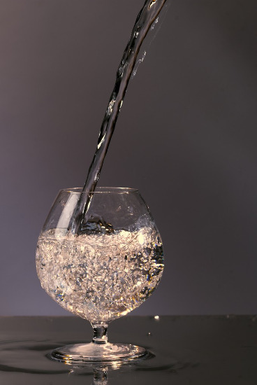
First test shoot using single continuous light source from softbox

Contact sheet
Most successful images from first test shoot
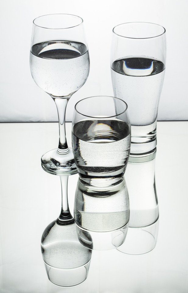
I am reasonably happy with these shots as a test and it has taught me to fill the glasses really slowly to avoid the bubbles in the water or better still, use bottled water as I feel the bubbles detract from the shots. My next plan is to assign final colours and glass or glasses type to depict each sin and sketch out the “poses” I think would work for the glasses. I also want to look at background textures and colours for each scene to see if this will compliment and further convey the message or just detract from the subject. I also may use additional props in the shots to qualify the particular sin if I don’t feel the main subject is adequately demonstrating the sin. This could be a cork from the bottle in each shot or maybe a shot glass with the word of the sin written on it in a sympathetic font for each sin or I could create neon type signs in Photoshop (the kind one might see in a bar) depicting the word of each sin. I have ordered some different glasses I think could work well for the next shoot, however, due to COVID-19, Amazon delivery times are longer, so they won’t arrive for a few days.
Shoot 1
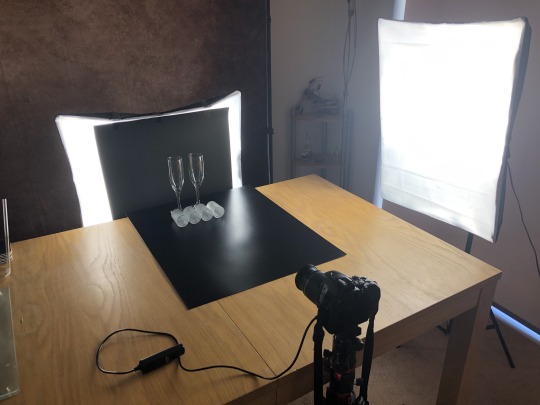
The glasses have now arrived so I made a visit to the local Range and picked up some silk finished black card to use as a surface for the shoot which I hope will subtly reflect some of the colours and highlights from the glasses. I also purchased an A3 sheet of matt black card to position in front of the soft box which I will use as my background while still allowing light to come out on the left and right hand side to hopefully create fine highlights on the left and right side of the glasses. I will use a second soft box to light the still life from the right and adjust to different positions and heights to try and achieve the best lighting effect. I will use the standard 18-55mm kit lens on my Nikon D5600 which I will position on a tripod and use a remote shutter release to avoid any camera shake during longer exposures.
Set up for the shoots

Notes on colours to use to portray sins and sketches of possible poses for glasses.

Contact sheets for first shoot

Best shots from the shoot
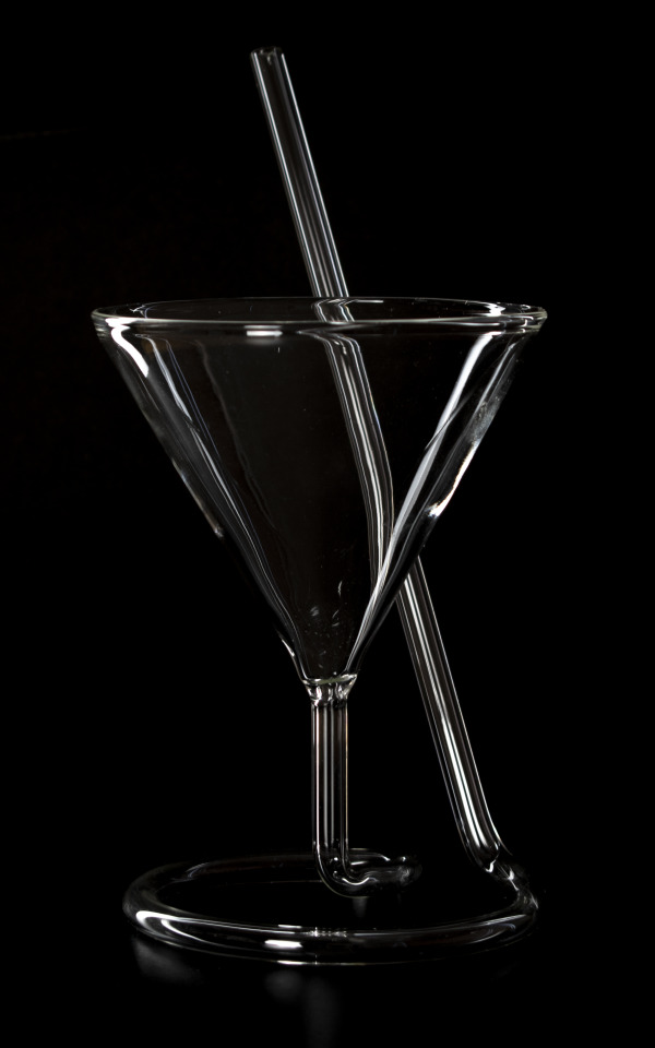


Overall, I was quite happy with this shoot and was able to pose the glasses in the way I had sketched them out. I made minor adjustments to the images in Bridge (mainly adjusting the contrast and clarity a little) and cropped some of them slightly in Photoshop.
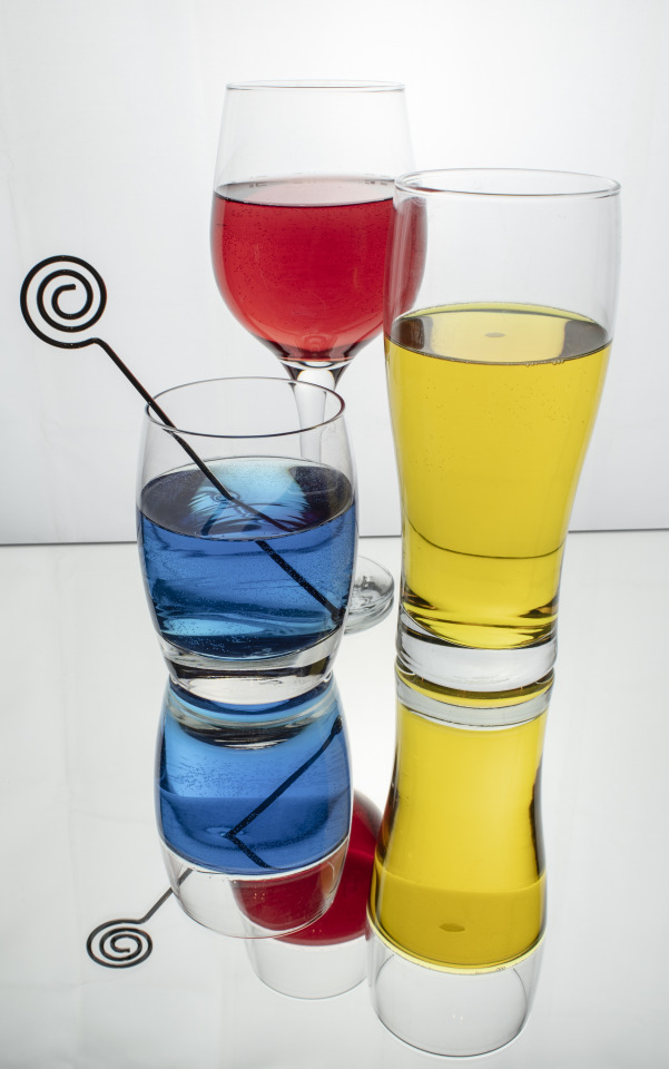
Shoot 2
For the second shoot, I used the same set up as before with the addition of making the coloured liquids from food dyes and water, to put in the glasses. The colours I was able to get were red, green, blue and yellow, so this should hopefully allow me to create the colours I need.
Contact sheets


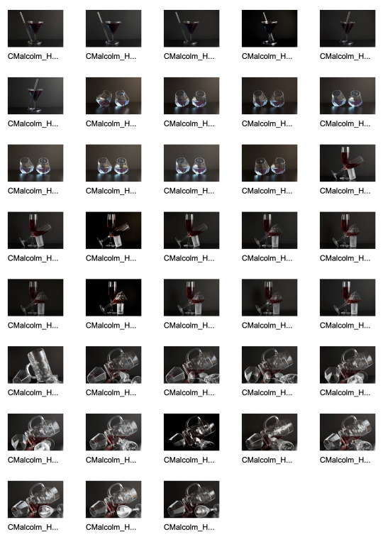
Most successful images from second shoot


I received helpful feedback on the images at the virtual “pin-up” session which I plan on implementing on my next shoot. Again, I only made minor adjustments to the shots as I did after the first shoot as the images were fairly close to the look I was after in camera.
Shoot 3
As mentioned above, I re-shot the wrath set up and also re-shot the pride glass as the colour I was trying to create was purple, however, this didn’t really work. I also re-shot the sloth image with light blue liquid to demonstrate the sin.
Contact sheets
Best shots from this shoot
I wasn’t happy with my shot of the tankard so decided on a different shot to portray the sin of wrath, using a smashed glass, which I will set up on my next shoot.
Shoot 4
I used the same set up as the previous shoots for this one. I also used a reflector and tried both the white and gold side for the shots but this didn’t really add anything to the images.
Contact sheets

Best shots from this shoot


I am much happier with the broken glass showing the sin of wrath and edited the images to the same degree as the previous shoots making very similar adjustments.
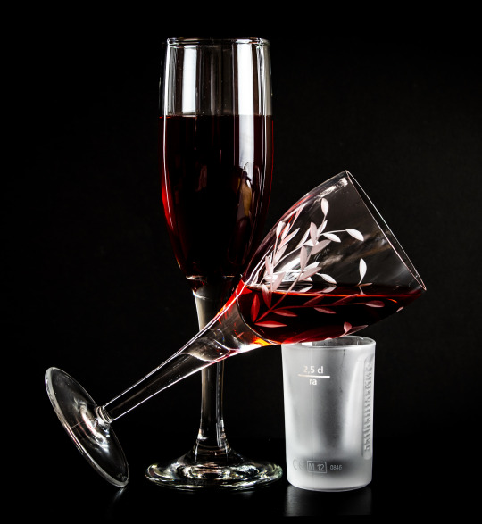
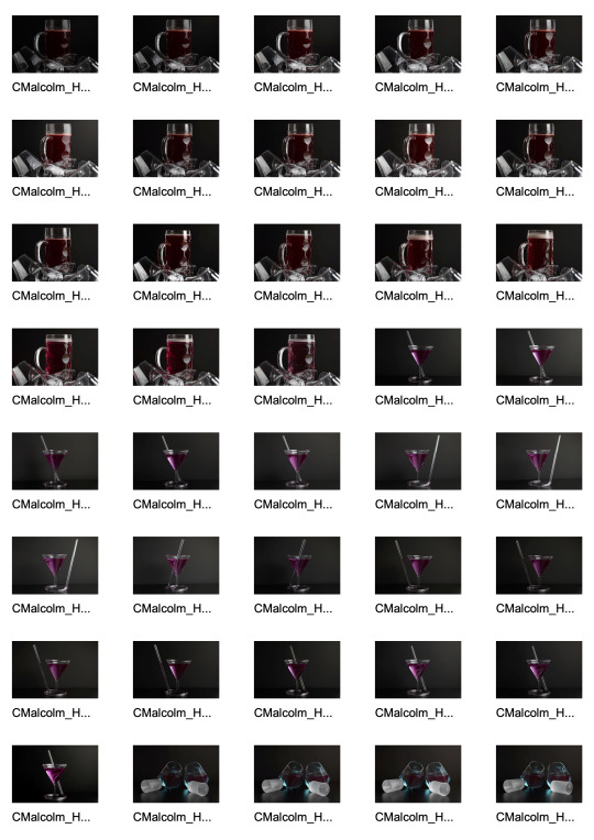
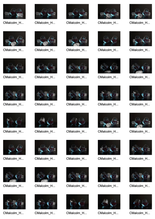
Final ten images selected (not shown in final order)
As there are only seven deadly sins but ten images required for the final submission, I had considered including some of the images from shoot one which didn’t have the coloured liquid in the glass. On reflection, I decided instead to include alternative shots of somer of the sins as I think all the shots need to include colour for them to work together as part of the same series. I also edited out the shot glass supporting the wine glass in the lust shot using the pen tool in Photoshop.
Gluttony
Pride
Envy
Greed
Sloth
Lust

Greed
Greed
Gluttony
Wrath

Gallery mock-ups
Today I have been looking at print options and sizes for gallery display. I have decided the images would work well in a really large format without frames so have researched the possibilities and associated costs. I would like them to be 50″ x 40″ (pro-rata depending on crop) metallic prints on 2mm satin acrylic. I think the metal print will really help boost the highlights in the shots and show off the richness of the colours. The cost per mounted print would be £380 each and turnaround is five days.
Examples of large format prints in a gallery space
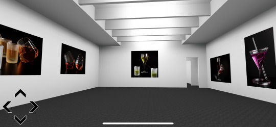
I think the images would work well compositionally and tonally displayed like this.

I like the balance of showing these images in this order.
This layout also works well I feel.
This scale really adds impact to the shot and the ones below.


I like this sequence as I feel it tells a story, leading from left to right and the composition, poses and tonality work well together.
Final order sequence images will be displayed in


3rd (and final) Zoom virtual “pin-up” session
Today we held our third and final Zoom visual “pin-up” video call. I have found these really useful for getting feedback and guidance on my images, planned sequence and format for my final prints. I ran through the sequence and my lecturer agreed they were in a fluid order that made sense and flowed well so I will keep them in the sequence above. Our lecturer encouraged the class to try and identify what sins I was attempting to portray with each image and I’m really glad to report that they were all guessed correctly by the class which showed me the combination of posing the glasses along with a coloured liquid to convey the emotion, helped convey the message I am trying to portray successfully.
There are some specs of dust and finger prints on some of the images that weren’t noticeable when editing but became apparent while re-sizing to 50″ x 40″ for print, so one of the other students (Michal) very kindly sent over a couple of links to Photoshop tutorials, which I will watch before I re-optomize and re-size for print.
https://photoshopcafe.com/ACR-CameraRaw-FilterBrushes-local-adjustments
https://www.youtube.com/watch?v=Yp_pXajhy40
Evaluation
For my Personal Project, I decided to explore the concept of portraying the “Seven Deadly Sins” through photographs. My research showed me some of the different approaches photographers have taken in the past to portray these, through portraiture (Ricky Davis), architectural photography (Bethany Parkin) and still life photography (David Sandell and Dave Nitsche). My research also showed that colour plays a large part in conveying emotions so I decided to define which colours I wanted to use in each image to help further convey the sin. Initially, I wanted to use portraits to convey my message and utilise appropriate props to show the sins, however, due to the COVID-19 outbreak restrictions, this was simply not possible. I discounted the idea of using architectural shots for similar reasons so decided on using glassware to create still lifes filled with appropriately coloured liquids (food dyes) to help further convey each sin. After much searching on the internet, I managed to find and order some glasses that I thought could work well and also visited the Range and purchased black silk finish card to use as a surface for the images and matt black card to fix to the front of my softbox to use as a background.
For my first test shots, I prepared my set as described above and added a further softbox to the right of the set which I moved around until I was getting the look and reflections I was after. I also decided not to use coloured liquids in these shots and try to convey the sins as much as possible by only using specific glasses in specific poses to show the sins. I also experimented with a reflector to further bounce light into the shots and used a remote shutter release as I needed a slow shutter speed to avid increasing my ISO (which I kept at 100).
I was reasonably happy with the outcome of the first shoot, however, the tankard I had selected to show “wrath” was a fairly ugly glass in comparison to the other glasses I had chosen and was very difficult to light to my satisfaction so I will see how this one works with the liquid and if I am still not happy, look at another glass option for this specific sin.
Now that we are no longer submitting prints, I have updated my schedule to give me more time for shooting and optimising in the week I had set aside for this.
For my second shoot, I utilised the same set up and poses as the first one with the addition of the coloured liquids which were:
· Lust – red
· Gluttony – orange
· Greed – yellow/gold
· Sloth – light blue/cyan
· Wrath – red
· Envy – green
· Pride – purple
I had also considered the possibility of using a neon sign type effect in the background showing the sin or possibly a cork in the shot with the word written on it if I felt the shot wasn’t fully conveying the sin, however, I decided against this as I feel I would have failed in the image if I need to rely on this device to convey the sin.
Mixing the colours to get the results I was looking for was very challenging and took a lot of time and effort but was well worth it as by my final shoot, I had the colours I was looking for and they really enhanced the images.
Unfortunately, the addition of the red liquid to the tankard for the “wrath” still didn’t look the way I wanted (I think the glass is simply too thick to let the light show the liquid the way I would like) so I decided to drop the tankard in favour of two wine glasses. The first glass would be filled with red liquid and be standing over a smashed wine glass, which I think would be more in keeping with the look of the other glasses in the series. I also felt the colour and lighting in the “pride” shot was not right, so I would re-shoot that too.
By the time I had completed my fourth shoot and previewed the images in Bridge, I was happy that I had captured the images with the poses and colours I needed to portray all the sins. (with the addition of some alternative poses for some of the sins to give me my ten images for submission).
Because of the time I had spent setting up the images during the shoot, there was very little I needed to do within Photoshop to optimise the shots. I really only made quite minor adjustments in Bridge and slight crops on some of the images.
On the whole, I am very happy with how my final shots worked out and think they work well in the sequence I have submitted on the canvas on MyCity. I think the success of the images is due in no small part to the amount of time I spent researching my initial concept and studying many tutorials on-line showing the best ways to light glassware along with much experimenting over the course of the four shoots. I feel the images would have the most impact printed as 50” x 40” without frames onto satin aluminium as I think this material would really bring out the colours and highlights in the glasses.
During a Zoom virtual pin-up, my lecturer asked the class to guess what sins I was trying to portray in the shots and I was really happy the class were able to identify all of the sins correctly from my images. This proved to be a more challenging brief than I initially thought it would be however, it has really helped me refine my composition techniques for still lifes and taught me a tremendous amount about lighting. I really enjoy still life photography and will definitely benefit in my future work from the new skills I have leaned and improved upon carrying out this brief. For future shoots of this nature, I will tether my camera to a larger monitor in order to allow me to see a lot more details (such as small bubbles, dust or finger marks on the glasses) as it’s just not possible to see these issues on the back of the camera. This would reduce the amount of time required in post-production to fix any issues. I think I would also like to try focus stacking the shots in Photoshop as there were occasions I wasn’t 100% sure where I wanted the main focus to be and this approach would give me further options when optimising.
2 notes
·
View notes
Text
Portfolio 2 evaluation
This portfolio has been very busy and covered a wide range of subjects and disciplines. The “Artisan” project had a very steep learning curve using Premier Pro, however, was really enjoyable and I gained a lot of knowledge in the art of making videos. I especially appreciate now, how important it is to have a comprehensive storyboard mapping out all the planned elements prior to shooting. I think this was quite a successful brief for me and can see how increasingly important it is for a photographer to also be able to offer this service.
“Recycle” was also an enjoyable brief for me and I enjoy still life photography a lot more than I thought I would. I enjoyed experimenting with angles and lighting to achieve a final image that I think worked well and was visually interesting and enjoyed optimising it in Photoshop.
“Catch me if you can” was a very challenging brief, much in the same way as “Sphere” was in portfolio 1, and was one of the least enjoyable projects for me during this trimester. It initially proved very hard to gain access to shoot events, however, I was able to shoot an American football game outside and a basketball game inside. The American football game really showed me the value of a quality fast telephoto lens and the basketball match indoors, the issues of shooting fast action shots in low lighting conditions.
“A sense of…” really helped me gain more experience in the darkroom and was an enjoyable project to work on and satisfying to have a final product I have overseen in analogue from capturing the images through developing and printing them to mounting them on A3 card.
The “Unseen” project was incredibly interesting and I really enjoyed researching and using all the different techniques. Having the chance to set up and use everything from UV to high speed flash was really good and I have been able to capture some images I wouldn’t have been able to achieve before this brief.
“Illusion” was also enjoyable and really helped me advance my skills in Photoshop, especially using layer masks and the pen tool. It was also a great project for helping with my studio lighting skills as I attempted to emulate the lighting from the background shots on the model in the studio.
Overall, this has been a very busy portfolio which has covered a very wide range of material in a relatively short space of time. It has, however, given me many new skills and experience to take forward with me to folio 3.
0 notes
Text
The Creative Industries in Scotland
The research below explores the Creative Industries in Scotland at present.
Scottish Government

Creative industries are those based on individual creativity, skill and talent, or which have the potential to create wealth and jobs through the development or production of intellectual property.
In Scotland our creative industries comprise over 15,000 businesses employing more 70,000 people, in addition to a large number of freelancers as well as students studying creative courses. Together they make an important contribution to our national wealth and international reputation.
We are working in partnership with other organisations to support Scotland's creative industries and ensure that they continue to enrich and grow our economy.
Actions
We are supporting Scotland’s creative industries by:
· funding incentives and resources for the screen industry to encourage more film and TV production in Scotland
· funding Creative Scotland, the national public body for the arts, screen and creative industries, to develop and promote creative talent in Scotland (£33,632,000 from 2015 to 2016)
· working with Creative Scotland to deliver its Creative Industries Strategy 2016-2017 for informing and supporting the work of creative businesses in Scotland
· working with Skills Development Scotland to implement their Creative Industries Skills Investment Plan for addressing skills gaps
· chairing the Creative Industries Advisory Group, which aims to advise Scottish Ministers on how best to support and grow the sector
Background
Scotland’s creative industries contribute more than £5 billion to the Scottish economy every year.
Our Economic Strategy identifies creative industries as a growth sector where Scotland can build on existing advantages to increase productivity and growth.
In particular, we aim to develop Scotland as a production centre for screen industries and are working to create the right conditions to allow these industries to flourish.
The creative industries sector is made up of 16 distinct industries:
· advertising
· architecture
· visual art
· crafts
· fashion and textiles
· design
· performing arts
· music
· photography
· film and video
· computer games
· radio and TV
· writing and publishing
· heritage
· software/electronic publishing
· cultural education
Bills and legislation
Section 36 of the Public Services Reform (2010) Act 2010 legislated for the creation of Creative Scotland and determined its functions.
Source: https://www.gov.scot/policies/creative-industries/
Creative Scotland

The subsidised arts sector is highly regarded both in Scotland and across the world. It is hugely influential in supporting creative industries and tourism, which together employ nearly 300,000 people. It provides a fulcrum for Scotland’s wider creative industries growth, which contributed £4.6 billion to the economy in 2015, up 23.6% from 2014.
The arts, screen and creative industries help develop talent and skills amongst our people and make a significant contribution to attracting people to work in Scotland, generating revenue in both local and national economies.
Creativity helps to revive our cities as well as smaller places; and it is central to galvanising and reviving communities across regions. It is a vital part of the DNA of our nation, encouraging people to stay here, to move here, or visit.
The Creative Industries in Scotland contribute £4.6 billion to the economy. This represents a steady increase since 2010.
In 2015 the Creative Industries employed 73,600 people - a 2.5% increase on 2014 and a 15% increase since 2011.
The Creative Industries is now larger than Life Sciences and sustainable tourism in terms of GVA and employs more people than the Energy sector.
Whilst the majority of jobs in the creative industries are concentrated in the main cities of Glasgow, Edinburgh and Aberdeen, Dundee and East Dunbartonshire also have higher than average share of Creative Industries jobs.
The Creative Industries sector is dominated by small enterprises with 59% of the 15,420 registered enterprises having zero employees (i.e. are sole traders) and 88% in total have less than five employees.
Over 98% of Creative Industries businesses operating in Scotland are registered in Scotland.
- Scottish Government Growth Sector Statistics, October 2017
In 2011, 10 million inbound visits to the UK involved engagement with the arts and culture, representing 32 per cent of all visits to the UK and 42 per cent of all inbound tourism-related expenditure - The contribution of the arts and culture to the national economy CEBR, 2013
VisitBritain estimate that Britain’s cultural and heritage attractions generate £4.5 billion worth of spending by inbound visitors. VisitScotland's Visitor survey highlights that a third of tourists are inspired to visit Scotland by our culture and heritage.
Examples
Scottish musicians receive support from pioneering Momentum Music Fund
C Duncan, Kobi Onyame, Man of Moon, Martha Ffion and Siobhan Wilson are amongst the latest round of artists to receive support from the pioneering Momentum Music Fund.
Published: 18 Apr 2019
Paper Houses Design launches lifestyle collection on Kickstarter
Stonehaven based textile designer Mhairi Allan tells us about launching her new lifestyle brand, influenced by mid-century modern design, Scandi-style and geometrics.
Published: 07 Feb 2019
Creative companies receive funding to Go, See, Share
12 creative businesses from across Scotland have been selected to participate in the Go See Share initiative, supported by the National Lottery through Creative Scotland.
Published: 09 Jan 2019
Findhorn Bay Arts wins at 20th SURF Awards
Findhorn Bay Arts tonight picked up an award at the prestigious 2018 '20th Anniversary' SURF Awards in Glasgow’s Grand Central Hotel.
Published: 06 Dec 2018
Examining the "In Kind" economy at Glasgow International
A new research project by artists Janie Nicoll and Ailie Rutherford is charting the hidden economies of the visual arts, using Glasgow International 2018 as a case study.
Published: 04 May 2018
£2million Expo Fund to boost Scotland's world-class festivals
The Scottish Government will invest £2 million in 2018-19 in support of Scotland’s international Festivals, promoting the development of Scottish artists and creative expression across the country and raising the profile of Scotland’s world-class festivals.
Published: 09 Mar 2018
Collect 2018: Showcasing Scottish design and craft talent
Collect brings together 40 galleries from four continents to showcase some exceptional work from makers, designers and creatives. Now in its 14th year, 2018's event is taking place at London’s Saatchi Gallery from 22 - 25 February, and the programme is packed with Scottish talent, both established and emerging.
Published: 22 Feb 2018
Record £69.4m spend on film and TV production
Production spend on film and TV in Scotland has increased by more than 30% to a record high of £69.4 million in 2016.
Published: 08 Sep 2017
Craft Scotland Summer Show makes waves in Edinburgh
The Craft Scotland Summer Show is an annual selling exhibition, showcasing contemporary, design-led craft throughout August in Edinburgh. Here, a selection of Summer Show makers talk about their favourite pieces they have made for the show, and what makes it extra special to them.
Published: 07 Aug 2017
Edinburgh International Film Festival records boost in admissions for 70th Anniversary
Edinburgh International Film Festival is celebrating a successful 71st edition, which saw a sixth successive year of increased audience numbers.
Published: 03 Jul 2017
Source: https://www.creativescotland.com/what-we-do/creativitymatters/economic-value
History
The term ‘creative industry’ began 20 years ago, then it was used to describe activities both historical (theatre, dance etc but came under the name cultural industry) and newer activities that came into prominence with digital technology. It was becoming apparent that these activities were important to the economy not just in the UK but countries around the world. In 1997, the Labour government in the UK made an attempt to define the term creative industries and how it had an impact on the economy. Creative Industries – Mapping Document 1998, which was published by the Department of Culture, Media and Sport listed 13 areas of activity, namely
· Advertising
· Architecture
· The arts and antiques market
· Crafts
· Design
· Designer fashion
· Film
· Interactive leisure software
· Music
· Performing arts
· Publishing
· Software
· Tv and radio
All of which had in common was the ability to creative wealth and have individual skill, talent and creativity.
Source: www.creativeeconomy.britishcouncil.org
UK
In present day, the notion of ‘creative industries’ is acknowledged by nearly every government in the world. In some countries the definition of creative industry also include food and gastronomy. So what is the current value of creative industries in the UK today? Information from www.gov.uksuggests that the Department for Digital, Cultural, Media and Sport’s sectors are worth £268 billion. There has been huge growth in Britain’s film, tv, music and advertising industries. Figures show that digital industries are worth more than £130 billion. In 2017 the creative industries contributed over £100 billion to the British economy. This is an increase from £94.8 billion in 2016. As well as areas such as film, tv, photography etc contributing to the increase, computer services such as video games have also played a huge part, companies such as Rocksteady and Scottish based company Rockstar have had an input. The video game sector is worth £5.11 billion alone. The tourist sector too, in 2017 was worth £67.7 billion. The impact of creative industries on the culture of Scotland and the UK can only be seen as a good thing going by the numbers above. The British economy benefit with the money that is created along with the jobs. With more funding for education, that teach the arts, media and radio, photography, more talent can discovered and promoted. Heritage sites throughout Britain bring in tourists from around the world which is both good for the economy and good for keeping the heritage alive as without tourists there would be no funds for maintenance of buildings. To encourage the creative industries throughout Britain, the government continue to fund sectors such as TV and film, performing arts and computer games. In doing this as stated above more talent is discovered and as such Britain can be seen as a leading force in the creative industries throughout the world which can then being business and funding from elsewhere in the world.
Source: www.gov.uk
Future career possibilities
During studying photography at NC level at South Lanarkshire College in East Kilbride, I set up a social media presence as Chris Malcolm Photography and developed a basic website using Wordpress which I promoted on Google and Facebook. www.chrismalcolmphotography.com This has been useful in providing opportunities to undertake both paid and unpaid assignments. I have also worked for a French company called Meero, who have the contract to provide shots for restaurants that are on the “Just Eat” platform. It is my intention to “shadow” professional photographers covering all disciplines in order to gain real life experience on a variety of types of shoots. On completion of my studies, I intend to be a full time photographer and will use my knowledge gained from studying to offer my services across all areas of the sector. Having worked in live events for over 30 years, I have good business acumen and a wide network of contacts.
0 notes
Text
Darkroom
Workbook


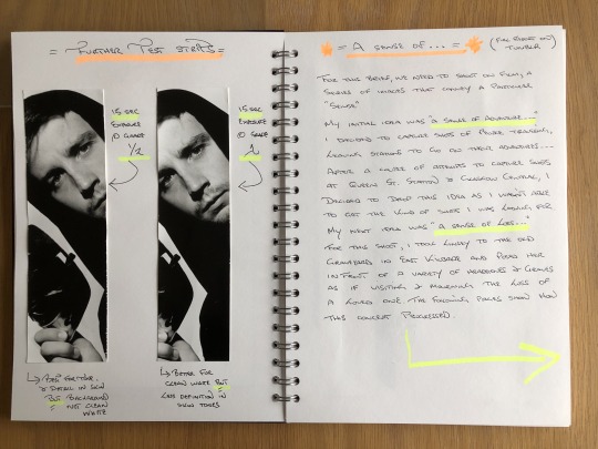


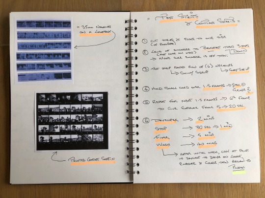

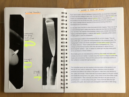
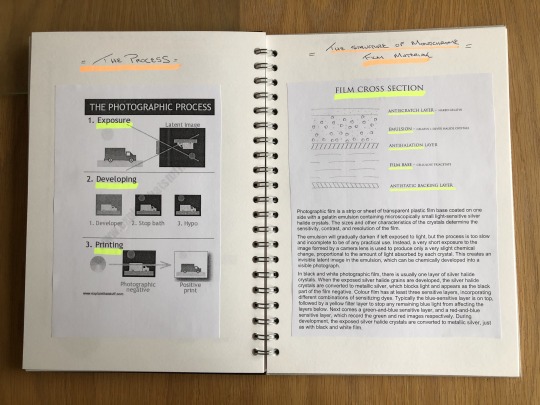


Toning - Blue

Toning - Sepia

2 notes
·
View notes
Text
Digital noise in photography
what is digital noise?
Digital noise is random pixels in a photograph that obscures detail and makes the picture have a lower quality standard. Photos can end up so noisy that they are unable to be used. When taking pictures with a digital camera an electronic sensor built from tiny pixels is used to measure the light for each of the pixel and the result becomes your photograph in the end.
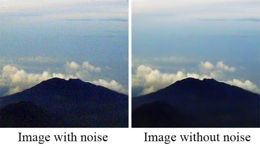
what causes noise in photography?
You’ll always have some amount of noise in your photograph as its not something you can prevent but it is something that you can control the intensity of it. Digital noise is a randomness caused by your camera sensor and internal electronics. By having a much higher ISO can cause a lot more noise especially when shooting in low light and its necessary to have a higher ISO.

A long exposure time can also be the cause of more digital noise. The longer the exposer the more light is being let into the lens therefore causing more noise to appear into your photograph.
Sensitivity and shutter speed is your main challenges when it comes to digital noise. Having a slow shutter speed causes the shutter to stay open for longer and the longer it is open the more noise will be introduced to the photograph.

16 notes
·
View notes
Text
Dark Frames - reducing digital noise
Dark frame - This is a technique used for reducing digital noise. with shooting at long exposures means that you will be creating more digital noise.This involves using multiple images with the same camera settings the lens cap on. With the lens cap on your camera, you will be capturing noise without any signal. This allows you to shoot a signal to noise ratio which will produce a better image quality.
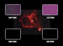
Step By Step Guide:
Shooting
1- turn off long exposure noise reduction
2- shoot long exposure On RAW file
3- shoot similar image with the lens cap on (same settings etc)
optimisation
1- Open files into photoshop, including lens cap image
2- layers- place lens image above normal image
3- blending mode - lens cap mage to subtract - 100% zoom
13 notes
·
View notes
Text
Digital Noise Removal
Photoshop:
It is quite easy to remove noise in photoshop as it is pretty straightforward. Click 'filter' menu on the top panel. Find 'Noise' and click on 'Reduce Noise'. You can do this before or after optimising your image. This is the best wnd easiest way to reduce noise in photoshop.
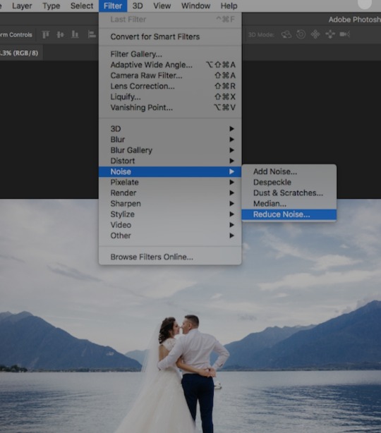
Lightroom:
Open up the 'Detail' panel where you will find noise reduction sliders which you can use to reduce/remove noise from your image. You will also find sliders for luminance noise and colour noise.
If you're optimising a RAW image in lightroom it should already have noise reduction applied to it during the import process which means lightroom automatically do this for you, however you can freely change it

Bridge/Camera RAW:
To reduce noise in Adobe Bridge you will have to click on the image you want to optimise which will dorect you to Camera RAW. Similarly to Lightroom, you will noise reduction in the 'Detail' panel and It is a slider again, which means you can adjust the noise to your liking.

4 notes
·
View notes
Text
Digital Noise Removal
Blending Images Together
One type of noise removal after taking a photo is taking many images of one scene then using photoshops blending tool and joining the pictures together. This means that you’re taking shorter exposures to reduce the digital noise in the photo.
How to do it
Step 1 - Open the images you want to blend in one photoshop document.
Step 2 - Create a layer mask on the top layer.
Step 3 - Use the brush tool to blend in the lit parts into the photo, you can use the opacity of the brush to change how bright you can the area to be. White adds back the top layer whilst the black deletes the layer and makes brings in the lit parts.
13 notes
·
View notes
Text
Illuminate Research Task
Here is my groups research on 5 photographers who use light painting techniques.
Amanda Friedman
Amanda Friedman is an American based photographer who’s photographic specialty lies between commercial and fine art photography. After receiving a BFA in photography at Rochester University, Friedman moved to LA where she later began photographing a series of night landscapes, using both natural and artificial light to produce creative effects. Friedman first began this series after capturing a night landscape on a foggy night in New York City. She shot a role of 120mm on her TLR and the results proved to be an unexpected surprise, thus inspiring her to produce a collection of beautiful images across a fifteen year time span. She captures all of her images using medium and large format cameras and using no digital manipulation in the process.
Below are some examples of her work.
I particularly like the top image of the tents in the campsite. This image is powerful in that the horizontal direction of the lights carries the eye from the bottom of the picture to the top. The brightest part of the photo indicates that white light is being projected from a stadium or arena, which has therefore helped to retain light and color in the foreground. This intensity of light has perhaps allowed the photographer to shoot with a tripod at a low shutter speed in order to achieve the desired effect. The natural vignetting in the photo again focuses the eye to the most interesting elements of the image and amplifies the lighting further. The overall quality of the image is good and presents little noise. This again has been helped by the use of tripod and large format of the camera. Although not directly painting light within the scene, the photographer has used the available light sources to produce a creative effect.
Lance Keimig
Lance Keimig is an American photographer who specialises in night and low light photography. After picking up a camera at an early age, Lance quickly began experimenting with long exposures and how light can be used to enhance this to change the entire mood or feel of an image. After developing a successful career as a photographer, Keimig decided to follow in the footsteps of his mentor and take up teaching. Since then he has taught classes and workshops on night photography across the globe.
Starting on film, his first experience with long exposure photography involved waving torches in-front of an AE1 just to see what happened. This experimentation lead him to explore the possibilities of using this particular lighting technique.

The above images present a variety of Keimig’s work, highlighting a broad range of work, from black and white to large expansive landscapes and some to smaller, intimate buildings. Throughout the images the light has been sculpted and crafted to evoke a feeling and response from the viewer. The variety of colours and tones, along with the direction of light create an effective which may not have came through with the natural light of the place.
O. Winston Link
O. Winston Link was born in 1914 in Brooklyn, New York. His first photograph was taken on a borrowed medium format, Kodak camera and by the time he had left school, he had built his own enlarger. His technique was making ‘posed photographs’ appear candid, whilst still showcasing a creative element. Link had a keen interest in railroads and whilst on commission for an industrial photography project in Virginia 1955, he captured his first night photograph of a railroad. A few months later, steam trains were taken over by diesel and it was then that Link’s work became a realised documentation of the end of the steam train era. By 1960, he’d accumulated 2400 negatives from this project (the below image is one of the most recognised.)
The majority of his work was photographed at night and each of his photos were were always meticulously composed. He once said; “I can’t move the sun - and it’s always in the wrong place - and I can’t even move the tracks, so I had to create my own environment through lighting”.
Link’s vision required him to develop new techniques for flash photography when photographing such large subjects. For example, the movie theater image ‘Hotshot Eastbound’ used 42 flashbulbs, all of which fired simultaneously. He used a large format camera which was loaded one sheet of film at a time. He used bulb lights in large cone-shaped holders (as seen below) which directed the light towards the subject. To highlight the texture and metallic surface of the trains, he used a high powered light directed from an angle to reflect off the train. This was the opposite technique for lighting people in his shots, whereby he would create a softer light source to clearly define both subject matters.

Tim Simmons
Tim Simmons is a UK based photographer who uses photography and film to explore themes of time, motion and place. Through his images, he aims to encourage a unique perspective of landscapes. Simmons’ images are captured using a large format camera combined with artificial lighting to produce a surreal and peculiar look. He often enhances natural lighting by using artificial lighting to sharpen the image; giving it an intense clarity and a greater sense of mystery and expectation. His locations are always carefully researched.
The below images were taken at twilight, using a combination of natural light with artificial light. The natural light of the sky is helping illuminate the subject/surrounding area and the added light (possibly LED or Flash) is helping control the light falling on the subject/object/area etc. This is especially important in the top image due to the similarity in colour of the object and the background sky. if the object was not lit with an added artificial light then it would be lost in the scene and the contrasting shadows wouldn’t be visible. This is why Simmons uses this particular lighting technique, in order to showcase a strong creative element to his photos which provide great visual impact.
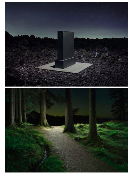
John Hartman
John Hartman is a well accomplished American photographer who specializes in ‘light painting photography’. His use of this technique has won him great recognition, including one of his images being selected as within the top ten photos worldwide in the 2016 international competition of the professional photographers of America.
His highly complex method of shooting involves using special LED lights to compose a series of images of the same subject, but from various vantage points. He then blends the exposures into one single photograph which helps to depict the subject in a way impossible to achieve using any other photographic technique.
The first photo portrays a landscape scene with a long exposure. The scorched sky and contrasting trees and scales do not attract the eye. The second picture is much more dynamic, with more depth and visual impact. The photographer achieves the shot by lighting specific individual elements of the photo. I’m unsure as to how the photographer has lit the sky, however, many of the techniques may have been executed post production. Using LED light from a side angle has produced depth of contrast in the highlights and shadows. The added clarity gives the image an overall more professional look.
9 notes
·
View notes
Text
Reciprocity law/ law failure
As there is less light, the silver halide grains will be struck by photons less evenly, causing the a dramatic drop in density after a few seconds of the correct exposure. This severely decreases the response to low light levels aka the films reciprocity failure. Not all film is the same- some will respond better than others.
B&W
Exposure in excess of 1-2 secs can result in reduced depth, resulting in very weak, if not non existant shadows
Colour neg
Exposures in excess of 20 secs, will result in shifting of colour, as the films dye layers can absorb light unevenly during prolonged exposure
Slide film
Exposures in excess of 5 seconds have similar colour shifts to colour negative film. This colour shift is extreme in high saturation film such as Fuji Velvia.
14 notes
·
View notes
Video
Final (low resolution version for Tumblr) edit of “Artisan” edited in Adobe Premier Pro.
Some stills I liked from the edit.

2 notes
·
View notes
Video
Low resolution (to meet Tumblr file restriction size), 1st draft edit of “Artisan” edited in iMovie.
1 note
·
View note
Photo
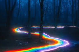
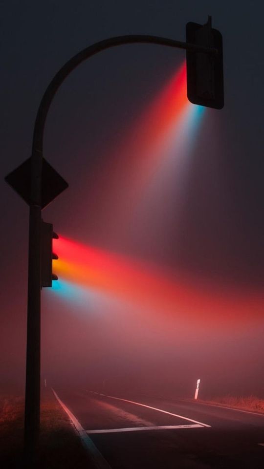
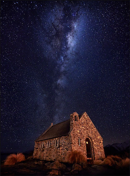
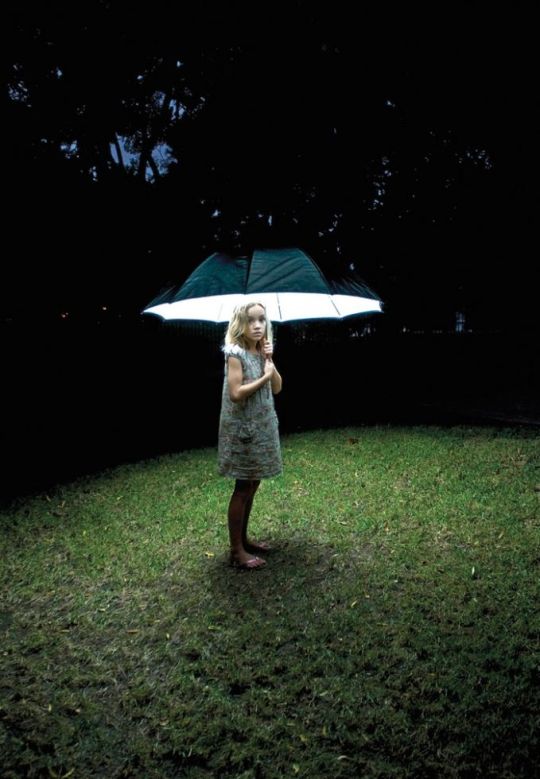
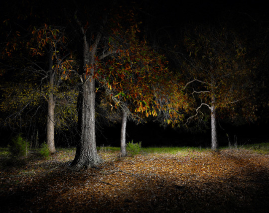
Illuminate - Research Task
Group - Jennifer, Katie, Chis and Scott
Our task was to research Digital Noise Avoidance.
Digital Noise Avoidance is
Ways to avoid noise is:
Low ISO
Use a tripod
Larger camera sensor (Full frame)
The exposure depends on the things you are shooting. But it’s better to have Long shutter but use it carefully.
Large aperture, so low number (i.e.F2.8)
Shot in raw
Use in camera noise reduction if it has it.
Keep camera cool
Cover view finder to help expose properly without more light getting into the camera.
Prime lens is better in low light because it uses less light because of less glass in lens, so makes less noise in image.
11 notes
·
View notes
Video
First practice edit for “Artisan” project using stock clips and audio.
0 notes
Text
Recycle
Project: Recycle. #recycle

©Scheltens-abbenes © David Whitelaw. © Tony Bowran. © Sarah Hogan
Overview.
Many of the everyday things we use lie forgotten or discarded once they have become tarnished or obsolete. However, with a little creative thinking, they can be, and often are, transformed into the subject of, or backgrounds for, the images photographers make.
Create.
Use recycled objects or materials to construct a Still Life image.
Produce.
1. Research 5 'traditional' Studio Still Life images.
2. Shoot one Still Life image using controlled lighting and set construction techniques.
3. One A3 portfolio quality print.
4. One Individual full res 300ppi jpg file uploaded to Moodle submission area.
Research
The following images are from my research for this project.

https://www.pxfuel.com/en/free-photo-xfguu
I like this image as it stands out really well on the simple matt black paper and it lit really effectively with a single light source from above left forming a soft circular pool of light. The rust discolouration tones on the keys and hasp really compliments the red paint on the padlock.

https://focusedcollection.com/180244880/stock-photo-old-radio-wooden-surface.html
I think this image works well, however, I think the shot could have been taken from a more interesting angle rather than the straight on view we see here, which makes the radio look a bit flat. I think the texture of the wooden table is great and the colours in the wall behind are amazing. The image suggests to me a decorator working in the late ‘60′s who never came back to finish the job! I also really like the lighting coming in from above left and casting hard shadows from the radio dials on the left of the frame.

https://www.canstockphoto.com/old-pulley-still-life-28936831.html
The stock photograph above really works well, with the hook part of the chain being sharp in focus but the remaining links quickly going out of focus with a very shallow depth of field. Again, thought has been put into making sure the background is very sympathetic to the main subject in terms of colour and texture and the simple, single overhead lighting arrangement works well.

https://pxhere.com/en/photo/1116405
This image works really well having the bottles lit from behind. The high contrast from back to front really adds a sense of depth and drama with the smoke or dust highlighted behind the bottles adding to the atmosphere and conveying a sense of agedness. Tonally, the wood in the bottom right and-side of the frame ties in very well with the colour of the glass of the two bottles on the left of the shot.

https://hiveminer.com/Tags/destruction,old
The reason for including this image is I really like the background. I think the colour and texture of the rusting and decaying metal are great. Unfortunately, I think the image is really let down by the composition of the forks, the boring angle they have been shot at and the lack-lustre lighting. A different object could have worked so much better on this really interesting background.

http://lenscratch.com/2013/05/robert-moran-relics/
This is one of a series of images shot by American photographer Robert Moran, for his series “Relics”. I think the tones and texture of the suitcase are great and really show the amount of use (adventures...) this suitcase has had. The lighting is subtle yet effective. My one criticism is that the suitcase looks kind of out of place on the shelf and I find the light under the right hand-side of the shelf distracting, however, all the objects in this series are photographed on the same shelf in order to help tie the images together so I understand why this has been done.
Thoughts for my object and background
For my background, I am going to try and source something with interesting textures and a tone that will compliment my chosen object(s). Materials I am considering are: wood, heavy fabric (canvas), slate or possibly a well worn and tarnished oven tray. The objects I am considering include: vintage phone, cutlery, glass bottles, metal chains, padlocks or old and worn hand tools like hammers or saws.
Shoot 1
For my first shoot, I took into the college 2 slate placemats, a grey/black and a dark brown pillowcase and a strip of wood laminate to potentially use as my background. For my objects, I took in an antique pen, snagged fishing reel and a can of tuna fish and a couple of old rusty hooks and some metal blocks I found in the garage. The hooks and metal plates were by far the most interesting of the objects due to the rust, dust and discolouration on them so I decided to use them and shoot them from above. Below are the contact sheets from my first shoot.
Contact sheet 1

Contact sheet 2
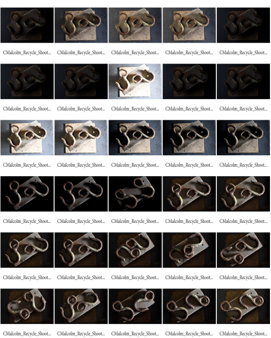
Best images from shoot one (pre-optimisation)


Reflection on shoot 1
I’m quite happy with the way the shots came out from the first shoot and think I have a couple of images that could work quite well and fulfilling the brief. For my next (and final) shoot, I would like to try shooting the objects at a 45 degree angle to allow me to create more of a set backdrop, using the dark brown pillowcase, which I think will add an interesting texture contrast and compliment the objects tonally.

Contact sheet 1

Contact sheet 2
Best optimised images from this shoot


Conclusions from shoot 2
As planned, I shot the objects again in a variety of compositions with angles ranging from around 45 degrees to about 75 degrees and included brown fabric in the background as part of my set as tonally, it tied in well with the other objects in the shot. I tried lighting from overhead suing a soft box on a reasonably low power with the intention of filling out some of the shadows, however, it really just made the images look a little flat so my most successful shots were achieved using a front lamp very close to the same height as the still life with barn doors only letting a slight amount of light across the objects, which I also flagged to further control light spill. During a 1-1 with my lecturer, we looked at the images from the first shoot and identified a couple of shots which could be improved by dodging and burning in Photoshop, which I will do when i am optimising them. Having looked at both shoots, I think the results from the first attempt work best so will be optimising from that shoot.
Final optimised image for submission

Further to the class critique feedback, I further optimised this image in Photoshop by adjusting the curves and increasing both the texture and clarity. I also straightened up the image by rotating 1 degree counter clockwise and cropping slightly. This is my final image which I have sized to A3 with a white border and sent off to print for Portfolio 2 submission.
Conclusion/Reflection
I really enjoyed this brief and am enjoying still life photography a lot more than I thought I would. I found the key is really exploring all angles of the subject and experimenting with many different lighting set-ups and techniques. I also learned how important the tonality and texture of the backdrop set is in complimenting the main subject of the shot.
1 note
·
View note