
cipselajournal
Verónica Herrera
This blog is a visual record book that intends to share with its visitors bits of inspiration to provide verses to the eye and reflection to the senses.
In this space you will find visual stimuli that have caught my eye and help me to build a color palette inside. Welcome 🌼
32 posts
Don't wanna be here? Send us removal request.
Last Seen Blogs

sugar12shame
Untitled

sufiixoo-blog
Photographer And Editor Hope You Like My Feed :)

wastebcrn
Ripped Apart!

succeedded
entice me

a-dyelast-blog
he was like a storm.
Photo


The creation process is much more complex than just adding random elements to the artboard. Semiotics is an important study for the development of meaningful projects. Understanding what the signs represent can give value to the project.
4 notes
·
View notes
Photo


Serif typefaces
A serif is a small line or stroke attached to the end of a larger stroke. They’re often referred to as the “feet” shown at the bottom of letters. Not all serifs are the same, you’ll notice slight character variation from one serif typeface to another and that’s what makes them unique. Serif typefaces are more formal and traditional. They’re often used editorially such as in newspapers, magazines, and the body copy of books. One of the most well-known serif typefaces and probably the first font you ever used on a computer is Times New Roman. Here are five visual examples of some of the most well-known serif typefaces.
Sans serif typefaces
The term sans serif comes from the French word sans, meaning “without”, it’s a typeface without serifs. These typefaces are more modern, bold, and tend to make good choices for large headlines. One of the most popular sans serif typefaces is Arial which is a copycat of Helvetica. Here are a few examples of the most popular and well-known san serif typefaces that have stood the test of time.
Decorative or display typefaces
These typefaces are mostly used for titles and headlines. They’re not recommended for large amounts of body copy due to issues with legibility. This is a large bucket for typefaces including subcategories like slab serifs, scripts, blackletter, monospaced, and more. They can also be some of the most fun to use and add flair to your design but use them sparingly.
SOURCE: thiagor.designer
3 notes
·
View notes
Photo


I think that when it comes to designing from scratch, with very basic photoshop skills, everything becomes a little more complicated. This assignment demanded that we make a poster based on fonts and geometric shapes on a particular song and with it, we had to convey the mood and tone of the chosen genre.
Here I share my designs. It was not easy, but I am happy with the results, especially because in the process I learned the use of various tools. I thank Rod and Pri, who guided me all the time to explore photoshop and most of all, not give up.
8 notes
·
View notes
Photo

Because when we decide to fly, things just happen. Above all, if we decide to be light and love for others. Fly and help others to fly as high as they can, take that as a mission.
Illustrator: Sam Cannon | England
Available at: https://www.instagram.com/samcannonart/
7 notes
·
View notes

Photo

There are times when one feels that designing takes ages... it is not always an easy task, but possibly trying again and again will help us to reach the goal we are looking for.
Illustration Kyle Jones Nashville, Tennessee, US.
Available at http://justkyle.com/
3 notes
·
View notes
Video
undefined
tumblr
Vicente Animated Typeface is another font made by the Animography design studio that specializes in designing animated fonts for Adobe After Effects. This is a highly usable, eclectic font with a unique illustrative character. The sharp contrast between thick and thin lines, combined with vibrant, effervescent colors, smooth motions, and unusual shapes makes you think all your designs need is this typeface and not much else.
Available at https://www.behance.net/gallery/90493077/Vicente-Animated-Typeface?tracking_source=search
3 notes
·
View notes
Photo

Typefaces are so much more than mere tools for written communication. Not only does the choice of a right font help you transmit messages in a striking way, but it also adds desired context and personality to any project, be it a book, a website, packaging, or brand design.
When it comes to experimental typography, the importance of lettering becomes indisputable. Experimental type is often at the epicenter of a project and can be so important that it becomes the designer’s primary visual tool.
Kanibal is an award-winning font created by the young graphic designer Milos Zlatanovic. It’s a collection of various, seemingly unmatchable letters. From perfectly proportional, simple, and distinctly stylish letters, to illustrated and grotesque characters that appear to be on the move, every letter and consequently every word looks fresh and unpredictable.
Available at: https://www.behance.net/gallery/46768673/KANIBAL-FONT
5 notes
·
View notes
Photo


Contrast Worksheet.
Here I come with another visual exploration.
In this case: CONTRAST, a design element that is very important because it helps to organize your design and establish a hierarchy. More than emphasizing the focal point of your design, good use of contrast adds visual interest.
The exercise was clear, restrict ourselves to lines, points and shapes using variations of color, texture or alignment.
They are simple images, but the truth is that they have had their difficulty, because I am still exploring photoshop to do these exercises.
For traces and vectors I feel much safer using Illustrator. However, today I have decided to face the challenge of using photoshop and discover new doors that will eventually lead me to new possibilities.
Thanks to Pri and Rod that are helping me in this adventure ♥
Tell me what is your opinion about them :)
12 notes
·
View notes
Photo

My first approach to the Bauhaus was in 2004, at the Design School of the Dr. José Matías Delgado University. I remember perfectly that my mind tried to take me towards those spaces and moments in history where the Bauhaus emerged, established and positioned itself as a school of great influence for design and architecture worldwide, despite its short operating life as a school. .
However, Bauhaus was much more than colours and shapes arranged in an innovative and harmonious way.
Helvetica, Calibri, Georgia, Times New Roman… Many are the typographic options that we have today only at the distance of our fingertips from the computer keyboard. Choosing one of these typeface is for many a completely arbitrary act, but there was a time when choosing a particular font was considered a bold political act.
This was especially true, in the short life of the Bauhaus, which a hundred years ago shaped everything that we consider modern art today. The ideas conceived in their classrooms crossed the entire globe. Influenced from buildings, furniture and cities. This German school was never a school that only made cool designs using nice colours. Its creators wanted to show how design could serve people. This I think is what most attracted my attention to his philosophy. Serve others.
The founders wanted to teach their students how design can be meaningful to people who use it in one way or another and that with the designs we come up we can transform societies.
Many things to say about the Bauhaus, which dates back to 1919 and inspires me very much.
By the way, I am anxiously waiting for the lockdown level 5, that we have in Ireland to end... So that I can go to the exhibition that the National Gallery of Ireland has prepared to celebrate the Bauhaus Century.
I share with you the link to the National Gallery and the exhibition
https://www.nationalgallery.ie/art-and-artists/exhibitions/past-exhibitions/bauhaus-100-print-portfolios
And a link where you can find more about this school
https://www.bauhaus-bookshelf.org/bauhaus-original-sources-for-pdf-download.html
4 notes
·
View notes

Photo

Flow, Jin, Siyon, 2011| Taken from the Korean Art Museum Association Collection. Available in Google arts&Culture .
This beautiful piece of art brings the essence of how light and color work together. The brilliance of the image is contrasted by the black background making the colors simply breathtaking. It reminds me The Universe.
4 notes
·
View notes
Photo

A portrait master who immortalized some of the most important personalities of the 20th century such as Albert Einstein or Winston Churchill, working for magazines such as Vogue and Life (in which he reached 101 covers). The main hallmarks of Philippe Halsman were style, elegance and also visual inventiveness that led to another iconic photograph in history: ‘Dali Atomicus’.
Riga, Latvia | Dalí 1948
http://philippehalsman.com/
4 notes
·
View notes
Video
youtube
Because movement, dance, also communicates.

“Pina” is a 2011 German documentary about contemporary dance choreographer Pina Bausch.
To know more https://www.pinabausch.org
9 notes
·
View notes
Text
isolation

The Italian digital artist Massimo Colonna creates abstract and surreal architectural landscapes with a captivating sense of nostalgia. He uses photography, architectural spaces, creativity and imagination. Simply magnificent.
March 25th 2020
If you want to see more of his work: https://massimocolonna.com
3 notes
·
View notes
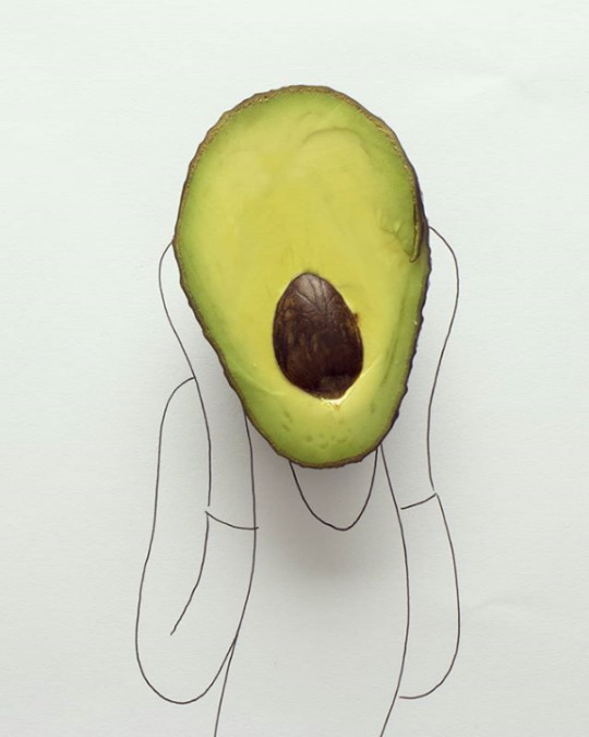
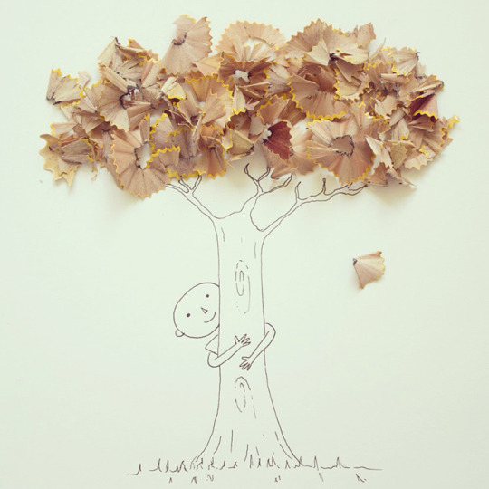
Text
Everyday things...
Since 2012 I have followed this graphic designer who with simplicity and a lot of ingenuity has always brought out butterflies of illusion in my eyes. His concept is minimalist and his use of including everyday things with drawings seems to me just lovely.
From Guayaquil in Ecuador, Javier Pérez under his pseudonym “Cintacotch”
The Scream 2019 | Piano Book 2017 | Violin 2013 | Wine Glass Trumpet 2019 | Flower Brush 2016 | Tree with Pencil Chip Leaves 2019
:) You can find more about him here: https://www.behance.net/cintascotch


3 notes
·
View notes
Photo

Victor Vasarely, Kroa MC (1970)
https://twitter.com/ArtistVasarely
57 notes
·
View notes