
curiositykytti
The Art Dungeon
Art blog for curiokytti! I mainly post my art and links, and any helpful art tips I may have come across. Commissions are open!
🎀✨ I draw animals and other cute things✨🎀
Twitter: curiositykytti FA: curiokytti
44 posts
Don't wanna be here? Send us removal request.
Last Seen Blogs

thepanicoffice
THE PANIC OFFICE

crystalcol0rs
hetero bitch

loststxrs-05
Jesse Coffman

th3e-m4ng0
megop central

Text
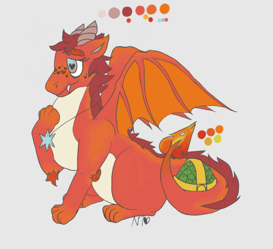
Dragonsona! She loves to hang out in the Evening Lake and Autumn Plains.
#pov i haven't posted art in ages but I've still been making art. such as it is. this is a pretty good one too#a couple years old#dragon#furry#curiokytti art#digital art#im gonna have to go back eventually and edit this with more info im sure that won't affect reach teehee
1 note
·
View note
Text
pannenkoek's explanation video of SM64's invisible walls is interesting because from the perspective of someone with a background in gamedev it seems like the random invisible wall bug of SM64 only occurs because the game was made before certain practices in 3D game development were standardized.
To try and summarize the problem as briefly as possible, the bug occurs in places where there's a gap in level geometry, and gaps occur because the positions of polygon points are truncated. This only causes an issue if your geometry has T-vertexes, which is a big no-no in modern 3D modeling, and can easily be solved by sub-dividing a few polygons.
Below is an example I found online of a T-vertex that needs to be solved (since explaining what they are takes too many words)
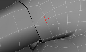
In this example, you can fix the T-vertex by turning that triangle into two triangles.
To put it into perspective, if your 3D models have T-vertexes in the modern era some 3D modeling software won't let you render them without flashing a warning to fix it first.
This isn't an issue of technical limitations on SM64's part. Solving the issue would require creating more polygons but not nearly enough to affect performance by any means. This is a case of 3D modeling being such an early pursuit that no one knew what not to do yet.
2K notes
·
View notes
Text
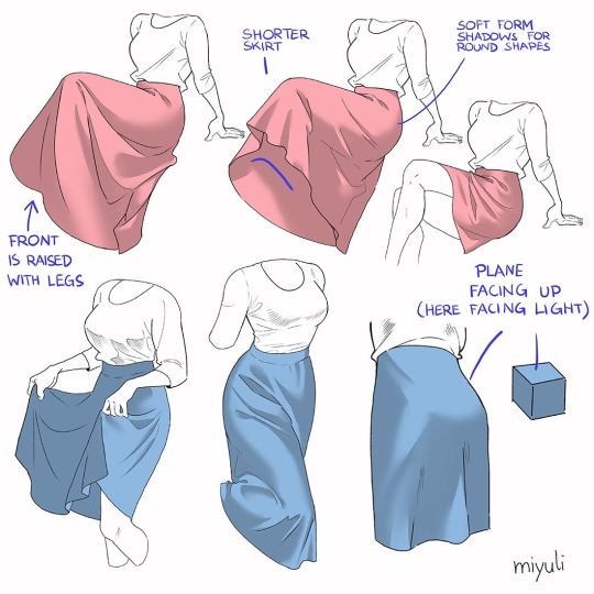
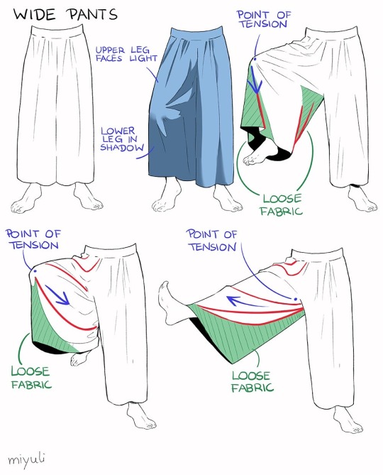
“Notes on skirts and pants”
Source: miyuli on twitter
50K notes
·
View notes
Photo

Guide to that elusive “PS1-pixelated-lowpoly”(but not really)
With the videogame playing population growing up we’ve finally broke from pixel-art nostalgia into the broadly called “low-poly” nostalgia. On closer look this broad categorization gets further described as “PS1 pixelated textures low-poly”, which is a bit better, but still is a really broad and a pretty wrong description of this style that’s so dear to a plenty of game-playing and game making individuals these days. I’ll try to dive into some of the technicalities and examples of this style in the attempt to find it’s characteristics and some actual technical requirements to meet this style.
Let’s start with the obvious, calling it PS1 low-poly is wrong, mostly because the same games were release on Nintendo 64, Dreamcast and PC. More so, games released later can be put into the same category, plenty of NDS or PSP games fit into the same style and adhere to the same economy principles. The only real surface level thing unifying these games is the game size, that is, the games came on CDs. The advent of a DVD format really changed up how the games look, so the graphical style we’re talking about here is called CD-3D in smaller circles.
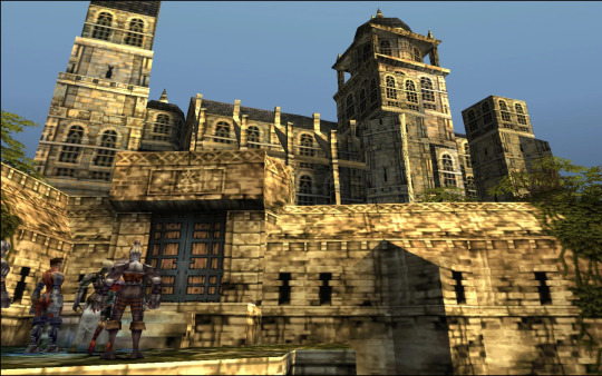
First let’s look at the games that fit the criteria would give you some information to describe the style, textures are obviously small enough to have visible pixelation (hidden by texture filtering) and models are obviously low-poly (that is around or less than 500 triangles for a character), but let’s see what doesn’t seem so obvious. Here’s Spyro and Crash, fan favorites
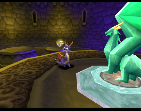
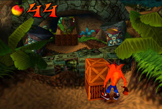
Both games check both points we’ve noted before, but what’s not obvious to an untrained eye is that these games both extensively use Vertex Color, the thing you’ll notice more and more in other games we’ll talk about. Vertex Color is absolutely simple, each vertex of a mesh can be assigned a RGBA value and they’re then linearly blended with other vertex colors. Notice how in Spyro the yellow and purple light is placed on places where texture is repeated, following that you can eyeball where the wireframe is and then you’ll see that the vertex color is used to simulate lighting. Crash himself is filled with Vertex Color, it’s a cheap way to avoid using textures, while having some control over the color of the thing, instead of it being a solid chunk. If you search-engine around you can also find some really fascinating notes on the development of the original Crash and the tricks they’ve pulled! The more ingenious way to use Vertex Color is to take a look at Spyro skyboxes:

Notice how the clouds are diamond-like in shape and are linearly gradiented to the next point in the wireframe.
Vertex color was used extensively and fell off with the increasing complexity of the meshes, delegated mostly to technical masking of stuff like foliage, it’s still a powerful tool for lower triangle counts.
Textures
Now, let’s talk about the textures. Pixelated textures look nice and crisp these days, at the age of 1080p being the norm, turning texture filtering really makes the games look crisp and feel right
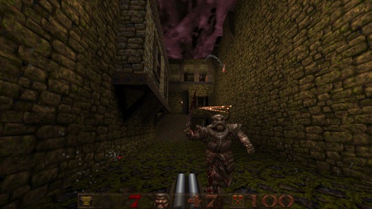
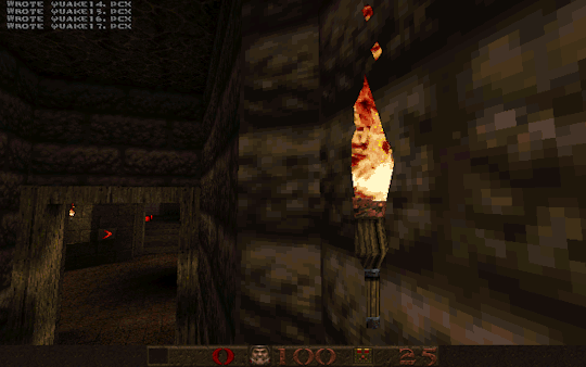
Quake 1 is a perfect example of CD-3D style, often undeservingly forgot in discussions about this style.
But this makes us forget that the textures were often authored with texture filtering in mind. Careful step gradienting to make textures seem smoother after being filtered is a craft in itself.
Texture filtering is not bad in itself, some games look better without it these days, because of the display resolutions, but it’s still a valid tool to apply, it can help push low-res texture a bit higher and produce a softening effect make those 4 pixels into a round circle or improve a visual effect.
Of course, some games took a deliberate approach of avoiding smudged look, like Megaman Legends, for example.
Via a very deliberate texture economy and unwrapping the developers were able to produce very crisp and pixel perfect textures (slightly warped by the infamous PS1 rendering), that look absolutely astounding when you render the game in a modern resolution. Pixel-aware UV Unwrapping, is being used in most games that are considered the pinnacle of CD-3D style, this technique is so powerful, that it was used to great effect in PS2 era games, PSP games and even modern games like Guilty Gear (for a different effect though). Let’s take a closer look,
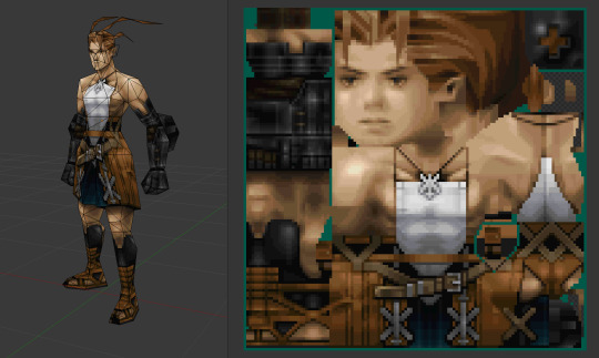
As you can see, our character is unwrapped in square pieces in such a way that a straight line on a texture will produce a straight line on a model. While Vagrant Story is an absolutely perfect in execution of this technique, it’s also used in a same way in Megaman Legends
While I couldn’t find a reliable tool that works with modern 3D modeling software to allow pixel perfect alignment, just using a UV Checker will produce great results. This method also requires some thought put into your topology before unwrapping, but it’s strong point is that you can make changes into your unwrapping and geometry easily, making little tugs won’t break the whole thing.
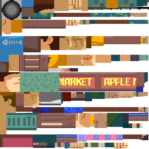
As you can also note, Vagrant Story textures are authored in a single atlas, while Metal Gear Solid separates this atlas into smaller chunks like this:

Allowing for easier unwrapping, since you can unwrap into the full UV space and then change the size of the texture to scale your results. The other important thing is that you probably want your characters in a T-pose when you’re unwrapping, since this allows for easier use of normal based unwrapping, considering your model would be authored with 4 to 8 sides for limbs and torso it could be box unwrapped and then tweaked for optimal results.

Silent Hill 1 used the same technique, and is also regarded as one of the best looking PS1 games.
While this is the best practice for this kind of look, it’s absolutely not required, Quake 1 used a really loose flat unwrap:
But it’s still looks bloody amazing in the end.
While the topic of using UV Unwrapping for crisper result is endless I’d also love to bring your attention to a certain Jet Set game
It also uses the same technique as Megaman Legends, but it tops it off with some cel-shading, producing crisp, stylish and iconic look.
Here’s some technicalities: Character textures are usually 256x256 for main characters, 128x128 for other characters, character usually have ~100-120 colors per full atlas. MGS breaks down the atlas into chunks so each chunks is usually 8 colors. So when authoring textures, make us of Indexed Color image mode or Save for Web.
Now let’s move from character textures to
World textures
Universally regarded as best looking CD-3D games share the same trait, not only the characters look amazing, but the environments too. Despite hard limitations, the environments look very much affected by lighting. A lot of the times this is achieved with this one simple trick that was only improved with modern technology. That is, a lot of the lighting is baked into the textures
While this limits you on the amount of lighting scenarios or makes you produce more same-ish assets this certainly elevates the look. While nowadays baked lighting is not something that exciting, it’s also being done on a separate “layer”, so there’s no need to make a separate texture for every lighting scenario, however the resolution of a lightmap should not be higher than your texture, to not produce a cheap and uncanny effect. You still want to bake some fake lighting into your texture, which contradicts the rules of PBR, but since you’re not using normal maps, rules of PBR should not apply in the same way.
The other important tool to use, is the one we’ve talked about, that is, Vertex Color. Vagrant Story uses to great effect, while it’s environment textures don’t have lights baked, they use vertex color extensively to create a variety of moods and lighting scenarios.

Using best texturing practice, Vertex Color and making sure your lightmaps are matching resolution to your textures will produce the best results.
Now let’s talk why I don’t advise using a lot of normal maps for this style. The simple answer, it’s somewhat difficult to produce a normal map that will work with an unfiltered look, but it’s somewhat manageable to do it if you’re using texture filtering. The issue arises when you try make your normal maps unfiltered, this will make your result either a mess or a bunch of visual noise. If you’re trying to make sharp pixel-perfect textures and then will try to make normal maps to match you’ll get very harsh results. The only way I can see it working somewhat nice is to make a normal map that’s less detailed and then use it texture filtered to give some volume to your objects, while not trying to chase pixel details.
The suggested method is to do a rough sculpt -> bake it down -> use ambient occlusion and other masks to author a texture map with more details. Then use a detailed texture and less detailed normal map for optimal result.
As a closing thought, let’s talk about the
Meshes
A lot of the time you can visually trace the wireframe of things, this makes it easy to pin the style as “low-poly”, but how lowpoly it really is?
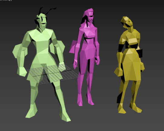
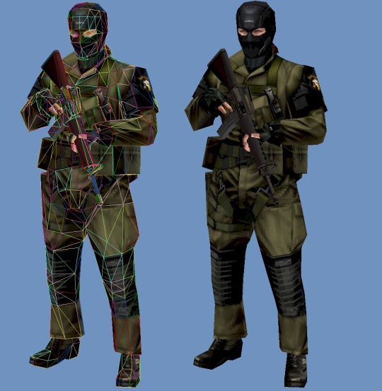
Characters in Vagrant story average 500 triangles per character. Characters in MGS go from ~450 for minor characters to ~650 for major characters. So 500-600 triangles is a solid baseline for a main character in a third person game.
This limit brings out some great restriction for every aspiring 3D artist. You have to know your limb deformation techniques (search-engine “Limb Topology” and browse around the polycount wiki to find some great examples and deformation ready examples), but as you might’ve noticed, some games decided to not wrestle with skinning and deformation and straight up detached the limbs or even made their characters out of chunks. This is perfectly noticebla if you compare the OG Grim Fandango and the remaster, where they botched the shading and you can see the bits in all of their glory.
Another easy example is Metal Gear Solid. Characters arms are separate from their torse, but this is covered with other geometry or they’re of the same color and shaded closely.

This way of doing it was used in a number of other games and allows for unlimited range of motion, while not looking weird.
It’s easy to fall into the trap of adding more triangles and loops, but if you’ll follow the rule of “if it doesn’t add to the silhouette, you don’t need it”, you’ll keep to the style. Zoom out often and if an edge doesn’t add anything from the distance and is not critical to the deformation in a character, you really don’t need it.
These principles are so solid they’ve been alive for decades, in fact, one of the best looking PSP games “Peace Walker” sticks to these principles very closely, for example this soldier is just around 1500 triangles
Spilling out of the “low-poly” territory it’s still made with the same economy principles used in CD-3D style, making use of every bit of texture and every triangle available.
Here’s another game of Metal Gear variety, Metal Gear Solid 2 is a direct heir to the design philosophy of MGS1, perfectly pixel-aligned unwraps allow for crisp detailing:
Another honorable mention goes to Animal Crossing on Nintendo 64
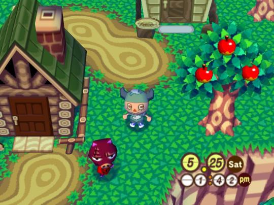
Animal Crossing combines meshes and sprites masterfully, uses pixel-aligned UV unwraps and makes up their own trick when creating landscape.
By unwrapping the repeating texture on each triangle of a hexagon they create these smooth patches of sand without the need for big or unique textures. It’s only 64x64 and 9 colors, but the mileage you can get out of it is insane!
And this honestly sums up the CD-3D style perfectly, it’s the style governed by economy. There’s no need for insane textures for sharp lines, and millions of colors for smooth gradients. Now of course all of these are not rules, but recommendations, you can certainly bend the rules and improve on some aspects. Before we go, here’s some more pictures to get you inspired.


6K notes
·
View notes
Text


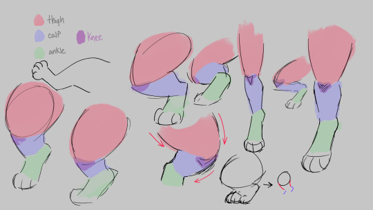
some anatomy tips for drawing cat legs - works for big cats too
37K notes
·
View notes
Text
Something I try to keep in mind when making art that looks vintage is keeping a limited color pallette. Digital art gives you a very wide, Crisp scope of colors, whereas traditional art-- especially older traditional art-- had a very limited and sometimes dulled use of color.
This is a modern riso ink swatch, but still you find a similar and limited selection of colors to mix with. (Mixing digitally as to emulate the layering of ink riso would be coloring on Multiply, and layering on top of eachother 👉)

If you find some old prints, take a closer look and see if you can tell what colors they used and which ones they layered... a lot of the time you'll find yellow as a base!
Misprints can really reveal what colors were used and where, I love misprints...
Something else I keep in the back of my mind is: how the human eye perceives color on paper vs. a screen. Ink and paint soaks into paper, it bleeds, stains, fades over time, smears, ect... the history of a piece can show in physical wear. What kind of history do you want to emulate? Misprinted? Stained? Kept as clean as possible, but unable to escape the bluing damages of the sun? It's one of my favorite things about making vintage art. Making it imperfect!

You can see the bleed, the wobble of the lines on the rug, the fading, the dirt... beautiful!!
Thinking in terms of traditional-method art while drawing digital can help open avenues to achieving that genuine, vintage look!


45K notes
·
View notes
Note
This may be a bit of a silly question but I’m trying to research this for a fanclan and I cannot make a fox’s tail out of the non twoleg workings
So how would you/Windclan go about reinforcing the tunnels? Used to think it was just ‘put a thick branch up there and every few fox lengths, it’ll support all that’ and that doesn’t seem quite right anymore. Please and thank you 🐈⬛
I'm gonna try and keep this reply simple and not get into the in-depth mechanics of digging holes, that's a post for some other time and I'd have to talk about depth and learn math and shit
So very simply putting it, usually, you would naturally dig square tunnels, and this is where all the tension of digging comes from. See, a square tunnel is really bad for physically holding things up, so beams are there to help.
Think about a tunnel kind of like building a bridge. The tunnel is a structure that needs to hold up the dirt above it. Really, functionally think about how many bridges are truly flat; it's not many! You want Arches.
And, it just so happens, a tunnel ALSO wants to be an arch. I'm not sure if I'm explaining this well so I drew a little diagram of a cave-in;
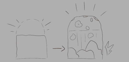
[ID: A drawing of a square tunnel with a dotted line showing the arch of where the dirt will collapse. It progresses into the second drawing of a rock fall, revealing the arch of the first drawing.]
Most cave-ins aren't the ENTIRE tunnel collapsing, it's the part of the tunnel that WANTS to be arch. Arches good. Arches are physically the best way for holding things up. Problem is that you can't dig like that without dropping however many pounds of earth on yourself.
So really, what you want is a beam, not just a stick in the middle of the hole. You want to put a beam from wall to wall, supported by two columns beneath. Like minecraft.
Other various things;
Older tunnels are, actually, usually more structurally sound. There's been more time for them to "stabilize."
The deeper the tunnel, the more stable. This is because the earth above the tunnel is packed in better. You do NOT want to open up a staircase downwards like minecraft, the entrance will COLLAPSE.
However, naturally, a collapse in a deeper tunnel is more deadly and severe for obvious reasons.
Just to state the obvious, sand bad. You do not want to dig in sand. Sand Bad.
Canon vastly overstates the severity of shallow tunnel collapses. Cats will die in less than a foot of dirt :/ There's this part in DOTC where Jagged Peak activates a quicktime event and a burrow collapses on him and it was so profoundly stupid it's been in my head ever since
suffocating in an old animal burrow... girl... do you think rabbits are constantly dying in collapses? genuinely? In soft soil?
Gray Wing is like, "you almost out bro?" and Jaggy-P is like, "ya im coming" and then WHOMP. DIRT. thats not how this works thats not how any of this works
And as a final note... the problems with WC's portrayals of shitty parents aside, it actually makes perfect sense that Tallpaw would think his father Sandgorse is a lunatic for feeling safe with going right back in after a collapse. Tallpaw doesn't know that some kinds of cave-ins actually make the tunnel more safe, but Sandgorse, an experienced digger, would.
(unfortunately the writers don't know this. but i do.)
#also rolling this around in my brain#rbing here for writing references. bc i didn't quite get tunnels before. but this makes it sound more interesting#wc
205 notes
·
View notes
Note
Hello! You made SLARPG in RPG Maker VX Ace, yes? We're looking at getting into RPG Maker ourselves and are curious to hear from someone who's used them how the versions compare. Why VX Ace and not MV or MZ? Would you recommend that version over the others? Thank you so much for your insight!!
slarpg was made in rpg maker vx ace because it was built off of the bones of an earlier project from 2013, when vx ace was the newest version available. i debated upgrading, but ultimately decided against it. knowing myself, i knew that the work needed to redo everything (mv and mz use 50% higher resolution assets and a completely different scripting language) would have probably been enough to discourage me from ever finishing the game in the first place - particularly because slarpg began as a "quick" and "easy" fallback project when i got burnt out and depressed after trying to make an overly-ambitious narrative adventure game in unity. of course, the vx ace version still ended up taking me almost eight years to make, but the alternative probably would have been to burn out immediately, so for me i can't necessarily say that sticking with the worse engine was the wrong choice
mine was a special case. to my knowledge, there's basically no reason for a new dev to use vx ace. just jump straight to mz. (now there's also rpg maker unite, based in unity, but it's still in beta and i'm hearing very mixed things.) do not make a game in rpg maker vx ace in this day and age unless you really, really want to have to explain to people why your game isn't on mac and switch every day for the rest of your life
#as someone unrelated interested in the rpg maker engine this is interesting#ref#ofc always changing but interesting passing knowledge
101 notes
·
View notes
Text
being a self-taught artist with no formal training is having done art seriously since you were a young teenager and only finding out that you’re supposed to do warm up sketches every time you’re about to work on serious art when you’re fuckin twenty-five
367K notes
·
View notes
Text


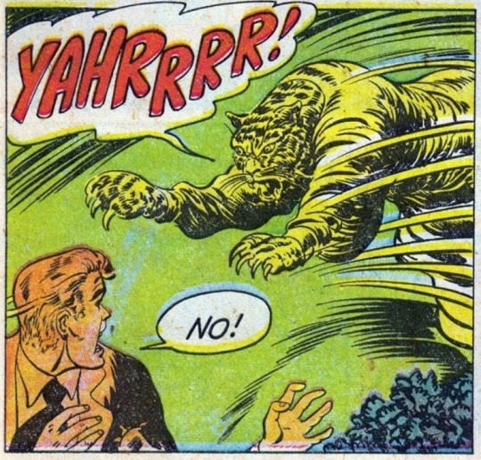
what the fuck is this genre of gif called. i had a collection of these kinds of images and i lost them all these are only ones i can find.
158K notes
·
View notes
Note
YAYYYY THE ASKBOX IS BACK!! on the topic of flower language if you're ever tempted to add a touch more symbolism you can use my carrd :) https://thesanctuary.carrd.co/ !!
Me when I see a comprehensive well-organized easy to search source for flower symbolism

166 notes
·
View notes
Text
LAYERS IN MSPAINT OUT NOW!!! 🎨
[check reblogs for links!]
43K notes
·
View notes
Photo
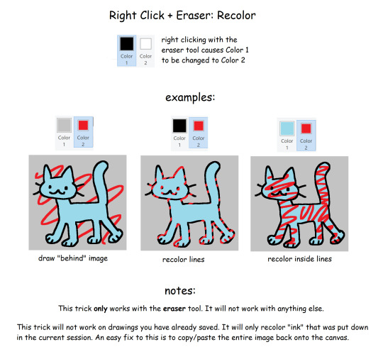
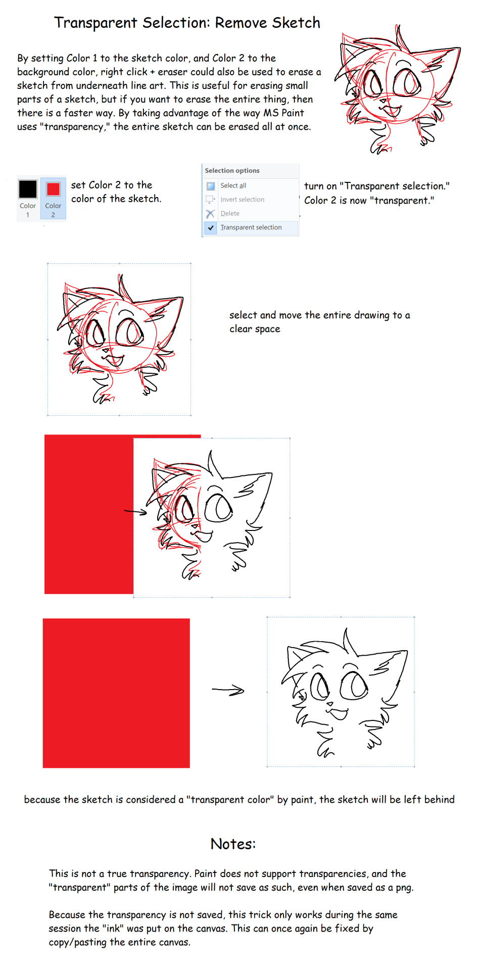
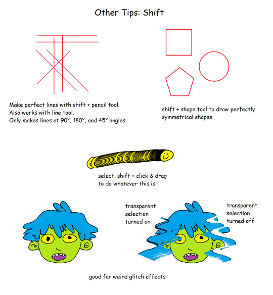
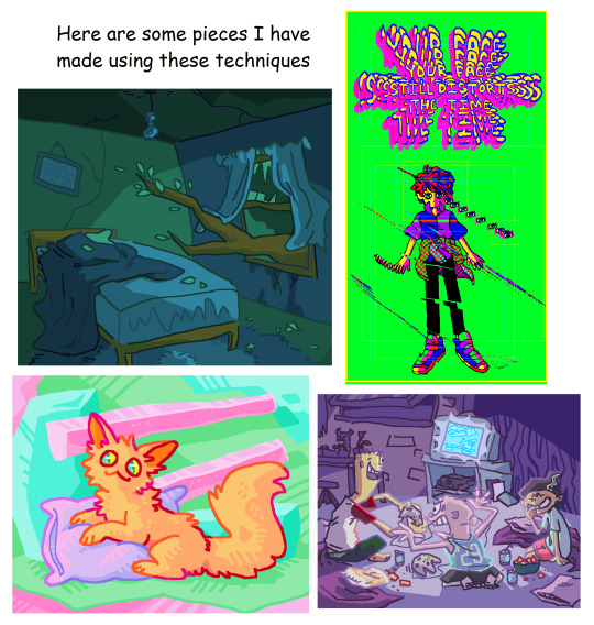
Made this because my other “ms paint tips” post is going around, but the images in it were only made as supplemental material for a paper i had to write and dont include all the necessary information on how the tricks work. As a result people are getting very confused when they try them out to unfavorable results. I hope all those people find this post and their confusion can be cleared up.
19K notes
·
View notes
Text
Resources For Describing Physical Things

Setting
Abandoned Mine
Airplane
Airport Check-in
Alley
Amusement Park
Attic
Bakery
Bank
Basement
Bathroom (home)
Barn
*GE* Barn 2 (Dairy Focus)
Beach
Bedrooms
Birthday Party
Bonfire
Bowling Alley
Bridge
Bookstore
Cafeteria
Casino
*GE* Catacombs
Cave
Church
City Park
Classroom
Closet
Coffee House
Courtroom
Cruise Ship
*GE* Cryogenic Sleep Chamber
Daycare
Desert
Diner
Dragon’s Lair
Dungeon (Caution Graphic Description)
*GE* Egyptian Pyramids
Elevator
Farms
Forest
Frozen Tundra
Gallows
Garage
Garage Sale
Garden
Graveyard
*GE* GLOBAL WARMING (dystopian)
Grocery Store
Halloween Party
Haunted House
Herbalist Shop (fantasy)
High School Hallway
Hospital
Hotel Room
House Fire
House Party
Kitchen
*GE* Laboratory
*GE* Laboratory (secret genetic)
Lake
Library
Locker Room
Meadow
Medieval Castle Armory
Medieval Marketplace
Middle School Dance (informal)
*GE* Mindscape (Mind Magic)
Mountains
Movie Theatre
Night Club
Nursery
Ocean/Sea Bed
Old Pick-Up Truck
Pirate Ship
Playground
Pond
Pool Hall
Prison Cell
Pub
Public Pool (Outdoor)
Rainforest/Jungle
Ranch
Restaurant
River
School Bus
School Office
Shopping Mall
Sleep-Away Camp
*GE* Spaceport
*GE* Spaceship
Stands at a Sporting Event
Storm Sewer
Subway Station
Swamp
Taxi cab
Teacher’s Lounge
Toolshed
*GE* Trailer
Treehouse
*GE* Tropical Island City
Urban Street
Video Arcade
Waiting Room
Waterfall
Water Slide Park
Wedding Ceremony (Church)
Woods at Night
Zoo
Weather
Air Pollution
Avalanche
Blizzard
Breeze
Clouds
Dew
Drought
Dusk
Dust or Sand Storm
Earthquake
Eclipse
Fall
Falling Star
Flood
Forest Fire
Frost
Hailstorm
Heat Wave
Hurricane/Typhoon
Lightning
Mirage
Mist or Fog
Moonlight
Mudslide
Rain
Rainbow
Sky
Sleet
Snow
Spring
Summer
Sunrise
Sunshine
Sunset
Thunderstorm
Tornado
Vortex
Wind
Winter
Color, Texture, & Shape
Color
Black
Blue
Brown
Gray
Gold
Green
Orange
Pink
Purple
Red
Silver
Spotted
Striped
Transparent
White
Yellow
Texture
Bumpy
Barbed/Spined
Crackled
Crumbly
Crusty
Foamy/Spongy
Fuzzy
Gritty
Pitted
Powdery
Prickly
Saw-edged/Serrated
Slimy
Smooth
Sticky
Shape
Arch
Circular/Sphere
Crescent
Heart
Oval & Oval-like
Rectangle
Spiral
Star
Square
Triangular
Tube
Wavy
Support Wordsnstuff!
Request A Writing Help Post/Themed Playlist/Writing Tips!
Send Me Poetry To Feature On Our Instagram!
Receive Updates & Participate In Polls On Our Twitter!
Like us and share on Facebook!
Read More On Our Masterlist & See our Frequently Asked Questions!
Tag What You Want Me To See With #wordsnstuff!
Participate in monthly writing challenges!
24K notes
·
View notes
Note
how do you go about picking the colors you use in your art? you seem to have such a good feel for which ones look nice
I have studied a lot and I like to select colours that I associate with memories.
A few people have asked me about colour, so I will explain further.
I recommend studying from anything that has colours you like. I have studied primarily from a selection of video games because I have been around video games since I was very young, and I have strong memories associated with them, so their colours impact me. What impacts you will probably be completely different, but the concept is the same: it is best to study what engages you.
I have difficulty understanding written theory, so I have this 'practical study' approach:
Before starting, keep in mind that you do not need to show or tell anyone about your studies, so there is no need to feel ashamed if your studies are inaccurate.
Find a photograph or image of something that engages you, and copy it without using the eyedropper tool. Guess which colours to use, and copy the image as best as you can.
Use the eyedropper tool on the image and paint a separate copy using those eyedropped colours.
Compare your colour guesses in your first study to the actual colours in your second study. When you do this a lot, you can naturally remember, 'oh, this type of brown contrasts nicely with this shade of blue, and I associate this specific colour combination with a childhood photograph of a river.' (This is just one example. You can study from anything.)
Use the knowledge and memories you gain from studying to create original artwork.
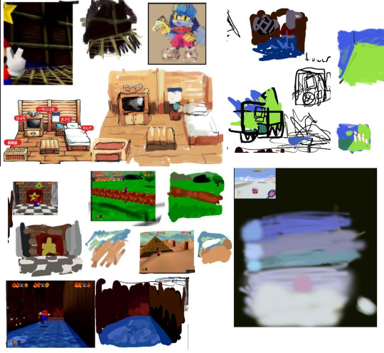
The above image is a compilation of a few of my studies from 2017. It was much easier to create original artwork after studying what I liked.
I think it is also wise to pay attention to how light and dark different colours are when they are next to each other.
In most drawing programs, you can make a layer, fill it with the colour black, and change the mode of this black layer from 'Normal' to 'Color'. When you move this black layer on top of another layer, it will show you how dark and light the colors are.
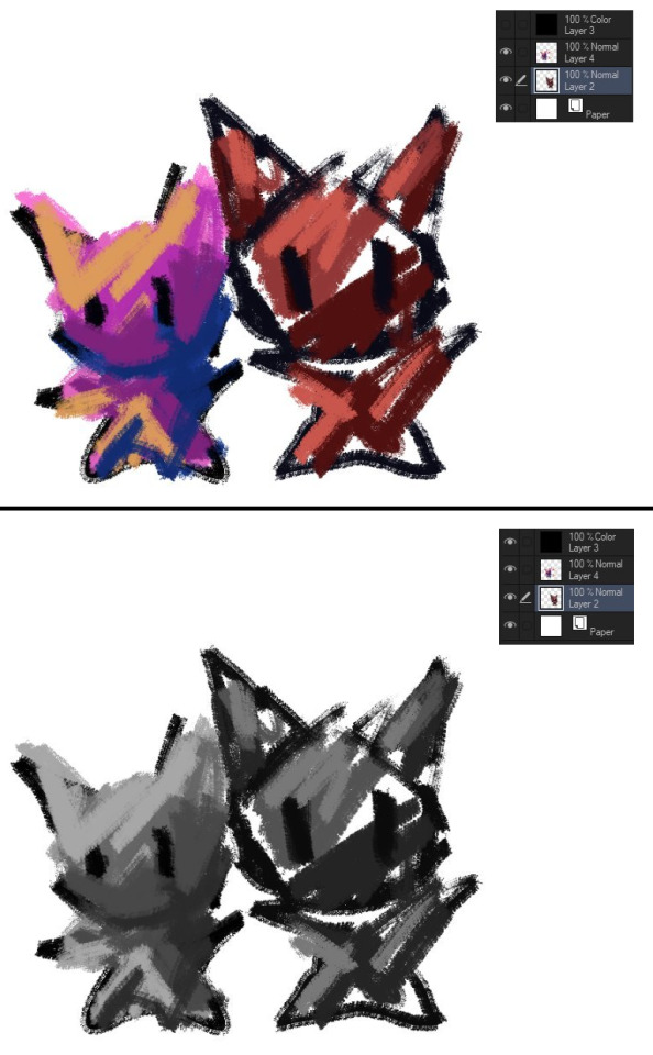
These two cats are similar in their dark and light values, but one has different shades of red and the other has pink, orange, and blue. Of course you do not need to use colours that contrast against each other, and you do not need to use a variety of colours either, but it can help open your mind to different colour combinations if you are frustrated with colours.
314 notes
·
View notes
Text
i hate that every time i look for color studies and tips to improve my art and make it more dynamic and interesting all that comes up are rudimentary explanations of the color wheel that explain it to me like im in 1st grade and just now discovering my primary colors
139K notes
·
View notes