
Don't wanna be here? Send us removal request.
Statistics
We looked inside some of the posts by damianacottstudio4 and here's what we found interesting.
Average Info
Notes Per Post
0
Likes Per Post
0
Reblog Per Post
0
Reply Per Post
0
Time Between Posts
2 days
Number of Posts By Type
Text
17
Last Seen Tumblr Blogs


Fun Fact
US Tumblr user growth rate is estimated to slow down to 4.1%.
Text
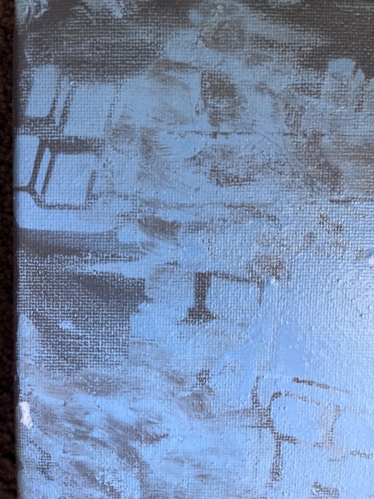
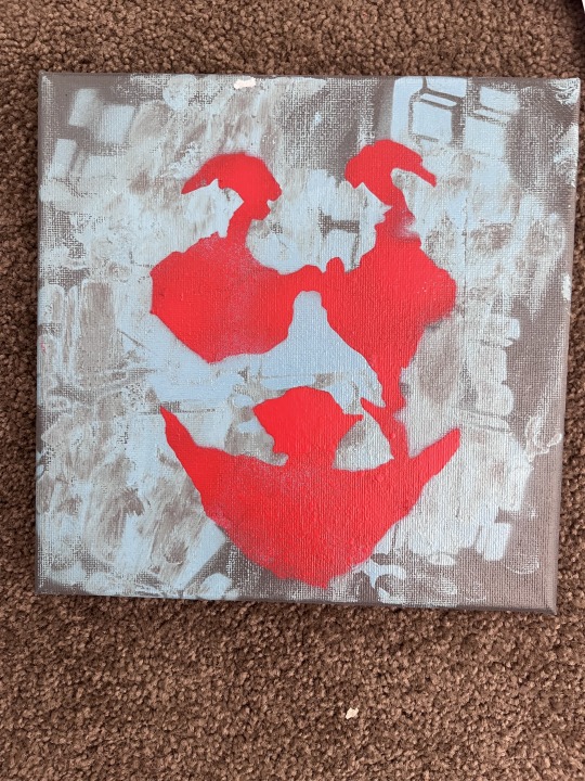
Experiment


new experiment, i was just looking at this work and wasn't feeling like it was complete, so i decided to try and create something new and test out what i had in mind


before i actually conducted the experiment onto the canvas i made a couple mocks to identify what colours work best, if new colours were a better option or if i should stick to the same colours
i found that the pairing of the red and pink was what worked best, i liked that they complemented each other rather than being combative and creating tension

the final result was interesting, i mean i am not totally against it but i am not for it as well, i feel that this was more of a experiment rather than a planned creation
in saying that though i am still glad i did it, it provided me with an answer to a question, this being what would it look like if i layered these stencils on top of this particular canvas?
i feel like there is too much going on, it is quite unpleasing or it just doesn't work, the colours clash with one another and in turn it has kind of separated the elements of the work (lego figures/joker stencil) rather than tying them together to create a smooth reading or is this because of the colour choice
i did think the colours would work,


i then to the mock into PS cropped and adjusted the images colour balance and came up with this look, i felt it looked good, it reminded me of a neon sign outside of a restaurant or like in Radiator Springs
i also knew i wanted to make it like a previous work i did, just placing the images side by side on one row then the next inverting/flipping it
the first version on the left i felt that it still looked off especially since the top level was the full image and the bottom line was 3/4, so i decided to move the whole image up to cut of just enough from both sides to finish the look, however know i am uncertain a to which i like


from this i then created this new work
i wanted to add text and initially played around with the five W's, and other phrases, words etc.
i then had this thought of adding a url, i knew i wanted the www and .com included because i felt that this was definitely needed to present enough information for the audience to create/realise/find the relationship
it actually kind of reminds me of like a cyber attack or comedic still in a film roll, like an intro scene or something, kind of has this piracy feel to it , i am very pleased about this work
i also like that the text isn't directed to anyone, its like open ended
who is this we -> is it third-person, second-person, or first-person ? does this change the reading ? -> i think it does affect the audiences reading
but also the imagery layered beneath the text is of the joker, maybe that is why i feel it is like this piracy film or social commentary thing ? it definitely feels like its a critique about something or someone/groups of people/communities etc. however at the same time i feel it isn't -> maybe the two exist simultaneously
0 notes
Text
Experiment


character drawings done in visual diary
i was essentially just mucking around trying to further develop my skills in creating characters
i did notice though before i begin to put pen to paper there is a hesitation in trusting my abilities -> where it becomes to controlled or a thing that has to be perfect
i also noticed that i often start by drawing something that i can see, wether it be an object, shape etc. -> this has become a regular occurrence that has enabled me to combat this "perfect" creation
also i am starting to notice patterns in the characters that i create, i noticed that often they have no eyes, and are almost as if they are skeletal beings
i find that with the characters having no eyes it kind of blocks or counteracts this "eyes are the window to the soul" saying, it allows for the removal of seeing?
0 notes
Text
Experiment

further experimentation in PS
i like that my eyes naturally follow the lines it makes it feel as if im being moved along this road following each turn sharp or rounded, just like a musical score and the various ups and downs

for this i just wanted to see how far i could take this work
i added the text " can you hear the music" , i got this from Oppenheimer the Christopher Nolan film during the early stages of the film
i don't know i just felt strongly about using this phrase, i mean i know i want to use it as a title for this work but without the text, i feel that this title could best sum up or rather help/guide the audience into thinking about the connections between one another
i do feel like the text isn't working with the background, its like there clashing against each other, but also the text isn't that clear/readable -> i did play around with different fonts/colours/sizes but i opted for this however i think it might've been a decision done in the heat of the moment
0 notes
Text
Artist
Fabio Silva - SALMOS
i like this work, i feel like the removal of the eyes creates this hidden aspect, "the eyes are the window to the soul" but we cant see any eyes so is what we are seeing true? are they accurate depictions of these characters? -> in the most literal sense then no because the character don't have eyes
i don't know maybe having no eyes solidifies them in there intended state or age? i don't know if the makes sense? -> i think i am trying to say that without the eyes they are oblivious to their surroundings or what is "true/real" it's like they are trapped in the "good" because they can't see the bad ? -> i kind of like this point, i know for most of the characters i draw i tend to not give them actual eyes, like they are not real eyes, they are either hashtags or other symbols but i never thought of them the way i thought of them with this work, i find this interesting
Matt Gondek
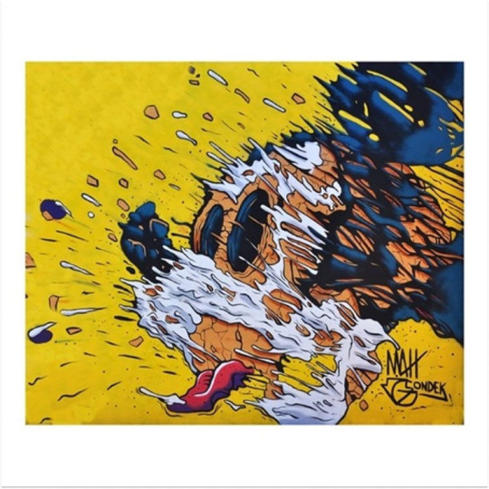
i like that the work is deconstructed yet it is still obvious, in terms of the character
i feel like its painting this character in a different light and highlighting or trying to highlight the negative things about it or what it represents ? like taking off a mask
i like the unsettling nature of the work, i feel like it is showing the downfall or the other side of MICKEY ? in some way i feel like it brings the character to life, we often see this character associated with HAPPY or all things good but i feel like this work presents a more real mickey ? (like if mickey was real or rather reflecting this day and age? ), one that is perhaps not happy or has more to it than what meets the eye
i like the colour palette, its explosive but works, the work still holds the true colour of Mickey (black/white), like its showing just enough for us as the audience to draw the connection to the iconic character ? as well as the inclusion of key characteristics that enable the audience to form the pieces of Mickey
0 notes
Text
Experiment

new experiment with the lego stencil
i had this idea before experimenting, the idea was to explore how i could depict these lego figures buried, however i didn't want them buried under sand, water, or things that fit this or rather go along the same line
i knew i wanted to incorporate cherry blossoms in some shape
so from this i had the idea to utilise a paintbrush and dab the brush onto the canvas to create these circular forms resembling cherry blossoms, however i realised that of the brushes i have i did not have the type of brush i needed, this being a larger circular tip brush rather than a straight edge flat brush
i then just made do with what i had and began to use different variations of the pink acrylic i had, either adding more or less white paint to achieve the various tones i wanted
at first i didn't know what colour spray paint to use however i then narrowed my choices down to the red as i knew it worked well with the pink due to previous experiments
since i wanted the characters/figures to be buried i decided to use the smaller stencil and orient them in ways that made it seem as if they were laying down/non-vertical -> yes some figures are vertical however i feel that they are slanted slightly to off put the "perfect" or "symmetrical" feel
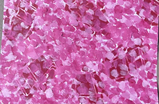
i then added more stencils and began to add more cherry blossoms to hide/burry the lego figures
in terms of achieving what i wanted or rather had in mind, like my vision for this work, i feel like i have achieved this
i do think that i have achieved the burying aspect of the work, initially i was skeptical as to how i could achieve this as i felt that the brush i had was too small to create circular brush strokes, i do think that what i have now is good however i feel it would be taken to another height if i were to use a brush big enough to achieve these circular brush strokes
i feel like the brush work that i have now, like the size of the markings is small and kind of reminds me of finger painting, although i wanted to replicate cherry blossoms i feel that i have only done so through the colour palette, i think that maybe also if i were to do this again, i would do so on a larger canvas but this time try to replicate the actual cherry blossom wether it be through the flower structure (like replicating each petal to form actual flowers) or maybe taking aspects of the flower like the natural form of the flower to dictate the movement of the paint brush
another thing is i realised that there is a very textural quality about it, you can see the excess paint left after pressing the brush, i think that this adds an additional layer of meaning or aspect to the work, what i mean by this is that it shifts the work from a peaceful to stressful/anger filled action? even if unintended it does add layers to this work, additionally i like that some brush strokes are as if they have been scraped off, to me it makes it feel as if someones finger is been dragged or slowly pulled away or down the canvas, like a hand on a glass window running down leaving marks and making screeching sounds -> additionally i feel like the brush strokes create movement which in turn makes me feel like this work is a field of flowers where the wind is blowing uncovering and covering these figures like a loop
i feel like this work is still exploring themes from previous work, i still get this feeling of lost while looking at it however i also feel like it is uncovering and covering these lego figures, like wind blowing leaves that fall onto the grass eventually covering parts that weren't covered before -> i guess this could be a metaphor for the process of constantly working on oneself, slowly reshaping or breaking down beliefs, gradually placing pieces together to create you ?
0 notes
Text
Experiment

decided to further experiment with the stencil however add to it rather than add multiple layers of the stencil
i then decided to try and create this warped are altered look, like
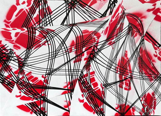

experimenting in PS, trying to create or play with perspective took me a couple variations to satisfy what it was i wanted to communicate
i felt that with what i had already i could expand and take further especially due to the numerous things that can be applied to an image in PS
it does remind me of music charts, notes flying all over the place as the notes ascends, shift and move during a song/music piece
like a roller coaster only what is saying? for me i feel as if these figures however different they maybe from another are connected by these lines -> potentially reading as a connection of life, that how no matter how different we are all connected?
expanding from this roller coaster -> like a ride of emotions, going through the high and lows? the lines also remind me of race cars, like in TRON, how the car/bikes leave a trail of light as they move, i do think also it could comment on the nature of thoughts -> how they start from one point moving and changing, joining into another only to leave a specific line with more than what it entered with, all the similarities and differences at intersecting points pivoting old/new thoughts to new/old locations
0 notes
Text
Experiments


i continued to explore different things i could do with this sencil
in all honesty the experiment above was done in like the spur of the moment, i wasn't really getting any ideas so i just started putting pen to paper
there was no vision, idea or theme i was trying to achieve, i really didn't care to much about the outcome i just wanted to try something, i did realise though before making i was hesitant to "mark" the stencil


with this experiment though i kind of put more thought into it
i know the lines vary in size, paint held and direction however i feel like it was more experimental and unplanned, i didn't focus on the direction of the lines to create this 3d look, like the bottom right of the leg, the lines aren't angled they are straight, i feel like this part effects the viewing, glancing over the work the lines are blurred and creates this wavy texture like wind blowing in tall grass whereas the bottom right it kind of feels boring its just horizontal and feels like it has no form or movement when the others do
i do like the outcome, i debated with painting the arms and head however felt that what i had done was already good and if i were to do the arms and head it would be to much, this was in my eyes a good thing, it feels more three dimensional like this
looking back at it i kind of feel like the visual differences between line weight etc. adds more to this textural feel like it emphasises it more, whilst also guiding your eyes, kinda look like tree rings
i noticed that the brushwork was the most "intense" part , the process was very different each time i applied the paint, i tried different methods like applying the paint in one stroke versus two, i played with the pressure(paintbrush, like pushing more/less) as well as the path movement, some are more curved some are more angular/straight edged,

made this in photoshop, played around with the image adjustments like the colour, saturations, hue etc.
0 notes
Text
Artists/Inspo
Gonzalo Sáez Díaz-Merry
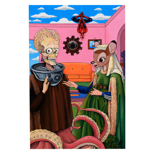
i like this artists combination of references, and blends them together
this work to me feels like a weird combination of tv shows and movies i have seen, which in turn makes it feel off putting
like the simpsons house, spider-man hanging from a web and bambi having arms dressed in a dress that looks like its from shrek, and even the skeletal brain man in a robe, with tentacles for feet
its like a collage of elements that form like a window into the world of pop culture, or maybe showcasing child-like imagination -> like a deer human, skeleton octopus man, spider-man
it is i guess weird to me or off putting that these characters aren't true to their original depiction however i feel as if this work is alluding to the boundaries of this
Alejandra De la Torre
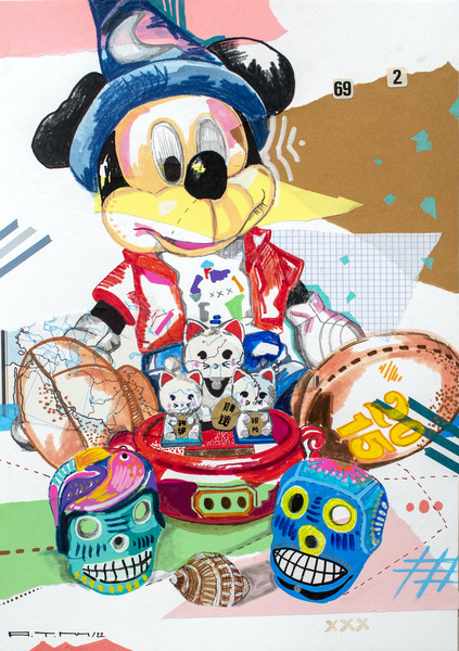
i think for this artist i am intrigued by the composition, more specifically the look and feel of the work, i like how the work emits this feeling of collecting or having a collection of objects that hold value?
all these objects put together creates this by acting as souvenirs or a momento, however in this work its almost as if the artist is showcasing the nature of these souvenirs once collected, positioning them in a manner that showcases their individual characteristics whilst also giving information as to the origin of these objects, like from a holiday or theme park etc.
it kind of reminds me of toy story,
i also like that it comes across as a process image, if that makes sense, like how early concept drawings of an animation or something
or like a pin board in someones room that holds key information, personal notes, important photos -> stuff that means the most to the individual
for me when looking at the objects individually my mind automatically tries to draw connections to places that i have been, like disney world, the beach etc. but i also feel like this work is highlighting the significance of these souvenirs/memento and how each object holds different meaning, memories attached to them, like showing the beauty in something that doesn't necessarily allow someone to question the nature of it ( like if someones room had a souvenir from somewhere, you don't necessarily associate it with memories its more so the place) i'm not sure if that makes sense though
0 notes
Text
Experiment

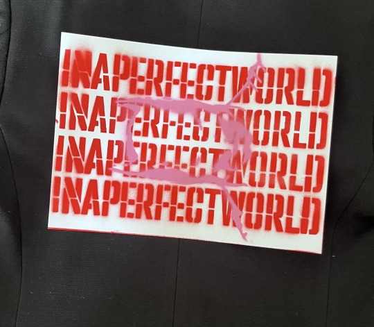

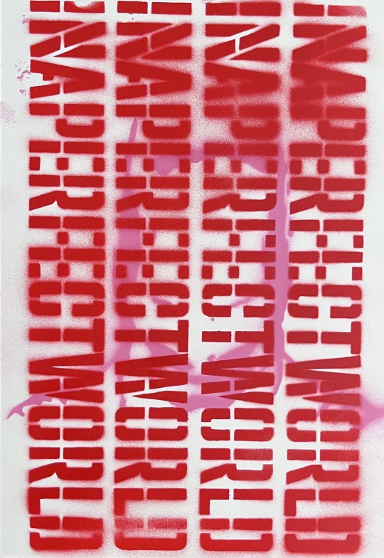
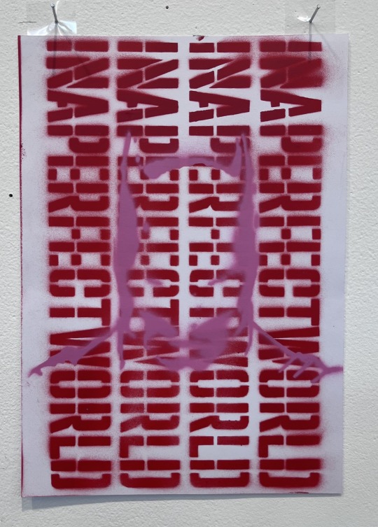
this work was for the group exhibition, we collectively decided on a theme which was Text and Textiles
from this i started to visualise, play around, with different objects, texts and others to see what works best
however after utilising the text and figure stencil shown above i decided to try and replicate this on a larger scale
i knew i wanted this specific text as well as the figure seen, i thought about doing something new however i felt that i had already had something and just had to play around with it to see what the result is
i began to play around with the positioning of the letters and figure, i used this mock as a guide to see which way the text is positioned would ensure a smooth reading, i found that placing it horizontal reading from left to right would be the most 'easy' in terms of the audience recognising the phrase, alongside this since the text was going left to right/horizontal i felt that the figure should only be placed vertically to show of the features without having the audience to tilt their head

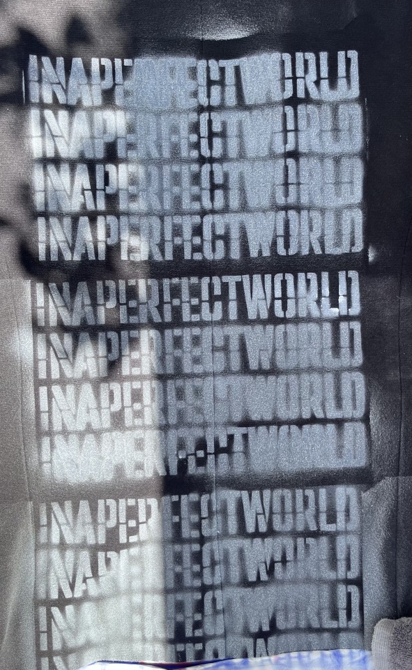


i then began to apply the stencilled text onto the canvas, from this i began to take notice of the process, like what went wrong what worked, what could be done better etc.
for instance i found that the text would not transfer onto the fabric the best i thought it would, i thought the result would be like the mock which presents a clear, easy, readable front whereas on the blazer it would come out fuzzy, illegible and dense in specific areas however in saying this i realised that it was never the whole line that was fuzzy it would only be certain parts of the stencil like the first four letter "INAP" some are easily read whereas some are almost jumping out of their respective boundaries and flooding into the other letter
i also realised that at points i often had to take a step back and revisit the work to adjust the placement of the stencil to ensure i was achieving the desired outcome which i was not made 100% aware of
i did have this moment during the process where i felt that the text although fuzzy it still fit the actual phrase " IN A PERFECT WORLD" like the stencil just took over and didn't transfer across perfectly it holds these imperfections? that plays to the lyrics

i feel like the work still achieves this altered space/reality whereby the audience is pressured or led to question what it is they are seeing? ,
there is definitely a visual grouping, looking at it you can see this panel of 3 reading top to bottom
i do feel like it has this rebellious feel to it, however i am not sure as to what specifically it is critiquing, i mean in my eyes its this masked figure, could be read as a masked individual trapped or sealed behind these words -> i feel like this is to figurative like reading it as individual layers rather than together -> maybe this affects the meaning/reading/viewing where the audience reads the layers individually
i feel like the text is comedic though, to me its like this opening phrase that leads to the audience engaging with the work, its like its hinting at something but it isn't set, like a cliff hanger, in a perfect world ... WHAT? WHO?
maybe its like being trapped behind the expectations of society or any expectation that causes oneself to dull down the intensity of life with meaningless words (don't reflect the truth, or whats real,) on the other hand maybe it comments on the beauty of the imperfect ?
was just thinking about how maybe the orientation of the text, if it were vertical it would change the feel/meaning of the work
0 notes
Text
Experiments
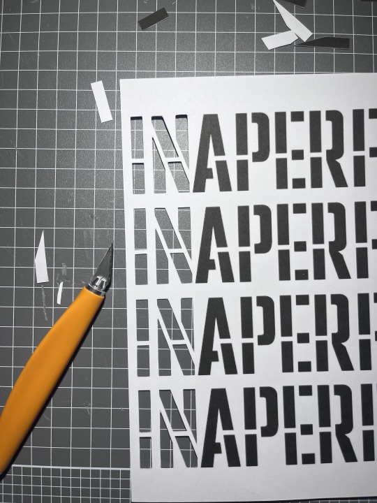
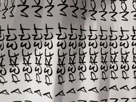
made this stencil in photoshop, just used one of the fonts on PS , i did play around with fonts but found that the spacing, size, and form of the letters didn't fit what theme i was aiming for
in this experiment i actually used different paper, i found that working with normal printer paper was not ideal for cutting stencils as the paper wasn't strong enough to hold the weight between two cuts (like the line in the middle , the thine ones) , when cutting the stencil the paper would often break when cutting smaller stencils or lines, and i could reuse them instead of them being crumpled up and used as a once off which led to works having trouble showcasing bold results from the stencils (i also used the same paper for the joker stencil) , the paper was heavier more like card stock - 210gsm
the cutting of the stencil actually felt like it was the most difficult part, which is what i have noticed when working with stencils, its very time consuming to make sure that i am cutting away not too much and not too little, whilst also ensuring that the figure/words could be easily seen like the curved bits so that the audience can make out the object
The text is actually lyrics from Kendrick Lamars song PRIDE, i felt that the lyrics best represented the theme i was looking or aiming for,
i think for the theme i was trying to head down this poster feel like the ones with big bold letters that feel as if they are attacking you or something
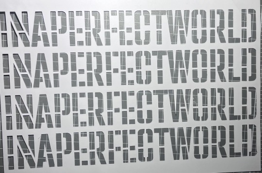
i then made a practice/mock of what colours i wanted the text to be
alongside this i played around with layering to see the effects however from this i found that the words could only be red from the top and the bottom line
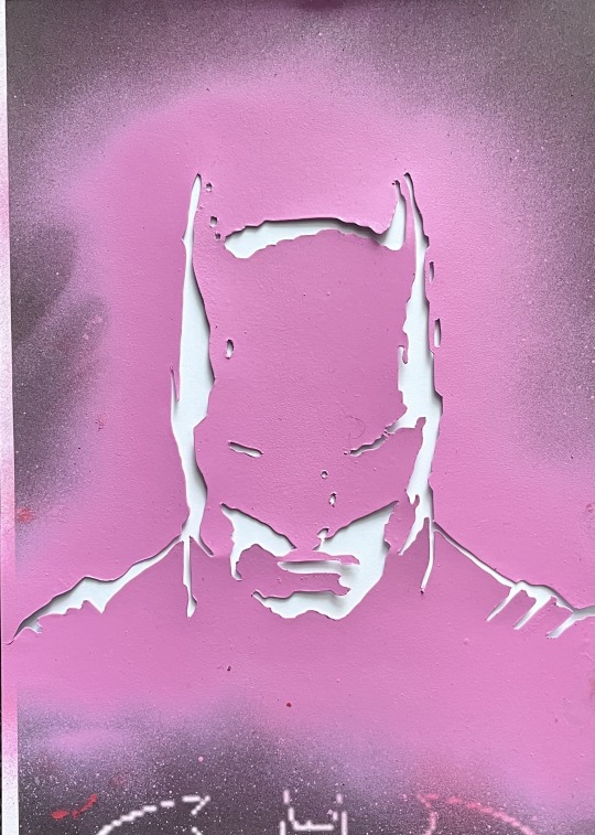
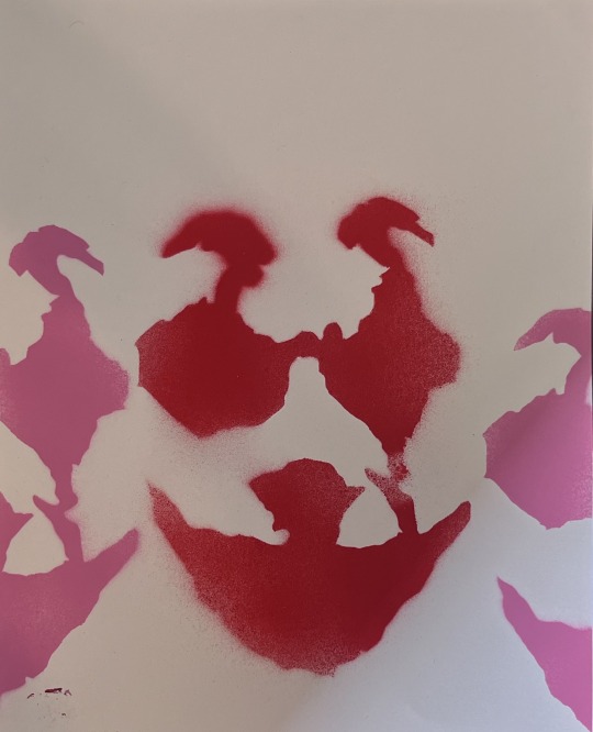
i then made this batman stencil, i think it might've been because i used the joker as a stencil but also i like his posture, it gave this intimidating feel like he's looking down on you or something, like big brother spying on you (1984 George Orwell)
i knew i wanted to layer it with the text as i felt it would work well contrasting against each other
when making the stencils i used this free website that makes stencils, and edited the photo to remove any noticeable things like the bat on his chest to not label it or give the audience that visual relationship
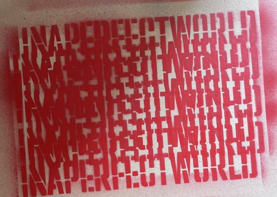
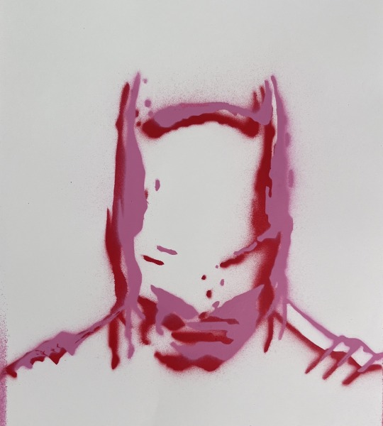
at first i only did the red stencil but then added the pink slightly off from the previous and the results where quite interesting, i actually like the look
i then created two new mocks to see what works best the image behind the text or the text in front of the image
i decided to use the red and pink because of the previous mock above
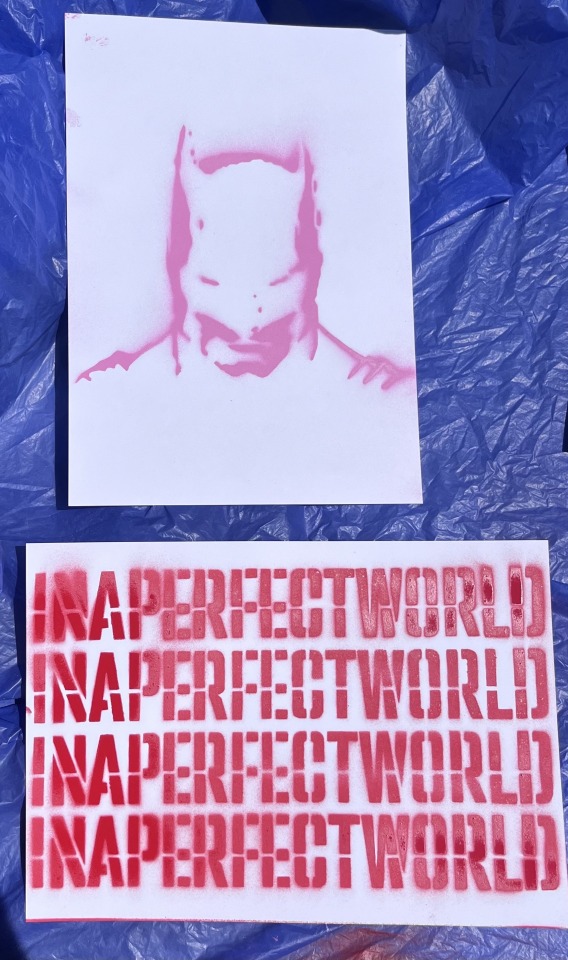
i do see that the text stencil did not come off as well as i would've liked especially the "in" "per" and "wor"
after this i then layered the two stencils onto the pages
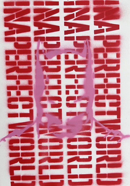
from this i found that the best one was the one that had the image layered on top of the text (left)
the one on the left doesn't hade the face too much where as the on on the right you can hardly make out the character/image however this combined with the text stacked vertically creates this feeling of jail bars, like the one on the right is behind bars and the one on the right is in front i also feel like the one on the left is contrasting better, like its more readable and defined whereas the left is not on the same level
i then installed it vertically like a poster and the results where better than i expected, i mean when looking at it uninstalled it didn't give the same effect as it did installed
too me it comes across as different, maybe because if haven't done something like this, or because it kind of makes me want to investigate this work i don't know if that makes sense
i mean the image of batman still is obscured, like it still doesn't have to definitive, bold lines
i do feel like it is comedic though, like you could read it very literally as in the text read "in a perfect world" and then you see batman, so is it this thing where the work is saying in a perfect world i'd be batman , however maybe it feels this way for me because i know what the image is or if im playing onto that big brother is it either all for big brother or against, i don't know
i fell like it could also be read as this thing that is bringing awareness to something like shedding light onto topics that are hidden ?
Failed Stencil:
0 notes
Text
Artist/Texts
i liked this article, i felt that it provided me new insight/perspective onto a form of creation.
i like the compositions that the mentioned artist creates, i feel like these works filled with various imagery, forms, colours, shapes etc. create a new or refreshing look that provokes a deeper appreciation or understanding of pop-culture
0 notes
Text
Experiment


after discussing with Dan about potential artworks etc. i took his advice and continued to experiment, develop, research, and investigate this character to see what and where it would take me
at first i was sceptical about further creating with this stencil, i thought that if i were to create more artworks consisting of the stencil it would become too much and next thing you know all works consist of this stencil, however i realised that what i have is worth exploring so i did that
i decided to utilise a different colour palette that actually was derived from my liking of cherry blossoms
instead of utilising the same processes as previous works especially like the other work with the stencil (dark green and grey)
the process of creating was actually very enjoyable, exciting, new and free, free as in i could place the stencil in any orientation use any colour and the result would not affect the overall composition
throughout this process i actually decided to trial new methods, spray cans etc.
i used new spray cans that were different to the other paints that i have, beginning the process of creation i immediately realised the difference in the two cans, i found that the newer spray paint cans that i bought were more controlled and presented a more even coating of paint with minimal pressure where as the other would often cause the paint to splatter
another i did differently was the actual application of the paint, instead of holding the paint down onto the stencil and continuously spraying i tried a new method where i would do short bursts of paint in vertical or horizontal lines either starting or stopping at the very edge of the stencil to limit overspray
another thing i did differently was positioning my body to be directly over the stencil, this ensured that unwanted paint wouldn't seep underneath the stencil, alongside this i payed more attention to the positioning of the can, movement path and try to spray in one direction so that if there was overspray it would occur in one area instead of multiple
in saying that i also did encounter some challenges, for instance i found that excessively using the stencils caused the stencil itself to stick to the background as i was applying multiple stencils to the canvas, this was stressful as unwanted marks or even removal of paint would occur as it stuck to the stencil when removing the stencil from the canvas
yes i do realise that some stencils vary in colour, especially like how much each lego figure holds, some were lighter and some were darker however i did not worry to much about it because i didn't really want to create something so clean, i like that it isn't "perfect"
i also encountered issues with the gloves i was wearing (latex), i found that if i left my hand to long on the canvas or stencil it would stick and actually remove the paint from the canvas, causing me to go back and lightly apply paint to areas that were removed
the process was very time consuming i often had to take a moment or two to position the stencil were i wanted it and then wait for the canvas to dry before starting again


in terms of installing the work, more specifically the orientation of the work i debated on landscape or portrait for a while, i actually made the work horizontally however as i was installing i kind of felt that the work was coming off as a poster and then decided to position it vertically to complete that poster feel
also the positioning was important, when looking at the work it is clear that the work holds more visual weight towards the bottom than the top, so by positioning it this way i found that the viewing process was not as stressful or interrupted as your eyes naturally follow this visual weight from top to bottom this was not done purposefully ( when creating i did not intend to make one side more heavy than the other) , also in my eyes it feels as if the bottom half or the last quarter is actually pulling the top closer to the bottom, like tetris blocks falling from top to bottom
looking back at it, i am actually quite happy with the result, yes there are things that can be better (mentioned above)
when viewing the work in my eyes it evokes this feeling of calm although the work itself isn't ? in terms of the layering and abundance of visual objects/colour
i like looking at it, it makes my eyes shift and move around instead of being fixated on a certain object etc. i also like the colour palette, its different, the contrast between the two colours combined with the negative and positive space kind of gives it this three dimensional feel, yes in the literal sense they are layered two dimensional however they look as if they aren't like a buoy bobbing up and down in the ocean
i feel like maybe i could've payed more attention to the spacing of each stencil as well as considering the amount of paint applies to the same spot creates this build up that kind takes away the contrast
i feel like the work is talking about the navigation of emotions, experiences, values, beliefs and establishing oneself
maybe its like this thing of taking something that is beloved by children and (often is associated with playing and imagination as you create these absurd and wondrous creations that aren't bound by reality) placing it in a new light highlighting the change of perspective where something was once playful is now burdensome
it could also be something where it highlights the good rather than the bad -> translating that into life, i mean like how within the work there is an abundance of chaos but within this chaos you find pieces of solid imagery or forms that can represent these "good" times
i also like to think of it as this navigation through the noise, in this day and age we are constantly fed information that can dictate who we are but can get overwhelming at times due to the abundance of views, beliefs etc. where your trying to be all these things but get lost in the process ?
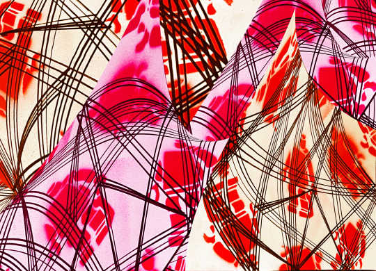
CRIT FEEDBACK:
contained
red, pink - no care for the boundary of the paper
its still preserved like its cropped
pink-red feminine
size variation
like meat - a marbled cut of steak or something
fleshy maybe
busy, violent, unbridled
takes time to realise what the images are because of the layering
no focal point or not as clear/maybe none at all
the background colour varies within the audience some see red as the background others see pink
there are lines hidden beneath the work
kinda drawing the audiences attention back to the small red lego figure ( middle right red figure)
energetic like free falling
repeating patterns to create patterns like tessellation
looks like they are holding hands
visual noise feel like a loud echo of the central doubling/duo
like a headache
lost & found or losing and finding - possible title
overspray gives it a little softness
Buried - possible title
don't have to add anything else, the spacing is correct/good as is
visual weight at the bottom of the piece
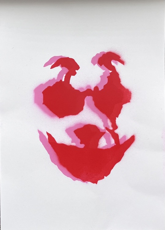
0 notes
Text
Experiment

created a stencil using the joker, i played around with different variations of it but i found this was the best, i also found that the process of cutting out the stencil is more meticulous then it seems as often unwanted paint would be a result of cutting out to much or too little of the stencil resulting in an off putting image that disrupts the viewing of the piece
i did debate on wether i should create a multilayered stencil or just utilise key visual aspects that i found interesting
i then created the stencil of just the features of the joker in makeup, like the iconic bright red mouth/nose and darkened eyes
i felt that with this stencil i could better communicate or rather show the audience what im trying to communicate, plus i felt that i could use this in various works to communicate various things
i feel like the experiment turned out better than expected
at first i had doubts that it would not transfer across as best as i wanted it to however it did
its weird like when looking at the result of the stencil my mind automatically replaces the parts that aren't in colour ultimately forming a three dimensional face rather than a 2d face
going further with the point above - i find it interesting that my mind made a connection/filled in the blanks automatically- Does this happen because of the familiarity of the character ? or is it because the result is purely showcasing facial features ? can this affect the meaning of a work in the sense that by unconsciously making a three dimensional/connection face the background is therefore not seen in detail? will it be too much of a focal point that it stops your eyes from escaping it edges onto the rest of the canvas?

during the early stages of this work i started off by creating the background, i then played around with different imagery and iconography i could add to this work to create something better i then opted to experiment with the stencil in hopes of creating an actual work
the background was done by spray painting the stencil then immediately smearing and redirecting the paint not really focusing on a the outcome and just allowing my hand to move, additionally i noticed that when rubbing the paint i occasionally felt friction between the gloves i was wearing and the canvas, it was almost as if my hand was getting caught
i used this canvas that had limited or obstructed/abstract pieces of the lego stencil and layered the joker stencil on top of the lego background
i do feel like the colours may not be working well or in unison, yes there is 100% no doubt that contrast is immense and almost very impactful in a negative way? its like kind of disturbing as well
i do like the stencil even though it may not work as well with the background
i don't know maybe its like this mask , and the background is this washed away, faded, scraped and scrubbed off like its not heavy in detail its obscured, hidden and unseen ?
like the mask is the outside of a person and the background is the inside? i like that, it plays to the character of the joker i feel, like the joker is not the joker without the mask/makeup, he is awakened or becomes himself only when the makeup is on
i do feel like it could be read as a covering of emotions or feelings in order to walk around and not draw attention from friends and so forth like when someone asks you if you are ok and you respond with i'm fine however deep down that might not be the case
however i do find that it is playful, like the stencil itself is playful or in my mind its linked towards this comedic, humorous feeling or theme
i don't know, it could also be a thing where its like yes it might be a mask but the person is still made up of whats underneath i saw it like visually and mentally
0 notes
Text
Artist
Smithe
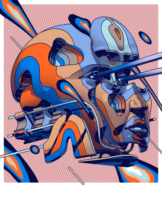
i think what interests me the most about this artist is his use of layering that creates this mechanical feel like a robot putting stuff together in a machine line or something
i like that its futuristic also i feel like it adds this altered perspective or reality whilst also playing onto this feeling of "hidden", i just get a feeling that something is hidden and we as the audience are deciphering or trying to figure out as to what the artist is specifically talking about, i feel like its a nice blend between theme and visual imagery more specifically how the they are connected but are seen as singular things?
i think it's definitely something i have been trying to achieve or rather am in the pursuit off, i feel like my work presents this raw quality from the street art style that using layering to alter perspectives
Art Text:
with these articles i was trying to gather information in regards to the influences of pop culture onto contemporary art
"The idea of pop art has also expanded into the use of modern-day technologies. For example, the rise of artificial intelligence has also found its way into the art world as various software now allow a complete art piece to be made without the hand of a traditional artist. With a prompt inputted into the software, a unique piece of art is visualized using a computer. This change will transform the art world, giving more weightage to the concept behind a piece than its technique and skill." (TIMESOFINDIA) -> i found this interesting as we are currently living through this drastic change, the current climate around AI continues to have its pros and cons however in the art world from my understanding could ultimately transform or merge into a more concept based approach rather than artistic skill -> could this lead to the end of certain techniques/processes? could this be a new form of creative expression? is it both a negative and positive? to what end does the artwork then become a image of a given prompt? is this art?
i also found interesting how the article only mentions the impact of using comedic, nostalgic, pop culture references as direct link between the youth and art. Is this something to be wary off ? or is this unimportant because of my target audience? , in saying this i feel like my practice currently targets a specific audience, this being the youth or young adults however i am concerned if this could lead to a isolation of two different demographics connecting or engaging through art
i do feel like i engage in the pop culture realm however if i were to classify my art as pop art i would be skeptical as my practice doesn't necessarily reflect the current state of society and urban/pop culture in saying this, it could be a new pathway to explore in my practice
i feel like this article (TIMESOFINDIA) has shed light onto the changing field of pop art that i engage with, yes art has changed throughout the years and is constantly changing however with this information i found myself excited yet weary of the new ways of making
the first article was also quite informing as i began to become more familiarised with POP ART, was just some light reading
i did find some stuff that was interesting like "From street art’s rebellious spirit to digital art’s transformative potential, and from fashion’s evolving status as an art form to the power of celebrity influence and commercial art, popular culture has catalyzed an art revolution. Moreover, it has empowered art to be a platform for cultural diversity and social discourse." "Fashion, a prominent element of popular culture, has blurred the lines between art and everyday life. Fashion designers often draw inspiration from art movements, historical periods, and cultural references, infusing their creations with artistic value. You, as a consumer, play an active role in this process by making fashion choices that express your individuality and sense of style. As fashion evolves as an art form, your daily clothing choices become a canvas for self-expression, influenced by the amalgamation of art and popular culture."
i had some sort of understanding or rather view on the fashion as art however i didn't really see it as a from of personal expression, like the idea of walking around as a canvas expressing yourself through the clothes you wear, i think this article has further progressed my knowledge of art but i also feel like it has shifted my perspective onto considering or chosing more specific objects references that connect more with the times rather than a generalised one ? however will this take away the personalisation of the process? like does this added step then take away an aspect of "raw" or does it then become about making art for the masses rather than what i want to make?
0 notes
Text
Experiment


expanding on the lego character
i decided to explore how i can manipulate or interact better with the stencil to create works that best represent what i am investigating, thinking, feeling and more
starting of with just manipulating the positioning of the lego character, whilst also utilising layering to create a visual mixture of textures, objects etc.
i don't know its like the process of creating was just myself getting lost in this canvas, randomly placing the stencil at different angles and allowing the paint (on canvas) pull out the characters features
i didn't pay too much attention to things like overspray, even layering of paint, bubbly marks or scuffs that alter the overall composition
i just took this as a experiment of figuring out how to work with stencil and spray paint but on a higher level
for instance an issue i found was that when applying the spray paint in a continuous movement allowed for a more thicker application of paint whereas a lighter press led to the can almost spitting out the paint causing some parts of the stencil to be filled with lighter spots rather than a full coat
i found that the numerous layering of stencils created this almost glossy texture, however i realised that if i wanted to create a stencil (or the image on the canvas created from the stencil), that holds alot of paint to create a complete even look often or maybe not as often but i did run into issues like excess paint seeping below the stencil and spreading to other parts causing a look that is incomplete ( like the stencil didn't create the grooves or marking of the stencil with the negative and positive space which resulted in either a blob of paint or the stencil being half lego and half full paint)


i then decided to add a smaller stencil to create this size difference and visual contrast, i did a practice stencil to see what works and what doesn't
i then sprayed the stencil onto the canvas

i am pleased with the result, although there are a few things that i would do differently
for instance the process of creating this was longer than i had expected, this was because of having to wait for the canvas or stencil to dry before spraying so rather than using only one stencil i could use maybe two or three and only having one for a specific colour?
another thing i would change is the composition layout, from my eyes there are two heavy focal points aside from the blue stencil, that hold a lot of space and they kind of confine your eyes to these spots
additionally i would probably use different spray cans or tips for these colours as these were hard to work with, i found that the lighter i sprayed the more splatter and the harder i sprayed more clumps of paint (like too much paint causing it to bubble)
overall though this was a informative experiment that has helped me with my creative process and ability
looking at the work again its a very straight forward piece in my opinion, i still feel that this work is continuing to speak on perspective
i feel like the work presents itself as a collection/grouping of people/beliefs/ideas etc. and smack bang in the middle is this smaller, contrasting and more filling stencil of the lego character, i don't know if its this thing where were all headless chickens running round you just gotta stand still and take in or look closely but also i feel like this stand still point could lead to a reading of the chaos around us where this figure is standing alone, almost like its trying to navigate the space around it.
i like the navigating through the space around the figure point, i feel like this is further added to by the fact that the work is reminiscent of those pictures that when staring at a single point, the background begins to blur or transform
0 notes
Text
Experiment

working on other characters
just trying to develop a natural process of putting pencil to paper and allowing my creative abilities to guide the direction of the character
starting to notice patterns in my practice, especially when drawing characters, i feel that i usually leave out the eyes or replace them with other objects/symbols, i also feel like i tend to explore or rather draw skeletons, like deconstructed bodies -> all the way down to just bones (or like they aren't full, like your normal characters, like building blocks put together)
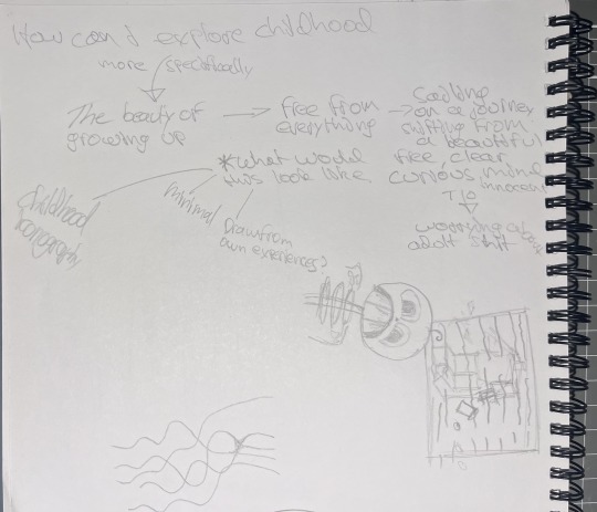

i also found patterns in themes and things i want to explore, i found that almost always there is something linking back to childhood and the innocence or maybe unawareness of the larger things in life, like adulthood, getting a job etc. -> i think from what i have been seeing in my visual diary its almost like i tend to explore or try and push the freedom of childhood ? which is interesting, in saying that however i feel as if i haven't really touched on aspects of my childhood or characters, iconography that i grew up around
0 notes
Text
Artist
Octavi Serra Arrizabalaga
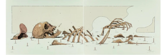
i find the imagery of this work quite eye catching
its like the bones are decomposing or getting buried into the sand as time goes on or you could even read it as people forget about you your bones start to fade like the disney movie coco
i feel like this burial adds more depth or character? to the work, like for me when i view this i get this feeling of time moving, more specifically like the decay or start-finish of something that can be accurately depicted through the burying of the skeleton, like a post apocalyptic place where time has taken its toll and all is to be remembered are bones -> maybe its a comment on life ?
Speto
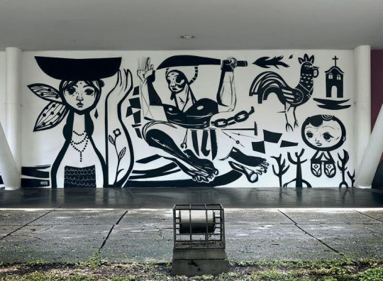
i like the use of negative and positive space
the black makes the line work pop out more however it almost looks like they have been carved out and the what we see is a blacked out cave of sorts
everything is so unique but they all hold the same visual weight, there is no abundance of colour or pattern the space allows for this cohesive viewing
it does however feel very cultural or has this cultural aspect to it
looking back at this artist i think i am intrigued with the contrast of white and black
Art Text:
"But now the digital realm has become the centre stage for contemporary society mixing and taking from the visual culture of games, influencers and the world of digital consumption. It is as if the Pop Art movement was still evolving and being discovered as the digital and physical boundaries of reproduction are reached.
‘Pop Culture’ has become a more diverse expanded category of symbols, fictional and non-fictional characters and images. So perhaps, more than asking ourselves whether Pop Art is a movement of the past, we should ask ourselves how this movement pushed artists, and the masses, to look at the new horizons of the Arts."
i found this article pretty interesting
i did manage to be introduced to new pop artists that i haven't heard of but was also reintroduced to familiar artists
i found that the article was stating that Pop art is changing with the times, for instance in the emergence and early stages of pop art it celebrated mass culture however know it amplifies them even more due to the new technological advancements that allows audiences to interact without being left out because of the symbols)
i also read this article
was more of a light read
0 notes