
Statistics
We looked inside some of the posts by deardotti-blog and here's what we found interesting.
Average Info
Notes Per Post
0
Likes Per Post
0
Reblog Per Post
0
Reply Per Post
0
Time Between Posts
2 days
Number of Posts By Type
Text
12
Photo
5
Last Seen Tumblr Blogs


Fun Fact
If you dial 1-866-584-6757, you can leave an audio post for your followers.
Text
Seeing it all on stands
I feel like we are all our worst critics, but the frustration I will never get over is my inability to transfer my designs into real life PROPERLY. I mean, overall I feel that what I have produced is an accurate portrayal of my illustrations, yet having a really rubbish body that won’t let me sit and sew for hours is massively disheartening.

For my own sanity, I have come to realise that sewing will perhaps never be my calling - at least not in the sense of total flawless professionalism. Put me into the setting of costume and less generic sewing techniques and I would probably be absolutely fine, but for fashion, no way. I have found positives in everything I produce, as always, meaning that I can now move forward pursuing the things I am capable of.
These were actual hell to sew - each material picked was a nightmare in its own way. Yet, minor details and imagination has been my strongest attribute once again, the amount of work gone into these pieces is unreal. The hand painted jacket, even though falling and flaking to pieces, with the hand sewn, designed lining and eyeball collar - the hand embroidered dress with pom sleeves, piss off bow and faux placket - the hand painted organs, pom and tulle filled rib cage, hand knitted bow and hand sewn layers - the amount of work I have actually put in is above and beyond, yet the finished result isn’t overall perfect.


I keep having to remind myself that I finished all of my work on time, I didn’t skimp on anything and made sure I put my all into every thing I produced this year. It might not be perfect but I was taken out of school aged 11 because my mental health was so poor, and tutors told my mum I would never make anything of myself. I didn’t leave my house for years because of anxiety and yet here I am, I totally finished and on a high too. For that I feel amazing.
This course has been more than I ever hoped for - not only in terms of teaching but also for my confidence. It is priceless and will never not be the best thing I ever did.
0 notes
Text
MY LOOKBOOK
Finally my lookbook has arrived!
I am so impressed with the gorgeous matte lustre paper it has been printed on as well as the hardback covers. It feels very professional. Let me share a few pages with you and discuss some of my final designs.

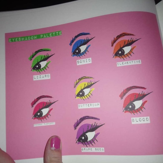
Eyes were one of the big drawing feats I accomplished for this project - so it seemed relevant I display them in my book. I used an eye drawing and edited it into the colour palette my book would use, which since I am so funny I had to of course call an eyeshadow palette. Ignore my trampy half chipped nails, I’m having a hard time.

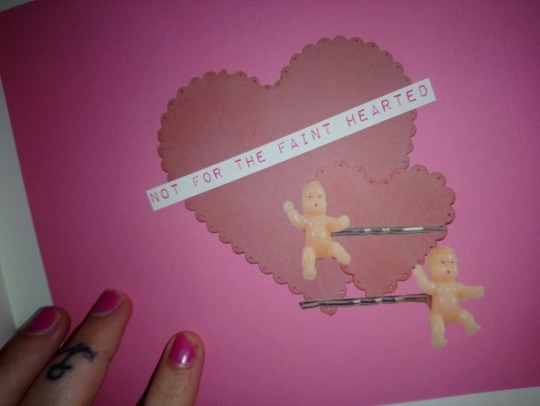
I paste into heart shapes with my fabric selection to create a simple yet descriptive page of the sort of materials used to create my range.

In between pages just hinted at the theme - for my last project I loved my lookbook but felt it was a little bit overboard. Although it did convey a theme, I could have pulled back a bit and perhaps been more subtle. I feel like this holds a bit more class, even with the swear words.
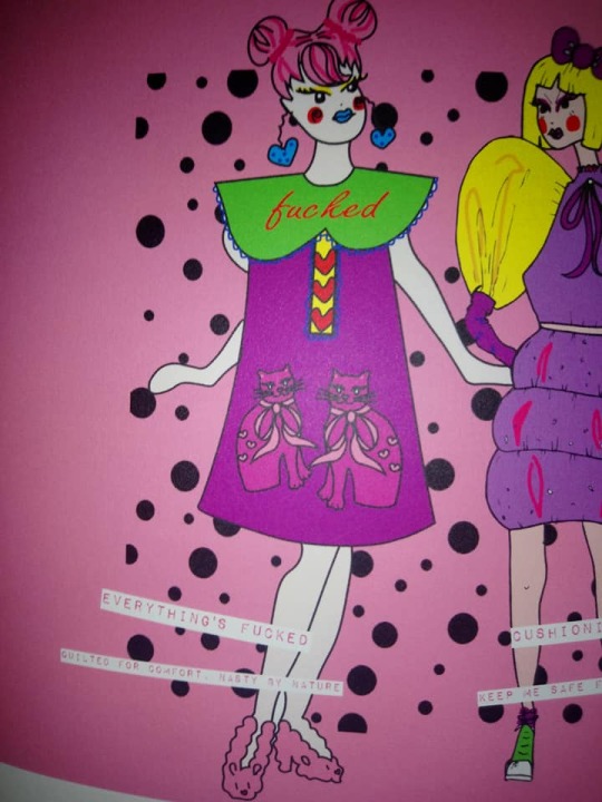
Everything’s fucked was based on an overheard comment from a borderline personality group I was in where a man who spoke up in desperation was instructed to basically shut up and now wasn’t the time to be emotional. The quilted kitty design would also feature the comment made by this “BPD specialist” and a large peter pan style collar would have FUCKED embroidered across it.
The dress next to it “cushioning the blow” was designed as a safety suit for days you’re feeling a bit fragile, so plastic filed with pom poms (taking on the properties of those big inflatable plastic sheets you get in with fragile items off amazon), would be good if you fell over, cus you would bounce back up.
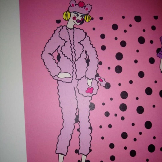
The bunny suit was a bit of a joke one I fell in love with and ended up producing the beret off. It was supposed to be the serious version of a onesie, so for anyone in the mood to be a boss bitch in added cute comfort. It plays on the oxymoron of cute aggression by adding humour and sweetness to an outfit destined for big meetings and serious shit.

I actually produced this outfit on the left, which features the “growing up is shit” jacket and the “it’s my party” dress. The jacket is based on a shadow box (boxes created to display important and often personal items), so the back has a large heart shaped pocket that you can display bits and pieces in. I displayed toys in mine, which fits in with the theme of rubbish childhoods - a key factor in borderline personality types. I also hand painted the sleeves in borderline themed tattoo prints. The party dress showcases pom pom puff sleeves, a hand embroidered skirt and large “PISS OFF” bow - it was based on a party dress I had as a young girl, but because I can’t deal with emotions I always used to cry at my birthday til my mum stopped doing parties for me because I would just hide under the stairs.
Next to it is the “what’s inside a girl” dress, which is based on a grayson perry vase that features a person with their anatomy displayed and labelled as everything that’s going on inside them. I wanted mine to be oversized and strange and feature body parts with what’s going on inside me written on them - so stuff like anxiety, self hatred, comfort eating and paranoia. The rib cage is detachable and has a heart shaped toggle underneath it.
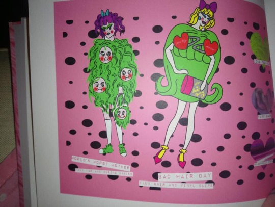
World’s worst mother was based on doctors opinions when I had my first diagnosis. I was originally diagnosed with schizophrenia and found that a majority of specialists were just concerned if I had children and if so was I safe to be a parent. This doubt will stick with me for life now (thanks doctors) that I will never be a decent enough Mum as I blatantly can’t really look after myself. So I thought, what’s better than showing how shite you would be as a parent than having a hairy coat with decapitated kids all over it?!
Bad Hair Day focuses on identity and the need to be different - I have had dyed hair since the age of twelve and have always used it as a subtle way to express myself. I took this one step further with bad hair day and paired it with a hair spray can bag and giant hair barrettes.

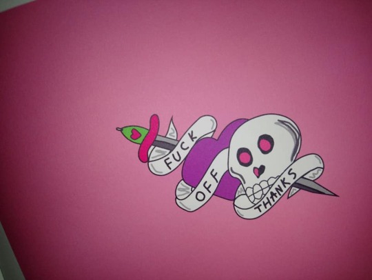
The Coat of many Fuck Offs is basically everyday abrasiveness - I think it’s pretty self descript for moments when you just want to be left the fuck alone. Pearls of wisdom is based on those sexy strip teases you get where people pop the balloons, except it’s not sexy, and no one gets nude, and instead you just have to listen to bad advice such as shutting off your friends and family and over analysing everything, which i’m sure is sexy to some.
I also included my own tattoo designs in with the book, on an actual transferable tattoo sheet.
T H A N K S
0 notes
Text
Fashion Illustration Summary
I have finished my sketch book!
This was my most predominant skill I watched blossom and my absolute favourite subject. To be honest, the task of cute aggression - so personal to me - was a really hard one from the beginning and something that at times I felt was too much for me to really handle.
Yet, I have found it therapeutic and a way to truly express and process feelings that go through my mind every moment. To keep a diary along side this project and draw inspiration from my own words felt like something positive was coming from an issue that in reality is quite disturbing. There are times I have stood back and thought, people are going to think i’m absolutely mental. Reality is, I am though, and it’s something that you shouldn’t be ashamed of. Psychosis and personality disorders are still seldom spoken of and although so much less stigma surrounds depression and anxiety, people still squirm when faced with something unruly.
The truth is, borderline personality may make me feel every horrible emotion a thousand times worse - yet it amplifies the good, the beautiful and the passionate in high resolution too.
My aim was to produce a collection of garments that encapsulated art and fashion - stuff that could be watered down to produce mainstream pieces or left concentrated and not out of place in a gallery. I wanted clothes that spoke of the turmoil within, sarcasm, depth, pain, obsession, that echoed the lost, angsty teen in us all and the spoilt child that never grew up.
Here are a selection of images from this collection.

How my work first began - naïve, still something I am proud of.

It then develops into faces, details and personas.

With additions of cat themed women to add a creative sparkle.

I really enjoyed working with a neon layout too.


This project is so much bigger than me and has given me confidence I never thought I could have. Even posting some work on line has given others with my condition something to talk about - I have had requests for items made from this collection - it has become a trend that I have wanted to carry forward and continue exploring. I have set myself tasks and challenges and kept on going, despite being permanently broken and often feeling out of my depth.
It may not be a million percent perfect, but I feel I have said all I want to at this stage. My work here is not done though, that’s for sure!

0 notes
Text
Pattern Cutting Summary
I finally have completed both garments. Here's my low down of them, the problems I have faced, what I would change and what I am proudest of.
I will begin with the most hated of the two, the “what’s inside a girl” skeleton dress. Three layers of scuba, one layer of bubble wrap and leatherette body parts is the stupidest thing I have ever done since I fell asleep in that bush clutching half a pizza when I was 18.
I had issues with painting the leatherette on the jacket, yet switched to posca paint pens this time and have had no issues. When I first painted the parts a week ago I was so unimpressed with how they turned out I stripped them and re did them.

Y U K

much better. in a classic tattoo style font.
I found that no matter what stitch length or width I set, what tension or needle I used, it just couldn’t cope with this amount of fabric. So I restitched a lot of it with bulky yarn. It really is not ideal at all, but has done the job fine. I would not choose to make this outfit again, as although it looks visually like the illustration and is very interesting to look at, the finishes are not flawless - an error I feel will forever be my downfall and breaks my heart a little bit. My body just can’t seem to cope with the repetition of sewing and it exhausts me to the point of tears. It’s horrible since I genuinely enjoy pattern cutting.
In between the layers of scuba on the back, is bubble wrap - this fits into my cute aggression theme since bubble wrap is what the subjects of the study were given to pop when observing cute animals and babies. The ribcage is PVC, filled with various pom poms and features a hand knitted chunky bow that fastens with a popper to the back, plus pvc bows on the sleeves that are filled with fake hair.
I do like this and think it will make people laugh at least, but it isn’t my moment of stardom.


The collar is embellished with tiny safety pins.

The second outfit is definitely the more beautiful of the two. It has turned out better than I thought I could possibly design, but again, isn’t refined to how I would want it to be.

it’s so hard to photograph stuff in my house! I can’t wait to get them on the stands and take photos properly.
I hand embroidered the skirt of this dress, and it took me around 30 hours in total. The jacket is hand painted and hemmed by hand, My other issue is this was made to fit my sister, who is a child, since I really wanted it to look out of place on her as borderline personalities are often described as “children clad in the armour of an adult”. This has really narrowed down the range of people who could model it though, which is a real shame.


I popped a zip on the back just to give it a little more flexibility and it could then possibly get on a model that isn’t a kid!

How cool are these vintage ribbed cuffs I got too?! I stitched them on incorrectly hoping I could fray the edges a little around the hem, but it just looked silly instead. They’ve really helped the sleeve to puff up more though.
My overlocker ate through my embroidery, which I wanted to actually die over, so I have decided to honour grayson perry once more and follow the technique he used in one of his vases, in which he fixed mistakes using liquid gold. This big tear has been messily repaired with gold thread.

Overall there is definitely stuff I could improve on, however I feel the complexity of my detail really does shine through, plus it does look a lot like the illustration they are based on which I’m very proud of.
I wish I could say that in the future I will learn from mistakes and plan better, but the truth is I planned this for such a long time, paced myself and worked so hard to improve my techniques - my body just won’t cooperate and it’s something I really need to deal with. I don’t think there will ever be a time I can be totally on the ball with sewing because i’m either distracted with pain or having to take strong pain killers.
I feel like I have done my absolute best, as well as problem solved along the way and worked more or less independently to create garments that do represent my illustrations.
I am very proud of myself.
0 notes
Text
Pattern Cutting Update
I have finally gotten round to piecing all the bits together and doing all the textiles samples and I realised just how much teensy tiny work there is involved in my garments and I suddenly thought WHY HAVE YOU DONE THIS TO YOURSELF.
Most notably, I realised I have this habit of picking the world’s stupidest fabrics to work with.
This time, two layers of leatherette plus fleece destroyed my hopes and dreams. It was hell to get through a machine, plus hell to attempt to hand sew. I have blood blisters on my fingers still left for it.
The other problem I encountered, that I never photographed properly since it made me so physically sick because I was so upset, was the tattoo paintings I did on the sleeves. Some plans you really rethink and wonder what convinced you to do them, this was one of them. Painting over a surface that remained flexible and would be in constant use was my downfall - I hadn’t thought that they would need a coating that moved with them. They began to crack and crumble, especially when under the stress of lapped seams.
After my initial meltdown I twigged that if I used a flexible adhesive coat on them they would have a fix that would bend slightly. I also repainted them in areas and reconsidered my seam style, especially as I was now lining the jacket, so could afford to sew it as I would normally. This alleviated one problem, yet the jacket still has cracked in points and flaked.
Not being defeated, of course I thought how could this tie into my theme? A theme that involves emotional trauma and vulnerability - somehow this jacket would fit that description quite well!
I made swing tags to fit this, of course.

you rip these open and like my shitty emotional haemophilia, a theme followed throughout, black pom poms spill out - this reflects the sadness in my life.
I also began to work on my other garment - which is scuba and bubble wrap and leatherette, all once again revolting to sew and have taken me many hours of unpicking and restitching, I really think I am going to have to just lump it and do them by hand, as it seems impossible to put under a machine without laddering the fabric further or wasting my time.
I made the pom ribcage too.

0 notes
Text
Illustration Update
It feels like one of those terrible quotes people make like “a bad workman blames his tools” but bloody hell, it’s been hard trying to blog because our internet connection is SO RUBBISH. I told ian it was so slow and he got really angry and started defending it, like he owes it his life or something.
Anyway, just a quick one.
I have continued illustrating in my pro marker way, however have found my old style filtering through a little more too.


How all my illustrations begin!
It only recently came to me that you can actually have more than one art style, sometimes some are reserved for more complex illustrations and others more simplistic. I really feel I have learnt to convey a theme, but also trust my own instinct and pick up a pen and draw.
No more templates, no tracing, just me and a pen direct to paper. I then fill in the gaps.
Jessica
0 notes
Text
Work Experience
The trials and tribulations of being freelance: a lowdown.
I thought perhaps I was doing the world’s stupidest thing doing my work experience as a freelance designer, as I felt maybe it wasn’t me pushing myself, or it would be seen as lazy or not adventurous...Now I feel like it’s the world’s stupidest thing because it is SO HARD TO DO.
I have so far, worked way past my 72 hours experience. Yes that has also included the freelance poster work I have undertaken for people, as well as the experience with silly girl club, but I now almost work twenty hours a week on top of course work to perfect my skill.
Here’s a little run down how I go about what I do and why.
I first was inspired to set up a shop when I worked with Nikki of the silly girl club - she had seen some jewellery I had been messing around with as a side project and convinced me to sell some bits to help me make some money.
Normally, I would procrastinate this to death and um and ahh for a few months...work experience however, decided to push me and give me the confidence to take a risk, almost giving me the perfect excuse to blame it on if it all went wrong!
In all honesty though freelance has appealed to me for various reasons, mainly being I am unpredictably ill and having the opportunity to work for myself as well as various people from the safety of my home gives me a great deal of comfort.
My idea came from people acknowledging my art style and me thinking perhaps they would like to wear it. It all starts off with a design from a postcard or vintage ornament - much alike most of most work - which I perfect and then transfer onto paper or tracing paper. I use a thick clear shrink plastic that is easy to place over my illustration, making it easy for me to take my sharpies (ALWAYS USE SHARPIES) and colour in the colourful parts first, before lining it all using a really decent hard wearing pen.


I normally use one side of an A4 piece of plastic to one design, this shrinks to around 3 inches across and makes a really good sized brooch.
After it is cut out (another nightmare part, as they bend and snap a lot and the plastic tears very easily), it goes into the oven for 2 minutes on gas mark 3. I have played around with this several times and it is still very unpredictable so now my work has taken off a bit I will be buying a heat gun which will give me more control. I find work tends to smudge or curl onto itself and then smudge more.
This is demonstrated here:

notice at the side of the player, there’s little white gaps and smudges? it may not seem much, but to me it is a failure I would be ashamed to sell, and so goes straight into the bin. As wasteful as it seems, I refuse to sell anything I am not happy with and a smudge is a flaw.
Each piece takes me around ten minutes to draw so you can imagine how much time gets wasted!
Once out of the oven I use a heavy tray and greaseproof paper to flatten them out, and then when cooled I use mod podge to paint and seal the drawn on side of the plastic, which I then coat in glitter and leave to set. This process is repeated layer by layer until it forms a thick, sparkly coating on the back of the brooch. I have found mod podge is my best friend, unlike other craft glues which can crack and then break all your glitter.

example! I was a little bit heart broken,
Once layered and opaque, I sand the brooch all over using a sanding tool and sand paper. I then wipe it clean and seal with a mod podge gloss. Once dry, I add my brooch back using the best glue in the world e6000.
They then get a good wipe down and are ready for new owners!
After launching my site last week, I sold out within an hour. I have since opened my own Instagram for it @thebigbadbuns and having sent out my first orders, watched the feedback come in!
So far all has been positive. Here’s a custom order on a jacket.

I have had requests for several more brooches now too, which I will be making in the spare time I get at the moment.
I have enjoyed this experience so much and it is bizarre how life works sometimes. If I hadn't done the posters, I would never have met Nikki, and then would never have had the guts to start my own shop!
My next plan is to open an etsy store with my new berets I have been working on...I’m confident this will keep me going over the summer!
0 notes
Photo


So I have finally almost finished my book.. you really do underestimate the amount of time spent of these.
Every element seen has various elements attached... the hearts with fabric swatches in come from scans, which are they altered, perfected, pasted into heart shapes and finished with labels you have to alter and paste in. Each bit takes time, to finally be added to a page that takes even more time from every element.
Good grief!
I am overall happy with this book, however still can’t get totally comfortable about it. Perhaps it is because it is new to me. I have added in all elements I feel are relevant, however cute aggression is a very broad theme and can feel like you’re giving people a bit of a lecture if you go overboard!
0 notes
Photo


two small examples of the sort of direction my look book should be going in. I traced out some of my outfits and put them onto models as I thought it was a bit different - i’m not sure though, I’m really not feeling this at all!
0 notes
Text
Look Book Update
Since the look book I produced for fusion wasn’t as polished as I perhaps wanted, the Cute Aggression look book felt like a good opportunity for me to try new ways.
I wanted to go with something a bit more vague than the overwhelming print and textiles of my previous book, which I thought really overcomplicated itself.
For example, I really liked some of these zines, as well as a look book for somewhere nowhere - all are very bold, basic shapes and have a very angsty teen feel which was a vibe I really wanted to capture.


Having prepared all of the elements to my book in photoshop, removing backgrounds, editing colours and perfecting illustrations via illustrator and photoshop, I felt very ready to face this task - especially using the new-to-me program, indesign.
How very wrong I was!
Whether it’s my current state of anxiety and overwhelmingness of life, or I am just a bit pants at being subtle, I really did struggle with this task. I found in design a bit confusing and awkward to use at times, especially with my laptop which is at best unpredictable.
Maybe it’s just that I am not the most vague of people either, so I found minimalism quite a tough one to master.
I’ll share my first pages with you soon, as I am just putting them together, slowly but surely!
0 notes
Photo

i have been having so many issues with uploading my blog as of late, in fact I thought I had updated this several times over and over yet none have posted - however luckily I always keep copies of them so can upload. I have realised the problem seems to be the internet in my house, especially if there’s a lot going on with the connection, the uploading seems to just automatically fail! So I have transferred all work to my laptop and am attempting to upload via this.
I always have a good browse at fashion illustration as it is possibly a favourite subject of mine - so was amazed when I found Fifi Lapin, the most fashionable bunny in the world, and hadn't heard of her before.

What I really love about the character of Fifi is she is considered her own person, as opposed to someone’s work. Her artist is unnamed and instead Fifi herself runs her Instagram and pages, appearing at all fashion shows whilst also having her own childrenswear line.
I thought it was incredibly interesting to develop a sassy animal, something that would be unique to draw and be a little bit different to work with. So I developed Babs, the cat.
Babs has no time for your shit.

from the unfit mother collection, of course.


I aim to pop these little last few drawings into my book in small frames, I really wanted to break up some pages with something a bit different.
0 notes
Photo


I have had several orders from friends and family but today it has gone LIVE.
I opted, like Nikki of the silly girl club advised me to do, for a bigcartel. This includes a cute website with my own logo and colours, paypal payments and is completely free for five listings at a time.
As my jewellery is made up and listed, it means I can constantly be updating with products as and when they are done, meaning I won’t stress about custom orders or having to make bits up.
I put a post out on Instagram this morning with my first five brooches and received lots of interest - so my next step will be sharing the page publicly...I am trying to brace myself for it!!
This concludes my work experience hours, as I have worked tirelessly to perfect this skill (I will do an in detail description later with how I go about creating and then wrapping orders), however I also have a top secret project I have just been asked to do which I will be working on tonight, that I will include in this experience to when I am able to go public with it!
My Instagram name is thechubbiestbunny, so it seemed appropriate I go for something bunny themed.
cute, silly, daft, perfect.
my first update
i’m so nervous!!!!
https://bigbadbuns.bigcartel.com/
0 notes
Text
Garment construction update
Now I've finally cut all my toiles I get the super fun task of doing all my textile samples!
I wanted to make the sleeves of my leather jacket into "tattoo sleeves" since it's a personal project, and I can combine illustration with hand painting techniques and my love of tattoo designs. Using some traditional style tattoo examples I freehanded some drawings with a pen onto the sleeves I had cut from my pattern, then used acrylic paints (I used to paint my jackets this way when I was punk rock), to begin to fill in the gaps and build up my designs.

Here they are as I build up layers, you can see marks from the pen as well.
Once dry I started to line them using my favourite marker, a hard wearing waterproof one. After this was all dry I used mod podge as a sealant and sprinkled a light dusting of glitter over the top, so as it dries it sparkles slightly in the light.


0 notes
Text
Pattern cutting update
Two really exciting updates! I have finally pretty much finished all three toiles and can begin to put together my final outfits. I'm so happy as I was genuinely so anxious that I wouldn't get them finished so quickly. I'm really proud of myself.


For my oversized bow dress, I completed the toile using the dartless block as mentioned before. I added a faux placket and used gathers on the puff sleeves which will be cuffed on the final garment. The bow will be interfaced and much broader on the bow itself (I originally feel I made part of it too thin). This will also feature swear words on it and seams will be trimmed with large ric rac. I ordered the fabric for this garment, picking a waterproof 'rip stop' Louise had shown me, which I have begun to embroider the skirt of.
For my second garment, titled "what's inside a girl", I wanted to do an enlarged, simply cut pattern with bold details and an overall daft feel.
It features an anatomy that is embellished with words personal to me, and has a faux collar with rib cage attachment.


I wanted the back to be cut bigger than the front, so from the front view it almost framed the garment. Ideally this would be cut in a neoprene or scuba, a weight of fabric that will easily hold itself up.
Louise suggested instead of working from a block, to measure against a mannequin and instead work from that.
I began by measuring 100cm at a widest point on the hips, then drew out the shape I felt the garment should be. I decided to include the arms in the shape as I felt that a seam to separate the arm from the body would be more interesting and unique.

I also developed this shape using a centre line, as it seemed much more practical to cut it on the fold rather than mess around with excess papers and fabrics.

I also began to measure out the body parts included on the anatomy. Originally I wanted to incorporate a cold shoulder type effect with a knitted bow, yet when on the mannequin this distorted with how big the pattern was cut. I decided to instead replace this with a bone.
I plan to translate these body parts onto CAD and have them printed onto a leatherette, which will be easy to stitch into the neoprene.


Overall I am so happy with how this has progressed. I cut my ribcollar from measurements taken from the neckline, which I then cut into two points to fold over themselves and fall lightly over the rib cage. This will be filled with pom poms and glitter for the final and close with a popper fastening.
The front will zip up with a short chunky zip that features a heart toggle that sits under the ribs.
I have shortened the width of the front of the dress to exaggerate even further the frame of the backing fabric.
I can't wait to start putting these all together now.
0 notes
Photo

For my pattern cutting, the clear heart pocket on the back of my jacket will have lots of toys in it - check out what I got for five pounds in a Blaby charity shop last week!!
0 notes
Text
Lining samples
They need their own post because they're BEAUTIFUL!!


Silk poly... The bears and poodles are holding offensive words, obviously.
Designed in CAD by me!
0 notes
Text
Pattern Cutting Update
Today I began my toile for my second garment, one of two dresses. Having already completed the overall look of my jacket, I am confident I can assemble it from the leatherette fabric I wish to make it in, which I have now ordered and will begin to decorate on its arrival.
My dress is a combination of two wonderful things, Grayson Perry's Turner prize outfit.

And my own design of course.


The dress itself should have a children's party feel, with sash ribbon waistband, gathered skirt and puff sleeves. I want to include a pussy bow collar that is extremely oversized and features swear words whilst the body is embellished with child like embroidery and my own words on my condition.
Louise suggested the dartless block (which I am basically married to anyway since all my ideas seem to come from there). I was advised to shorten the shoulder width (I however, increased the neckline so it was still able to be pulled over a head), then split the sleeves into several pieces and enlarge the pattern both length and width wise to allow room for pleats.


I originally began with a sleeve that featured six darts, however when assembled this felt too structured for me and not "child like" enough.

So I gathered it loosely with a hand stitch instead and this created a much softer, fuller sleeve that I was happy with.


I cut a rectangle taken from the measurement of both the front and back, that is to be cut on the fold twice to make a sash style waistband.
The skirt will be produced using the width of the material, with a gathered waist that is attached at either side and fastens with an invisible side zip.
The front of the garment contains a fake placket design, with trapped lace and ric rac.
I originally intended to make the outfit from a duchess satin, which I felt would have a party feel, and be a good weight to embroider on to and hold its shape.
However, louise showed me a really interesting sample of ripstop, a waterproof sheet like material with a rubbery, silky feel.
It not only holds it shape, but embroiders beautifully whilst having a childish appearance, it also comes in garish colours which is even more perfect. Grayson Perry comments his first embrace with cross dressing came when a tutor put him in a rubber smock for an art lesson, so this fits in even better!
It also works out around ten to fifteen pounds cheaper per metre than my duchess satin. I am still using a satin for the neck bow, which I have cut using the measurements of the neckline plus length and enough to tie a bow from. This worked out at around 260cm.
I will be completing this toile this week so I can cut my final fabric and begin to embroider it ready!
0 notes