
Statistics
We looked inside some of the posts by denniscup and here's what we found interesting.
Average Info
Notes Per Post
12
Likes Per Post
10
Reblog Per Post
2
Reply Per Post
0
Time Between Posts
4 months
Number of Posts By Type
Text
16
Photo
1
Last Seen Tumblr Blogs


Fun Fact
Tumblr is available in 18 languages.
Text


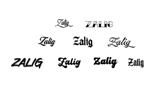

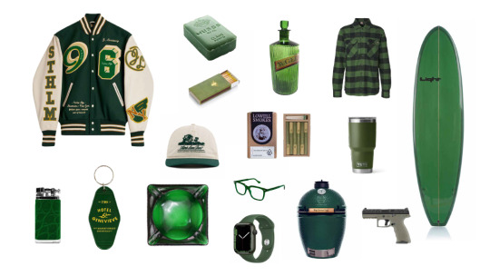
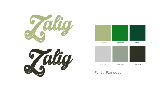


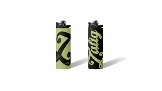
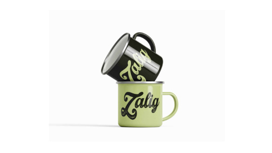

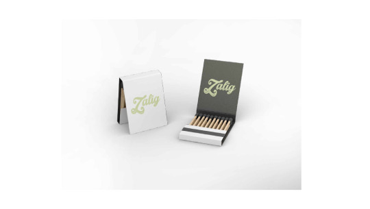
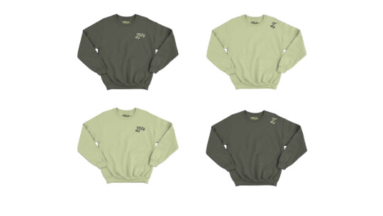
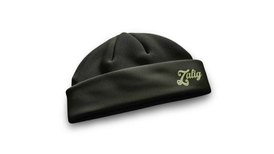
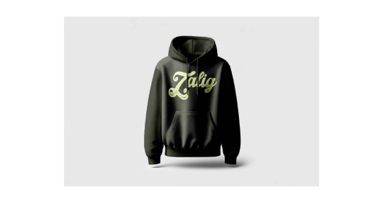


Zalig – A Lifestyle Brand Born from Friendship
Zalig (Dutch for “blessed”) is more than a word — it’s our catchphrase, our mindset, and now, a lifestyle brand. Developed from within my friend group, Zalig captures the energy, inside jokes, and shared style that define us.
For this project, I led the brand research, color exploration, and art direction, drawing from visual culture and lifestyle trends to build a concept that feels both personal and iconic. I designed the logo, created mock-ups for apparel and accessories, and shaped the brand’s aesthetic through curated inspiration boards.
Zalig is a tribute to our vibe — laid-back, stylish, and always a little tongue-in-cheek.
3 notes
·
View notes
Text
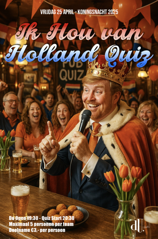


Posters – Queensday & “Ik Hou van Holland” Quiz
Art direction, concept & design
Every year around Koninginnedag (and later Koningsdag), I created themed posters to promote special events at Café du Théâtre. From orange overload to cheeky nods to Dutch clichés, the visual style evolved with each edition – but always celebrated Dutch culture with a wink.
The “Ik Hou van Holland” Quiz became a returning crowd favorite, combining music, trivia and gezelligheid. I handled the full design and concept development, always pushing for something bold, fun and memorable.
These posters are a time capsule of orange madness, playful references, and evolving design choices – from collage-heavy 2007 to a cleaner retro look in later years.
The most recent edition was a first: I created the visual with the help of AI (Sora), blending classic Dutch kitsch with modern tools.
A celebration of identity, humor and creativity, all in Dutch style.
0 notes
Text


youtube
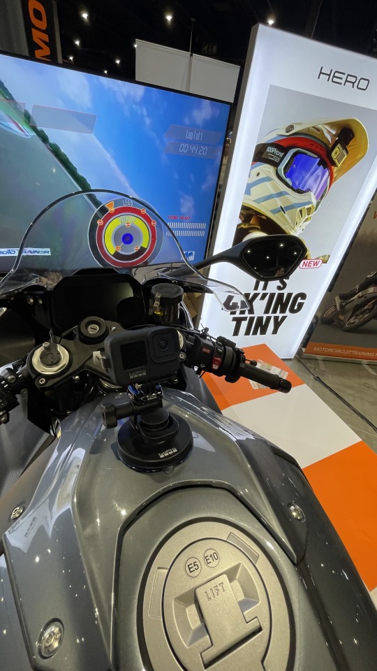
GoPro x Motorbeurs 2025 – Full Throttle Brand Activation
At MOTORbeurs 2025 — one of the biggest motorcycle events in Europe with over 90,000 visitors — we went all-in.
In partnership with Motorkledingstore.nl, we brought GoPro straight into the heart of the rider community for four action-packed days.
From hands-on demos to real-time upselling, this wasn’t just brand awareness — it was pure activation. We engaged with thousands of passionate bikers, gave tailored setup advice, and converted interest into sales with smart bundles and in-the-moment offers.
Key insights:
Visitors don’t just browse — they buy.
The right offer = high conversion, especially in a niche like motorsports.
Talking to real users gave us feedback you won’t find in data reports.
Retail + influencer collabs amplify everything — visibility, credibility, and follow-up opportunities.
I led on-site creative direction, activation strategy, content coordination, and partner alignment.
0 notes
Text

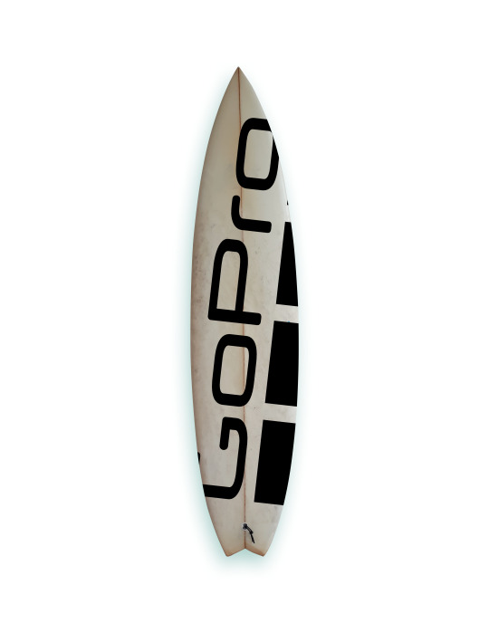


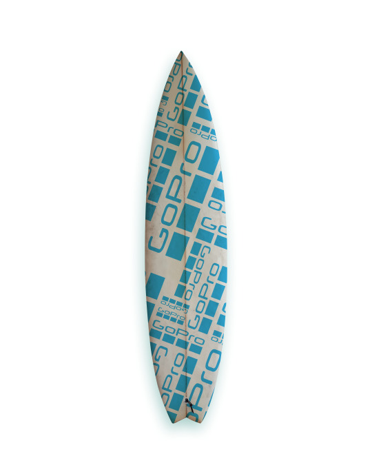
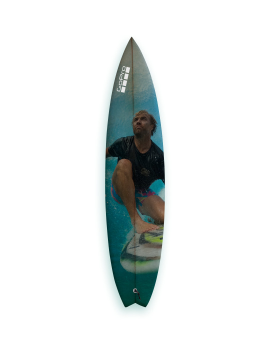

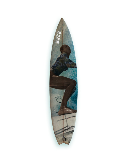
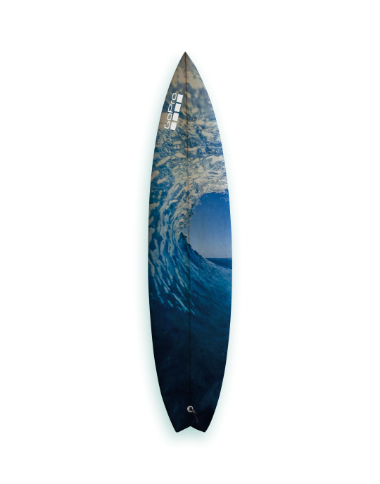
GoPro Surfboards – Branded Boards with Real Rideability
For this project, I developed the concept and art direction for a series of GoPro-branded surfboards — a tribute to the brand’s roots in surf culture and a bold way to bring that energy into retail and creator spaces.
These boards were more than just eye-catchers: they were designed to be fully surfable, because handing out fake boards just isn’t the GoPro way. Every board was hand-shaped by a Spanish surfboard shaper, giving each one a crafted, authentic feel. The artwork was composed using assets from the GoPro Brand Bank, ensuring a visual identity that aligned with the global look and feel of the brand.
Purpose & Use:
In-store branding: High-impact retail visuals
Giveaways for surf content creators
Prizes for Dutch NK Surf competitions
The result? A unique brand object that looked good in the water and in-store — surf-ready, visually on-brand, and deeply connected to where GoPro began: in the waves.
4 notes
·
View notes
Text


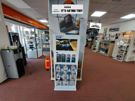
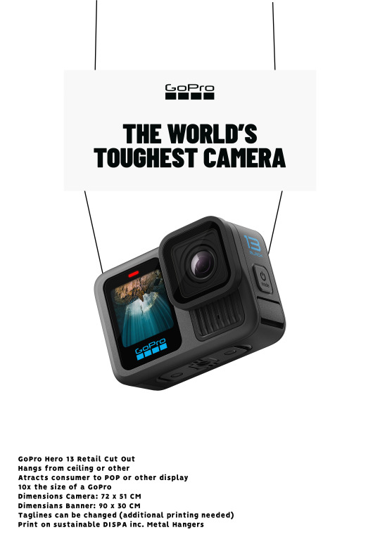
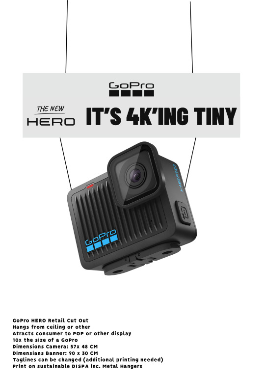
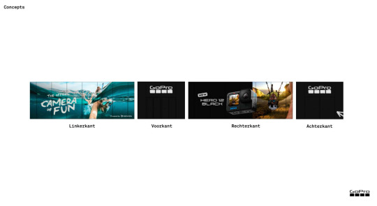
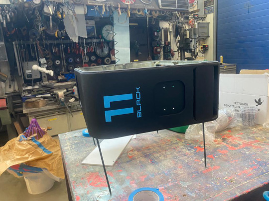
GoPro Retail Cut-Outs - Retail Visibility Concept – HERO & HERO13 Black
An old idea, brought back with purpose. Inspired by the iconic Big GoPro, these hanging retail cut-outs were designed to instantly grab attention in-store—bold, simple, and unmistakably GoPro.
I came up with the concept and managed the project from start to finish. Execution was done by our design department, with very specific delivery specs for print to ensure quality and consistency across all locations.
Together with our Sales team, we reached out to key retail partners in the Benelux and rolled it out across stores.
We made the conscious choice to use eco-friendly, sustainable materials for production—slightly more expensive, but absolutely worth it.
Eye-catching presence
Lightweight and easy to install
Over 200 units per version printed
The response was great—from sales teams to store staff. A reminder that sometimes the simplest ideas still make the biggest impact.
1 note
·
View note
Text

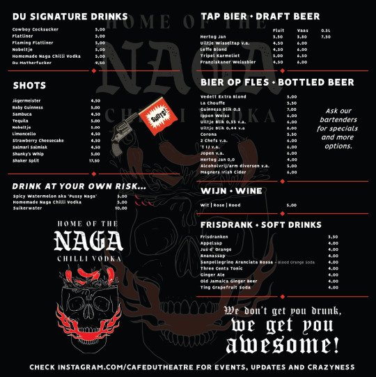
Bar Menu – Du Theatre
For Du Theatre, I developed a timeless yet flexible bar menu, fully aligned with the venue’s characterful atmosphere. From art direction to design, every detail was carefully crafted to reflect the unique identity of the space.
The menu is updated 2 to 3 times a year due to pricing changes, so I designed a modular layout that’s easy to adjust without compromising on style or experience.
A functional design with flair – just what a great bar menu should be.
0 notes
Text


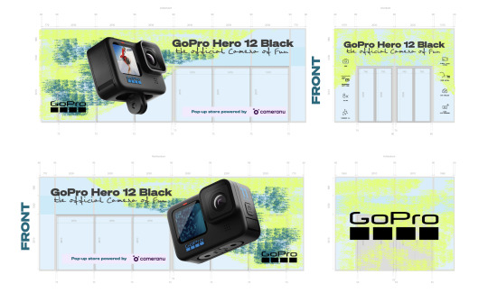

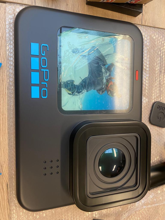
GoPro HERO 12 Launch – Pop-Up Experience at Utrecht Centraal
To celebrate the launch of the GoPro HERO 12, we turned one of the busiest locations in the country - Utrecht Centraal Station - into a high-impact brand moment. With almost 2 million passers-by per week, the pop-up store offered the perfect stage to combine product experience, PR, retail and media reach in one powerful activation.
The pop-up was paired with Digital Out Of Home screens, amplifying visibility and driving foot traffic straight to the store. Inside, visitors could discover and try out the latest GoPro HERO 12 features through interactive displays, hands-on demos, and real-time storytelling.
Highlights:
Official press launch with Nick Woodman (GoPro CEO)
Content creator workshops by GoPro Gurus
Live Q&A sessions
Retail collaboration with CameraNU – including on-site sales
DOOH campaign across key rail media
Full concept and execution managed in-house
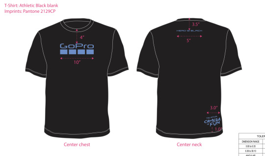
The idea came from personal insight - I passed through Utrecht Centraal daily, and with our HQ based nearby, I saw the perfect opportunity for a relevant and high-traffic activation. I led the project from start to finish:
Concept development & first sketch of the store layout
Creative direction (including T-shirt design & visual materials)
PR strategy & event production
Creator & partner management
DOOH & ad traffic coordination
Budget control & project leadership
The result? A launch GoPro was genuinely thrilled with - and one of our most visible and dynamic activations to date.
0 notes
Text


Pale Blue Earth – Benelux Sales Deck
Strategy, design & localisation
In collaboration with the sales team, I developed a region-specific sales deck for Pale Blue Earth - fully aligned with global brand guidelines and visual identity. The presentation was tailored to the Benelux market, highlighting product benefits, sustainability claims, and market-specific opportunities. My work included strategic structuring, storytelling, and the design of all assets in Dutch. The result: a visually clear and compelling B2B tool to drive retail adoption of Pale Blue’s rechargeable lithium-ion batteries in a traditionally alkaline-dominated market.
Strategy
Benelux localisation
Design & copywriting
Retail- and sustainability-focused content
Looking back, it’s a snapshot of a market in motion - where storytelling, timing, and clarity made the difference between a pitch and a placement.
0 notes
Text


CameraNU Amsterdam – GoPro x BMW Brand Activation
For the opening of the new CameraNU store in Amsterdam, we developed and a bold in-store activation in collaboration with BMW Motorrad Nederland. The centrepiece? A BMW S 1000 RR — a true monster of a machine — placed right in the heart of the store.
Fully GoPro branded and decked out with mounts, cameras and accessories, the bike served as an instant eye-catcher, drawing in visitors and elevating the in-store experience. Dynamic social media content for both GoPro and CameraNU amplified the moment online.
A high-performance collab where tech, lifestyle and retail came together in full throttle.
0 notes
Text


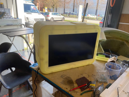


Big GoPro – Bigger Than Life Retail Impact For this project, I developed the concept of an oversized GoPro — over 10x its original size — designed to serve as a bold retail eyecatcher. I led the entire process: from concept development and sourcing a Dutch 3D print partner, to co-creating the final product.
The Big GoPro featured a working screen on the back, allowing for dynamic GoPro showreels to play in-store. The concept was so well received that GoPro HQ ordered a custom unit for the CEO’s office, and later rolled out the idea internationally — from the Middle East to APAC — for use in retail spaces and events.
A standout example of how creativity and execution can scale — literally.
0 notes
Text


Traeger Benelux x Brouwerij Eleven – “Traeger Blond” Collab Beer
For Traeger Day 2023, we wanted to mark our place in the Benelux BBQ scene with something a little different — something that felt local, real, and connected to the community. And what better pairing than BBQ and beer?
I explored several brewery partnerships, but the best match ended up being right in our backyard: Brouwerij Eleven in Utrecht. From the first meeting, the vibe was right — they immediately understood our vision for a beer that could complement the Traeger brand: approachable, flavorful, and built for good times around the grill.
After tasting sessions and creative development, we landed on Traeger Blond: a smooth, bright blond beer that feels like a summer day, but with enough depth to pair perfectly with pork, beef, fish, or whatever’s cooking. Accessible but with a kick. just like Traeger.
I led the concept development, managed the collaboration process, and designed the label artwork to ensure everything stayed on-brand and on-flavor.
The response? Fantastic. The beer became the main pour at our Traeger Day cookout, and we sent it out to influencers, retail partners, and friends of the brand. It was so well received that we’re still getting requests to brew another batch.
A perfect example of how product, brand, and community can come together — cheers to that!
0 notes
Text


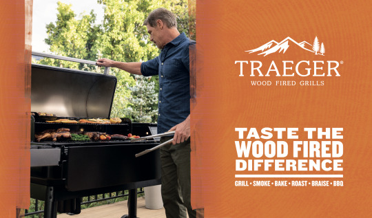

Traeger Trailer – A Rolling Flavor Statement
For the Traeger Trailer, I led the creative direction and design — transforming it into a bold, mobile brand experience. While staying within the official brand guidelines, I pushed the design further by focusing not just on logos, but on what Traeger truly stands for: the product, the process, and most of all — the food.
The trailer features bright, eye-catching visuals, showcasing juicy end results and the unmistakable Traeger vibe. Every angle was designed to draw attention, whether parked at a store, event, or festival.
More than a branded vehicle — it’s a moving taste of the Traeger lifestyle.
0 notes
Text


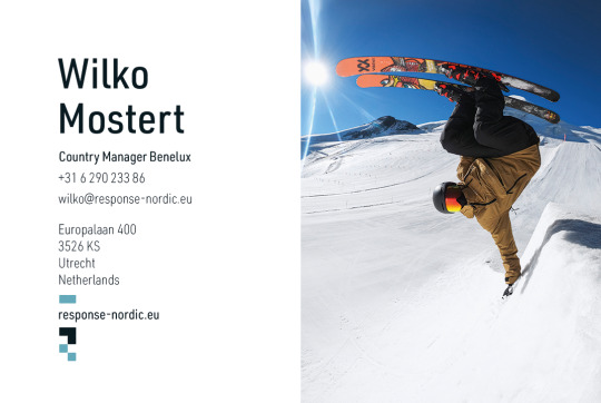
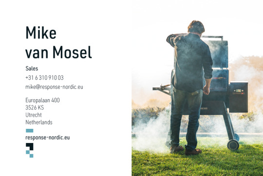

Response Benelux – Brand-Driven Business Cards
For Response Benelux, I designed a series of unique business cards that go beyond the standard corporate look. Each card was tailored to reflect the brand the team member is most involved with — from GoPro to Traeger and beyond — making every card a personal brand statement.
While staying true to each brand’s visual guidelines, I pushed the design further by adding subtle creative edge, texture and bold layout choices. The result: business cards that don’t just represent a name, but instantly communicate the energy and identity of the brands we work with.
A small format with a big story.
0 notes
Photo
youtube
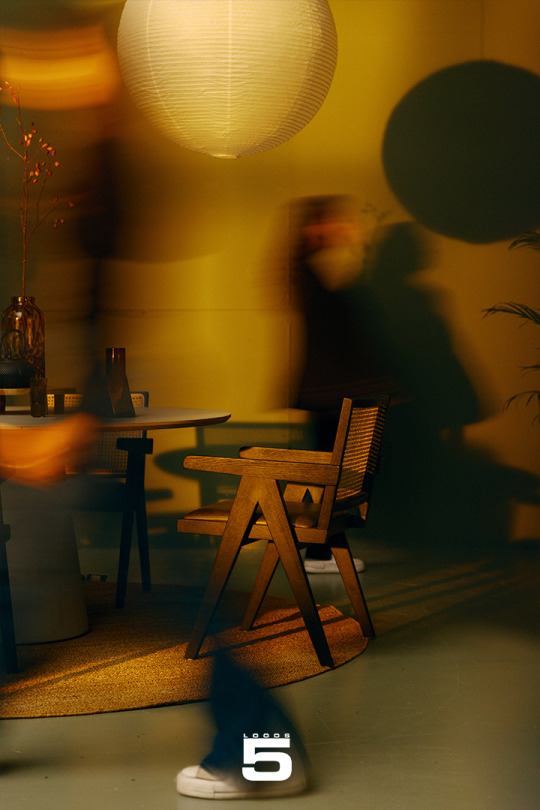
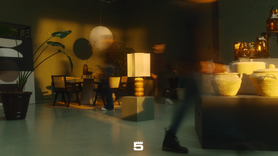
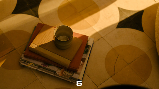
Loods 5 – First National TV Commercial A proud milestone: the very first national TV commercial for Loods 5 aired across the Netherlands!
Instead of highlighting the full range of furniture and accessories, this campaign focused on that one unique item - the piece that transforms a space and captures your personal style. A fresh creative angle that reflected the brand’s identity: inspiring, individual and full of character.
The commercial was broadcast on national TV, YouTube, and Loods5.nl, reaching a wide audience while staying visually true to Loods 5.
My Role:
As the executive producer on behalf of Loods 5, I was the central coordinator throughout the entire process - from selecting the creative agency to guiding the concept development, managing production, and overseeing distribution across TV and digital platforms.
I worked closely with the agency and a top-tier production team to ensure the execution matched the ambition - delivering a visually strong, well-crafted and on-brand result.
Credits:
Directed by Robbert Doelwijt Jr. D.O.P.: Zeeger Verschuren Voice-over: Sydney Lowell Edit: Fernando Barrientos Sound design: Six Feet High Composer: Ingmar Kiemeneij Agency: Lemon Scented Tea Media: Abovo Media & Prodos Production company: Vigics
The campaign marked a new step in Loods 5’s brand storytelling, and I’m proud to have helped bring this vision to life - from the very first idea to the final broadcast.
1 note
·
View note
Text


youtube
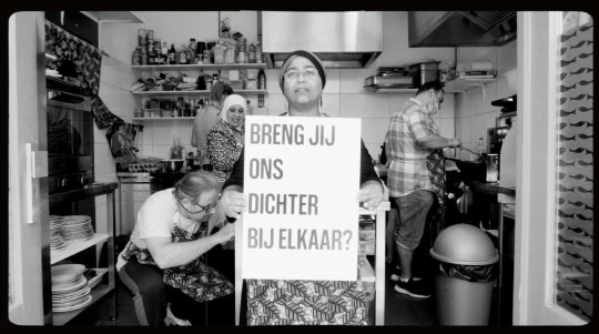
Project: Video – “Zoektocht naar de Stadsdichter”
Client: Bibliotheek Zuid-Kennemerland
For this campaign promoting the search for a new city poet, I was asked to create a video that would capture the power of language and the connective role of poetry in the city. As a former employee of the library, I knew the tone, mission and internal dynamics well - which helped shape the message into something both true to the organization and impactful for the public.
I developed the full concept and was responsible for directing, filming and editing the video. One of the biggest challenges was casting a diverse range of people who could authentically represent the voices of the city. This took time, but the result was worth it.
The video was widely shared and resonated deeply - helping to give the campaign visibility and soul. I’m very proud of the result and the way it brought people together through poetry and representation.
0 notes
Text


Curated Poster Series: DU HEROES
For the upstairs meeting space at Café du Théâtre, I curated a series of bold, iconic posters celebrating cultural heroes that shaped our worldviews—musically, visually, historically. Think Hip-Hop royalty, 90s icons, sports legends, space pioneers.
This collection is a tribute to pop culture, Americana, and personal inspiration. Carefully selected, formatted, and printed to energize the space and spark conversation.
📌 Posters to inspire. A wall of icons. From Biggie to Ali. From moonwalks to mixtapes.
#Babe Ruth#Michael Jordan#Johan Cruyff#De La Soul#Biggie#Bruce Lee#Jay-Z#Lebron James#daft punk#Opgezwolle
3 notes
·
View notes
Text


Du Signature Drinks Posters
Two striking visuals created to promote Du Théâtre’s signature drinks - each with its own story and punch.
For this series, I handled concept, art direction, set design and photography. The goal: capture the bold flavor and visual character of the cocktails in a way that would work both in-house and across socials. The Kraken Dark & Stormy was all about bold contrast and rich detail, while the Naga Skull shot leaned into mood, edge and mystery—perfectly fitting the bar’s offbeat identity.
Shot on location, styled with real bar tools and ingredients, and designed to pop against Du Théâtre’s dark, eclectic interior. The results? Eye-catching, brand-consistent assets that helped elevate DU’s drinks menu and atmosphere.
Proud of how these visuals turned out — simple, striking, and full of atmosphere.
0 notes