
Don't wanna be here? Send us removal request.
Statistics
We looked inside some of the posts by designdummpp and here's what we found interesting.
Average Info
Notes Per Post
0
Likes Per Post
0
Reblog Per Post
0
Reply Per Post
0
Time Between Posts
5 days
Number of Posts By Type
Text
17
Last Seen Tumblr Blogs


Fun Fact
Tumblr has a low social media market share in South America.
Text

I chose this Skala Design poster because it uses motion to create a really strong visual flow. The way the type and shapes move together feels smooth and connected. It caught my eye because the motion helps guide where you look on the screen. Designer/Studio: Skala Design URL: instagram.com/p/DCMOYAeMKu-/?img_index=2
0 notes
Text

Why I chose it:
Uses clean animation within typography to highlight key points
Subtle transitions of opacity and scale feels polished and intentional
Designer/Studio: graphic.elisava (Master’s program showcase) URL: instagram.com/p/DBRepipKRHq/
0 notes
Text

Why I chose it:
Bold typographic motion brings emphasis to each word
Smooth fade-ins and quick cuts create a strong, urgent rhythm
Motion mirrors the idea of “bringing visibility” type moves in as if stepping forward
Designer/Studio: UN/SEEN Women Design (@unseen.women.design) URL: instagram.com/p/C7QsDDHiKuc/
0 notes
Text

I researched different fonts to see how they could help set the tone for my poster. I wanted the type to reflect both the history of The Civic and the bold cinematic feel I was going for.
I tried out a few script fonts like Daisybud Script, California, and Edwardian Script ITC, as well as some bolder fonts like Saint Carell, Hetigon Vintage, and even the Star Wars font. Testing these different styles helped me figure out what worked and what didn’t. Some of the script fonts felt too playful or too light, while some of the bold fonts were too harsh and took away from the mood I wanted to create.
In the end, I chose Edwardian Script ITC Regular for the word "Gaze" because it had the right amount of elegance and connected well to the old theatre style of The Civic. I paired this with Helvetica Neue for the rest of the text to keep it clean and modern.
Experimenting with these fonts really helped me develop my final poster. It showed me how much the choice of type can change the feeling of a design, and it helped me create a stronger, more balanced final result.
0 notes
Text

I created this moodboard to help guide the visual direction for my Civic poster project. The posters I collected focus on bold typography, cinematic style, and strong use of contrast, which was something I wanted to bring into my own design.
I was especially inspired by the way type can be treated as both image and text, as seen in posters like Eye for an Eye and the National Theatre designs. The use of black, white, red, and gold also connects well with The Civic’s interior aesthetic.
This mood board helped me explore different ways to layer textures, play with type hierarchy, and create a poster that feels both theatrical and modern, in line with the atmosphere of The Civic.
0 notes
Text

Colour Planning for My Civic Poster
This colour plan shows the main colour palette I want to use for my Civic Theatre poster. I picked deep red to represent the velvet curtains and the warm theatre feeling. Yellow is for the glowing lights inside the space. White gives it a soft and dreamy look, while orange adds a warm and vintage feel. I also included black to bring contrast and make the colours stand out more.
This planning helped me stay focused with my design and made sure the mood of "Gaze for a Gaze" comes through in the colours I use. It also helped me figure out what extra textures or animations will suit the overall feeling of the poster.
0 notes
Text

This was one of my early drafts where I played around with using type to form a face. I used words like “Wellesley,” “West,” and “CIVIC” to shape the features, which was a fun way to experiment with how text can build an image. it gives off too much Civic like it’s trying too hard to say “this is about The Civic” in a really obvious way. It felt more like a sign than a poster with deeper meaning. But it was a really good exercise to practice with shape, layout, and using type as a design element instead of just for reading. It helped me figure out what worked and what didn’t before moving on to my final design.
0 notes
Text

In this one, I played around with the idea of turning the word “CIVIC” into a building. I sketched the letters to look like the Civic Theatre itself, with the clock and entrance as part of the design. I added the phrase “Historic Theatre in the Heart of the City” around it to describe the Civic without needing a photo. This was more of a fun and creative idea to connect the text with the theatre’s shape.
0 notes
Text

In this sketch, I started experimenting with a more structured layout using a simple 2x2 grid. I wanted to test how I could break the space into smaller sections almost like film stills or theatre scenes. At the bottom, I included the title “THE CIVIC” in bold to ground the design, and I added a small line of text to acknowledge its history. This was my way of exploring balance and hierarchy, but overall, the layout felt a bit too safe. It was useful, though, for thinking about structure and how to incorporate text without relying on imagery of the actual building.
0 notes
Text

This poster is very colourful and playful compared to the others. The background is purple, and there are blocks of green and yellow text and shapes throughout. The large letters "O A S I S" are spread out across the top in a grid, mixed with pictures of plants and flowers. Some of the letters have textures or plant images inside them, which makes them feel natural and soft, matching the idea of a garden or park.
Yellow star and flower shapes are placed around the poster, giving it a cheerful and peaceful mood. The text at the bottom includes a short poem about Albert Park, which talks about laughter, whispers, and nature. Words like "beauty" and "refuge" make it clear that this poster is about showing the park as a relaxing and special place in the city.
The poster has a very friendly and gentle feel. The pastel colours and organic shapes create a sense of calm, which fits well with the idea of Albert Park being a "green oasis" in the middle of the city. It invites people to come and enjoy nature and find peace there, away from the busy surroundings.
0 notes
Text

This poster is very clean and bold with its design. The background is a bright sky blue, which feels fresh and calming, while the large text in black makes a strong contrast. The words "more than a walkway" are stacked and broken up to fit vertically, which draws the viewer’s eyes down the page. Inside the words "than" and "walk," you can see a texture or pattern that looks like a pathway or natural landscape, adding more meaning to the idea of walking through something special.
At the top right corner, "TE ARA MANAWA" is written in white, which stands out clearly against the blue background. This is the name of the walkway, and it is placed where people will notice it easily. The poster overall feels simple but powerful — the big, bold letters and bright colours make it eye-catching and easy to read from a distance.
At the bottom in small text, the poster explains more about Te Ara Manawa. It says the walkway is more than just a path ,it is also a place for nature, recreation, and connecting people to the environment. This ties back nicely to the idea that the walkway offers more than you first expect, which is also shown visually by the layered patterns inside the big text.
0 notes
Text

This poster looks very messy and layered, but in a purposeful way. The words "DISARMED," "DISMANTLED," and "DISAPPEARED" repeat many times in different sizes and levels of boldness. Some are clear, while others fade or blur, which makes them seem like they are slowly disappearing or being hidden. The lower part of the poster becomes very dark and chaotic, where the word "DISGUISED" gets buried under layers of text. This makes it feel like things are being covered up or lost in history.
Red words like "GUNS," "AMMO," and "PLANES" stand out from the rest. This use of colour makes these words feel important and linked to violence or war. By making them red, the poster draws attention to the dangerous things that are being "disarmed" or "disappeared." The different levels of fading and overlapping text makes it feel like the poster is trying to visually represent something being slowly erased or hidden away from the public.
0 notes
Text

This is the final poster I designed in InDesign, and I felt a lot more confident while making it. I focused more on using typography to tell the story of The Civic. I used different fonts depending on the message I wanted each part of the text to give for example, bold and clean type for the title to make it strong and eye-catching, and a softer serif font for the quote to make it feel more poetic and elegant. I also created small visual elements like gold lines, floral patterns, and vintage-style frames that were inspired by The Civic’s interior design and its rich history. The gold and navy colour scheme helped me create a classic and dramatic mood, which fits the theatre’s style. This poster let me explore how typography can stand on its own as the main design feature, while still bringing in decorative details to support the overall feel of the piece.
0 notes
Text

This is one of my early poster designs for The Civic, made in InDesign. I used bold yellow and outlined text to highlight the phrase “The Golden Age” and added a photo of the theatre to show its real-life look. I also included a double-lined gold border to give it a classic feel. I didn’t go with this design because it had too much imagery, and the project needed to focus more on typography.
0 notes
Text

In this typography poster for The Civic, I used a bold, classic-looking font for the main title “THE CIVIC” to show that the theatre is important and historic. I used different font sizes to help guide the viewer’s eyes — the biggest text is for the name of the theatre, medium text for important dates like when it opened and was renovated, and smaller text for extra information. I kept all the text in capital letters to give it a strong and elegant look, which fits well with the old and grand style of the theatre. The border around the poster and the corner designs were chosen to match the Art Deco style, which was popular when the theatre was first built in 1929. The background is a rich reddish-orange colour, which makes the light cream text stand out and gives the poster a warm and inviting feeling. I also chose poetic and dreamy words like “gilded splendor” and “starlit dreams” to match the magical and beautiful atmosphere that people feel when they visit The Civic. Altogether, the fonts, colours, shapes, and words work together to celebrate the theatre’s history and show that it’s still a special place for shows, concerts, and films today.
0 notes
Text
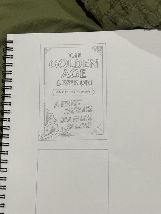
My sketch that I drafted up was my way of exploring the different elements of Auckland's The Civic theatre. The use of the bold lines, and letters illustrates the ancient and grand ambiance feel of The Civic, projecting its architectural structure. The use of floral and decorative edges reflects the details present within and on The Civic theatre building. Following this, my next step in progressing with my sketch will be to look into shadowing and contrasting of the texts to create more in depth enhancement and overall design to reflect the grandness of The Civic theatre.
0 notes
Text

In class, I analyzed different typefaces and how letterforms change depending on their style. I looked at how certain letters, like 'g' and 'A,' have different structures in different fonts. Some had decorative or exaggerated features, while others were more minimal. I also identified details like ligatures, serifs, and the way letters connect. Writing notes on the paper helped me see how typography is designed with different purposes in mind, from readability to artistic expression.
0 notes