
Don't wanna be here? Send us removal request.
Statistics
We looked inside some of the posts by designthingsnstuff-blog and here's what we found interesting.
Average Info
Notes Per Post
1
Likes Per Post
1
Reblog Per Post
0
Reply Per Post
0
Time Between Posts
8 days
Number of Posts By Type
Photo
2
Text
9
Last Seen Tumblr Blogs


Fun Fact
The KCSC sent more than 20K requests to delete posts related to prostitution and porn to Tumblr from January to June 2017.
Photo
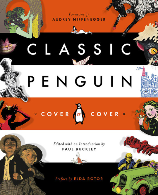
Classic Penguin: Cover to Cover AUTHOR: Edited with an Introduction by Paul Buckley, Preface by Elda Rotor PUBLISHER: Penguin Books DESIGNER: Paul Buckley and Matt Vee
TYPEFACE: Bold Geometric Sans, Light weight serif.
This book is a collection of classic covers used by the Penguin in the past. Showing a history and stories behind these innovative designs, as well as commentary and insight from the designers. This book is the winner of the Winner of the 2016 AIGA + Design Observer 50 Books | 50 Covers competition. This cover is a cover for a book about covers, this is a lot to live up to and Id say the designers did a wonderful job. The Cover features to bold and eye-catching color scheme that we have grown accustom to with penguin books. This gives the cover great hierarchy and creates great visual interest. The use of point size and font choice is also expertly crafted, making everything cohesive and east to understand. There are a great many images on the cover which could get messy, but the designers managed to make them all very clear and harmonious. There are many ways they did this, such as using the color stripes to signal having a new image, having the images come out from the bottom of the stripes, and having a subtle drop shadow. The drop shadowing does an effective job of giving everything a certain physicality to it. Certain images bleed of the page giving variety and rest for the eye. The images chosen to have a good variety, such as highly illustrated and cartoon, to highly iconographic and bold.
My book is an exhibition catalog about animation for Texas university students. I picked this book because it complies a large and diverse set of images that span a large period of time. I also found great inspiration on how bold this is, and how it expertly commands the eye.
—Martin
0 notes
Text


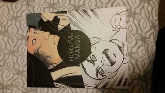
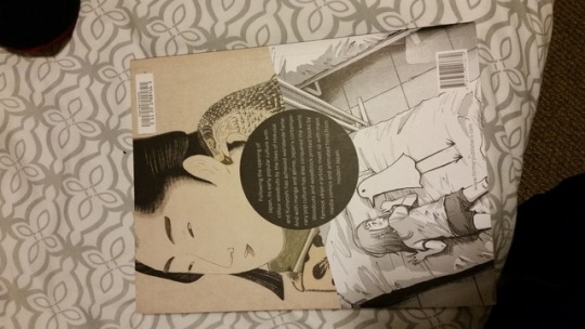
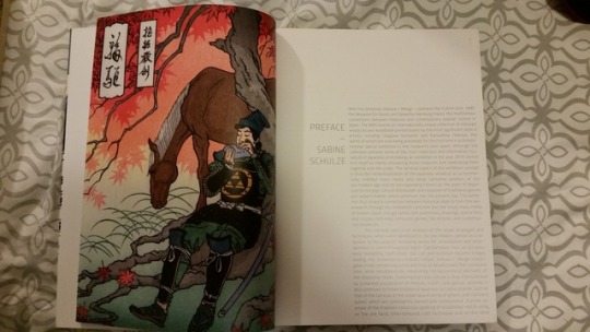
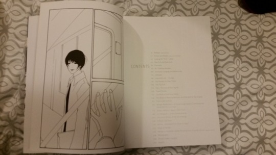
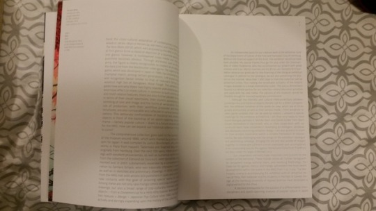
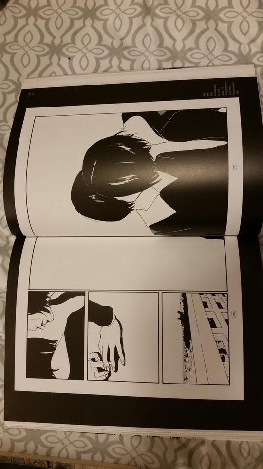
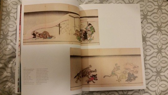
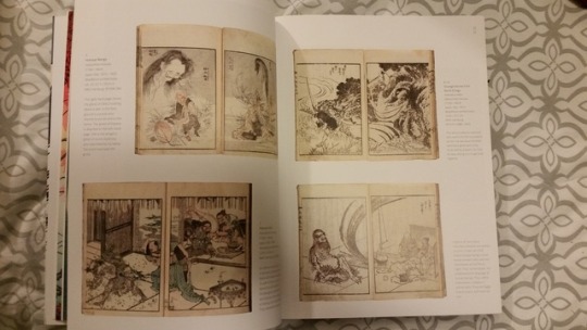
This book is very finely crafted and mixes modern and traditional type. This is done by having one large text block on the spreads. On many spreads aligning the text block right with very tight margins on the right and bottom. The left and top have very large space and provides a nice balance. The line length is very well executed, as well as the leading, typeface pointsize relation. The page numbers are displayed on the top right corner of the right page. This helps push the modern edge and tie together the idea of the content spanning 17th century japan to 21rst century japan. The pages apear to use a 5 column grid and some spreads have images going into the other pages. The start of a new section has a full page full color images on the left page. The title of the section is put closely to the margin of the text block in a thin san serif font, they also use japanese in the same font. The artwork spreads a very well laid out and serve the content while remaining interesting. Overall the only flaw i see in this exhibition book is that it is very large and think. Stand alone this is very nice however. This book was designed by "Heine/Lenz/Zizka, Frankfurt a.M." this is set in "Titillum," and is printed in italy on 150g/qGarda Matt Ultra.
0 notes
Text


This book is very finely crafted and mixes modern and traditional type. This is done by having one large text block on the spreads. On many spreads aligning the text block right with very tight margins on the right and bottom. The left and top have very large space and provides a nice balance. The line length is very well executed, as well as the leading, typeface pointsize relation. The page numbers are displayed on the top right corner of the right page. This helps push the modern edge and tie together the idea of the content spanning 17th century japan to 21rst century japan. The pages apear to use a 5 column grid and some spreads have images going into the other pages. The start of a new section has a full page full color images on the left page. The title of the section is put closely to the margin of the text block in a thin san serif font, they also use japanese in the same font. The artwork spreads a very well laid out and serve the content while remaining interesting. Overall the only flaw i see in this exhibition book is that it is very large and think. Stand alone this is very nice however. This book was designed by "Heine/Lenz/Zizka, Frankfurt a.M." this is set in "Titillum," and is printed in italy on 150g/qGarda Matt Ultra.
—Martin
0 notes
Text

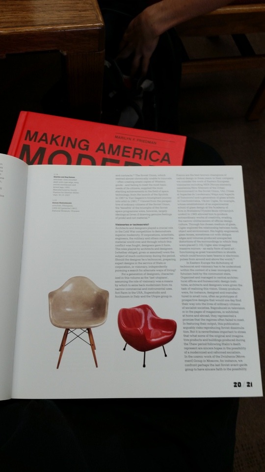
My book has a very modern sweedish grid layout. On most spreads it has a 3 column grid with small margins. The book uses san serif typefaces. The page numbers are bold and create a nice contrast. There sometimes are notes on the side with smaller columns. Images without boxes sometimes bend the rules of the grid creating interesting contrast.
–Martin
0 notes
Photo
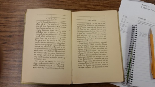
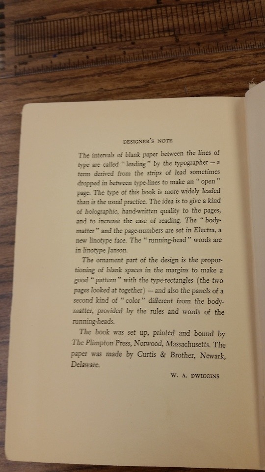
Not under forty, a collection of short essays by Willa Cather
This book has unique design choices that make it very easy to read such as its very generous and wide margins. This gives ample room for the thumbs and creates a very beautiful white space. The right side of the spreads also appear to have more white space around the margins than the left page, I’m not sure if its because of an error of old printing or intentional but I personally enjoy thing asymmetric design. The text is justified and has a generous amount of line leading and kerning. In the designer notes they state that they wanted “hand written quality to the pages” and wanted them to be highly readable. The fonts they used were Electra and Janson.
— Martin
1 note
·
View note