
Visual diary as part of Postgraduate Interactive Digital Media. Author: Dominika Campbell
Don't wanna be here? Send us removal request.
Statistics
We looked inside some of the posts by domiandhervisualdiary and here's what we found interesting.
Average Info
Notes Per Post
4K
Likes Per Post
3K
Reblog Per Post
692
Reply Per Post
5
Time Between Posts
3 days
Number of Posts By Type
Photo
17
Last Seen Tumblr Blogs


Fun Fact
If you dial 1-866-584-6757, you can leave an audio post for your followers.
Photo

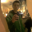
Girl on the train, Myanmar
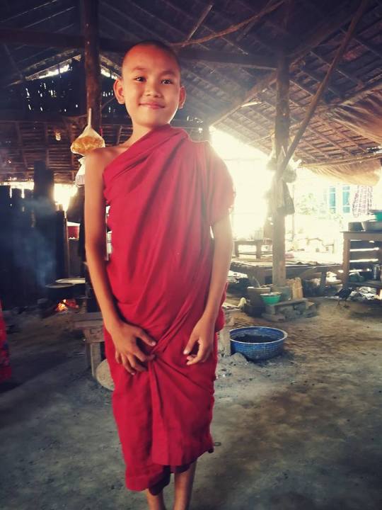
Proud young monk, Myanmar
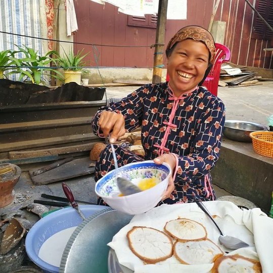
Lady from Cham Muslim community preparing delicious pancakes; Chau Doc, Vietnam
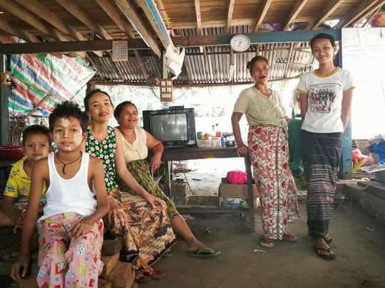
Lovely family who invited us for a cup of tea; somewhere near Taungoo, Myanmar
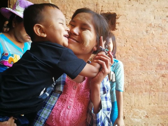
Pure happiness; Bagan, Maynmar
“Photography is a way of feeling, of touching, of loving. What you have caught on film is captured forever… It remembers little things, long after you have forgotten everything.” — Aaron Siskind
Here are some of my favorite photos captured during my travels in South East Asia. Beautiful people, real emotions. I miss travelling.
5 notes
·
View notes
Photo
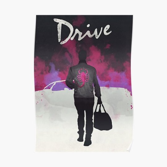
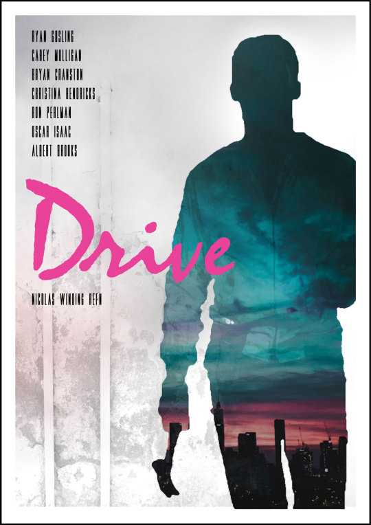
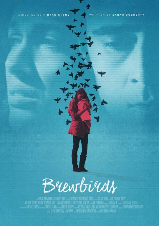
Movie posters inspiration continued. This time, I decided to look for crime posters. Composition and colours in these posters really grabbed my attention. I love how they used masking (a way to apply something to a very specific portion of an image). Colours are spot on too and very relevant to genre tone - dark, with some red elements to attract attention. I also really like the colours of “The Drive” poster and the illustrated style.
Source: https://www.behance.net/
1 note
·
View note
Photo
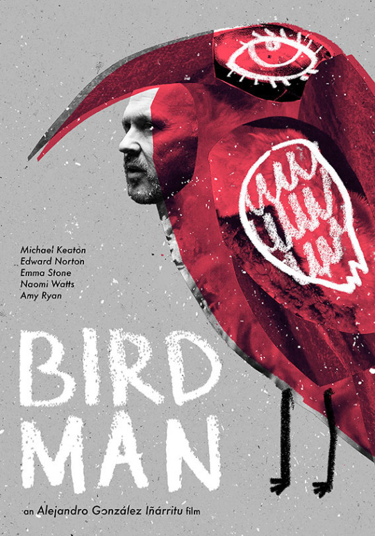
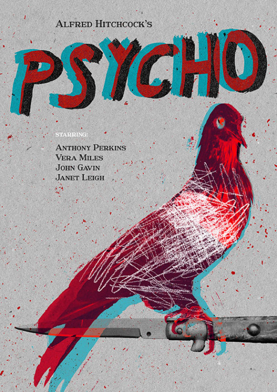

When searching for movie posters on Behance, I came across these four posters. Even though I won’t use a similar concept in my movie poster as we need to use photographic elements, these posters really caught my attention. Ada Jarzębowska, a Polish student, designed a series of movie posters as a part of her Master's degree final project (exploring insanity themed movies). I like the creativity here - typography goes hand in hand with a movie theme and the overall tone. Nice three-tone effects where red attracts attention. I love the use of RGB split in Psycho poster!
0 notes
Photo

While looking at some movie posters inspiration, I came across these posters on https://www.behance.net/
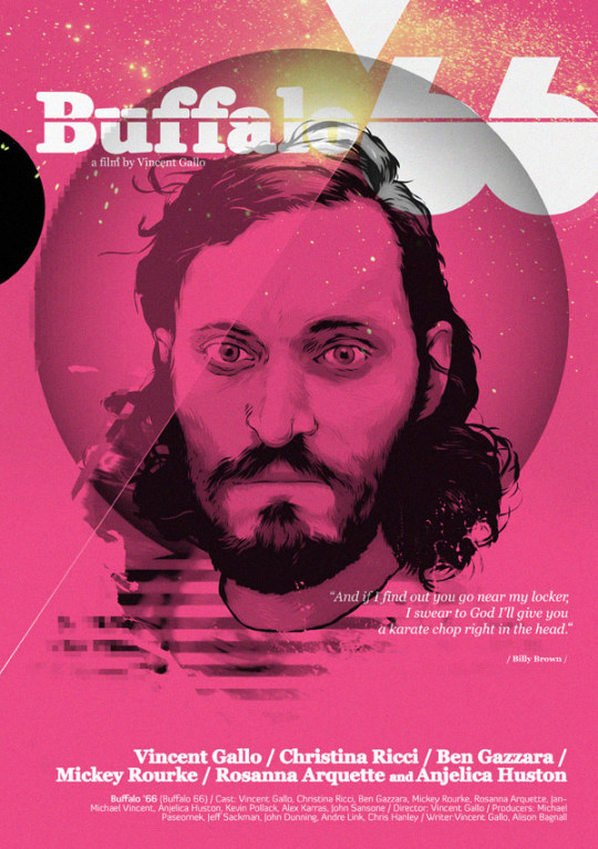
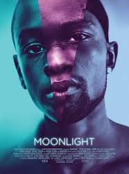
I really like how they use colours here - only few, but vibrant tones which creates powerful message and very cool effect. I’m a big fan of duo tones - really modern and eye-catching. I really like how they used typography in “Her” poster and shapes in “Moonlight” and “Buffalo” poster.
5 notes
·
View notes
Photo
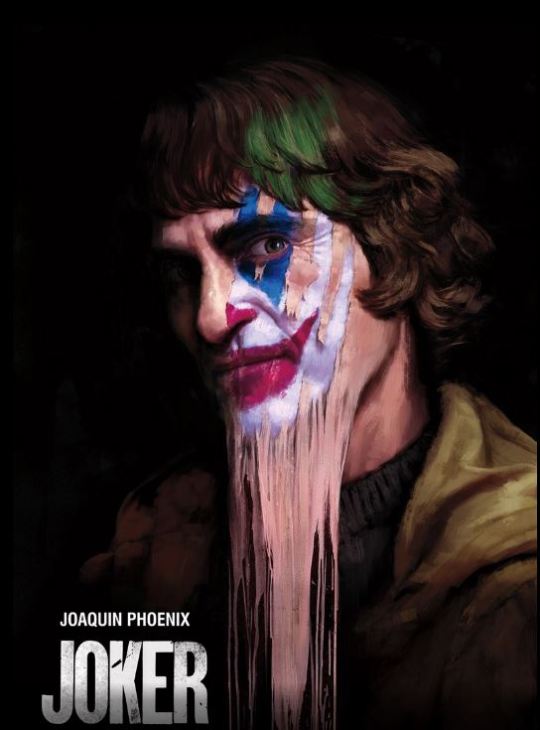
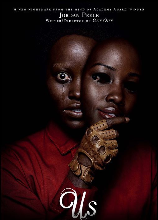
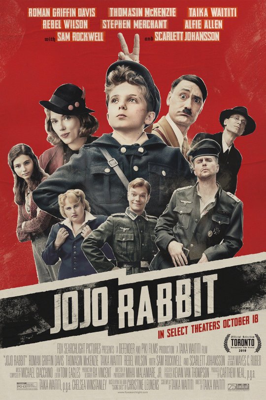
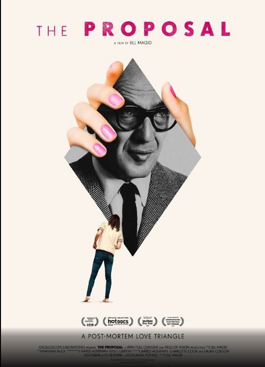
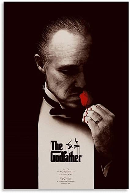
For our next assignment for Visual Communication, we need to design a movie poster. I started looking for some inspirations. I recently watched JoJo Rabbit, what a fantastic film. I really like this vintage looking poster. When looking at the Joker and Us poster, I like how they captured emotions. I also like the simplicity of The Proposal poster and the way it is designed.
Source: https://www.comingsoon.net/movies/features/1115789-the-25-best-movie-posters-of-2019?slideshow=135309#/slide/3
5 notes
·
View notes
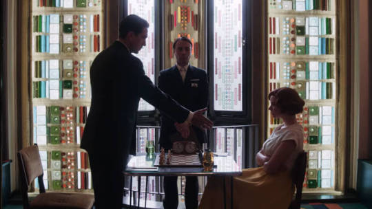
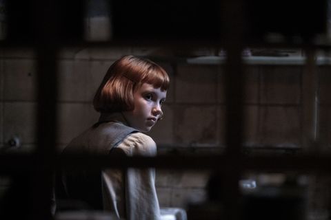
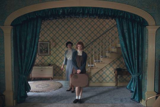
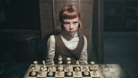
Photo
Wow, just wow! I’m amazed by cinematography and the mood of this show. They capture emotions perfectly.


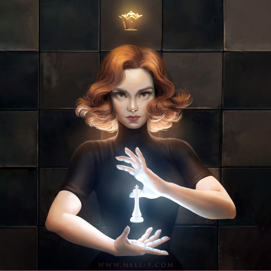

The Queen’s Gambit - fan art paintings by selected artists: Yaşar VURDEM, jilly liu, Karmen Loh, Nell Fallcard, Mandy Jurgens
4K notes
·
View notes
Photo
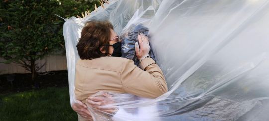
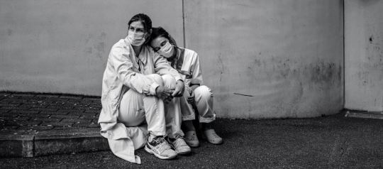
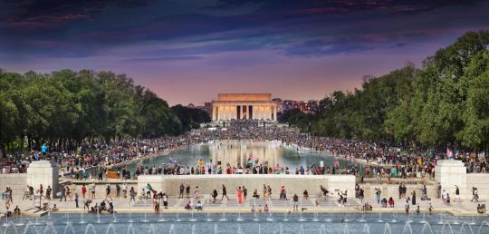
I came across those photos in the National Geographic website: “ 10 unforgettable images from our Year in Pictures issue.“
2020 year in review. National Geographic photographers document a year that tested, isolated, but also empowered and brought hope to the world.
Happy New Year! 2020 has been a challenging year for everyone, but we shouldn’t forget to appreciate how far we've come! There’s a lot we have learned and can take with us into 2021. Let's reach eagerly for 2021 like it's our next challenge and an opportunity to grow.
Source: https://www.nationalgeographic.com/photography/2020/12/10-unforgettable-images-from-our-year-in-pictures-issue/
1 note
·
View note
Photo
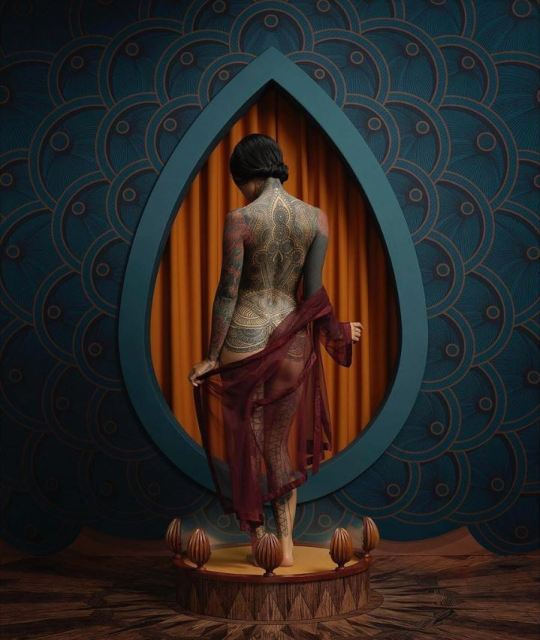
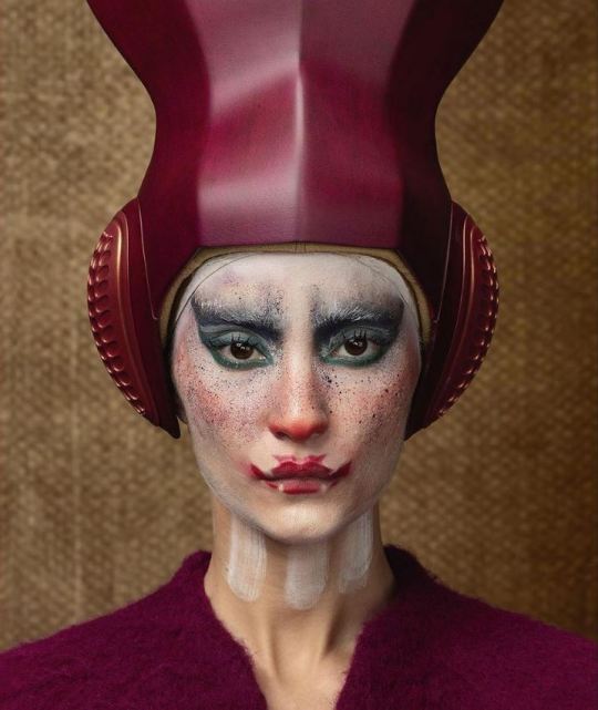
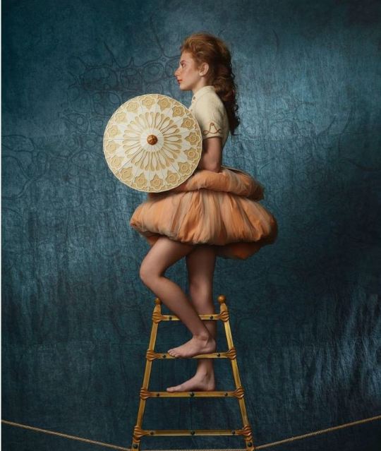
I came across these photos when browsing through exhibitions in Art at Berlin website. Circesque” exhibition shows Christian Tagliavini’s latest art series, on which he worked for over three years. Christian Tagliavini is a Swiss-Italian photographer. He loves designing stories with open endings. I really like this unusual concepts, photos of extraordinary people and their stories.
Images source: https://www.instagram.com/christiantagliavinifotografie/?hl=en
2 notes
·
View notes
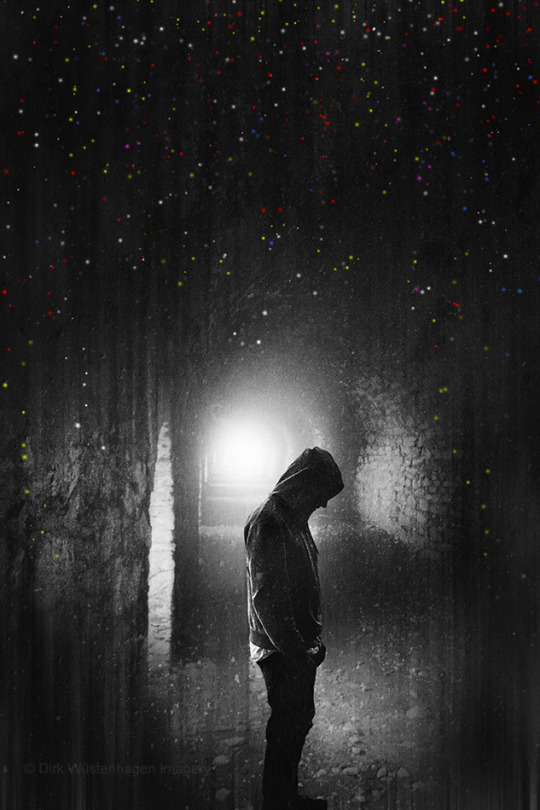
Photo
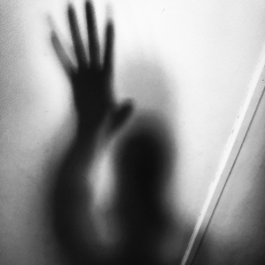
I came across this photography on Tumblr, posted by trevorme.
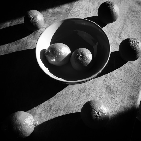
I love black and white photography - the emotion that they bring, the different lighting contrasts – darker colours tend to evoke a darker mood, they can create a feeling of tension.
Shadows in the photography add a hint of drama, emotion, a mystery to a photo. When working on my photography assignment for Visual Communication, I was using light and shadow interplay for capturing “anger” and “fear” emotion.
3 notes
·
View notes
Photo
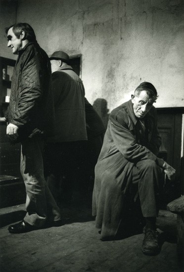
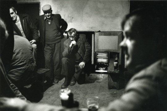
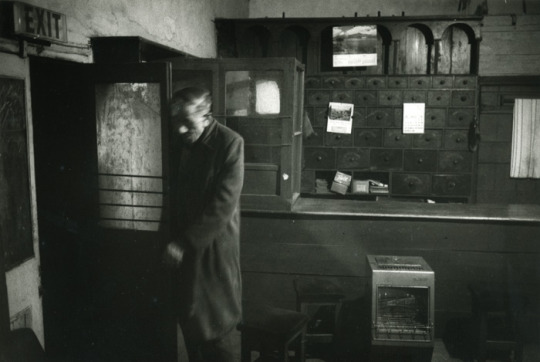
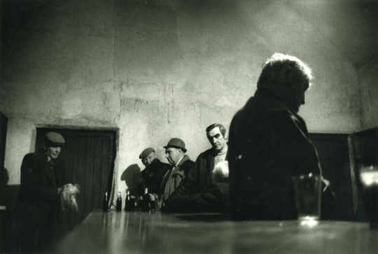
When doing my research on capturing emotions in photography, I came across these photos in the article “Emotional Pictures: Sad Faces, Fake Smiles and Angry Photographers”.
Krass Clement, the Danish photographer, took a series of photos in a pub in Ireland. They were shot in one evening, Clement used three rolls of film and three-and-a-half pints of Guinness to photograph a single man spending his evening alone in the pub. I like the contrast here - showing loneliness of men, where there are people socializing (and drinking Guinness, of course!). It’s an emotional series, but the emotion doesn’t just come through the face, it comes through his body, his environment, through the people who surround him. This man isn’t laughing or taking part in any “craic”.
Source: https://witness.worldpressphoto.org/emotional-pictures-sad-faces-fake-smiles-and-angry-photographers-7100a71e51b7
6 notes
·
View notes
Photo
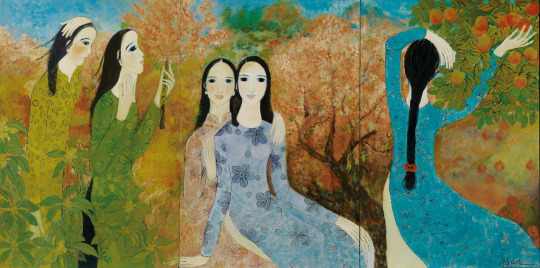
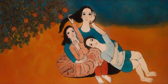
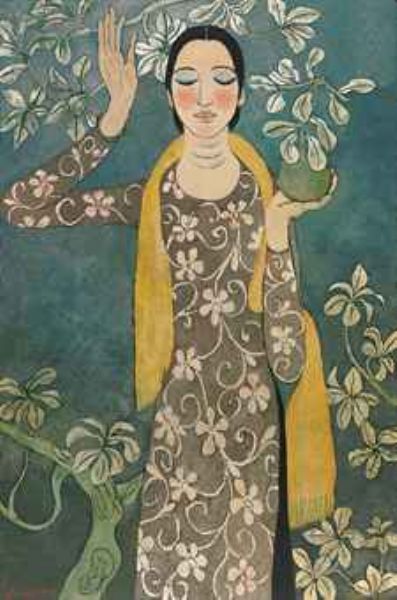
I came across this artist while watching Anthony Bourdain’s “Parts Unknown” about Vietnam.
Boi Tran is a Vietnamese Postwar & Contemporary painter who was born in 1957 in Hue, in central Vietnam. The city was the battleground for the Battle of Hue, which was one of the longest and bloodiest battles of the Vietnam War. During the Republic of Vietnam period, Hue, being very near the border between the North and South, suffered a lot during the Vietnam War.
Tran's creations are made with different materials, including oil, silk and lacquer. Most of her paintings capture the beauty of women and flowers. The young women in Tran's paintings appear in traditional Vietnamese dress, ao dai. Boi Tran’s pictorial work expresses the search for universal humanism deeply rooted in a characteristically Vietnamese sensitivity.
“Boi Tran is a painter and something of a throwback, an anomaly, a creature from another, earlier time in the life of the onetime Imperial City. She lives in an area called Thien An Hill, in a magnificently restored compound. These traditional wooden houses were once part of the regal style, with sloped grooves to handle the rainy Hue weather. But most importantly, they feature a garden at the center which follows the eastern philosophy that all things originate from a single source and expand in all directions.” A. Bourdain
Visit her website here:
http://boitran.com/aboutus/
2 notes
·
View notes
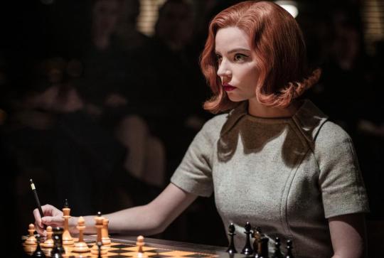
Photo
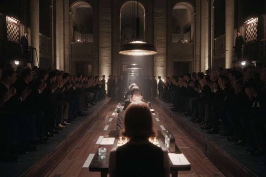
I started watching The Queen’s Gambit last night and I have to say that I'm amazed by cinematography and the mood of this show! I decided to search for some photos from this great series - they capture emotions perfectly. You can hit the pause button pretty much whenever you want, and you’ll have a great photo. I came across this article, which highlighted some of the composition techniques used in this great show. Very useful photography tips!
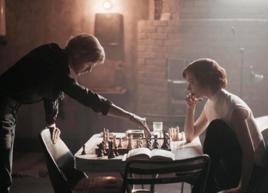
Leading lines: leading lines are a powerful composition technique, leading the viewer’s eye to the main subject.
Symmetry: even though symmetry is mostly used in architecture photography, you can also create it in a composition that involves people, and The Queen’s Gambit has lots of examples.
Patterns and rhythm: many scenes in the series have a lot of visual interest, especially in the background. For example the beds in the orphanage, the lockers in school, or those fantastic patterns from the 1950s and 1960s. All these create very dynamic scenes and dictate how our eyes move across the scene.
Frames: framing is also one of the composition techniques we’re all familiar with. Like leading lines, framing also draws the viewer’s eyes straight to the main subject or subjects. The Queen’s Gambit has loads of examples of great framing that tells a story. Sometimes it uses traditional “frames” such as doors and windows, and sometimes they are less obvious.
Negative space: lighting-wise, the series is pretty dark, which creates a lot of negative space. It tells a story, sets the mood, or tells the audience where to look. It’s used in the series, just like it often is in photography, to show the isolation or the loneliness of the character.
Depth and layers: many scenes in the series show the foreground, the middle ground, and the background. This helps to establish the characters in the world around them and makes the setting more complete.
Close-up portraits: during the most intense moments of the show, you’ll often see the characters filmed from up close. As the tension grows, they will get closer and closer, which intensifies the atmosphere even further.
Source: https://www.diyphotography.net/seven-composition-techniques-you-can-learn-from-the-queens-gambit/
6 notes
·
View notes
Photo
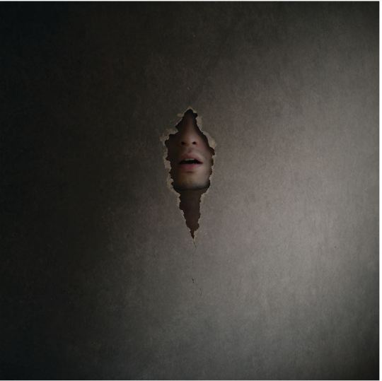
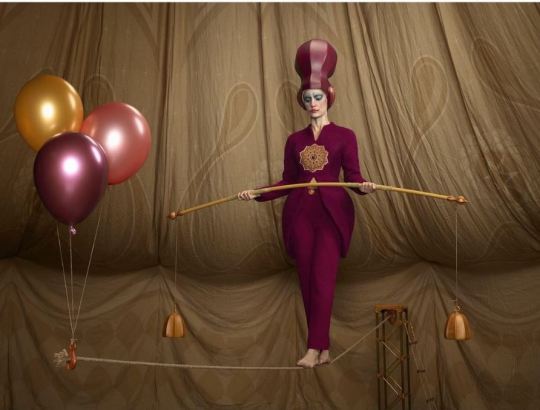
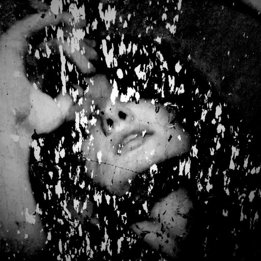
I love this surreal, magical photography. Capturing emotions is really difficult, I think Simon McCheung masted it.
“My inspiration comes from the challenges of taking a fragment of emotion or a slice of story, and then finding powerful ways to evoke this to the viewer,” he says.
Simon is a self-taught photographer and a graphic designer for a Warner Bros company, he is based in London, UK. His work is renowned for surreal images that tell intriguing stories that play on sensorial themes.
Simon's work has been featured within Saatchi's gallery space on two occasions as his image 'An Underwater Spell' being used for the forefront of Google's and Saatchi's collaboration project, Motion Prize. You can view his photography HERE.
Images source: https://www.simonmccheung.com/
4 notes
·
View notes
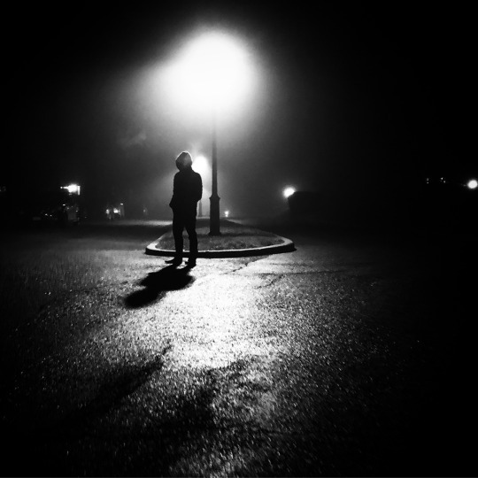
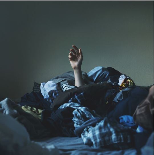
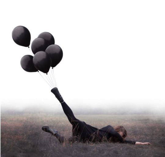
Photo
What does this photo tell you?
One of the most powerful, yet difficult, elements to master in photography is capturing emotion. A really great image is one that capture a mood and pulls the viewer into the scene. Feelings and emotion are subjective, and each of us may feel differently when we look at a particular photo.
I came across this image on Tumblr. This photographer has an amazing portfolio: most of his images are captured in the forest, it is a lot of mystery there. You can view his photography here:
https://dyrkwyst.tumblr.com/
2 notes
·
View notes
Photo
"Branding is what people say about you when you’re not in the room."
Consistency is everything
In the last Visual Communication lecture, we were talking about branding. When it comes to building a memorable brand, it's all about consistency. When you are in the shop looking for your favourite brand, you want to be able to spot it straight away. All of the most identifiable brands are recognizable because of their messaging consistency - colours they use, fonts, logos, language. Branding defines who your brand is, what you’re brand does, and how you communicate that externally.
When developing a consistent brand, it's vital to start with creating a brand style guide. A brand style guide is the collection of specifications that help to showcase a consistent visual brand. It is essential to building an effective marketing strategy, but it also gives employees access important guidance and visual assets to create more effective content. It helps to maintain consistency, especially when it comes to updating/refreshing branding It also helps establish trust with your audience.
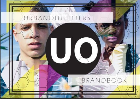
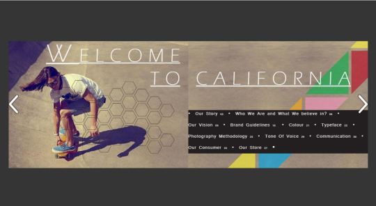
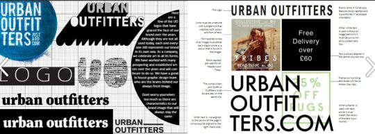
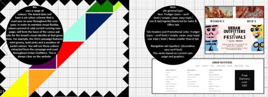
When searching for branding inspirations, I came across Urban Outfitters brand style guide - they definitely know how to do it right!
They include everything what is vital: photography, colour, and even tone of voice. They are not even shy to include information about their ideal consumer and what the brand believes in. See the full brand guide here.
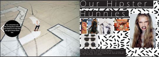
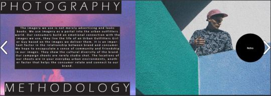
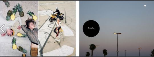
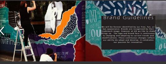
Images Source: HubSpot, 21 Brand Style Guide Examples for Visual Inspiration: https://blog.hubspot.com/marketing/examples-brand-style-guides
2 notes
·
View notes
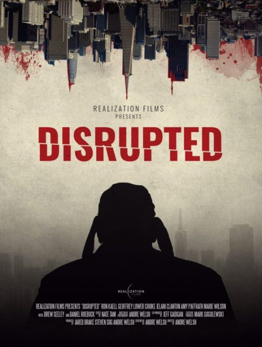
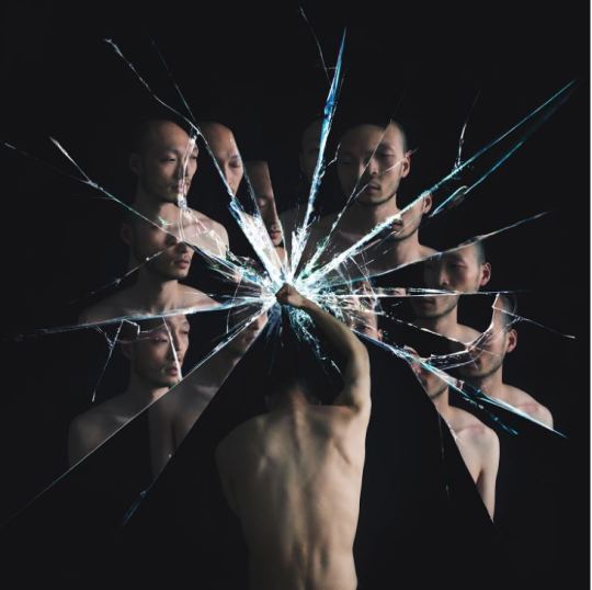
Photo

I came across these posters when searching for graphic design trends and some inspiration. I love this abstract style! The ‘sliced effect’ is really cool and attention-grabbing - you can bring a boring image to life! I will definitely put it on my to-design list!
Image source: https://yesimadesigner.com/graphic-design-trends-2019/
4 notes
·
View notes
Photo
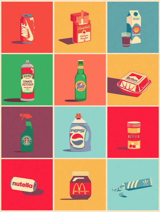
In today’s Desktop Publishing lecture we were talking about brands and logos. I came across this graphic on Pinterest. Very interesting concept of putting logos on objects not associated to a brand - how creative, yet simple idea!
Combining these completely unrelated products, this artist has produced a colourful, interesting, vintage looking graphic. Is it irony that Netflix logo is displayed on a bottle of medicine pills?😉
You can check out Mike Stefanini’s work HERE.
Image source: https://www.freepik.com/blog/graphic-designer-plays-combining-completely-unrelated-products-logotypes/
4 notes
·
View notes