
Coffee addict, nerd, and developer in the making. Be sure to check out my techmancer blog detailing my journey and progress as a programmer. Cheers!
Don't wanna be here? Send us removal request.
Statistics
We looked inside some of the posts by dordlebuns and here's what we found interesting.
Average Info
Notes Per Post
34K
Likes Per Post
20K
Reblog Per Post
13K
Reply Per Post
135
Time Between Posts
1 month
Number of Posts By Type
Text
17
Last Seen Tumblr Blogs


Fun Fact
The Tumblr office adopted Tommy, an 11-year-old Pomeranian.
Text
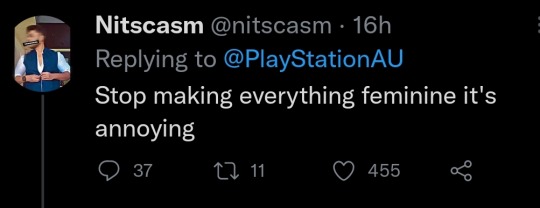
Twitter dudebros truly are in a class of their own. Playstation/Santa Monica studios posted this gif of Kratos:

(Based on a GIF of Jason Momoa btw)
And the dudebros are loosing their goddamned minds in the comments


34K notes
·
View notes
Text
Day 21: Finishing Flexbox
Recovering from a cold this weekend but got in plenty of fun emotional moments with NieR. Time to finish up Flexbox!
Learned about flex-shrink and flex-grow.
These are different compared to previous flexbox properties as they influence the size of the flex item and not the flex container.
flex-basis property makes it so the initial size is specified before adjustments are made with CSS with the aforementioned properties flex-shrink and flex-grow.
flex can be used as a property to shorthand the three properties discussed above. This is done by following this template: <flex: 0, 1, auto>. That is the standard value for flex, and follows flex-grow, flex-shrink, and flex-basis in that order. (NO COMMAS)
The order property can be used to determine the flexbox container order, which defaults to the order in which it appears in the HTML code. Negative integers can be used.
That's it for Flexbox! I'm going to dive into Grid now and then it's project time in freeCodeCamp!
0 notes
Text
Day 20.5: More Flexbox
I was running out of space so here we go again, starting with where we left off on Day 20: The align-items property and cross axis.
As we talked about on the last post, I just learned about the cross axis which is the opposite axis of the main axis.
The align-items property makes use of moving content with gridbox to this axis.
This is useful if we need to push content up or down with rows, and left or right within a column.
Different values include many that are similar to justify-content. These include: flex-start, flex-end, center, stretch, align-items, and baseline.
flex-start: Aligns to the start. Rows = top, columns = left
flex-end: Opposite to flex-start. Rows = bottom, columns = right
center: Aligns items to the center. Rows = vertically aligns, columns = horizontally aligns.
stretch: The default value if no align-item value is specified, it stretches the items to fill the flex container. Rows = top to bottom, columns = left to right.
align-items: value is specified.
baseline: Baselines are a text concept that should be thought of as the line that the letters sit on.
New property! flex-wrap
flex-wrap is a feature in CSS flexbox that can split an item into multiple rows or columns. By default a flex container will fit all of them into a single line if it's a row for example.
That's it for today! A lengthy one but a great way to kick off the weekend! Later peeps.
0 notes
Text
Day 20: Flexbox Time
So yesterday I watched the Demon Slayer film and it was DOPE. But today to kick off the weekend we'll be going into what I learn with Flexbox so I'm pretty pumped. After that, it'll be playing the new Nier remake, so let's get started!
Learned about display: flex and using flex-directions to make rows or columns. By using display: flex it will turn that element into a flex container.
By doing this, it's easy to align any children elements within the parent element into rows or columns.
Going off of display: flex and making flex containers (hey now we know why it's called CSS Flexbox!) is justify-content. BUT, it's important to understand how Flexbox organizes everything once we use display: flex.
The direction of flex item's arrangement is called the main axis.
If we used flex-direction: row then the main axis is the horizontal line going through the elements.
Vice versa for flex-direction: column. Main axis would be the vertical line going through them.
When we want to move elements in this flexbox, we can use various properties that influence how they interact with the main axis.
This includes justify-content: center which moves content to the center of the gridbox.
Others include flex-start, flex-end, space-between, space-around, and space evenly.
flex-start: Aligns content to the start of the flex container, so if it's a row it'll go to the left and if it's a column it will go up top.
flex-end: Opposite of flex-start. Row = right, column = bottom
space-between: Places content to the center of the main axis with extra space between the center content pieces. The first and last items are pushed against the very, very edge of the container. (So if it's a column, the top and bottom elements will be touching the edge with space between the center elements.)
space-around: space-around is similar to space-between but the space is evenly divided among all the elements with space on the ends.
space-evenly: Lastly, space-evenly distributes space evenly (of course) between every flex items with a full space at either end of the container.
Opposite to the main axis is the cross axis which is exactly like it sounds. It's the axis opposite the main axis, so with rows the cross axis is vertical.
0 notes
Text
Day 19: Finishing Touches on Accessibility
Yesterday was a lengthy one and today will probably be no different. After finishing one half of Visual Accessibility on freeCodeCamp I am determined to make it to CSS Flexbox today. Let's get to it!
Accessible date picking. We know from what seems like forever ago that forms often include an <input> field, which is used for form controls. The <type> attribute indicates what type of input element is made.
When prompting users for dates, you simply use the input type set to the string value of "date". Then you can assign an ID and name as usual.
Learned about the <time> element with <datetime> attribute! <datetime> is an inline element that can wrap a date or time on the page. It's used for assistive devices and helps avoid confusion by stating a standardized version of that time.
So far, everything I have been using is HTML, but you can also use CSS! It's just really important to have element semantics and meaningful, easy to read code/structure in place before applying visuals with CSS.
CSS can utilize classes and move screen reader only elements off the visual area of the browser window. Using <overflow> and numerous other properties like <position>, <left/right>, <height>, and <overflow> can help allow screen readers to access the elements. Setting these values to 0px though (like width or height) will mean those elements are ignored by the screen reader.
On a side note, I dived into a comparison between attributes and properties so that I don't mix them up in the future.
Attributes initialize DOM (Document Object Model) properties and then they are done.
Property values can change, BUT attributes CANNOT.
Other words: the HTML attribute value specifies the INITIAL VALUE. The DOM value property is the CURRENT VALUE.
But for the most part they seem to be used interchangeably.
DOM or Document Object Model is what your browser creates once a web page has been loaded. On it, is a sort of tree looking model with objects. These objects include elements and things like text.
Okay... enough rabbit holes!
Color! 4.5:1 is the recommended contrast ratio for colors on webpages by the WCAG (Web Content Accessibility Guidelines). This is important as we make pages accessible for those who are colorblind.
Contrast ratio is calculated from the relative luminance or lightness values of both foreground:background.
Learned to give emphasized meaning to descriptive link texts, wrapping <a> tags around helpful text. (In case you forgot Ethan: <a href="link" > </a>.
Almost there!
Learned about the <accesskey> attribute that specifies a shortcut key to activate or bring focus to an element, which is helpful for keyboard-only users.
Learned about the <tabindex> attribute which uses an integer value to determine the behavior. The main purpose of this is to add keyboard focus to an element.
Just to iterate: keyboard focus can be used on most browsers by pressing "Tab" or "Shift+Tab". It selects different elements on the screen to receive input and is a huge component of accessibility.
Going off of <tabindex> further, setting a <tabindex> value to "1" will focus on that element first and go up, 1..2..3.. etc. 0 is cycled to after the highest number.
SUCCESS. Visual Accessibility is complete! Now onto Web Design Principles before finishing that up and doing Gridbox tomorrow.
Media Queries are really handy and used to change sizes and other features with content based on the viewport. (the viewport being the screen we are looking on, which changes based on device and monitor size) Similiar to animation keyframes, we use <@media>
0 notes
Text
Day 18: Accessibility and Element Semantics
Feeling pretty refreshed tackling on a new challenge within my full-stack development: accessibility and element semantics! This is really important because I had worked on a side project that was looking pretty sloppy with TONS of <div> elements. After tonight I can revisit the code and make changes as needed.
Let's get to it!
Learned of element semantics and the things encompassed within that. There are two main categories: primary structure and content indicators.
The alt attribute on img tags (this is used after the url like so: <img src url alt text> is used to provide text to an image should it not load properly for whatever reason.
<h1> - <h6> is used as a way to categorize content and label them as such. Something that was stressed to me is to NOT use them for sizing, that is something CSS can be utilized for.
Learned about different elements to semantically label my content. <main>, <head> (which is not the same as <header>), <section>, <article>, <nav>, and <footer>. Tons of ways, but at the end of the day if they don't fit the bill use a <div>.
Audio accessibility! With text, using an <audio> element can provide for accessibility to any user. The <audio> tags support the control attribute.
The control attribute shows the browser default play, pause, and keyboard functionality controls. It's a boolean attribute, so it does not need a value.
When providing the source tag, use a src attribute and set it to a url similar to an image. Then, using the type attribute will need to be set to audio/mpeg. (at least in my example)
The <figure> element which is used for wrapping a visual representation like charts or images. The <figcaption> tag is used within <figure> tags to provide a caption to the image.
The <label> element used around user responses. It can have a <for> attribute on it to provide information to the user.
Radio buttons can be pretty hectic looking on the developer. Using a <fieldset> tag surrounds the entire grouping of radio buttons. The <legend> attribute can be used as well typically next to the prompt or question the user is responding to.
That was a pretty informative and lengthy section. Tomorrow I will be finishing up Visual Accessability and moving on to principles and Flexbox! Sleepy time.

1 note
·
View note
Text
Day 17: The Visual Finish Line
I'm back! Don't think I gave up! No no no, we are only getting started. Today I will be finishing Visual Applied Design which has taken some time in between coursework and my internship but hey, we did it!
-cue the bullet points-
Kicking it off, I am continuing from animations with the <@keyframes> property but let's recap on animations since it's been awhile:
1. Animations are used with key words and properties to change their attributes. We can give them names using animation-name, duration or length using animation-duration and have the animation start with <@keyframes> CSS rule followed by a name and curly braces.
2. Using frames which are essentially "points" at which different properties of animations activate. These are declared under the keyframes rule as percentages, which are then followed by curly brackets containing the block of code to take on those properties.
3. Using the pseudo class :hover, we can alter other properties within HTML using CSS to interact with the user. :hover can change the color or image when a user hovers over the property for example.
Well, now that we have some refreshers placed, it's time to go into the new stuff!
Learned of using the opacity property to change an animation's opacity as it moves at certain points.
Learned about movement with keyframes by using offset properties like top, bottom, right, and left.
Something really cool is the animation-iteration-count animation property, which is how many times the animation will play once it ends. By setting this to the value infinite we can have the animation play endlessly!
The animation-timing-function property controls how quick an animated element changes across it's animation duration. You can use a few handy keywords like linear, ease, ease-out, and ease-in.
Going off of the animation-timing-function property we have the cubic-bezier function. The cubic-bezier function takes four coordinates (x, y, x2, y2) and determines the curve of the element. Still confused here and will need to revisit.
Let's go into bezier curves more. So each bezier function takes 4 values: x1,y1,x2,y2 for the p1 and p2 main points. (p0 and p3 are 0,0 and 1,1 so they are already being nice to us.)
The x-axis or x value for these are essentially the duration of the animation.
The y-axis or y value for these are essentially the change in animation.
Bezier curves are great because they are customizable and very extensive. With freeCodeCamp, we simulated juggling physics by changing the values with p1 and p2. Something important to note is that while bezier curves are on a 1x1 coordinate system and x cannot be higher than 1, the y value can be which is how we replicate juggle animations for smoother, realistic motion.
Well that is everything for today, and concludes my extensive look into Visual Applied Design! With that being completed, I can move onto Applied Accessibility!
0 notes
Text
Day 16: Late Night Coding
It's a late chilly night here at 11:00 PM but I'm hoping to get in some more Visual Design with CSS now! Without further ado, it's time to get into it!
Using the url() property with background can create textures based on the image's url. I'll have to be sure NOT to forget that there are brackets!
Using the transform property with the scale function, I can utilize interactivity for my elements within the code.
Going further, if I use the :hover pseudo-class I can give certain elements scalable sizes based on when the user hovers their mouse over it. Ex. p:hover would make all of my <p> elements whatever <transform: scale> value I assigned it when users mouse over that <p> element. Very handy.
The skewX function with transform property changes the x-axis of an element by giving a degree value. skewY does the same thing but for, you guessed it, the y-axis.
Learned how to use numerous element selectors and classes to manipulate shapes with pure CSS.
::before and ::after pseudo-elements are confusing and I'll need to read up on those before bed. (once I do I'll be sure to add an update to the blog to hopefully better understand it)
Now before bed, I recently learned some animation techniques using the <@keyframes> rule with some basic properties! Things like <animation-name> and <animation-duration>. Then by using <@keyframes> followed by the <animation-name> you can begin assigning background-colors using percentages! These percentages act as timers, with 0% being the beginning and 100% being the end. Really exciting and looking forward to going into more depth with animation tomorrow as I finish up Visual Applied Design!
Night everyone!

0 notes
Text
Day 15: Colors and New Properties
Hey everyone! It's been awhile (been playing MH:Rise on the Switch!) but I am excited to get back to working after a relaxed weekend and with today being my first vaccine shot I am feeling pretty optimistic. Let's get to it!
More on Color
Diving back in, I have learned of a new property called hsl(x,x,x) where hsl represents hue, saturation, and light and the x's inside the bracket represent the three values. Pretty extensive and more customizable than something like the rgb property or just using a hexadecimal value.
What is also handy is thinking about tone for applying effective visual design. By manipulating the saturation and light of a hue, we can create tones or tints. Mixing white for example to a pure hue will give it a tint while adding more black to it will create a shade. This will be important to know when tackling visual design projects in the future.
Gradient Time
Now I am going into the linear-gradient property with background. Linear-gradient isn't so bad, you define the direction typically in degrees for the gradient itself. Then you follow up with values for the colors. There are also repeating-linear-gradients which can be used to make stripes. This also follows a similar structure, with a degree that indicates positioning for the stripes, and then "color stops" which are basically when a color begins relative to the first color, and when they end.
Not too much to dive into today but hopefully tomorrow will be a little more of a deeper experience. Until then!
0 notes
Text
Day 14: More properties, display values, and color theory!
So I did some super late night coding on freeCodeCamp and didn't record it since it was technically after I submitted Day 13, so lemme digitize that info!
<z-index> as a property: The "z-index" property influences the order in which elements appear. It's almost like a layering system. Giving a z-index property a higher value will have it appear over the other elements, otherwise it resorts to declaration order with the latest element showing up in front.
Float is another positioning tool like <position> but you can add a width modifier to it to determine how much horizontal space it needs.
The "margin" property can be set to "auto" to set elements center. Kind of like text-align: center. You can also use the "display" property to center images by giving it the value "block". (this changes the display value from inline to block which I'm diving into later)
I was slightly confused and needed a refresher on inline vs. block elements. The site w3schools.com has some awesome pages with valuable info to learn! Important to note is that all HTML elements have default display values. (which is the block or inline values)
Inline elements don't start on new lines.
Only take up as much room as necessary.
Block-level elements always start on a new line.
They always take up the full width available.
Lastly, they have a top and bottom margin whereas inlines do not!
Now we are diving into some color theory with RGB values, complementary colors, secondary colors, and tertiary colors. (among many other things)
Complementary colors are exactly what they sound like! They are opposite of each other on the color wheel, and when they are combined they cancel each other out but when placed side by side are vibrant with a strong contrast.
Primary colors are red, green, and blue. (hence RGB)
Secondary colors are created by mixing two primary colors.
The secondary colors are complement to the one primary color not used in it's combination. (cyan is complementary to red)
Tertiary colors are colors made from one primary color and a neighboring secondary color.
New color scheme idea! Split-complementary color scheme. Use one base color and then two colors adjacent to the complementary color of the base. (not the best way to word that) Used for strong visual contrast but much more subtle than two complementary colors.

Tomorrow I will be going into hues, tones, and gradients! Until tomorrow, see ya space cowboys.
-techmancer
0 notes
Text
Day 13: More Visual Design
Missed a few days due to Deutsch Hausaufgaben, but excited to dive into some more applied visual design tonight! It's a beautiful, soft and breezy evening which complements the coding experience even more. Let's get to it!
Starting with tags, the <strong> tag is handy for making text bold.
Something to note is that the <strong> tag is different than the property <font-weight: bold;> and much more useful for selecting certain parts of your code rather than larger amounts of it. (as it seems for most tags vs. element selectors/properties)
Something elseee to note is the <u> tag which is used for underlining. If using it as a style property rather than a tag, it follows the same example of bolding with the <text-decoration: underline> property.
<em> tags for italicized text. (<font-style: italic>) and <s> tags for strikethrough! (<font-style: line-through>)
The tag <hr> for horizontal lines which is helpful to distinguish different content.
RGBA which is red, green, blue, and alpha or level of opacity. RGB values can range from 0-255, and the opacity ranges from 0-1 (with 0 being transparent, 1 being fully opaque)
Currently I have been mostly messing with and cleaning up code for a side project that I am doing when I'm not learning through freeCodeCamp.
Once that is finished up I'll be sure to share it on here and the code on github! It's a work in progress and I learned a lot from doing this one so I am positive the next site will be even better.
It's been a long day so until tomorrow, tscüss und bis bald!
0 notes
Text
Day 12: Applied Visual Design
Now that I am through the CSS basics, I am diving into freeCodeCamp's "Applied Visual Design" section. Let's get to it.
Used text-align properties to change the way text appears on the front-end. <text-align: justify> allows me to have all lines besides the last line start and end left to right. The <width> property is also especially handy for creating consistently clean visuals.
0 notes
Text
Day 11: Colors with CSS/Parsing Rabbit Hole
Going straight to it, I have been learning about decimal versus hexadecimal values with CSS coloring. (Decimal being a base of 10 with 0-9 and hexadecimal being a base of 16, adding A-F on top of the 0-9) You can also use shortened hexadecimal values, and the typical formatting for using these values is six digits, two for each color. (RGB)
Speaking of RGB, you can use those values too! By doing:
rgb(0,0,0) for example we would get the color black.
Short and sweet. Now it's time for variables. Variables are powerful because they can be used to change multiple elements in your code at a fast rate. These are defined as such:
--cssvariable: blue;
This gives the variable --cssvariable the color blue that I can then use elsewhere in my code.
Short and sweet again! Now I am spiraling down a rabbit hole of parsers. I'm still confused by them oooh boy. But, I'm going to try to reiterate what I have seen online regarding them.
Parsers are basically ways of organizing and analyzing the data we enter into the rules of grammar. There are usually two steps to parsers: the lexer and the parsing itself. Lexers read and take a line of code, say an expression like <Hello, World!> and turns each individual element into a "token". It also ignores irrelevant information like comments or whitespace. Then, the tokens are handed over to the parser, where parse trees divide the expression into a proper chain of events. A parse tree for the expression 5+5 would have each number and operator separated all leading upward to the expression itself. All of this is the first phase of the compiler, which is what takes our source code and turns it into object code/machine code for the computer to understand. Yeah... still a little lost myself but we'll keep going with our CSS endeavors! Just about done with the CSS basics.

0 notes
Text

Some code so far on a separate project from freeCodeCamp. Hoping to refine this later and make it even more accessible.
0 notes
Text
Day 8/9/10: Relocation and More HTML/CSS!
It's been a hot minute since I posted on my Squarespace site, but the site inevitably expired and I really don't feel like paying for another domain name so here we are! I've transferred my previous seven blog posts and will be continually logging in more entries to keep the coding challenge going. In the past three days I have been grinding away on freeCodeCamp to better understand CSS!
As of now, I have explored Element Selectors with classes, ID's, and inline styling. With HTML I have learned of the semantic structure behind it with elements, attributes, tags, and internal/external links using anchors. The previous day had me introduced to Google Font importing and font degradation.
Recently learned more on spacing in CSS with padding, margins and borders as well. Elaborating more on CSS, I explored absolute and relative units of measurement for things like text or borders, and also learned of clockwise notations with the previously mentioned margins and padding!
Progress is going well and fast, but there is never too much to learn! HTML and CSS seem incredibly intuitive and I'm happy with things are at the moment! Until tomorrow.

0 notes
Text
Day 7: HTML and CSS Basics
Codecamp Time: Basic HTML and HTML 5
As I continually journey through Odin’s lands, I finally arrive to a new, mysterious place: The freeCodeCamp Tavern. Here I’ll be beginning a “sub-journey” of sorts into learning HTML and CSS, eventually earning a “Responsive Web Design” certificate in the process! Let’s add this site to my list of great sources.
Going into HTML, I am learning about quite a bit:
HTML tags including <h1> or <h2> which is a subheader. The </h1> tag would be the closing tag, shown by the forward slash after the opening bracket. Also a few other tags like <p> which is paragraph.
Commenting is a little different than other languages I’ve used before. A comment is opened by writing in the editor “<!--” and ended by doing “- ->”. If I do just the “<!--” it will comment everything in the code.
HTML 5 seems great all around and provides for easier to understand and read syntax. More descriptive, and it helps with Search Engine Optimization as well as accessibility with the <main> tag, allowing other developers to find the main content of the page.
The <img…> tag is used for… images! If we use the src attribute which is followed by <img> we can then use URLs. An example of using images would be: <img src=”url.jpg”>. Image tags are self-closing meaning we don’t need to use another image tag at the end of the statement.
Then, there is the alt attribute which all image tags need. This basically provides more clarity to other developers and the user, which is also used to display text if the image fails to load. To add onto our previous image tag example, it would be: <img src=”url.jpg” alt=”A URL jpg image.”>
If the image is purely decorative, it is recommended to leave the alt attribute empty.
I also have been seeing attributes and elements used so I did some extra snooping around to find definitions. From my understanding, elements are what give our HTML code structure. They add formatting, and use attributes as modifiers to give different features to our elements.
Linking to Internal Sections
Typically I would continue my bullet point format without a new header on what I learned, but linking to internal sections seemed a little weird to me and I feel more comfortable listing this whole process out.
So! We learned that anchors are used in conjunction with href attributes and URLs to take us to different pages from the current web page we are on. We can also have a link take us to different parts on the same page!
To do this, we use this format: <a href=”#someID”>Header#3</a>
To break this down: <a href> is what we use to initialize an anchor which is needed for this linking process. It’s then followed by <a href=”#someID”> which is a new type of attribute I learned. An ID is an attribute that is like a password that takes us to other like-minded passwords on the same webpage. I’m sure it’ll have other uses but for now I’ll just say it’s used for the same page. So the ID “#someID” would be used at another point on the page, and that link would take us there. For users however, it would say: “Header#3”, which would then be clicked on.
If we had a header element we wanted our previous internal link to take us, we would do this: <h id=”someID”</h>. To break it down, we have the header element followed by the ID attribute which is given the same value “someID” before it is closed off by the </h> element.
And that’s a wrap for today!
0 notes
Text
Day 6: Front End Introduction
Onwards to HTML!I finished submitting my first git project! I was able to go into github, create a repository and work on it remotely through Xubuntu on a virtual machine, through the console’s terminal with command lines. If you asked me a week ago what any of that meant I would be like “uuuhhhh.” It may not seem like much, but I think it’s not only really cool but exciting too. With the basics down in The Odin Project, I am now moving onto front end fundamentals.
HTML, CSS and JavaScript
Going into a very basic overview of front end languages and development, I was able to get a better understanding on what purpose each language serves in web development:
HTML is used for semantic structure, and allows us to form the “identity” of the web page.
CSS is used for the design, style, and visuals of the page. Things like background art, text font and coloring, etc.
JavaScript is what gives the site functionality with interactive tools like games or searching functions.
All of these work together and are what allow us to create custom, user-friendly pages! It’s very basic but I’m nearing the halfway point through the Foundations unit on The Odin Project. I also was able to bookmark and save the reference API documents for each language that I will most definitely be using later.
0 notes