
Statistics
We looked inside some of the posts by e0026544-blog and here's what we found interesting.
Average Info
Notes Per Post
1
Likes Per Post
1
Reblog Per Post
0
Reply Per Post
0
Time Between Posts
8 days
Number of Posts By Type
Text
9
Photo
2
Last Seen Tumblr Blogs


Fun Fact
Tumblr has been banned in Indonesia for providing people with access to pornographic content.
Text
Final Project
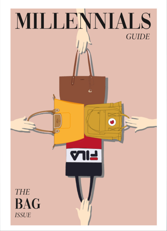
Our group decided to focus on designing a millennials’ guide for stylish and functional bags.
Project idea
This project idea came up when I was handling a business case study on Longchamp, which had a lot of information on the history of the brand, as well as how the Le Pliage became a fashion icon. Thus, I suggested that we design a guide for the Longchamp brand, to help millennials understand its success and its other products that are available. As we continued the developmental process, we obtained feedback that millennials may not be interested in learning about one brand. Thus, we expanded the focus onto recommending four bags that fit the needs of millennials instead.
Visual design
In order to visualise the e-book, I volunteered to do a sketch to show how the various sections could come together. I tried to integrate a modern and minimalist look, but I also found it to be difficult since a lot of information had to be included into our guide. Thus, I decided to spread some content over some pages to reduce the visual clutter. This eventually inspired us to adopt a double-paged spread approach to showcase each of the four bags.
We also decided to showcase models carrying the bags, in order to echo a fashion magazine look. Thus, I showcased several examples in an early draft for the group to review (illustrated through the example below). This approach turned out to be favourable and it was adopted to showcase the bags throughout the guide.

Creating graphics
As we were not allowed to use images from the Internet, we sought to use Adobe Illustrator to create our graphics. In the process, I realised that the pen tool produce images that look rather flat if they were filled with only one colour. Thus, I suggested to use darker colours around the image to create “shadows”, which enhance the perceived depth of the graphics.
The example below shows how the sides of the bag have been coloured in a darker shade of orange, which shows a more three-dimensional graphic of the bag.

Creativity with layout
I found this aspect to be challenging, since I am not used to designing fashion guides. I noticed that a lot of fashion magazines have framed their text boxes around images, which conveys a very stylish appearance. I also noticed that fashion magazines tend to feature models walking in one row. Thus, I tried to integrate these iconic elements into the double-paged spread for Longchamp. I was also conflicted as to where to place the bag in the spread. At last, I felt that placing it in the middle would deliver the most impact, as it would form the centrepiece of the spread. As we are working on an e-book format, the pages would not bind together in the middle, which would free it up for more creative design work. Thus, I decided to proceed with this layout, as shown below.

Working together as a team
I felt that there were relatively little challenges in communication with my group mates. We shared similar design aesthetics, and could quickly agree upon a united direction on how we should organise our content. At the same time, we allowed each other to dress up our individual spreads with what we feel suits the brand best. This final work is thus a collection of spreads which express individual brand identities, while also unified by a common theme of organisation. My team mates were also helpful in answering any questions I had about the topic, since I was not familiar with bags.
Learning points for future projects
This project has taught me valuable lessons about exposure to new ways of design and thinking. By referring to a variety of fashion magazines and infographics, we were able to draw inspiration from multiple sources to guide our visual layout. Thus, the importance of the research process is significant and can be carried forward to future projects.
The project also helped me to appreciate the importance of receiving feedback from external parties. While designing the work, we reinforced each other’s opinions, and could not see beyond our own views. Thus, the critique and presentation segments were very useful in helping us to incorporate new ideas and make critical revisions to our work. This is a learning point that can easily apply to all future projects, and help us improve our work.
I had a great experience with working on this project, and I am delighted at how we have managed to assemble the e-book together. While it looked to be a challenging task at the start, I am glad that we have managed to align on a common topic and exercise our creative abilities effectively. It took a long time to create the different graphics that are featured in the e-book, but it was well worth the effort.
0 notes
Text
Assignment 3 - Information Design

For Assignment 3, I wanted to focus on my passion for cars and present this topic in a highly visual way.
As outlined in my sketch below, I decided to use the idea of a “road” to show the evolution of car design and technology over the years. I felt that it was essential to draw out the cars on Illustrator using the pen tool, in order for the different time periods to be visualised.

In using the pen tool and incorporating colouring work on Illustrator, I realised that it was a task which required planning and attention to detail. I could not simply use the pen tool to draw over the entire car. Instead, I had to segment the parts according to the parts which need to be coloured differently. For example, for the graphic of the blue BMW, I had to draw the bonnet as 4 different parts in order for different colours to be used to convey depth.
Thus, the process of using the pen tool felt more like drawing different parts of the car in a step-by-step process. In doing so, there were times when overlaps between pen lines were also necessary, such as when the window and the bonnet are elements which are right beside each other and had to be drawn as separate objects. It is thus important to keep the pen lines as neat and precise as possible.
I discovered that the sequence of drawing and closing the loop on these parts are also important. For example, I had to draw the entire wheel first, and then move on with drawing the rim, and the inner designs. If the process was reversed, the colours of the wheel will overlap with the inner designs and obscure its details. I realised that one quick way to correct this is to use “Cut and Paste”, as the recently pasted layer would then become “brought to the front”.
Here are screenshots showing the different layers which were involved in the work.

As shown above, the graphic car used under the “Fun Fact” section was done by drawing the body and different parts of the wheels in a step-by-step process in order to differentiate the parts by colouring.

Similarly, the screenshot above shows how the graphic of the “1900s” car was constructed. The headlights and various body panels had to be individually drawn and coloured.
For me, the hardest part was on how to design the last section on “The Future”. I needed to create a futuristic look, but at the same time, stick to a specific colour scheme to not distract the viewer from the other parts of the infographic. Although I had to dial back on some visually interesting ideas for this part to work, I feel happy with how the work turned out.
I felt that one important learning points of this assignment was about how we can balance visual elements, which could otherwise compete for attention. It has made me more conscious on the importance of a coherent colour scheme, and at the same time, encouraged me to be more creative in how different ideas and be presented within these constraints.
0 notes
Text
Assignment 2 - Storytime

Development process
I decided to compose a short story about a situation which we can currently relate to - about maintaining good hygiene habits in public spaces. I felt that it was important to capture angles which convey a sense in urgency and movement, which ultimately resulted in the character being too flustered and forgetting to heed important health advice.
Shortlisted photographs
There are a few photographs which were shortlisted but ultimately omitted from the final prototype. I have listed them below with accompanying explanations:

1. Blurry photograph of watch
While it was a photograph which was able to convey a sense of movement of the character rushing against time, I decided against it as the blurriness could be a cause of confusion due to the lack of clarity. A clean shot of the watch could enable the viewer to see the time clearly and thus form an impression that the character is being time-conscious.
2. Outstretched hand towards lift button
While this shot was able to show the story from the character’s point of view, it lacked a bodily presence. I felt that it is important to include the body of the character to introduce him to the audience, and to set up the next few photos which will include the body in the photos.
3. Rushing towards lift button from a different angle
This photo does not feature the watch on the character’s hand, which was a key element of the previous photograph. Thus, I opted to use another angle in the final prototype which showcased a sense of continuity in the story by featuring the watch on the character’s left hand.
4. Panting in elevator
Besides the photographer’s reflection being visible in the background, the photograph also does not utilise framing effectively to convey how the lift doors are closing, with the character managing to make it in the lift just in time.

Final prototype
The final shots are intended to show how the character is rushing against time. Seeing that the lift doors are about to close, he rushes to press the lift button. He manages to do so, and is able to enter just in time. In the process, he instinctively wipes off his sweat on his face. He then looks up in shock, as he looks up to stare at a health notice. He realises that he has forgotten the precious health advice that we are not supposed to touch our face as a form of good hygiene habits.
0 notes
Text
Assignment 1 - Abstraction
I took this photograph of a car when I was overseas on exchange as I am a car enthusiast.

For this exercise, I decided to abstract the car in the photograph above and demonstrate how the various stages of abstractions can carry different meanings to the viewer of abstracted design.

Stage 1: All of the details of the car are captured accurately in this abstraction. This application may be useful in technical diagrams or specifications, which require the car to be precisely detailed in order for the reader or user to make sense of the abstraction.

Stage 2: Although many finer details have been omitted, the car is still recognisable to be of a particular make and model. This is because core elements such as the shape of the grill, logo and headlamps are still visible. This simplified representation may be useful for illustrative purposes of describing general features of the car, such as in an instruction manual.

Stage 3: Only the most striking features of the car remain visible. The abstraction becomes useful in showing the distinctive features of the car which form its unique design. This level of abstraction is often used to tease the designs and offer a sneak peak of upcoming cars ahead of their official launch.

Stage 4: With the grille, logo and body lines removed, the car is now no longer identifiable by its make and model. The abstraction now carries meaning as being representative of a typical car, which we associate by its function. We can observe similar styles of abstraction in several car park signages around Singapore.

Stage 5: With all details removed in this level of abstraction, the car is now reduced to the form of its silhouette. The key elements which enable us to recognise the object in this abstracted form are the wheels, the windows and the streamlined shape of the vehicle.
0 notes
Text
Ex. G

The pattern which I created is inspired by the D.N.A. “double-helix” structure. I imagined the chromosomes to entangled with one another, creating a darker pattern.
0 notes
Text
Ex. F

I took this photograph of a student lounge in AS8.
The colour scheme in the lounge seems to consist of the following five hues:
1. Brown, from the wooden parquet flooring
2. Beige, from the armchair
3. Grey, from the seats
4. Black, from the surface of the coffee table and the partitions in the background
5. Silver, from the metal legs of the chairs and coffee table
The first two colours (brown and beige) are hues which seem to be analogous colours on the colour wheel. This forms an impression of harmony in the colour scheme. Furthermore, the first two colours seem to have tints which make their appearance lighter. This appears to create the effect of an warm and inviting ambience without being too claustrophobic.
The last three colours are monochromatic, and they seem to introduce an element of formality into the lounge. As silver and light grey also have an element of shade in their colours, they may also convey the impression of sophistication and complexity.
In all, the colour scheme helps the student lounge to strike a good balance in its ambience: it look cosy for people to stay in it for extended periods of time, and at the same time, it looks suited for serious discussions about academics or work.
0 notes
Text
Ex. E

What seems to be off about this particular typographic representation?
At first glance, the title is big and clear, and the centre-alignment seems to form a rather neat array of text.
However, there are several issues about the representation which may cause difficulty in reading and perceiving the message of the text. Firstly, all of the body text is capitalised. This makes it difficult to discern the hierarchy of text as the importance of individual words are less distinct. The kerning of the text is also too narrow, which makes it difficult to read each individual letter. The centre-alignment of the text also makes it difficult to read the text as our eyes have to constantly shift between the left and right with no anchorage on a fixed starting point.
To improve this text, I would consider using a sans-serif typeface for the body text. This can introduce an element of contrast between the body text and the title, and help to complement each other’s qualities. I would also dig deeper into the purpose of the text and choose an appropriate typeface to suit its intended message. For example, the current typeface, with its large white space inside each letter, which gives the impression of a sporty, school-based event like a tennis match. Thus, it may not be appropriate for other purposes. I would align the text to the left and de-capitalise the body text, if it is appropriate based on the intended message.
0 notes
Text
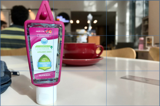
Ex. D
I would like to attempt to demonstrate my understanding of visual composition with the four images appended below.
1. Golden-ratio in photography

I attempted to position the object to fit into the flow of the spiral as much as possible. The starting point of the photograph appears to be the “Watsons” logo, since it is the first banner containing words which we see after the white cap. The shadow generated by the Sun behind the camera seems to help to “fill” the spiral on the top left of the picture. The “tail” of the object was positioned to mirror the curvature of the spiral. I cropped the photograph such that the length and the height of the photo will form the ratio of 1.618. However, the object does not appear to be able to completely fill all points of the spiral. The band of light which was reflected outside of the spiral also appears to distract from the visual focus of the object.
2. Rule-of-thirds in photography
The object is aligned 1/3 of towards the left. The object appears to be in focus against the background. This appears to create a sense of place of the object in relation to its surroundings. It is interesting how this was the only angle in my series of shots which showcases the background accurately. The rule-of-thirds seems to strike a good balance between capturing details in the background, while maintaining focus and creating interest in the object and foreground of the picture.
3. Camera angle: Low

The object appears to tower above everything else in the background. It looks taller than it really is, especially since the tumbler in the background appears short in comparison. This exaggerates the sense of scale in relation to the object. I used this camera angle to experiment with how the presence a simple object, such as a hand sanitiser, and be drastically magnified with this camera angle. It seems to be an angle often used in building photography, especially when photographing skyscrapers. The angle appears to be effective in amplifying our perception of the building height, and accentuate its importance as a standalone piece of architecture against its environment of buildings visually competing for our attention.
4. Camera angle: Top down

This camera angle seems to enables the viewer to grasp an understanding of how the object fits in with its surroundings, but also detracts away from the focus on the object. The object appears insignificant here, as part of a larger whole. I used this angle as it is a common aesthetic in photography. It seems to be effective in that context, as food is usually presented as an entire course meal and thus the top-down angle portrays a sense of completeness.
The experimentation with different camera angles with the object has enabled me to understand how the perception of photographs can change with different techniques of visual composition.
0 notes
Text
Ex. C

There are a few signs present in the advertisement of Heinz Ketchup. Within the signs, there are several pairs of signifiers and their signified meaning.
The signifier is the sliced tomato pieces adorned with label stickers which are stacked atop one another to form the shape and likeness of a ketchup bottle, with the top tomato piece still having its stalk intact. The signified is the quality of freshness and purity of the ketchup without the use of artificial ingredients, as it suggests that the taste of the ketchup is as good as a freshly sliced tomato.
The deep red background of the ad is another signifier in the ad. To this, the signified is a quality of intense flavour of the ketchup, since red is known to be a colour of passion, and one that also simulates our appetite.
In addition, the copy ‘No one grows Ketchup like Heinz.’ contains a signifier present in the ad. With a focus on the word ‘grows’, the signified is about how the tomatoes are naturally farmed by Heinz and therefore authentic in taste. The words “no one” is another signifier, in which the signified is a superior quality of the ingredients in the ketchup, since it suggests that Heinz has exclusive knowhow in the farming of their tomatoes used in their ketchup which is better than any other manufacturer.
0 notes
Photo

Ex. B
(Image retrieved from the Digital Collection of the Städel Museum: https://sammlung.staedelmuseum.de/en/work/relief-eponge-bleu)
Yves Klein’s Relief éponge bleu uses sea sponge and pebbles to convey a scene on the canvas which is reminiscent of nature. The sponges and pebbles act as a relief to the artwork, in which they have been attached and raised above the background plane. The entire canvas, including the sponge and pebbles, is colourised in a striking shade of ultramarine blue. The placement of the sponge and pebbles appear to be concentrated towards the bottom half of the canvas, which enhances the impression of depth. The piece appears to be abstract art in which its elements are non-representational in nature. The artwork is also not framed, which was a deliberate choice by the artist.
The striking shade of ultramarine blue which dominates the artwork is patented as International Klein Blue (IKB) by Yves Klein in 1957. Unlike conventional oil-based paints which become dull upon application onto canvas, Klein’s blue paint is developed with an innovative paste which allows the pigment to retain its vivid colour even when made into paint. Due to its unique suspension process of the paint, the pigment of IKB appears to hover over the surface of the canvas, creating an impression of rich texture and depth. As such, IKB shines brightly in a radiant hue unlike any other shade of blue. In Relief éponge bleu, IKB has a fluorescent quality which penetrates deeply into the gaze of its viewer. Thus, the colour in itself is also very much an instrument of expression for Yves Klein. Furthermore, the irregularity in the surfaces of the sponges and pebbles, characterised by their dark cavities, serve to further highlight the intensity of the blue.
The overall effect of the artwork inspires much meaning. The colour blue has been historically affiliated with religious and spiritual meaning; blue was traditionally the colour of the robe of the Virgin Mary. It thus conveys qualities of purity and divinity. To Yves Klein, the colour blue was associated with the concept of pure space and immaterial values beyond dimensions. While all colours are linked with specific ideas, the colour blue relates to the sea and the sky, in which the intense hue of blue represented a freedom of limitlessness of the spirit. The sponges and pebbles in the artwork resemble enlarged grains of pigment, drawing further attention to the application of the paint. The omission of a confining frame for the artwork was a deliberate choice by Yves Klein, which may suggest towards the infinite expansion of his composition in all directions beyond the canvas.
The abstract nature of the artwork may polarise opinion between its viewers. On one hand, the lively, intense shade of ultramarine represents nothing in the literal form, and stirs the depths of our imagination within us. The evocation of the blue of the water, the air and the wind invites us to project our dreams and everything that we would like to see onto the canvas. The monochromatic nature of the art demands for the viewer to imagine an invisible beauty. Yet, with its visible lack of action or story in its abstract form, a heavy investment is required in the viewer to make sense of the art. This could blunt their understanding of the purpose of Yves Klein’s work, especially if they do not understand its context.
0 notes
Photo

Ex. A
This device is a shape-shifting blob in a glass tank, which will stimulate my creativity. The blob levitates and shifts in form, while laser lights are projected onto its surface. This will create the effect of a constantly morphing structure. I believe that this device will be helpful for me, because I am inspired by visual forms and designs. A seemingly random shape could give rise to a unique form which can spur new ways of re-imagining the structure of objects. While it is useful to take inspiration from nature and the world around us, I believe that creativity can emerge from imaginative sources such as this device.
1 note
·
View note