
Hi, I'm Ellie! A Digital Designer and Illustrator | Student at #ixdbelfast | www.elliethompson.co.uk
Don't wanna be here? Send us removal request.
Statistics
We looked inside some of the posts by ellie-thompson1 and here's what we found interesting.
Average Info
Notes Per Post
0
Likes Per Post
0
Reblog Per Post
0
Reply Per Post
0
Time Between Posts
21 hours
Number of Posts By Type
Text
14
Video
2
Link
1
Last Seen Tumblr Blogs


Fun Fact
In 2020, Tumblr had 29.4 million users in the US.
Text
FINAL SUBMISSION
IXD303: Designing User Experiences
User research
Reviews
Survey results
User Personas
User flow
Card sorting
Design process
Visual grammar slide deck
Logo
Logo animation
Brand guidelines
Style tile
all icons
Low fi prototype
Animations
Final
Ux hub online link or download link
Ux hub presentation keynote download
Other
Research posts & other materials
Master-apprentice
Exercise 1
Exercise 2
IXD304: Narrative and Storytelling
Design process
Immersive prototype
Final
Final website
Other
Research posts & other materials
Master-apprentice
Exercise 1
0 notes
Text
UX hub User Flow


After multiple sketches of the user flow, I then went on to develop all my sketches into a detailed digitalised version. This shows the possible journey of a user on the UX hub application. From the big features to the smaller breakdowns of activities that can take place when a user clicks on a certain element.
0 notes
Text
Logo - Paper to Digital

Amongst numerous sketches of logos my initial idea of including some kind of speech bubble developed into something much more minimalistic BUT relevant to the brand.

Here is the finished logo with feedback considered such as lining the ux with the hub. I am happy with how this has turned out.
0 notes
Text
After creating a new instagram I came across this super nice card feature. Which recommend people to follow, i liked this because of the scruture where you can see the accounts profile picture, name and a flavour of their feed. Below is a clear call to action button to help guide the user. Although the card is white as the background is too there is a subtle background drop which helps set it apart. If the user isnt interested they can simply hit the X and its will disappear. This could be w nice approach for either courses or following users for my ux hub app.
0 notes
Text


Responsive typography on the web
Looking at responsive typography on the web. As I currently build my site making it responsive is one of the key things to consider here. As there is quite a lot of text on this site I wanted to see how other heavy text sites style and layout there content - is there lots of white space or does it fill the screen? This is something I thought about looking at because on desktop version of my website there is a lot of white space around the sides of the content so that it is in the middle of the screen but I wasn’t sure if this would be the same for mobile as obviously it is much smaller meaning smaller space so i thought i would look at examples of how other site do it.
When thinking about were to go I instantly thought that the likes of Medium and BBC news came to mind. I took a look at both of these websites for examples and noticed they both take full advantage of the screen. I know feel more confident in the choice I make when presenting text responsive
0 notes
Text
Design Systems

During Thursday's lecture, we talked about design systems and as I saw this very helpful post on Instagram by Lubos Volkov I thought I would discuss design systems a little further so that can wrap my head around what they are and how they are used.
What it is?
A Design System is the single source of truth which groups all the elements that will allow the teams to design, realize and develop a product. When first hearing about a design system I thought it was another word for a style guide or element collage but it is not a Sketch library, no more than a Style guide or a Pattern Library… Actually, it’s all of this and so much more!

Things to include:
Purpose and shared values
Design Principles
Brand identity & language
Components & patterns
Why are they needed?
We need design systems because they help the entire company to deliver better and more consistent design solutions efficiently. Using a design system helps to keep everyone in the same direction which can certainly be very efficient for large design teams or someone who has recently joined a company.
So basically a design system can be a pretty handy tool for design teams and companies. Lubos Volkov post recommends starting with the basic interface kit and evolves that into a system design system.
0 notes
Video
tumblr
Master-apprentice upload animation
(Top my version) (bottom by Jatin Dua’s version)
Instagram has become a great spot for me discovering a lot of design work its kind of like the new Dribbble dare I say. Yesterday I saw this super nice upload animation I like how the button was initially a circle and then changes shape and fills with colour to show users there file uploading. Little things like this are hidden delighters that make the overall experience of a product much more interesting and fun.
I thought what better way to build my skills in UI animations than to recreate something that I liked as I’ve learnt to allot from previous master-apprentice exercises and find that I always learn a lot and generally they are very fun. As this is my first animation so far I thought it would be best not to take on board something too tricky so this example was perfect and as if I designed it on keynote it was very much something I was familiar with and straightforward enough to create.
I was super pleased with the end result with this piece although my Jatins version transitions are much quicker than the ones I built I just felt they were a little to fast and slightly tweaked these transitions to suit.
0 notes
Text
Typography experiment
As a we begin to consider the typefaces we choose for our website I thought what better time to try and create my own with a number of objects such as your standard paint brush before experimenting future with different sized sticks. Although the experiment didn’t exactly go as imagined it was still quite fun.
The sticks definitely arn’t suited for achieving a smooth script like type it’s very hard to have full control over the lines and they tended to be a bit sharp and rough looking although when draggings the brush lighly along the paper it does have that slight effect.
After using the sticks for a number of pages I went back to using a brush as I preffered the look of it. I began to experiment deeper by applying tape and ripping it off to create a worn texture which some turned out quite nice.
It certainly wouldn’t be ideal to use these for body text however these type experiments could probably be used as titles or maybe a nice logo for the site.
0 notes
Text
Designing a case file
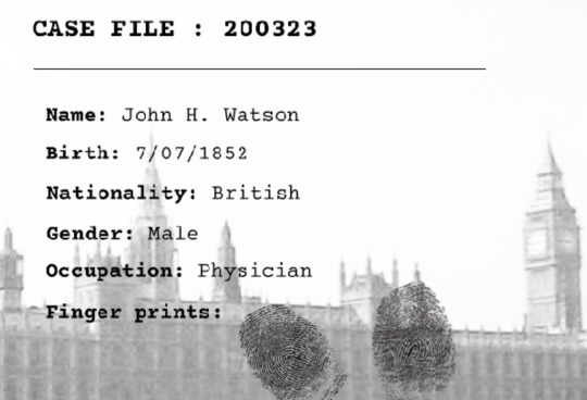
I have created case files for the cast of characters pages as I wanted to portray the detective look and feel. I gathered information on each character that would be required on a case file to make it seem more realistic but also informs the user a bit more about the character themselves.
I really like how the case file turned out it has this old vintage effect and gritty texture which makes it look like a very old piece of documentation that has been printed which really helps keep the consistency of old fashioned style.
0 notes
Text
Optimising images for the web

As I finish the lasts of my to-do list for the heroes and villains website. One task includes optimising images which are now ticked off my list but I wanted to discuss what this is and why it's important.
What is optimising?
Optimizing web images is a process of delivering high-quality images in the right format, dimension, size, and resolution while keeping the smallest possible size. Image optimization can be done in different ways be it by resizing the images, caching or by compressing the size I used https://tinypng.com
Why do it?
Optimising images improve your page load speed, providing better overall user experience. If your website takes more than 3 seconds to load, users are more likely to abandon it which will drastically increase your bounce rate and eventually, it will affect your conversions. so user satisfaction and happiness can depend on page load speed, so by optimising images, we can help our web pages load faster.
0 notes
Text
Master Apprentice - Designing Drop Caps

(initial version)

(my version, hand-drawn on Ipad pro)
Whilst flicking through some books in the library I stumbled across this book based on 80′s and 90′s design which features multiple design pieces from furniture, interior design to graphic design. I spotted this piece above which was being used as some kind of logo. I couldn’t help but admire the elegant detail in this lettering and it reminded me a lot of some of Jessica Hiche’s Daily Drop Cap project.
I thought this would be perfect to recreate so that I could explore how to create elegant and quicky drop caps as such. Particularly because the Heroes and Villains focus quite heavily on typography I thought it would be perfect practice and fun to do. I truly enjoyed creating this sophisticated lettering particularly when it came to drawing the long curly tails and adding line detail for effect. I also love the choice of colour here it reminds me a lot of something from an old fairy tale book. I couldn’t not recreate this stunning piece of work and I’m happy with the result, I’m certainly inspired to possibly create some of my own perhaps in the style of my website.
0 notes
Text
Icon changes

These were the initial icons I was going to use for the onboarding experience however no matter what I did to change them and make them colourful and fun. I still felt something just didn’t fit.

I then accidentally deleted the background gradient of the icons and actually found that I liked them better like this as I soon realised that perhaps the colour in the icons was clashing with the background and making it a bit too much to look at. A perfect example of how less is more.
0 notes
Text
Experimenting with distressed backgrounds

(before)

(after)
After completing my illustration I went on to experiment with some backgrounds. For this, I used procreate to create this piece by using watercolour brushes I experimented with the blotchy effect which give me this worn effect. Very subtle but effective, I like how it turned out and the feel it has could maybe work really well on my website.
0 notes
Video
tumblr
UX hub - Like Interaction Animation
Here is a little example of an interaction that would occur whenever a user likes a post on their social feed. The heart will pop and fill colour alongside the number increasing provides user feedback and they are able to recognise that they have liked the post. If they unlike it will simply undo what it has done to tell the user they have unliked it.
0 notes
Text
User Personas


After diving into some online research and creating a survey I then had a better, clearer vision of who the type of users was that UX hub would target. From this, I developed some user personas.
Each persona presents an equally different challenge each outlining there goals and behaviours but also their pain points are. Each section is broken down into a bio, interests & goals, pain points, behaviours, interests and technology experience so that I can break down this information and relate back to it when it comes to brainstorming features and designing the app.
0 notes
Text
UX hub icons

Here are all the icons used throughout the interface of UX hub.
On-boarding icons
These icons for the onboarding experience I felt needed to be a bit more playful than the minimalistic outline look I was going to use for the rest of the icons throughout the interface because I wanted to make this experience a bit more interesting an fun. I took inspiration from the UX hub logo and used this one line with a gap which I took from a segment of the logo as you can see below:

Navigation and other icons
These icons I felt needed to be a lot more simplistic and minimal for their purpose in communication which I felt would be decreased if there was a lot of colour, detail and broken lines like the on-boarding experience. Therefore these icons are just right for helping the user navigate around the app because they are very clear. (on the app these icons are white against the gradient navigation bar).
Some other icons I created was for the courses I needed something to present rations, students and time of course. Alongside these, I have a search icon (for obvious reasons) and a tick which tells users they have completed a module or course. The download icons would be clicked by users to start downloading content from the app.
0 notes