
Don't wanna be here? Send us removal request.
Statistics
We looked inside some of the posts by emlaee and here's what we found interesting.
Average Info
Notes Per Post
18
Likes Per Post
11
Reblog Per Post
0
Reply Per Post
7
Time Between Posts
6 days
Number of Posts By Type
Text
7
Last Seen Tumblr Blogs


Fun Fact
1,644 Tumblr posts in 1 second.
Text

The futurists took an extreme look at design, eliminating anything old fashioned. Science and technical knowledge was the inspiration for designs rather than history. Intense violence and modern warfare was the “new world.” This poster from 1915, uses very angled lines with black and white, bold contrast to depict three soldiers with their weapons walking in the city.

The bauhaus style emphasized functional buildings, daylight factories and open plan warehouses. The aim was to improve the construction and habitation of the living spaces for everyone. Practical objects were the focus of this style of design. This photo is a very open floor plan with a functional design. The balconies are all lined up to maintain usability but the building itself is also designed to be a work of art.

The hippie movement was a counter cutlture to the uncomfortable older styles. Using bright colors becomes iconic in pop culture. This photo of peace and love uses many bright colors and contrasts to portray their message. They are dead set against living in marketed society. They did not want to be told what to do or follow so this style shows a type of rebelling style.
0 notes
Text

This first picture is an example of renaissance architecture. It is the Hungarian Academy of Sciences built in 1825. The large windows allow more light in but the design is durable portrays a strong connection to the ground. The renaissance is highlighted by a heavy use of materials that shift from height to width. This is a widely built building that possesses load bearing walls. It is a solid, design which functions as intended but still has the ability for beauty with the pillars and ability to let in natural light.

This picture is from the neoclassic style period. It is the British museum built in 1753. This is when style shifted to older is better. The search for a national identity in multiple areas of Europe led to a romanticized idea of the historical past of the Roman Empire. The discovery of the ruins of Rome portrayed a grand, prosperous civilization that the Europeans wanted to adopt. The large, weight bearing pillars spread to hold a triangular, intricately designed roof became a visual language of power.

Beneath all the DVDs, videogames and photos, are a table and bench inherited from my late grandmother to my mother.

To the left of the table and bench is this other table we use as a tv stand which has been through years of wear, tear, children and animals. There’s nothing else in the living room besides a large, sectional couch which is not from the same style period of the renaissance. I say it is the renaissance because the tables and bench emphasize width and sturdiness. They are all hand built and two are heirlooms passed down from other generations. The designs are all functional but clearly able to last through all types of lifestyles. We didn’t design this room with the intention of sticking to renaissance it kind of just happened that way. With such useable furniture it would have been a waste to get rid of it after my grandmother passed when I was little. Actually now that I think about it, we have tables in our kitchen and dining room that are also from her! She really knew how to pick quality furniture. So the living room has majority renaissance inspired tables/bench, as does both the other rooms previously mentioned.
1 note
·
View note
Text

According to Naccarella (2016) three elements of design that most significantly affect nurses are space, proximity and indoor environment quality. Storage space is very important because having all necessary equipment to care for a patient can mean life/death. In addition, having this equipment close to the patient is essential. I work in home care and the poor design that jumps out at me is my patient’s fabric/cardboard nightstand next to his/her bed. It’s a small, black storage space with four drawers as illustrated above. The many flaws are the fact it is fabric means anything spilled on it is absorbed. Frequently, this is formula which starts to smell and it is very difficult to clean. Second, it’s fabric and cardboard design makes it very fragile and easy to knock over, which I have done several times. The drawers are not on actual hinges so they just fall out. For all the equipment and supplies stored in it, there is not enough space. This is the main concern. The new design (difficult to draw) utilizes plywood to make up the drawers to provide a more sturdy backbone. Plywood is more durable than cardboard and the thickness of the wood can be changed to keep the nightstand lightweight. The storage space was made larger by putting two units together but still maintains mobility with the six wheels at the bottom. This allows for proximity to the patient to remain close. The color can be painted to suit the patient’s favorite color(s) rather than staying with the black fabric. From SCAMPER I used combine (added two nightstands together), substitute (replaced colors and cardboard) and eliminate (got rid of the fabric). Changing the elements changes the experience of the object because now the table is much more reliable. This is evidenced by putting weight on it. The color change will make the patient happier because it is personalized for them.
2 notes
·
View notes
Text


This is my boyfriend, Matt’s, kit he uses for his type 1 diabetes. The element I chose for these pictures is shape and volume. The relevance of this designed object creates the sensation of protection. These are important medications and tools that cannot be damaged otherwise Matt’s blood sugar will be sky high or too low. The senses involved are sight, obviously, but also smell. The kit smells like insulin, which most people actually hate. Since I’m so familiar with it I actually like the smell and I think I also associate the smell with him being healthy. The design of this kit utilizes positive space for his supplies and negative space where nothing is present. Therefore he can add more if need be. In addition, the design utilizes rectilinear shapes to portray stability.

For this photo I selected the color and line element. This is my front door with the added design of a window with an opaque set of curvilinear lines. The design is very symmetric but the lines, especially in the center go all different ways to perceive a shape. The lines themselves for the most part have the same width and shape, apart from the shapes thrown in there. To my experience this design has brought serenity and a feeling of calm because the shape allows light in the house in a very particular way. It creates that shape in distorted ways on the wall with whatever light is shown through it. The sensory process having the most impact is sight because it’s a beautiful arrangement to see in the living room. Although it is clear and opaque in color, the absence of color is just as important as color itself. It creates a tranquil mood since the focus is more on how light plays with the window rather than the color itself.
0 notes
Text

1. Concept map for mounted computer stations in each patient room.
2. What is especially important about this design is the scanner being within reach of all personnel. With the computer mounted right in the room and the scanner right next to the monitor, it makes patient charting and giving medication much more efficient. Nurses no longer have to search the floor for a free mobile computer which will also save time and money. This leaves more time for nurses to focus on patient care. In addition, they are always plugged in so they will never run out of battery.
3. To someone who has never seen it before I would tell them it is basically a normal looking computer that is attached to a wall via a moveable, metal arm. I would also describe it can be moved up, down, left and right with this hinge. The keyboard is present with a small metal arm as well making it easy to move.
4.

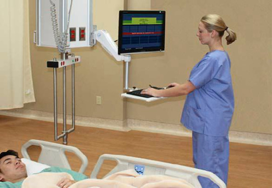


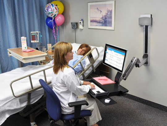
The design can vary from facility to facility with moveable arms, moveable keyboards or moveable computers being interchangeable. Regardless having these mounted computers in the room is much more convenient. These pictures can attest to that.
5. One physical object could be a computer with the scanner. The presenter could ask for a listener to be a patient with the computer at their side. Very easy to demonstrate its effectiveness. Another object could be a computer on wheels. The presenter could put this at the other end of the room or in another room. Therefore showing it takes precious time to locate and bring a mobile station to the patient. The last object could be the moveable wall hinge to demonstrate how helpful it is to be able to adjust it to users height or patient’s location.
6. Since nurses spend the most time with patients, they know what designs would help the facility and the ill. This computer design is constructive input on how to make nurses work more efficiently. They are uniquely qualified according to Eagle (2016). Nurses understand the needs of patients and families and if this computer is already in the room it could save space not having to bring a mobile station in the room, time and give the nurses more time to focus on medications and treatments.
4 notes
·
View notes
Text


The safety design principle of automate where possible really resonates with me because my home care company uses paper charting. There are numerous problems that have come up with this type of system. First, the paper charts take up a lot of room in my patient’s drawers. Sometimes it monopolizes the entire area leaving no room for anything else. This is troublesome for the family who may want to use that area of space for something besides a mountain of paperwork that they do not use. Second, with so much paper many sheets get lost. This would be an enormous problem if my patient had many different nurses or if a fill in nurse needed to know about specific care. Medication errors and treatment errors are bound to happen with such clutter. The charts sometimes have wrong dates on them and the newest ones are nowhere to be found. Since the paperwork gets mailed to the family, it is up to them to keep track of it until they give it to us. Lastly, the paperwork has to be handed in at the end of the week, every week. Since it has the time sheets on it and the care for the day they are very important. However with so many nurses handing in their paperwork at the same time, some are bound to be lost and as a result paychecks can be incorrect. To fix this problem the conceptualization and exploration phases in the design process would likely be used. This is because the problem has already been identified, but new solutions and prototypes would need to be developed. From SCAMPER, the substitute option would be the best choice since it will fix all of these problems. By replacing these paper charts with IPads or secure applications on cell phones, paperwork would become unnecessary, all the time stamps would be uploaded automatically, treatments, medications, doctors’ appointments, plans of care would all be accessible at the click of a button. In addition, the program would not let the user submit the forms without them being fully completed. It is easy to visually scan a paper chart and think everything is filled out, until the office calls and states one box wasn’t checked off. In conclusion the switch to electronic health record would save everyone time and money.
7 notes
·
View notes
Text

This is the mud-room where everyone walks through to come into the house. Most of the time people come through the door with all the magnets on it. A few times a day we use the sliding door on the left to let the dog out and care for the chickens on that side of the house. There’s a window all the way to the right and once a month the other door on the right is opened, but it’s broken so we don’t usually use it. Two skylights are also in the room. The design problem is the heating system. There is one radiator along the wall behind the couch, but it is not efficient. The problem is this room is significantly colder than the rest of the house to the point where blankets and coats are needed. When the house was built they did not take into consideration the amount of windows and doors in the room and the insulation was not planned accordingly. Problems were not identified before executing the mud-room. It would be pretty easy to inspire others to fix the problem since it’s always so cold in there. We have just gotten used to it over the years and hang out in other rooms instead. Using the SCAMPER acronym from the text on page 15, the heating problem can be troubleshot. SCAPER won’t work for this problem since we can’t move the radiator, eliminate it, put it to other use or adapt it for something else. We could modify the room by adding more insulation to the lacking insulation present. The current design has little to no functionality. Adding insulation will increase the proficiency allowing it to perform better than before.
4 notes
·
View notes