#week6tmd126
Explore tagged Tumblr posts
Visit Tumblr Blog
Explore Tumblr blogs with no restrictions, modern design and the best experience.
Last Seen Tumblr Blogs


Fun Fact
Premium Tumblr themes are available from anywhere between $9 to $49.
Text
RN Portfolio 5-6 - Design and Culture
Room in my home: Living room
These are photos inside my apartment from before I moved in and right after. The floors are old and pine and probably have dirt in between from 300 years ago. Around the windows are casings that have rosettes in each corner maybe from the Romanesque or Renaissance period. the casings look like Greek columns. The furniture on the other hand is modern and has an art nouveau table. In the progression of art and design, I choose a home on it’s history and then add what design I like because I am human and have different styles that appeal to me. I like things to feel clean and uncluttered and the style of the home and the style of the furniture make me feel like it all works together. #week6tmd126

#week6tmd126

#week6tmd126

6 notes
·
View notes
Text
Portfolio #5-6 Design and Culture
Baroque
This period was the European style, showing itself in the architecture, music and fine arts. This style was improving due to the increase in wealth and resources in Europe. This era started around the 16th or 17th century, and lasted till the end of the 18th. This period was very extravagant, ornate and grandeur. Baroque style often incorporates waves & soft edges in design to create a motion and flowing pattern.
This picture depicts the Fountain of Apollo at the Palace of Versailles. The image shows the Greek god Apollo rising from the sea with his chariot. Charles Le Brun created this piece of the fountain.

Rococo
This style was used primarily in furniture and art pieces. Some unique parts of this style include asymmetry, theatrics, and moldings which contribute to the extravagant and dramatic design. This design focuses more on emphasis and heightened sensuality.
This picture shows an extravagant coffee pot made in the 17th century, incorporating Rococo moldings and bright pastel colors. This design is currently from the Bow Porcelain Factory.

5 notes
·
View notes
Text
Portfolio 5-6: Design & Culture

The Rhode Island State House is located within the states capital Providence. This building was built in from 1895–1904 and designed by McKim, Mead, and White. There was also major construction done during the late 1990s. This style of design is considered to be NeoClassical and places emphasis on the walls of the design. This style is based off classical antiquity such as designs from ancient Greece.


The Providence Preforming Arts Center (PPAC) Is a theater space located in downtown Providence, Rhode Island. This building was built in 1928 and designed by architects George and C.W. Rapp. This is considered a renaissance style of design. There are certain ideal geometries that are specifically noted throughout the design. The was major destruction done to the PPAC due to a hurricane which forced reconstruction/ remodeling of this design. There is now a mixture of more modern architecture within this building now. It is more vibrant and has more upgraded design such as the exit ramps, the seating, etc.

This is a design of the living room/ kitchen area. With all modern appliances, white and metal furnishing this space does present as very modern. However this home is about 90 years old and has been remodeled and redecorated. The table is a mixture of antique and modern design given the rusted metal combines with the glass table top. The carpet is also a redesigned antique thrifted piece from India. Although many of these pieces are from different eras of design there seems to be a smooth balance in the aesthetic.
4 notes
·
View notes
Text
RN Portfolio 5-6 “Design and Culture” Part 2
Renaissance influence in my home
The following photo is of the bay window in the front of my house. To be honest, I am not in love with the exterior of my home. However, this bay window helps to give character to my home, and the light that it allows in along with the beautiful outside view is one that would not be achieved with a standard window. In the times of the Renaissance, the emerging knowledge of craftsmanship allowed for building of walls that could support larger windows. When looking further into the history of bay windows, I found some interesting information about how bay windows were originally used in the Renaissance era. Traditionally, a bay window was placed at the end of a great hall and behind the raised platform that seated the lord of the home. Presently, these windows serve an important function to allow optimal light into the home and also help to make a home look larger, as well as add appeal to the home.

4 notes
·
View notes
Text
#week6tmd126


This is my back office. At one time, this was a 3 season room that was screened off and only used during the warmer months. Being that my house is a 1 floor ranch, we decided to turn this area into a year round usable space. A wood stove was installed and this is where we decided to place our home office. The room doesn’t follow a particular design style but it kind of resembles an old farmhouse.
3 notes
·
View notes
Text
RN Portfolio 5-6 Design and Culture-Part 2:

It was really difficult to find artwork or pieces that reflect the styles discussed. And then I stared at my living room for a bit and realized this area rug in my living room has an oriental inspired frame, patterns and with variety of colors.

This little sculpture is the size of my hand. However, It looks so sturdy and grand at first that it seems bigger than what it actually is. When I look at the lines and the strong connection to the ground this little sculpture gives, it makes me think of the great architecture of the renaissance period.

This is the St Patrick-St Anthony church in Hartford CT. I live 15 min away from this church and I always found it mesmerizing. I found out the style in architecture belongs to the Gothic style, even though this is not a style we are studying at the moment I read that it preceded the Renaissance period, so I thought it would be interesting to see.
3 notes
·
View notes
Text
RN Portfolio 5-6: Design and Culture
ROCOCO: The images below show a bedframe and a painting in the Rococo style. The beframe was produced in Italy in the 1920′s. Here we see abundance of gilded edges, swirling patterns, and not many straight lines. The painting is by the french artist Jean-Honoré Fragonard, and is call the ‘The Swing’ (1767-1768). We see attention to detail in the dress and the soft color pallet that is widely seen during the rococo period.


ORIENT: Here we see two portraits that are painted in the Orient style. The first is A Woman in Turkish Dress by Jean-Étienne Liotard somewhere between 1740-1750. The second is An Albanian Smoking by Jean-Léon Gérôme in 1881. Both portraits show a caucasian person in a setting or clothing that would be considered “other. Even though the second painting is titled An Albanian Smoking, the person pictured has fairly light skin and a mustache that was popular of European adventurers of the time.


2 notes
·
View notes
Photo


WEEK 6
These pictures show my dining room/kitchen. I believe that this room has a renaissance typestyle with a modern-day look. I believe it to have a renaissance feel because of the solid, and wide pillars that separate the kitchen and dining room. There is a strong layering connection from the floor to the ceiling with the use of basic materials. The room is visually lighter through the open and high ceilings and the look of “load-bearing” pillars that seem to support the room. I believe that the furniture also helps to create a Renaissance feel, as the dark wood of the dining room table, chairs, and picture frames display craftsmanship and elegance as seen during the Renaissance. The modern aspect of the room comes from the precise use of clean straight lines, lack of texture and shape creating a minimalist feel.
2 notes
·
View notes
Photo


The top picture I took from my Grandmothers’ house and the bottom picture is of my grandfathers desk. Both of these pieces are in my living room. They do not match the style of my living room at all but someone fit nicely. The overall feel of my living room is light and comfy. These pieces add a feeling of old age or renaissance to the room. It gives the room a piece of history.
1 note
·
View note
Text
RN Portfolio 5-6 Design & Culture Part 2

Above is a photo of my vanity. If you look to the sides you can also see my closet doors and trim in my room. Throughout my entire home the doors are all dark brown, with dark trim, and gold shiny door knobs. While this is not the modern feel I was looking for when I wanted to move this was the most suitable home for us at the time to rent. Looking for bedroom furniture I was interested in getting a dark wood/cherry color as it was something my husband and I both agreed on. This furniture piece was a great addition to my already existing set as it matched in color. But the one major difference between my vanity and my bedroom furniture is the detail work around the vanity. The layers of texture and decoration give it a renaissance feel. While the craftsmanship of its detail work reminds me of the baroque style. Although it is not a piece of clothing its details remind me of a intricate but feminist piece of art work that separates men from women. The furniture and style of the home go well together as it all matches although I wouldn’t mind white doors and white trim to bring more light to the room.
1 note
·
View note
Text
“RN Portfolio 5-6: Design and Culture”

This is a picture of the Miriam Hospital found by Jewish community in 1925 in providence, Rhode Island. This picture represents the Renaissance period as building portrait a heavy and solid look.

This is the renovated and the new face of the Miriam Hospital today, which represents the Neoclassicism. The building is much more finer, the luxury glass wall gives a beautiful and a much lighter look.

the furniture and decor in the picture defines the neoclassic style. The classic china is very modern compare the the old china which were long and tall. The china along with the decor and wall art blend together and create a fine fluidity.
1 note
·
View note
Text

This first picture is an example of renaissance architecture. It is the Hungarian Academy of Sciences built in 1825. The large windows allow more light in but the design is durable portrays a strong connection to the ground. The renaissance is highlighted by a heavy use of materials that shift from height to width. This is a widely built building that possesses load bearing walls. It is a solid, design which functions as intended but still has the ability for beauty with the pillars and ability to let in natural light.

This picture is from the neoclassic style period. It is the British museum built in 1753. This is when style shifted to older is better. The search for a national identity in multiple areas of Europe led to a romanticized idea of the historical past of the Roman Empire. The discovery of the ruins of Rome portrayed a grand, prosperous civilization that the Europeans wanted to adopt. The large, weight bearing pillars spread to hold a triangular, intricately designed roof became a visual language of power.

Beneath all the DVDs, videogames and photos, are a table and bench inherited from my late grandmother to my mother.

To the left of the table and bench is this other table we use as a tv stand which has been through years of wear, tear, children and animals. There’s nothing else in the living room besides a large, sectional couch which is not from the same style period of the renaissance. I say it is the renaissance because the tables and bench emphasize width and sturdiness. They are all hand built and two are heirlooms passed down from other generations. The designs are all functional but clearly able to last through all types of lifestyles. We didn’t design this room with the intention of sticking to renaissance it kind of just happened that way. With such useable furniture it would have been a waste to get rid of it after my grandmother passed when I was little. Actually now that I think about it, we have tables in our kitchen and dining room that are also from her! She really knew how to pick quality furniture. So the living room has majority renaissance inspired tables/bench, as does both the other rooms previously mentioned.
1 note
·
View note
Photo
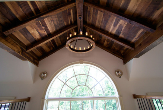
I didn’t have a picture of anything in my environment even remotely close to any of these styles, so I found this picture of a two story foyer entryway to a home and the dome shaped exposed beam ceiling. This adds height and airiness similar to the baroque area and dark wood similar to that used in the Renaissance
1 note
·
View note
Text
Portfolio #5-6 Design and Culture

This picture is hanging in the kitchen and has a significant Renaissance still art design theme. Looking around the rest of the house I don’t see many similarities between the styles and those periods of design we covered this week. Everyone in my family has been involved in culinary and catering, and a friend of the family gave us this picture and it does have history and emotions involved.
The rest of the house has a lot of wood and a type of country lodge feeling, so this gives the kitchen a different sensation. Since the picture shows fruit and a kitchen like atmosphere, it was important to place this piece in the kitchen setting to make it feel more complete. I also think the design is unique with the gold frame against the blue background, allowing it to stand out and give the kitchen a more relaxing impression.
1 note
·
View note
Text
#WEEK6TMD126
The Library Restaurant
Portsmouth, NH
Romantic Period: “Gothic” Medieval style with the dark woods. The outside of the building is Federalist style built in the late 1700′s during the Neoclassical period. The inside atmosphere is mysterious and reminiscent of fantasy. You can see from the various pictures the stone and dark wood accents. The rod iron on the railings along with the brass details on the lights. The lions that are guarding the door of the building give it a medieval castle vibe. I do feel that the seating options are not as authentic with the time period. But I feel they have to do this or the furniture would take up to much space in the room allowing for less seating and tables for guests to dine at. The cushioning lack the rich velvet fabric (red or gold). I would guess that this was not chosen as it is not as durable and forgiving if needing to be clean often from food being spilled on them.


Above: Federal style building


1 note
·
View note
Text


This is my living room. The first picture is of my mantle , which I consider inspired by the neoclassical period because of use of columns. The columns are stacked, but the top set are smaller. This reminded me of the U.S. Capitol building. Also, the use of simple and subtle detailing is similar to the neoclassical asthetic. The second picture is of my light fixture in the living room. The fixture is in front of my mantle. This reminded me of the Rococo style because of the metal design is light and wispy. Also, the gray ceiling medallion looks like fluffy flowers. These light fixtures and medallions are really out of place in my house. The rooms styles are modern, simple, and all the other lighting is inlaid. My furniture is all black and simple as well. Every wall in the apartment is painted a cool gray. There are no other ornate patterns in the apartment. I think the mantle suits the space well because of its classic design, you can add items to the area and it doesn’t clash. The lack of congruency in style leads me to believe that the landlord updated the apartment and didn’t budget for updated lighting.
0 notes