
ensnarement
23 posts
valerie/snaredthing, it/its, icon is timer and yi xi v2's vimalion project design
Don't wanna be here? Send us removal request.
Statistics
We looked inside some of the posts by ensnarement and here's what we found interesting.
Average Info
Notes Per Post
398
Likes Per Post
273
Reblog Per Post
124
Reply Per Post
1
Time Between Posts
1 day
Number of Posts By Type
Text
15
Note
2
Last Seen Tumblr Blogs


Fun Fact
69% of Tumblr users are millennials.
Text

Stake: one who presents their femininity and masculinity through vampirism.
Functionally a combination of rosary and crucifix.
See also: coffin, fang, and blood moon.
Flag design: Purple to represent a mixture of femininity and masculinity, represented with blue and red respectively, and in a gradient from cool (blue-toned) purple to warm (pink-toned) purple to further represent how both are present. Purple is also a color often associated with royalty (due to the dye to make bold, rich purples being quite expensive and thusly only affordable to royals), and fictional vampires are often associated with or are royalty. The symbol is a gradient because honestly I just thought it looked cool.
Tagging @radiomogai, @vampiremogai, @rwuffles for the coining of rosary, and @vampitsm for the coining of crucifix.
#stake#mogai#mogai flag#mogai presentation#queer presentation#masculine presentation#feminine presentation#multigender presentation#vampiric presentation#my terms#my flags#post: encaptured
88 notes
·
View notes
Text
i really do want to talk and post about mogai identity outside of just coining posts more but i have no idea what to say... does anyone have any ideas? suggestions? anythings on the table, really.
#post: enraptured#mogai#might take a while since i am about to go to work and also formulating thoughts takes effort but it will happen! at some point.
3 notes
·
View notes
Text
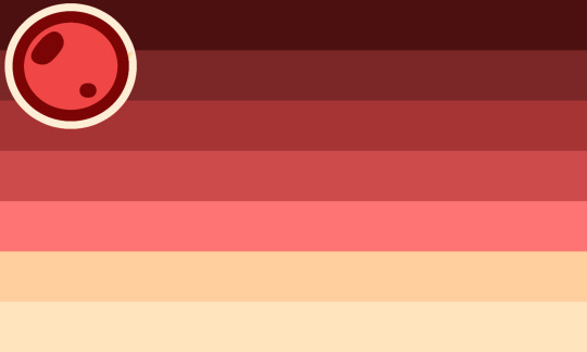
Bloodmoon: when one presents their multigenderness through vampirism. Can also be spelt as Blood Moon.
See also: rosary, crucifix, coffin, and fang.
Flag design: Red gradient to match with the other flags, but also to represent the blood moon and how it is red. Two yellow-beige stripes at the bottom to further indicate the moon, but also for some contrast. I don't have much to say about this one.
Tagging @radiomogai, @vampiremogai, @rwuffles for the coining of rosary, and @vampitsm for the coining of crucifix, coffin, and fang.
#bloodmoon#blood moon#mogai#mogai flag#mogai presentation#queer presentation#multigender presentation#vampiric presentation#my terms#my flags#post: encaptured
121 notes
·
View notes
Text

Jackal Dog: someone is both a raccoon dog and a jackal. Or, someone with feminine presentation that is distinctly monachoric who is disheveled, messy, or otherwise unkempt in their presentation with dark circles under their eyes. Can also be called jackal tanuki.
Flag design: Functionally a combination of raccoon dog (took and flipped top 3 stripes with some contrast changes) and jackal (took bottom 3 stripes) in a warmer tone. The warm tone is specifically a red tone, which is associated with monachinity. Paw print taken from the hybrid jackal dog (specifically figure 1 of that link, also content warning for dead animal specimen), traced over by yours truly.
Tagging @radiomogai, @rabidbatboy for the coining of jackal and monachoric, @emailmeurheart for the coining of raccoon dog, and @presentation-labels.
#jackal dog#jackal tanuki#mogai#mogai flag#mogai presentation#queer presentation#feminine presentation#monachoric presentation#monachoric#my terms#my flags#post: encaptured
10 notes
·
View notes
Text
okay, i think i'm a little normal again. back to regularly scheduled posting soon.
this blog may be put on the backburner for a little while, toby fox took a big hammer and is currently beating me over the head with it. in other words, i played deltarune chapters 3 and 4 and now the hyperfixation is back.
3 notes
·
View notes
Text
that television
this blog may be put on the backburner for a little while, toby fox took a big hammer and is currently beating me over the head with it. in other words, i played deltarune chapters 3 and 4 and now the hyperfixation is back.
3 notes
·
View notes
Text
this blog may be put on the backburner for a little while, toby fox took a big hammer and is currently beating me over the head with it. in other words, i played deltarune chapters 3 and 4 and now the hyperfixation is back.
#post: enraptured#im going to feed that tv estrogen. it wouldn't have saved her but i still think its worth a shot
3 notes
·
View notes
Text

Painted Dog: someone who presents masculinely and femininely while subverting masculinity and femininity in a distinctly monachoric way.
Functionally a combination of hyena and jackal.
Flag design: Took resemblance from the painted dog, the animal, for the top part, dark colors on light colors. Dark brown was chosen for its usage in aesthetics of grunge, grime, and misfit-ness, which monachoric utilizes. The bottom three stripes are a combination of hyena and jackals, hyenas being darker, while jackals being lighter. Dark red was also for the monachoric tie-back.
Tagging @radiomogai, @rabidbatboy for the coining of hyena, jackal and monachoric, and @presentation-labels.
#painted dog#mogai#mogai flag#mogai presentation#queer presentation#monachoric presentation#monachoric#my terms#my flags#post: encaptured
23 notes
·
View notes
Text

Pancannicourtlyricen: experiencing cannicourtlyricen attraction without consideration to gender, and/or, experiencing cannicourtlyricen attraction to all genders.
Flag design: Brown is a color used in cannicourtlyricen, so the meaning stays the same. (Stable color both in theming and color palette.) Pink, yellow, and blue are the colors of the pansexual flag, which is directly translated over for this. However, yellow is repeated in the flag, partially for recognizability, but also for representation of it's double meaning. (Danger and self-confidence/dignity.)
Tagging @radiomogai, @musicamogai, and @rabidbatboy for the flag template and coining of lyricen attraction.
#pancannicourtlyricen#mogai#mogai flag#mogai orientation#lyricen attraction#cannicourtlyricen#panlyricen#my flags#my terms#post: encaptured#last one for now i promise. i just needed to get these out before i head off to work. sorry for all the notifs you 3 >_<
5 notes
·
View notes
Text
Homocannicourtlyricen: experiencing cannicourtlyricen attraction to those with the same/similar gender to you.
Flag design: Brown is a color used in cannicourtlyricen, so the meaning remains the same. (Stable color both in theming and color palette.) Red is a color associated with passion, and also typically the start of a rainbow, which is associated with homoattraction. Orange is a color associated with energy, but also caution. Yellow is color associated with self-confidence and danger. Green is a color associated with health, as well as being the color of a praying mantis, which are directly mentioned in the song Cannibal Courtship.
Tagging: @radiomogai, @musicamogai, and @rabidbatboy for the flag template and coining of lyricen attraction.
#homocannicourtlyricen#mogai#mogai flag#mogai orientation#lyricen attraction#cannicourtlyricen#homolyricen#my flags#my terms#post: encaptured
6 notes
·
View notes
Text

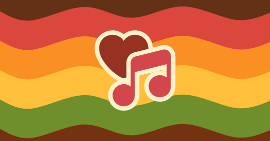
Cannicourtlyricen: A term where the lyrics of the song Cannibal Courtship (Dengue Fever) best describe one's attraction.
Flag design: Brown is a neutral color that represents stability and simplicity, which allows it to play nice with color palettes often. Red is a color of passion as well as blood. (It is difficult to eat a person without getting a little bloody...) Yellow is a color that can be used to represent danger, self-confidence and dignity, as well as renewal. I believe all of these themes are relevant to the song. I also personally associate it with jazz, which is the genre of the song.
Tagging @radiomogai, @musicamogai and @rabidbatboy for the coining and flag template of lyricen attraction.
#cannicourtlyricen#mogai#mogai flag#mogai attraction#lyricen attraction#my flags#my terms#post: encaptured
7 notes
·
View notes
Note
hi really like your blog!!! really liking what are coining, excited for seeing posts - Radio
thank you! i really like your blog as well, i find it really helpful as a resource and hub for mogai. glad to see people are excited about my posts, i've got plenty more to make ^_^
1 note
·
View note
Note
@musicamogai here, i cover anything related to music even a little! :3 i really appreciate tags so thank you!!
thank you for the clarification! i thought so but figured i'd put a note on that post in the case it wasn't. :) i'll be sure to continue to tag you in the future!
1 note
·
View note
Text
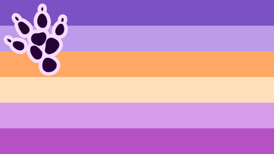
Mara: a multigender person who subverts masculinity and femininity in a distinctly multigender and queer way. Maras reject cisnormative ideas of what it means to be masculine and feminine while rejecting binary concepts of gender. Functionally a combination of vole/rat and hare.
Flag design: Cool purple chosen for being adjacent to blue, the color typically associated with masculinity, while still subverting that expectation via having other elements as well. In the case of purple, having red as well. Similarly with the warm purple, but for femininity instead. Yellow is a neutral color associated with self-confidence. If I may confess something, that is a guinea pig paw print. I couldn't find any pictures of mara prints, so I took one from their relative.
Tagging @radiomogai, @blood-moon-night-coining for being the coiner of vole and hare, and @presentation-labels.
#mara#mogai#mogai flag#mogai presentation#queer presentation#multigender presentation#my terms#my flags#post: encaptured
107 notes
·
View notes
Text
starting to realize my sanguinarian identity and cannibalistic identities, cannibalistic attraction especially, are far more intertwined than i thought they were. this sounds obvious in hindsight, flesh and blood are literally right next to eachother after all, but its news to me. and is probably something that most vamps would side-eye me for ;P
1 note
·
View note
Text
oh, totally, go for it!
My proposal for a revulamour flag.

The swoops are to represent embracement and repulsion respectively. It's intended to partially invoke a heart, the side representing adoration being upright while the revulsion is upside down, as the inverse of embracement, while still making up two parts of a whole. The ends are hidden to indicate this as deep-rooted and partially instinctual. It extends to the edges of the flag for replication sake as well as just looking better aesthetically, in my opinion. It also has quite a wormy shape. The inner green ring gives the illusion of being it embraced by the swoops. The yellow circle in addition to the inner green ring can give a silhouette adjacent to a black hole, albeit in light colors as opposed to dark ones. (The swoops clutter it a little.) I find that holds a very potent metaphor for ultimate transformation. An all-consuming density that overwhelms everything within and around it, produced by massive and incomprehensible titans upon death, that transform themselves into something of endless destruction that decays everything around it before eventually becoming apart of it. I digress. The outer green ring is to represent the physical symptoms of certain types of disease and its accompanying rot. Showing on the outside. It also wraps around the other elements, further indicating at a embracing feeling, of smothering, even. I feel that the smothering feeling could also be shown via 3/5 of the colors of being green. An excess of anything can feel smothering, and green makes up about 75% of the flag.
Green was chosen for its common meaning of disgust, rot, and illness, all of which are ideas that revulamour encapsulates. It is definitely one of the most commonly associated colors with these themes, which is why it makes up most of the flag. All three being different shades, a lighter green inside, a duller green outside, and dark green root, lends itself to each of the meanings respectively. Light green indicating disgust, dull green indicating illness, and dark green indicating rot. Yellow was chosen for association with swarms (via bees and wasps), a similar meaning of illness, and its association with energy. Energy specifically, due to how adoration can induce feelings of excitement and energization, as well as how decay often indicates a lack of energy. This can be further indicated through the softness of the yellow, with how its energy, or saturation, is mostly absent. It is also a complementary color to green. Brown is a color that often indicates warmth, which plays nicely to the embracement and comfort theming. It can also represent stability, which allows its role as a backdrop in the flag to work as well as it can. It is also a color that is a complementary to green and analogous to yellow. I do want my flags to look nice... The warm tint was honestly mostly an aesthetic choice. However, it does amplify some of the meanings; as feeling of disgust is typically more induced with warm greens as opposed to cooler or neutral greens, and warmth is typically well... associated with warm colors.
Tagging @ashenvanity and @radiomogai.
10 notes
·
View notes
Text

Kickstart vivid heart lyratric necrotic attraction/Kickstartlyrotic: when one's necrotic attraction is best described by the lyrics, "I'll sink my teeth into your vivid heart, if there's any chance it could kickstart mine." (Phantom Pain, Rave The Reqviem)
Flag design: Muted greens for necrotic attraction, as well as the implication of the user's heart (the one being kickstarted) being not vivid, or dulled. Light beige from the album cover. Bronze and muted gold to resemble rust, metaphorically pointing at the stopped heart. Red for the heart, sinking teeth (assumedly blood is involved), and also necrotic attraction.
Tagging @radiomogai, @musicamogai (if this is something you cover), @daybreakthing for the flag template of lyratric attraction, and @webby-mogai for the coining of necrotic attraction.
#kickstart vivid heart lyratric necrotic attraction#kickstartlyrotic#kickstartlyrotic attraction#mogai#mogai attraction#lyratric attraction#necrotic attraction#mogai flag#my terms#my flags#(i just cannot stand it when terms are a whole phrase instead of a few words or a portmanteau. sorry.)
6 notes
·
View notes