
Run by Evan Collins. If you're enjoying the content, please help support me on Patreon: https://www.patreon.com/y2kaestheticinstitute -- A stream of anything I find interesting in my research for CARI, the Consumer Aesthetics Research Institute. Formerly named ‘newwavearch90’.
Don't wanna be here? Send us removal request.
Statistics
We looked inside some of the posts by evan-collins90 and here's what we found interesting.
Average Info
Notes Per Post
8K
Likes Per Post
5K
Reblog Per Post
3K
Reply Per Post
4
Time Between Posts
6 days
Number of Posts By Type
Text
17
Last Seen Tumblr Blogs


Fun Fact
The KCSC sent more than 20K requests to delete posts related to prostitution and porn to Tumblr from January to June 2017.
Text


Menlo Park Mall - Edison Township, NJ (Oct. 1991)
Designed by RTKL Associates
Scanned from American Shopping Centers by I.M. Tao (1993)
#frasurbane#menlo park mall#menlo park#shopping center#mall#new jersey#1991#1990s#90s#design#interior design#interiors#architecture#colorful#my scans#neoclassical pomo#beaux arts revival
281 notes
·
View notes
Text


RiverFalls Mall & RiverFair Family Fun Center - Clarksville, Indiana (Opened Oct. 1990)
Designed by Bullock, Smith & Partners
Perfect example of the colorful & playful side of the Festival Marketplace design style, trending into Memphis Jr.
"A series of roof peaks resembling circus tents set the festive tone for the unique 750,000 square-foot center, which features a 100,000 square-foot family fun park on its upper level. A full-size, antique-style carousel is the focal point among the many rides in the park, its glittering revolutions visible through the center's immense 50-foot-high window wall. In addition to the Grand Carousel, River Fair features an 18-hole miniature golf course, a train ride, bumper cars and action rides, a 10,000-square foot video and skill games arcade, and several other attractions. Adjacent to the park is a 10-screen movie theater, party pavilion, specialty retailers, and a food court. "Food Fair" offers seating for 760 and the selections of 11 quick-serve restaurants. Enhancing the exciting atmosphere of the center are liberal uses of bold color in banners, floor tiling, and paint; reflective silver ceiling panels; and more than one mile of colored neon accents. Natural illumination from the center's many skylights will brighten River Falls, creating an open, airy ambience for customers while promoting the growth of numerous trees and plants."
Scanned from the book, American Shopping Centers by I.M. Tao (1993)
#design#interior design#interiors#architecture#malls#shopping center#fair#festival#colorful#90s#my scans#1990s#riverfalls mall#riverfair#family fun center#clarksville#indiana#1990
272 notes
·
View notes
Text


Sanrio Gift Gate - New York (exact location not listed) - early 1990s
"This youth-oriented store is tilled with myriad small inexpensive gifts that may be purchased for a trend to express the giver's feeling of friendship and happiness." The items range from party goods, school supplies, stationery items, and novelty gifts and include beauty items.
The client wanted the store to encourage "social communications and the communication theme begins at the store signage and the Hello Kitty "postmark". A neon, back-lit frieze which forms a cornice illuminating the merchandise is the primary decorative element in the store. It is an "illustrated, silk-screened, dimensionally layered representation of the various Sanrio licensed characters in their native habitats around the world."
A World's Fair sub-theme unites the characters from the many countries. An animated merry-go-round and ferris wheel not only contribute to the festive atmosphere and color - they also support merchandise display. The raised ceiling in the center of the store is highlighted by a moving hot air balloon that traverses the selling space. "The decorative elements of light and color create a strong backdrop for the bulk merchandise display".
Designed by Newbold/Schkufza Design Associates - New York, NY
Scanned from 'Stores of the Year 7' (1993)
#design#interior design#interiors#architecture#colorful#90s#my scans#1990s#hello kitty#sanrio#new york#retail#store#gift store#wrold's fair
386 notes
·
View notes
Text

Bathroom in a private residence, designed by Larson Associates Inc. - Glencoe, IL (1991)
Scanned from the book, Chicago Architecture & Design (1993)
#design#interior design#interiors#architecture#90s#my scans#1990s#1991#chicago#home#residential design#bathroom#mirror#late modern#postmodern
349 notes
·
View notes
Text


Selections from Excellent Shop Designs - Store & Showroom by Shotenkenchiku-Sha (1989)
1. Bathroom showroom 'XSITE' - designed by Toshiyuki Tanaka
2-3. Jewelry & Clock Shop 'Tenshodo' - designed by Eiichi Fujii
4-5. OA Equipment Showroom 'Ricoh Oa Port' - designed by KID Associates
6. Optician Hogetsudo - designed by Shojiro Ninomiya
7-8. WaiWai Plaza - designer to be added
9. Tableware store 'Savoia Vivre' - designed by Kenjiro Tsuji
10. AV Station CSV Shibuya - designed Keiichi Irie
11. Green Bell multi-store - designer to be added
12. Showroom 'Texture' - designed by Setsuo Kitaoka, Kazuko Fujie, and Ryoichi Yokota
#design#interior design#interiors#architecture#colorful#80s#1980s#japan#bubble era#my scans#shop#retail#showroom
770 notes
·
View notes
Text


Exeter Street T.G.I. Friday's in the then newly-renovated Exeter Street Theatre Building - Boston, MA (1977)
T.G.I. Friday's branding & interior design from this era is probably one of the best examples of the 'Gay Nineties Revival' trend common in the 1960s-1970s.
Designed by the firm, Childs Bertman Tseckares & Casendino, Inc. and Melvin Fain of TGI Friday's
Scanned from the Dec. 1978 issue of Interior Design Magazine
#1970s#70s#design#interior design#architecture#interiors#colorful#my scans#boston#exeter street theatre#tgi fridays#restaurant#gay nineties revival
466 notes
·
View notes
Text


Velvet Pixies prototype store by Claire's Inc. - Rockaway Townsquare - Rockaway, NJ (opened 2000, closed 2001?)
Retail concept store developed by Claire's & designed by FRCH Design Worldwide, Velvet Pixies had at least three locations in NJ & NY.
Love the very early 2000s tween 'curly girly' design style! The custom-designed mannequins, called the 'Pixie Girls', seem really similar to another brand but I'm not sure - definitely has that 'Shoe Diva' look popular at the time. I'm not able to find when they closed, someone mentioned 2001 and the trademark was cancelled in 2008.
These images were scanned from the book, Stores of the Year 13 by Martin Pegler (2001)
#design#interior design#interiors#architecture#colorful#my scans#2000s#00s#curly girly#velvet pixies#retail#claire's#claires#mall#tween#shoe diva
284 notes
·
View notes
Text


Japanese discotheque selections from the book, Excellent Bars and Discos - Collection II (1987)
#design#interior design#interiors#architecture#colorful#1980s#80s#my scans#japan#tokyo#discos#discotheque#club#nightclub#bar
813 notes
·
View notes
Text


The glossy, maximalist, retro-yet-futuristic NBC Experience Store at The Rockefeller Center - New York City, NY (Opened April 27th, 1999)
Designed by JGA, Inc. of Southfield, MI
Scanned from the May 2001 issue of Lighting Design + Application (LD+A) magazine
PS: Anyone know what that weird alien-head looking thing in the gridded display in the last image is?
#design#interior design#interiors#architecture#colorful#90s#my scans#1990s#1999#nyc#ny#nbc#nbc experience store#jga inc#rockefeller center
251 notes
·
View notes
Text


Valencia Town Center - Valencia, CA (1992)
Designed by RTKL Associates
"This charming retail shopping center draws its inspiration from the rich agricultural history of the surrounding Santa Clarita Valley. The project integrates references of early ranching with the Mission and Victorian influences indigenous to central California coastal communities.
The center's Mediterranean exterior is a collection of towers and sloped terra cotta tile roofs. Inside, a planned "urban main street" takes customers past a series of handsome murals depicting "The Orange Grove", "Our Valley", "Ranch Life" and "The People of the Valley" - each a proud representation of the lifestyles of the people who founded the territory.
A wonderful graphic that takes its cue from the flourishing orange groves is the orange crate label. It pops up, deliciously, every-where: on shiny shopping bags, stationery and all promotion pieces. In addition, the orange crate label is interpreted on the exterior signage, food court signage and most dramatically on a huge, circular mosaic imbedded in the sidewalk at the main entryway to the mall.
One of the most entertaining and popular sites in the mall is the floor clock/time capsule. Patterned after early 20th century clocks, this timepiece's face is (of course) a great big Valencia orange. Encapsulated underneath it are a collection of historical objects which were contributed by area residents.
Towering palms and planters of abundant foliage, along with Spanish tile marble continue the staging of this lush, valley environment which successfully represents its historical past and unique identity."
Scanned from the books, American Shopping Centers 2 by I.M. Tao (1996), and Retail Image & Graphic Identity by Joan Salb (1995)
#design#interior design#interiors#architecture#colorful#90s#my scans#1990s#mall#shopping mall#valencia#california#RTKL#valencia town center#santa clarita
441 notes
·
View notes
Text


La Perla (store) - Via Montenapoleone, 1 - Milano IT (1994)
Designed by Paolo Cermasi
I see a lot of this style in the early 90s but I'm not sure what it is exactly -- it feels French, luxurious and sophisticated but somewhat understated, with some influence from deconstructivist swoopy look popular at the time.
Scanned from the book, Nuovi Negozi in Italia 3 (New Shops in Italy 3)(1995)
#design#interior design#interiors#architecture#90s#my scans#1990s#italy#shop#retail#milan#gold#beige
84 notes
·
View notes
Text


'Space-Age McDonald's' - McDonald's at Miami International Airport (1981)
"Patrons of the McDonald's at Miami International Airport get their "break today" in an environment of tomorrow. The fast food restaurant offers more than hamburgers to elite international travelers. In a space that floats atop the four-story international arrival/departure complex, visitors are greeted by futuristic motifs that reach beyond the chain's traditional golden arches into the universe itself. Part of a satellite building connected to the airport's central facility by means of a monorail, this McDonald's has qualities of a space ship that defy earthly orientation. Six glass-enclosed floating "pods" and plaster "ice cubes" were designed to organize space, yet contribute to fluid transition between lounge, meeting room, dining area, and, yes, a bar concession operated by Marriott Corp. Transparent materials—Lucite and glass—are used in seating, tables, walls, and ceiling to achieve the effect of limitless, undefined space."
Designed by Larry Seitz Associates, Inc. & Robert Bradford Browne, AIA
Found in the April 1982 issue of Contract Interiors magazine
#design#interior design#interiors#architecture#80s#1980s#mcdonalds#miami#airport#fast food#futuristic#space age#florida#Lucite
148 notes
·
View notes
Text


Hotel Intercontinental Miami at Miami Center - Miami, FL (1988)
Designed by The Russell Partnership and Rita St. Clair Associates, photographed by Dan Forer
Scanned from the Sept. 1988 issue of Architectural Lighting magazine
#design#interior design#interiors#architecture#colorful#my scans#80s#1980s#architectural lighting#miami#intercontinental#hotel#florida#1988
317 notes
·
View notes
Text


FAO Schwarz store - San Francisco, CA (1989)
Designed by John Holey Associates & Newbold/Schkufza, and Theo Kondos Associates, Inc.
Scanned from the Sept. 1990 issue of Architectural Lighting (magazine)
#design#interior design#interiors#architecture#colorful#my scans#80s#1980s#fao schwarz#toy#toy store#clock tower#sf#san francisco#retail design#retail#store
605 notes
·
View notes
Text


1970s & 1980s Japanese disco & club selections from the book, Excellent Bars and Discos 1 (1981)
#design#interior design#interiors#architecture#colorful#my scans#80s#1980s#1970s#70s#japan#tokyo#disco#club#bar
1K notes
·
View notes
Text


Club Eiko (Opened March 1976) - 67 Motoyoshicho, Higashiyama-ku, Kyoto, Japan
Designed by Ibusuki Machiko & Architectural Design First Class, Architect Office Fujii Takasaku Amagasaki Yoshinobu
Scanned from Excellent Bars & Discos 1 (1981)
#design#interior design#interiors#architecture#colorful#my scans#1976#1970s#70s#disco#club#bar#japan#kyoto#club eiko
855 notes
·
View notes
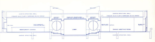
Text
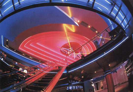
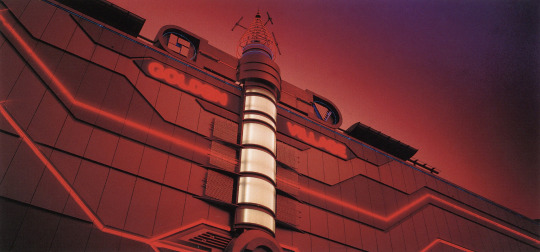
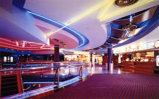
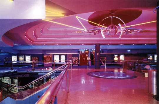
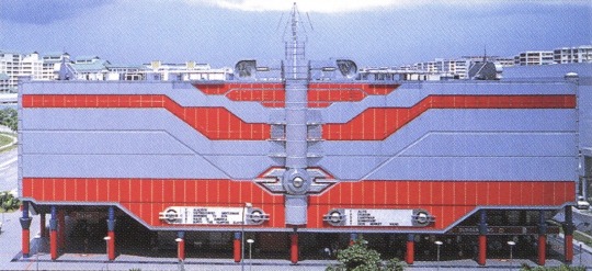
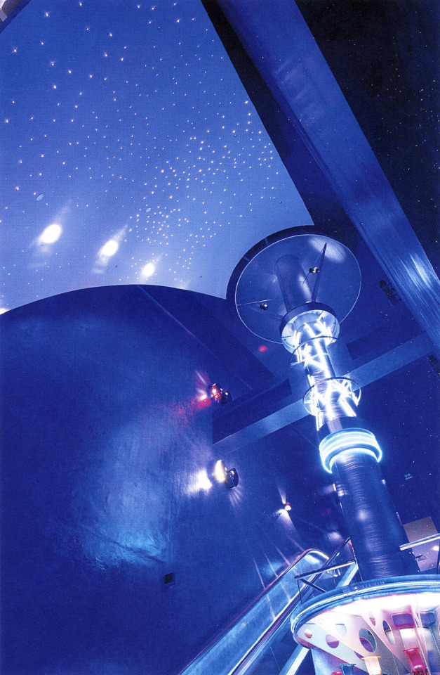
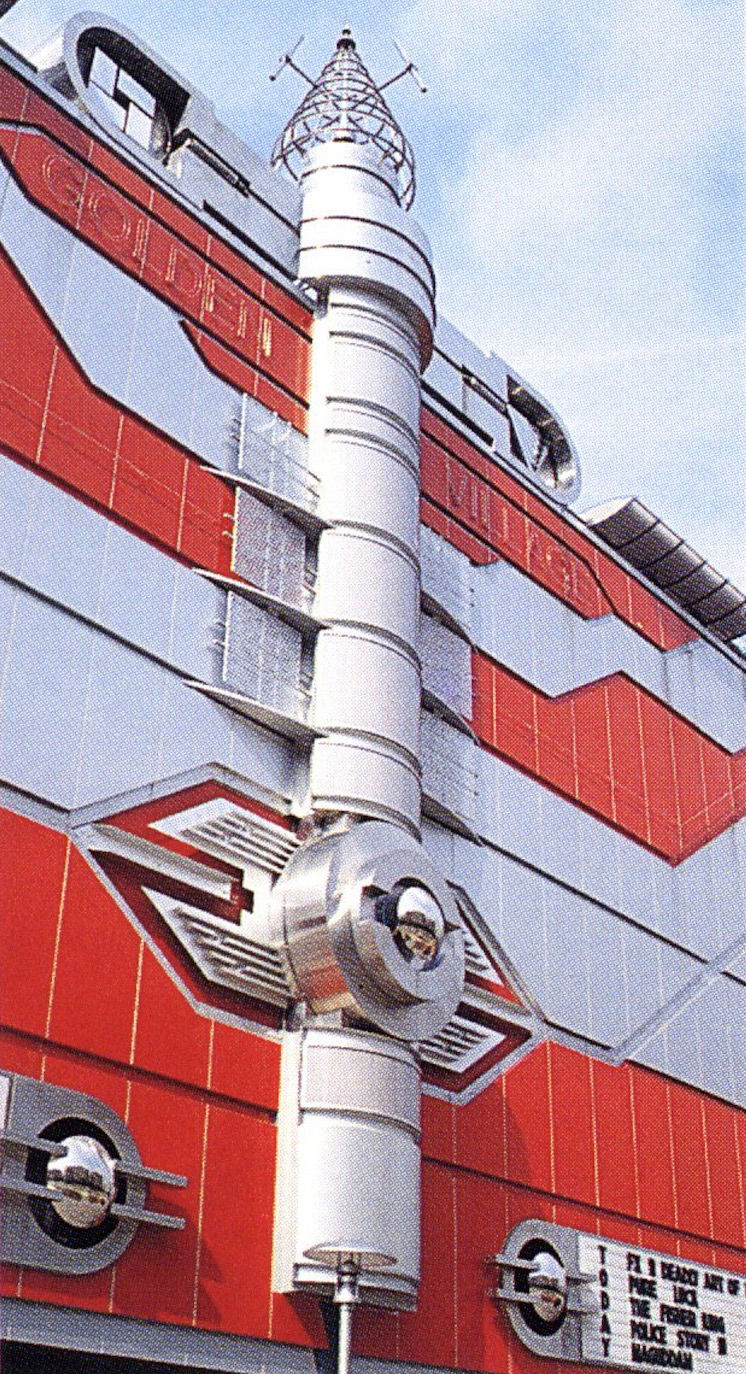
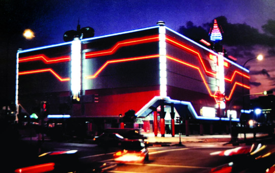
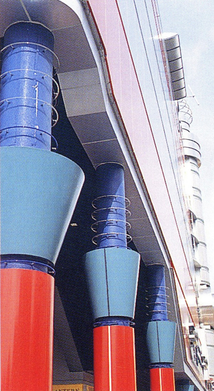
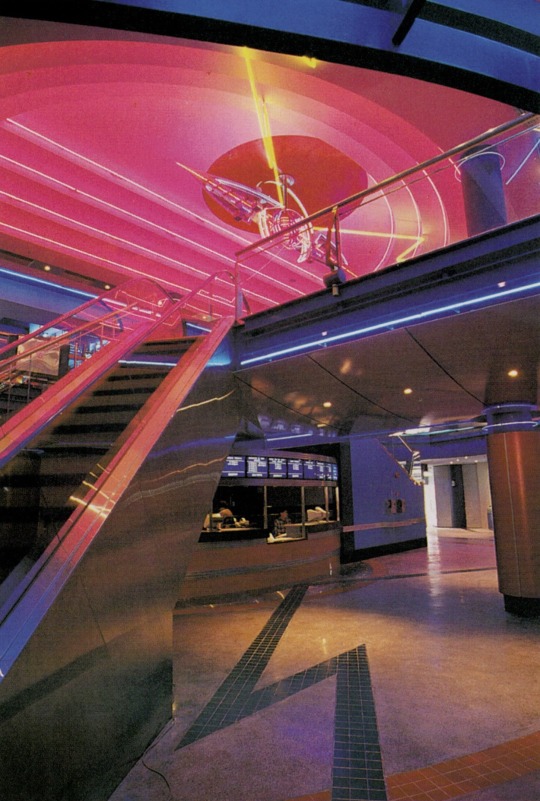
Golden Village Multiplex Yishun 10 - Singapore (1992)
Designed by Geoff Malone International (GMI)
"The detailing of the external cladding is reminiscent of the Kirin Building in Osaka by Shin Takamatsu, with meticulously constructed junctions of stainless steel and profiled cladding juxtaposed with lighting tubes. Unlike Takamatsu's monochromatic facade, however, the colours used in Yishun 10 are predominantly red, white and silver, with "splashes" of other primary colours—all evoke the excitement and magic of "a night at the movies". Interestingly, the Kirin Building houses a film institute and cinema buffs will recall it being used for location filming of the movie Black Rain.
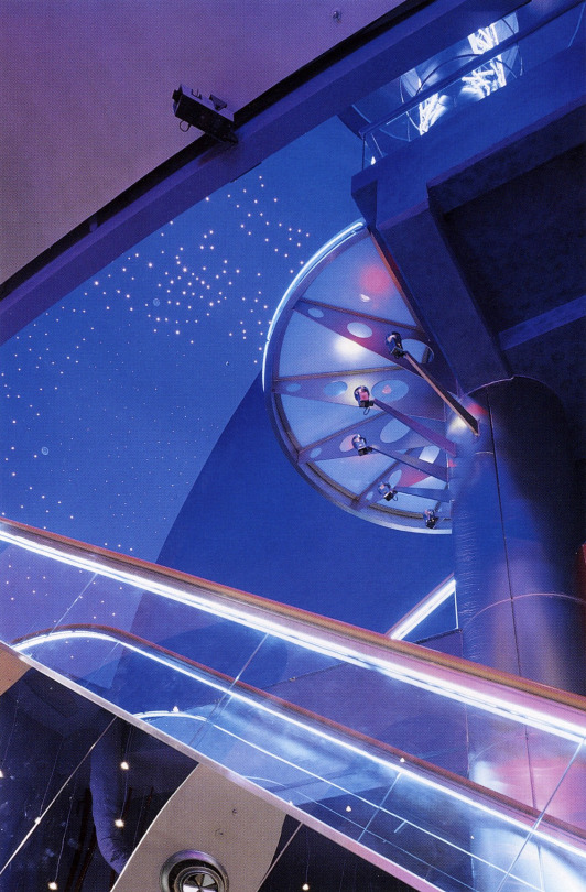
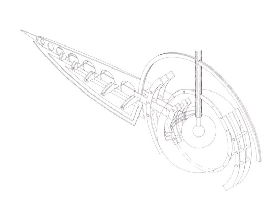
A central two-storey atrium has numerous restaurants arranged around its perimeter at first-storey. The automated ticket office is located in this central space. An escalator and stair-cases give access to the spacious second-storey foyer and thence to the ten individual cinemas on the third storey. A stair-lift permits access to the disabled.
In the main foyer, aside from the functional planning, the architect obviously derived much pleasure from the task of designing the sculptural sci-fi light fittings and multi-coloured fluorescent tube lighting in an otherwise slightly dimmed interior. Floor lighting beneath laminated glass blocks and multiple television monitor screens, with constantly changing images, all contribute to the "escapism" that is an integral part of a visit to the cinema.
For a brief interlude, the cinema-goer is transported out of the HDB township and the frantic rush of economic activity into a world of fantasy, glamour and enchantment. The Multiplex is "both a centripetal and a centrifugal force" in the urban landscape; it attracts patrons from a wide catchment area and projects an image of a vigorous and enterprising new town. It is ironic that, until the early 1990s, cinemas in Singapore were closing down for lack of patronage and some were being converted to churches. Now we see not only a revival of the genre, but as exemplified in the Golden Village Multiplex Yishun 10, it can create a special urban focus."
Scanned from:
Singapore - Architecture of a Global City (2003)
Cinema Builders by Edwin Heathcote (2001)
Unknown magazine (I'll try to track this one down)
#design#interior design#interiors#architecture#90s#1990s#colorful#my scans#yishun#singapore#cinema#movie theatre#multiplex
477 notes
·
View notes