
A gentleman and scholar, at your service. I like to think of myself as being a Renaissance Man, so the topics here can vary wildly; I do hope it's all interesting, though.
Don't wanna be here? Send us removal request.
Statistics
We looked inside some of the posts by ex-professo and here's what we found interesting.
Average Info
Notes Per Post
1K
Likes Per Post
848
Reblog Per Post
496
Reply Per Post
34
Time Between Posts
23 days
Number of Posts By Type
Photo
6
Link
8
Text
3
Last Seen Tumblr Blogs


Fun Fact
69% of Tumblr users are millennials.
Photo
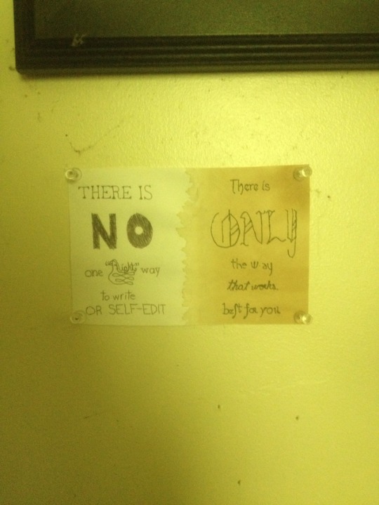
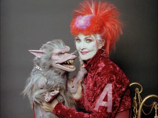
Did this last week - it's a quote from a free writing course I've been taking - Self-Editing for Writers, with Joan Dempsey. I've taken a course with her before, and like last time, it's been a good learning experience - she's great at giving me another way to look at how I'm writing - in the current course, for instance, I thought I'd been doing editing wrong for years, when it turns out that doing my editing while I write? Perfectly valid! She's also got a masterclass on the subject - sadly, I can't afford that, but I can at least say that if you want a good learning experience to help smooth out your writing problems, you can't go wrong with Joan. Anyway, this quote really popped out to me as something that I could do a cool calligraphy thing* with. It's just... well, the structure of the sentence is perfect for two columns: There is/EMPHASISED WORD/segment/segment/segment, repeat. And it seemed to me that the it'd be easy to do it as a sort of right/wrong thing: the first column, you see, is really plain. The paper's basic white, and each script is very basic: a serif script mimicking standard serif fonts; big, bold, and plain NO; next line's the lowercase of the first line (with right over-decorated in the middle of the phrase - so it's kinda like a bulls-eye, you see). Next two lines are what I call my "school" hand: it's what you learn in school, nothing more. The second half is aged (with tea, naturally), and there's a wider variety of scripts: First line is based on a font, Pfeffer Simpelgotisch, which I used to use as my computer's font when I was in a big steampunk mood (these days, I'm more into retro sci-fi, so I'm doing Sierra Madre), and which is the first font I sought out and downloaded, back when I was first getting into typefaces and calligraphy. The second's another early one; I used to write in blackletter like that all the time. Everybody complimented me on my handwriting, because who else writes like that? Third line's an art deco medley, my current favourite script, although I'm sure I'll move on to something else in a couple of months. Next line's my cursive handwriting, followed by my usual handwriting. Note the long s and r rotunda; I'm pretty sure I'm the only person using a long s these days,***** and I'm quite definite on the fact that nobody else uses r or rum rotunda.****** * "Cool calligraphy thing" is, in point of fact, a technical term used by modern calligraphers the world over,** and is not something I came up with just now because "calligraphy project" sounds too big for a (slightly larger than) notecard-sized work like this. ** You can trust me on this, because I'm honest to a fault.*** *** Usually someone else's. **** There once was an internet explorer, Who whilst on safari met a calligrapher, They saw the inscription And read the description Even the footnotes from nowhere. ***** I find most attempts by modern writers to emulate long s appalling, because A) it's not every s, you know - there's rules about when to apply it; and B) it's not an f - take a good, close look at that crossbar. I recently read Good Omens, and had a few (probably unintentional, though you never can tell with Gaiman and Pratchett) laughs when they attempted it during the sections about Agnes Nutter and her book - it was just so haphazardly applied, it's like they just chose s's at random. ****** Why's the rum gone?
#Calligraphy#Joan Dempsey#Advice#Writing#That last question is probably as common these days as asking#'Why did Constantinople get the works?'#Which is nobody's business but the Turks by the way
9 notes
·
View notes
Link
With just an itty-bitty baby reference to Team Fortress in the first stanza, because nobody boasts like the Heavy.
#Seven Wonders of the Ancient World#Statue of Zeus#Lots and lots of bragging#When you're literally made in the image of a god#Bragging just comes naturally
4 notes
·
View notes
Link
You know, I half-expected that asstard Crassus to be richest man ever, but no. He doesn’t even rate in the top ten. (Augustus - who was, of course, a contemporary of Crassus - is in second place, though. Go Augustus!).
#So the richest man ever is a black Muslim#Maybe that's why Trump's so awful?#He's just jealous that he isn't that rich#Actually I have to point out#Richest man ever was such a philanthropist that he accidentally ruined the economy#Richest businessman ever?#Andrew Carnegie - perhaps more famous for his philanthropy than for his steel#One has to wonder whether perhaps there's a lesson there
8 notes
·
View notes
Text
I'm honestly more concerned that the person thought "interesting" was a good thing. Boring rulers (for the most part; Buchanan's an obvious exception) tend to mean the country's at peace, there's no major crisis (crises? crisises? criseses? glaive-glaive-crisis-glaive?) going on, the economy's going steady - all that's needed is someone to sign the paperwork, and all the interesting people have better things to do (hence why they're interesting).
Boring is a good sign; interesting, not so much.
I ran into a “trump isn’t malicious he’s just stupid and at least he’s up front and interesting” person online. In 2019.
#I do think he's an incompetent#He's made a hash of getting the wall done#And it's the one thing he's focused on too#But yeah#At the level of the presidency#Incompetence and malice are hard to distinguish#And I can't say I like either one either way
22 notes
·
View notes
Photo
That’s pretty obviously a loaded question; “politically correct” is something that has, for better or worse, become associated with social justice warriors, the “War on Christmas,” and other such liberal extremism; and phrases like “more sensitive” and “things people can’t say” further tilt the balance. If you asked whether people were for or against the US getting more “polite,” or more “considerate,” you’d definitely see a different answer. (Especially with something like “considerate,” I think, where this isn’t the usual context you’d expect it in).
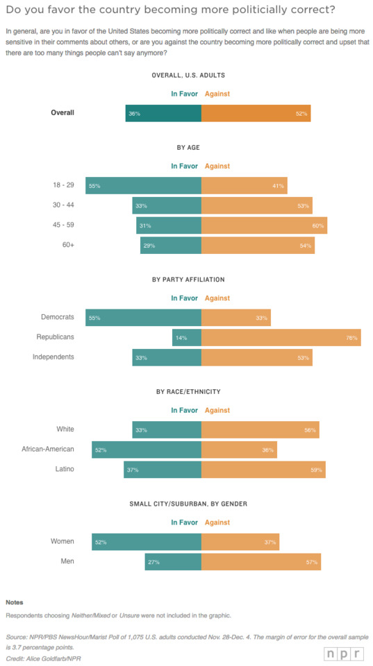
Heading into the 2020 Democratic primaries, a new NPR/PBS NewsHour/Marist poll has a warning for Democrats: Americans are largely against the country becoming more politically correct.
Fifty-two percent of Americans, including a majority of independents, said they are against the country becoming more politically correct and are upset that there are too many things people can’t say anymore. Only about a third said they are in favor of the country becoming more politically correct and like when people are being more sensitive in their comments about others.
That’s a big warning sign for Democrats heading into the 2020 primaries when cultural sensitivity has become such a defining issue with the progressive base.
“If the Democratic Party moves in a direction that is more to its base on this issue, it suggests independents are going to be tested to stay with the Democrats electorally,” said Lee Miringoff, director of the Marist Institute for Public Opinion, which conducted the poll.
“Political correctness” has been fundamental to the Trump phenomenon.
“I think the big problem this country has is being politically correct,” then candidate-Trump said during a Republican primary debate, adding “and I don’t, frankly, have time for total political correctness, and to be honest with you, this country doesn’t have time, either.”
Warning To Democrats: Most Americans Against U.S. Getting More Politically Correct
Graphics: Alice Goldfarb/NPR
816 notes
·
View notes
Link
Is it just me, or are pizza drones the modern version of flying cars? Cool but impractical, possible but a regulatory nightmare.
#Science#Technology#Drones#The reason we don't have a Star Trek future yet is because Star Trek features no OSHA compliance#Also: handrails you aren't supposed to actually use#Star Trek has those too#...I still don't know why
0 notes
Link
By the way, here’s a great class I’ve found on how to write dialogue (which is the hardest part of writing, rivalled only by writing narration).
1 note
·
View note
Photo

Found this on the online Conan Doyle Encyclopedia.
So, do we call him Arthur the Barbarian now? Or Conan the Spiritualist?
4 notes
·
View notes
Photo
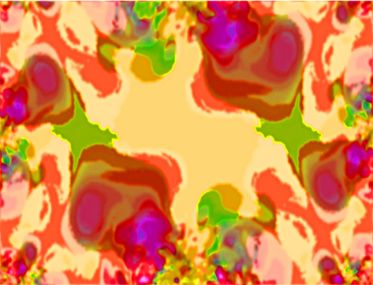
I usually wait until I finish a project and, if it’s a gift (as this one is), until after it’s been received as well, before I upload any images from it, but in this case, I think I can be forgiven: this admittedly rather psychedelic image is the closest I’ve yet come to creating a marbled paper texture digitally. Unfortunately, I don’t quite have the process down pat; apart from the colours having been plucked from the Era of Free Love, I might not have been taking enough notes... or any at all... and GIMP’s undo history proved disappointingly barren, so I have no clue whatsoever as to how I did it. Well, I mean, I’ve got the general gist, I know what tools and filters were involved, but it’s a tad bit like having a list of the ingredients for a recipe, but nothing about the amounts or the order they go in. Still, that just means further experimentation is needed; and this is - without a doubt - the most promising result I’ve had all year, after all. So I’m really quite pleased at the moment.
#Endpages#Digital Marbled Paper#And they said it couldn't be done!#It just shows once again that you can accomplish anything if you throw enough fractals at it#Valuable Life Lesson
0 notes
Link
Regrettably, there haven’t been any parallel-universe “Me”s since the “Battle of the Bands” Incident. On the bright side, the me from Earth-256 had, like, fifty bucks in his wallet!
#You'd think more of me would have brought money#I mean really#You can't just reward XP you know#That's just plain rude#And I honestly expected better of me#Just goes to show
9 notes
·
View notes
Text
Fun fact: the second season (not series) of Doctor Who started off with an serial with a pro-environmental message about the dangers of pesticides. The show’s always been making political comments from the very beginning; it’s just being blatant about it at the moment.
“What’s with this new woke Dr Who era shitting on Trump and making political comments? Can’t we get back to proper Doctor Who that was just good stories with no SJW agenda?”
#Doctor Who#Although I do feel that some of the episodes in the latest season are a tad bit 'heavy on message light on plot'#Rosa in particular#Flat one-dimensional villain#Stupid unworkable plan#David Drake and Eric Flint did the whole 'time-travelling racist out to prevent equality from being a thing...#...and is foiled by time-travelling super-intelligence' thing better#Honestly I'm surprised that's even a thing#But whatever#I should probably stop before I stop ranting on how the episode could've been so much better
458 notes
·
View notes
Photo
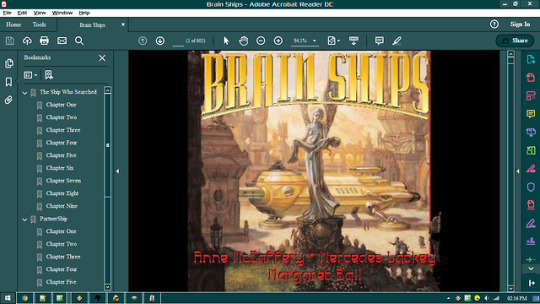
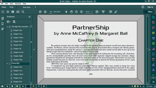
For my brother’s birthday, I came up with this. It’s nothing really special (as far as the e-book design goes; the stories are really good, and I’d recommend you go to Baen.com and take a gander at them); I’d already had practise with the computer screen design during the last project. But there are three interesting points:
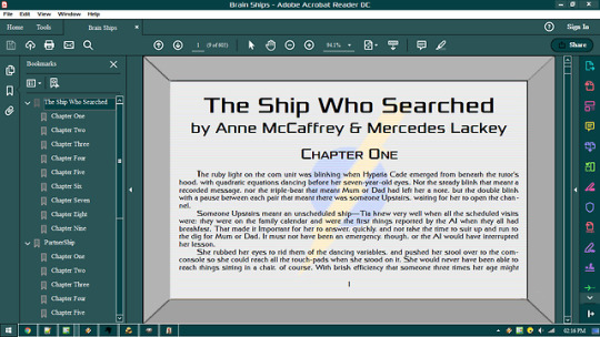
First, I’ve moved away from the standard page format to something shaped a tad bit more like a computer screen. Nothing technically difficult there, but it is worth nothing for the first time I’ve abandoned the usual portrait layout.
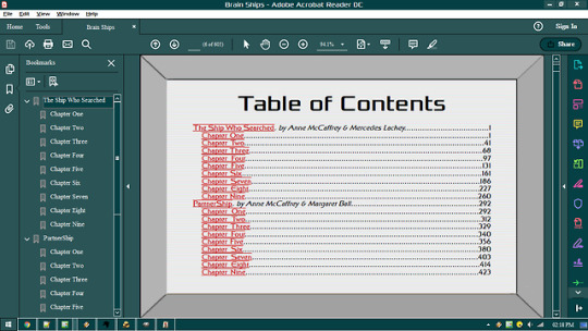
Second, as you can see, there are images on the computer screen! For The Ship Who Searched, I did a courier service logo, which is described in-story as a “blue and yellow... circle-and-lightning-bolt”. Not really hard to create, obviously. I did attempt to create a white outline around the bolt, but found that the logo worked best with a blank space between the circle and bolt. For PartnerShip, I wanted an image of a hyperchip, to hint at the importance of such a device in the story. That was somewhat harder: I had to find just the right image of a computer chip, (I wound up finding a motherboard, I believe, to use as a starting point in the end) and experiment with a number of operations to get it to look just right - not too complex, or it would make the logo look too simple (which it is, but there’s not much I could do to avoid that, is there?), but not too simple, or it’d be unrecognisable. I can’t even recall how I managed it; there was a lot of playing about with colour indices and posterisation and who-knows-what-else. Still, in the end I wound up with exactly what I was going for. After I was done, it was just a matter of getting the images roughly centred on the page and correctly aligned with the screen lines.
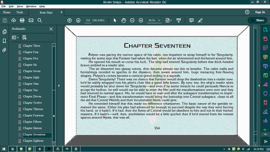
Third, Chapter Seventeen of PartnerShip has a static effect, as you can see. Not to spoil too much, but given the unique situation the characters are in during that chapter, I thought it would be a good idea to mirror that on the page. I wound up creating four variations on the original image, and cycling them just as [ERROR: SPOILER NOT FOUND]. Luckily enough, the chapter wound up having just the right number of pages! It’s surprisingly hard to do glitched and readable, but I managed that in the end - the first image of the cycle, pictured above, is the worst. I also thought about modifying the text - not the actual words, but the layout or the font; but I was working under a time constraint and felt it best to avoid experimentation for this project - and, if done poorly, such messing about would definitely hinder readability.
So I guess there’s a few special things about my work on this book. And yes, looking at this now, I fully realise I misspelled Anne McCaffrey’s name on the front cover. Unfortunately, it’s too late to fix... Ah, well. In other, less typoe-ridden news, I think I may be able to crack the secret of virtual marbled paper; it may be doable with fractals...
#E-Book#Brain Ships#Anne McCaffrey#Mercedes Lackey#Margaret Ball#Ah the joy of finding typos only too late#I'd be more upset#But if there's one thing working with these e-books has taught me#It's that even professional editors miss typos a lot#You'd be surprised how many times 'be' was used instead of 'he' in Telzey Amberdon#Besides it's not as bad as that time a text replacement app on my browser replaced 'scientific' with 'magical'#If I bothered with embarrassment that would have been embarrassing
0 notes
Text
Obviously, it would mean that Stockholm had come down with Glenn Syndrome, which is like Stockholm Syndrome, but with more Glenn.
What if Stockholmers starts claiming that “everyone in Stockholm name is Glenn”?
🤔 🤔 🤔
#I think it's like 20% more Glenn#+/- 7%#But I could be wrong#Psychology isn't an exact science after all
42 notes
·
View notes
Photo
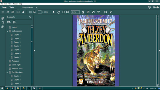
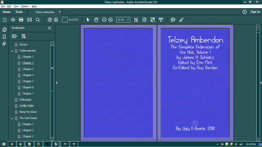
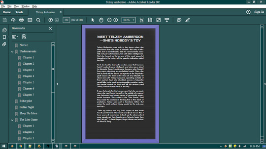
I made this for my sister’s birthday. Actually, I intended to do the complete Federation of the Hub - all four books - but sadly didn’t have time to finish; still got one book left to do. Might give her the last three for Christmas - along with something else, of course. Don’t think I’ve attempted a holiday-themed e-book, yet... and I’ve got this idea for a scroll that might be good with some Christian texts...
Might’ve been closer to finished if the editor’s commentary at the end of Book 3 hadn’t been completely screwed up. Ah, well. Some things we can’t change. Although it occurs to me that I should probably alert Baen to that little issue - the whole section was unreadable, and I had to look up an html version of it.
I also had an interesting problem with the title page for book two: despite using the same font as the other two books, the title was completely screwed up for no apparent reason. It’s as if the letter spacing failed completely and all the letters collided with each other - a complete garble. Thankfully exporting to PDF solved the problem, but I’m still curious as to why the heck it happens with some fonts at some scales, and not with others at other scales.
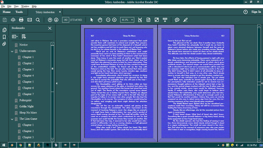
Anyway, on a much better note, I enjoyed making the pages for these. I decided to go with a “classic sci-fi computer screen theme”. The border around the page is a result of bump-mapping combined with a VGA colour index I found on the web - in fact, everything is VGA, including the title page (which is, admittedly, just the original cover converted to VGA and given a video filter). The actual screen was done separately; a little bit of noise to give it texture, then VGA and video filter, and voila. I also used a more... old computer-y font than usual for the main text, to give it that little bit extra.
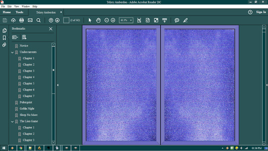
I also wanted to make the back page look like the screen being turned off, with one of those four-point starbursts on it, but I ran into two problems: One, it was surprisingly difficult to create in GIMP; two, it looked terrible in VGA; and three, there was a slight problem with putting text over it afterwards. So instead I went with a plain black screen - although, unlike our silly non-science fiction screens, it still has those video bars across it!
The static image for the endpages is, I think, the first time I’ve not even attempted a marbled paper look, and probably not the last; it wouldn’t have worked with a science fiction theme, anyway (and on a related note, those grapes I couldn’t reach were probably sour, too).
Resources used:
Telzey Amberdon (ebook), available at: https://www.baen.com/telzey-amberdon.html
Control Freak (font), available at: http://www.fontspace.com/apostrophic-lab/control-freak
Granular BRK (font), available at: http://www.fontspace.com/ænigma-fonts/granular-brk
Xolonium (font), available at: http://www.fontspace.com/severin-meyer/xolonium
#Telzey Amberdon#Ebook#Federation of the Hub#Science Fiction#Computer Screen#I'll never understand why see-through computer screens have become so popular#Doesn't that just make it harder to use?#Besides#Everyone knows low-res graphics and blocky fonts are the future!
0 notes
Link
Honestly, praying to Janus is a good idea if you’ve just started something. Or finished something. Although not in the middle of something, oddly enough...
#Poem#Prayers to the Roman Gods#Janus#Latin#Also this prayer looks like a spaceship#Or maybe a palace turned on its side#So that's cool
3 notes
·
View notes
Link
I think this poem features the biggest differences between the Latin and English versions yet.
“Flame” is hard to rhyme.
#Poem#Poetry#Prayers to the Roman Gods#Vulcan#Latin#Honestly that's one good feature about Latin:#You never ever rhyme unless you want to look like a fool#And Romans pitied the fool#Whose rhymes didn't rule#Whose verses didn't scan#Without a rhyme in hand#And whose lines were pathetic#Even when memetic#Such a fool they wouldn't save#Burma-Shave
1 note
·
View note
Link
And no, it’s not a brand new superhero. Think more mythically!
#Riddle#Myth#Fable#You should always think mythically TBH#But don't cross over into thinking epically#Because that just takes too long#And you've got things to do#...I assume
1 note
·
View note