she/they, 21+; @fashion4standusers is basically my main atp. art is sometimes at @expendable-intern
Don't wanna be here? Send us removal request.
Statistics
We looked inside some of the posts by exa-reblogs and here's what we found interesting.
Average Info
Notes Per Post
1M
Likes Per Post
608K
Reblog Per Post
474K
Reply Per Post
1K
Time Between Posts
21 hours
Number of Posts By Type
Text
15
Photo
2
Last Seen Tumblr Blogs


Fun Fact
There were a total of 171.5 billion posts on Tumblr in 2019.
Text
who was your original blorbo? Like the first ever blorbo that you felt Blorbo Induced Emotions for
91K notes
·
View notes
Text
video essays about horror, fear and dread
Films That Feel Like Bad Dreams
The Nightmare Artist
Fear of Big Things Underwater
Control, Anatomy, and the Legacy of the Haunted House
House of Leaves: The Horror Of Fiction
Monsters in the Closet: A History of LGBT Representation in Horror Cinema
The History of Insane Asylums and Horror Movies
The Saddest Horror Movie You’ve Never Seen
Fear of Forgetting
Slender Man: Misunderstanding Ten Years Of The Internet
The Real Reason The Thing (1982) is Better than The Thing (2011)
The Bizarre Clown Painting No One Fully Understands
The Little Book of Cosmic Horrors
The Disturbing Art of A.I.
Fear of Depths
Goya’s Witches
David Lynch: The Treachery of Language
The True History That Created Folk Horror
The Existential Horror of David Cronenberg’s Camera
Keep reading
62K notes
·
View notes


Text
Sad! your hottest transgender mutual lives in an inaccessible pit at the bottom of a deep ocean trench
25K notes
·
View notes
Text
i hope the anonymous person who sent the "i used to live in your house. i'm drunk in boston and it's the only address i know. happy holidays" postcard is aware that they wrote my favourite poem
124K notes
·
View notes
Text

Cheshire cat inspired computer worm. It has a floppy disk head and body segments that change between flat 2D squares to 3D cubes.
16K notes
·
View notes

Text
i will raise my children traditionally
the oldest will have a ruinous military career and develop a tendency to recklessness, alcoholism and anger management issues the middle one will be a brilliant student with strong atheist inclinations and casual demonic hallucinations the youngest will be an angel prone to hysteria turned tsaricide by circumstances
54K notes
·
View notes
Text

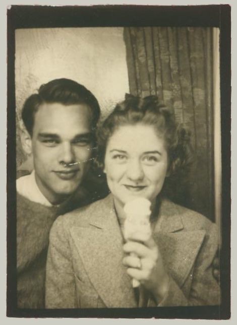
My farmer sim and his two beautiful normal daughters
7K notes
·
View notes

Text
I need someone else to appreciate this extremely niche meme I've just slapped together...

185 notes
·
View notes

Text
Some identifiers for AI generated fashion images that I've noticed
So, recently and not unexpectedly, I've seen a major uptick in AI generated images showing up in my searches for fashion photos, specifically. I've seen people make posts like this for specific art styles, and for 2D art in general, but I wanted to share some observations I made regarding clothing, fashion, and runways. I've seen a lot of people getting fooled by these, but it seems like for every one person thinking it's real there's about three people informing them that it's AI, fortunately. I'll admit, a lot of them look somewhat believable at first, but once you look closer it becomes apparent that they're off somehow.
To clarify: this is about common inconsistencies I've personally noticed in AI fashion images, so that you can learn where to look for these and similar inconsistencies and avoid sharing AI content by accident.
There's this one "collection" specifically that seems to come up a lot (also, click on all these images in this post to see the details more clearly):
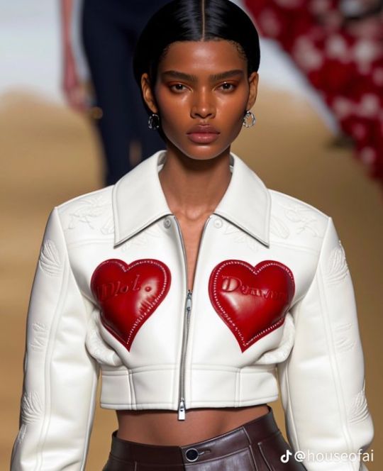
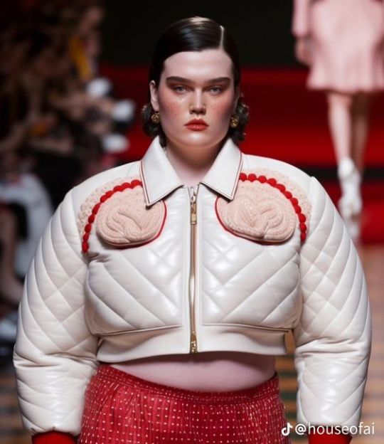
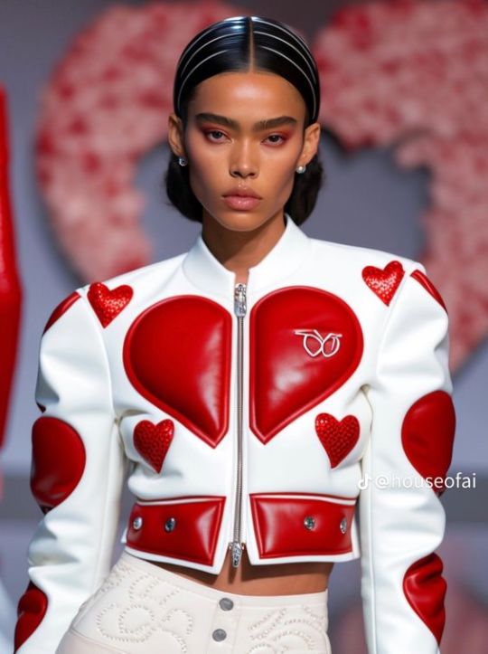
There's more images like this and yes, despite the "houseofai" watermark I still see people asking who the designer is, or saying that they genuinely thought it was real at first. First and foremost: these are all clearly meant to be from the same runway show, right? Then why does each image look like it was taken on a different runway? The lighting and coloring are different in each one, and the middle one has vague red stairs in the background while the other two look like just a plain light-colored runway. This is something you'll obviously only be able to notice in groups of images and not singular ones, but it's a pretty dead giveaway if you see it.
Secondly: AI generated images, as a whole, tend to have this specific kind of super dramatic lighting with very bright, white lights and soft grey shadows. I'm not very knowledgeable about photography, so I can't explain it exactly, but I know it when I see it (and if someone reading this can properly explain it , please do.)
Thirdly: AI generated fashion tends to attempt perfect symmetry, but always fails somehow.
As for the actual outfits: the best that I can describe it is that a lot of the shapes and patterns just don't look like intentional human choices.
What in the hell is that monogram on the upper right supposed to be? It's clearly mimicking a logo of some kind, but it's messy and indecipherable, not actual branding.
The heart motif is clearly the running theme here, but the hearts don't really make sense. Like the main one in two halves across the chest here: why does it have those two notches missing at the bottom that prevent it from coming to a point at the bottom like a heart is supposed to?
The bottom hem is way longer on the left than on the right.
The little shoulder hearts are like, bleeding into the shoulder seams; those lines in the hair look like they're supposed to be headbands, but they disappear at the part with the rest of the hair; the embroidery on the pants isn't in a clear or intentional pattern.
Again, compare the lighting on this one's neck with the lighting on the last one's neck, totally different.
Those pink things on the chest look like they're trying to be hearts, but they're so clearly not actually hearts. If your collection is heart themed, why aren't you using actual hearts?
The quilting effect is uneven and the individual lines don't follow through and finish in the places they should. Look at the upper right sleeve, where the diamonds are misshapen and the diagonal lines are clearly disconnected. On the lower right chest, the lines just disappear. This can't actually with quilted garments IRL because the top layer is literally stitched to the bottom one along those lines with material in between. It can't fuck up like that, especially not a designer garment that costs your monthly rent.
Smooth zipper. Zippers seem to be a common fuck up.
You can't read the text on the hearts. It's nonsense. Nonsense, unreadable text and fucked up hands are the absolutely surefire ways to identify AI art like this. Conveniently, there are no hands in these photos.
What are those embossed shapes on the sleeves? They're not identifiable as anything in particular.
That is not how zippers work.
I suppose that weird folding beneath the hearts is something technically physically possible. But it's much, much more likely that they would create smoother, less ugly seams with less excess fabric.
These generative AI programs don't actually comprehend what they're trying to depict. Thus, they make mistakes like these. Physical inconsistencies that are often totally impossible, but even the possible things are just... stupid choices that an actual designer isn't going to do. Yeah, sure, designs can be weird, asymmetrical, and imperfect on purpose. But it's way, way more likely that this is just an AI.
Experiment: look at these two images of retro-futuristic headpieces/eyewear and determine whether they're real or AI.
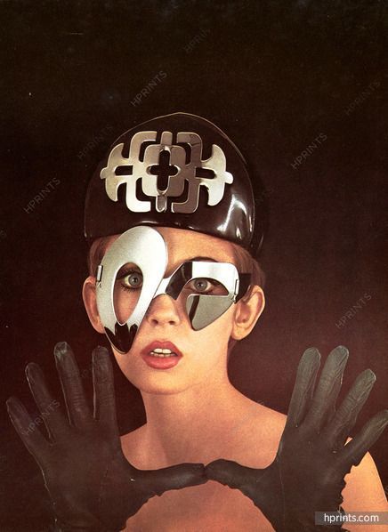
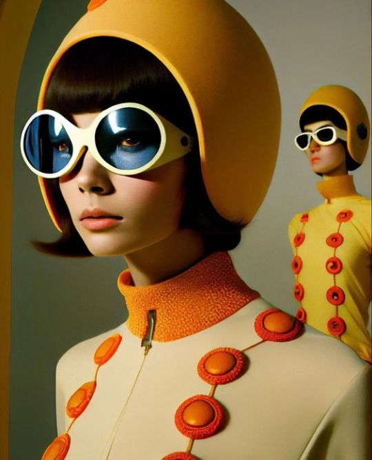
Right one is easy, mostly because of the wonky bitch in the back. But some other inconsistencies I specifically wanna note: if the blue goggles color the "model"'s skin, hair, helmet, and the background behind the lenses blue, why doesn't it do the same for the eyes? And also, I've noticed that a lot of these images have trouble properly rendering the corners of the mouth, which is a weird detail but one you won't be able to unsee once you know to look out for it. Yes, there's a dark line where actual human lips meet, often with some subtle divots at the corners, but in the image on the right, it's rendered as a harsh, gaping hole more like something sculpted out of plastic than actual flesh. On the note of imperfect symmetry again: the left lens isn't perfectly round. And finally, this is a really good example of that giveaway lighting I mentioned. I don't know how you would actually achieve that lighting IRL, but it's so, so common in AI images.
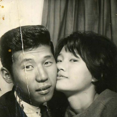
The left photo is an actual model in 1967 wearing pieces designed by Pierre Cardin, a designer that the right image is definitely trying to emulate. The model has a look on her face that isn't super duper expressive, but it's still far beyond any of the AI images I've seen. Every AI fashion image I've seen thus far has totally blank-faced, expressionless "models". They might pout slightly, but I haven't seen any with visible teeth. Something tells me the AI would render teeth the same way it renders fingers. The emblem on the hat is actually perfectly symmetrical, and the glasses are clearly asymmetrical as an intentional design choice, not like the shapes are supposed to be the same but got messed up somehow. And she has ten fingers total, five on each hand.
Two more:
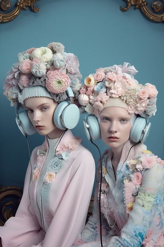
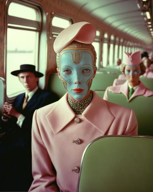
These are both AI generated. I'm not gonna lie, i fell for the one on the left at first. The right is easy:
distorted faces
woman in back is being absorbed by the train(?) seat
those middle buttons on the jacket are totally useless
AI Lighting (TM)
But the "models" on the left look very, very convincing, and the lighting doesn't immediately register to me as AI lighting. The only really wonky thing on the faces is the mouth on the left "model". However, there's one dead giveaway: the headphone wires. Why are they different thicknesses? Why does the rightmost wire disappear into the jacket sleeve? Where the fuck does the leftmost wire even go? AI, I've noticed, struggles with thin lines, strings, and strands of things. Like with the quilted jacket above, you can often try and trace a single line, only to find that it drops off, distorts, or disappears. And sure enough, as soon as I noticed something was weird with those wires, I went to the Pinterest profile that posted it and found that they exclusively posted AI content. Speaking of the actual headphones, the leftmost ear cushion is sitting on an angle that doesn't make sense, and the one to the direct right of it is significantly thinner than the other three. Again, subtle failed symmetry.
This is by no means a comprehensive guide, and I encourage anyone seeing this to point out ways they've found to identify AI images like this. These are things I've just been on the lookout for lately. And when in doubt: conduct reverse image searches and try your best to identify solid sources for your images. AI images won't list designers, model names, photographers, stylists, makeup artists, etc., while actual runway and photoshoot images will, because there are human creatives behind them.
#posting this to my least active blog rather than my fashion one so that less notes will overwhelm that blog's notifications#ai#psa#long post
785 notes
·
View notes