
Ehren Stanhope, CFA, is a Principal at O'Shaughnessy Asset Management. He examines investment themes that are informed by deep historical research and are timely given the current market environment.
Don't wanna be here? Send us removal request.
Statistics
We looked inside some of the posts by factorinvestor and here's what we found interesting.
Average Info
Notes Per Post
52
Likes Per Post
35
Reblog Per Post
13
Reply Per Post
4
Time Between Posts
3 months
Number of Posts By Type
Text
17
Last Seen Tumblr Blogs


Fun Fact
Tumblr posted its first advertisements in May 2012 and subsequently earned $13M in revenue.
Text
Current State of Affairs for Value, Profits, and Debt
The woes of value investors reached a new peak today. A well known institutionally-oriented value shop decided to close its doors at year end. The firm has been around for decades and at its peak managed tens of billions of dollars.
For the most part, both Value’s underperformance during the crisis can be explained by sector composition. The panel below shows a time series of sector composition for the cheapest value decile, most expensive value decile, and highest-ranking momentum decile.
There are a few key takeaways from these visuals. First, cheap value has a disproportionate allocation to Financials and Energy—both acutely impacted by the crisis—with low allocations to Info Tech. Conversely, expensive value has a disproportionately high exposure to Info Tech and Health Care and low ones to Financials and Energy. Lastly, although high-ranking momentum’s sector allocation was not as favorable as expensive value, it did have a sizeable weight to Info Tech and an increasing trend to Health Care and Communication Services while reducing exposure to Financials and Industrials.
How Value Rewards
In “Factors from Scratch” we decomposed the historical performance of Value and Growth into their component parts—Return of Capital, Fundamental Growth, and Multiple Expansion. Return of Capital consists of dividends and buybacks. Fundamental Growth represents EPS growth, and Multiple Expansion is measured as the impact of the change in the P/E ratio. From 1965-2019, value derived its edge from higher levels of Return of Capital. Fundamental Growth was a detractor, and Multiple Expansion was effectively a wash.
Over the last two years, however, Fundamental Growth has weakened for both categories relative to history. Value’s Return of Capital advantage contracted while Growth’s Fundamental advantage widened. The key driver of Growth’s outperformance has been Multiple Expansion. Value’s multiples shrunk and Growth’s expanded, a spread of 7.03% annualized.[1]
Value’s Recovery Underperformance
P/E multiples can be viewed as the price per $1 in earnings per share, which allows us to extrapolate that multiple expansion over the last two years was driven by an increase in price.[2] Price can be thought of on a per share basis, or as the stock’s overall market capitalization. In either case, both market cap and price per share theoretically represent an investors’ collective measure of the present value of all future cash flows associated with the stock.
Discount rates, which can be approximated using bond yields, are a key contributor to present value calculations. We can see below that the real yield for Treasury Inflation Protected Securities has fallen roughly 2.3% from the recent peak in late 2018. Falling rates mean falling discount rates, which is generally supportive of higher valuations.
However, multiples are not rewarded evenly. Value stocks are generally cheap because their underlying businesses are not expected to grow at the rate of their Growth peers. In our present value calculation, this suggests that near-term earnings are more meaningful for Value than Growth. In a situation like the COVID-19 crisis, when Value’s near-term earnings are severely impaired, discount rates are falling, and Growth’s earnings are expanding, it’s a perfect Growth-leadership cocktail.
Using S&P 500 index dividend futures, we can back into the short-term (next five years) and long-term (5 years and beyond) components of the S&P 500’s value using pre-crisis and current yields. The left-most chart in the panel below shows the change in value of the short and long-term components of the S&P 500’s market cap using prevailing discount rates since the start of the year. Notice that the short-term component has declined in value while the long-term component has risen. The rise is tied to the decrease in yields, as can be seen in the middle panel, which have shifted down during the crisis. The right-most chart in the panel shows what would happen to the components if we applied pre-crisis yields today. The analysis suggests the long-term component would be 23.5% lower.
Unfortunately, we are unable to dissect the Value vs Growth dynamic in this analysis because dividend futures don’t exist on those indexes, but we can infer that the impact on the long-term component of valuations would likely disproportionately impact growth stocks.
All of this suggests that higher long-term rates may cause a shift in the Value-Growth dynamic. With the Fed’s pause on Fed Funds for the foreseeable future and massive fiscal stimulus ongoing, it is not inconceivable that we could see higher rates at the long end of the curve, which would favor Value.
Debt and Profitability
Another point that bears noting in this environment is the prominence of unprofitable firms and massive debt issuance. The third quarter marked the largest debt issuance binge on record—$267 billion for investment grade corporates and $119 billion for High Yield. The surge is evident when looking at the U.S. stock universe. What is notable is that when dividend into two cohorts, profitable and unprofitable companies, the unprofitable ones are taking on more debt with greater leverage. Probably, not going to end well and argues strongly for an active approach in the coming years.
[1] The analysis concludes in 2019 due to the extreme aberrations in Q1 and Q2 earnings data related to the COVID crisis.
[2] Another way for multiples to expand would be for earnings to decline, but that’s not the case here
4 notes
·
View notes
Text
Why Do Markets Go Up?
Stock markets are the greatest compounders of wealth the world has ever seen. The key objective of any investor is to get more than $1 back for every $1 invested. Sadly, most introductory investment courses and literature do not begin with an explanation as to why markets go up. It’s such a fundamental question, but it is often overlooked. With greater understanding as to why, it may well prove easier to stay invested when “Mr. Market” goes on a binge and lops 20% off the value of your portfolio.
Think of the U.S. stock market as one holding company named USA, Inc.[1] that holds a portfolio of businesses. If you were the CEO of this holding company, you would have two jobs. First, ensure profits are generated by the underlying businesses. Second, reinvest those profits in the best interests of the company’s owners. To do so, you would seek investments that grow USA, Inc.’s future earnings—like starting, expanding, acquiring, and/or selling businesses. If opportunities for those activities weren’t enticing, you might offer a dividend or repurchase shares outstanding (an implicit bet on the portfolio companies of USA, Inc. itself).
USA, Inc. has done a remarkable job of all this over time, but not in the ways you might expect. First, the reallocation of capital via dividends is more important to return than the underlying earnings generated themselves. Second, demographic and long-term economic forces drive earnings persistently higher.
Let me explain.
Earnings Growth, Dividends, and Valuation Multiples
Since 1871, the earnings of USA, Inc. have grown by 3.99% annually.[2] We can think of earnings growth as the first of three sources of return to the investor.[3] Keep in mind that this growth is for the entire portfolio of USA, Inc.’s businesses. Some businesses within the portfolio grew at dramatically higher rates and some at much lower rates, but they averaged out to 3.99%.
Dividends account for the second source of return. If we assume that shareholders of USA, Inc. reinvested their dividends, that reinvestment would tack 4.55% annually onto the 3.99% of earnings growth, bringing total return to shareholders at 8.54%. Note that the contribution of dividends is greater than from underlying earnings growth. That seems strange. How can reinvestment be more important than the underlying earnings upon which dividends are generated?
One potential reason is that dividends, when reinvested, represent a redistribution of underutilized capital to firms that may have higher earnings growth rates. Dividend payers tend to be more mature firms, while non-dividend payers may be growing at a pace that requires all capital to be ploughed back into the business. Here’s an example. In a hypothetical two firm market, firm A is a young Technology company growing earnings at 20% per year. Firm B is a mature Consumer Staples firm growing earnings at 3% per year. Firm A is in growth mode and offers no dividend. Firm B offers a 3% yield to entice investors. Firm A is smaller and has a market capitalization of $5 billion. Firm B has a market cap of $10 billion. When Firm B issues its 3% dividend, $300 million gets paid to shareholders. Those who choose to reinvest do so pro rata—~33% to Firm A ($100 mil) and ~66% to Firm B ($200 mil). Because Firm B paid a dividend, $100 mil more is now invested in Firm A than would have otherwise been if no dividend were paid. $100 million has been reallocated to a more efficient use—a higher earnings growth firm.
The third component of return, which is more transient, is directly related to the valuation placed on the stream of earnings and dividends generated by USA, Inc.’s portfolio of businesses at different points in time.
The value of any company should theoretically be the combined value of 1) its existing business persisting into the future, and 2) a speculative component that represents the market’s guesstimate of the present value of future growth. That’s a mouthful so let’s dig in.
The simplest valuation measure is the price paid for each $1 of earnings generated by the company, commonly referred to as the Price-to-Earnings, or PE, ratio. In 1871, the PE for the market was 11.1x. At the end of 2018, it was 22.3x, which means the multiple “expanded” 0.47% per year. Unfortunately, multiples don’t always expand in linear fashion; we have simply smoothed the impact by annualizing the change.
Valuation multiples oscillate between expansion and contraction for the very reason that they are attempting to value the future, and the best guess of the future is constantly evolving (see chart below). It should be noted, however, that except in extreme circumstances like the tech bubble on the high end and the 1970’s on the low end, the PE ratios tend to revert to the long-run average of about 15x. Forecasting is an inherently difficult exercise for obvious reasons. It is unknown. The ability to do so would require a forecaster to accurately predict future cash flows, interest rates, and inflation—among a suite of other variables.
Add multiple expansion to the 8.54% generated via earnings and dividends, and we arrive at 9.01%, the annualized total investor return for the market (USA, Inc.) since 1871.
So, why do markets appreciate over time? Because earnings have grown over the very long term, dividends are paid—and when reinvested—are powerful additional contributors to return that implicitly reallocate capital. Finally, markets value the stream of earnings and dividends from the market differently at various points time. Changes in this valuation result in multiple expansion or contraction, which makes up for the balance of total investor returns.
The Three Components of Growth
Though we’ve broken down total investor return to show why markets go up, we have not addressed the second-order question— “what causes earnings to grow?”[4]
To answer this, we will assume that the S&P 500 Index is a decent proxy for the overall economy. This turns out to be a pretty good assumption, as the business sector represents 75% of GDP.[5] We also need to invoke three economic forces—inflation, productivity, and demographics.
Inflationary forces result from increases in costs—i.e. labor or raw materials—when demand overwhelms supply.[6] Over the very long term, these get passed along to the consumer via price hikes. The classic analog being too much money chasing too few goods. A little bit of persistent inflation can be good—it encourages consumption that fuels the economy, and it diminishes the future burden of debt repayments. Conversely, demand can decrease, resulting in deflation. Deflation is bad because it deters spending in favor of excessive saving (see Japan), and it increases the future burden of debt repayments.
Productivity generally results from either efficiency gains or value creation.[7] If a technological advancement allowed a worker to increase output to two widgets per hour from one, that’s a measurable doubling of productivity. Value creation would be the invention of something totally new, i.e. the internet. Productivity is amazing because more value is created with the same or fewer inputs than would otherwise have been possible. For the most part, productivity tend to be a gradual force. Productivity, defined as Real GDP per Capita, has grown consistently in the 2% range for many decades.[8]
Inflation tends to be more volatile—with a notable decade-long spike in the 1970’s—but has increased at around 3% on average. Inflation often lays the foundation upon which productivity induced innovation creates value, and so the two are interlinked forces. Inflation drives up costs, which necessitates a more efficient means of production, which increases profits, which attracts competitors into the market, which lower profits, which drives investment out of the space until a new, more efficient means of production is discovered and the cycle repeats.
Here is an example where this plays out in the real world—education. Until the advent of online classrooms, there were no noticeable productivity gains in education over the last several decades (I suspect longer, but don’t have the data!). The only way to increase educational productivity was to hire more teachers to teach more students in a physical space at a time. There are practical limits to this endeavor. In the last two decades, more students with loan-fueled pocket books have been attending school than ever—increase in demand without a commensurate increase in supply, resulting in inflation. Since 1947, higher education costs in the U.S. have grown dramatically faster than across the rest of the economy (5.7% versus 3.0%).[9] Enter online classrooms, which have no physical constraints, and they are contributing to lower educational inflation in recent years.
Demographic trends, though boring due to their glacial pace, are important because labor is often the most expensive component of production. According to the Bureau of Labor Statistics, it represents more than 60% of the value of economic output.[10] Labor means workers. Workers are a part of the population. Growing populations will have more eligible workers in the future. Workers earn wages which they spend to support their growing families and lifestyle. Demographic headwinds and tailwinds can be identified by simply understanding the change in the overall population, or a subset—like workers employed.
Using these three forces, we can break down GDP into its component parts. I have shortened the time frame here to 1947-2018 for ease of access to Federal Reserve data. Over this period, nominal GDP has grown by 6.36% per year. That can be broken down into our three forces—Inflation 3.25%, Productivity 1.95%, and Population Growth 1.16%. When combined Productivity and Population Growth constitute Real GDP, which has grown at 3.11%.
We can then recategorize the drivers of market return in economic growth terms. To level set, here is the table from above but with a shortened timeframe of 1947-2018 and adding a column for inflation-adjusted data.
The data point we seek to explain is real earnings growth of 3.42% using the forces of Productivity and Population Growth. Notice that it is relatively close to the 3.11% real GDP growth number above. Productivity in the business sector differs from that of the overall economy in that the labor force is smaller than an entire country’s population. Here again, demographic trends play a role because the working age population ebbs and flows with generational birth trends. For business Productivity, we look to real corporate output relative to nonfarm payrolls. Over our time frame, business Productivity has grown at a 1.64% clip, accounting for slightly less than half of real earnings growth of the S&P 500.
The Population Growth component of real earnings has grown by 1.73% over this period, slightly more than half. Though I haven’t dived into it extensively, I suspect that the higher contribution for business versus real GDP is due to women entering the workforce in the latter half of the twentieth century.[11] The women’s labor force participation rate nearly doubled from 35% in 1950 to 60% in 2000, which means the labor force grew at a greater rate than the overall population.
At our firm, we spend a lot of time thinking about the characteristics of stocks that predispose them to outperform over time. We’ve found that attempting to predict first order results—like returns—is generally a fool’s errand. There are too many variables. However, if you can identify characteristics that are more stable—like underlying earnings—you can increase your odds of laying proper wagers on one or a portfolio of stocks.
When I look at the previous table, the stable and more predictable measure that jumps out at me is population growth. As noted before, its glacial and persistent. Given birth rates today, one can fairly reasonably predict what the labor force will look like in 10, 20, 30 years. Which is also to say that one can also potentially predict, with reasonable confidence, one major contributor to real earnings growth.[12]
Snow fall, Navigation, and Grinding Higher
I grew up in New Orleans. Besides being the Mecca of everything music, food, and culture, it happens to sit near the mouth of one of the greatest commerce thuways on the planet, the Mississippi River.
Kids love big, fast stuff, and I was no different. Watching the tanker ships glide by was a favorite pass time when we went downtown. There’s something pretty magical about hundreds of thousands of pounds moving in complete silence and seemingly effortlessly. What makes it even better is when those big tankers move fast. Naturally, I asked how all this was possible.
I learned a few things about rivers, navigation, and delayed gratification at a young age. First, the water tends to be higher in spring because all the snow from winter up north melts and fills the river. Second, more snow = more water = faster current = faster ships = cooler to watch.
At some point I realized that the cool factor was predictable. When it snowed an inordinate amount in January, the river was higher and the current moved faster. And the icing on the cake, a ship can only steer when it is moving faster than the current. So if the current was moving quick, ships moved even faster in April. This was a predictable cycle. It didn’t repeat every single year, but thematically, it has persisted since time immemorial.
Markets do tend to go up over time, but in cycles. While I think there is a decent portion of the population that still thinks markets are unpredictable casinos, there are fundamental trends at play that justify the continued rise of markets for decades to come—demographic trends and productivity gains.
Though imperfect in many ways, capitalism generally works. Businesses generate profits. Successful businesses employee people. Employees earn wages. They spend those wages to support their lifestyles, often raising a family. Inflation persists at a low rate, but periodically crops up as generational waves (i.e. Baby Boomers) stress the capacity of an economy. As new trends take shape, preferences change. Technological innovation occurs, resulting in disruption to the status quo and new value creation. Hopefully, in their quest for maximizing shareholder return, businesses continue to allocate to these new innovations, spurring relentless productivity gains over decades, and pushing markets higher.
—
[1] I use the S&P 500 Index as a proxy for USA, Inc.
[2] Irrational Exuberance [Princeton University Press 2000, Broadway Books 2001, 2nd ed., 2005]
[3] This approach was developed by my colleagues in a research paper titled “Factors from Scratch”.
[4] https://www.oaktreecapital.com/docs/default-source/memos/2015-09-09-its-not-easy.pdf
[5] https://www.bls.gov/lpc/faqs.htm#P01
[6] In economics there are the paradigms of financial markets and goods markets. Though the requisite balance of demand and supply apply in both markets, the mechanism by which inflation/deflation occurs is different. For example, in financial markets, inflation (deflation) can be generated via excess (deficient) monetary supply with no real change in the goods market. For the purposes of this piece, I refer primarily to the goods markets.
[7] http://reactionwheel.net/2019/01/schumpeter-on-strategy.html
[8] How the Economic Machine Works
[9] Federal Reserve Economic Data
[10] https://www.bls.gov/lpc/faqs.htm#P01
[11] https://www.bls.gov/spotlight/2017/women-in-the-workforce-before-during-and-after-the-great-recession/pdf/women-in-the-workforce-before-during-and-after-the-great-recession.pdf
[12] The BLS offers a report every two years which lays out their projections for growth of the labor force. The most recent projection can be found here.
7 notes
·
View notes
Text
Where is the Value?
Investors always want to know what’s cheap—cheap relative to the opportunity set and relative to history. Cheapness could refer to any number of things—price relative to trailing twelve months earnings, to trailing earnings over multiple years, to analyst earnings estimates, to long-run projections, or a dozen other variations based on sales, cash flows, book value, etc.
Because analyst estimates tend to be tainted for a number of different reasons (see this discussion on why), we tend to focus on price relative to trailing twelve month sales, cash flows, and earnings to measure cheapness. This gives a more holistic and objective view of valuation.
Using this simple construct, we’ll give every investable stock across the globe a percentile valuation score from 1-100. Scores are then rolled up to countries and regions to get value scores for each relative to the entire global stock market. Our universe will be all stocks with a market cap greater than an inflation adjusted $1 billion (USD) and with reasonable daily liquidity from 1990-2018.*
Because developed and emerging markets are often treated differently, we’ll separate the two within each region. Some countries are such large portions of the overall global stock market that they warrant their own “region”, i.e. the U.S. and Japan.
The chart below summarizes the results. Each green column represents a region/country. The vertical axis are the average percentile scores for each region/country discussed above. The top of each region column is the highest (most expensive) valuation since 1990, and the bottom is the lowest (cheapest). The red triangle represents the average valuation over the period, and the blue triangle represents current valuations.
As value investors, the most intriguing regions/countries are those with current valuations (blue triangle) below the historical average (red triangle) and low relative to the rest of the global market. Based on this chart, Japan and Emerging Europe, Middle East, Africa (EMEA) fall into this group. On the flip side, the U.S. stands out as being one of the most expensive markets relative to other regions and its own history. Given the massive run in the U.S. market over the last decade, this is no surprise.
Over the last several decades, it is common for there to be long cyclical trends of U.S. outperformance. Since the 1970’s at least, it has always reverted to form with non-U.S. markets outperforming for long stretches. Below is a chart of rolling 3 year returns for U.S. vs Foreign markets. At some point, the tide will change and foreign markets will have their day in the sun. Timing uncertain.
Regions give a decent overview but drilling down by countries within each region reveals some interesting stuff. Let’s turn first to the broadest region—EMEA. Obviously, Europe has been afflicted by several political events in the post Global Financial Crisis (GFC) era. Grexit, Brexit, questions on solvency in Italy, Spain, Portugal, etc. Setting all that aside, there are three countries that are trading reasonably below their historical averages and relative to others in the region—Portugal, Greece, and Turkey. These countries are not for the faint of heart, but then again, opportunities tend to require a contrarian bent form investors that can see through the noise.
Turning to the Asia Pacific region, there are a few standouts. For developed markets, Japan and Singapore are both trading well below their historical average and with discounted valuation relative to other countries. On the EM side, Russia is the clear winner—cheap relative to history and within the region. With high economic reliance on the Energy sector, a volatile currency, and a few political concerns, the valuation seems to make sense, but certainly worthy of a closer look.
Turning to the Americas, as mentioned above the U.S. appears expensive relative to history and other countries/regions, but that has been the case for some time and could persist. Of interest on this side of the Atlantic is Mexico. A little ways into The Absent Superpower, author Peter Zeihan makes a succinct case for an industrial revolution in Mexico based on the U.S. shale revolution.
Long story short, there seem to be more opportunities, based on valuation, in Emerging Markets. Among Developed Markets, Japan seems the most attractive. The U.S. remains expensive.
We could stop there, but there is always more to the story. Value investing is great, but there exist lots of value traps the world over. An interesting corollary to value investing is that of growth. Peter Lynch famously quantified this concept in the PE to Growth ratio. Basically, what are you paying for a dollar of earnings growth. We extend this concept below by using the same Value score framework and adding to it some growth metrics. We will measure Earnings Growth using a combination of 1-year EPS change, Return on Invested Capital, the trend of earnings over the last several quarters. The chart below shows the percentile ranks for value on the horizontal axis and Earnings Growth on the vertical axis. A country with the highest growth and cheapest valuation would fall int eh lower left corner. Expensive and low growth countries would fall in the upper right corner.
I’ve highlighted a few countries on the chart that I found interesting. The countries noted above as being deeply discounted relative to peers and history are also showing up as having favorable Earnings Growth relative to peers—Portugal, Greece, and Russia.
For the most part, if you can find discounted stocks with strengthening fundamentals, you usually have a solid cocktail for a good investment. For enterprising investors willing to bear the currency and geopolitical risks, there may just be some diamonds in the rough in some of these unloved and beaten down markets.
* If you don’t see a country, its likely because there weren’t enough tradeable stocks to warrant inclusion. China being a prime example here. Lots of stocks that aren’t tradeable to foreign investors.
9 notes
·
View notes
Text
False Promises: Going Passive is Not Momentum Investing
There is some popular marketing spin going around that indexing—constructing portfolios based on market-cap weights—is effective because it allows an investor to own more of companies that have been successful and appreciated, while moving away from losers that have been unsuccessful and declined.
This sounds logical, but it is empirically wrong.
The strategy suggested above is tantamount to a diluted form of momentum investing, which seeks stocks that have appreciated recently and avoid those that have fallen in price.
But the devil is in the details. The above is false because it doesn’t take into account the investment horizon over which indexes hold positions and the momentum factor delivers return.
Let’s look at the data.
Momentum investing does work over time. The below creates a series of momentum portfolios—strong momentum on the left, poor momentum on the right. Strong momentum stocks do, in fact, outperform while weak momentum stocks underperform.
But, lets take a deeper dive. If you invest in a strong momentum name (decile 1 above), how does the outperformance come? Does it all come in the next month, 6-months, 12-months, 2 years? How long does the signal remain effective before you need to move out of that momentum name and into another strong momentum name?
The chart below answers the question. It is the information horizon for momentum investing using 12-month momentum. The logic would go as follows. If someone finds a strong momentum stock and makes an investment, on average, how will they get rewarded, relative to the market.
If you made an investment in one of the top 3 momentum portfolios at time 0 and held it for 36 months, this would be your average cumulative return relative to the market at each holding period-- 6, 12, 18, 24, 30, and 36 months.
As you can see, excess return (return better than the market) peaks at about 10 months. Then you see a decline in the strongest momentum decile. This is reversion to mean in action. Whatever the behavioral phenomenon—I would say it’s initial excessive optimism— that originally drove the misprising has worked itself out and performance has reverted. If the investor holds the strong momentum stock too long, that outperformance erodes and even turns negative.
In other words, if you don't move out of momentum names, you will end up underperforming.
For simplicity’s sake, let’s say the optimal holding period, selling at the peak, is 12 months. This suggests that the entire "strongest momentum" portfolio must turn over every 12 months--100% turnover to realize the benefits of momentum. For the middling momentum deciles, it needs to turnover even faster.
Last I checked, no passive cap-weighted indexes have anything near 100% turnover. If they did, it would be completely antithetical to their objective, low cost exposure to the market. It is empirically impossible for low turnover cap-weighted indexes to provide value-add momentum exposure over a market cycle.
In fact, over longer periods, they actually provide the opposite! Why? Because the turnover for passive funds is 3%, not 100%! (Turnover of SPY per Morningstar). A 3% turnover implies a holding period of 33 years. I wonder what the momentum horizon looks like over 33 years?
Because the holding period is so long, cap-weighted strategies can actually have negative contribution from momentum over long periods. Here’s why... compounding. The excess return (outperformance) for an investor in the strongest momentum decile peaks at 2.17% in month 10, but then goes on to lose all the gains by month 21 and then produce underperformance for a cumulative return of -1.49% in month 27.
A more nuanced implication of the Investment Horizon chart is that more of your capital is “at risk” at the peak of this curve than at the bottom. If you have more money at risk before a downturn in performance, it stands to reason that all of those gains erode and you eventually end up in a worse position than when you started.
This phenomenon is why investors would actually be much better off in an annually rebalanced equal-weighted portfolio. A portfolio that set each position at the same weight for one year (approximately the optimal momentum holding period) implicitly buys into beaten down names ("Weakest Momentum" in the chart below) that could be about to revert in the information horizon and sells ones that have appreciated to the peak of the horizon ("Strongest Momentum" in chart below).
Don’t believe the spin, passive cap-weighted products are market exposure, not momentum investing.
5 notes
·
View notes
Text
Dimensions of Return
This post originally appeared on osam.com as part of a new push to accelerate the velocity of our firm's research and tackle "big" questions in investing.
There are three universal dimensions of return that drive the performance of all strategies—regardless of investment style or asset class: consistency, magnitude, and conviction. These dimensions serve as levers that can increase or decrease performance of any strategy. They also provide context for why portfolios are constructed in the manner that they are. This piece will attempt to create a framework for evaluation and to identify which of the dimensions have a disproportionate influence on performance. In applying the framework to the Russell 1000® and 2000® Value, and the top and bottom large and small cap managers, I find that the dimensions provide insight as to which skills differentiate top and bottom professional managers.
Investing in any asset class, be it public equities or seed stage venture capital consists of two critical decisions: what to buy and sell (selection) and in what proportions (weighting). To understand the drivers of return, an investor must disaggregate the impacts of these selection and weighting decisions. Selection decisions can be evaluated through the dimensions of consistency and magnitude. Weighting decisions can be evaluated through the dimension of conviction.
Having studied markets for almost two decades, I have found the existing knowledge base to be abundant on investment selection and sparse on weighting, or portfolio construction. This piece breaks with existing literature, which conflates the effects of selection and weighting decisions in an overarching assessment of “skill”. Evaluating selection and weighting as distinct skills provides unique insight into what drives manager returns, and how active manager returns might be improved with no additional improvement in selection abilities. My hope is that this framework contributes to the portfolio construction literature as an alternative perspective to the theoretically beautiful, but over-utilized and impractical, modern portfolio theory
Before we can get into the practical application, bear with me as I build intuition for the framework. Caution: there is some math involved. If Greek letters evoke some inner anxiety, skip over the equations and focus on the concepts.
CONSISTENCY – HOW OFTEN POSITIONS WIN
Consistency measures the performance impact of how often winning investments are selected.
The return of a portfolio over any holding period is the weighted average of the underlying position returns and weights. If a position is held at a 1% weight and it appreciates 10% over the holding period, its contribution to return is 0.1% (1% X 10%). The sum of all individual contributions is the portfolio return, which is the weighted average of position returns:
To isolate consistency, we need to level the playing field across portfolio positions by neutralizing the investor’s expression of preference for one investment over another through position weights. This can be done by assuming that each position receives the same weight. When you assume positions have the same weight, you get the portfolio’s equal-weighted return, defined as:
The equal-weighted portfolio is the simplest expression of neutrality because its weighting scheme suggests that the expected probability of some investment outcome is the same for each position. Said another way, uncertainty as to which investments will win or lose is at its maximum. The outcome has nothing to do with manager skill beyond simply selecting the investments from a wider opportunity set. To understand the connection between expected outcomes and how positions are weighted, we can look to probability and information theory.
In attempting to predict the outcome of a fair coin toss—fair in the sense that each toss is 50% likely to be heads or tails—there exists no edge to betting on one outcome over the other, despite our behavioral biases to the contrary. The chart below illustrates the amount of uncertainty as the outcome of the toss becomes more certain, either a tails or heads outcome. Notice how uncertainty (measured on the vertical axis) falls as the probability of tossing heads (moving to the right on the horizontal axis) or tails (moving to the left) increases. As uncertainty decreases, an investor should revise his bets accordingly by increasing the wager—more on this later when we discuss the weighting component of skill. But for now, our equal-weighted portfolio is evaluated as if it were a series of fair coin tosses where each position either wins or loses.
We can break out the winning and losing positions from the equal-weighted portfolio return in equation (2) as follows:
After some manipulation, we can derive the average return of winners and losers as:
Knowing the number of winning and losing positions in a portfolio is useful because it allows you to calculate a batting average. The batting average quantifies how often a manager picks winners. It is a measure of breadth of wins across the portfolio and is the yard stick for consistency.
A batting average can be generated relative to any objective—a benchmark index, a fixed return, or just whether a positive return is produced. The batting average (𝐵𝑝) can be defined for a given holding period as:
All else equal, a manager with a higher win rate will outperform one with a lower win rate.1
The impact of consistency in investment selection is most easily thought about in terms of its extremes—a manager that wins often, and one that loses frequently. On one extreme, Manager A in the table below implements a strategy where 99 out of 100 of her picks produce a win. Her batting average is 99%. On the other extreme, Manager B implements a strategy where 1 out of 100 of his picks produces a win. His batting average is just 1%. Given the choice between Manager A and B, most people would select Manager A, as A seems like a sure bet. This betrays an inherent bias to oversimplify complex problems. Given a batting average, most think of 100 equally placed bets, perhaps $1 each with even money odds—bet $1, win $1. In that context, Manager A would effectively double her money, while Manager B loses almost everything:
In this example the entire difference in return can be explained through the dimension of consistency. This should be intuitive given that the only variable introduced is a different batting average.
To determine the contribution to return from consistency (𝑅𝐶), we multiply the difference between the batting average and 50% with the difference between the average win and loss. 50% is important because it represents the dividing line between winning more than losing.
𝑅𝐶 is the amount of a portfolio’s return generated from winning more often than losing. All else equal, the impact of consistency improvements are linearly related to portfolio return as the batting average improvement multiplied by the difference in average wins and losses.
MAGNITUDE – WIN BY MORE THAN LOSERS LOSE
As it currently stands, our manager performance narrative is incomplete. What if the winnings do not result in equal payouts? If Manager B’s single win was a two hundred bagger—returning 20,000%—and his other positions were total losses, his return would be 101% (1% x 20,000% + 99% x -100%). Similarly, if Manager A’s wins only generated a 2.5% return and her losses were 50%, her portfolio return would be just 2.0% (99% x 2.5% + 1% x -50%). Consistency alone does not define a manager. To add to our narrative, we need to provision for the magnitude of wins versus losses.
The contribution to return from the magnitude (𝑅𝑀) of winning versus losing positions is defined as:
Here, we assume that the winning positions and losing positions have equal influence on the portfolio’s return. This again harkens back to our idea of neutrality. Assuming that a manager is equally likely to pick a winner or a loser aids in disaggregating the impact of the magnitude of wins versus losses.
Given the dimensions of consistency and magnitude, one can build intuition for how different types of investors select investments, and the risks for which they need to be aware. Extending our example above, Manager A generates small frequent wins and large periodic losses, a return profile that is similar to insurers, but which can be extrapolated to option portfolios. Insurers effectively write short put option portfolios against a wide range of risks. Their upside is known and consistent, while their downside is unknown and unlimited, but estimate-able and infrequent.
Manager B is at the opposite end of the spectrum, generating infrequent large wins and lots of small losses. This is similar to the return profile of a Venture Capital fund in which a few big wins often pay for all the failed bets in spades. At a basic level, VC’s invest in portfolios of call options with a known limited downside, but unknown, unlimited, and infrequent upside.2 It is important to note here that the return profiles of insurers and venture firms are unique corner cases on a spectrum of investment styles where more mainstream asset classes fall somewhere in the middle. I say this because, when combined, the payoff diagrams above equate to that of a simple long stock position.
That said, the return profiles of insurance and venture managers can be stylized using consistency and magnitude even though there is a strong case to be made that Venture returns are distributed according to Power Law distributions. Beyond certain limits, power law distributions have no theoretical mean or variance. This clearly poses problems within the framework presented here as the analysis is dependent on the mean, or average. This is an area that deserves a deeper dive and further research. Jerry Neumann, on his blog Reaction Wheel, has presented a compelling case that venture outcomes follow Power Law distributions.3
To the Insurance and Venture examples, I add bond and stock portfolios below. Bond portfolios generally have very high batting averages with favorable average wins to losses. Stock portfolios feature batting averages closer to 50% with favorable, but more volatile average wins to losses.
As mentioned previously, these two dimensions evaluate the impact of investment selection decisions. It turns out there is a relationship between the two. Consistency and magnitude are proportional components which sum to the equal-weighted return of the portfolio: 𝑅𝑒w = 𝑅𝐶 + 𝑅𝑀. As such, improvements in the consistency of wins can only increase return to the limit of the average win in the portfolio. In other words, consistency can only drive so much improvement. When the investor’s batting average hits the natural limit of 100%, consistency and magnitude become equal contributors to portfolio return.
All else equal, the impact of improvements in magnitude are also linearly related to portfolio return as the average of the change in wins and losses.
This is reflected in the following chart. The light blue lines represent improvements in the batting average (moving from left to right) given a static set of average wins and losses. For example, the highest light blue line shows the impact of a batting average improvement based on average wins of 10% versus average losses of -5%. The dark line represents improvement in both consistency and magnitude. Notice that it is non-linear, which suggests that there is leverage in simultaneous improvements in more than one dimension.
This occurs because of the symbiotic relationship between consistency and magnitude. Together they represent an investor’s skill in stock selection. Improvements in one or both will drive the portfolio’s equal weighted return 𝑅𝑒w higher.
Equations (7a) and (8a) quantify the impact from changes in consistency and magnitude individually. Realistically, that does not happen. Let’s say an investor runs an analysis and finds her batting average is poor. If she wants to improve upon it, there are two approaches. She can either attempt to select more winners— improve the numerator in her batting average—or, she can attempt to do a better job of screening out losers— lower the denominator in her batting average. Both methods, if successful, will improve her overall batting average. I refer to the latter as pruning. Just as trees periodically require removing dead branches to improve overall health, investors aught look at their processes to prune the waste.
Naturally, this has implications for concentration within portfolios. It even suggests that there is some optimal level of concentration based on a particular strategy’s batting average and magnitude.
In either case, the improvement has to capture two effects, the improvement in the batting average, and the difference in average wins versus losses from either bringing in new winners or eliminating losers. As such the combined improvement to 𝑅𝐶 and 𝑅𝑀 can be modeled as:
CONVICTION – PLAYING TO STRENGTHS
Conviction is the X factor in portfolio performance. Whereas consistency and magnitude can only be improved through the challenging exercise of better investment selection, conviction can improve performance outcomes with no additional skill in the investor’s selection abilities.
Conviction evaluates the relationship between position weights and investment outcomes. The concept is predicated on the assumption that information content is inherent in the weight of a position. This requires a departure from our previously established concept of neutrality. All else equal, a high position weight suggests greater confidence on the part of the investor in a successful investment outcome than for a lower weighted position. Unfortunately, investor confidence, conveyed through the position weight, may not always align with reality. A classic example of this calibration error would be the well-documented bias towards overconfidence in one’s decision-making abilities. A corollary is that underconfidence, or undue conservatism, can also negatively impact performance by leaving return on the table when the distribution of potential outcomes suggests being more aggressive.
Let’s say, for example, that Venture Firms A and B regularly co-invest and have decided on the same set of investments. From their own historical experience, they know that about 1/3 of investments fail to return any capital, 1/3 break even and return the invested capital, and 1/3 deliver a 200% return on capital.4 At the outset, the firms have no way to reliably differentiate between which investments will fall into each group, so they equal-weight the investments. Let’s assume that investments proceeding with additional “up” financing rounds—Series A, B, C—are more likely to persist to a successful venture exit. In the decomposition of outcomes below, Venture Firm A makes the decision to equal-weight all investments after the Series A round despite the evidence that some of those investments are more likely to be successful. The expected return for its portfolio is 78%, or 12% annualized over five years. Venture Firm B recognizes that after a successful Series A round, those investments are probabilistically more likely to be winners. The expected return for its portfolio is a significantly greater 124%, or 17% annualized.
Clearly, the expected return of Firm A is significantly understated relative to Firm B, which is to say that Firm A’s portfolio construction approach likely leaves a lot of return on the table by under-allocating to winners. However, there is another subtle, but important point. Assuming investment outcomes played out as the probabilities suggest, Firm B’s portfolio would exhibit higher correlation between position weights and ex-post investment outcomes.5
Conviction is relatively easy to define, but complicated to evaluate because it represents the convergence of portfolio construction decisions and investment outcomes. The contribution to return from the investor’s conviction (𝑅𝐾)—deviation from equal-weighting—is defined as:
In our venture example, Firm A does not deviate from equal-weighted so there would be no contribution to return from conviction. The difference in expected returns of the two firms, however, is completely explained by differences in conviction. As such, conviction can be defined even more simply as the difference between the weighted-average and equal-weighted portfolio return:
Now that we’ve defined each of the three dimensions, we find that they are additive and should sum to the portfolio return over a given holding period.
Impact attributable to conviction can result from either manager-driven portfolio construction decisions, as in our example, or spurious exogenous shocks that increase correlation between position weights and returns. For simplicity, I assume that any shocks are short-lived, independent, and mean-reverting over time, allowing us to focus on the effects of manager-driven weighting decisions.
To illustrate the return impact of varying levels of conviction, I create ten hypothetical portfolios which differ only by the degree of conviction applied to the portfolio’s weights.6 The graphic below charts the position weights on the vertical axis for each portfolio from highest on the left to lowest on the right. For example, the portfolio represented by the dark blue line suggests about a 3% weight in its highest conviction position, and a 0.5% weight in its lowest conviction name.
I then introduce look-ahead bias to create three sets of randomly generated position returns.7 The returns differ only in their level of correlation with position weights. The first set is uncorrelated with position weights— correlation of 0.0. This functions as a control set whereby our expectation is that the investor’s conviction has no bearing on performance. The second set has a positive correlation with position weights of +0.1. This replicates a scenario in which an investor’s confidence is somewhat aligned with investment outcomes; she is skilled. The third set has a negative correlation with position weights of -0.1—suggestive of a manager who is overconfident in weighting decisions and is unskilled.
The chart below plots the portfolio return at each level of conviction for the skilled, uncorrelated, and unskilled investors. Conviction is plotted on the horizontal axis and increases from left to right. As is expected, the control portfolio with uncorrelated weights and returns delivers the same performance despite the level of conviction. The skilled manager with appropriate and realistic conviction (correlation +0.1) is progressively rewarded as his expression of conviction increases. Conversely, the unskilled manager (correlation -0.1) is penalized as his conviction/overconfidence increases.
This highlights that even slight deviations—correlation of +0.1 is not particularly large—can have a significant impact. In this case, the hypothetical portfolio with a slight positive correlation outperforms an equal-weighted portfolio by 2.7%—exact same securities, different weighting scheme. The payoff for expressing confidence is symmetric with the skilled manager outperforming by 2.7% and the unskilled manager underperforming by -2.7%.
While normal, bell-shaped distributions are great for theoretical exercises, they generally do not reflect reality. For example, if an equity investor were formulating an investment strategy and had to choose between two opportunity sets, he would likely face the choice represented in the table below. In this case he would probably always choose Option 2—higher average return, higher batting average, better magnitude in average positive versus negative return. Option 2 is statistically “skewed” in the investors favor.
From this opportunity set, an investor would then apply some conviction framework to weight the names. Option 2 differs from our hypothetical example in that it is a skewed distribution that is approximately, but not perfectly, normal. The data above is taken directly from monthly returns of US stocks from 1987-2017. Option 1 are all large stocks. Option 2 is a subset of cheap large stocks as measured by sales, earnings, and cash flows.
SO WHAT?
One useful purpose for the framework is in identifying skilled and unskilled managers within a competitive peer group. The dimensions framework quantifies the value add from investment selection (consistency and magnitude) as opposed to portfolio construction (conviction).
As we have seen, portfolios of the exact same underlying investments can yield very different performance depending on the manager’s ability to align position weights with ex-post investment outcomes expressed through conviction. One would think that managers which use a process-driven portfolio construction methodology should deliver value-add on the conviction dimension over time.
To test this thesis, I pulled positions and returns for the top 20 and bottom 20 managers from Morningstar’s U.S. Large Value and Small Value peer groups for the 5 years ending December 31, 2017.8While an analyst could theoretically evaluate a strategy over any time frame, I look at rolling one-year periods. Public equity managers are attempting to beat indexes, and most equity indexes rebalance once annually, which aligns with a one-year buy and hold. The benchmark for the peer groups are the Russell 1000® Value and Russell 2000® Value Indexes.
To level set, below are the contributions to return by dimension for these benchmarks for the 5-year period from 2013-2017.9
The indexes generate most of their return from consistency. Though there is no explicit empirical tie to beta, I interpret this as exposure to a broad market category—large value or small value. Magnitude is a much smaller contributor but is probably analogous to style exposures—value or growth. Conviction is the smallest contributor. As we established earlier, this contribution should only be significant in the presence of investor skill. Since the average correlation between benchmark weights and forward position returns is 0.0 for the Russell 1000® Value and Russell 2000® Value over the analysis period, it seems safe to conclude there is no “skill” implied in their cap-weighted construction.
How do professional active managers stack up? The answer is, as always, “it depends”. The scatter plot below shows the top and bottom large value managers from Morningstar. The vertical axis plots the contribution to total return over the last five years from conviction, while the horizontal axis shows consistency and magnitude (investment selection).
What is readily apparent in large value is that most managers, even the top ones, are not able to differentiate themselves through conviction. For the majority, the dimension is a net detractor from performance, which suggests their skill in portfolio construction is poor. In fact, most would be better off simply equal-weighting their portfolios. Notice though, that the top and bottom managers are clustered into two groups. Dots further to the right generate greater return from selection. What does it take to excel in the equity US large value space? Be a really good stock picker
It turns out though, that is not universally true across equity asset classes. Moving down capitalization to a less efficient space, small value, and the results are a bit different. The scatter plot below shows the same analysis, but on top and bottom small value universes.
As compared to the large value chart, a few things jump out. Dispersion is much greater at the bottom end of small than large value. Large and small managers generate roughly the same amount of return from investment selection, but small value managers appear to be more skilled at portfolio construction. The majority of small value managers plot above the 0 line on conviction, suggesting portfolio construction is additive to performance.
The analysis above is by no means exhaustive. This is just one five-year period among many, and a particularly difficult one for professional managers. Future research would apply this analysis more broadly in the equity space to growth and non-U.S. managers, as well as expanding to other asset classes—fixed income, venture, and private equity portfolios.
CONCLUSIONS
This framework should be useful for both allocators and investment managers. Allocators are always seeking managers with robust processes that have the ability to deliver alpha over time. This framework provides a quantitative process whereby allocators can identify manager skill in certain areas, selection and portfolio construction. In our work studying value factors, one of the things that has surprised us is that most companies we study have negative free cash flow yield yet can still go on to produce strong investment returns. Because of this, when we see companies with strong and sustainable free cash flow, we try to figure out what structural advantages exist. Conviction is the free cash flow of manager analysis. Some managers succeed in spite of their poor skill in portfolio construction. Some managers thrive because of it. Why is this important? Because skill in conviction is all about the manager’s process, something he/she can control to amplify existing skills. Conversely, investment selection, is a wait-and-see affair.
For professional managers, the inferences from the analysis can be used to aid in refining their portfolio construction processes. While it would be impossible to suggest managers to get better at predicting the future, I do think it is fair to suggest that investors can do a better job of understanding the distributions of their own investment outcomes. If an analysis shows even mild positive correlations (+0.1), it could be a massive contributor to their advantage versus other managers. If its negative, the investor should set hubris aside and equal-weight their portfolio until they can develop a reliable and repeatable portfolio construction methodology
FOOTNOTES:
1 The batting average, which is always a percentage from 0 to 100%, can be used to reconstruct the equal-weighted return of the portfolio by proportionally weighting the average of wins and losses from equations (4) and (5): Rew = BpRw + (1-Bp)Rl
2 In both cases, insurance and venture capital, provisions are put in place by managers to tilt the odds of success in their favor. Insurers place policy limits to limit losses and Venture Capital firms insert liquidity preferences to mitigate losses on their investment. In both cases, risk is shifted to the counterparty—policyholders and founders, respectively.
3 See references to Reaction Wheel.
4 “What Is A Good Venture Return?” http://avc.com/2009/03/what-is-a-good-venture-return/.
5 Grinblatt and Titman (1993) find that a positive covariance means that active weights are large for securities with positive excess return, which they interpret as a measure of skill in security selection. I extrapolate the finding to correlation effects, but attribute to skill in conviction (portfolio construction) rather than selection.
6 The weighting scheme is determined through a decay rate meant to represent an investor’s degree of conviction in positions. Weights are determined by re-weighting the results of a formula for logarithmic decay: wi = -d ln(i) + wmax where d = a decay rate and wmax = the maximum allowable position weight
7 Returns are log-normally distributed with a mean and standard deviation of 10% and 15%, annualized. Approximately half will outperform the mean and half will underperform
8 To determine the top and bottom 20 managers, I excluded duplicate mutual fund share classes, enhanced index strategies, and strategies with greater than 500 holdings. Portfolios are reweighted to exclude cash holdings.
9 I chose this time period purposefully because it has been an exceptionally difficult period for active managers. In extending the analysis back ten years I found similar conclusions, however, the ten-year period encompasses the financial crisis which does skew the results.
REFERENCES:
Kelly, J. L., “A New Interpretation of the Information Rate”. The Bell System Technical Journal. July 1956.
Shannon, Claude E. “A Mathematical Theory of Communication.” The Bell System Technical Journal. October 1948.
Grinblatt, Mark & Titman, Sheridan, 1993. "Performance Measurement without Benchmarks: An Examination of Mutual Fund Returns," The Journal of Business, University of Chicago Press, vol. 66(1), pages 47-68, January.
Colin, Andrew. “Portfolio Attribution for Equity and Fixed Income Securities”. Chapter 5, Smoothing Algorithms. Amazon. 2014.
“Entrepreneurship and the U.S. Economy”. Bureau of Labor Statistics. https://www.bls.gov/bdm/entrepreneurship/entrepreneurship.htm
“Venture Outcome are Even More Skewed Than You Think”. VCAdventure. https://www.sethlevine.com/archives/2014/08/venture-outcomes-are-even-more-skewed-than-you-think.html
“Power Laws: How Nonlinear Relationships Amplify Results.” Farnham Street. https://www.fs.blog/2017/11/power-laws/
“Power laws in Venture”. Reaction Wheel. http://reactionwheel.net/2015/06/power-laws-in-venture.html
“Power Laws in Venture Portfolio Construction”. Reaction Wheel. http://reactionwheel.net/2017/12/power-laws-in-venture-portfolio-construction.html
“Applying Decision Analysis to Venture Investing” Clint Korver, Class 14. Kaufman Fellows Press. https://www.kauffmanfellows.org/journal_posts/applying-decision-analysis-to-venture-investing/
2 notes
·
View notes
Text
When Breaking up is Easy To Do
This post is a bit of an experiment. My good friend Steven Wood and I started discussing some collaborations a few months ago. We hope that it ups the quality of our research and also brings some new insights into each of our philosophies. Below is his recent post, for which I helped provide some research on the performance of spin-offs, which was popularized by Joel Greenblatt in the mid 2000's.
One of the most common questions I receive when talking to allocators and advisors is "Have you found factors that just stop working?" I think this post helps answer that question.
When Breaking Up Is Easy To Do
March 29, 2018 Steven Wood
We get by with a little help from our friends. The back-testing for this article was done by our dear friend, Ehren Stanhope who writes a great blog, factorinvestor.com. This is the first of what we hope will be many collaborations with Ehren, and we thank him for his generous data-crunching on our behalf.
Speed Read:
Returns from spinoffs are no longer categorically great, but when they work, they WORK
When the clown car (hedge fund crowd) goes left, we go right.
Nearly ¾ of our portfolio is undergoing some type of split in the coming years.
One has to go where there is no competition. Always.
Healthy Break Ups
Your author grew up in a traditional catholic household, in which the Italian-born mother was more comfortable with the F-word than she was with the D-word. The word which must not be named was “divorce,” and our mouths were washed out with soap if we let it slip out.
Yet at the same time, quite paradoxically, numerous relatives showed that separations not only can sometimes make both sides happier but also healthier people. This was the first, of many, paradoxes noticed within Catholic dogma.
In a very similar vein, investors who push for corporate separations are often relegated to the “short-term profit maximizing,” bucket which we so staunchly despise. The evidence supporting long-term thinking and decision-making is large, growing, and nearly irrefutable. We disagree with many activists which call for company separations merely to take a quick buck and move on.
We disagreed with Jana’s insistence that Whole Foods sell itself, though once Amazon decided to enter the physical grocery space, we did eventually prefer to not compete against that combination and were happy to sell our shares to Amazon.
Despite the bad name given to “break it up,” activists, there are in fact many businesses which make sense to stand apart from each other. Of course, the pioneer researcher of spin-offs is Joel Greenblatt, who wrote the tome on the subject You Can Be A Stock Market Genius.
Your author read it in 2004, nearly identically matching the peak interest in the book and special situations in general. In perhaps my first contra-indicator move, I took the bait and joined a Special Situations fund straight out of Tulane. That school was also where I first met Ehren, who generously crunched the data contained in this analysis. I hadn’t even seen the performance of the fund, I simply knew the type of investing made sense and spoke to me.
Apparently, it did for everyone else too.
From Conglomerates to Splits
In January of 1997, Joel Greenblatt published Stock Market Genius. Not coincidentally, it followed less than 18 months after ITT, one of the largest and most famous conglomerates announced it would split itself into three units. The ITT breakup was the tombstone that capped the terrible reputation that conglomerates came to have. Just a few months after Stock Market Genius debuted, ITT announced another 3-way split and the era of conglomerate had officially given way to the era of the spinoff.
Greenblatt cited third party research which claimed that spinoffs outperformed the market by 10% per year and then offered some case studies on what particularly worked well. Studies that have been published since the publishing of the book have confirmed 10-20% outperformance of the spun companies. Indeed, Stanhope’s data suggests this “rule of thumb,” still holds.
Exhibit 1: Spinoff & Parent Excess Performance (vs. S&P 500) 1996-2017
Kellogg Capital Group’s Special Situation Group, the family office your author joined out of university, generated outstanding returns following similar strategies, compounding at 41.8% per year. When you generate performance like that, you create friends for life. While one PM wished to remain anonymous, I’d like to publicly thank Co-PM Jeff Anderson and his partner for giving this naive fool an early education. Yet, as the contra-indicator comment suggested, the “discounts” on these event-driven situations had completely collapsed and by the time I joined the fund, there were very few new ideas to look at. I added zero value.
Exhibit 2: KCG’s Special Situations Group Returns
The Climax
Greenblatt’s own hedge fund at the time had compounded returns above 50%, outstanding performance that invited herds of investors to join the cult. Even had he not written the book, we suspect these returns would have been diminished as word spread of the performance and the strategy, but the book officially killed the category.
But it took a while. While we only have Google trends data going back to 2014, it was right around 2014 or 2015 that the steady stream of ideas had completely dried up. Sure, there were still spin-offs, but they would no longer sell-off. The valuations of such securities were driven to abnormally high levels, as the herd of investors chasing >50% returns crowded out the value guys.
Exhibit 3: Google Trend Data for Key Terms
Opportunities dried up, and we had a much harder time finding attractive special situations candidates. We had to look for similar types of opportunities, but ones that hadn’t formally announced a spin or split. Yet all the “confirmatory” studies on whether or not spinoffs still generated excess returns suggested the category was still attractive and still outperformed the index. That ran counter to our experience.
Curious to know if our personal experience was backed by empirical data, we spliced the same data above by a pre-craze and post-craze time period. We identify 2004 as the year of “peak,” interest in Greenblatt, Special Situations and Spinoffs as measured by Google Trends. While Greenblatt’s early 2006 interest eclipsed the mid 2004 experience, it was in conjunction with the launch of his second book, The Little Book That Beats the Market, where he didn’t refer to special situations strategies. Thus, we isolated 2004 as the point of maximum interest in these strategies to see how spin-offs before and after such a period performed.
The empirical data confirmed our suspicions, by a long shot.
The Let Down
Exhibit 4: Excess Performance of Spinoffs by Vintage
Splicing the exact same data as shown in exhibit 1 shows a completely different experience. The retrospective studies all included the best years in the sample. This hid the more lackluster performance that was being experienced by the same exact strategy in subsequent years. This empirical data is why we constantly catch ourselves rolling our eyes at “backtested,” strategies as if they were predictive of future returns.
This data also matches the experience of the Guggenheim ETF (CSD) that was created to buy spinoffs a couple years after the climax. Returns have been fairly languid relative to the overall index.
Exhibit 5: Guggenheim S&P Spin-Off ETF (CSD) vs. S&P 500
The data analyzing the performance of the parent is similar, the strategy performed slightly better before the Special Situations craze had climaxed, yet still remained a fairly lackluster way to generate alpha.
Exhibit 6: Excess Performance of Parent Companies by Vintage
When everyone is crowding into the clown car, it’s time to pump the brakes. Being contrarian, even against the “contrarians,” is of the utmost importance.
However, we’re not saying one needs to give up on the category. In fact, of the 2005-2017 cohort of spinoffs, 48% outperformed the market two years after the spin. But it is no longer a “set it and forget it,” strategy, and each opportunity requires serious scrutiny.
When the Clown Car Goes Left, We Go Right
Our experience with splits has been very positive and quite a bit different that that of the overall spinoff sample size. Yet, we’ve been keen to look for hidden assets within companies rather than wait for the actual announcement of a split to come. Of course, this means that we’re taking transaction “risk,” in the event a split isn’t announced. And that’s ok for us, we’re not often investing based on a catalyst (we are post-catalyst investors). Rather, if there are assets within a company that the market is choosing to ignore, that is not only our opportunity, but if we back good managers, they will tend to create value from these assets over time.
Often times, however, the easiest way to build value is to actually split. There are innumerable reasons why a split may be better for each individual situation. Often times it’s allowing a unit to access a cheaper cost of capital, other times it’s in order to hire an independent management team that myopically focuses on value creation of the individual unit.
Isn’t it interesting that in preparation for the spin-off of Ferrari, FCA had to fire its complacent manager and install Sergio Marchionne as head of the unit? The company could have easily lifted deliveries sooner, given the waiting lists had dragged past two years for its performance models, but it took a public debut for the company to step on the gas. Ferrari currently trades for 3x the market capitalization of FCA when we bought it, not to mention the positive performance FCA has since posted.
Exhibit 7: FCA-Ferrari Performance Vs Peers
Yet, quite opposite from most special situations in the US pursuing “strategic alternatives,” when we purchased our stake in 2011 and 2012, FCA was in an “untouchable” area given it was a leveraged auto company in Italy. Three strikes, and it was out for nearly all global investors. In fact, it was a favorite short among London hedge funds. If we remember correctly, the short pitch at Ira Sohn London was that, “it’s just shitty.”
Sometimes, though not often, it pays to be a contrarian against contrarians.
Renaissance
Now that most roll ups have completely blown up (we think Kraft-Heinz is next), the last few decades of GE have completely unwound, and the historical performance of spin-offs has deteriorated so thoroughly, we think breakups are about to stage a comeback.
We still think all of the useful lessons learned from the last decade of lackluster category returns apply. Given the competition for catalysts, we need to invest before any split has been announced or is apparent. Furthermore, starting valuations need to be constructive and we need to stay contrarian.
Each of our top five holdings (~55% of our portfolio excluding the coinvestment, ~75% including the coinvestment as our largest position) has quite mistakenly ended up in splitsville. EXOR’s FCA is about to spinoff its parts division, and its CNH unit is preparing to fix its Iveco truck unit to spin it out. TripAdvisor has had approaches for multiple units within its business, though here we agree with Aristotle, and think the sum of the parts is greater than the whole.
“The whole is greater than the sum of its parts.” – Aristotle
Telecom Italia is preparing the separation of its network infrastructure from the retail arm, and despite an activist fund coming in and “demanding” that TI split itself, had it actually met with the chairman, it would have known this was already in motion. Investors can see our notes from our meeting with the chairman last week here. We believe the group is headed for a New-Zealand style breakup, a divorce that ended quite well for investors.
Exhibit 8: New Zealand Telecom’s Split Experience
Vivendi has been a Special Situations machine since our Bolloré holding took control. The group is preparing to carve out a portion of Universal Music Group (see our notes from our meeting with the CEO last week) and is backing the TI split. We would be surprised if one day, Bolloré doesn’t eventually split itself in two.
Lastly, and quite surprisingly to the market, Rolls-Royce announced it was pursuing a sale or split of its marine division a couple months ago. While there are zero synergies between aerospace and marine engines, we are surprised by this timing. We would prefer the group to follow FCA’s lead and only split the division when results are accelerating.
Certainly not to come last, we are working with our largest position, which remains confidential, to accelerate the build out of its key growth business. Not only will be backstopping a public offering of its capital-intensive growth business, so that it can access cheaper capital, but we are encouraging the company to ignore short-term margin expansion and reinvest profits back into longer-term growth.
By doing so, we hope and trust, we will fall on the right side of the history of splits.
Steven’s article originally posted here. I highly recommend subscribing!
https://www.gwinvestors.com/blog/
0 notes
Text
Panic! At the Disco
“I chime in with a
"Haven't you people ever heard of closing a goddamn door?!"
No, it's much better to face these kinds of things
With a sense of poise and rationality.
I chime in,
"Haven't you people ever heard of closing a goddamn door?!"
No, it's much better to face these kinds of things
With a sense of...” -Panic! At the Disco
This band was a little early in their political discourse (this song is from 2005), but it rings true in the current environment.
I have no doubt that there was waffling and waning on courses of action played out in previous administrations, but now it’s just political theatre for all to see. The sausage is being made in front of us.
Markets are paying attention. Markets are rational, in the long run, but speculative sentiment is for the “here and now”. It dominates the short term.
I have no idea what direction market the will move next week, next month, or this year—except that it will go up on some days and down on others. But, I do know that markets dislike uncertainty.
Uncertainty is distinct from risk. Risk is quantifiable and manageable; uncertainty is not.
It’s the tail event of a trade war, or of hundreds of billions coming out of share repurchase activity. It’s the heavy foot of the Fed pressing on the gas way too late in the economic cycle. It’s the specter of global elimination of term limits (see Russia and China), and perpetual rulers. Does anyone not believe President Trump would seek a third term after watching on as his “peers” Putin and Xi establish permanent rule with relative ease?
I would argue that each of these events are distinct and independent events. There is no distribution with which to quantify them all.
Mathematically, the variance of independent events (in my opinion, a definition of uncertainty) is additive when combined together.
This suggests that layering in the wide variance within which any of these independent events may occur should increase market volatility substantially.
Practitioners are much more used to correlated events, where diversification can be useful in mitigating quantifiable risk.
For me, this isn’t a signal to sell and run. It too shall pass. I worry more that people will panic and hit the sell button at the bottom and then miss the recovery.
I do believe markets will be more volatile going forward. Making money has been too easy since 2009. It’s about to get harder.
“No, it’s much better to face these kinds of things
With a sense of poise and rationality again...”
1 note
·
View note
Text
What’s Cheap? A Factor Perspective
There are a hundred ways to evaluate whether an investment is cheap--discounted cash flows, competitor multiples, mean reversion, multiple of projected earnings--the list goes on...and on. To each his own on what is the "best" valuation methodology, but suffice it to say that the persistent tug of our own behavioral biases suggests that objective measures (as opposed to subjective) are preferable.
While valuation is a terrible timing metric, its a pretty good mental model for helping understand what is driving the market. Felix Zulauf referred to this on a recent Masters in Business podcast as "knowing the zeitgeist of each market cycle". He thinks about it more thematically--suggesting that the current market cycle is all about China--while I think about it in terms of factors.
The logic would go something like this:
Investors buy and sell stocks.
The price per share that the stock transacts is an agreement between two parties as to what that stock is worth.
That price per share continuously changes based on some combination of fundamentals and speculative sentiment.
Think about "price" as the multiple paid for a dollar of sales, earnings, and/or cash flows.
Draw inference from the trend in valuation over time.
For example, if I really wanted to by a high earnings growth company today, does it cost more or less relative to history? When measured using objective trailing fundamentals like sales, earnings, and cash flows, one can draw inference from the trend in valuation of a market segment. The market segment could be a market cap group, region, country, sector, industry, or factor. Our team has done exhaustive research of all these groups and find that the factor angle tends to be the most explanatory.
When I look at the current market relative to history, a few things stand out to me today.
Poor Quality is Expensive
The chart below looks at the cheapness of the best and worst stocks by earnings quality over the last three decades. Earnings quality measures cash-driven versus accrual-driven earnings. The vertical axis is a value percentile score; a lower score is cheaper. The orange line charts the valuation of stocks with poor earnings quality while the blue and grey dotted lines chart the same for strong earnings quality and large US stocks.
Key takeaway here is that poor earnings quality has been getting progressively more expensive since the credit crisis. There are two explanations for this. Valuation ratios have two components--price and a fundamental metric. For example, P/E has two components, a P and an E. If P/E is increasing and getting more expensive, P may be getting bigger because investor 's are buying, or the E is getting smaller, i.e. fundamentals are deteriorating. In the case of poor earnings quality, we can relatively easily eliminate the P getting bigger by looking at performance. From 2010 through 2017, poor earnings quality has underperformed the market by 2% annualized. The underlying fundamentals--sales, earnings, cash flows--of companies with poor earnings quality are deteriorating.
Below are the names with the poorest earnings quality rank in various sectors:
Verizon (VZ)
DowDuPont (DWDP)
Paccar (PCAR)
Tyson Foods (TSN)
Abiomed (ABMD)
DR Horton (DHI)
Cheniere Energy (LNG)
Nvidia (NVDA)
CBRE (CBRE)
And just for fun, here are some other notable names falling in this poor earnings quality category:
Apple (AAPL)
Facebook (FB)
General Electric (GE)
United Parcel Service (UPS)
Deere (DE)
Shifting from the quality of earnings to the quality of balance sheets, the story is a little bit different. The chart below looks at the valuation of financial strength, as measured by leverage and reliance on outside sources of capital, for the last three decades.
In 2017, strong balance sheets got more expensive and weak balance sheets got cheaper. Stocks with high financial strength were in favor, outperforming by 2.6% while poor financial strength underperformed by 2.1%. As the specter of rising rates has gradually picked up pace, this seems to reinforce that investors are preferring properly leveraged, as opposed to overly leveraged companies.
Earnings Growth and Momentum are en Vogue
As the current market cycle gets long in the tooth--few drawdowns, no recessions, and low volatility since the credit crisis--its pretty natural for investors to prefer strong earnings growth and momentum. I've done a bit of research on factor performance throughout the market cycle here. The chart below shows the valuation of the best and worst of earnings growth--a theme that includes profitability and year over year earnings change.
As with financial strength, we've seen a strong value reversion in the last year. Strong earnings growth outperformed weak by 7.5% in 2017. Investors are clearly favoring companies that are logging strong earnings gains, and shunning those with questionable current growth prospects.
Momentum and earnings growth tend to have a symbiotic relationship. Fundamental growth in earnings begets investor interest as we tend to extrapolate previous growth on into the future. Investor interest leads to flows into a stock or sector, which drives prices up (i.e. momentum). The cocktail of earnings increases and momentum is a potent combination that drives further interest and return chasing--sometimes warranted, sometimes not.
Momentum tends to be a shorter term signal than the other factors discussed. The scenario I just described tends to lead to a lot of rotation within the factor as market leadership changes. For example, in 2014 the Energy sector went from darling to delinquent in a short 6-month period as oil prices crashed. Sentiment changes fast sometimes. From a position of valuation parity in early 2015, high momentum has become more expensive while weak momentum has gotten cheaper. This is mostly driven by investor preference for strong momentum in 2015 and 2017. In 2017, strong outperformed weak momentum by 11%--a huge margin.
Shareholder Yield Gets Cheaper
Finally, we look at shareholder yield, a measure of total return of capital to shareholders through buybacks and dividends. This is probably the most controversial factor because of all the bad press buybacks get.
Stocks with the best shareholder yield have been getting consistently cheaper since 2008. On the flip side of the equation, companies that tend to dilute their shareholders are about as expensive as they’ve been over the last three decades.
Summing it up at this late stage in our bull market:
Companies with poor quality earnings appear to have some deteriorating fundamentals.
Investors are bidding up the prices of stocks with strong balance sheets.
Favoritism for high earnings growth and strong momentum is in-line with historical trends in later stages of bull markets.
Stocks with high conviction buyback programs are as cheap as they’ve been since the tech bubble, and trending cheaper.
0 notes
Text
Starting from Scratch
One of the things I’ve learned over the years is that there is a persistent dualism in conducting research balance—a between reliable preexisting findings and questioning preconceived notions.
New research often builds on old findings. Those findings themselves come off the back of other discoveries and so on. “It takes a village.” This unbroken chain drives beneficial compounding effects for innovation and new understanding. Sometimes though, starting from scratch can bring in new insights. Jeff Bezos had no previous formal experience in the retail book business; Elon Musk had no experience in car manufacturing. In the same manner, it always behooves the investment analyst to “trust, but verify”. Sometimes old paradigms, upon closer inspection, are ripe for disruption.
Access to quantitative analytics are available freely, which is to say that almost anyone can generate some really appealing empirical evidence that has no bearing on reality. It is more important than ever to start from first principles when tackling research questions. I am fully embroiled in one of those right now, probably more so than in quite some time on one topic.
A few months ago, my friend Steven Wood of Greenwood Investments and I were discussing markets, managers, and investment philosophy. Our conversations are usually full ranging because he is a hard core Graham and a Dodd guy. I’m a quant, or at least pretend to be one in my day job. His investment theses are deep, award winning, and enlightening.
Somehow we landed on the topic of manager performance—clearly a sore spot for the industry. I floated the idea that there are two characteristics, regardless of asset class—equities, bonds, VC, PE, derivative, etc., that dictate investment portfolio performance. I have not yet in my career come across a unified theory of investment performance. There may be one, I just haven’t found it (and no, MPT doesn’t count because it doesn’t work!).
These characteristics, which I refer to as dimensions, are pretty intuitive at first glance. But, proving out the logic has taken an ungodly amount of time given the requisite trips down rabbit holes for probability, statistics, information theory, performance attribution, option pricing, and a whole lot of mathematical pyrotechnics. The other day I left my notebook on my home desktop. My wife opened it up expecting some juicy personal diary intel, but was met with pages of Greek variable scribble-scratch.
At first, I posited two dimensions of performance—consistency and magnitude. Consistency has to do with how often the manager generates winning bets. Magnitude is the ratio of wins to losses. Anyone with experience as a trader is probably laughing right now, because these are such basic concepts. Through just these two dimensions, one can relatively easily break down the return profile of most portfolios. Here are two extreme portfolios that fall on either ends of the spectrum—insurance and venture capital.
Insurance portfolios include lots of small positions. Those bets frequently win, but have capped upside (the premium collected), and unknown and infrequent downside. Insurance companies are writers of out of the money put options on unknown, but estimate-able risks. Venture portfolios fall at the other end of the spectrum. They are effectively portfolios of out of the money call options on the future success of some investable idea. Downside is known, frequent, and quantifiable, while upside is unknown and infrequent.
What Steven and I realized is that a key third dimension is that of manager conviction. If a manager invested in a stock that shoots the moon, but its only 1% of the portfolio, its contribution to performance may be small. Conversely, if a losing bet carries a weight of, say, 50% in the portfolio, that would be very very bad for performance. All else equal, two managers could select the exact same investments, but the manager that overweights good investment outcomes will do much better than the manager that overweights bad outcomes.
To complicate matters, this element of conviction is not static. When facts change, so should new information be incorporated into portfolios. More technically, this is known as Bayesian Inference. For example, venture investing commonly features follow-on investment opportunities. A VC manager makes an investment; the company achieves some set of pre-determined objectives, and then raises more money to achieve the next set of objectives. If the venture investor doesn’t follow-on by putting in more money, their investment can get diluted. If they do follow-on, the investment represents a greater allocation in their overall fund. Remember from above that conviction can result in vastly different performance of portfolios with the exact same underlying investments. This is a critical decision for VC’s. Some are very much for it. What should a VC do?
This is the dimension I have spent the most time researching. Conviction is ultimately about portfolio construction choices and whether the manager’s wins correlate with position weights in the portfolio. Look for upcoming posts, and a paper, that attempts to tie all these concepts together.
0 notes
Text
Investing Outside the U.S. - Purgatory for Pessimists
Investing Outside the U.S. - Purgatory for Pessimists
The current equity bull market has not been kind to non-U.S. allocations. At a recent conference I attended, the term ‘TINA: there is no alternative’ came up more than once in the context of allocating investor portfolios. It captures the collective sentiment that equities, despite a massive bull run and rising valuations, are one of few viable asset classes to park capital. Expected returns on fixed income are likely to be low, and identifying top quartile alternative managers—and getting access to them—is getting harder and harder.
This conundrum is further exacerbated by the dramatic outperformance of U.S. stocks on the global equity stage, captured in the table below. International and Emerging Markets have lagged their U.S. counterparts by over 5% annualized for the trailing 10-year. To put that return gap in perspective, the current balance of $1 million invested in International and Emerging Markets ten years ago would be worth about half of a similar investment in the U.S., or $1.1 million less.
Of course, the persistent rise has lifted U.S. valuations. No matter what metric you look at—earnings, sales, cash flow, book value—or the time frame—cyclically-adjusted, trailing twelve months, normalized—the U.S. is more expensive now than it was a few years ago. While value is a not a good timing metric, its challenging to ignore valuations that are 17% and 35% cheaper for international and emerging markets, respectively.
Though ten years often seems like an eternity for investors, it’s just about one full market cycle. Expanding our window into returns for U.S. and non U.S. markets back to 1970 reveals a regular cyclical pattern of leadership—seen below in the chart of rolling three year performance. The current environment represents the 5th “round trip” cycle over the last four and a half decades.
One allocation approach would be to simply buy the respective index ETF’s for International and Emerging Markets and call it a day. While market level valuation metrics can be useful as a first pass, they tend to obfuscate risk and reward within broad averages. Explanations abound as to why non-U.S. stocks have lagged—from central bank intervention to economic growth to geopolitical crises. I always like to think of non-U.S. markets as “purgatory for pessimists” because there is always something of justifiable concern. Because we are hard-wired to form simple heuristics for efficient decision making, the line of thinking will go something like this…crisis in Greece, Greece in Europe, European crisis, Europe outside U.S., foreign = unsafe. Rinse and repeat for Russia, Abenomics, North Korean hostilities, and China’s ascendancy. A simple indexing approach to these markets naively manages these “risks” by obfuscating them within average index returns.
Digging Beyond Market Cap to Identify Opportunity
The return and valuation metrics presented above are all based on common market-cap weighted indexes that cover hundreds, if not thousands, of stocks across their respective market. They tend to favor larger capitalization firms, thus, omitting at the worst and underweighting at the least, a large portion of the global opportunity set. As believers that a stock’s characteristic profile predisposes its future performance, we often look at factor spreads for evidence of opportunity to generate excess return.
We have found that six themes collectively define the factor profile of a stock—regardless of geography, market cap, or style. Three of the themes are used specifically to select stocks: value, momentum, and shareholder yield. Three of the themes are useful in eliminating stocks from consideration that fail on certain quality tests: earnings quality, financial strength, and earnings growth.
The table below looks at the return differential between the highest-ranked and lowest-ranked decile of these six factor themes from 1991-2016. We look at the spreads within three universes: U.S. stocks, international ordinary shares, and American Depository Receipts (ADRs). ADRs are traded like stocks in the U.S., but provide exposure to foreign stocks.
While factor investing has commonly been applied to U.S. stocks, the table above demonstrates that stock selection based on factors can be as effective, if not more so, outside the U.S. For example, the spread in return between the cheapest and most expensive U.S. stocks is 17.8% annualized over the 26 year period. For Ordinaries, the value spread widens to 19.1%, and for ADRs it widens further to 21.1%. We present ADRs alongside ordinaries to show that these uniquely structured securities provide an enticing alternative to the operational complexity and cost structure of local share portfolios without degradation in factor returns.
The key take-away from the factor spreads shown above is that tremendous performance differentiation underlies average returns for broad groups of stocks. Just as a pure indexing approach turns a naive eye to managing seemingly obvious risks, it also naively turns a blind eye to large, consistent, and persistent structural trends that offer the opportunity to generate alpha.
Harnessing Factors to Create Differentiated International Portfolios
Select the ‘right’ stocks, avoid the ‘wrong’ stocks
Underlying the factor spreads for Ordinaries and ADRs is a relatively consistent stair-step monotonic trend. As you move from highest to lowest-ranked on each factor, there is a relatively linear degradation in excess returns. To demonstrate, I take the Ordinary and ADR universes, rank them on a multi-factor value theme, and then organize them into decile portfolios from least to most expensive. The chart below shows the annualized excess return on those decile portfolios from cheapest decile on the left to most expensive on the right. I compare these portfolios to an equal-weighted universe of stocks that meet certain liquidity and market cap criteria.[1] In other words, we do not start our assessment from the point of view of a cap-weighted benchmark. Clearly, it behooves the investor to own more of the cheap stocks and less of the expensive ones.
Cap-weighted indexes are agnostic to this empirical evidence. Astute investors would seek to concentrate into the highest-ranked deciles and avoid stocks in the lowest-ranked deciles to enhance portfolio return. There are a couple of ways to do this in practice. One method is to tilt towards cheap stocks, owning a little more of them, and a little less of the expensive stocks than the cap-weighted index. This is the Smart Beta approach—great for large institutional investors that are tracking error conscious and care more about information ratios than absolute returns. A second approach is to simply own the highest-ranked stocks, while avoiding the rest of the universe, which I discuss next.
Concentrate and weight by conviction, not market cap
Inherent in owning only the highest-ranked names by a given factor is accepting that large portions of the market will go un-owned. This introduces significant differentiation into a portfolio in terms of Active Share, but also higher tracking error relative to the benchmark.[2] Translation…a portfolio using this strategy could have large performance deviations from the overall market. Most individual investors don’t particularly care about this, and that’s good. Most institutional investors, however, care a lot about this. Large prolonged deviations from benchmarks can cause heads to roll, and introduce a lot of career risk. From an objective point of view given the information above on Value, we should certainly be fine with not owning the underperforming deciles and accepting the tracking error that results.
To evaluate the importance of concentration, I ran portfolios of 0-300 stocks and charted the excess return (relative to the MSCI ACWI ex US index) as the number of names within the portfolio expanded. I constructed two versions of the concentrated portfolios to show the deleterious impact of market-cap weighting when introduced.
The equal-weighted version simply ranks all stocks in the universe on the value theme and then equal-weights the cheapest names. The cap-weighted version selects the exact same names, but weights them in the portfolio proportionate to their market caps.
In both cases, the degradation of excess return is apparent as the number of names allowed as the portfolio expands. Notice also, the huge disparity in excess return between an equal-weighted versus a cap-weighted portfolio construction process. These are the same exact stocks! Yet, a cap-weighted approach performs hundreds of basis points worse even in large 300 stock portfolios.
There are no free lunches, embrace lower capacity
All of this looks great on paper. The challenge is in effective implementation. As concentration increases, strategy capacity decreases. As the tie to market cap weighting is severed, capacity decreases and implementation costs go up. This generally doesn’t matter to the DIY investor, but start overseeing a portfolio greater than a few million dollars and implementation costs can grow quickly if not managed. Despite lots of innovation on brokerage platforms, the non-U.S. markets are generally cost prohibitive for small investors.
Fortunately for U.S. domiciled investors, ADRs provide cost effective vehicles whose implementation costs are on par with their U.S. common stock counterparts. Below, we compare the all-in market impact cost to make trades of various sizes for U.S. common stocks, ADRs based on portfolios of 50, 100, 200, and 300 stocks. In all cases, names are more expensive to trade as concentration and capacity increase, but the cost differential between U.S. and ADR stocks is remarkably similar. As capacity increases, these costs could become prohibitive to excess returns.
Plan Accordingly
As the U.S. bull market rages on, it is important for investors to remember that all market cycles are mean reverting. The U.S. has been the leader, but may not be in the future. In fact, in 2017 there has been a reversal of the prior years’ trend. Emerging and developed markets have outperformed. It remains to be seen if this trend continues. Valuations are significantly discounted outside the U.S. Factor spreads are as wide or wider historically, which suggests that disciplined investors have a significant opportunity to harness the power of factors to create differentiated portfolios. For my part, I suggest seeking a strategy that parses the international landscape to eliminate stocks which rank poorly on quality criteria, and then concentrate in on names with strong value, momentum, and shareholder yield. Given the valuation disparity and the massive run in the U.S. over the previous several years, now might be a good time to think about adding to non-U.S. allocations.
[1] For Ordinaries, the universe of stocks is those domiciled outside the U.S. with a market cap greater than $200 million and average daily volume greater than $250k. ADRs are compared against a similar universe, but with the added constraint that the security must be an ADR. Bothe universes are equal-weighted and agnostic to benchmark constituency.
[2] Active Share is a measure of the percentage of stock holdings in a manager's portfolio that differ from the benchmark index.
0 notes
Text
A Returns-based Approach: Incorporating Microcap in Equity Allocations
We are often asked how much of a plan’s assets should be allocated to microcap equities. As long-term investors that view the opportunity set through the lens of factors, our answer is usually some version of "probably more than you currently do." Microcap is a very challenging asset class to evaluate. There is little empirical research specific to the intricacies of the space, and common benchmarks cast a shadow on the alpha that is readily apparent in active manager returns and factor spreads. As I have written about previously, true microcap offers substantial opportunity for differentiated alpha generation. This post attempts to provide an alternative framework for approaching and sizing strategic allocations to microcaps.
Optimization Meltdown
Asset allocation typically involves some form of optimization process that requires return, risk, and correlation assumptions. The table below shows common proxies for U.S. equity asset classes. As you move from top to bottom, returns decrease and volatility rises, causing decreasing risk-adjusted return (Sharpe Ratio). While lower return and higher volatility are not enough in and of themselves to eliminate an asset class from inclusion, correlations can. As one can infer from the benchmark statistics below, typical mean-variance optimization will suggest no allocation to the microcap asset class.
A simple test to determine the efficacy of adding an asset class to a portfolio is to look at correlation-adjusted Sharpe ratios.[1] To do this, simply multiply the Sharpe Ratio of an existing portfolio by its correlation with the new asset. The Sharpe of the new asset would then need to be greater than this adjusted Sharpe Ratio to be included. In the table below, both the Russell 2000 and Microcap would fail this test when compared with a 100% Russell 1000 portfolio.
While it would be easy to write off small and microcap as an asset class, a key issue I detailed in a previous post is the poor construction of the commonly used Russell Microcap benchmark.[2] Significant overlap with the Russell 2000® Index, about 88%[3], results in correlation between the indices of 0.96, resulting in little differentiation. This causes microcap as an asset class, defined by Russell, to fail simple tests for strategic inclusion in portfolios. This begs the question of whether cap-weighted benchmarks should always be the de facto measuring stick for asset classes. In my experience researching small and microcap portfolios, it is abundantly clear to that there is ample opportunity to generate return that is distinct from cap-weighted benchmarks.
A Returns-based Approach to Allocation
Many practitioners and academics agree that the “market” is an aggregation of stocks weighted by market capitalization. While this is certainly accurate, it represents a capacity-based view of the opportunity set.
Constructing a portfolio, or index, in proportion to market cap weights is unique in that it provides the lowest cost, highest capacity exposure to the market, regardless of investor size. It requires minimal trading beyond dividend reinvestment and investor driven flows because portfolio weights adjust in proportion to changes in market weights as stocks rise and fall. This minimizes ongoing implementation costs.
For active managers, the proposition is that an alternative portfolio exists which will survive ongoing implementation costs required to maintain exposure to its strategy. As the size of the investable portfolio grows, aligning that portfolio more closely with market cap weights becomes a necessity, not an option, because research has shown that implementation costs rise at approximately the square root of assets.[4]. This implicitly concentrates the bulk of investor equity exposure into more competitive portions of the market—large, liquid names. While this is great for maximizing strategy capacity, alpha becomes more scarce as market cap increases. This disadvantages larger investors relative to their smaller counterparts.
The opportunity for alpha can be defined along two dimensions: consistency and magnitude. Consistency relates to how often alpha opportunities exist; base rates, or batting averages, capture this concept. Strategies that win more often than they lose are predisposed to generate persistent outperformance over time. However, if the average loss is greater than the average win, the power of consistency is diminished. Investors seeking persistent and outsized gains relative to some benchmark attempt to identify situations where consistency is in their favor, and the magnitude of wins is greater than that of losses. When properly aligned, consistency and magnitude have a compounding effect over time. A capacity-based view of the opportunity set runs exactly opposite of this concept, favoring allocations where consistency and magnitude are lowest.
The chart below represents a stylized capacity-based view of the equity opportunity set. Notice how the probability of outperformance is inversely related to the largest allocations.
For all but the largest investors, I would argue a returns-based approach is likely more applicable for assessing the opportunity set. The returns-based view begins by disaggregating the effect of market cap to equal weight the opportunity set. This has the effect of pulling allocations away from the largest, most liquid names.
Viewed as a level playing field, investors would begin allocating to asset classes for which the magnitude and consistency of alpha is aligned and highest. Adjustments related to investor risk tolerances, constraints, and costs of implementation could then be made with a greater understanding of the tradeoffs associated with those decisions.
Factor Spreads as a Proxy for Alpha
To evaluate the opportunity for alpha, two breakpoints are established within the U.S. market. The first breakpoint demarcates the difference between Large Stocks, which have a market cap greater than the average across all investable stocks on the U.S. market, and Small Stocks, which have a market cap less than average. The second breakpoint sets the minimum market cap of $200 million for Small Stocks. Stocks below $200 million and greater than $50 million are designated as Microcap Stocks.[5]
Within each particular asset class, factor spreads serve as a decent proxy for the availability of alpha. Factor spread is defined as the return of a portfolio of stocks falling into the highest-ranked decile of a factor minus the return of a portfolio comprised of the lowest-ranked decile of a factor. In the chart below, which shows the results of investing based on a multi-factor value theme within the micro and large stock universes, respectively, this would be the difference between the excess return of decile 1 and decile 10—28.2% for micro and 12.4% for large stocks. [6] Clearly, the microcap portion of the U.S. stock market has significantly wider spreads, more than twice that of Large Stocks, which suggests the opportunity to generate alpha is higher.
There are two key inferences from the chart above. First, stocks ranking in the cheapest decile within the microcap universe deliver on average nearly 3x the excess return of their large counterparts. They also outperform almost 25% more often in rolling three-year periods. Second, the most expensive stocks underperform their large counterparts by 2x, which suggests the benefits of avoiding the most expensive stocks are much greater. This helps explain why passive allocations in small and microcap fair worse in mega and large cap. The most expensive stocks also underperform with greater consistency, 95.4% of the time versus expensive large stocks which underperform only 79.4% of the time. This suggests a relatively greater opportunity for alpha generation and a wide margin for error in stock selection that provides flexibility to accommodate real world constraints.
Practically, this is reflective of how the results for active management have played out over the last decade. The chart below shows the performance of active managers within the micro, small, and large cap competitive universes.[7] The median micro cap manager outperformed the Russell Microcap benchmark by 2.55%—net of fees—while the median large cap manager underperformed the Russell 1000 by -0.46%. Even the 75th percentile manager in the micro cap universe outperformed the Russell Microcap benchmark by 1.21%.
Notice how the performance of the median manager decreases relative to the universe, and how the spread between the top and bottom quartile manager shifts lower. In other words, the magnitude and likelihood of alpha generation is inversely correlated to market cap, benchmark construction, and ultimately, the competitive nature of the space.
Generating Return “Expectations”
One challenge we often face as quantitative investors is the idea of developing return expectations. Frankly, forecasts give a false sense of precision, and should always be taken with a grain of salt. Though I believe that over very long periods, themes like value, momentum, yield, and quality will offer investors superior risk-adjusted return, there is no way to forecast the next year, three years, or even five years with any certainty.
A good bit of the academic literature suggests that the factor themes mentioned above represent risk “premiums.” The concept of premiums is a bit curious because it is suggestive of something that is always available, whereas, factors historically come in and out of favor. A mean-reverting perspective seems a more accurate depiction of the ebb and flow that is inherent in all factors. Since factor timing is a yet unsolved mystery, a reasonable approach seems to be consistent diversified exposure to multiple factor themes.
To illustrate, I created a hypothetical factor-based microcap portfolio. The portfolio is constructed by starting with a Microcap Stocks universe and eliminating stocks falling into the worst decile by our stock selection themes of financial strength, earnings quality, and earnings growth.[8] The portfolio then focusses in on stocks with the strongest combined score by our momentum and value themes. The portfolio is refreshed monthly based on a rolling annual rebalance.
After generating a return stream for this portfolio for the 35 year period from 1982-2016, the portfolio’s return is regressed on the excess return of the highest-ranking decile of the various factor themes to generate exposures, column 1 and 2 in the table below, respectively. I ran the same process for the benchmark in column 4. The contribution to return from factor exposures are in columns 3 and 5 for the portfolio and benchmark, respectively. Column 6 represents the Active Exposure—the difference in exposure for the portfolio and benchmark. Finally, column 7 decomposes the Factor Impact on the portfolio’s excess return. Using the Value line item as an example, the highest-ranked decile of stocks ranked by the value theme outperformed the universe return of 9.0% by an annualized 11.3% excess return. The portfolio had a 0.34 overweight exposure to Value, which contributed annualized excess of 3.9% to return over the full period.
Based on the results of this three-and-a-half-decade study, I make the intellectual leap that factor excess returns, volatility, and correlation in the future will somewhat resemble those of the past. Over reasonable time frames, this has been a decent assumption.[10]
“Expected” return, volatility, and risk-adjusted return (Sharpe) can be found at the bottom of the table. Since absolute returns are incredibly difficult, if at all possible to predict, the more instructive info is likely the excess return, tracking error, and information ratio. The table is suggestive that this factor based portfolio, which demonstrates strong active exposures to value and momentum, should generate excess return of 6.0% over the long-term. For perspective, this level of excess return would be representative of the 5th percentile manager within the microcap manager peer universe over the last 10 years. A key assumption that cannot be emphasized enough is consistent factor exposure throughout the period. For example, if this hypothetical strategy started buying growth stocks without regard to valuation in the 1990’s, this data becomes irrelevant. Discipline to any strategy is key to avoid behavioral pitfalls on a go-forward basis.
I performed similar exercises to generate factor-based portfolios within the large and small stock universes. To provide some diversification of factor exposure across the universe, the large portfolio uses Shareholder Yield as its final selection factor, and the small portfolio uses the Value composite theme. Results for those portfolios are included below.
In both cases, factor exposures are about as expected, the small portfolio had strong active value exposure with benchmark-like quality and momentum exposure. The large portfolio had strong active Shareholder Yield exposure, and mostly benchmark or better elsewhere. In both cases, the “expected” excess is on par with top active managers over the previous 10 years as illustrated in the chart above.
Determining Allocations
Finally, having generated expectations for excess return and volatility in micro, small, and large portfolios, we can apply the results in the common mean-variance optimization (MVO) framework to determine overall equity portfolio weights.
The inputs required for MVO are expected returns and covariances. I use the expected returns generated in the analysis above as inputs. The return streams for the portfolios are then used to generate a covariance matrix. Implicit is the assumption that covariances are stationary over time. We know this not to be the case in the short-term, so care should be taken to interpret the results only in the context of long-term strategic, not tactical, decisions. The correlation matrices below demonstrate the differentiated return profile that can be generated with carefully constructed factor portfolios as distinct from relying on market cap weighted benchmarks in asset allocation. Notice the decrease in correlation between the Micro and Small portfolios and the Russell 2000 and Russell Micro benchmarks.
Armed with expected returns and covariances, I apply very few constraints to the overall portfolio optimization. The portfolio must be fully invested at all times, and shorting is not allowed. Other than that, no constraints are needed to “force” the optimization into reasonable results. The objective is maximizing risk-adjusted return via the Sharpe Ratio.
The table below displays the results of the MVO process. Weighting to the micro and small portfolios are much greater than most allocators are probably used to at a combined 57% of the equity portfolio. The lower portion of the table includes summary statistics for our hypothetical optimization of the micro, small, and large factor portfolios as compared to the cap-weighted benchmarks at the optimization weights. Contrary to what might be commonly expected, the increased allocations do not result in dramatic increases in volatility. Volatility actually decreases by 1%. With 4.5% annualized excess return and 1% lower volatility, the Sharpe ratio increases dramatically.
As a comparator, I ran a parallel comparison which uses expected returns and volatility for the Russell benchmarks as proxies for cap-weighted portfolios. The results are much more in-line with typical investor allocations, though still probably higher on small cap than expected.
Thus far, we have not considered the risk tolerance of the allocator. While one set of investors may be perfectly comfortable with significant micro and small cap exposure, certain investors probably need to adjust portfolios to their risk preferences.
It turns out that there is a relatively simple way to scale portfolio returns based on volatility. This entails incorporating a penalty factor for portfolios that adjusts based on an investor’s risk aversion. Risk averse investors would incorporate a greater penalty in determining their appropriate policy portfolio. Less risk averse investors would incorporate lower penalties. Risk aversion could be modeled to incorporate any number of different characteristics—investment horizon, sensitivity to absolute and/or relative drawdowns, liquidity needs, etc. For this post, I demonstrate an example based on volatility.[11]
In the table below, a Risk Aversion score of 0 represents the utility of each portfolio for a return-seeking investor, effectively the results we determined in the MVO analysis above. We then apply successively increasing risk penalties based on the volatility of each portfolio. Because the micro and small portfolios are more volatile than large cap, returns decrease to the point at which the utility of the micro and small portfolio are close to indifferent with large by the time a risk aversion score of 5 is reached. Think of the returns below as a proxy for how the investor feels about the level of return given the volatility required to achieve that return. A highly risk averse investor with a score of 10 significantly prefers the large cap portfolio rather than small or microcap.
These utility-adjusted returns can then be used as expected return inputs into additional MVO analysis which adjusts allocations of the total equity portfolio for individual risk aversion. The table below displays these results at each level of risk aversion. As risk aversion increases, the optimal weight dials down exposure to the micro and small strategies in favor of the lower volatility large strategy. In my experience, most investors fall in the 3 to 6 range.
Conclusion
It would behoove of investors to recognize traditional indexes for what they are, factor-based strategies predicated on one factor, market cap. Though market cap has everything to do with low cost implementation, high capacity, and cheap beta exposure, it has little to do with optimal investor allocations for all but the largest plans.
Breaking from the capacity-based, cap-weighted perspective allows investors and allocators to focus on asset classes in which "edges" are apparent and hidden within traditional benchmarks. Allocators should view portfolios through the lens of consistent factor exposures over multiple market cycles. Doing so allows for reasonable "expected" excess returns that are otherwise overshadowed by cap-weighted indexes when used as proxies for asset class returns. Further, poor benchmark construction can, in and of itself, actually eliminate entire asset classes from consideration.
Using long-run factor excess, correlation, and risk aversion inputs in traditional MVO analysis yields surprising results that suggest volatility reduction and return enhancement through inclusion of micro and small cap stocks in equity asset allocation.
---
[1] See appendix for more detail and references.
[2] “Microcaps — Factor Spreads, Structural Biases, and the Institutional Imperative”. August 2017.
[3] As of 12/31/2016
[4] “Asset Growth and Its Impact on Expected Alpha.” Ronald N. Kahn.
[5] Market cap breakpoints are adjusted for inflation historically.
[6] The value theme is defined as an equal-weighted score of ranking based on price to sales, price to earnings, ebitda-to-ev, free cash flow-to-ev, and shareholder yield. Shareholder yield is the combination of share buybacks and dividend yield.
[7] PSN
[8] See Appendix for Factor Theme descriptions.
[9] See Appendix for Factor Theme descriptions.
[10] See Factor Correlations in Appendix
[11] For a detailed explanation of our approximation of risk aversion, see the appendix and Bodie, Kane, and Marcus (2004, p. 168).
Appendix
Decision to Add the Asset Class
For an investor deciding to gain exposure to an asset class, the decision itself can be addressed through common frameworks that seek to balance risk-return tradeoffs. Blume (1984) and Elton, Gruber, and Rentzler (1987) suggest that the decision to add an asset class to an existing portfolio can be determined by comparing the Sharpe ratio of the new asset class with the correlation adjusted Sharpe ratio of the existing portfolio. The correlation adjustment is important as it incorporates the benefits of risk reduction when evaluating the new asset.
Factor Theme Descriptions
Universe - The market factor is an equal-weighted selection universe for the portfolio.
Value - The excess return of the highest-ranking decile of a Value Composite relative to the selection universe. The Value Composite consists of underlying constituents such as price relative to sales, earnings and cash flows.
Momentum - The excess return of the highest-ranking decile of a Momentum Composite relative to the selection universe. Momentum consists of four underlying constituents—3-month, 6-month, and 9-month momentum, and twelve month volatility.
Yield - The excess return of the highest-ranking decile of Shareholder Yield relative to the selection universe.
Earnings Quality - The excess return of the highest-ranking decile of an Earnings Quality Composite relative to the selection universe. The composite consists of several underlying constituents, which measure the conservatism of accounting choices through accruals.
Financial Strength - The excess return of the highest-ranking decile of a Financial Strength Composite relative to the selection universe. The composite consists of multiple underlying constituents, which assess balance sheet leverage and strength.
Earnings Growth - The excess return of the highest-ranking decile of an Earnings Growth Composite relative to the selection universe. The composite consists of multiple underlying constituents, which measure the consistency of earnings and profitability.
Implementation – A proxy for the cost of implementation is measured using two factors that historically correlate with the cost of trading, such as dollar volume and market cap.
Factor Correlations
The table below includes summary stats for the rolling 36-month correlation of the highest-ranked decile of six factor themes encompassing value, momentum, yield, and quality relative to the microcap universe. Correlations are on average above 0.9, with deviations within reasonable bounds.
Risk Aversion
Risk aversion can be proxied through utility theory. Practically, the return of a portfolio can be adjusted through a penalty factor for increased volatility. Risk averse investors would incorporate a greater penalty in determining their appropriate policy portfolio. Less risk averse investors would incorporate lower penalties based on increases in risk. Risk aversion could be modeled to incorporate a number of different characteristics—investment horizon, sensitivity to absolute and/or relative drawdowns, liquidity needs, etc.
Bode Kane, and Marcus (2004) outline a simple equation for modeling risk aversion.
0 notes
Text
Micro Caps, Factor Spreads, Structural Biases, and the Institutional Imperative
So far in this series, we’ve covered faulty benchmark construction, the wide array of fundamental drivers, and the critical importance of quality in cutting through the noise among micro cap stocks. Now, we turn to the largest factor spreads I’ve come across in any segment of the market, real world considerations for implementation, and why the dichotomy of scale versus alpha could result in a persistent opportunity for outperformance.
Factor investing is more effective in micro than any other cap range
Though factor investing has rooted itself squarely in large cap equities, it significantly more effective in eclectic corners of the market—small and micro cap. Thus far, we touched on quality themes like financial strength, earnings quality, and earnings growth to screen stocks out. Let’s turn our focus to a broader suite of multi-factor themes by bringing value and momentum into the arena. While value and momentum are also effective in negative screening, they are most effective in identifying which stocks to select.
In an analysis of the performance of each multifactor theme from 1982-2016, shown below, there are enormous differentials in the return spread between high and low-ranking stocks. Spreads serve as a proxy for robustness of a factor. In the academic literature, these are hypothetical long-short portfolios that suggest the size of a systematic return premium.
The table below displays the spread between the return of high and low deciles in Large, Small, and Micro stocks on each theme. Using this lens, it is readily apparent that factors are more robust in micro than large, and even small stocks. Within the micro cap space, the smallest spread (Earnings Quality, 14.5%) is wider than the largest in Large Stocks (Value, 12.5%). This again highlights the importance of quality in microcap. As measured by the spread, quality is 3-4x more important in Micro as Large.
The spreads for value and momentum are greater than twice the spread in Large Stocks. The Value spread in Micro suggests one could go long a portfolio of the cheapest stocks and short the most expensive to earn an eye-popping 28.2% annualized return. Practically, this would be virtually impossible due to the operational challenges and costs of managing the short side of a micro cap portfolio. This real world complexity necessitates a focus on not owning the lowest ranked names—as opposed to shorting, and owning the highest ranked names.
The table below continues our previous analysis of adjusting the microcap universe for quality by eliminating poorly ranked names. To that high quality group of stocks, the two rightmost columns display the results from only owning names falling in the highest ranked decile by Momentum and Value, respectively.
As was the case with quality adjustments, a focus on momentum improves return by 3.6% annualized with 10% lower volatility than the quality adjusted group. The addition of value is even more compelling. A focus on value improves return by 6.1% annualized with 17% lower volatility than the quality adjusted group.
Structural features underpin the persistence of factors in micro cap
While I wish I was the only one aware of the massive spreads available in the micro cap space, the reality is that this information is well known. On a recent Masters in Business podcast, Ed Thorp remarked that "Any edge in the market is limited, small, temporary, and quickly captured by the smartest, or best informed, investors."
It is curious that investors have not arbitraged this clear edge. In practice, real world implementation costs quickly erode theoretical alpha if not managed precisely. Thorp also commented "Every stock market system with an edge is necessarily limited in the amount of money it can use and still produce extra returns." Along these lines, there are three inherent structural constraints to scale that hamper professional money managers, thus, protecting the persistence of alpha for dedicated investors at appropriate scale.
Supply of Transactable Stock
Liquidity can be thought of along a spectrum that ranges from the most liquid U.S. Treasury securities (T-bills) to illiquid private businesses (Private Equity). Moving to the illiquid end of the spectrum, the cost of implementation increases, which magnifies the importance of expertise when transacting in scale. The primary considerations as it relates to implementation on the liquidity spectrum are free float and dollar volume of transactions.
Float is the number of shares that are freely available to trade. While a mega cap firm like Apple has a free float of 96% of its shares outstanding, micro cap stocks tend to have the lowest free float as a percentage of the total shares of any market cap range. As of year-end 2016, their average free float was just 72% of shares outstanding. Because of their stage in the business life cycle, micro caps commonly feature large ownership by founders and insiders, and relative to large stocks, could be considered closely held. This feature is important because it reduces the available supply of stock to transact in by 28%. Given Apple’s 96% free float, $737 of its $767 billion in market cap is freely tradeable. Within the micro cap universe of $50-$200 million, just $72 billion of the $100 billion is freely tradeable. This curtails the size of any individual actor in the space, including large institutional investors and product providers.
Volume of Transactable Stock
Dollar volume gives a sense of transaction velocity, and an investor’s ability to enter and exit the market at will. The chart below details total dollar volumes, adjusted for inflation, for large, small, and micro stocks over the last 20 years. The difference in dollar volume is astounding. Dollar volume in large and small stocks is 245x and 43x greater, respectively, than micro cap. The relatively low $420 million volume for micro cap suggests that an active manager employing strategies similar to the ones discussed in this paper would find it rather difficult to oversee assets of significant size, while still being able to transact.[1]
Transaction Costs
While free float and volume constrain the ability to oversee a large amount of assets in the space, implementation costs erode theoretical factor spreads. At scale, these costs can be material. Real world costs have always been, and will likely continue to be, a barrier to entry at scale in less efficient spaces.
The three costs of implementation investors must grapple with are commissions, market impact, and bid-ask spreads. Fortunately, commissions have a relatively low impact on cost given the highly competitive nature of the brokerage business. Most institutional transactions occur at pennies per share (generally not relevant unless transacting in penny stocks). Commissions are the only true explicit cost. The more relevant and hidden share of costs are market impact and bid-ask spreads. Market impact is effectively how much you move the market when transacting at a certain size.
The chart below organizes the U.S. market into liquidity groups sorted from most to least dollar volume to assess the market impact and bid-ask spread of a hypothetical $10 million trade to get exposure to each liquidity group. Overlaid on the chart is the measure of dollar volume across the market. The horizontal axis is the average market cap for each liquidity bucket. From this, one can infer that dollar volume and market cap are highly positively correlated, while cost and dollar volume are clearly inversely correlated. Said another way, the smaller the stock, the lower the dollar volume, the more expensive to trade.
A $10 million trade could be implemented in the most liquid group of U.S. stocks for approximately 5 bps. Sophisticated trading techniques would likely neutralize this impact altogether as smart traders act as liquidity providers when establishing positions. This is made considerably easier with an average $480 million average volume in the most liquid stocks with which to work the trade. Capacity in this part of the market is virtually unlimited. On the other end of the spectrum, stocks in the least liquid bucket bear an all-in cost estimate of 220bps, a 44x increase in cost on 99.97% lower dollar volume with which to trade. Again, sophisticated trading techniques could minimize, but in this case not eliminate, relevant costs. Capacity in this corner of the market is low, but alpha potential remains massive net of transaction costs.
Supply, volume, and cost act as significant barriers to scale in micro cap. Not only do they require a specialized set of skills to implement portfolios in an efficient manner, but they require restraint on the part of money managers as it relates to asset gathering.
Scale Destroys Alpha, Alpha is Expensive to Realize
Objectively, the capacity of a given strategy is a function of supply, volume, and cost of implementation. Subjectively, and most importantly, capacity is determined by the investment manager’s desire for assets under management. Increasing strategy capacity can often lead to conflicts of interest between the business necessity for fee generation and the client necessity for alpha generation. There is a dichotomy in the fact that less liquid micro cap stocks require greater skill in implementation, while also requiring restraint in scale. From a product management perspective, the space is anathema to large money management organizations because asset-based fees on low capacity strategies struggle to support the costs of dedicated teams and infrastructure.
It is not uncommon for micro and small cap managers to creep up the market cap spectrum in order to realize greater capacity. Moving up-market results in smaller factor spreads, and therefore, reduced opportunity for alpha generation. Another alternative is bearing greater market impact costs through larger trade sizes. Both are unappealing options. Pushing the limits of scale could easily detract hundreds of basis points of return. Static, however, are manager fees, which capture a greater proportion of alpha even as the effectiveness of factors are diluted.
Look beyond highly competitive markets for factor exposure
We’ve been conditioned for decades to believe that obvious anomalies will be arbitraged away. Business schools teach the fundamental principles of the efficient market hypothesis even though it clearly does not reflect reality. Most investors readily agree that alpha is scarce. It is hard to find, highly sought after, and requires skill to extract.
Based on this premise and the recent horrendous performance of active managers, many investors establish their beachhead in the most competitive portions of the equity market, large cap, where alpha is scarcest.
I’ll call this the institutional perspective. Though we often mock the Hollywood scene, we are just as guilty of star-gazing. Institutions follow their peers like hawks, and research has shown that herding does occur amongst sophisticated investor asset allocations. For a multi-billion dollar plan, sheer size prevents them from accessing the micro cap. A $5 billion plan would probably need to make a $100 million allocation to micro cap to make a difference to overall plan returns. That’s a large allocation to a constrained space. Going larger, a $30 billion plan? Forget about it! So, instead they pay massive fees for coveted, concentrated access to illiquid private equity markets where their edge cannot be arbitraged away—as easily. But, should smaller investors follow suit?
While large allocators face structural constraints, all else equal, this behavior doesn’t make sense for smaller investors. Just as business schools teach the intricacies of the efficient market hypothesis, students cross the courtyard for their next round of classes in…marketing strategy, corporate finance, competitive strategy, game theory, entrepreneurship…all geared toward identifying and exploiting strategic advantage in business. Investors should start building allocations where competition is low and alpha is less scarce���micro cap. Why not approach allocations from the non-institutional perspective?
At a time when the proliferation of factor investing is being driven by asset gatherers in highly-competitive spaces, my guess is that discerning investors find the research on factors in micro cap quite enticing. In this series on micro cap, we began by reviewing the Russell definition of micro cap, finding that the majority (88%) of what Russell considers micro cap to actually be small cap. The inferior construction methodology of the index—simple market cap weighting—omits critical considerations for quality and the cost of implementation in micro cap. The lackluster results of index returns fail to offer a compelling narrative for micro cap allocations. We then explored the composition of the micro cap universe to shed light on why it is a less competitive and lower quality space. A revolving door of new ventures and fallen angels flank a core group of steady state firms, which cause significant variability in the measurement of underlying stock fundamentals—often leading investors to write off the space as a junk yard littered with poor quality stocks. We then homed in on pure micro cap stocks that offer the potential for risk-adjusted return on par with large stocks through a framework for quality assessment. We noted the significantly greater spreads for the multi-factor stock selection themes of value, momentum, earnings quality, financial strength, and earnings growth in micro cap as compared to large and small stocks. We closed with an argument for the persistence of alpha generation in micro cap based on the structural barriers of supply, volume, and implementation costs to scale.
By breaking away from the institutional paradigm that is heavily aligned with the most competitive portions of the market, avoiding low quality, controlling implementation costs, and focusing in on stocks with strong momentum and value characteristics, I believe investors can realize substantial alpha in this capacity-constrained
[1] As of 4/30/2017
1 note
·
View note
Text
The curious world of micro caps—leveling the playing field
In the previous post in this microcap series, I established that the fundamental drivers of micro cap businesses are widely varied, at least in part, due to their state of being—new venture, steady state, and fallen angel. This poses a challenge for stock pickers. It creates a lot of noise in the data, as we saw in the previous post, and requires expertise in many different types of situations—venture, growth, distressed, etc. One could argue that stock picking in microcap requires a broader analytic skill set than for more stable large stocks. This post attempts to cut through some of the noise inherent in micro caps to level the playing field.
Let’s take a step back to build intuition for stock selection regardless of where a company falls on the business life cycle. In our research, we have found several quality metrics to be indicative of good businesses. Generally, businesses should be profitable, growing at a reasonable pace, and appropriately capitalized. Individually, these metrics are effective, but when used together thematically, they provide a powerful framework for eliminating poor quality stocks. The table below compares several characteristics for Large and Mirocap stocks.
In each case, a simple average of characteristics for Micro cap stocks betrays the universe’s lower quality nature relative to Large Stocks. One would assume from looking at the Microcap Stocks column that these businesses are rapidly growing their asset base (Change in Net Operating Assets), not particularly profitable (ROIC), taking on tremendous debt (1-Year Debt Change), and generating negative free cash flow (Free Cash Flow-to-Enterprise Value). All of these would seemingly signal starvation for cash, a particularly bad thing for small businesses.
Change in Net Operating Assets (NOA) measures the growth in assets required to run the business. If a small consumer products company, for example, hit the jackpot with a new contract at a huge retailer and then had to ramp up production to fulfill the order, this metric would increase. Sales growth requires large investment for raw materials, inventory, delivery of finished goods, and equipment for ongoing production. The challenge with growth is that it requires huge cash outlays. This cash is all outlaid before revenue occurs. Dramatic growth in operating assets can be indicative of stress, as it leaves the business in a tenuous cash position. This state of affairs appears to be the norm for micro cap stocks with an average change in NOA of 44.3%—close to twice the rate for Large Stocks.
Few small firms have enough internal capital to fund such large investments. They then turn to capital providers to fund growth—equity offerings or taking on debt. Keep in mind that many micro cap stocks have no analyst coverage, so the ability to tap equity capital markets is limited and expensive. Debt becomes the default source of capital. The average 1-Year Change in Debt for the universe is 32.6%, and debt-to-equity is on par with Large Stocks. The ROIC of just 13.2% indicates that capital, of which debt is a part, is not being as efficiently invested as with Large Stocks. A free cash flow yield of -4.5% suggests economic value is being destroyed, rather than created.
Each of these characteristics are components of multi-factor themes that can be used to assess the quality of a firm: Earnings Quality (NOA), Financial Strength (D/E, Change in Debt), and Earnings Growth (ROIC). To level the playing field for comparison to Large Stocks, we can rank stocks in the micro cap universe based on these themes and eliminate the lowest ranking decile. Firms falling into these poorly-ranked groups tend to be poorly capitalized and have low profitability and weak earnings quality.
By adjusting the micro cap universe, the overall metrics dramatically improve, and in some cases, are actually better than Large Stocks. Quality Adjusted Microcap Stocks reveal much more moderate growth rates in NOA. An average 13.7% is indicative of businesses that are more likely to handle organic business growth without needing to seek substantial funding from debt or equity issuance. The improvement in the 1-Year Debt Change metric after adjusting for quality supports this logic. A large 32.6% increase in debt decreases to just 12.1%—lower than the average for Large Stocks.
Clearly, the universe quality metrics have improved, but how does this translate into investor returns? It turns out that elimination of poor quality boosts the return of our universe by 5.3% annualized with a 0.7% reduction in annual volatility (table below).
Incorporating quality criteria to eliminate stocks from consideration has a dramatic impact on micro cap stocks. Performing a quality assessment highlights the importance of a less appreciated aspect of factor investing. While many researchers focus on the outperformance associated with factors, the avoidance of groups of stocks can be just as positive a contributor to investor returns. After controlling for quality, the risk-adjusted returns available are in-line with large stocks. In the first post of this series, I mentioned that the historical return and risk of the Russell Microcap® Index did not merit an allocation according to mean-variance optimization. This simple quality screen alters the space’s characteristics to such an extent that it becomes a viable source of differentiated return for investors.
Now that we’ve leveled the playing field for micro cap investors by controlling for quality, my next post will dive into the effectiveness of selection factors—like value and momentum—and present a comprehensive look at the real-world hurdles to managing micro cap portfolios.
0 notes
Text
The curious world of micro caps—evolving and devolving businesses
For the first installment of this series, I dove into the Russell Microcap® Index to understand it’s construction and behavior. I showed that Russell’s definition of micro cap is flawed in that it is predominantly representative of small cap stocks, and includes highly illiquid names that drag on performance. From an allocator’s point of view, the index return is lackluster when compared to large cap stocks. For this post, I think more fundamentally about what drives the opportunity set of “true” micro cap stocks.
For the remainder of this series, I diverge from the Russell index definitions to get a better sense of the composition of micro cap and the alpha opportunity available. I define micro cap stocks as those trading on U.S. exchanges with an inflation-adjusted market capitalization between $50 million and $200 million.[1] This micro cap universe is also equal-weighted, as opposed to cap-weighted. This provides a “pure” view of the micro cap market that has minimal overlap with small cap stocks. This group of about 1,300 stocks represents a disproportionately small 0.4% of total U.S. market capitalization. With average daily volume of just $700 thousand and a cumulative market cap of about $100 billion, the group is a mixture of exciting growth opportunities and the land of misfit toys. Once I screen out companies with unreasonable liquidity and non-U.S. firms, the list dwindles to about 500 investable stocks.
For comparison purposes, I periodically refer to a Large Stocks universe. Large stocks consist of U.S. firms with a market capitalization greater than the average capitalization for the total market, currently those stocks above an inflation-adjusted $7 billion market cap. This group is instructive as it represents the bulk of investor’s U.S. equity allocation. It is analogous to the S&P 500 Index on an equal-weighted basis.
Unique aspects of the micro cap universe
An investor cannot fully appreciate the micro cap space without understanding how stocks have come to fall on the micro cap spectrum. Whereas, most large stocks have succeeded in attempts to grow their businesses, as recognized by their multi-billion dollar valuations, micro cap stocks are on a completely different playing field. These businesses range from biotech startups to failing businesses that have depreciated to their current middling market cap. From an empirical perspective, the result is a lot of noise in the data.
To demonstrate, let’s look at one of the most fundamental metrics for a firm, sales growth. Though its efficacy as an investment factor is marginal, sales are the lifeblood of any firm and have a cascading effect on all other elements of the financial statements. The chart below compares the distribution of 3-year sales growth across large and micro cap stocks.
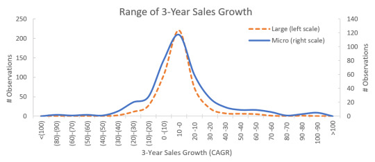
Notice the significantly fatter tails for micro cap relative to large stocks. If growth in sales is the most basic assessment of the state of a firm, this suggests much greater dispersion in the underlying metrics of micro caps. The popular rhetoric is often that small and micro cap stocks are junkier than their large cap counterparts. While this is true on average, a wide dispersion in fundamental metrics obscures many phenomenal businesses in meaningless averages.
A deeper dive reveals a disparate group of constantly evolving (and devolving) businesses
Investors have widely accepted that there exist many different types of private equity—angel investing, venture, early stage, late stage, mezzanine, LBO’s, distressed. Interestingly, in the private space, these labels represent the need of the firm receiving the investment. Just as there are many sub-classes of venture capital and private equity, such is the case with micro cap stocks, but for whatever reason, we do not view these businesses with the same categorical lens as we do private investments.
The micro cap universe can be divided into three broad categories: New Ventures that have become revenue generating within the last three years, distressed Fallen Angels that have descended into the micro cap universe from small cap—and sometimes large cap—and those in a Steady State that have been micro caps for at least three years.
From 1982-2016, new ventures represented 25% of the micro cap universe, while 16% were fallen angels, and 59% were steady state. Effectively, 41% of the universe is in some sort of transition—from startup to established firm, or from established firm to potential liquidation. When you think about micro cap, think of a revolving door where firms are constantly entering and leaving for different reasons.
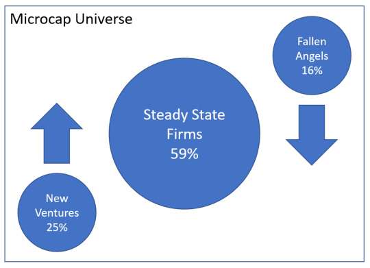
This simplistic perspective on the universe is relevant because it sheds light on the strong inherent biases that skew the underlying fundamental characteristics. Below is the same distribution of sales growth for micro cap broken down by these three categories.[2] These disparate groups possess fundamentally different metrics that when averaged together obscure a lot of noise in Micro cap stocks.
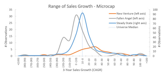
New Ventures, with their small sales bases are highly skewed towards positive sales growth. Unsurprisingly, new ventures tend to be comprised of Information Technology and Health Care stocks—most notably biotech, software and pharmaceuticals. Currently, these industries represent a rather large 20% of the micro cap universe. The average annualized return of this group from 1982-2016 is 4.7%, woefully short of the micro cap universe average of 8.9%. Adding insult to injury, annualized volatility for this group is 27.8%. This likely has to do with the nature of outcomes in the space. Biotech firms generally succeed or fail in what amounts to binary outcomes—leaving investors with staggering gains or maximum losses.
Steady State firms are more centered in the distribution, but still positively skewed. At 59% of the overall universe, a good proportion of steady state firms are Commercial Banks and Thrifts. These two industries represent 20% of the universe currently. Banks are the least volatile micro cap industry and one of the top performers. The remainder of firms in this category tend to be widely dispersed across industries. Steady state firms are the best performing of the three categories with an annualized return of 10.1% and volatility of 22.8%.
Fallen Angels skew significantly in the negative growth direction. This group is a smattering of firms across industries. Currently, the oil & gas industry has the highest representation in this category. It tends to offer representation of groups of stocks that suffered in the previous cyclical business downturn. This group delivered an annualized return of 8.0% from 1982-2016 with volatility of 27.4%.
Our task as factor investors is to develop empirical criteria that enable us to cut through the noise to separate the good from the bad within the space. Given the perspective above, we know that there are reasonable fundamental explanations for the “junk-ish” nature of micro cap stocks. Quite simply, a lot of micro cap stocks possess poor business characteristics, whether that be weak cash flow generation, too much leverage, or dwindling and unprofitable revenues. By categorically identifying and removing firms with poor characteristics, we can improve the investor’s base rate for success.
For the third installment on micro cap investing, I’ll suggest some screening criteria that will aid in parsing out some of the “junkiness” of microcaps. Surprisingly, eliminating low quality, puts risk-adjusted returns for micro caps on par with large stocks.
[1] This would be analogous to the approximately 2,600th to 4,000th stock using Russell’s ordinal market cap ranking methodology.
[2] An analysis on 3-year earnings growth yields similar patterns, though with greater noise.
2 notes
·
View notes
Text
The curious world of micro cap investing
I’ve recently been exploring the world of micro cap stock investing. You don’t hear much about this space except from the occasional banner ad promising a 10,000% return in a week by buying penny stocks. So I think micro cap gets a bad wrap. The truth is that you don’t hear about micro caps because the large fund and ETF providers generally shy away from the space. At just around $100 billion in total market cap, as opposed to over $20 Trillion for the rest of the market, it truly is a tiny corner of eclectic firms. Liquidity is low and transaction costs are high at scale. These things are anathema to product providers that are constantly seeking the next blockbuster hit ETF that can accommodate tens of billions in assets.
This is the first in a series on micro caps. When I began working at Western Asset in 2008, my then boss had me spend my first week studying the core bond benchmark, the Lehman (now Barclays) Aggregate–how it was constructed, what sectors existed, rules for inclusion, etc. As an active manager, we got paid to beat the benchmark, so understanding our bogey��s behavior was critically important. For the first installment, I dive into the Russell Microcap Index to understand it’s construction and behavior. The second part will leave the benchmark behind and think more fundamentally about what drives the opportunity set of microcap stocks. The thirdpart in the series will apply some fundamental criteria (factors) to control for the universe’s biases to drive (hopefully) outperformance. The final installment is a discussion of the real world application of the theory discussed in the first three installments, and an argument for the persistence of alpha in the space.
Enjoy, comment, send me feedback and questions!
—
Micro cap stocks represent a fraction of the total U.S. market—literally less than 1% of total capitalization. These stocks are under-covered, unloved, and under-owned. Since the late 1990’s, micro cap’s share of the total U.S. equity market has been cut in half—though it was small to begin with. A key culprit, the proliferation of passive and “Smart Beta” investment products has resulted in disproportionate flows into the large cap space, and therefore, away from small and micro cap stocks. Below is a chart of the share for large (market cap above average) and small (market cap below average) for the U.S. market. Large is dominating. This is the wealth effect in stocks. The big keep getting bigger.
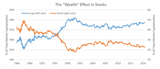
Though there are many unique considerations as it relates to liquidity and tradability at the smaller end of the market, as factor investors who constantly seek ways to tilt the probabilities of investment success the investor’s favor, we simply can’t look away from the opportunity that capacity constrained corners of the market—like micro cap—provide.
What is micro cap?
Russell defines the micro cap space using an ordinal ranking methodology. Whereas the Russell 1000® consists of the 1000 largest stocks in the U.S., the Russell 2000® contains those ranking from 1001 to 3000. The Russell Microcap® Index overlaps with the Russell 2000® in that it includes the 2,001st to 4,000th ranked stock. Russell has conveniently created some overlap to prevent index churn—buying and selling constituents frequently crossing over between index thresholds—because there tends to be a lot of movement in the ranking of stocks at the lower end of the market cap spectrum.
Since these indexes are market cap-weighted, owning the Russell Microcap index is nothing more than owning a small tail of the Russell 2000® plus a minor allocation to even smaller names. 88% of the Russell Microcap® Index overlaps with the Russell 2000®. The correlation of return between the two indexes is 0.96. (Yet, the relevant iShares Russell ETF (IWC) carries an expense ratio of 0.60%, 3x the fee of its Russell 2000 counterpart (IWD) costing just 0.20%.)
A similar picture emerges when reviewing the share of dollar volume in each index. The table below summarizes the allocation of the total U.S. market based on capitalization and dollar volume across the indexes.
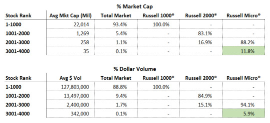
Notice that average dollar volume declines exponentially as you move away from large cap. Also, the small unique portion of the Russell Microcap® index (3,001-4,000), highlighted in green, represents half the dollar volume weight as it does the market cap weight. Low volumes in this corner of the market can lead to significant transaction costs if not managed appropriately. This suggests that the cost of exposure to that small tail is very expensive, and likely a drag on performance of the index. (We’ll review implementation costs in the fourth installment of this series.) Based on our own analysis, we found that applying a liquidity floor of $100 thousand-dollar average daily volume, inflation-adjusted, improved the index return by an annualized 0.8% from 1982-2016. That’s a huge gain over 35 years.
In current form, the index performance statistics for micro cap certainly do not drive a compelling narrative for adding an allocation to portfolios. The risk-return trade-off is poor enough that commonly used covariance optimization techniques in an institutional asset allocation study would suggest a 0% weighing to micro cap. In fact, most would suggest little or no weight to the small cap Russell 2000® as well. Given these results, its little wonder large cap stocks are all the rage.
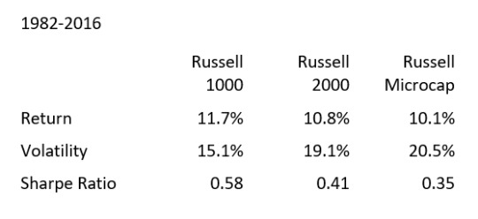
In the next post in this micro cap series, I’ll diverge from the Russell definition of micro to dive into the composition of micro cap stocks to it is widely perceived that micro caps are “junk” stocks.
2 notes
·
View notes
Text
Successful Active Stock Investing is Hard: Here are Seven Traits that I Believe are Required for Active Investors to Win in the Long Term
Years of experience have taught me that to be a successful active investor requires a very specific set of characteristics, and that many investors attempting to actively manage their portfolios today lack the emotional and personality traits necessary for success.
Investors with passive portfolios—assuming they are adequately and broadly diversified—face only one real point of failure: reacting emotionally to a market selloff and selling their holdings, often near a market bottom.
But investors who use actively managed strategies face two points of failure:
1. Reacting emotionally to a market selloff and liquidating their holdings, usually at the very worst time; and 2. Selling out of an active strategy that is doing worse than its benchmark, often over periods as little as three years.
The second point of failure occurs even if the investor has earned positive returns in the active strategy—let’s say a gain of 10% per year over the last three years versus a benchmark return of 12%. While all investors face the same point of failure when selling during market swoons, only active investors face the second pitfall. What’s more, research has shown that managers who are fired due to a three-year underperformance typically go on to outperform the manager with which the investor replaces them.
Obviously, this second point of failure can destroy long-term results, even if the general market has been performing well. Sadly, I have seen this type of behavior often, leading me to conclude that for many investors, active management will never work because they lack the emotional and philological traits required to succeed.
Now, let’s look at seven traits that I think are necessary to be a successful long-term active investor.
1. Successful Active Investors Have A Long-Term Perspective on Their Investments.
“Having, and sticking to a true long term perspective is the closest you can come to possessing an investing super power.”
~ Tweet from Cliff Asness, Co-Founder AQR Capital Management
Cliff is right, but, sadly, most investors lack this ability. Evolution has programmed us to pay far more attention to what is happening now than to what might happen in ten or twenty years. For our ancient ancestors, that made a great deal of sense. Those who reacted quickly to rustling in a nearby bush—assuming it was a predator who could kill them–ran away and survived, whereas those who didn’t were often killed. Guess whose genes got passed down to us? Of course it was those that ran, even if there was no fatal threat.
Our culture has evolved much more rapidly than our brains, which doesn’t help us keep a long-term perspective on our investments. When you time-weight short-term information for investment decisions, you create a reactionary model, not an anticipatory one.
Many behaviors that hobble making good investment choices seem to be encoded into our genes. In their paper Why do Individuals Exhibit Investment Biases?, researchers Henrik Cronqvist and Stephan Siegel write:
“We find that a long list of investment biases—e.g., the reluctance to realize losses, performance chasing, and the home bias—are human, in the sense that we are born with them. Genetic factors explain up to 45% of these variation in those biases across individuals. We find no evidence that education is a significant moderator of genetic investment behavior.”
Wow! It’s no wonder that the majority of investors succumb to short-term volatility in the market by selling and waiting until markets have been very strong to begin buying, even though more than 30 years of studies have proven this is exactly the wrong thing to do. It’s literally programmed into our genes and is impervious to education. We are also prone to a slew of cogitative biases, from overconfidence in our own abilities to our tendency to overweight things simply based upon how easily they are recalled. And knowing about our biases of judgment—something that has been noted in market research for more than 30 years—hardly eliminates them.
Successful active investing runs contrary to human nature. It’s encoded in our genes to overweight short-term events, to let emotions dictate decisions and to approach investing with no underlying cohesiveness or consistency. Successful active investors do not comply with nature; they defy it. The past, present and future make up their now. It’s not natural to watch others get caught up in spirals of greed and fear, causing booms and panics, and remain unmoved. It’s not natural to remain unemotional when short-term chaos threatens your nest egg. And, leading to my next required trait, it’s not natural to persevere in a rigorous, consistent manner—no matter what the market is doing.
2. Successful Active Investors Value Process over Outcome.
“If you can’t describe what you are doing as a process, you don’t know what you’re doing.”
~W. Edwards Deming
The vast majority of investors make investment choices based upon the past performance of a manager or investment strategy. So much so that SEC Rule 156 requires all money managers to include the disclosure that “past performance is not indicative of future results.” It’s ubiquitous–and routinely ignored by both managers and their clients. In keeping with human nature, we just can’t help ourselves when confronted with great or lousy recent performance. “What’s his/her track record?” is probably investors’ most frequently asked question when considering a fund or investment strategy. And, as mentioned above, the vast majority of investors are most concerned with how an investment did over the last one- or three-year period.
Yet successful active investors go further and ask “what’s his or her process in making investment decisions?” Outcomes are important, but it’s much more important to study and understand the underlying process that led to the outcome, be it good or bad. If you only focus on outcomes, you have no idea if the process that generated it is superior or inferior. This leads to performance chasing and relying far too much on recent outcomes to be of any practical use. Indeed, shorter-term performance can be positively misleading.
Look at a simple and intuitive strategy of buying the 50 stocks with the best annual sales gains. Consider this not in the abstract, but in the context of what had happened in the previous five years:
Year Annual Return S&P 500 return
Year one 7.90% 16.48%
Year two 32.20% 12.45%
Year three -5.95% -10.06%
Year four 107.37% 23.98%
Year five 20.37% 11.06%
Five-year
Average Annual
Return 27.34% 10.16%
$10,000 invested in the strategy grew to $33,482, dwarfing the same investment in the S&P 500, which grew to $16,220. The three-year return (which is the metric that almost all investors look at when deciding if they want to invest or not) was even more compelling, with the strategy returning an average annual return of 32.90% compared to just 7.39% for the S&P 500.
Also consider that these returns would not appear in a vacuum—if it was a mutual fund it would probably have a five star Morningstar rating, it would likely be featured in business news stories quite favorably and the long-term “proof” of the last five years would say that this intuitive strategy made a great deal of sense and therefore attract a lot of investors.
Here’s the catch—the returns are for the period from 1964 through 1968, when, much like the late 1990s, speculative stocks soared. Investors without access to the historical results for this investment strategy would not have the perspective that the long term outlook reveals, and thus might have been tempted to invest in this strategy right before it went on to crash and burn. As the data from What Works on Wall Street make plain, over the very long term, this is a horrible strategy that returns less than U.S. T-bills over the long-term.
Had an investor had access to long-term returns, he or she would have seen that buying stocks based just on their annual growth of sales was a horrible way to invest—the strategy returned just 3.88 percent per year between 1964 and 2009! $10,000 invested in the 50 stocks from All Stocks with the best annual sales growth grew to just $57,631 at the end of 2009, whereas the same $10,000 invested in U.S. T-Bills compounded at 5.57 percent per year, turning $10,0000 into $120,778. In contrast, if the investor had simply put the money in an index like the S&P 500, the $10,000 would have earned 9.46 percent per year, with the $10,000 growing to $639,144! What the investor would have missed during the phase of exciting performance for this strategy is that valuation matters, and it matters a lot. What investors missed was that these types of stocks usually are very expensive, and very expensive stocks rarely make good on the promise of their sky-high valuations.
Thus, when evaluating an underlying process, it’s important to decide if it makes sense. The best way to do that is to look at how the process has fared over long periods of time. This allows you to better estimate whether the short-term results are due to luck or skill. We like to look at strategies rolling base rates—this creates a “movie” as opposed to a “snapshot” of how strategies perform in a variety of market environments.
Lest you think you can only do this with quantitative strategies that can be back tested, consider Warren Buffett’s results at Berkshire Hathaway. If you were making a choice about whether to invest in Berkshire stock using short-term results at the end of 1999, you probably would have passed, as over the previous three years, it underperformed the S&P 500 by 7.6% per year, and over the previous five years, by 3.76% per year. Indeed, your decision would have been reinforced by the news stories circulating that Buffett’s simple process no longer worked in the tech-dominated “new normal” for the stock market.
But if you checked on Buffett’s process, you would find that nothing had changed and that he still followed the stringent criteria he always had, generally looking for stocks with:
1. Recognizable brands with a wide moat; 2. Simple, easy to understand products and services; 3. Consistent, solid earnings over a long time period; 4. Low and manageable debt, and 5. Good ROE and other solid ratios.
These seem like sensible ways to buy stocks, and Buffett showed no signs of deviating from the strategy—he was (and is) patient and persistent, sticking with a proven strategy even when it isn’t working in the short-term. Now take a look at Buffett’s base rates from 1977 through 2016, Using Berkshire Class A stock:
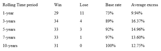
These base rates are very similar to investing in the 10% of stocks that are cheapest based upon our value composite 1 from What Works on Wall Street, which ranks stocks on:
1. Price-to-book; 2. PE; 3. Price-to-sales; 4. EBITDA-to-enterprise value; and 5. Price-to-cash flow.
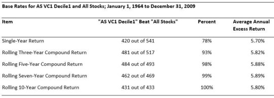
This process always focuses on the cheapest stocks in the universe and makes a great deal of intuitive sense, which is backed up by the process and its performance over time.
3. Successful Active Investors Generally Ignore Forecasts and Predictions.
“I don’t let people do projections for me because I don’t like throwing up on the desk.”
~Charlie Munger
“I have no use whatsoever for projections or forecasts. They create an illusion of apparent precision. The more meticulous they are, the more concerned you should be.”
~Warren Buffett
You can’t turn on business TV or read all of the various business news outlets or even talk with other investors without being bombarded with both short- and long-term forecasts and predictions. Against all the evidence, forecasts and predictions about what might happen in the future are intuitively attractive to us, since we are desperate to have a narrative about how the future might unfold. As I mentioned above, we tend to extrapolate what has happened recently well into the future, which almost never works. We’ll explore the results of this in a minute, but for now, consider that since we literally hear or read so many forecasts about markets, stocks, commodity prices, etc. that to follow up on the efficacy of each would be a full-time job. Lucky for us, others have done this job for us, and the results are grim. In a post at his website The Investor’s Field Guide, my son and fellow OSAM portfolio manager, Patrick O’Shaughnessy, highlighted a study that showed:
“The CXO Advisory group gathered 6,582 (investment) predictions from 68 different investing gurus made between 1998 and 2012, and tracked the results of those predictions. There were some very well-known names in the sample, but the average guru accuracy was just 47%–worse than a coin toss. Of the 68 gurus, 42 had accuracy scores below 50%.”
In his book Contrarian Investment Strategies: The Psychological Edge, money manager and author David Dreman looked at the accuracy of analysts’ and economists’ earnings growth estimates for the S&P 500 between 1988 and 2006. Dreman found that the average annual percentage error was 81% for analysts and 53% for economists! In other words, you might as well have bet on a monkey flipping coins.
People tend to take recent events and forecast similar returns into the future. Dreman nicely captures the results by looking at large international conferences of institutional investors where hundreds of delegates were polled about what stocks they thought would do well in the next year. Starting in 1968 and continuing through 1999, Dreman found that the stocks mentioned as favorites and expected to perform well tended to significantly underperform the market, and in many instances the stocks selected ended up in the stock market’s rogue’s gallery—for example, the top pick in 1999 was Enron, and we all know what happened there: one of the largest bankruptcies in corporate history. Least it seem like he was cherry-picking, Dreman looked at 52 surveys of how the favorite stocks of large numbers of professional investors fared between 1929 and 1980, with 18 studies including five or more stocks that experts picked as their favorites. The results? The 18 portfolios underperformed the market on 16 occasions. As Dreman dryly notes: “This meant, in effect, that when a client received professional advice about those stocks, they would underperform the market almost nine times out of ten.”
If you think this is outdated, here are some more famously wrong forecasts, as well as the results of an August, 2000 Fortune Magazine article called “10 Stocks To Last The Decade: A few trends that will likely shape the next ten years. Here’s a buy-and-forget portfolio to capitalize on them.” The results? As of December 31st, 2016 the 10 (or 8, since Nortel and Enron went bankrupt) were down 27%, versus a gain for the S&P 500 of 116%.
Finally, many studies have shown that this is true in almost all forecasts, be they about stock prices, patients needing medical treatment, college admissions offices trying to pick who to admit–and virtually every other industry where professionals were making predictions and forecasts. For more on this, check out Chapter Two of my book, What Works on Wall Street.
4. Successful Active Investors are Patient and Persistent.
“Nothing in this world can take the place of persistence. Talent will not: nothing is more common than unsuccessful men with great talent. Genius will not: unrewarded genius is almost a proverb. Education will not: the world is full of educated derelicts. Persistence and determination alone are omnipotent.”
~Calvin Coolidge
In addition to having a well thought out process, great active investors are patient and persistent. Warren Buffett, Ben Graham, Peter Lynch, John Neff and Joel Greenblatt are all great investors, and while they have very different ways of looking at the stock market, they all share a common disposition—they are patient and persistent. In 1999, numerous articles and TV features suggested that while Warren Buffett might have been great in the old economy, he was well past his prime and was out of step with the “new” market reality. Buffett’s response? He noted that nothing had changed and that he would stand pat with the process that had served him so well for so long.
The same could be said for every investor on this list. John Neff, a great value investor who helmed Vanguard’s Windsor fund and over his 31 year tenure beat the S&P 500 by 3.1% per year. In the early 1990’s, I remember the cover of Institutional Investor magazine showing a man inside an hourglass where the sand had nearly dropped through to the other side with the question: “Is value investing dead?” Neff, who favored stocks with low PE ratios and high dividend yields and good return on equity and who had therefore had been underperforming over the short-term, did the same as Buffett, he patiently stuck with his process focusing on cheap stocks with superior yields and high ROE. He went on to deliver great returns for his investors.
The point is clear: successful active investors are not simply defined by their process, as many have very different approaches and processes that they follow, but rather by their diligence and persistence in sticking with their strategies even when they are underperforming their benchmarks. But all of these investors are also defined by the clarity of their process.
John P. Reese and Jack M. Forehand wrote a book called The Guru Investor: How To Beat The Market Using History’s Best Investment Strategies, in which they methodically create checklists investors can follow to emulate their favorite manager. Now, while their interpretation of the manager’s criteria is open to debate, they do a good job of creating checklists for the investors they attempt to duplicate, usually using either books or statements from the manager to generate their criteria. They also maintain a website, www.validea.com, detailing the performance and current stock picks from each of the manager’s they follow. For example, much like the list of criteria already covered for Buffett, here’s their process to emulate Ben Graham:
1. No technology companies, company must have high sales; 2. Current ratio of at least 2.0; 3. Long-term debt does not exceed net current assets; 4. Steady EPS growth over the past decade; 5. 3-year average PE is less than 15; 6. Price-to-book times PE is less than 22; 7. Continuous dividend payments.
According to their website, since 2003, applying these criteria to select stocks has returned a cumulative gain of 377%, outperforming the market by 248%! You can see how other managers performed at their website. Note, they subtly anchor you on the long-term by presenting the cumulative return over the last 13 years, thus reinforcing the idea that you should only judge active performance over very long periods of time.
Had you only been looking at the recent performance for the strategy, you would have been led to a very different conclusion—in 2014, the strategy lost 22.9% versus a gain of 11.4% for the S&P 500 and in 2015 it also lost 20.4% versus a slight loss of 0.7% for the S&P 500. Had you started using the strategy at the start of 2014, your account would show a cumulative loss of 39% at the end of 2015 versus a gain of 10.62% for the S&P 500–do you think you would have had the patience, persistence and emotional fortitude to stick with it? For the vast majority, the answer is no. For successful active investors, the answer is yes. Patience and persistence would have paid off in 2016, with a gain of 20% versus a gain of 9.5% for the S&P 500. More importantly, keeping the long-term track record in mind would have immensely helped an active manager or investor to stay the course.
5. Successful Active Investors Have a Strong Mental Attitude.
“Nothing can stop the man with the right mental attitude from achieving his goal; nothing on earth can help the man with the wrong mental attitude.”
~Thomas Jefferson
Ben Graham believed that great investors are made, not born. It takes constant study, learning from both your own experience and that of others to create habits that lead to success. I believe that one of the habits that is not innate but learned is a strong mental attitude. I think that most successful active managers not only have strong mental attitudes, but many border on stoicism. Stoics taught that emotions resulted in errors of judgment and they thought that the best indication of someone’s philosophy was not what a person said, but how they behaved. In the words of Epictetus, “It’s not what happens to you, but how you react that matters.”
Successful active investors understand, as Napoleon Hill stated, “The only thing you control is your mind.” Practically, this means that you do not base your actions, feelings, emotions and thoughts on external events—good or bad—or on what other people are doing or saying, none of which are in your control, but rather on your own actions, beliefs and habits, all of which are in your control.
Successful active investors do not blame others or events; they do not shirk from their personal responsibility for how things turn out, but rather continually focus on their process and trying to improve it. They learn from every lesson, be it good or bad, and continually strive to incorporate that learning into their process. Above all, they understand that you must control your emotions rather than let them control you.
They understand, as Shakespeare famously said, “there is nothing either good or bad, but thinking makes it so.” Events very much depend upon how you interpret them. What might cause one person to react emotionally to something is treated as a learning experience by someone with a strong mental attitude. I think that this is a disposition that is learned and rarely innate. It is very helpful on the journey to becoming a successful active manager to keep a journal of how you reacted to various events and outcomes. This allows you to learn if there is a common thread that keeps you from succeeding. If so, you can then actively work to replace those behaviors.
By doing so, you reinforce the belief that the only one controlling your mind is you, which strengthens the synaptic connections in your brain that allow you to make this type of thinking more natural. Once accomplished, your thought patterns and mental attitudes become vastly more useful than reacting from base emotions such as fear, greed, envy and hope. Once habituated, this mindset frees you to persistently follow your process, even when it is not working in the short-term. Ralph Waldo Emerson said, “To map out a course of action and follow it to the end requires courage.” And, I would add, a strong mental attitude.
6. Successful Active Investors Think in Terms of Probabilities
“You don’t want to believe in luck, you want to believe in odds.”
~Charlie Munger
We are deterministic thinkers living in a probabilistic world. We crave certainty about how things will unfold. This is precisely why we fall for predictions and forecasts. Yet, even in the most prosaic of circumstances, nothing in the stock market—or in life—is 100% certain. But many people confuse possibility with probability and the two are almost exact opposites. Think of Jim Carrey’s “Dumb and Dumber” character Lloyd Christmas reacting to the unobtainable Mary Swanson’s rejection of his romantic advances; she told him his chances were “like one out of a million” and he responded: “So you’re telling me there’s a chance. YEAH!” Poor Lloyd mistook possibility with probability. And didn’t understand that the probability of he and Mary hooking up was virtually zero.
If we focus on “possibilities” rather than “probabilities,” we are lost. Almost anything is possible, even when highly improbable. If we think only of possibilities, it would be hard getting out of bed in the morning. It’s possible that you will get hit by a bus, get accosted by a stranger, get killed by a crashing plane or, more brightly, win the lottery, despite the very low probability of any of these events occurring. Focusing on possibilities can lead us to a state of constant fear—thus our desire for orderly, known and “certain” information and actions.
Life doesn’t work that way. According to Richard Peterson’s Inside the Investor’s Brain, “When an outcome is possible but not probable, people tend to overestimate its chances of occurring. This is called the possibility effect…Emotions in uncertain or risky situations are more sensitive to the possibility rather than the probability of strong consequences, contributing to the overweighting of very small probabilities.”
The best real world example of people thinking in terms of possibilities rather than probabilities was during the financial crisis—people actually sold out of all their long-term investments and I know of at least two who put large sums of cash into their safety deposit boxes. They were most certainly thinking of possibilities rather than probabilities.
A study we conducted in 2009 looked at the 50 worst ten-year returns for the US market since 1871 and found that the ten-years ending February 2009 was the second worst in more than 100 years. But more importantly, we looked at what happened after those horrible periods, and found that the 50 returns over the next three to ten years were all positive. This led us to conclude that the probabilities were quite high for the market to do well in the ten years after February 2009.
To succeed, it’s best to know the probabilities of a certain outcome, and then act accordingly. Knowing the probabilities gives you a strong edge over people who don’t know them or choose to ignore them. If you, like legendary card player and investor Ed Thorp, can count cards in blackjack so that you know the probabilities of what the next card is likely to be, you have an enormous edge. The same holds true for any number of professions: life insurance companies use actuarial tables to predict the probability of someone dying; casinos use probabilities that allow the house to always win in the end and colleges and universities rely on educational tests to determine who gets a spot at their institution.
In the stock market, I believe the best way forward is to look at the long-term results for an investment strategy and how often—and by what magnitude—it beat its underlying benchmark. For example, the table below (from the 4th edition of What Works on Wall Street) illustrates the results of simply buying the 10% of large stocks with the highest shareholder yield (dividend yield plus net buy backs) between 1927 and 2009.
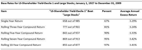
You can see that over all rolling 3-year periods, that group beats other large stocks 81% of the time by an average 3.24% per year. When you extend it to all rolling 10-year periods, the base rate increases to 97%. Now, if you think about this, the base rate offers us an 80% chance of winning over any three-year period, but it also informs us that we have a 20% chance of losing to the benchmark over any 3-year period.
But very few investors pay much attention to base rates, and study after study has shown that when you introduce any information in addition to the base rate, people usually ignore the base rate in favor of the often-useless anecdotal information. Even though the rational thing to do is bet with the base rate and accept that we will not always be right, we are forever rejecting the long-term evidence in favor of the short-term hunch, even though our probability of being correct plummets.
We also ignore probabilities when we enthusiastically buy a story stock that is incredibly expensive—the 3-year base rates for buying stocks with the highest PE ratios is just 20%, meaning you will lose in 8 of 10 of all rolling 3-year periods.
The bottom line? Knowing the past odds of how often and by what magnitude a strategy either outperforms or underperforms its benchmark gives you an incredible edge that many people ignore. Successful active investors know this and pay close attention to this information, thereby putting the probabilities on their side.
7. Successful Active Investors are Highly Disciplined
“Discipline is the bridge between goals and accomplishment.”
~Jim Rohn
It is easy to say is that you are an unemotional, disciplined investor—right up until the market goes against you and you throw in the towel. Did you sell the majority of your equity holdings during the financial crisis? Did you enthusiastically buy tech stocks in 1999? Did you ever let a prediction or a forecast influence your dealings in the market? Do you blame events or other people for what happened with your investments? Did you ever ignore all of the evidence and probabilities and “take a flyer” on a stock or a fund? Did you ever invest in something because the majority of other investors were doing so? Did you ever abandon a well-tested and thought out investment strategy because it recently had been doing poorly? If you answered yes to several of these questions, congratulations, you are a normal human being, but you may lack the discipline required to succeed as an active investor.
Being highly disciplined is extremely difficult. It goes against almost every impulse we have baked into our genes. Sure, it’s easy to be disciplined when things are going your way. When you are significantly outperforming your benchmark, your mantra might be the song “The future’s so bright, I’ve got to wear shades.” Real discipline kicks in when things are going against you, sometimes significantly. When every week seems like a month, when you are filled with self-doubt and constantly questioning every single part of your investment process, when others express skepticism about your core beliefs, and even friends and colleagues begin to doubt you and your process, that’s when discipline is required.
And, boy, does your mantra change, perhaps to the song “Been down so damn long that it looks like up to me.” You know what it’s like to feel horrible about yourself and your ideas, and you suddenly really understand the opening of Shakespeare’s 29th sonnet “When, in disgrace with fortune and men’s eyes, I all alone beweep my outcast state, and trouble deaf heaven with my bootless cries, and look upon myself and curse my fate…” That’s when you really need discipline if you are to succeed.
And, like most things in life, that is precisely the moment when you want to shout: Stop! Every event and news item you see is the opposite of what you believe, and your emotions and intellect shout: Stop! And every single thing you read or hear people say remind you that you are wrong, that you must abandon your silly persistence and allow this pain to stop. Just let it stop. The emotional pain is so overwhelming that it feels like slow torture, day in and day out, and all you need do to make the pain go away is to abandon your silly process and allow yourself to breathe.
And if you continue to stick with it, even when every single thing conspires to dissuade you from your consistent application of your investment ideas and principles, you’ll also know that you may be wrong for a lot longer than you think you can endure. What’s worse, you won’t have to just put up with your interior fear, doubts and pain, you will often be derided, mocked, and ridiculed by many other people who think you’re simply a fool. All of the recent weight of the evidence will be on their side. Not only that, but experience teaches that they don’t come alone, they come in crowds. The criticism can be deafening, snide and cruel and this can be devastating to your psyche. According to a March 22, 2012 article in Psychology Today magazine listed “The (Only) 5 Fears we all Share”:
1. Extinction; 2. Mutilation; 3. Loss of Autonomy; 4. Separation and 5. Ego-death.
Each of these also plays a part in feeding your self-doubt and desire to abandon your discipline, but 3, 4 and 5 are the ones that are the cruelest in this instance because they feed everything you are feeling. Loss of autonomy is the feeling of “being controlled by circumstances beyond our control.” Separation is the feeling of “rejection, (and) not (being) respected or valued by anyone else.” And ego-death is “fear of humiliation, shame…or the shattering…of one’s constructed sense…of capability and worthiness.”
The only thing you can do is hang on to the idea that “this too, shall pass.” Not much of a lifeline, is it? I go on at length about this because I have been there more times than I care to remember. Indeed, absent discipline, all of the other six emotional and psychological traits that are pitfalls to successful active investing are worthless. And the question you must answer honestly is—in the throes of underperformance or rocky market conditions, do you really have the discipline to remain unemotional and stick to your plan? According to a recent post by Ben Carlson discussing Charlie Munger’s ability to withstand drawdowns, he wrote: “Many people simply weren’t born with the correct wiring to be so unemotional…The ability and willingness to take risk are not always equal for most investors. Charlie Munger is a one-of-kind. It’s good for investors to remind themselves of this when trying to emulate him. Very few can.”
I believe that if you possess these seven traits and can really enforce a disciplined commitment to them, over time, you can do significantly better than passively indexing your portfolio. But as Ben points out, very few can.
If you are one of the few, I think our current environment and the rush of investors into passive products will only increase your chance of doing much better than an index, but you must be brutally honest with yourself. Keep a detailed journal of all of your investments and note when you succeed and when you fail. Then work on your weak points until they are gone. If you can manage this, you will become a member of a shrinking, and yet potentially lucrative club, that of long-term, active investors.
17 notes
·
View notes
Text
The True Cost of Indexing
"And in the naked light I saw Ten thousand people, maybe more People talking without speaking, People hearing without listening..."
Anyone in the investment industry not living under a rock has read about, investigated, or had an intense conversation with a client about the merits of passive exposures in investment portfolios. The popular pitch is that widely-owned portions of the market, most notably U.S. large cap equity, are efficient. It continues that investment managers cannot outperform the benchmark consistently over time in an efficient market. This is the "Theory of Efficiency". The cacophony of articles on this topic is both silent and deafening. Most include little proof for their assertions of efficiency and parrot a conglomeration of statements parsed from other articles. As a result, hundreds of billions of dollars have been passively invested.
I believe that the cost to long-term investors for indexing portfolios is staggering. First, let's quit beating around the bush and recognize passive investing for what it is, low cost market exposure. For investors without access to high quality investment managers, this very well may be the best option. I contend, however, that U.S. large cap equity is not efficient, which is to suggest that the decision to invest passively due to the theory of efficiency is based on a faulty premise. Many investors conflate the "theory of efficiency" with the "law of averages", a more realistic explanation for the poor performance of investment managers.
Let me explain.
Football, bookies, and investment managers have more in common than you think
Just as not every team in the NFL can win the Super Bowl, win a conference championship, or make it to the playoffs, most investment managers will fail to deliver on their promise to outperform the market, or their stated objectives. This has always been the case in the past and will continue to be in the future in both arenas.
In fact, in aggregate, the record of all NFL teams for all time is 50%. No complicated mathematical pyrotechnics needed because we know that for every game, there is a winner and a loser (omitting ties). If you were a gambler and you devised the gambling equivalent of indexing, your ingenious plan would be to bet on all teams for every game. over time, your expected return on even-money odds would be... exactly $0. Ever wondered how you can place gambling bets without paying a transaction fee? Any half-witted bookie knows he wants to make a spread on those bets, so he adjusts the odds on each bet out of your favor. Think of this as the "transaction fee" for placing a bet. So what is our hypothetical gambler left with over time, $0 in winnings minus the bookie's spread. Sound familiar!?!
If you don't watch Comedians in Cars Getting Coffee, you should. This gem of an episode with Chris Rock contains one of my favorite quotes of all time: "There's math and then everything else is debatable." Mathematically, before fees, half of managers will outperform, and half will underperform. Yes, there are other market participants, like individual investors, but their share of the market has steadily declined over time. Institutional investors owned 73% of the equity market in 2009. With the proliferation of ETFs since then, I would bet (with the right odds of course) that it's now higher.
For every stock transaction, there is a buyer and a seller. Absent new stock issuance or redemption, this is a closed system. Taking fees and market frictions into account, more than half of active managers will underperform over the long term. This is the law of averages. In aggregate, investment managers will deliver the market return less their aggregate costs, just as our gambler did.
The law of averages is NOT a justification of market efficiency.
I enter into evidence the below substantiating my argument that U.S. large cap equity is not an efficient market. It demonstrates that multiple persistent biases exist that investment managers can take advantage of to generate outperformance.
I purposefully ran the analysis below on an equal-weighted universe of U.S. large stocks (the "market") to allay the naysayers who so ardently argue U.S. large cap represents an efficient space.
The average number of names in this market universe over the last 10 years was 404. Think S&P 500 Index, but only the largest 400 stocks instead of 500. Over the last 10 years, the average market cap of this universe was $31.4 billion. More importantly, average daily volume was $240.8 million per stock. In other words, there is lots of capacity and plenty of liquidity to transact in size.
This is a study from 1964-2016 which sorts stocks into portfolios based on three investment themes--Value, Momentum, and Shareholder Yield--from most to least advantageous. it rebalances the portfolios on a rolling annual basis. For those not familiar, Shareholder Yield is a metric which measures the shareholder orientation of a company by including share buybacks alongside the dividend yield calculation.
As can plainly be seen on the left side of the chart, the top portfolios of Value, Momentum, and Shareholder Yield (portfolio 1) outperform the market by 4.1%, 2.8%, and 3.3% annualized. On the right side of the chart, the worst portfolios of Value, Momentum, and Shareholder Yield (portfolio 10) underperform by 7.0%, 5.6%, and 5.1% annualized. There is a gaping wide return differential of 11.1%, 8.3%, and 8.4% between the highest and lowest portfolios based on these themes. This is particularly astonishing in that the return of the overall market is 11.7%, which is to say that the differential in performance between cheap and expensive stocks is almost as wide as the return of the market itself! (See the appendix for regression results substantiating the robustness of these factors). Further, if we dive into the above, we find that in the 600 three-year periods (rolled monthly) within this five decade analysis, portfolio 1 of the factor-themes outperform the market, 80%, 86%, and 71% of the time for Value, Momentum and Shareholder Yield, respectively. (For reference, the Pats record under Brady's reign is "just" a 74% win rate.)
To put all of this into context, the difference in the final value of a $100,000 investment over the course of this 53 year period is absolutely staggering--excluding fees, costs and taxes.
Said another way, the cost of indexing, which seems like a bargain based on fees alone, is to forgo millions of dollars in potential future investment gains. Let's now take a look at a more realistic analysis that includes some realistic market frictions like management fees, taxes, and transaction costs.
The true cost of indexing
Over multiple decades, the cost of passively investing becomes multiples of reasonable active manager fees. To make this simulation a little bit more realistic, because costs are real, I tack on a .05% annual fee for the indexed market portfolio and a 1.0% "management" fee to the factor-themed portfolios. I also deduct another 0.5% to simulate market impact costs of trading the factor-themed portfolios. All in, that's a 1.45% annual cost advantage to the indexed portfolio. But, there's more. I assume the factor portfolios turn over 50% per year and are taxed annually at the 20% long-term capital gains rate. The index portfolio is allowed to compound tax free with no turnover. A 20% capital gains tax is then applied to the index portfolio at the end of the 53 year period.
Under this scenario, the approximate cost of indexing to an otherwise disciplined value-oriented investor putting $100,000 to work is $85.5 million after 5 decades.
How can a market with multiple persistent biases be truly efficient!?! Let us not conflate the theory of efficiency with the law of averages as a justification for going passive. At the end of the day, let's call passive investing what it is...low cost exposure to the equity market. There is absolutely nothing wrong with allocating a portfolio to passive investments. I have suggested passive investments to people multiple times, but only when they do not have access to high quality investment managers.
As the law of averages suggests, an investor cannot just plow money into any active manager, because more than half of them will underperform over time. Finding good active investment managers is hard, really hard, but they do exist. The rewards for finding them are huge, because U.S. large cap equity is not efficient, and passive investors are leaving a lot of money on the table.
"...People writing songs that voices never share And no one dared Disturb the sound of silence" -- The Sound of Silence - Simon & Garfunkel
-----
Appendix:
To demonstrate how robust these results are, a statistical test of significance for portfolio 1 of the Shareholder Yield theme is significant at the 99.99999999999999999999999% confidence level. Yes that's 23 digits to the right of 0. In other words, there is a 0.00000000000000000000001% chance the test is wrong and these results are random. Below are the summary regression results:
Using Value as an example of the interpretation, the Value portfolio 1 has a Beta to the market of 0.92 over the test, and expected alpha (similar, but not exactly the same as excess return) of 0.08% per month. That doesn't seem like a lot, but it compounds over many years to drive the results in the cost of indexing tables above.
2 notes
·
View notes