
Don't wanna be here? Send us removal request.
Statistics
We looked inside some of the posts by grad603-kaynetic and here's what we found interesting.
Average Info
Notes Per Post
0
Likes Per Post
0
Reblog Per Post
0
Reply Per Post
0
Time Between Posts
14 hours
Number of Posts By Type
Text
12
Photo
2
Video
3
Last Seen Tumblr Blogs


Fun Fact
Tumblr has 411 employees.
Text
Rationale
Weeks 6-12 - Kinetic Type Animation
Animation is quite a tricky and difficult skill to perfect. I have dabbled in it only once before for a previous course. only learnt animation through Adobe Photoshop until this course, so switching over to After Effects, I had a little bit of previous knowledge on the basics. This was still a big challenge however. Animation is not something I consider my self good at, but the guidance and skills that I’ve learnt through Grad603 have shown me that I will be able to improve even further and possibly become a great typographic animator. I am not at a professional level yet, but I learnt how to create a good typographic animation. This is a very useful to skill to have and is sought after in the work industry.
For the project, I struggled a lot to relate the effects and transitions to the speech. I have a few areas to work on such as dwell times, jitters, and lagging between frames or movements. The application After Effects was a little tricky to get used to, but once I understood the basics tools of importing and creating transitions it was very helpful to animate with. I learnt many skills like how to use the effects that are offered. Receiving feedback and outside constructive criticism also helped me to continue and stay motivated when constructing the animation. It pushed me in the right direction and showed where the flaws or improvements can be adjusted.
The Animation
The speech is a snippet from parliament by Chlòe Swarbrick. I selected a simple but friendly typeface to portray Swarbricks personality, but also represent the serious location that it is in. The colours were inspired by the topic and background of the speech. They are talking about climate change, younger generations, and making a remark at a fellow parliament member. Brighter shades of colour in green and orange are best to portray this because of their associations with younger people and climate change. Orange can also be used as a warning colour, which suits the speech because it is trying to warn people of what is coming. I wanted to create the transitions each in a different way to create a interesting animation, and not a boring video of just the same thing over and over. The animation movements are simple but all different, so you never know what is coming, much like the speech.
0 notes
Text
Final Animation
Info – Full HD 25fps, 1920 x 1080 pixels, 46 Seconds, 5.3mb.
The final video is ready for submission and has been published using Adobe Media Encoder to reduce file size and create an mpeg-4 format.
I am quite happy with the outcome and think that for a beginner animator this is quite good. The flow is overall quite good, the dwell times are similar enough and match with the speakers voice. It doesn't feel like anything is lagging behind when she talks. There are a few places where it feels slightly too fast, but I am unable to make the text dwell longer because then it stays over into the next sentence or frame and overlaps too much. This creates a confusing and chaotic video so I compromised and left the text in the faster flow.
The colours have been selected to represent urgency, and climate change topics. Greens are commonly associated with Climate Change or global issues similar. It is also the same colour as the party that Chlöe Swarbrick was from when the speech was given. The orange comes in at a later stage to help the impact of a scene, and to match the tone change.
There are definitely things that can improve, but more practice and knowledge in this area is needed for me to have more professional animations.
0 notes
Text
Guana Typeface - Full Animation
Testing the full animation with this typeface and fixed the spacing between sentences on the orange background.
Insert more text
Next Steps
Make the frames flow better, some are jittery or laggy. Add sound effects for impact.
Add to references if necessary
Proofread for typos, and issues.
Finalise Animation
Write a rationale for Tumblr
Submit and upload everything
0 notes
Text
Guanabara Typeface Test
This typeface I tested with italic and bold version. The italic appearance is a bit too fancy and elegant for the speech, but the bold version has potential.
0 notes
Text
Motiva Typeface Test
Testing a different typeface. I think this typeface works a bit better because of its friendly qualities but still simple and clean features.
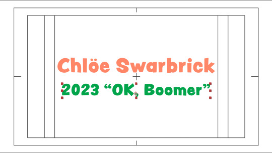
It gets Swarbricks persona across, and the overall tone quite well. It also works for the serious parts in full cap.
I have left the cheeky comment "OK Boomer" in a different font because I think it was a less formal and slightly immature remark to make, so the typeface staying the same for that suits the tone.
0 notes
Text
Vinila Typeface Test
I am testing out some new typefaces before deciding on the final one.
I definitly think a sans serif typeface suits the animation better than the comic and childlike peachy keen from before, but this one feels a bit weird. The cutouts that this typeface features in the corners and crevices feels like reflections from a light behind or something similar, which doesn't really make sense for the animation.
0 notes
Photo


The Search Continues - Typefaces
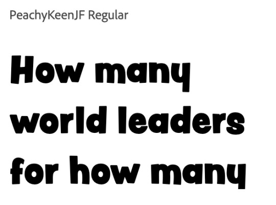
The current typeface Peachy Keen TF, is too childlike for a political speech and for Swarbrick. Something inspiring and young, but not too young is needed. I have gone through a couple of web pages for typefaces, and used keywords like Inspiring, Young, Informal, to find more suitable typefaces.
Here are some of the typefaces that came up. One that stands out to me is Vinila. My lecturer likes Mantika and recommended I find similar fonts for the animation.
0 notes
Text
First Full Animation
This is the first full animated speech including an intro, end credits and a sound track.
The sound track needs to be faded in and out in the beginning and end to be less noticeable. Some sound effects for the harder text landing or coming into frame should be added for impact and emphasis.
From here I can adjust the dwell times and jitters between frames to better suit the speech pace. Some text is also lagging or dwelling slightly too long compared to others, this will need small tweaks to have better flow. The colours are also a work in progress and can be better placed to create more seamless changes and contrasts. This took me a couple hours to finish off, but is a big relief that I have it this early. It also helps next week for feedback, that I have more to show and can get more feedback on the animation.
0 notes
Text
End Credits
An end credits using text effects "Slide in by line", and opacity key frames.
This may change in the future when the other sounds effects get added or changed.
I wanted to have a simple and easy effect for the the references because it has no tone or voice over it. References are often the boring part at the end of an essay or piece of work, which doesn't add to the work itself but is rather explaining it. Reference lists should be clean and simple but easily understandable so that the references may be found and appropriately sourced. By sliding them in one by one viewers will read the top one first, then middle, then last. This makes them focus on the more important parts. The Speaker is the most important part of this animation because without it there is no animation. Next up the creator of the video. Now that we know who is talking, we can see who designed the visuals that accompany it. Lastly, the background sounds are extras that are not as important, but they set the mood and scene of the animation, and create a better and more entertaining video for viewers to watch.
0 notes
Text
Stock Music provided by goodmoodmusic, from Pond5
0 notes
Text
Full part 2
Completed part 2. The ending couple of words has been added to the end after "OK Boomer".
Now that I have a full animation, I can work on improving the effects and flow of it to better match the speech and speaker. This also helps me to stress a bit less knowing that I have something I can submit, even if it is not the highest quality work yet. It can only go up from here, hopefully.
The font is growing on me but still something about it feels wrong. Like its an ice-cream advertisement font instead of a political speech.
I've stuck with creating simple text moving effects for entering and exiting the frames. I have tried not to repeat effects too much because then it will be a rather boring animation that does the same stuff over and over.
0 notes
Text
Continuing the Animation
The next few sentences following on my previous animations have been complied into a type animation as shown. The orange background is from the end of the last animation where it from "do not have that luxury". The colour change brings emphasis into a new tone or section. This works for that serious and aggressive "DO NOT" and then the colour just stays because the section is now talking about age and generations. I really liked the "OK Boomer" phrase because it is so out of place and unique compared to the rest of the speech, so I added it as a wobble pop-up with a touch of playfulness. I still want to bring more emphasis onto that part because it was the highlight and most popular part of this speech, but i'm not sure how to do so without disrupting the flow. More iterations will need to be made.
0 notes
Video
tumblr
Testing new Typeface and Sizes
Type Size has been changed to fit within the grid (see image below), and the typeface it self has been changed to test a younger feel. The positioning and effects have been improved slightly, and a little bit more added to the end.
This typeface is working in most aspects but there is still something that doesn’t feel right about it. Text is lagging a bit for “Do not have that luxury”, it will need to be adjusted. Something about the typeface or animation of “politically expedient” doesn’t fit right and needs adjusting, a possible solution is to just add uppercase for impact.
Proportional Grid below
0 notes
Video
tumblr
Intro Animation
Simple and easy intro to start the animation.
I used the text effects for the intro, and will probably match it for the end credits, but the rest of the animation featuring the speech itself is completely animated by me.
The end credits will have references and designer names because the beginning of an animation is just to give the viewers an idea of whats coming, or to see if they want to continue watching. At the end when they’ve watched it, then they can see who created it and more details about the contents.
The new font Peachy Keen has been applied. It follows a fast pace to match the speeches flow, but is a bit slower to allow for better legibility.
0 notes
Photo


Testing fonts
Nove, Marvin, Peachy Keen TF. Available on Adobe Fonts.
The previous font was Acumin Pro Condensed.
After reciving feedback, I focused less on the seriousness of the speech topic and location, but more onto the personality of the speaker and the tone of the speech. While it is taking place in a rather serious area, the speaker has a hint of cheekiness or playfulness in her words. She laos makes a quick remark towards a fellow parliament member “OK, Boomer” and mentions younger generations. With these in mind, selecting a font that can display both seriousness and a younger aura, I narrowed it down to these 3 options. Peachy Keen is the top one at the moment which will be tested in the current animation. This is because it has upper and lower cases, while the other 2 might not.
0 notes
Video
tumblr
Text Effects - Workshop
Drop in by Character & Evaporate
This workshop took us over the basics of Text Effects that can be applied in After Effects. Text effects are easy and efficient ways to quickly have an animation of type. By double clicking on an effect, it will apply it to your text with only 2 key frames, the start, and the end.If they are over used, the animation was not really animated by you, and it can start to look really tacky. So avoid using them a lot unless necessary. It is also really good to learn how to animate it yourself before just applying an effect.
The 2 effects that I chose was the drop in by character, and then evaporate. They basically explain themselves, but to analyse it further and create it manually I would need to use positioning of each individual letter. I do not know what would be the most efficient way of recreating this, but my first thought would be to have each letter on a seperate layer and then manually position them correctly with key frames, and line them up. This would take quite a lot more time than just double clicking an effect. The Evaporate would also take a considerable amount of time for a beginner such as myself to create. Because the letters all fade out at different times and scales, I would put them each on a seperate layer because I do not know any better methods.
0 notes
Text
Typography and colour

https://www.greens.org.nz/chloe_swarbrick
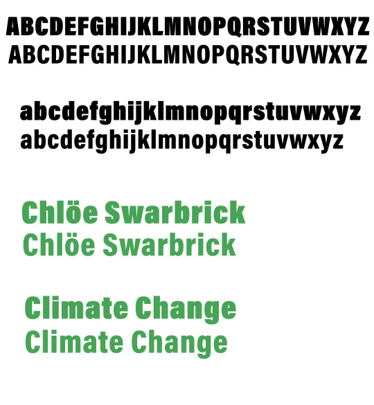
Following The Green Party colour scheme above, and common colours for issues surrounding climate change, I have selected a green shade that will help to viewers to relate the speech to issues about earth and nature.

#339F23
The typography currently being used is : Acumin Pro Condensed, at sizes around 100+ depending on the frames.
I selected this typeface because of its simple but serious qualities. It suits the majority of the speaker’s tone, but can easily be switched out for the more cheeky parts. Climate change is a serious topic and it is talked about in a normally serious location - Parliament,
However, after some feedback it has been pointed out that it doesn’t feel like Swarbrick talking. To represent the speaker as well, a more recent typeface with younger qualities may be necessary. Swarbrick also talks about a younger generation in the speech, and at the moment this typeface does not suit that idea.
0 notes