
Don't wanna be here? Send us removal request.
Statistics
We looked inside some of the posts by hannahvanloo and here's what we found interesting.
Average Info
Notes Per Post
0
Likes Per Post
0
Reblog Per Post
0
Reply Per Post
0
Time Between Posts
18 days
Number of Posts By Type
Text
5
Last Seen Tumblr Blogs


Fun Fact
Premium Tumblr themes are available from anywhere between $9 to $49.
Text
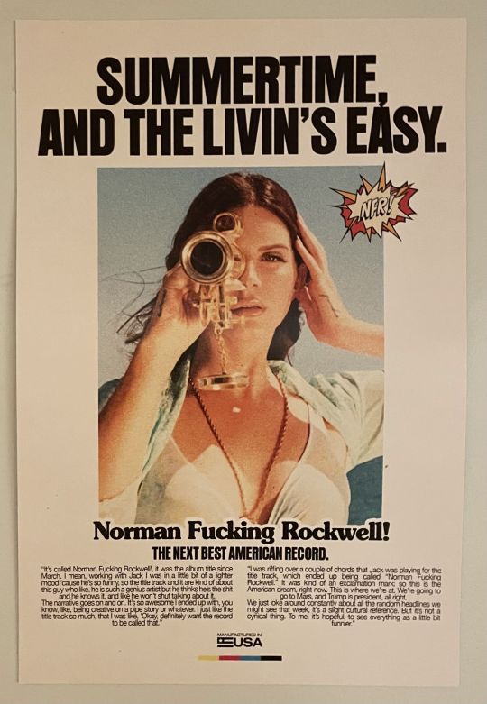
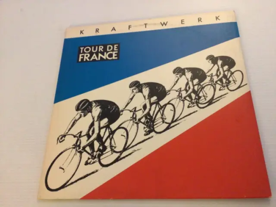
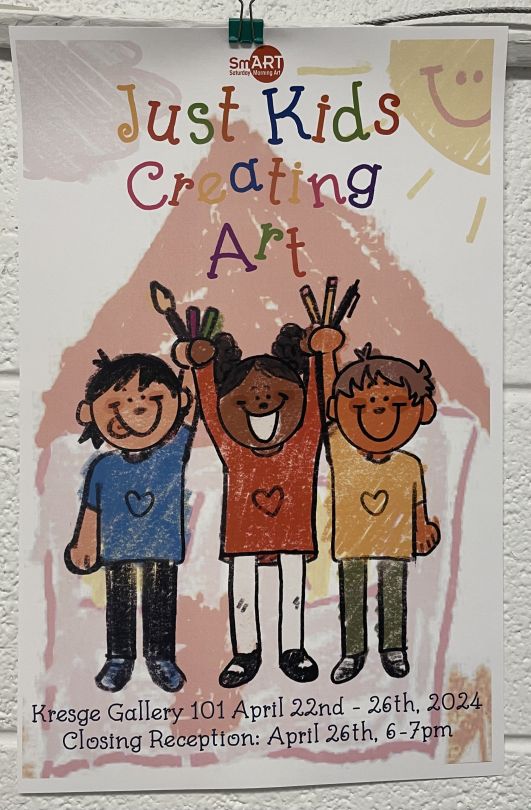
Image #1- An example of rhythm in a publication design
Image #2- An example of typographic hierarchy to establish the order of importance on a page
Image #3- A letter with an ascender (d)
Image #4- A letter with a descender (y)
Image #5- A letter with a counter (O)
Image #6- A letter with a crossbar (f)
Image #7- A font that has a large x-height
Image #8- A font with a small x-height
Image #9- A piece of design that appears to be “Modernist”
Image #10- An example of a font being used that is trying to connote something more than just the text typed in that font (Just kids creating art)
0 notes
Text
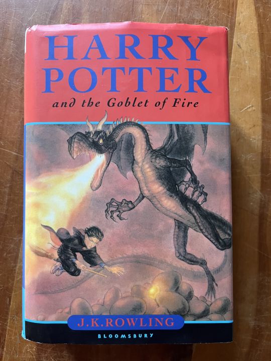
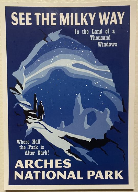


Image #1- The contrasting colors are making both the blue and the orange more prominent by juxtaposing them against one another. Essentially, it acts as a visual cue, drawing the eye towards specific areas or elements within the design, effectively communicating the intended message and enhancing overall visual impact.
Image #2- Analogous colors are often employed in graphic design to create a harmonious and cohesive visual experience. By selecting colors that sit next to each other on the color wheel, designers establish a sense of unity and balance within the composition. These colors work together seamlessly, evoking a feeling of fluidity and interconnectedness.
Image #3- I believe that the cool colors are trying to evoke a sense of calm and tranquility, associated with getting away to a national park. The only color is blue and the different shades and tints are used very effectively.
Image #4- I believe the warm colors are trying to communicate a sense of welcoming and invitation. The poster is trying to get you to come to the community's event and feel welcome. Warm colors elicit a sense of comfort.
Image #5- Graphic design that uses contrast in color to communicate the relative importance of something. The contrasting colors are beige and dark blue, in my opinion they are utilizing the contrasting colors to exaggerate the title of the cologne, promoting it to potential buyers.
Image #6- A graphic design example with the gestalt proximity principle of grouping.
Image #7- A graphic design example with an active figure-ground relationship (Could not find in person)
Image #8- A piece of graphic design that tries to look like something historical in order to communicate something related to that history. Utilizes Andy Warhol's pop art graphic style, that was very influential at the time. Warhol was prominent in the creation of the album. (Serving as the band’s manager, Warhol was the one who linked up The Velvet Underground with Nico and payed for studio time.)
0 notes
Text


Image #1- The denotative meaning would be that it represents a retro computer system.
Image #2- Connotative meaning: Beyond its surface appeal lies a connotative journey back to simpler times, evoking feelings of warmth, familiarity, and fond memories. Transport yourself to an era of innovation and creativity, where every keystroke was an adventure and every pixel held limitless possibilities.
Image #3- Find a piece of design and describe its iconic function. In this case, the octopus depicted on the can is a direct representation of the product contained within. The image of the octopus serves as a visual cue for consumers, immediately informing them of the contents of the can without the need for additional text or explanation.
Image #4- Find a piece of design and describe its indexical function. The indexical function of a corrosive material sign can be vividly depicted by showing the result of the material melting a hand. In this graphic representation, the hand appears distorted and partially dissolved, with flesh melting away and bones exposed. This image serves as a direct indexical sign of the corrosive properties of the material, illustrating the physical harm it can cause upon contact with skin. The melted hand serves as a tangible and immediate warning, visually communicating the severe consequences of mishandling or exposure to the corrosive substance.
Image # 5- Find a piece of design and describe its symbolic function. While it may seem to resemble an icon because it somewhat resembles the actual object it represents (a cross used in first aid contexts), its meaning is not solely derived from its visual similarity. Instead, it functions as a symbol because its significance is culturally and contextually determined. In this case, the cross symbolizes medical assistance, emergency care, and first aid, regardless of its visual resemblance to an actual first aid kit or equipment.
Image #6- Find a piece of design that references a past “style”. I think the sign is in this old western style to evoke a sense of nostalgia and authenticity, creating a unique atmosphere that transports diners to a past era. This sign harkens back to the rugged charm of the American frontier, with "weathered" wood, hand-painted lettering, and rustic imagery reminiscent of saloons and eateries from the Wild West.
0 notes
Text


Image #1: In my opinion, the underlying agenda of this infographic may be to highlight the success of the college (UCLA, who the College Senior Survey is associated with) in preparing students for their future careers. By showcasing data on post-graduation employment rates, salaries, and career paths of recent graduates, the college aims to attract prospective students and reassure current students and their families of the value of their investment in education. I also think the underlying agenda of the infographic may be to build the college's reputation and brand image.
Image #2: Room Essentials achieves consistency in its visual identity by carefully managing the relationships between color, typography, imagery, and graphic elements. Room Essentials uses a mix of illustrative and photographic imagery to convey its brand identity. Illustrations may be used to add a playful or whimsical touch to product packaging or marketing materials, while photographic imagery showcases products in real-life settings, helping consumers envision how they might incorporate the Room Essentials products into their own homes after buying. By maintaining consistency across textual and graphic elements, the brand is able to establish a strong and recognizable visual identity that resonates with its 'target' audience.
0 notes
Text


Image #1- Batter mix box: This box contains color and type. I found a nice use of contrast between the goose and the text overlaying it.
Image #2:-Vodka bottle: This bottle I noticed is very simple but still utilizes a nice font and has a legible logo that easily translates to viewers. This bottle also utilizes the design element of shape really well in both the organic Matisse painting and the sharp rectangle text box overlapping it.
Image #3- Coffee bag: This bag is one of my favorite examples of graphic design as it looks very cohesive while still allowing for all of the necessary information to be displayed. The two lines on the sign represent that element of design.
Image #4- Museum sign: This sign is on display with the Mathematica exhibit at the Henry Ford designed by Charles and Ray Eames. I noticed a very nice contrast between the white and red accents in the text and to display the different sections of the cube.
Image #5- Book cover: I really like this book cover's use of a large-scale font and the ripped paper effect on the bottom text. Color was the design element that really stuck out to me in this example.
While some of these images are examples of packaging design and book cover and some show museum exhibit design, all of them are examples of graphic design. All of these examples include visual and textual content intended to transmit messages. I chose these examples because I feel they are strong examples of design while still being diverse.
0 notes