
Don't wanna be here? Send us removal request.
Statistics
We looked inside some of the posts by hollyoxleylevel5 and here's what we found interesting.
Average Info
Notes Per Post
0
Likes Per Post
0
Reblog Per Post
0
Reply Per Post
0
Time Between Posts
5 hours
Number of Posts By Type
Text
17
Last Seen Tumblr Blogs


Fun Fact
After the announcement of the deal with Yahoo!, there were 170K signatures of unhappy Tumblr users petitioning to prevent the sale in 2013.
Text
Bibliography
Aagaard, J. (2019). Salad On A Plate. [Online Image]. Available from: https://www.pexels.com/photo/salad-on-a-plate-2097090/. [Accessed 19 April 2023]
Adobe creative (n.d.). My Creative type. [Online]. Available from: https://mycreativetype.com/share/dreamer/. [Accessed 18 May 2023]
Allcott, G. (2016). How to be a productivity Ninja. 6th Edition. London: Icon books.
Datalands. (2023). Datalands. [Online]. Available from: https://datalands.co/. [Accessed 14 May 2023]
Boltneva, V. (2018). Green Leafy Vegetable Dish in Gray Steel Bowl With Fork. [Online Image]. Available from: https://www.pexels.com/photo/green-leafy-vegetable-dish-in-gray-steel-bowl-with-fork-842571/. [Accessed 19 April 2023]
Cats Coming. (2016). Bowl of Vegetable Salad. [Online Image]. Available from: https://www.pexels.com/photo/bowl-of-vegetable-salad-406152/. [Accessed 19 April 2023]
Choquette, W. (2019). Cooked Food in Stainless Steel Plate. [Online Image]. Available from: https://www.pexels.com/photo/cooked-food-in-stainless-steel-plate-2641886/. [Accessed 19 April 2023]
Clockify. (2023). The 26 most effective time management techniques. [Online]. Available from: https://clockify.me/time-management-techniques/. [Accessed 19 May 2023]
Coolor. (n.d.). Orange Colour Palette. [Online]. Available from: https://coolors.co/palette/fff200-ffe600-ffd900-ffcc00-ffbf00-ffb300-ffa600-ff9900-ff8c00-ff8000/. [Accessed 17 April 2023]
Datalands. (2023). Datalands. [Online]. Available from: https://datalands.co/. [Accessed 14 May 2023]
Danilevich, O. (2020). School Utensils Flatlay. [Online image]. Available from: https://www.pexels.com/photo/school-utensils-flatlay-5088023/. [Accessed 30 May 2023]
Feisner E A, and Reed R. (2016). Color studies. Third edition. New York: Bloomsbury.
Foster, M. (2000) Get everything done - and still have time to play. London: Hodder & Stoughton.
Game House Original Stories. (2019) Home. Delicious World - Cooking game. [Mobile App]. [Accessed 14 April 2023]
Gertz, M. (2016). 13 Artists Who Turned Ocean Trash Into Amazing Art. Time. 8 June. [Online]. Available from: https://time.com/4358434/world-oceans-day-art-marine-plastic/. [Accessed 17 May 2023]
Google. (n.d.) Material Design. [Online]. Available from: https://m1.material.io/#introduction-principles/. [Accessed 29 May 2023]
Google. (n.d.) Layout- Structure. [Online]. Available from: https://m1.material.io/layout/structure.html#. [Accessed 29 May 2023]
Google. (n.d.). Google Translate. [Online]. Available from: https://translate.google.co.uk/?sl=en&tl=la&text=Balanced&op=translate/. [Accessed 31 May 2023]
Gregoire, C. (2019). We All Have a Creative Type. [Online]. Available from: https://creativecloud.adobe.com/discover/article/we-all-have-a-creative-type/. [Accessed 18 May 2023]
Ho, L. (2023). The Importance of Time Management: 6 Ways It Matters. [Online]. Available from: https://www.lifehack.org/692542/the-importance-of-time-management/. [Accessed 16 May 2023]
Holmes, N. (1984). Designer's guide to creating charts and diagrams. New York: Watson-Guptill Publication.
Icons 8. (n.d.). Help Icons. [Online]. Available from: https://icons8.com/icons/set/help/. [Accessed 29 May 2023].
Ideo. (2016). Mondays, Redesigned. [Online]. Available from: https://www.ideo.com/blog/mondays-redesigned/. [29 May 2023].
JAN N G U Y E N. (2017). Cooked Seafoods. [Online Image]. Available from: https://www.pexels.com/photo/cooked-seafoods-699953/. [Accessed 19 April 2023]
Jay, R. (2001). Time Management. Oxford: Capstone Express
Jones, H. (2022). How To Find the Right Time Management Method for You. [Online]. Available from: https://www.calendar.com/blog/how-to-find-the-right-time-management-method-for-you/. [Accessed 19 May 2023]
Khongchum, C. (2019). Close Up Photo of Stacked Pancakes. [Online Image]. Available from: https://www.pexels.com/photo/close-up-photo-of-stacked-pancakes-2280545/. [Accessed 19 April 2023]
Krum, R. (2014). Cool Infographics : Effective Communication with Data Visualization and Design. [ebook]. Indianapolis, Indiana : John Wiley & Sons. Available from: https://web.p.ebscohost.com/ehost/ebookviewer/ebook/bmxlYmtfXzY1NDgzMl9fQU41?sid=27d29fec-1651-4a74-b0d3-0daa0cbc9018@redis&vid=0&format=EB&lpid=lp_57&rid=0/. [Accessed 14 May 2023]
Lupi, G. and Posavec, S. (2016). Dear data. London: Particular Books.
Martin, L. (n.d.). What are the different time management styles?. [Online]. Available from: https://www.timedoctor.com/blog/time-management-styles/#list/. [Accessed 19 May 2023]
Meta. (2023). Home page. Instagram. [mobile app]. [Accessed 21 May 2023]
Office Create Corp. (2015). Home. Cooking Mama: Let's Cook!. [Mobile App]. [Accessed 14 April 2023]
Roos, D. (2016) Don’t read this book: Time management for creative people. Amsterdam: BIS Publishers.
Root studio, (n.d.). About. [Online]. Available from: https://rootstudio.co.uk/about/. [Accessed 14 May 2023]
Root studio, (n.d.). RSPB. [Online]. Available from: https://rootstudio.co.uk/work/rspb/. [Accessed 14 May 2023]
Snap Inc. (2023). Home page. Snapchat. [mobile app]. [Accessed 21 May 2023]
Spotify AB. (2014). Home. Spotify. [Mobile app]. [Accessed 21 May 2023]
Suleiman, A. (2022). Color Associations: A Designer's Guide to Their Significance. [Online]. Available from: https://ux4sight.com/blog/designers-guide-to-color-associations/. [Accessed 23 May 2023]
Taciu, R. (2017). iPhone X MockUps – 9 Angles. [Mockup]. Available from: https://graphicburger.com/iphone-x-mockups-9-angles/. [Accessed 30 May 2023].
Team Leverage Edu. (2023). Importance of Time Management for Students. [Online]. Available from: https://leverageedu.com/blog/time-management-for-students/. [Accessed 16 May 2023]
Touli, T. (2023a). About. [Online]. Available from: https://tinatouli.com/about/. [Accessed 25 May 2023]
Touli, T. (2023b). Cosmos. [Online]. Available from: https://tinatouli.com/cosmos/. [Accessed 25 May 2023]
Touli, T. (2023c). BFI Flare 2023. [Online]. Available from: https://tinatouli.com/bfi-flare-2023/. [Accessed 25 May 2023]
Twemlow, A. (2006). What is Graphic Design for?. Hove: RotoVision.
University of ST. Augustine for Health Science. (2019) 9 Proven Time Management Techniques and Tools. [Online]. Available from: https://www.usa.edu/blog/time-management-techniques/. [Accessed 10 May 2023]
Van der Veer, J, and Tejada, R. (2020). Design in conservative times : in between making great things and making things great again. Netherlands: Onomatopee
Whisk.com. (2019). Community. Whisk. [Mobile app]. [Accessed 14 April 2023]
0 notes
Text
Portfolio pages
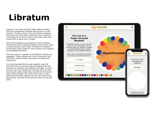
For the portfolio page I wanted to keep the design simple to keep the focus on the Libratum. I decided to use a 2 page design with the first design showing Mockups whilst the second page showcases how the concept functions. To explain my concept I included a single column of text on the first page. This allowed me to only use labels for second page, making the images bigger to see the designs better.

0 notes
Text
Mockups
Occe I had developed my designs, I placed them in the Mockups I had used previously. I like how this places the designs into a real life setting which helps to convey the concept.


0 notes

Text
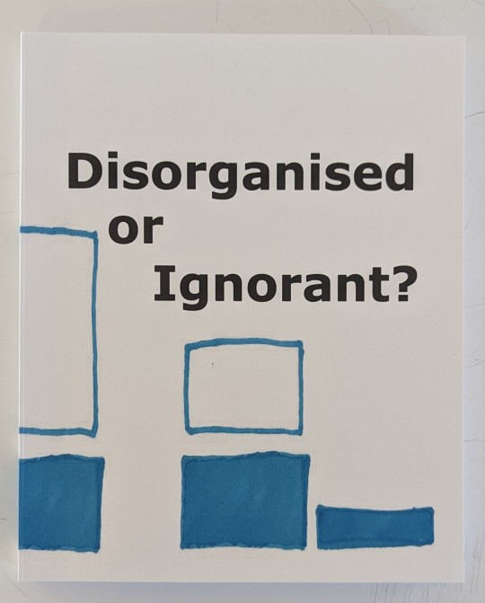
Process book cover
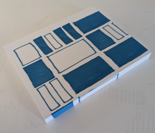
For my process book cover I have decided to use the illustrations I have drawn to represent my productivity. I decided to use the rectangles from week 7 because this is the week where I started to design and create my process book. I also like how this week shows the different sized tasks throughout.

When I added the outlined designs I had used to show the full week, I found that is made the cover look unfinished. It looked too plain compared to the designs I have created in this project.

When I placed the boxes I used to represent the completed tasks on the page, I though it looked too busy.

However, when I used a combination of the two designs I liked how it made the design look fun. I like how this links to the method I have used inside the book. This links the cover to the content of my process book.
For the name I decided to use 'Disorganised or ignorant?'. This refers to a conclusion I made during this project where I found that creative students have trouble managing their time because they have not learnt most time management methods. Therefore, the problem most students face is being ignorant about how to manage their time instead of being disorganised.
For the type I decided to user Verdana to keep the front cover connected to the contents of the book. This keeps my design consistent throughout the book.
0 notes
Text
Evaluation
I have found this project quite challenging. However, it has also opened my eye to why Time management is a big problem for me and a lot of other creative students. From this project I have been able to see how I can improve my own organisation skills and seen where my weaknesses are. Looking at theories behind why time management methods are suited to different mindsets has helped to make my outcome more user focused. This has allowed me to see that to make the outcome suitable for my audiences I need to find ways to include them in the creative process. By using questionnaires to inform my research and development, it has allowed my audience to have a say in what they want my outcome to be.
Throughout this project I have has mixed experience with time planning. At the start I used a list style to plan out each week. I found this quite useful because it allowed me to break down my days. It also allows me to allocate a project to each day. However, I found as I progressed through the term I stopped planning because I felt exhausted and drained. This type of planning became boring and something I did not want to do. I have tired multiple methods throughout this project and I have found that some methods worked better than others. Overall, I have found that I find visual methods more useful than detailed methods.
I like how my outcome uses visuals to convey a message. Using hand drawn shapes has give it a personal feel. This gives the user the idea that they are interacting with the page making it more engaging. However, I would like to develop my brand identity more. I feel like the logo is underdeveloped. I would like to explore how I. can combine the movement element I use in the image into my logo. This will make the visuals more unified and feel like one combined identity.
Overall, I think this project has been successful in creating a tool to help my audience improve their time management. The tool is easy to navigates and appeal to my audience who prefers visuals over large amounts of text.
0 notes


Text
Development - Colour

Based on my feedback, I decided to use a grey colour for the background. I liked how this made the white canvas stand out. It also complimented the warm white I used for the top bar and circles.
Although I removed the shadows from the buttons, I decided to use the shadow for the top bar. I found that without the shadow it blended in with the background colour, making it look a part of the main area. However, I wanted to make the two areas distinct to make it easier for the user to navigate the page.
0 notes
Text
Development - Visuals
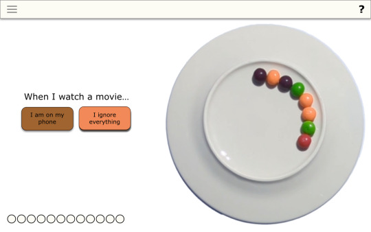
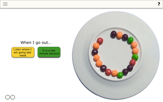
During my tutorial, mark mentioned that the plate looks out of place. It does not have any connection to the idea so it is unnecessary. He suggested I look at using handmade marks for the colours because this will still keep the interactive appearance.


I started by experimenting with sharpie marks. I like the textures effect this created. This gives the shapes personality and stops them looking generic. However, when I placed the colours onto the page I found that the different shapes made the image look busy. To solve this problem I decided to use a circle mask to make each shape consistent. I found this created a more unified image.
0 notes
Text
Development - Logo
For my logo I decided to use a simple sans serif typeface. This will prevent the logo from overwhelming my design. I also have limited time to create the logo so I decided to look back at my past projects to see what works and what does not.
I decided to use the typeface Tahoma for my logo because when I looked at a past project, I found this sans serif typeface looked simple but has quirky features. I liked the way the L was slightly shorter than the I.

I decided to use colours as the main feature of the logo because this is the main visual feature of my tool. However, when I experimented with using a separate colour for each letter I did not like how it made the letters feel separate.

I decided to experiment with using the bleed effect I have used for the methods page for my logo. I like how this shows how the colours blend together. Although the separate colours can be seen, the letters look like one combined image because the colours travel through multiple images. Furthermore, I like how this refers to the visuals I have used in my images.
If I had more time. I would like to explore creating a short animation to add movement to my logo. By adding movement I can link it to the bleed of the colours on the logo page.
0 notes
Text
Name
During my tutorial, Mark suggested I look at latin words surrounding my theme to create a name for my tool. This will give my outcome a brand.
Complete - completum
organised - constituto
Time - Tempus
Productive - Productivum
management - procuratio
Balanced - libratum
Name: Libratum
I decided to use the word Libratum because my tool helps people balancing their time by suggesting time management methods. I will use this name to create a logo, using my experience from previous projects.
Google. (n.d.). Google Translate. [Online]. Available from: https://translate.google.co.uk/?sl=en&tl=la&text=Balanced&op=translate/. [Accessed 31 May 2023]
0 notes
Text
Based on this feedback, I have decided to experiment with the visuals element of my outcome. I will look at ways I can remove the plate and keep the fun and interactive elements. I have decided to keep the 3d element of the colours because this makes it feel more interactive and different from other designs I have looked at. However, I will experiment using hand drawn colours or digital circles beucase thhis may work better with my limited time frame.
I will also look at how I can use the visuals to create a brand for my tool. I will look at latin words to name my outcome. However, I will need to make sure the colourful aesthetics are the main element of my design to stop it from looking busy and complicated.
0 notes
Text
Feedback
Design feels like a wireframe.
The buttons do not need the shadows.
It needs a brand identity.
Is the plate needed?
Would it be better to use blobs of colour?
could you use hand drawn elements to give it personality?
You could look at using warm greys.
Could you go from plain to colourful? or complex to simple?
Concept is good, just need to look at the aesthetic elements.
Look at latin words surrounding time and organisation for the name.
0 notes
Text
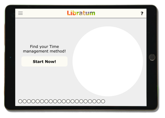
Mockups
To present my outcome I have decided to use mockups. This will place my design in a real setting, making it easier for the user to se themselves using it. Instead of using a desktop mockup, I decided to use a tablet because my audience have moved towards tablets and phones over using a computer.
However, I found I was unable to find an existing mockup online. To solve this problem I decided to create my own using Stock imagery. Using photoshop I was able to change the screen into a smart object, using a rectangle. This ten allowed me to easily swap between my designs.
When placing my designs into the mockup, I found that the dimensions were too wide. To fix his I used XD to slightly change my designs so they fit the dimensions of the tablet screen. I also added a drop shadow to the tablet to give it a 3D appearance.

To show how my design can be converted to a phone screen, I decided to also include a mockup of a phone. This shows the flexibility of my design. For this mockup, I used an existing mockup from the website Graphic Burger. To change the shape of my design, I used XD and added the main features. I decided to place the image of the colours and indication of the questions at the bottom of the page because this will be the first thing the audience sees. My concepts relies on the visuals to convey they progress of the tool. Therefore, I wanted this to be the main focus. I placed the buttons side by side to make them more comfortable to choose when holding the phone one handed. This will make the design easier to use.
When I was looking at the phone mockup, I realised that is had a different shadow to the tablet. This would have made it look unusual when they are on the same page. To solve this, I removed the existing shadow and create a new shadow using the same settings at the tablet.

Taciu, R. (2017). iPhone X MockUps – 9 Angles. [Mockup]. Available from: https://graphicburger.com/iphone-x-mockups-9-angles/. [Accessed 30 May 2023].
Danilevich, O. (2020). School Utensils Flatlay. [Online image]. Available from: https://www.pexels.com/photo/school-utensils-flatlay-5088023/. [Accessed 30 May 2023]
0 notes
Text
Refined Design
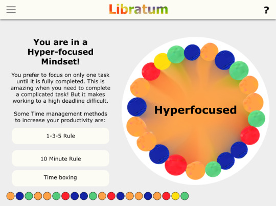
Home page

Question 9
Question 19
Loading page
Mindset page

I think this design looks simple but effective. It allows the colours to show what each answer refers to what mindset. This allows the user to se how their answers have informed the methods they are suggested. However, The design still feels unfinished.
0 notes
Text
Refining the design

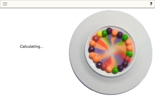
By using a warm white colour, it gives the design a more warm and welcoming tone. However, I found the first colour I used looked too yellow which drew attention away from the questions and image. However, the second tone stood out from the white background without overwhelming the other components.

To show the blending of colours I first tried changing the full centre to the colour. However, I found this was not successful because the colour stood out from the circles. This made the image look unbalanced and separated giving it an unfinished feel.
However, by using a gradient of colour it gives the image a blended effect. This stops the orange from looking separate from the image but still shows that orange is the main colour shown through the questions.
0 notes
Text
Developed outcomes

By adding shadows to the buttons it gives the website depth. When I was looking at Material design, I noticed how they use this to inform the user when they have chosen a button. I decided to use this becsuse it will make the website easier to use. It also separates the buttons from the image of the colours.
Adding a shadow to the top bar, also separates it from the rest of the page. This makes it easier to tell where the user should interact and pay the most attention.
From these two designs, I think the first one is most successful. The buttons are the first thing that draws my eye. However, it does not overpower the image of the colours. The side by side visuals make the page look balanced and connects the questions to the image of the circles of colour on the plat. I think this works better than the second design because the buttons and question still look difficult to read. Having the question above the plate removes the negative spaced between the two components. This gives it a restricted feeling.
Based on this I will continue refining the first design. I will look at how I can use colour to give he page more personality. this will stop the design from looking like a wireframe. However, I will need to look at using more neutral colours to stop the background from conflicting with the colours. of the main image. This will stop the page from looking too busy and complex.
0 notes