
i-draw--sometimes
Sure hope this isn't my best :)
Dany-21-she/her-Pan
33 posts
Don't wanna be here? Send us removal request.
Last Seen Blogs

misterpandaboom
ミスターパンダブーム玄笑顏无双凰战斗力仙
visneliivotkaaam-blog
VİŞNELİ VOTKA
jedimasterbailey
Real Life Barriss

mistermicc
Never odd or eveN

Text
Final Portfolio
https://indd.adobe.com/view/7239cdc3-ed01-4c00-963e-eff12b554f45
-----------------------------------------------------------------------------------------------------------
Considering how much you knew when you started the class, do you feel the work you have done shows that you have progressed in your knowledge and ability to produce digital art projects?
Which project are you the most satisfied with and why?
If you have any other reflections you'd like to add on the work you did this semester, please add them.
Considering that I knew absolutely NOTHING when I started the class, I do think that my portfolio shows my progress. From our first animation project you can clearly see that I knew almost nothing about using the path tool in illustrator, the mask gave me some practice, and I mastered it by the time the face trace come around. The poster project was the first time I’ve used photoshop, and I’m genuinely proud of it.
I’m most satisfied with my face trace. I used a photo of myself because it had a nice range of shadows and highlights (and because I like that photo). I had the most fun with it because following each different shape with the path tool was relaxing :)
I’d love to try these projects again at some point now that I have the experience I have.
2 notes
·
View notes
Text
Poster Reflection
What did you learn? What do you wish you could have done better? What are you are proud of?
----------------------------------------------------------------------------------------------------------
I learned so so much about photoshop- I tried to use all of the lessons taught to us in the provided exercises from the crop tools to the color and filter tools.I wish I’d planned the spacing of my poster a little better, I would have prefered to fit the title at the top, but since I did all the photo editing first, I hadn’t left a proper amount of space for it. I’m proud of my newly aquired cropping skills, at first I had a hard time trying to use the content aware fill tool (because I’d forgotten how to activate it), but after I figured it out it was smooth sailing with the stamp tool. I had a hard time starting this project because I couldn’t settle on an idea in the beginning, but after deliberating with my friends I found one I really liked and the ideas flowed after :)
0 notes

Text
Poster Progress #2
Once I had my background set, I added the buildings on top of the sunset and added some opaque color filters to the refection to make it more blue, and make the normal buildings a little more yellow.

After that, I added a radial gradient from transparent to black to make it look like a vignette.

Finally, I added in a photo of my sister blowing out some candles

This was my final photo edit before adding text files
0 notes
Text
Poster Progress #1
Here are the main images I started with, and the steps I took as I began working on my poster :)

#1- I cropped out the background and reversed the cityscape view in hopes of making a reflection-like effect, and with the sunset photo I used the Content-Aware fill tool to remove the buildings and tree.


#2- After doing the intial edits I took the sunset photo, reversed it, and added some adjustment filters so make averything seem a little darker.

0 notes
Text
Poster illustration ideas and plan

My poster will mostly be photo editing (I’ve never done this outside of the exercises, so good luck to me). Starting from the middle, I’ll be using a photo of the city view from my recent vacation and I’ll edit out the sky and most of the foreground, and I’ll add a new sunset background that I’ll also edit by removing the contents. After altering the colors to something I like, I’ll copy paste and flip both parts so I can have an inverse image beneath the original, and then I’ll try to add a blue tint and a filter to make it look somewhat like water. After that I’ll superimpose an image of my sister blowing out some candles and I’ll try to erase the outer edge so it looks like it fades into the background. Next I’ll add a gradient over the entire thing and try to make it look like a vignette, where the edges fade to black. Lastly, I’ll add in all my text- the title, credits, and ‘actors’.
My mock up is a very simple version of what I plan on doing.

2 notes
·
View notes
Text
Poster Logotype
After doing some research about typical movie poster fonts, I combed through the adobe font website to find fonts I liked, and after looking at several options I settled on the two marked with stars, though I'll be stretching and condensing the leters manually.

0 notes
Text
Ideas, research, and sketches for poster
-----------------------------------------------------
Idea: What would you do if your dream vacation turned deadly from one night to the next? A dream trip to Hawaii for Amilie Spencer's 25th birthday turns nightmarish when one of her friends is discovered dead the morning after the party.
Research: Since my movie idea is a horror/murder mystery I searched for movie posters for similar movies


Sketch:

0 notes
Text
Portfolio WIP
Here’s the link to my semi-final I-changed-it-twice-already portfolio work in progress.
https://indd.adobe.com/view/f229aeee-5b92-4690-af4a-09da4788f218
A lil preview:

0 notes

Text
Mask Reflection
Here are the final screenshots of my mask process: the mask, the final line art, and the final gradient. I've learned a lot during this project, I think I got a good handle now on using and editing the pen tool, but what I really learned was how to make my gradient look like it's actually following a contour. I learned that using midtones and not just two colors for the gradient makes it look especially realistic. I'm very proud of my mask overall, but I think I could have experimented more with different brush stockes, instead of keeping it all uniform. I think doing this would have made my blue look more like a "glow" as I had originally intended. I also realized when I finished my design that I hadn't included any room for color, so next time I do something like this color is something I have to keep in mind to make the piece more interesting. All in all, I've never done something like this before so I'm proud of the end result :)


2 notes
·
View notes
Text
Mask WIP #2
Here’s the second part of my work in progress. Here I show the first look at my line art and my updated gradient. At this point I started using medium grays in my gradient instead of just black and white, and that really helped me create the illusion of depth. I mostly used the pen tool for my line art and I had had trouble with trying to select it all at once so to solve that I think I used the unite or divide (cant remember which) to create a single shape from the lines. I also had to draw the eye and mouth holes separately on top of my base color layer and then use the Minus Front tool to create the holes in the base shape.


1 note
·
View note
Text
Mask WIP #1
Here are the initial stages of my mask- At this point I forgot to screenshot my line art wip, so here’s just the in-progress gradient work. You can clearly see that I was working with a lot of pure white and black to try and create depth, but it wasn't the best yet.

1 note
·
View note
Text
Mask Research, Ideas, & Sketch
I had a hard time deciding what my mask would be, but eventually I came up with a half-robot, half-theater mask idea :) Below are the reference images I used while designing my mask, as well as the initial pencil sketch


1 note
·
View note
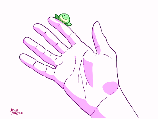
Photo

This is the end result of all my layers that went into my mini animation
2 notes
·
View notes
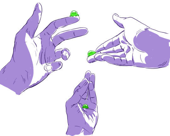
Video
undefined
tumblr
Here is the final result of my mini animation! I took inspiration from the song “Say My Name” from the Beetlejuice musical, specifically the part where Beetlejuice is on a rooftop with Lydia, trying to convince her to release him by saying that they’re “B-F-F-F-F-F’s forever”. I tried to model my character after the outfit that Beetlejuice wears in the musical, but we had to get rid of a lot of detail because it was just too much for the program to handle. Speaking of being too much to handle, I had SO much trouble getting this animation finalized. The part where you make the individual animation layers was easy, but my issues came when I tried to export my illustrator file as a .swf file- my computer would just NOT do it, it kept saying that there was a problem exporting and it wouldn’t do it. I had to have the professor help me do the exports, and this was the final result! She also helped me change my wonky freeform gradient into a radial one, and I really like this one better :) The animation runs quicker than I wish it would, but I'm still proud of my results otherwise.
2 notes
·
View notes