
Statistics
We looked inside some of the posts by idratherbefishingg and here's what we found interesting.
Average Info
Notes Per Post
6
Likes Per Post
5
Reblog Per Post
1
Reply Per Post
0
Time Between Posts
8 days
Number of Posts By Type
Text
6
Photo
11
Last Seen Tumblr Blogs


Fun Fact
Tumblr has a low social media market share in South America.
Text
Linoleum Printing Essay
Before the use of linoleum as a printing method, the oldest form of relief print is woodcut. Woodcut printing was used to produce images, text or patterns and was used widely throughout East Asia. It originated in China as a method of printing on textiles, but the method grew and was expanded to include printing on materials such as paper too. Ukiyo-e is the most well-known Japanese woodblock print and was made very famous by the artist Hokusai with his woodblock print The Great Wave Off Kanagawa. While this was a popular and effective printing method, its popularity decreased over the later years due to its price compared to the inexpensive linoleum. (Wikipedia Contributors, 2019)
Linoleum came about around the 1800s, starting off as a new type of flooring. This material was made from linseed oil and would then be heated and pressed into a mesh to hold it all together (Curious Seagull, 2017). It was invented by a man named Frederick Walton, who first patented the material in 1860 (Boarding All Rows, n.d.). Although lino was originally designed for flooring, even before it appeared in the artists view, it was also used to create patterns for wallpaper. Now during this time period, the most common forms of relief printing were wood and metal, which were used all over the world.
The transition from linoleum flooring to lino printmaking isn’t very clear due to a lack of research and documentation, although there are chunks of information here and there which can be used in order to attempt to piece it together. It is said that from the 1900s, linoleum had started to be used for wallpaper patterns in Germany and from there had gained traction, going on to be widely popular within the German expressionist and Russian constructivist movements. From then on, people recognised lino as a cheaper alternative for relief printmaking and much easier to carve due to its consistent texture compared to grainy and imperfect wood. It was brought into schools as a cheaper method to demonstrate carving and easier for the students to use and buy. (Curious Seagull, 2017)
The materials necessary for linoleum printing include; linoleum, a carving blade, a marker, a sketch, water-based relief ink, a roller and some tracing paper. To begin the process, you would create a sketch or choose an image that you would like to create a print from. Depending on preference, you would either draw straight onto the lino or could trace a drawing and transfer it onto the lino instead, the latter allowing for a clearer vision of a finished product. From there you would use a marker to indicate either the areas which you want to cut out or the areas you want to keep. Then taking the carving blade of the desired size, cutting and removing the areas which are to remain un-inked. Once completed, take the roller and roll out some ink, ensuring it is not too thick, and roll onto the linocut until fully covered in ink. The paper is placed on top of the inked lino and the roller is used to create pressure, which allows the ink to be transferred to the paper, then once satisfied the lino is peeled off to reveal the print.
The three lino print artists whose artwork I will look into are; Ethel Spowers, Valenti Angelo, and Tom Hazelmyer. Starting with Ethel Spowers and her piece Wet Afternoon. Ethel was born in Melbourne on 11thJuly 1890 into a fairly wealthy and cultured family. The wealth of her family allowed Spowers to be able to train as an artist in both Melbourne and Paris, notably with André Lhote (a famous French artist). Spowers was first known for illustrating fairy tales, however her style had changed in 1928/29 when she studied linoleum printing with Claude Flight. Her lino prints are renowned for being bold but simplistic and for her interesting use of colour (Wikipedia, 2020). Her piece “Wet Afternoon” gives a sense of peace and calmness through the use of muted colours in a rainy scene. The sense of movement in this piece is prominent through the ongoing lines of rain and the numerous umbrellas in the piece, creating the feeling of a bustling street and people trying to fend off the pouring rain. It feels like a very real piece of work, as if you could easily place yourself in the print, amongst the many umbrellas. The people in the print are anonymous – you cannot tell their age or their gender or even if they have hair, but dispite the unfamiliarity of these people, they still feel very much alive and are an important part of the feeling of this piece. I rather like the composition of Wet Afternoon because of Spowers use of colour and positioning. The starch white of the umbrellas in the background help to focus the viewers eyes on the foreground instead, seeing more of the colour and detail before then roaming your eyes back. The way that the rain falls almost makes it so you must look diagonally at this piece, creating a unity in the piece as the rainfall covers the whole print. Overall, the emotions this piece creates are very calming to me and that is why I chose this print from Ethel Spowers.

The second artist I’m looking at is Valenti Angelo, he was an Italian-born U.S. illustrative artist, illustrating about 250 books. For printmaking, his favourite medium was linoleum. I’m going to analyse his print Cat (Nydam, 2014). This piece represents a very dark side to lino, not in a sinister way but an actual darkness. Angelo’s use of the carving tool to create the small delicate lines allows for a soft appearance despite the high contrast, giving an overall soft feeling. The deep black used all over the piece makes way for very defined and distinct shapes and form, creating a gentle night-time scene. Despite the fine, intricate lines this piece still contains a very strong and hard-hitting image. The repetitive, small carvings of the cat’s body help to create a round motion, giving the cat more of a realistic feeling, almost as if the cat could jump out of the print. The contrast between white and black and the delicate versus the strong shapes creates a vivid scene that anyone could envision themselves in, creating almost a homely vibe to this piece. I feel like Angelo tried to create a very comforting yet almost daunting piece, the cat’s stare being very intense but the flowing of the curtains and the lines on the table being calm. Overall, I think Angelo’s use of negative space, specifically in the shadows on tables, and the subtle carved lines really bring together the intensity of this piece, despite how gentle the carving seems to be.

The last artist I want to analyse is Tom Hazelmyer and his piece Gay Witch Abortion Bash. Tom is best known as a musician and founder and owner of the independent label Amphetamine Reptile Records. He is also the lead singer and songwriter for the band Halo of Flies. Despite being big in the music industry, he’s also very deep into printmaking. He started his interest into printmaking because of his daughter, she had a project to do with lino printing and he decided to help. It was from there that he developed a love for it. His piece Gay Witch Abortion Bash is an album cover he designed, it’s a very striking piece because of the bold lines and colours used (White, R. 2015). The texture of the print creates a roughness that goes hand in hand with the provocative subject matter of this piece, helping to bring together the whole feel of it. The piece frames itself using the writing above and below, the writing uses up negative space smartly to draw the viewers eyes around the piece and create a border without it being an obvious choice. The contrast between the white outline of the rat and the smaller brown and red lines creates an almost 3-Dimensional quality to the piece. The lack of difference of tone throughout most of the piece allows the white outlines to act as a focal point, making sure your eyes are drawn specifically to the rat’s face. As red is the most striking use of colour in the piece, it almost screams at you to look at it, similarly the music this album cover was created for is classified as noise rock, creating a link between the album cover and the music. The gritty look of the print relates closely to how people perceive wild rats, as things such as dirty pests, disease carries, etc. Overall, the emotions this piece creates within me is a quite a strong excited feeling, the visually impactful focal point of this piece is almost shocking to the viewer, inciting raw emotion.

Bibliography
Curious Seagull. (2017). A Short History of Lino Printing…. [online] Wordpress. [Viewed 14th March 2021] Available at: https://curiousseagull.wordpress.com/2017/06/20/a-short-history-of-lino-printing/
Linocut Artist | Boarding All Rows. (n.d.). Linocut Artists and History. [online] Boardingallrows. [Viewed 14th March 2021] Available at: https://www.boardingallrows.com/history-of-lino-printing-and-famous-linocut-artists.
Nydam, A. (2014), Block Prints by Angelo. Black and White – Words and Pictures. [online]. (4/2/2014). [Viewed 14th March 2021]. Available at: https://nydamprintsblackandwhite.blogspot.com/2014/02/block-prints-by-angelo.html
White, R. (2015). Interview - HAZE XXL. [online] MPLSART.COM.[Viewed 14th March 2021] Available at: https://www.mplsart.com/written/2015/07/interview-haze-xxl-
Wikipedia Contributors (2019). Woodblock printing. [online] Wikipedia. [Viewed 14th March 2021] Available at: https://en.wikipedia.org/wiki/Woodblock_printing.
Wikipedia. (2020). Ethel Spowers. [online] Wikipedia.[Viewed 14th March 2021] Available at: https://en.wikipedia.org/wiki/Ethel_Spowers.
1 note
·
View note
Photo

Saint Jerome by Alasdair Gray (1955)
Alasdair Gray was quite a political man, he wrote pieces support socialism and Scottish independence and I feel he took a lot of this into his pieces. Saint Jerome is based off of the man Jerome of Stridon, who was a Latin priest, a theologian and a historian. Jerome was best known for translating the bible into latin and had many writings do with christian moral life. Gray ties this in using the man with his slab and feather pen, creating this almost story telling scene of Saint Jerome during his times of writing. The weary look of Jerome tells us that the whole feeling of him and this piece is tired, that maybe his age and his ideas are catching up to him and it’s wearing him out. The position in which Gray has done Jerome is quite a half and half position, he’s kneeling on the ground in a way which shows his age, makes you feel that Jerome is probably quite an old man at this point but the balancing of himself plus the obvious big slab and pen shows that despite his obvious age in this, he is still fit and able to do as he pleases. I think this artwork is meant to show Jerome in his study, working away but Gray has taken it a bit further and shown Jerome in a more broken down study, surrounded by quite powerful but also scary animals such as the lion, and despite this he has Jerome still writing away as if this whole scene around him isnt real. This whole scene looks as if Gray was trying to project that Jerome, despite the bad going on around him, would still keep strong and keep working on his beliefs just like gray did his entire life, especially with his passion for the SNP and Scottish independence. The black and white print gives a rather deep and sad feeling, emphasises how Jerome looks and probably feels in the piece and how maybe Gray was feeling about his place in the world. Wanting such ideas that not everyone accepts. Gray’s very angular lines from the top to the bottom of the piece help to convey the obvious tension and strain Jerome seems to be under, so much is going on around him and all these lines are moving in different ways, almost as if to be confusing as well as understood. So my final take on the piece is that because of the man Gray was, the very strong belief in certain political views and holding onto them till the end, is Gray tried to recreate how he feels into the man Saint Jerome as he was also a man who was known to have very strong beliefs and would write and write endlessly about them. Gray poured his life of beliefs and thoughts into this print in the form of a Saint who many years ago believed so strongly in something that he had to write about it, just as Gray did in his life.
Bibliography
Wikipedia Contributors (2019). Jerome. [online] Wikipedia. [Viewed 22 Febraury 2021] Available at: https://en.wikipedia.org/wiki/Jerome.
Wikipedia. (2020). Alasdair Gray. [online] Wikipedia. [Viewed 22 February 2021] Available at: https://en.wikipedia.org/wiki/Alasdair_Gray.
0 notes
Photo


Relief Printing
The earliest examples of relief type print in the form of woodblocks comes from 200 AD China. Woodblock printing, named xylography today, was the very first printing method that was applied to paper (SNAP). Back in the 2nd century BCE, it was believed that the Chinese accidentally created a more primitive type of paper after leaving their clothing in water for too long. Their clothing was made from hemp meaning that when left in water for too long, a residue would be left in the water. This residue could be pressed into paper which would go on to be a very useful material. More refined paper was then created later in 105 CE, this paper was created by soaking and pressing plant fibres, which then were dried in sheets on wooden frames or screens (Ancient History Encyclopedia). Carving into wood surfaces gave Chinese scholars the means to replicate important texts such as Buddhist scriptures by printing onto paper.
Although the Chinese developed these types of prints relatively early on, woodblock printing didn’t catch on in Japan until roughly 1800 years later! Woodblock printing became popular in Japan during the Edo period, which lasted from 1603 through to 1868. Its initial use was for reproducing traditional handscrolls into book form so it could be more widely distributed (Metmuseum.org). However over time it was then used for mass producing prints for multiple purposes. Prints of the Edo period focused on depicting seductive courtesans and Kabuki actors of the urban pleasure district. Of course, in time the subject matter of prints would change, ranging from famous romantic vistas to dramatic historical events (My Modern Met). The scenes depicted in these prints were quite popular amongst the wealthier people of that period. Although the woodblock printing method goes on to be replaced by methods such as the moveable type, it remained the most popular to Japanese artists that work in the ukiyo-e genre.
By the 11th century, moveable type was invented. The moveable type meant that separate text characters could be put together across several pages instead of painstakingly creating a woodblock for each individual page. Bi Sheng was the first to develop the moveable type system, around 1040 AD, using a ceramic type material. The way he would do it was to use a relief type of cut to create the Chinese characters onto porcelain clay, then they would go into the kiln to be fired (Wikipedia). These individual characters could be mixed around to create certain messages that would then be inked up and printed onto paper/silk. Bi Sheng also went on to experiment this method by using wood instead of clay. For himself this material was not up to standard, as the grain of wood and the absorbing of the ink often led the markings to be smudged and uneven. However, this wasn’t the case for everyone as the wood version was responded to quite well by others, most likely because wood is easier to carve than baked clay. This version of printmaking became very popular once Chinese printers started using a bronze material instead, this print type was used mainly for money and official documents (Colour Print).
Colour Print. (2018). Moveable Type: A Print Revolution. [online] Colour print. [Viewed 31 January 2021]. Available at: https://www.col-print.co.uk/blog/moveable-type-a-print-revolution
Wikipedia Contributors (2019). Movable type. [online] Wikipedia. [Viewed 31 January 2021]. Available at: https://en.wikipedia.org/wiki/Movable_type.
Metmuseum.org. (2021). Woodblock Prints in the Ukiyo-e Style. [online] Metmuseum.org. [Viewed 31 January 2021]. Available at: https://www.metmuseum.org/toah/hd/ukiy/hd_ukiy.htm?fbclid=IwAR1fGlaDFj6FihzLYJl2BJ4WQ_z70eMXmZBdh-fhgy6UsdZPhJu0Evg5QUg
Ancient History Encyclopedia. (2017). Paper in Ancient China. [online] Ancient History Encyclopedia. [Viewed 31 January 2021]. Available at: https://www.ancient.eu/article/1120/paper-in-ancient-china/#:~:text=The%20Invention%20of%20Paper&text=The%20traditional%20date%20for%20the.
My Modern Met. (2019). The Unique History and Exquisite Aesthetic of Japan’s Ethereal Woodblock Prints. [online] My Modern Met. [Viewed 31 January 2021]. Available at: https://mymodernmet.com/ukiyo-e-japanese-woodblock-prints/?fbclid=IwAR10k8OAvwI9O93pp3OQuSTnBV6Ct_2WlQWUmfzSUM0ogyQoE1L_suwhZF8 [Accessed 31 Jan. 2021].
SNAP. (N/A). The History of Printmaking from Wood Blocks to the Digital Age. [online] SNAP. [Viewed 31 January 2021]. Available at: https://snapartists.com/snapline-article/the-history-of-printmaking-from-wood-blocks-to-the-digital-age/ [Accessed 31 Jan. 2021].
3 notes
·
View notes
Photo


SUMERIANS AND PRINTING
One of the first documented, methods of printmaking was done by the Sumerians. The Sumerians are acknowledged to be one of the first civilizations in human history, who’s texts are dated around the period between 3500 BC to 3000 BC. It was found that the Sumerians dominated the historical region of Mesopotamia, which is now known as southern Iraq in the Middle East. Its population was incredibly high for its time, estimated at between 40,000 and 80,000 people (History.com, 2019).
There are two main printing techniques that I’m going mention. First is the brick printing block, similar to a stamp in its looks and uses. The designs were carved into soft clay brick before being fired. These printing blocks were created under the ruling of Naram-Sîn of Akkad, who ruled over the Akkadian Empire (Norman, 2021). This empire was another of the first ancient empires of Mesopotamia, along with the Sumerians, they united under a single ruler (Wikipedia, 2019). There are three separate printing blocks like this one, scattered across the world in different museums. ROYAL INSCRIPTION OF NARAM-SÎN is the official name. The printing block is 13 x 13 x 10 CM, with three lines of large Cuneiform text (Cuneiform was the system of writing that the Sumerians designed) and a big loop handle for holding (Schoyen Collection, 2020).
The second printing technique I want to talk about is the Cylinder seals. These seals were a very important aspect of the life in ancient Mesopotamia, they were used by both the Sumerians and Akkadians. Known as kishib to the Sumerians and kunukku to the Akkadians, these seals were used by everyone, from as high up as the royals to as low down as the slaves. They were used mainly for business reasons and correspondence. There are claims that they originated in the Late Neolithic Period (7600-6000 BCE) and there also claims that they originated in the Sumerian Period. The seals were like a signature for people, especially ones in business as these seals would be unique to them so they were able to trace back what belonged to who. A cylinder seal was typically 7-10cm long and were claimed to be made out of semiprecious stones such as, marble, obsidian, amethyst, lapis lazuli, or out of metal such as, gold and silver(Ancient History Encyclopedia, 2015).
Bibliography
History.com., (2019). Sumer [online]. HISTORY. [Viewed 28 January 2021]. Available at: https://www.history.com/topics/ancient-middle-east/sumer?fbclid=IwAR1_6TAjgUxzGW6-jsHeji9vausjlP0eVEBZ5no6InMF7P_LfzVH2_Yk6Tg
Norman, J., (2021). The Earliest Printing was Stamped into Soft Clay in Mesopotamia: History of Information. [online]. Historyofinformation.com. [Viewed 28 January 2021]. Available at: https://www.historyofinformation.com/detail.php?id=2241&fbclid=IwAR1VGhMqqHRIm0H4YfSUCXHY0ix_T8lUmHj0wACoXD20L3KZ8gdff_SOKUU
Wikipedia Contributors., (2019). Akkadian Empire. [online] Wikipedia. [Viewed 28 January 2021] Available at: https://en.wikipedia.org/wiki/Akkadian_Empire.s
Schoyen Collection., (2020). ROYAL INSCRIPTION OF NARAM-SÎN. [online] The Schoyen Collection. [Viewed 28 January 2021]. Available at: https://www.schoyencollection.com/pre-gutenberg-printing/21-1-blind-on-clay-gold/ms-5106
Ancient History Encyclopedia. (2015). Cylinder Seals in Ancient Mesopotamia - Their History and Significance. [online] Ancient History Encyclopedia. [Viewed 28 January 2021]. Available at: https://www.ancient.eu/article/846/cylinder-seals-in-ancient-mesopotamia---their-hist/?fbclid=IwAR22PiEArQQAy9KQw1d2B53IrbEltwXlXAmvI6s_WzRzYqRX6t1oY0dqht8.
0 notes
Photo


The 5 images I have chosen are some of my favourite pieces of printmaking I’ve seen. These pieces are from two different printmaking artists, who specialize mainly in lino, their names are Lucie Spartacus and Kitty (HoneyThief Prints). I really like the style of both of theirs, the very bold dark spaces and the very intricate detailing, these areas really capture me as an artist.
I feel the type of printmaking that really inspires me is very bold statement lino pieces, I’m a sucker for lino prints and seeing pieces that really delve into the world of shading and highlighting using lino fascinates me. I don’t really think I have a favourite genre because all genres of artwork can be interesting but if I were to choose its probably either rather abstract landscapes or not so realistic portraits, as these tend to catch my eye the quickest. And of course, as for style, I myself am a Lino Printer, I’ve been doing lino printing for about 4/5 years now and it is by far still my absolute favourite printing medium. The range that lino has is incredible, you can go from big, bold, messy pieces to very small, intricate, quieter pieces just with the change of a blade really. Being able to see people really take on very different styles using a piece on lino I think is what really inspires me.
Currently the people inspiring me are artists I follow on Instagram, such as Honey thief Prints, Lucie Spartacus, Affanita and Bailey illustration. All these artists are pursuing an art career amid some of the worst times and they don’t let it take them down. They are so very talented and confident, whether it be in the subject they design about or how they present their art to the world. I love all their styles so equally as each one is so original and unique. As well as these artists I’m also inspired a lot by my art friends, my close friend Julia McTiernan does animation in the same college, we had been in printmaking NQ together last year and had helped each other loads. Every time she posts something new, whether it be a quick little warm up sketch or a full-blown piece, it always puts a smile on my face and gives me the inspiration to pick up my pencil again. (Her Instagram is Faeruthin.) Another one of my close friends, Flick Moore, is a self-taught illustrator who focuses mainly on character design. I’ve been friends with her for years and I’ve had the pleasure of watching her art grow, she works at her own pace and truly loves what she does. Seeing the love for her own art really inspires me. (Her Instagram is fl1ck.h34d).
1 note
·
View note
Photo


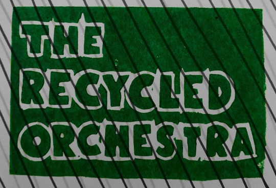
Out of all of my experiments I like these ones the most and I took inspiration from them for my final piece. From the collage, it was the grainy effect that I really wanted to incorporate into my final piece, whether it was through a lino print itself or if I added it digitally. I felt that for the album cover, having that sort of effect made it have a similar feel as the album cover created by Andy Warhol for The Velvet Underground which I really liked and found inspiring. I also find that the texture adds a lot of interest, especially using it for several elements of the final piece so it all worked well together. I also took of inspiration from the vibrant colours which I had used in the Adobe Draw experiment. I wanted my little character to be a focal point in the piece, so using a very vibrant green with the bright red “toothbrush guitar” truly brought him to life and made him stand out. The bold black lines used to outline him made him stand out from rest of the piece despite him being quite small. Lastly, I enjoyed the logo experiment which is evident given that I actually ended up using one of these experiments in my final piece! I took one of my lino logo experiments, and made it purely black and white and digitally cut out the letters so I could use them as the text in my final piece. I love how it added to my piece since it’s quite original. I also felt that the lino-printed block letters linked really well with the lino-printed lamp which I also used in my final piece, creating unity throughout the album cover, both front and back. The use of lino printing gave the finished piece a grainy/messy effect that I wanted. I loved this effect as the texture hints towards the ‘messy’ nature of The Recycled Orchestra, and klinked it all together perfectly.
The software I used to create my final piece was Photoshop. I chose this mainly because I have experience with the program and because I knew I could execute the digital parts of my concept with it. For example, making my lino look more broken up and textured using a brush tool. For these reasons, I chose Photoshop. My familiarity with it made it an easy and fun to use program, plus Photoshop offers a lot of range and different editing techniques which would be useful for my album cover.
0 notes
Photo


This is my final album cover! I really loved how this turned out in the end as I was uncertain on whether I would like it when I first started. I think it fits the brief perfectly as I’ve taken very everyday objects and given them life! The speckled print of my lamp gave this almost like messy rustic effect that I really wanted. I also adored my little alien guy, I feel like he adds a little bit of spice to the cover, he fits in perfectly but then also is so completely different too and I love that. The toothbrush guitar was a little bit out of place at the beginning but I think when I added a bit more colour to the whole thing it started to fit in better. Overall I really really loved how this turned out, I love the way I turned it around for the back cover, its almost like you’re walking round the whole piece and I really enjoy that feeling it brings.
1 note
·
View note
Photo


For my final idea I used these three components to then take it digitally and create my final. The first image is a picture of my lamp that i cut out on a piece of lino. The second image is a little drawing of an alien guy holding a toothbrush like a guitar. And the last image is one of my previous workshops, it is a logo that i cut out on a lino that i printed. All of these things helped me loads in developing my final piece, even more helpful that we had the workshops as I definitely took some inspo from those.
0 notes
Photo

For my final album cover I thought of a few different ideas that would work with the brief. The first idea was a skyline made up of random objects such as a ketchup bottle, or a utensil. The back cover of that idea would be a night sky of a banana moon and stars made from pencils. My second idea was a very simple album cover of a lamp acting as a tree with a person sitting in it playing the toothbrush ( like a guitar ), and the back behind the behind of that scene. And my lastly my final idea was a little house made up of random stuff again, with the back cover being from the viewpoint of the grass. From these ideas I asked around a few people and from my opinion and a few others the most favourited idea was the second one. That is the one I developed for my final piece.
0 notes
Text


This final piece is the most detailed as this felt like the sharp and harsh sounds mixing with the calming sounds, like both of what i had heard mixing together to give a new feeling i couldn’t put into words
0 notes
Text


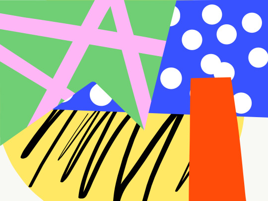
This piece was also inspired by The Recycled Orchestras music. The muted colours are because the classic music is quite calming to me and the circular objects are very smooth and pleasant to look at which is what i felt listening
0 notes
Text
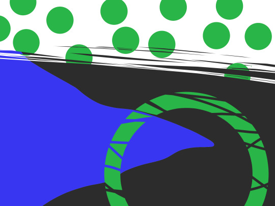


This piece was inspired by The Recycled Orchestra music. It feels very sharp to me because when i was listening to their music i felt like a lot of it was quite sharp sounds, harsh.
0 notes
Text


Andy Welland is a British artist and art director living and working in the UK. He is recognised for his vibrant, graphic collage work that is both welcoming and bold with a sophisticated conceptual edge.
He’s recently been partnering up with COCO chocolate to design the packaging
0 notes
Text
Bitmap vs Vector
A bitmap (also reffered to as "raster") graphic is made up of rows and rows of different coloured pixels that all form an image together. If you were to go to its simplest form, it would only consist of two colours, those being black and white. But if you were to complicate it more then it would include more colours. Photographs you take with your phone could have millions of pixels. The type of bitmap graphic formats include GIF, JPEG, PNG, TIFF, XBM, BMP and PCX. The monitor of your laptop, the screen on yor printers and scanners and that of similar devices, these are all bitmap. They would have been created using a programme like Adobe Photoshop.
A Vector (also reffered to as "object-oriented") graphic is made up using a mathematical formula, this describes the shapes, colours and placement of your vector. So rather than a bitmap which is like a huge plate of information on the colour of the pixels, a big vector plate would contain the instruction manual on where to place each component, like the shapes and colours. The type of vector graphic formats include PICT, EPS, WMF, PostScript, Truetype fonts, AI (Adobe Illustrator) and Adobe Draw. This means if you were to decide to scale up an bitmap image you would end up with a big messy plate of just a blurry pixelated image, whereas if you decided to scale up a vector then its plate would have the cleanest, clearest image you started with, only bigger.
Therefore I think for the final album cover design, a Vector graphic would be the better option just in case this design would need to be scaled for somehing other than a small album. Like maybe they decide to produce a vinyl record, thus making the packaging bigger, therefore needing a bigger image. Or perhaps they decide to sell tshirts with this image on it. Always think about where this design might go.
0 notes
Photo
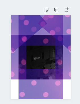


Hilton This is my third and final canva experiment, this one gave me a mixture between loud and jazz because of the purple colours i used and the vivid swirling in the middle. I actually liked how this one turned out.
I created it using some cropping, some transparency, some duotone effect and pixelate effect.
0 notes
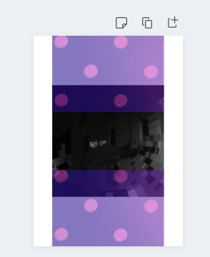
Photo


Concert My second canva experiment, I based this off the word concert because I thought the overlapping of the shadow hands created the same sort of vibe you’d get from concert pictures.
Created this using a series of overlapping, transparency and screen effect.
0 notes
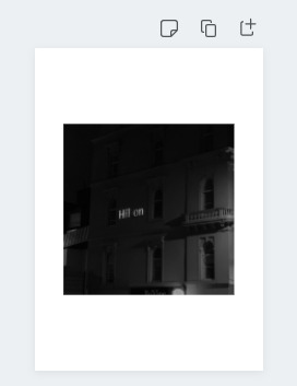
Photo


Moon. This is my first canva experiment! I actually quite like this one, I inspired the picture from the word Conductor as I thought the conductor tends to be a big deal, shines bright for all the orchestra to follow along and the moon also shines quite bright so I thought it was quite fitting. My process was a variation of cropping, Liquifying and duplicating!
0 notes