#MB_HNDCPM1
Text
Art Analysis Essay
Identifying which printmaking process works for me is pretty hard due to not having much experience in each different process, so I’d have to base this essay and my decision on which technique I’ve enjoyed the most this past year. I evaluated each process and my outcomes, and I feel the best would be Screen-printing. I also, came to this decision due to the speed and efficiency of this process. My art style can be quite graphical, and I feel this process captures that in print form the most, by using digital applications like Adobe Draw initially then exposing them onto a screen to produce a print. Using the specific colours in the initial design or being able to experiment freely without changing the integrity of the initial outcome.
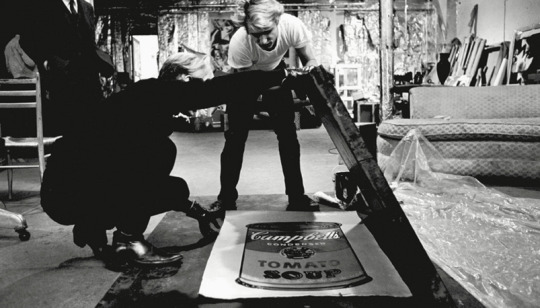
After conducting initial research, I discovered that screen-printing started as early as the 17th Century progressing through the decades ever evolving as the technique, we know it as today. Artists like Andy Warhol, David Hockney and Roy Lichtenstein really giving it the platform of popularity. The process makes up of a exposing a stencil onto a silk screen, then pushing the ink or paint through the screen so it transfers onto the material you’re wanting to print on. The stencil is exposed onto the screen in a similar way to a photograph, using light to burn the image into the reactive emulsion paint which hardens it. Any areas that weren’t covered by the design stencil remain a liquid which can be washed off to reveal the image you’re wanting to print, then allowing the ink to flow the screen to your desired layout or design.
Kate Gibb
Kate Gibbs is artist I’ve researched as part of another project and is printmaking artist from London, England. I loved her work previously, as I find it to be very expressive with her use of colour, lines, shapes and texture. The obvious use of mark making within her work can be visualised in different works. Utilising the chance of happy accidents that can occur during the creative process.

kategibb.co.uk. (n.d.). Kate Gibb. [online] Available at: http://kategibb.co.uk [Accessed 1 Mar. 2021].
My analysis of Kate Gibbs ‘Pleasure Garden’ starts with my initial feelings on the overall, composition, colours, textures and shapes she has used to create this piece. When looking at this design I get cultural references of Japanese printworks though her use on colour and their tonal ranges, after conducting further research I noticed that this design in particular references Kyoto, Japan for a magazine publication. This explains why she worked in this way to portray a more abstract outcome in relation to her way of working. As similar to her other prints works, I’ve researched Kate Gibb prefers the use simple shapes, colours and lines combined with layering. These marks on top of one another make her prints more cohesive to me, I think she does this, so her style is fluent and easily recognizable predominately, in her album cover works. My eyes are more drawn to the circle which looks like sun on the bottom layer, then flow around the composition following the brush strokes down the page into a pool of different mark marking processes. I find this design very relaxing compared to her other designs, the colours are more complementary of each other already mentioning their tones but, also different shades blue ranging to green and aqua. I think she might have done this to relate back to Japanese culture, as I also find the ‘The Great Wave off Kanagawa’ by Japanese artist Hokusai, very harmonious and calming. I like her use on paintbrush strokes to add texture especially in the larger areas where you can see the background peaking through. The little areas of detail filling negative spaces with repeated patterns and the shadowing of the background adds dimension also, contributing to the flow of direction when looking at the design. I like that there are some elements more subtle than others I think she would have done this to keep eyes on the piece for longer a the more I look and analyse different shapes and lines appear.

Google Arts & Culture. (n.d.). The Great Wave off the Coast of Kanagawa - Katsushika Hokusai. [online] Available at: https://artsandculture.google.com/asset/the-great-wave-off-the-coast-of-kanagawa/fAFp7yddSAtcTQ?hl=en-GB [Accessed 10 Mar. 2021].
Laurie Hastings
Laurie Hastings is a printmaking artist I’ve discovered recently on Instagram; her simple illustrative style of screen printing really caught my eye. Her background as an illustrator shows through into her silk-screen works, with the cartoon influenced figures and use of block colours. She is a commission-based artist with displaying works on her online portfolio but, also international exhibits.
Laurie Hastings. (n.d.). Portfolio | LAURIE HASTINGS Illustrator and Printmaker. [online] Available at: https://www.lauriehastings.com/ [Accessed 1 Mar. 2021].
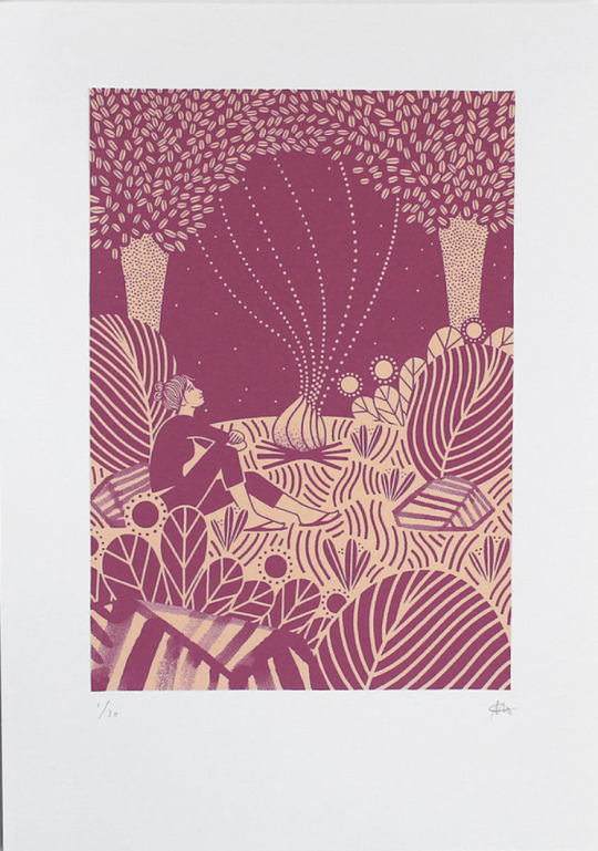
My analysis of Laurie Hastings ‘The Adventurers - Campfire’ starts with my initial feelings on the overall, composition, block colours and line work she has used to create this piece. My initial reaction was to the process of how this piece was made, as at an initial glance I thought it was a Lino Print, very similar to another artist I’ve researched called Michelle Hughes in terms of line work and block colours. I feel the simplification of only two blocked colours, one darker, one lighter which have no tonal range, shadows or highlights to them, then to be applied in layers create this effect. I get a real homely, warming feel from this, warmth relating the fire and her use of organic lines and shapes in waves. I can feel movement within the design to how it has been illustrated this way with fewer straight lines and the trees being more suggestive than realistic shapes. The figure in the print is of a woman looking out at the sky looking comfortable in her overall position. My own relation to camping and a sitting in front of a fire is that I’ve always found it very peaceful which also, strengthens the warmth intuition as I have a personal relation to it. The ground has also, been flipped in colour to create extra dimension of shape, grounding and stability. Highlighting this area to be different to the sky and other elements of the print. After looking deeper, I discovered this piece being part of a series of 3, with the other designs having similarities within their illustrative forms. Making all 3 designs a cohesive collection together. Looking at the bottom of the print your eyes automatically are drawn upwards due to all the different marks/lines facing vertically then interconnecting with different elements then drawing focus back looking at the print and its entirety.
michellehughesdesign. (n.d.). Yorkshire Dales III, original linocut print. [online] Available at: https://www.michellehughesdesign.com/yorkshire-dales-3-linocut-print?lightbox=dataItem-j97a2han [Accessed 10 Mar. 2021].
Chuck Sperry
Chuck Sperry is another screen-printing artist I’ve come across recently. He’s an American printmaker based in San Francisco also, working from his studio there. He exhibits his work internationally propelling his American rock poster style into fine arts using a silk-screen process. His use of text, patterns and various materials to print on caught my eye as I’d not seen this before.
Chuck Sperry. (n.d.). Original Art Archives. [online] Available at: https://chucksperry.net/category/original-art/.
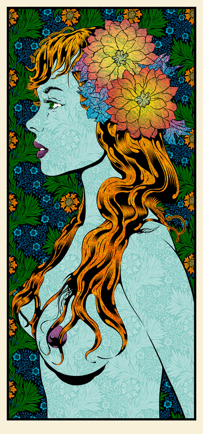
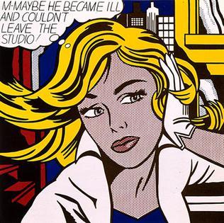
My analysis of Chuck Sperry ‘Vivien 2016’ starts with my initial feelings on the overall, composition, colours, patterns and influences that have gone into creating this print. My eyes are drawn to the initial profile of a woman as the title suggests is Vivien. Vivien reminds my highly of Marvels villain Mystique in the X-men series due to her being topless, the colours used for her hair and body along with the watermarked style texture of the background pattern showing through. I also researched his influences and among them was the era of pop art which I can see this print is heavily inspired by. Roy Lichtenstein portrayed women in many of his designs and the facial features and hair of ‘Vivien’ here compared to his ‘M-Mm Maybe’ print look very similar to me regarding there cartoon comic style. Although I do see the differences, I see I that Roy used dots to add definition in specific areas strengthening comic references whereas Chuck Sperry uses florals it his work. The floral head piece which looks as if it’s glowing from radial illusion created is the most eye-catching part of this design dividing the figure away from the busy background. Highlighting aspects of the background, the style of how the leaves have been drawn remind me of Celtic symbolism, and a traditional illustration of a Scottish thistle, the repeated pattern and the colours used a similar to a tapestry. Chuck Sperry has created a series of these designs uses the description of ‘muses’ and female names to title them, each design has similarities to the hair, florals and beauty creating a series print. Although his more recent work in this style looks less like a comic and more like a realistic portrait of a woman. The title of Muse to me highlights the feeling of confidence, strength and beauty which I feel is portrayed along with sensuality.
Wikimedia.org. (2021). [online] Available at: https://upload.wikimedia.org/wikipedia/en/2/23/M-Maybe.jpg.
All of the prints I’ve chosen have some form of an organic natural feel I find I am most inspired by these elements in terms relating to my own work. Different aspects of each artist drew me in for the analysis of their work. I find Kate Gibbs expressive abstract style very freeing with the use of her bold colours and layering. Whereas both Laurie Hastings and Chuck Sperry although using the same printmaking process have more of a graphical, planned technical feel. While writing up my analysis I wanted to include both styles of working as depending on my mood I like to work either way.
Word Count- 1,532
2 notes
·
View notes
Text
I have always been interested in the printmaking process of Collagraphy. This genre of printing allows room for experimentation, surprising mistakes and interesting outcomes. I’m also interested in Collage making and Collagraphy is a great way for me to combine the two. Even when drawing on paper, I usually feel the need to add something physical to it, to create a texture or create something more tactile. Throughout this research for collagraph artists I have learned more about the genre and I am excited to progress and experiment now that I have inspiration. I enjoy the process of finding day to day objects around me, and to find out how they take ink and print. To create a collagraphy print it’s imperative to correctly and properly prepare your ‘plate’. Your plate is a firm surface which can be scored, etched and different textured paper,gels and paint can be added to create an image. You can transfer your chosen image the plate as if creating a Lino cut image. You must use the correct glue to when building your plate and you can also use string, buttons etc as long as the material used isn’t too soft or absorbent which will affect the inking process. The plate image is then sealed with gloss or varnish (also the back and sides to prevent curving of the plate when being washed). The inking process can be the relief or intaglio method (adding ink on top of the image or adding ink into the image and wiping off then using a press similar to the etching method) I have chosen three artists and of the three I was happy to find Donald Stoltenberg. I also was happy to find information on Atelier 17, a famous print studio in Paris and later New York, set up by a British artist, Stanley William Hayter. He encouraged lots of experimental ways of printing and encouraged artists such as Sue Fuller.
Donald Stoltenberg
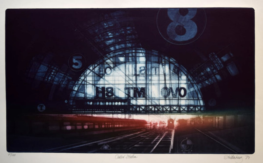
Donald Stoltenberg’s collagraph ‘Central Station’, immediately sets the scene. The viewer feels caught up in a timeless romantic narrative filled with anticipation and excitement. We cannot see other passengers which eludes to a journey or travel out-with the humdrum and the rat race. The warm red and orange hues and bright white of daylight from the archway are enticing as if there is another life outside of the dirty smokey city. The title ‘Central station’ reflects the mood of the occasion, perhaps we are waiting to meet a friend we’ve not seen for a long time or we are taking a long train journey. We, as the viewer are given the choice to create the story...the train arriving - who are you there to meet? There is a huge sense of anticipation surrounding this image.
The scene seems to be dateless, could be 100 years ago or yesterday. The image has a heavy vignette and this gives focus to the huge archway of the station entrance and gives the viewer a sense of smokey hazy station. The train to the left of the image... is it arriving, departing or stationary? We are able to create our own narrative and that’s why I feel this image is of a romantic nature.
Stoltenberg trained as a graphic designer before starting his career as an artist. The artist also had a passion for architecture and maritime structures. He has published books in his career, popular books being ‘The Artist and the Built environment” and Collagraph Printmaking. Although Stoltenberg was a successful collagrapher and printmaker, later in life he dedicated his life to watercolour and oil painting as these techniques were less laborious, although his subject matters remained the same. (Destroyer At DryDock for example and can been seen in the link for the Anderson Gallery)
The addition of the bold text and numbers seem to act like a calendar or stopwatch - the countdown to a rendezvous or a holiday. The number 8 seems to be a favourite of Stoltenberg as we see this figure of 8 in his train triptych. Stoltenberg also favours a circular object when fixing his collagraph plate. We can see the circle plays a vital role in many of his other works. (Shipyard 1982, Warship, Wooden bridge, Relic and Coin collection again, in the link provided). The lettering in the station’s large arch window are not recognisable or familiar, therefore I would presume that due to the technique of collography, the letters were used purely for aesthetic reasons rather than for any symbolic reason. With this collagraph, the fonts and figures would have been deliberately chosen in order to sit well on the plate.
The Artist has achieved a sense of movement with the train lines and carriages moving from the foreground of the image into the distance. He has also achieved the sense of direction and movement with the hazy shadows from the outside of the station tunnel. The artist has used both vertical and horizontal lines overlapping giving a sense of the enormous structure of the station and how it seems to loom or envelope the trains and passengers. The glass archway is almost central to the image and our eye is led to the incoming train with it’s white dot as a light. The viewer easily places themselves standing on the platform in anticipation...
Works Cited
ARCHIVE, ARTWORK. “Art Collection from Anderson Gallery - BSU.” Artwork Archive, 2021, www.artworkarchive.com/profile/jay-block/artist/donald-stoltenberg. Accessed 8 Mar. 2021.
“Donald Stoltenberg.” Wikipedia, 18 May 2020, en.wikipedia.org/wiki/Donald_Stoltenberg.
“Zullo Gallery - Current Exhibit.” Www.zullogallery.org, www.zullogallery.org/printmakers_page_1.html. Accessed 8 Mar. 2021.
KATHLEEN BUCHANAN
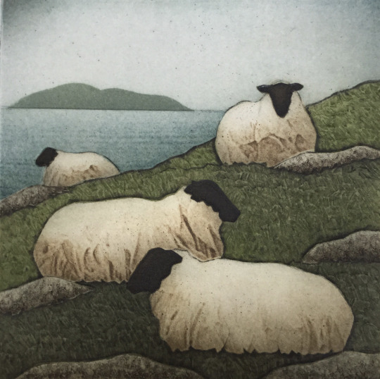
This image is by the Collagraph artist Kathleen Buchanan. Titled ‘Flock and Sea” is conveys a sense of silence and serenity - a slow pace. We find ourselves in quietness, stopping to appreciate the landscape on a hazy Scottish island perhaps.
The sheep are in a restful mood, however there is a humorous element to them. Our eye is drawn to the crumpled sheep coat - like an old paper bag, random like litter in the lush green grass being anchored by the boulders. In a light hearted way we could see that the boulders are preventing them from sliding down the hill. There is also a sculptural feel to the sheep’s coats which gives them a comical look, like they’re are wrapped up in a duvet keeping warm.
It’s Spring time but still cold, the slight haziness and speckled effect in the blue of the sky reminds me of the Scottish midge fly buzzing around with the sheep unperturbed.
The sheep are relaxed, reminding us of the harmonious relationship between nature and animals.
The viewer cannot see the eyes of the sheep, but Buchanan has caught the personality of sheep - one always seems to be curious or suspicious. The distant sheep of the flock could be the dreamer or the outsider - the ‘black sheep’. The other sheep make the viewer feel ignored by the deliberate positioning of the animals .
The boundary line, between the sea and the hillside divides the image. There are many outlines in this image - around the boulders, the sheep coats and the island - giving a sense of heaviness and solidity.
Kate Buchanan, by profession is a biologist and her background in science links well with printmaking. Both fields of study involve great observational skills and this is obvious with her great understanding of the natural landscape and its inhabitants.
Works Cited
Design, Doug Felton Web. Kathleen Walsh Buchanan Fine Art Printmaking | about Me. www.greysealpress.com/about. Accessed 8 Mar. 2021.
SARAH AMOS
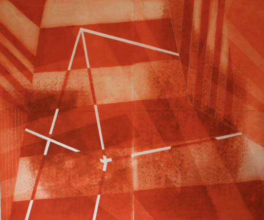
Sarah Amos, is a master printmaker who divides her time between Australia and America and her art combines collagraphy with mixed-media or more recently, stitching. Her recent work is based on images from the vast Australian landscapes. This collagraph is from 2011 and is not so typical of her recent work however it immediately caught my attention. The title is called Little Red Wonder and it’s an apt title. There’s no obvious narrative, but the artist evokes nostalgia, and grabs your attention through the colour and lines and form alone. So many words spring to mind on viewing this image - it feels like Christmas. It’s candy canes and gift wrapped boxes under the tree. It’s like a hazy red glow of the fairy lights and the warm fire. The image reminds me of sweeties and paper straws, strawberry shoe laces, and toffee apples at Halloween. The geometric lines and shapes and the vibrancy and the mottled marks conjure up visions of and old-fashioned circus and the high trapeze -the big top. Or a slice of cool watermelon or Summer Cup cocktail. The white lines, in strange directions, as if holding up the makeshift tent, cosy and warm, safely camping in your bedroom. The image is fairytales of Dorothy and her ruby red shoes and The Queen of Hearts in Wonderland all in one box of wonder.
As much as the image gives a sweet naive impression, we can also imagine the polar opposite. The colour red is a very symbolic colour, maybe the artist chose this particular hue of red to translate an emotion. Could this be an angry expression with the jutting disjointed lines. The lines are hard and edgy and there is no flow. Is the emotion aggression - the white lines in the centre of the image seem to puncture the composition - like exposed bones through blood. The viewer feels small, as if we are underneath a structure and it feels looming and foreboding. The two blocks each side of the image seem to be leaning in and are imposing.
With the nature of collagraphy, the inking and printing process almost always gives a dreamlike quality, a little hazy but alway an honest and sincere image.
Reference list
AMOS, S. (2021). Master Printmaker | Sarah Amos Studio. [online] sarahamosstudio.com. Available at: http://sarahamosstudio.com/index.php [Accessed 8 Mar. 2021].
Bunyan, D.M. (2001). Sarah Amos. [online] Art Blart. Available at: https://artblart.com/tag/sarah-amos/ [Accessed 8 Mar. 2021].
0 notes
Text
Woodblock Printing
Examples of Woodblock Prints


History
Woodblock printing is said to date all the way back from just after the days of stone carving (which is said to be the first method of printmaking) dating back all the way to around 105-868 A.D. This printing method originally came from Eastern countries such as China and Japan. Some of the oldest prints were; a chinese woodblock print book which was the 'Diamond-Sutra from Dunhuang' which was also the first of its kind, dated all the way back to 868. The piece was so technologically ahead of its time that it is most likely that there were other works which have been lost in time/not yet found predating this work and so this was evidence that woodblocks had been in development for a long time before this work. Another was a Japanese print named 'Dharanis' which is dated even further back in time to 770 A.D. This piece was heavily inspired from Chinese prints. Woodcuts had been used during the first centuries in China mainly to roll out buddhist scriptures and other things such as amulets.
Woodblock Printing in Europe
In Europe, woodblock printing had been introduced much later. It came around when paper production first began in the 1390s in paper mills. These first woodblock prints were also usually works of religious figures on single page prints. People saw these as symbols of protection. The size of these prints sometimes would be whole ceilings and doors. Early prints had been handmade using a muller. Sometimes, they were also hand painted by people named 'letter painters' who were guided with the help of patterns. These painters took extra care to leave linnes visable on the print when colouring.
Woodblock printing continued to further develop its own style within Europe toward the end of the 'High Gothic' era with it's prints looking similar to the stained gothic era glass windows. It had taken all the way up until the 19th century before more intriquitely detailed master prints had begun to be developed. These more detailed works were commonnly used for illustrations in books.
Text could also be carved out of the woodblock which was also very handy for printing and publishing books.
Techniques
Woodblock is another form of relief printing works the same as lino printing where the cut out/carved out pieces are not printed and the ink is applied to the uncarved areas.
References
Dieter Wanczura (2004). Woodblock Prints - History and Techniques. [online] Artelino.com. Available at: https://www.artelino.com/articles/woodblock-prints.asp.
www.artelino.com. (n.d.). Hiroshige Ando 1797-1858 - Sewing - Gold Coin Tree Series - artelino. [online] Available at: https://www.artelino.com/show/japanese_single_print.asp?mbk=6757 [Accessed 1 Feb. 2021].
Dieter Wanczura (2009). Woodblock Printmaking. [online] Artelino.com. Available at: https://www.artelino.com/articles/woodblock-printmaking.asp [Accessed 1 Feb. 2021].
1 note
·
View note
Text
Art Analysis
cogc
task: Complete the assessment on printmaking processes
1. Identify which process of printmaking you see yourself working towards and using your own words, describe this genre. Identify the key characteristics of this process.
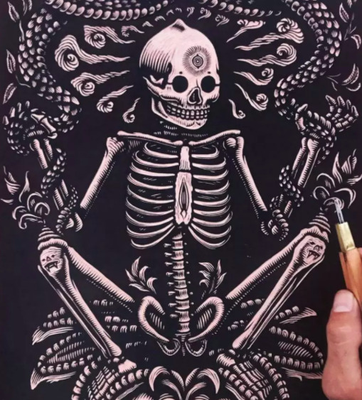
The process of printmaking that I see myself working towards the most is linocut. I haven’t been able to try much of the different techniques so I will be basing this off of the different processes that I have tried as well as from what I have found out from researching, and i have decided that linocut is the process that I see myself working towards. I like this technique as it is very easy to do and you can do any type of design easily, you can also get any level of intensity you want when doing this technique. Linocut also gives bold designs and clean prints. My genre of art is dark, horror and alternative styles. As my personal style is dark and alternative, I like to use this as the genre for my artwork. Usually when doing things such as drawings or paintings, I like to do detailed graphic pieces that have a lot of dark colours and tone/depth. When it comes to linocut, my genre changes a little. When doing linocut I still like to do alternative/dark designs but I try to make them a little more simple but still with the dark graphic ideas. Linocut is a printmaking technique where the artist cuts into a linoleum sheet with a blade to create their design. After the design is cut into the lino sheet, the artist then uses an ink roller to roll printing ink over the lino. The inked lino is then placed on a material and pressure is put over it to help print the design onto the material, this is usually done by using a press. Linocut is very similar to woodcut but due to the different variables of wood and lino, linocut can leave different effects and styles when printing. Lino prints can be created in masses due to the ease of reusing the lino sheet. The sheet used for linocut was created in 1860 by Frederick Walton in order to find a cheaper alternative material. The technique of linocutting was created in the 20th century although was frowned upon by artists due to its ease and lack of needing technical skills. German expressionists such as Erich Heckel and Gabriele Munter are thought of some of the first to come up with using lino for art purposes. Linocut was being used for black&white prints in 1912 in the UK, and russian artists started using it for prints by around 1913. Coloured linocuts were inspired by Claude Flight’s work and was taught in Grosvenor School of Modern Art from 1926-30. Picasso was famous for using linocut and made his first linocut in 1939-60′s, he is also thought of as the artist who started the “reduction linocut” idea - which is where a lino design/sheet is used multiple times in the one piece. Namibian John Ndevasia Muafangejo and Henri Matisse are also famous for their lino prints.
2. Choose 3 pivotal printmakers and their artworks to analyse and evaluate within your chosen genre.
Artist 1 - Ramon Rodrigues
Ramon Rodrigues is a graphic artist and printmaker born in 1982 in Florianópolis, Santa Catarina. He has various degrees in design and also has a studying background of drawing, illustration, anatomy, engraving and printmaking. Rodrigues specialises in dark gothic styled prints, which relate a lot to the same genre and style that I do in my work. From first glance, I can tell that Rodrigues specialises in black and white, there are some prints with colour but most of his work is black and white. This helps add to the horror and gothic genre of his work and works well with the designs of his prints. Another thing I noticed is the scale of his pieces, some are small little prints and others are very large, it’s very impressive to me how he manages to keep such detail and depth in his pieces no matter the scale. The main thing that I noticed when researching his work is just how detailed it is. Rodrigues’ work is filled with lots of tone and depth, all of his pieces have multiple layers of shading and all have little pieces of detail which help bring the piece together. The amount of depth and detail of his work is what really intrigued me and made me amazed at how good his work is. The amount of detail, depth and tone in his pieces make them look almost like a photo/realistic or that they were paintings (and not prints). These are three of my favourite pieces due to how diverse they are yet still all hold the great amounts of detail/depth/tone in them. Pieces like “Os Sete” are filled with objects in the background yet is still as impressive as something like “A Bruxa” which has less subject matter. All have different compositions, subject matter, layers etc yet are all as impressive as the other.
Artist 2 - Mazatl
Gráfica Mazatl is a printmaker based in Mexico City. His work centres around fighting for social, enviromental and political justice and works with groups related to these. The work that he makes is inspired by the work that humans do to “shake off the noose around our necks”. Mazatl creates pieces of printmaking, linocuts, woodcuts and also does murals. Mazatl is also a street/graffiti artist and is very into the punk scene. A lot of his work is also based from and inspired from his culture/heritage. Some of his interests include: anarchism, indigenous resistance and social movements. Although Mazatl’s work isnt as dark and gothic as some of the others on this list, I still think it’s dark and very impressive. The first thing I noticed in his work is the contrast between how much of each colour is used. His work, like the ones below, is predominately centred and filled mostly with one colour with smaller parts of another in it. For example: white with black detail or black with white detail. Another thing I noticed largely when researching his work is the amount of detail and little marks that he uses in his work. Usually, printmaking pieces have a lot of blank space, yet in Mazatl’s work the entire thing is filled with little detail and little lines/engravings. At first look it is clear that his work is filled with detail but the impressive thing is that the longer you look, the more detail and depth you notice, which leaves the viewer interested for longer. I really enjoy all the little and impressive detail/depth used as well as the messages and subject matter that he puts into his work. I also enjoy how a lot of them have the same subject matter which makes the pieces look like a continuing story.
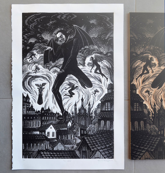
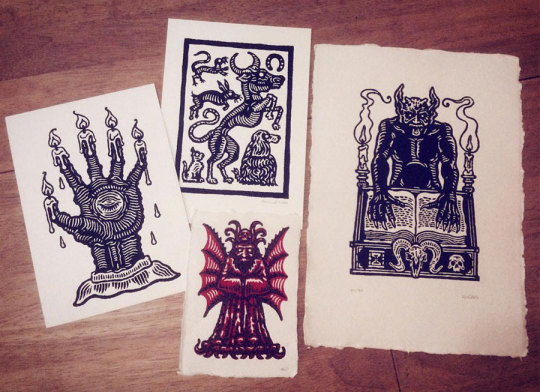
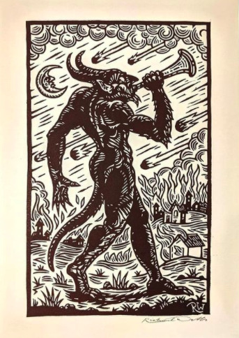
Artist 3 - Slippery Jack
Richard Wells, aka Slippery Jack is a printmaker who specialises in horror and macabre style work. Wells also does work for TV shows, album covers and book illustrations. His work includes things like Doctor who, Dracula (TV) and Green Lung (band), and work for authors such as Arthur Machen and M.R. James. A lot of his work involves traditional mediums such as linocut and drypoint etching. The thing that drew me into his work is the similar subject matter that we have in common, a lot of the work i do is similar to his work and the concepts he does. Although Wells still has the alternative horror genre in his work, some of his work is very modernised looking compared to other artists I’ve listed (e.g. second photo). The thing that drew me into his work is just how much detail and layering there is. Just like Mazatl, you can tell wells’ work is detailed from first observation, but the more you look - the more detail you see. It also impresses me how much depth Wells’ has in his work and how you can tell there’s a foreground, midground and background. My favourite photo of his work is the middle image, this is because each is different yet theyre all as impressive as each other. The right hand photo has so much detail, from the book writing to the book stand. I really enjoy the subject matter and composition of the top middle one as it looks simple but is filled with detail in the animals. The left hand one is one of my favourite due to the creepiness of it, as well as all of the detail and little lines that were used to create it. I think the bottom middle is my favourite as there is so much tone and depth used in it, that you wouldnt think it is a print. The wings, face and outfit are all filled with depth and tone that it looks like it is done by pen or paint or pencil and although it’s simple it is still very creepy and effective. Even though Wells’ work all have the same macabre style, each one is completely different to the others. Wells’ is definitely an artist who is good at his perception in his work (tone, depth, dimension etc).

References:
website: https://www.drawcutinkpress.com/south-american-linocut-artists/
publisher: draw cut ink press date: 2020
website: https://www.drawcutinkpress.com/top-linocut-artists-to-follow/
publisher: draw cut ink press date: 2016
website: https://www.ramon-rodrigues.com/sobre-about
publisher: ramon rodrigues date: n/a
website: http://www.graficamazatl.com/about
publisher: grafica mazatl date: n/a
website: https://www.juxtapoz.com/news/street-art/the-work-of-grafica-mazatl/
publisher: juxtapoz date: n/a
website: https://justseeds.org/artist/mazatl/
publisher: justseeds date: n/a
website: https://vampiresquid.co.uk/artist-richard-wells-on-folk-horror-tv-work-and-his-upcoming-book/
publisher: vampiresquid date: n/a
website: https://www.britannica.com/technology/linocut
Uploader: Britannica Date: 2019
website: https://www.thesprucecrafts.com/an-introduction-to-lino-printing-2578530
Uploader: The Spruce Crafts Date: 2019
0 notes
Text
Art analysis
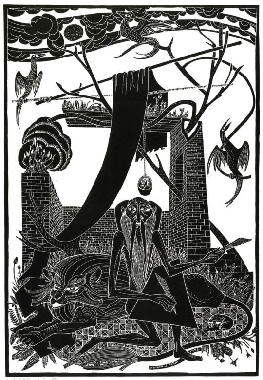
The background of this artwork seems to be the ruins of the Indian countryside because the guy who has got long beard and moustache like old wise man in India or other Asia.
In a mythical or imaginary place, it looks like a wise old man is trying to do something important with his familiar, looks like a lion in a shelter. There is also a human skull next to him probably meaning of death and dark his past or maybe this skull is someone who is really important to him.
There are three phoenixes above them, and I think the circular shape that I thought was the sun at first might represent the phoenix's egg. So, these three phoenixes are waiting some magical new birth is happening soon. For this reason, this work mixes myths and religions. Isn't life and death the main subject? I can feel the really dark feeling from this and also hope for the future.
Despite the work being from 2017, overall it has the emotion of some old tapestries and black-and-white printed matter. If you look at each object, you can see the clouds in the sky, the face of an old man, and the lion are done in the old fashioned llustration style. What seems to be a desk or paper on the lap of an old man is trapezoidal, and the pattern of the rug underneath is very abstract and modern.
Overall, I think this is really interesting artwork for me. It gives me a lot of imagination and feelings.
Japanese version;
このアートワークの背景はインドの田舎の廃墟のように思われます。神話に出てくるような場所で、賢い老人が手慣れしたfamiliar spiritsのライオンとシェルターで何か大事な儀式をしようとしてるように見えます。人間の頭蓋骨もあります。彼らの頭上には3羽の不死鳥がおり、最初は太陽かと思った円形の形はその不死鳥の卵を表してるのではないかと思います。このことから、この作品は神話と宗教を混ぜ合わせて生と死を主な題材としているのではないでしょうか。2017年の作品にも関わらず、全体的に見ると、どこかしら昔のタペストリーや白黒の印刷物に見られる情緒があります。一つ一つのオブジェクトを見ていくと、古い感じがする中にも煉瓦造りの壁には立体的であり、空の雲や老人の顔、ライオンはイラストレーションスタイルが見られます。老人の膝の上にある神と思われるものは台形で下に敷かれてるラグの文様はとてもアブストラクトで現代的な感じもあります。
Alasdair Gray, Saint Jerome, 2017
0 notes
Text
Artwork Analysis: SAINT JEROME
Alasdair Gray: Saint Jerome (2017)
Upon first glance at Aladairs piece, theres a sense of loneliness that can be visually stated by the colour and portrayal of the image, that being (in my opinion and perspective) Saint Jerome among Wildlife, alone, possibly writing memoirs with quills beside a run down brick structure thats overflown with nature. Saint Jerome appears to be the only human presence visible, with long facial hair, wearing little to no clothes, looking content in his rundown surroundings, as if he’s been there for a long time. But i believe that Gray is trying to convince the viewer that Jerome seclusion from society was intentional. Jerome seems to look very relaxed, not fearful to be sitting comfortably beside what appears to be a lion who are known meat eating predators, looking at the viewer with a sense of invitation and reassurance. Looking further into the image, it could be said that he’s turned his back on human innovation to be one with his surroundings as theres little man made architecture or invention visable, almost as if he’s came to despise what humanity is or has done to the world we share with animals.
I’m convinced this was an intentional choice by Gray to convey said loneliness and seclusion along with the colour used. As Black & White are the only two pigments of colour, the matte black creates a main focus to everything going on, not distracting the viewer with any other dark colours while the white creates a vibrant background layering to convey the Blacks tonal presence and create the immersion of more open space. The variety of shapes and noise in said image creates an everlasting presence, almost like the art is breathing and adding to itself. I believe the two pigments where used to bring out the images visual beauty without distracting the viewer with a main focal point. The piece creates an amhpostphere of uncertainty with the colour and topic used, in terms of there isn’t a defined description of this image apart from what your brain is drawn to, I feel like Gray created this thought provoking piece to be visually absorbed and let the mind create its own interpretation which is a great creative choice as it creates depth, mystery and overall return factor.

0 notes
Photo

Saint Jerome by Alasdair Gray (1955)
Alasdair Gray was quite a political man, he wrote pieces support socialism and Scottish independence and I feel he took a lot of this into his pieces. Saint Jerome is based off of the man Jerome of Stridon, who was a Latin priest, a theologian and a historian. Jerome was best known for translating the bible into latin and had many writings do with christian moral life. Gray ties this in using the man with his slab and feather pen, creating this almost story telling scene of Saint Jerome during his times of writing. The weary look of Jerome tells us that the whole feeling of him and this piece is tired, that maybe his age and his ideas are catching up to him and it’s wearing him out. The position in which Gray has done Jerome is quite a half and half position, he’s kneeling on the ground in a way which shows his age, makes you feel that Jerome is probably quite an old man at this point but the balancing of himself plus the obvious big slab and pen shows that despite his obvious age in this, he is still fit and able to do as he pleases. I think this artwork is meant to show Jerome in his study, working away but Gray has taken it a bit further and shown Jerome in a more broken down study, surrounded by quite powerful but also scary animals such as the lion, and despite this he has Jerome still writing away as if this whole scene around him isnt real. This whole scene looks as if Gray was trying to project that Jerome, despite the bad going on around him, would still keep strong and keep working on his beliefs just like gray did his entire life, especially with his passion for the SNP and Scottish independence. The black and white print gives a rather deep and sad feeling, emphasises how Jerome looks and probably feels in the piece and how maybe Gray was feeling about his place in the world. Wanting such ideas that not everyone accepts. Gray’s very angular lines from the top to the bottom of the piece help to convey the obvious tension and strain Jerome seems to be under, so much is going on around him and all these lines are moving in different ways, almost as if to be confusing as well as understood. So my final take on the piece is that because of the man Gray was, the very strong belief in certain political views and holding onto them till the end, is Gray tried to recreate how he feels into the man Saint Jerome as he was also a man who was known to have very strong beliefs and would write and write endlessly about them. Gray poured his life of beliefs and thoughts into this print in the form of a Saint who many years ago believed so strongly in something that he had to write about it, just as Gray did in his life.
Bibliography
Wikipedia Contributors (2019). Jerome. [online] Wikipedia. [Viewed 22 Febraury 2021] Available at: https://en.wikipedia.org/wiki/Jerome.
Wikipedia. (2020). Alasdair Gray. [online] Wikipedia. [Viewed 22 February 2021] Available at: https://en.wikipedia.org/wiki/Alasdair_Gray.
0 notes
Text
Timeline Project - Moving Backwards
Timescale allocated - 3000 BCE - 1750 BCE
3000 BCE
Cuneiform inscriptions
The Sumerians were the earliest known developed civilization, and they populated the region of southern Mesopotamia, otherwise known today as the Middle East. They had the first known form of a government-led society, which came about as a result of conflict and unrest for hundreds of years in the area, which ultimately influenced the future of modern civilization as other societies took on a similar model and structure through the example set by the Sumerians.
The Sumerians were a very industrious society, and contributed to many cultural and technological developments, such as the world's first vehicles with wheels, the world's first known city-states, the first laws written anywhere, and the world's first system of writing, known as cuneiform. Cuneiform inscriptions and designs would be engraved onto cylinder seals, which were typically made from stone, and then rolled over soft clay to leave relief impressions. Such designs have been discovered dating back to around 3000 BCE. Inscriptions have also been discovered engraved into prehistoric bones, cave walls, and stones. These cuneiform marks and symbols were put together and standardised over time to ensure that they could be easily recognised and understood by people, allowing spoken language to be represented and recorded. Once this was popularised, ideas and concepts were capable of being expressed through the art of writing. Cuneiform writings were used in all aspects of life, from recording trade, business, and temple activities, to writing stories, myths, literature, and even personal letters. In regards to trade and business, cuneiform allowed for information which would otherwise be impossible to remember, such as inventory and sales, to be accurately recorded somewhere and safely stored for future reference, similar to how in the modern age we use receipts for transactions with businesses. Some of the very earliest texts discovered actually depict pictographs of the produce and livestock which scribes had to record.

2500 BCE
Ancient Egyptian ink
The Ancient Egyptians invented black ink using a mixture of vegetable oil, beeswax, and black soot. From then, different colours were created using natural materials found in the earth such as ochre, in place of the soot used in the production of black ink. Scribes would use these pigments and inks with reeds to apply the medium to papyrus in order to write and keep records, and to decorate tombs for burial purposes.
Most commonly, scribes would use black ink for the main body of texts, and would reserve red ink for more important parts of the texts such as the titles or key words to highlight these sections. Other observed colours used in ancient Egyptian texts include shades of blue, green, yellow, and white.

1800 BCE
The Prisse Papyrus
Discovered in 1856, the Prisse Papyrus is thought to be the oldest known book form document to date. This document is relevant as it is a complete scroll of a literary manuscript which contains three literary texts, titled as 'teachings' or 'instructions', including the 'instruction of Ptahhotep'; a very important document of which only four have ever been discovered, the only complete document being included within 'The Prisse Papyrus'. The document contains information on how people of the time conducted themselves, and how they were lead in order to have a full and happy life. This is a very important historical document as it allows people to have insight into the ways of ancient cultures and societies, and how these people behaved within their societies and were expected to act in accordance with these beliefs. The text shows that general attitudes of the time of it being written were very good. The text was heavily influenced by and showed how to act in accordance to Maat, in ancient Egyptian culture, it was very important to act in accordance with Maat, which is the concepts of truth, order, balance, harmony, law, justice, and morality. Maat was an ideology which helped govern and control the people of the time, who were becoming more and more diverse as a society, and had conflicting interests, therefore averting chaos from erupting. This text was key to the understanding of this construct, and to the way in which people of the time were governed, as not many documents have survived which give insight on the laws of the time.
In order to control people and avoid mass chaos, the concept of the 'Gods' was created, each representative of different ideologies and beliefs. This helped govern the people of the time as they believed that if they acted in accordance with the Gods they would be rewarded with things such as a full and fruitful life, good health, prosperity, and good crop yields, to name a few. People would rarely dishonour the Gods and the beliefs at the time, as they were frightened that they would bring about badness and chaos within their lives by angering the gods, and through this people would be controlled to act well and uphold good virtues. Maat was one of these Gods, and represented the virtues aforementioned. Upholding these important virtues was key to building a successful and long-lived society, hence why ancient Egypt is synonymous with largely successful and progressive ancient societies and cultures.

Bibliography
•Mark, J.J. (2018). Cuneiform. [online] Ancient History Encyclopedia. Available at: https://www.ancient.eu/cuneiform/.
•Khan Academy. (n.d.). Cuneiform (article) | Ancient Near East. [online] Available at: https://www.khanacademy.org/humanities/ancient-art-civilizations/ancient-near-east1/the-ancient-near-east-an-introduction/a/cuneiform#:~:text=The%20earliest%20writing%20we%20know [Accessed 1 Feb. 2021].
•McGreevy, N. (n.d.). Why Did Ancient Egyptian Scribes Use Lead-Based Ink? [online] Smithsonian Magazine. Available at: https://www.smithsonianmag.com/smart-news/renaissance-painters-ancient-egyptians-used-drying-techniques-make-their-words-stick-180976176/#:~:text=Ancient%20Egyptians%20began%20writing%20with [Accessed 1 Feb. 2021].
•www.historyofinformation.com. (n.d.). The Prisse Papyrus, Perhaps the World’s Oldest Literary Manuscript : History of Information. [online] Available at: https://www.historyofinformation.com/detail.php?id=2045 [Accessed 1 Feb. 2021].
•www.sutori.com. (n.d.). Sutori. [online] Available at: https://www.sutori.com/story/history-of-printmaking--coDL8uRjurzfq5v4H9i85BV1 [Accessed 1 Feb. 2021].
•https://cosmosmagazine.com/chemistry/ancient-egyptians-preferred-metallic-inks/
1 note
·
View note
Text
Beginning of Research
1. Do you have a favourite printmaking image?

‘The People’ by Käthe Kollwitz, 1922, woodcut on paper.
2. What type of printmaking inspires you? Why?
I really like printmaking pieces from the expressionism movement, some pop art and some traditional japanese pieces. I really like very well done lino/woodcut prints as I really like how they look as a finished result once theyre printed, I also think that screenprinting with the use of bold, bright colours is also very inspiring to me.
3. Who inspires you? Why?
Printmakers who inspire me are; Käthe Kollwitz, Keith Haring, Stanley Donwood, and John Byrne. All of these artists inspire me as they can convey and capture real emotions and passion in their works, especially Käthe Kollwitz as she was famous for her hard hitting, macabre works. Their use of other elements such as their combinations of bright colours also give me inspiration to incorporate these into my own works as they give me more ideas on how to make my piece grab attention.
1 note
·
View note
Text
Offset Printing - 1875
Offset printing was developed near 150 years ago and remains the same today, its still the most popular method for printing in bulk. Its mostly used alongside the Lithographic process to create and produce bulk orders of posters, magazines and other large formats of prints.

Image:
In-text: (2021)
Your Bibliography: Instantprint.co.uk. 2021. [online] Available at: <https://www.instantprint.co.uk/umbraco-media/2631/8b-modern-day-offset-printing-heidelberg-speedmaster-sx-102-jennies-photos.jpg?width=500&height=333.33333333333337> [Accessed 1 February 2021].
Paragraph:
INSPIRED, B. AND PRINT, T.Online Business Card Printing and Flyer Printing
In-text: (Inspired and Print, 2021)
Your Bibliography: Inspired, B. and Print, T., 2021. Online Business Card Printing and Flyer Printing. [online] instantprint. Available at: <https://www.instantprint.co.uk/printspiration/be-inspired/the-evolution-of-print> [Accessed 1 February 2021].
0 notes
Text
The Rotary Press - 1843
The Rotary Press was created by Richard March Hoe and was the follow up to the Printing Press. The rotary press worked by using cylinders which images that where to be printed where curved and bent around. It was a quicker and more efficient way to produce prints than the Printing Press as the Rotary Press gave a constant flow of paper to be fed in and out the press.

Image:
In-text: (2021)
Your Bibliography: 2021. [image] Available at: <https://www.instantprint.co.uk/umbraco-media/2624/3-movable-type-wwwpinterestcom.jpg?width=343.05317324185245&height=500> [Accessed 1 February 2021].
Paragraph:
INSPIRED, B. AND PRINT, T.Online Business Card Printing and Flyer Printing
In-text: (Inspired and Print, 2021)
Your Bibliography: Inspired, B. and Print, T., 2021. Online Business Card Printing and Flyer Printing. [online] instantprint. Available at: <https://www.instantprint.co.uk/printspiration/be-inspired/the-evolution-of-print> [Accessed 1 February 2021].
0 notes
Text
Etching- 1515
Etching was a popular method in the middle aged to decorate armour and was later applied to Printmaking by Daniel Hopfer, a German Craftsman. This Process of Etching involved producing a print from a metal plate which was made from Zinc or Copper. The plate is then covered in Ecthing Ground which is an Acid Resistant Substance, to be then drawn on with a preferably sharp tool. The plate is then set in the acid which removes areas which the etching ground didn’t protect. This created lines which are recessed and hold the Ink. Finally, the plate is put on to paper and sent through a press to produce the etched print.

Image:
In-text: (2021)
Your Bibliography: 2021. [image] Available at: <https://www.instantprint.co.uk/umbraco-media/2624/3-movable-type-wwwpinterestcom.jpg?width=343.05317324185245&height=500> [Accessed 1 February 2021].
Paragraph:
INSPIRED, B. AND PRINT, T.Online Business Card Printing and Flyer Printing
In-text: (Inspired and Print, 2021)
Your Bibliography: Inspired, B. and Print, T., 2021. Online Business Card Printing and Flyer Printing. [online] instantprint. Available at: <https://www.instantprint.co.uk/printspiration/be-inspired/the-evolution-of-print> [Accessed 1 February 2021].
0 notes
Text
ICONIC PRINT MOMENT - 'The Gutenberg Bible' - 1455
‘The Gutenberg Bible’ was created in 1455 and was the first book ever to be mass produced. It was made by the use “movable type” which is another type of printing method. 180 copies where made but this was a huge step in printmaking innovation as there where only 30,000 books in Europe at the time.

Image:
n-text: (2021)
Your Bibliography: Instantprint.co.uk. 2021. [online] Available at: <https://www.instantprint.co.uk/umbraco-media/2626/5-the-gutenberg-biblewwwpinterestcom.jpg?width=344.3223443223443&height=500> [Accessed 1 February 2021].
Paragraph:
INSPIRED, B. AND PRINT, T.Online Business Card Printing and Flyer Printing
In-text: (Inspired and Print, 2021)
Your Bibliography: Inspired, B. and Print, T., 2021. Online Business Card Printing and Flyer Printing. [online] instantprint. Available at: <https://www.instantprint.co.uk/printspiration/be-inspired/the-evolution-of-print> [Accessed 1 February 2021].
0 notes
Text
The Printing Press - 1440
The Printing Press was invented in 1440 by Johann Gutenberg, The Printing Press built upon the techniques and method of “Moveable Type” and merged them into the one device that could be operated by hand. This was a huge step in Printmaking at the time, as it increased the speed that prints could be produced at a rapid rate and because of this, Printed texts became more commonly available to the lower class rather than just the wealthy and improved the lower class’ lifestyles drastically as they could self educate through what they read.

Image:
Image:
n-text: (2021)
Your Bibliography: Instantprint.co.uk. 2021. [online] Available at: <https://www.instantprint.co.uk/umbraco-media/2625/4-the-gutenberg-press-wwwpinterestcom.jpg?width=397&height=487> [Accessed 1 February 2021].
Paragraph:
INSPIRED, B. AND PRINT, T.Online Business Card Printing and Flyer Printing
In-text: (Inspired and Print, 2021)
Your Bibliography: Inspired, B. and Print, T., 2021. Online Business Card Printing and Flyer Printing. [online] instantprint. Available at: <https://www.instantprint.co.uk/printspiration/be-inspired/the-evolution-of-print> [Accessed 1 February 2021].
0 notes
Text
Moveable type 1041
Moveable type was created in 1041 by Bi Sheng in Song Dynasty, China. Moveable type is alot more similar to woodcut but was used specifically to print script. Before, lettering had to be fully written out, whereas Moveable Type allowed singular letters to be moved and placed to any order. The Tiles/ tablets which created the wording where made from clay and then wood and metal where used down the line for a better finish.

Paragraph:
INSPIRED, B. AND PRINT, T.Online Business Card Printing and Flyer Printing
In-text: (Inspired and Print, 2021)
Your Bibliography: Inspired, B. and Print, T., 2021. Online Business Card Printing and Flyer Printing. [online] instantprint. Available at: <https://www.instantprint.co.uk/printspiration/be-inspired/the-evolution-of-print> [Accessed 1 February 2021].
Image:
In-text: (2021)
Your Bibliography: 2021. [image] Available at: <https://www.instantprint.co.uk/umbraco-media/2624/3-movable-type-wwwpinterestcom.jpg?width=343.05317324185245&height=500> [Accessed 1 February 2021].
0 notes
Text
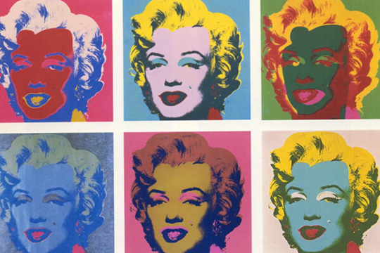
Screenprinting 1960-
Screenprinting 1960-
Andy Warhol popularised screen printing as a medium and art technique. His work included the 1962 Marilyn Monroe Diptych which stood out with its bold colours. Another artist who found international fame was Sister Corita Kent during the 60′s and 70′s for her vibrant serigraphs. Kent used bright rainbow colours that contained wording of a politcal and peace, love and caring manner.
Michael Vasilantone was an American entrepreneur, artist and inventor who used, developed and sold a multicoloured, garment screen printing machine in 1960 who went on to create the original Screen Printing Machine in 1969. The Orignal machine was created to print logos and team information on Bowling garments but was directed to printing on tshirts. Vasilantones Patent that he originally filled out in 1967 was licensed by multiple manufactures to produce printed tees. This popularised the Screen Printing machine and today, screen printing on garments accounts for over half of the Screen Printing activity in the US.
Digital Hybrid Screen Printing is the joining together of analog screen printing and traditional digital, direct to garment printing. Both of these methods are the most common in the textile embellishment technologies today. Digital hybrid screen printing is an automatic screen-printing press with a screen print station that shows CMYK digital enhancements. Digital hybrid Screen-printing can create endless customisations and multiple data options with the ability of screen printing specific techniques.
SCREEN PRINTING
In-text: (Screen printing, 2021)
Your Bibliography: En.wikipedia.org. 2021. Screen printing. [online] Available at: <https://en.wikipedia.org/wiki/Screen_printing> [Accessed 1 February 2021].
MARILYN MONROE SCREENPRINT
In-text: (Marilyn Monroe Screenprint, 2021)
Your Bibliography: 2021. Marilyn Monroe Screenprint. [image] Available at: <https://visitoceanside.org/events/art-workshop-painting-printmaking-andy-warhol/> [Accessed 1 February 2021].
Image2:
In-text: (2021)
Your Bibliography: 2021. [image] Available at: <https://everpress.com/creator-toolkit/a-brief-history-of-t-shirt-screen-printing/> [Accessed 1 February 2021].
0 notes
Last Seen Blogs

dark-tvwoman-w
DARK TVWOMAN

jimmycs-world
Untitled

cozz-mo
men are a scam, lesbianism is the answer

mopeytropey
a pleasant undoing

loadingoffice642
loadingoffice