
Artist + Sculptor + Silversmith | Passionate about creative concepts, handmade works and environmental practices
Don't wanna be here? Send us removal request.
Statistics
We looked inside some of the posts by jadearmstrongart and here's what we found interesting.
Average Info
Notes Per Post
8
Likes Per Post
3
Reblog Per Post
5
Reply Per Post
0
Time Between Posts
37 minutes
Number of Posts By Type
Photo
12
Text
3
Link
2
Last Seen Tumblr Blogs


Fun Fact
There were a total of 171.5 billion posts on Tumblr in 2019.
Photo


Photographs showing time, power and movement
Researching through the book ‘Photoviz: Visualising Information Through Photography’, by Nicholas Felton, week 13, 03/06/2020
Over the last few weeks I have been getting back into photography, so this week I started reading Nicholas Felton’s book and was inspired by many of the photographs. Above is a selection of my favourites.
They include:
Time Slice Global by Richard Silver where he has collaged 36 photographs from before and after sunset to show the passage of time. I feel this is a beautiful representation of the change in our lifestyles and use of spaces and buildings.
Another interesting depiction of the passage of time is shown in Bobby Neel Adams’ work Family Tree. Through this he shows a portrait of an individual which is stitched together from two photographs at different periods of time through a process he calls phot-surgery. It is incredible how perfectly the two images have been stitched together.
Political power and leader similarity is show through Alejandro Almaraz’s work Portraits of Power where he overlays portraits of all of the leaders of a nation. Some of these works are quite scary as they could almost be considered to be a single person.
The Writing on the Wall by Shimon Attie has a very sad undertone due to it depicting the former life of the Jewish quarter of Berlin by mapping pre-second world war photographs onto photographs taken in the same location in current times.
Finally the use of long exposure when photographing carnival rides allows Roger Vail to create a dystopian feel and capture movement through his work Carnival.
Seeing these works inspires me to want to go out and take beautiful data driven photographs too.
4 notes
·
View notes
Photo


Coding isn’t as easy as 1, 2, 3
Making the website, weeks 12-13, 25/05-05/06/2020
So I started trying to code my website using the information that I had learnt from the online courses, but this was quite tricky. So each time I was stuck I searched for coding help online and found a few handy sites:
https://www.w3schools.com/ - this is by far my favourite and it has a code editor which updates faster than GitHub which is handy.
https://www.learningjquery.com/
https://api.jquery.com/
https://developer.mozilla.org
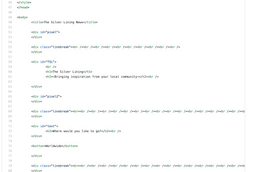
I managed to use HTML and CSS to code the site structure, though this could be enhanced by using floating boxes and columns. You can see a few of my site versions and tests using the W3 editor above. But currently I am trying to work through the Javascript to read the Phantom Buster scrapings and return set data. This is what I need the function/script to do:
Input: form output, i.e. Australia, UK, or USA
Variable: location
Process: read json file for location if it is the input
Output: imgUrl and description
After some first hand experience I have realised how complex coding is and that I have a lot to learn. But I really enjoy this process, especially the website design.
1 note
·
View note
Photo


Data poetry feeds my soul
Data art books, week 12, 30/05/2020
For my birthday I was gifted the book The Beautiful Poetry of Donald Trump by Rob Sears, which wonderfully compiles Donald Trump’s tweets into poems. This poetry through data concept remineded me of reading the Fifty Shades book from the Library of Non Human Books. Think I am a little bit in love with the idea of creating poetry by compiling or redacting data.
0 notes
Photo

How can a little flyer say everything you need it to?
Designing my flyer for the presentation, week 13, 04/06/2020
Currently I am in the process of designing my flyer for the presentation next week and am trying to get it to match the design of my website. Still need to write the text for the presentation, but so far I feel the design is coming together nicely.
0 notes
Text
Let’s hold up a mirror to our art practice!
Making a Statement tutorial, week 12, 25/05/2020
In this class Karen Ann took us through the making a statement worksheet to help guide how we write our artist statement. This was far more detailed than any artist statement I have completed before, I think it will be great to consider some of the questions such as how we would like to exhibit the work, the engagement of viewers of the work, artists who relate to our practice and how our background informs our approach to the work.
For me it is tricky to consider my overall art practice as everything feels quite seperate, but I feel this excercise will help inform my thinking around this and am excited to begin!
0 notes
Photo
Coding confusion
Making the website, weeks 10-11, 11/05-25/05/2020
These two weeks could be described in one word: confusion.
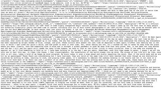
Firstly I began by looking for an API to scrape Instagram posts. Sounds easy. It should have been until I discovered that Instagram recently changed their privacy settings so it is not possible to scrape their site directly. There are sites that run APIs though so my search narrowed to those, after looking at numerous sites -Apify, Octoparse and Scraper API to name a few- I found Phantom Buster which scrapes Instagram through hashtags into a messy JSON or CSV, pictured above. Success. Next I needed to find users’ location data, which I later found Phantom Buster could scrape too. Double success.
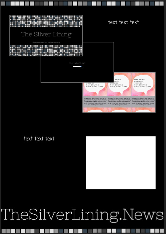
Next I needed to find a platform to host/build my website. I began looking at Squarespace, but you can’t easily edit the code. Next, I looked at Go Daddy, bought a domain: thesilverlining.news, and tried to code on their hosting platform but again you can’t add code. After calling the Go Daddy help desk I was directed to WordPress so gave that a go, but it also seemed to be too structured and you couldn’t edit the code fully in the way I wanted. Karen Ann reccomended GitHub and then off I went.
Coding began slowly but surely!
1 note
·
View note
Photo


Mapping power, traffic and other things
Researching in the book ‘Visual Complexity: Mapping Patterns of Information’, by Manuel Lima
This book acts almost as a manual for different techniques of mapping data and creating digital renderings. It covers everything from flow charts and ordering nature to arc diagrams and radial implosion. Generally I find this type of data art visually appealing yet complex to digest.
Of the works I found through this book I was most drawn to Jer Thorp’s NYTimes: 365/360. This visualisation of news shows the ties between the top organisations and personalities mentioned in the NY Times in 1996. Bill Clinton and the New York Yankees were mentioned the most frequently. I find it fascinating that in one visualisation you can essentially sum up the entire city of New York for a year.
I was also drawn to the pure visual beauty of Pedro Miguel Cruz, Penousal Machado and Joao Bicker’s Visualising Lisbon’s Traffic. The lights show the the speed and GPS location of 1,534 taxis in the city across a single day. The green hues represent faster speeds typically reached on larger roads and highways, while the reds show the slower speeds of the city. This work is something that I am drawn to and the more I learn about it, the deeper I am drawn to look at and investigate it.
2 notes
·
View notes
Photo


Data art shining a light on power
Power In Data Art tutorial, week 11, 18/05/2020
I feel that data art is a fantastic medium to expose where power lies, misuses of that power and corruption which exists. In the tutorial we were introduced to some artists who have shown such power through their artworks and use of data.
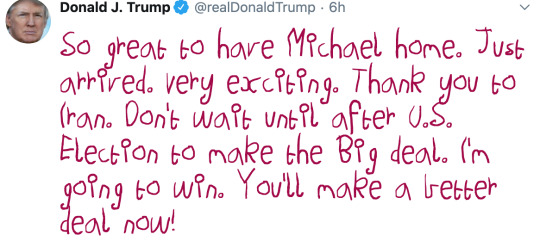
Jonathan Moore’s Artificial Killing Machine is probably my favourite example of the exposure of pollitical power and the outcomes of this. Another example I enjoyed of this political spin on data art was The Daily Show’s humorous browser extension to Make Donald Trump’s Tweets Eight Again (http://maketrumptweetseightagain.com, pictured). This has given me many hours of joy!
The Google AI, Ngram Viewer, trained in natural language is also of real interest. I wonder what potentials there are to use such technologies to assess cultural norms and to benchmark against in changing topics such as racism and gender stereotypes.
0 notes
Photo

Power derived from shock and panic
EXIT exhibition, week 10, 13/05/2020
An exhibition which I keep thinking about, and probably the first data artwork I saw, is the exhibition EXIT, by Paul Virilio, Diller Scofidio, Renfro, Mark Hansen, Laura Kurgan, Ben Rubin, Robert Gerard Pietrusko and Stewart Smith.
I saw the work in 2017 at the Ian Potter Museum of Art. You entered into a dark room, sat on the floor and watched for an hour as the wrap around screens immersed you into the statistics of climate change. Never before has an exhibition had such a profound emotional effect on me. The statistics were overwhelmingly alarming.
After experiencing this work I felt panic about the future of our earth and began taking more steps to live in a more environmentally friendly way. That exhibition was powerful. I’m not sure if it was the statistics or the visualisations which were most powerful, or both. The work is one of the reasons I am completing the Visualising Data Through Art course now. And for some reason as I work on my project, I just can’t get it out of my mind.
0 notes
Text
You can code if you put your mind to it!
Coding tutorials, week 10, 11/05-18/05/2020
So, I want to make a website. But, I have never coded before.
To LinkedIn Learning I turned and completed the below courses...
Introduction to Web Design and Development, by James Williamson: https://www.linkedin.com/learning/introduction-to-web-design-and-development/
HTML Essential Training, by Jen Simmons: https://www.linkedin.com/learning/html-essential-training-4/
CSS Essential Training, by Christina Truong: https://www.linkedin.com/learning/css-essential-training-3/
Responsive Layout, by Clarissa Peterson: https://www.linkedin.com/learning/responsive-layout/
WordPress 5 Essential Training, by Morten Rand-Hendriksen: https://www.linkedin.com/learning/wordpress-5-essential-training/
It was useful completing these courses and now I have a lot of notes, though need to test out the theory and create my own website. I feel that through the courses I understood the basics of what each part of code does, but not how to put it all together. Hopefully this will become more clear as I create my website.
0 notes
Photo

Did Disney freeze gender diversity?
Visualising Data class, week 10, 11/05/2020
In class today we were introduced to several new artists, I was most inspired by the way these two artisits used public data to guage or suggest people’s opinions on a macro and micro scale respectively: the work Public Face, by Public Art Berlin and Kyle MacDonald’s Exhausting a Crowd.
Also, as someone who is fascinated by the way DNA is used to solve crimes I found Heather Dewey-Hagborg’s works Stranger Visions and DNA Spoofing particularly appealing. Though DNA Spoofing for me does have a slightly creepy undertone at the concept of swapping DNA with strangers - I wonder if any smart criminals ever used their service to frame a stranger for a crime.
After the presentation, we were broken into small groups and asked to complete an activity to make a chart using pop culture references. We were told to “ask questions of the data. Interview the data. Rinse and repeat.” ~ Buzzfeed. My group decided to look at gender representation in the movie Frozen and found that while this was deemed to be Disney’s most important feminist film, most lead actors were male and over 50% of the spoken dialogue was by men! You can see our draft data board above, as sadly our final board was deleted.
0 notes
Photo


Abracadabra! Are you fooled yet?
Reading from ‘Visual Explanations’ book by Edward R. Tufte, week 9, 09/05/2020
As someone who has dated a magician for several years I love magic and was so excited to see an entire chapter dedicatied to ‘Explaining Magic’!
While this may not strictly be a data visualisation, the author suggests that through the pictoral illustrations of the steps in performing a magic trick the artist is communicating information and therefore classes it as such.
I found the cartoon drawing by B. Kiliban Two Amusing Water Tricks hilarious and would definitely recommend it as one to try at home! Lyle Douglas’s depiction of The Flying Glass of Water in Complete Five-in-One Catalog is of particular interest to me as this is a magic trick I have personally performed and I felt perfectly depicted the excitement of the trick itself. Lastly, Thomas Hill’s sketch of using illusion to float a piece of wood has a cheeky tone by revealing the illusion with a lift up flap.
I wonder, could these step by step instructions still be considered relevant art today given their simplicity?
0 notes
Photo


The beginnings of data visualisation
Reading from ‘Visual Explanations’ book by Edward R. Tufte, week 9, 07/05/2020
As I was researching the beginnings of data visualisations I came across Michael Florent van Langren’s drawing ‘La Verdadera Longitud por Mar y Tierra’, pictured above, which is one of the earliest visual representations of statistical data. It was drawn in 1644 and depicts (slightly incorrectly) the distance between Toledo and Rome. Fascinating that this drawing, which would be comon place today, would have been revolutionary at the time it was drawn.
Another drawing which I thought was quite sweet was Humphry Repton’s ‘Designs for the Pavillon at Brighton’. This is also an early visualisation, coming from the slightly later year of 1808. It shows the same building before and after its construction. The artist added to the before sketch notes on what had changed between the two timeperiods, as well as three people holding ten foot long poles to help him calculate perspective in the image - though the scale was slightly incorrect. Images which highlight somethings change over time are of interest to me, particularly when they concern something which is of historic importance.
These two early visualisations highlight for me how concepts can be simply communicated, and also the errors which were in both of the works show that today we have so much access to detailed and accurate data sources which we take for granted and can be a source of inspiration.
0 notes
Photo

Fading Beauty
Data art concepts in my sculpture work, week 9, 06/05/2020
I was inspired by Sam Taylor Wood’s artwork Still Life and felt the concept tied into another work I was creating for my Sculpture class. For my work I was drying rose petals and was surprised to watch how much they changed as they dried. So I decided to record this change in a similar way to Sam Taylor Wood, though a time lapse video.
To caputure this, set up a system for my camera to automatically take a photograph of the flowers every 7 minutes for 9 days. You can see in the photograph above how the roses shrunk, changed positioning and colour as they dried. Currently I am in the process of editing the 1,757 photographs into a video to reflect the change over time of the rose petals.
0 notes
Link
Yes, you can do this!
Wiip Board and Milestone Review, week 9, 04/05-10/05/2020
I created a Wiip board (in the link) to present my idea to my colleagues to get their feedback in the milestone review. The board covers details on the idea itself, a gantt chart of the tasks required to complete the project, the tools I will need and a sample of the intended output.
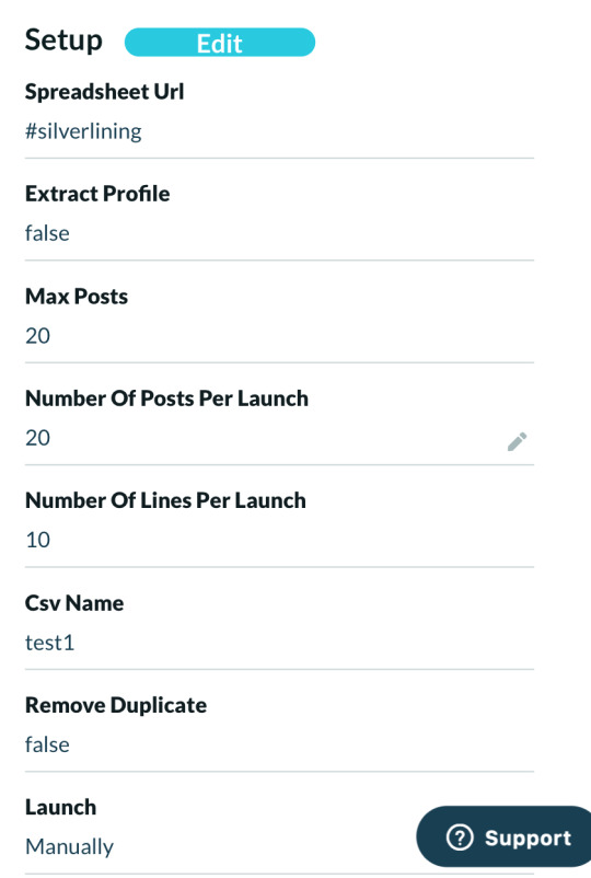
My idea has changed slightly, now the good news site content will be collected by scraping Instagram posts tagged #silverlining.
The milestone review was really useful in getting feedback from both my peers and tutor Karen Ann. The most prominent points of discussion were around the use of Javascript to create the website, using an API to scrape Instagram, pagination, as well as how HTML and CSS can work together. I was pleased to hear positive reactions from my peers and that the consensus was the project is feasible.
I also got a lot of energy from listening to my peers talk about their projects, it is fascinating how we all begin at the same place and then fork off in so many different directions.
0 notes
Link
How safe is safe?
Data in the news, week 9, 30/04/2020
A very topical subject is the Coronavirus app, Covidsafe, which tracks users’ location to help with contact tracing when a user is diagnosed with COVID-19. The best article I have found which outlines the situation is this one linked by The Guardian.
The good: it can help save lives, that is pretty good!
The bad: the government has access to its citizens location data and can identify who you have been meeting with. Also, this could set a precident for the future that goverments should always have access to this data, which for situations like COVID-19 would be very helpful. Though, there is a posibility for corruption which can be dangerous.
Interestingly, the app data is managed by Amazon Web Services, for which my mum happens to be the Head of Cloud Security for AWS. Her team is managing the data for Covidsafe and she has reassured me that the concerns raised around data extradition by the US Government due to AWS being a US company are unfounded. This is because AWS has a head office/seperate company arm in Australia and the Australian Government is able to veto any such request. Also, the data is held under the highest level of security clearance and the Government is unable to access this unless users are diagnosed with COVID-19 and subsequently opt-in to release the data to the Government.
Knowing this put me at ease in this case, but I do wonder if there is a risk data being collected and shared by the government in the future? Or if this risk is more prevelent in other countries and we have just made the technology to do so more accessible? Though is there really anything new to be worried about anyway as Google has been tracking our location for years? Only time will tell.
0 notes
Text
Here is the idea, but how can I make it a reality?
Idea development, week 8, 29/04/2020
I decided to progress with my idea of creating a website which shares good news stories to bring hope and inspiration to others. So far these are my thoughts on what I will create:
Idea - my idea is to create a website about silver linings to give hope and inspiration to people and make it relatable by it being locally sourced. Viewers will be able to go to the website, it finds their location, and then shows them the top 5-10 Instagram posts of the day/week within approx. 50km of their location which has been hashtagged #silverlining and formats these into a digital newspaper page titled for example Silver Linings of Melbourne. They would also be able to search for specific locations too. Ideally, each Instagram post within the newspaper page would also have a headline which is automatically generated using the post content. Once the site is running, I would then create/print a physical newspaper of all the individual pages of selected cities at a set time. Further concept developments (though I'm not sure if this is realistic in the timeframe) would be to create feature/topic newspapers, for example, a Corona topic which features all the posts which hashtag '#silverlining' and '#corona or #coronavirus or #covid or #covid19'. Questions - I have quite a few questions to work through at this point around next steps and how to make this idea a reality:
Is this a realistic project within the timeframe?
What is the best website platform I can use to build the site?
How do you pull hashtag data from Instagram with geotags?
How do you set up/code a website which is regularly updating/pulling this data?
Can I make the site populate the data in a newspaper-style format?
Can I find the location of the person going onto the website?
Is there anything key that I have missed?!
0 notes