Statistics
We looked inside some of the posts by jazz-vcd and here's what we found interesting.
Average Info
Notes Per Post
10
Likes Per Post
8
Reblog Per Post
2
Reply Per Post
0
Time Between Posts
7 days
Number of Posts By Type
Text
13
Last Seen Tumblr Blogs


Fun Fact
Tumblr was acquired by Yahoo for $1.1B in 2013.
Text
Final Reflection
Task 2 was a rollercoaster ride (it was a lot of fun, but I was also scared that I wouldn’t make it to the end). It was a big project, so I will break the reflection into parts.
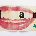
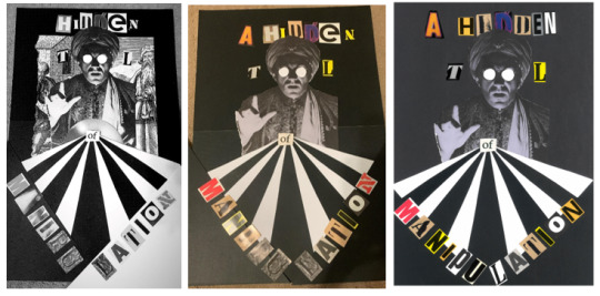
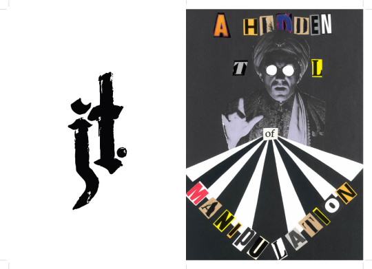
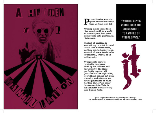
First up was the collage for which I presented Neville Brody’s quote “typography is a hidden tool of manipulation in society.” I chose this quote partly because I believe it, partly because I love how seriously designers take themselves, and mostly because it sounds cool. I cut the quote down to just 5 words “a hidden tool of manipulation” as the full quote was too long and cluttered the page. I knew I would probably lean towards Postmodernism and grunge in my collage, so when a classmate brought a collection of old art magazines to cut up, I plundered accordingly. I was picky with my letters, collecting letters with a handmade/printed look that were similar sizes and colours. Initially I wanted to make a collage like a hidden objects game so that I could use details as features on different pages of the zine. I tried many iterations of the collage but ultimately felt the images I had weren’t cohesive, so I decided to cut back to only the fortune teller since he tied in nicely with the quote. I followed Constructivist influences when creating the sunburst and positioning the words. Overall, I love the way the collage turned out, although it is off-centre which really frustrates me – in future I’ll be sure to measure things out properly before cutting them up or gluing them down.
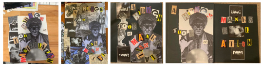
Collage evolution (#DesignIsAnIterativeProcess)
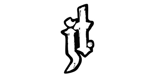
Next up was the monogram, which was the section I struggled with most. Silly as it sounds, I don’t like my name, so I wasn’t keen on investing time into portraying it. Still, I gave it a go- I do appreciate a good monogram (and it was mandatory). I found myself drawn to older monograms; those made by creatives who used traditional making techniques like printing or engraving to sign their works. Our first monogram exercise tasked us with hand drawing 2 monograms inspired by 3 different font styles.

Dodgy attempts at hand lettering
Of the styles I experimented with I wound up really liking the blackletter designs, so I sent it to Illustrator using the Adobe Capture app, where I edited it to improve the quality of the vector and position the letters more nicely together. I kept some of the texture of the original drawing to maintain the handmade feeling, but edited enough so it felt refined. My monogram was well made, but could have been more interesting – I really struggled to find ways to weave the letters J and T without it looking like a stick. I am interested in pushing myself on this front to improve my typography and hand lettering skills.

Brainstorming alternative monograms

Process of designing final monogram
Final monogram (in a container)
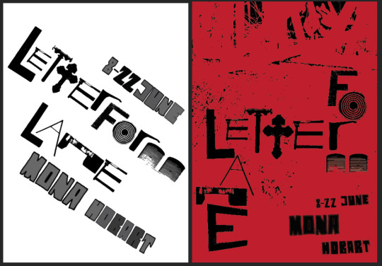
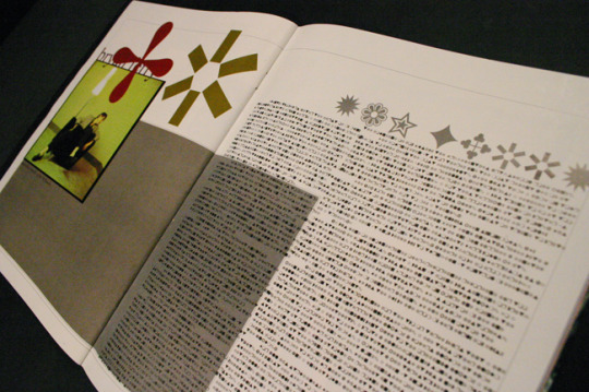
Finally, all the pieces came together for the zine. I got Covid right in the middle of this project so it was a little hectic for me. Regardless, I thoroughly enjoyed the making process and felt that it was a great creative exercise. My font choices were Kiln Sans (sans-serif)- a textured font styled to look like a wood-block print; and P22 Typewriter (serif). Both of these fonts came from the Adobe Fonts library, and both emulated the handmade look that I love. I enjoyed playing with the layouts of the text and tried to develop a look that blended the geometry of Constructivism with the chaos of post-Modernism. That being said, after looking more carefully at the magazine spreads of Greiman and Carson, I could have done with a more careful use of grids in my layouts (particularly on pages 4 and 5). I enjoy learning the Adobe suite so most of the issues I faced during the creation process felt like learning opportunities – except for the problems that made me feel crazy... I'm looking at you printing set-up. It took me four tries to get all the pages printed in the right order, I had to add an extra collage in the middle to make the pages divisible by 4, then the pages printed unaligned. I cut them to size as best as I could, but realised that I definitely need some practice with using bleeds/slugs/etc to achieve the desired results.

(Bonus collage/mini-poster in centerfold!)


Final zine spread, cover to cover
This project (and class overall) has helped me to further develop my own art style, while encouraging me to see a project through to completion – something I really need to work on outside of uni. This process has also deepened my understanding of the history of design, giving context to and (I think) improving the overall quality of my work.
0 notes
Text
Monograms
A monogram is a motif of overlapping letters, designed to be easily recognisable. Some of the earliest known use of monograms was in Ancient Greece, where coins were embossed with the monogram of the city they were produced in. Since that time, monograms have maintained their position as subtle but unmistakable signs of ownership and/or authority, with royalty, businesses, wealthy families, artists, and craftworkers using personalised monograms to represent themselves.
A famous early example is the monogram of Albrecht Dürer, who began to sign his elaborate paintings and prints with his stylised initials. The monogram he designed was simple enough to be clearly legible, but included detailing in the serifs and proportions of the letters that created a unique symbol.

Various iterations of Albrecht Dürer’s monogram
Additionally, Dürer would shift the size, perspective, and positioning of his monogram to best fit each work. For example, in the etching ‘St Jerome in His Study’ the monogram is fitted onto a small board on the floor of the titular study, and he employs a similar tactic again in ‘Coat of Arms with Skull’, in both instances seamlessly including the monogram for evidence of his authorship. This is a perfect example of how valuable it can be for a monogram to be adaptable; the ‘AD’ is simple enough that it can be reshaped as needed, but designed in such a way that it is recognisable regardless. Dürer’s monogram also became grounds for an early case of protection against plagiarism when Dürer took issues of plagiarism to the Venetian courts and won the case, making it illegal for others to imitate his monogram. As such, works marked with Durer’s monogram increased in value, and the artist’s creative ideas were protected. This use of monogram is also a great example of the power of brand recognition.

Albrecht Dürer, ‘St Jerome in His Study’ 1514, Copper engraving

Albrecht Dürer, ‘Coat of Arms with Skull’, 1503, Engraving
A more recent, and equally (if not more) famous example of a monogram is the logo for Volks Wagen. It is fairly common knowledge that Volkswagen (meaning ‘the people’s car’ in German) began in 1937 as a company producing vehicles for the Nazi party. The company’s first monogram incorporated the swastika, with the recognisable clockwise spokes protruding from a cog which enclosed the ‘VW’. The design was thematic to the company, creating a logo which looked like a wheel, meanwhile aligning Volkswagen with the Nazis, making it both a tool for brand recognition and propaganda. By 1939 the swastika motif was dropped from the design, in what could be cynically considered a shrewd business decision more than moral recompense. However, the monogram remained, still enclosed in a cog until 1945 when its container became a smoothed circle. The letters of the monogram are creatively situated; like Dürer’s monogram, it shifts the sizing of individual letters to fit them neatly together and create an entirely new symbol. There is a considered use of symmetry, angles, and negative space in the logo that has created an interesting and unique symbol. As such the VW monogram has become one of the most easily recognised logos around the world, with its origins often overlooked- which in part is due to effective design and rebranding.

History of the Volkswagen logo
Trends in the use of monograms have shifted gradually over time. For better or worse there has been a mainstream trend towards simplification; whittling away the flourishes and serifs of yore to move towards sleek, modern designs. In older examples like the conjoined monograms of authors Somerville and Ross, or even further back to the monogram of French Emperor, Napoleon Bonaparte, we see elaborate designs with symbolism and decorative shapes. Modern monograms tend toward sans-serif fonts, with little to no details beyond the letters. They are most commonly used by high-end brands and companies seeking to establish authority in their field. These current trends can be seen in the logos of Chanel, Yves Saint Laurent, Gucci and LG. It seems that monograms are established enough for designers to make use of them through hundreds of years of social changes; I am eager to see what the future of monogram design looks like (and maybe even participate in creating it).
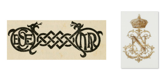
Left: Paired monograms of E.OE. Somerville & Martin Ross from a 1915 edition of ‘The Real Charlotte’ Right: Monogram of Napoleon in gilt on Royal china dinner plate from Tuileries Palace

Various brand logos, from left to right: Chanel, Yves Saint Laurent, Gucci, LG
References
Inkbot Design (2019). History Of Volkswagen Logo Design — An Evolution. [online] Medium. Available at: https://inkbotdesign.medium.com/history-of-volkswagen-logo-design-an-evolution-6be7a9262eeb [Accessed 20 May 2023].
Ip, N. (2017). Dürer or not? [online] Royal Museums Greenwich. Available at: https://www.rmg.co.uk/stories/blog/durer-or-not [Accessed 20 May 2023].
Keung, L. (2021). What Is a Monogram? Types, Designs, and Ideas. [online] Envato Tuts+. Available at: https://design.tutsplus.com/articles/what-is-a-monogram-types-designs-and-ideas--cms-35023 [Accessed 15 May 2023].
0 notes
Text
week 6 - assessment 1 reflection
Preeettyyy excited!! I’ve finished my poster and proof sheet - all that’s left now is doing a full sized printout.
I wound up adding a figure into the poster- it’s just an image traced photo I took in my bedroom (on my iPhone at that 😳) - it was a nightmare to cutout in photoshop because there was lots of junk behind me in the pic & for some reason I took the photo in really dim lighting, but it doesn’t matter because I got the result I was looking for.
I also added some extra hand drawn text to fill in space and add context to the figure. I did play with colour a little and got some cool results, but my heart wanted greyscale!
Some iterations with variations on colour/use of space. I liked these but ultimately chose to go with the design below.
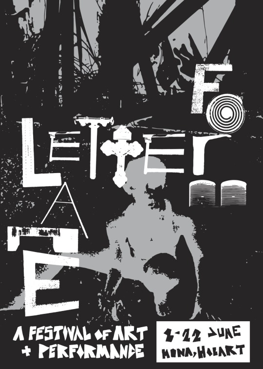
I’ve also finished my proofsheet(s)! Happy days :)))

0 notes
Text
“Typography is a hidden tool of manipulation in society.”
Visual design is the business-minded sibling of visual art. In my research this term this has been reiterated for me many times, particularly when looking at the immense business successes of designers like Paula Scher and Neville Brody. Design, unlike art, must serve a purpose. Designers make use of visual tools to communicate ideas to the masses, often on behalf of businesses trying to sell products. In order to make these products seem appealing to the viewers, the designer must understand the whole range of tools available for them to use, including colours, images, shapes, layout, and of course typography.
Text is a straightforward way to visually communicate a message, but typography selection is more complex than first meets the eye. Different type faces can communicate different ideas and moods, for instance the Jokerman font designed by Andrew K. Smith has a goofy energy and is generally used to invoke whimsy or excitement. On the other hand fonts like Helvetica or Times New Roman are more serious and refined, so they are more likely to be used for companies/brands seeking to establish their authority. It is also worth noting that in the current world of global markets, design favours simplicity, which often means sans-serif fonts and minimal text, so as to establish brand recognition quickly and communicate smoothly to the widest audience possible.
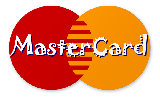
Steve Lovelace’s reimagining of MasterCard logo with Jokerman font. Definitely doesn’t seem like the logo of a financial company now, huh?
High impact sans-serif font, minimal text, eye catching and communicative regardless of text content
Different fonts can effect readability, with sans-serif fonts having an increased readability in comparison to serif fonts. For example, the polarising Comic Sans is considered to be the most legible font for people with ADHD, dyslexia, and other literacy issues. Still, despite its benefits, Comic Sans has its fair share of critics.

The well-versed designer is aware of these aspects of typography, and is able to work with and around them to communicate their ideas so effectively that the viewer is unaware of the typography itself speaking to them. To me, that is what Neville Brody meant by, “Typography is a hidden tool of manipulation in society.”
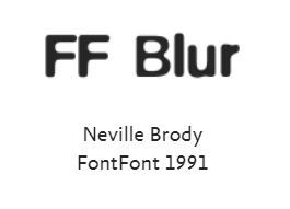
As a young man, Brody was heavily involved in the emerging London punk scene, which influenced his decision to study design at the London College of Printing. In an Architectural Review interview from 1986, Brody shared “[I was] morally against the manipulativeness of advertising, so I went into design partly to understand how the form worked, and to use it against itself. I wanted to manipulate people too, but into querying, into questioning what they were being told…” The influence of punk carried on through his career, and he became best known for his work within the 1980’s alternative music scene, where he designed record covers and contributed to “The Face” magazine. He also designed several popular typefaces including FF Blur and Industria.
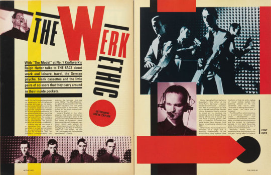
The Werk Thing – Kraftwerk interview in The Face magazine. We can see the influence of constructivism in this magazine spread.

The anti-capitalist sentiments of Brody resonate with me and I feel that it echoes in his quote that I’ve chosen for the next project in this class. I will likely shorten the quote to “typography is a hidden tool of manipulation” to simplify it without losing the meaning.
References
Farrelly, E.M. (1986). An Interview with Neville Brody, Art Director of The Face. [online] Architectural Review. Available at: https://www.architectural-review.com/essays/an-interview-with-neville-brody-art-director-of-the-face [Accessed 22 Mar. 2023].
FontShop (2019). Neville Brody. [online] FontShop. Available at: https://www.fontshop.com/designers/neville-brody [Accessed 22 Mar. 2023].
2 notes
·
View notes
Text
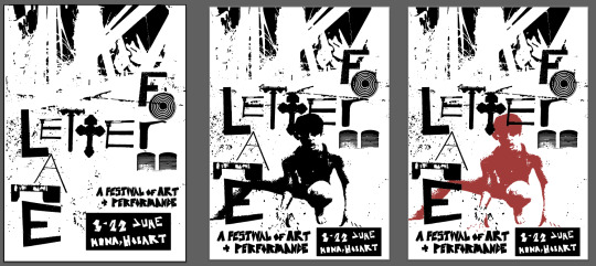
week 5 process
This week I played with a few supporting text ideas. I still want the supporting text to be a handdrawn element, I think it makes sense when my chosen design style is grunge, plus it is a fun personal touch to include. I also played around with colour and shades a little bit, I think I honestly like black and white the best but I feel like my background will need something more to make the overall image strong enough to pull off b/w.
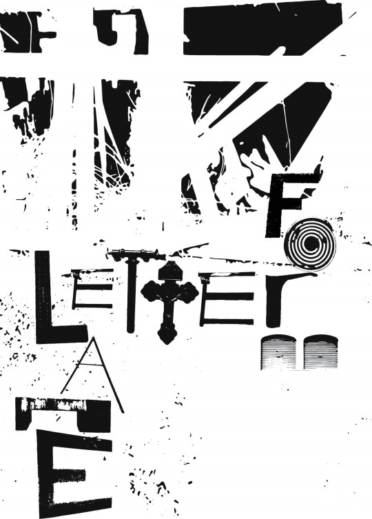
The first poster is definitely out, I don’t hate it but it’s not particularly strong. On the other hand, I do quite like the second poster with a red background. It feels vampire-y (a good thing) especially with that crucifix “t” so bold in the centre.

The only difference between this two is the supporting text. I think the blocky lettering is better, but its lowkey illegible because of the black fill so I’ll probably need to fix that. I do like the more scratchy looking font on the right poster though, maybe if I made it bigger that would help? If I did include a background image that could act as a colour fill for the hollow font too.
Much to consider! Not that much time to do it though!!!!
0 notes
Text
Wes Wilson
Wes Wilson was one of the greats in the psychedelic design movement, whose work centred on the rock music of the 1960s. Wilson did not complete any official instruction in art or design but had an interest in art since he was a child. After a few years of military service and a short attempt at college, he joined a friend’s printing business around 1963 where he began his creative career.
His first poster, designed in 1965, was one which reflected his disapproval of the U.S. becoming involved in Vietnam. The poster made a bold statement, portraying a USA flag with a swastika superimposed over the stars and bold text asking “Are We Next? Be Aware.” The symbolism used in this poster would be instantly meaningful worldwide but would have been particularly hard hitting in 60’s America, where their part in WWII was still fresh in the public’s conscious. Although the typeface used in this poster is less ‘psychedelic’ than the style he became known for in his career, it is similar in that it plays with the spacing and positioning of letters and adds flourishes to the lettering to add interest. Wilson created the poster to encourage his fellow countrypeople to take notice of the decisions being made by their government, and to avoid replicating the behaviours of the fascists they had just won a war against. The anti-Vietnam war stance was a widely-shared opinion within the youth culture of the 60s, particularly in 1965 when the US’ began bombing Vietnam more heavily. As such, the reach of Wilson’s poster was broad, with many people resonating with the concerns he portrayed so effectively.
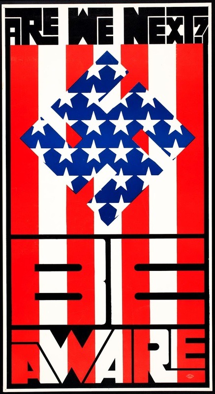
Wes Wilson - ‘Are we next?’
In 1966, Wilson began working on concert poster designs, and quickly gained notoriety. Many of his posters featured the same typeface – one which Wilson redesigned based off the ‘curvy block lettering’ handmade by Austrian designer, Alfred Roller in 1903.
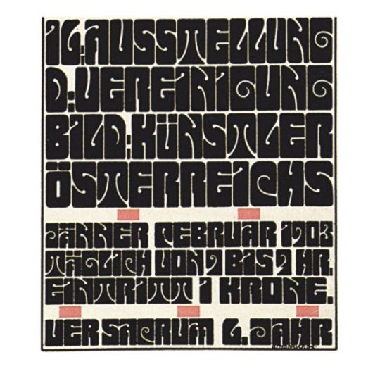
Alfred Roller’s 1903 Typeface
The result of Wilson’s reworking was a barely legible, psychedelic typeface. The font was reflective of the uptick in LSD use at the time, but it was also used as a means of simultaneously catching the eye of those in the know and deterring the attention of the uninitiated. The elements within Wilson’s posters were free flowing, filling all available space, stretching and melding together to do so. In the examples below, other trademark features of psychedelic design are apparent such as bright colours, varied texture, organic shapes, figures entwined with text, and use of optical illusion. Many of these features are the product of inspiration found in the Art Nouveau movement, which emphasized natural beauty, portraying ‘earthy’ women and patterns drawn from the natural world- themes which came back into fashion with the hippie movement. Wilson also expressed that many of his artistic choices were made based on his visual experiences while on psychedelic drugs.
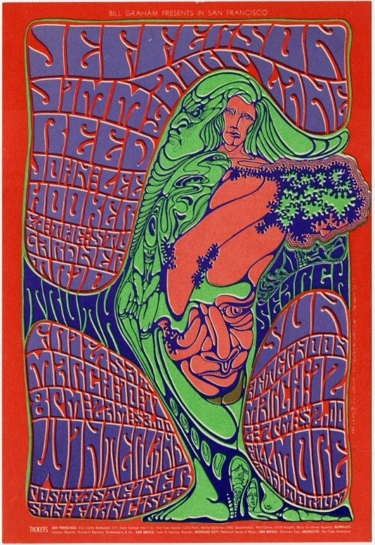


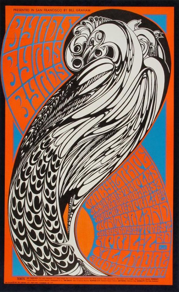
Wes Wilson posters: Jefferson Airplane; Byrds Byrds Byrds; Levi Strauss & Co; New Generation
Today, Wilson is often referred to as the father of the psychedelic rock poster. His ground-breaking styling, paired with historical art referencing and broad social commentary, has made his work timeless, despite its distinctly 60s aesthetics.
References
Artlark (2022). LSD and the Psychedelic Art Movement. [online] Artlark. Available at: https://artlark.org/2022/07/15/lsd-and-the-psychedelic-art-movement/ [Accessed 22 Mar. 2023].
Devroye, L. (n.d.). Alfred Roller. [online] On Snot and Fonts. Available at: http://luc.devroye.org/fonts-51662.html [Accessed 22 Mar. 2023].
Genzlinger, N. (2020). Wes Wilson, Psychedelic Poster Pioneer, Dies at 82. The New York Times. [online] 30 Jan. Available at: https://www.nytimes.com/2020/01/30/arts/design/wes-wilson-dead.html [Accessed 22 Mar. 2023].
TypeRoom (2020). Wes Wilson: an ode to the anti-war pioneer of rock’s poster psychedelia - TypeRoom. [online] www.typeroom.eu. Available at: https://www.typeroom.eu/wes-wilson-ode-anti-war-pioneer-rock-poster-psychedelia [Accessed 22 Mar. 2023].
Wilson, W. (2013). Are We Next? [online] www.Wes-Wilson.com. Available at: https://www.wes-wilson.com/ww-writings/are-we-next [Accessed 22 Mar. 2023].
4 notes
·
View notes
Text
Paula Scher
Paula Scher is one of the biggest names in contemporary graphic design. Her hand can be seen around the world, on event posters, company logos, music packaging, in art galleries, and more.
In her youth, Scher was always interested in art and became the poster designer for her high school’s events. She studied her BFA at the Tyler School of Art, where she was taught by Stanislaw Zagorski, the youth culture icon who was a prolific designer in both Poland and the USA and was responsible for iconic album covers such as The Velvet Underground’s Revolver, and Cream’s Wheel of Fire. It was Zagorski who gave Scher the advice “illustrate the type,” which she credits as the three words which led to her success as a designer.
Upon finishing her degree in the early 1970s, Scher moved to New York to pursue a career in design. She quickly landed a job with CBS Records as the record cover art director and contributed to hundreds of album covers throughout her 8 years with the company. Some of her most noteworthy work from this period is her series with Bob James, particularly the One to One cover which cleverly reworked something familiar (a matchbook) into something new.

Award-winning One to One album packaging
In her album cover designs, she ensured that the image matched the soul of the music. In a time when many album designs featured photographs of artists, Scher was an advocate for including illustration. She used typography as needed by individual designs, but her strongest works made use of her skilful hand-lettering, like her work on Charles Mingus’ Changes One and Two.

Charles Mingus - Changes One & Two
Personally, I really like the design on the Cheap Tricks album cover (below), which plays with contrast and uses degraded letters that look like they have been hand applied with a technique like (rushed) lino-print. The result is striking, grungy, and comfortingly familiar.

Cheap Tricks album cover
In the mid 90s Scher began to work with The Public Theatre, designing posters for their up-and-coming events. In her designs she fused high and low brow styles, reflecting the ‘new wave’ that was prominent at the time. Scher designed the theatre's posters for their Shakespeare in the Park productions, which individually reflected the political happenings of the time, making subtle nods to events like the Clinton-Lewinsky scandal and the Iraq war. Scher capitalised off current events by staying in the know and understanding what was on the public’s mind; she captured the eye of the audience through understanding them then relating what they know to what she was trying to promote. Scher’s work with the Public was socially aware, and her use of dynamic, expressive, and bold design on their posters was a conscious choice to reflect the melting pot of a city that was (and is) New York. Her work on the Bring in Da Noise, Bring in Da Funk posters was playful, making use of bright colours and movement, while maintaining rules reminiscent of constructivism for the typography.

Bring in Da Noise, Bring in Da Funk Posters
Being as prolific as she is, it is easy to see how Paula Scher - with her sophisticated and eye-catching body of work - is often referred to as the Queen of Graphic Design.
References
Art Design Music - Paula Scher, (2021). [Podcast] Nov. Available at: https://www.artanddesignformusic.com/podcast/ep7-paulascher/ [Accessed 22 Mar. 2023].
Pentagram (n.d.). Paula Scher. [online] pentagram.com. Available at: https://www.pentagram.com/about/paula-scher#:~:text=Scher%20has%20developed%20identity%20and,the%20Museum%20of%20Modern%20Art [Accessed 22 Mar. 2023].
Singh, A.P. (n.d.). Paula Scher - Redefining Typography. [online] Available at: https://amrit.art/lighthouse/paula-scher-redefining-typography [Accessed 22 Mar. 2023].
TypeRoom (2019). War, lust, type! How Paula Scher’s typographic affair with The Public Theater redefined our culture - TypeRoom. [online] www.typeroom.eu. Available at: https://www.typeroom.eu/war-lust-type-paula-scher-the-public-theater-pentagram [Accessed 22 Mar. 2023].
2 notes
·
View notes
Text
week four
made more letter cutouts in illustrator and started drafting up some posters! I’m going for post-modern/grunge style because I’m that predictable. I’m pretty happy with what I’ve got so far.
Iteration 1

Iteration 2
The second poster is a lot less developed and I think it might stay that way because I’m really liking the first poster. I feel like merging of words is a good way of playing with the legibility à la David Carson.
I like having texture on the background, but I think I can do better than the current background image I’ve used. My poster will be advertising the Public Art & Performance Festival, so I’m thinking of taking a photo of a dancer and distorting it in a way where it probably won’t be obvious to the viewer what it is, but I’ll know. I think the texture would add dimension and context while maintaining a kind of abstractness which is how I want it.
For the supporting text I want to use hand lettering, but my hand writing is pretty shabby so I’m not sure how that’ll pan out. Suppose we’ll see!
0 notes
Text
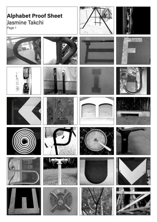
week 3 progress
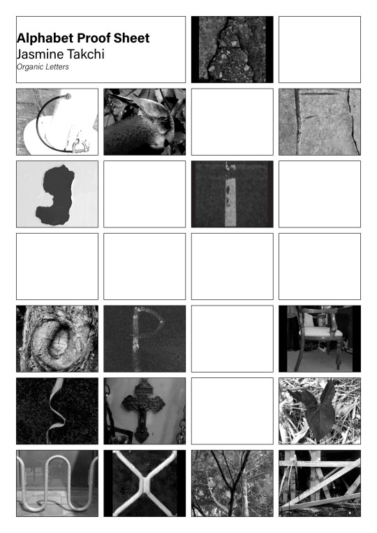
This week saw the progression of the alphabet proof sheets! woo! I have at least one of every letter now- except ‘K’ which refuses to reveal itself to me. Both my geometric and organic letters are below- again, I feel that the letters in the geometric set are stronger, but I’m comfortable with the idea of using letters from both sheets.

I also worked on creating cut-out vectors of some letters - my favourite by far is the “O”. The “T” is pretty cool too.


0 notes
Text
week two progress
I’ve been collecting letters from the outside world for the upcoming assessment and have sorted what I’ve found into two categories; organic shapes, and geometric shapes. Neither set has a complete alphabet yet, and I’m not happy with all the letters I’ve found so far (the “j” in the geometric set, and the “c” and “p” in the organic set)

Geometric Alphabet

Organic Alphabet
I’m pretty taken by post-modern design, and I think if I were to look at someone like Carson or Fella as inspiration for my poster design I could comfortably mix and match letters from both the alphabet sets I’ve been building (although so far I think the geometric set is much stronger- and more complete)
0 notes
Text
Post Modernism
Post-modernism came about as a response to the neat and tidy, function-first approach of modernism. Broadly speaking, the post-modern movement carries an ethos of skepticism, especially towards categorization and the dogmatism of art movements which came before it. Oftentimes, design within this movement is self-referential and referential of the past. It makes use of loud colours and bold lettering. The designs proffered by post-modernists are not concerned with timelessness, instead they are highly expressive and comfortable in being ephemeral.
A highly recognised Post-Modern designer (and one of my favourites) is David Carson, who is particularly known for his designs for the 90s music magazine, “Ray Gun”. Often, Carson entirely did away with grids for typography, and sometimes even legibility when designing the magazine pages (like when he published an entire interview in Zapf Dingbats).
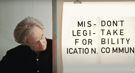
David Carson - “Don’t mistake legibility for communication.”

2-page spread in Ray Gun - words overlap, use of multiple typefaces, no consistent grids
Ray Gun - Interview printed in Zapf Dingbats (essentially making the text illegible, though the layout of the pages makes it easy to infer that it would be an interview.)
Carson also played with typefaces in his designs, using multiple techniques in a single piece (e.g. hand lettering, typewriter fonts, and “ransom” letters). In doing so, he blurred the line between “art” and “craft” or high- and low-brow art – as post-modernists tend to do!
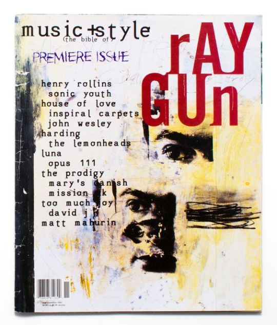
Ray Gun – Premier Issue (use of multiple typefaces)
A second notable post-modern designer is Ed Fella, who was particularly skilled in lettering and typography. In his work he made ironic reference to commercial art deco types, and experimented with many techniques including stencils, found letters, typesetting, brush writing, and more. The result is distinct and eye-catching.
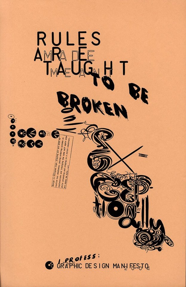
Ed Fella - Rules are made/meant/taught to be broken only exceptionally
References
Architectural Styles of America and Europe. (2011). MODERNISM AND BRUTALISM. [online] Available at: https://architecturestyles.org/post-war-modern/ [Accessed 8 Mar. 2023].
RIBA (n.d.). Postmodernism. [online] Architecture.com. Available at: https://www.architecture.com/explore-architecture/postmodernism#:~:text=Postmodernism%20is%20an%20eclectic%2C%20colourful,the%20dogmas%20associated%20with%20it [Accessed 8 Mar. 2023].
1 note
·
View note
Text
Russian Constructivism
I was drawn to Russian Constructivism as I appreciate their philosophy of art as a social practice.
This movement features a use of bold lettering, photomontage, limited colour schemes, strong visual paths, visual hierarchy, and geometric shapes/images.
One of the most influential artists of this movement was Aleksander Rodchenko. In the poster below, we see his use of visual hierarchy, which smoothly leads the viewers' attention to the focal point of the poster. He uses photomontage to give familiar images new meaning, and bold, neatly aligned typography to provide further context. The poster is visually interesting, while maintaining its functionality.

Aleksander Rodchenko “Kino Eye”
Varvara Stepanova is another significant artist of the Constructivism movement. Her practice covered propaganda, poetry, stage scenery and textile designs. The work below is a propaganda poster, which, similar to Rodchenko’s work, uses photomontage and clear bold lettering. The image has a clear visual story (the importance of education to the revolution) displayed in an interesting way.
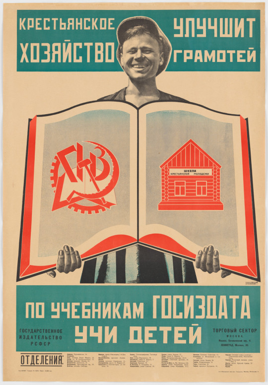
Varvara Stepanova “The Literate Will Improve the Farm Economy! Teach Your Children with Gosizdat Textbooks!”
References
MoMA (n.d.). Aleksandr Rodchenko. [online] moma.org. Available at: https://www.moma.org/artists/4975 [Accessed 8 Mar. 2023].
MoMA (n.d.). Varvara Stepanova. [online] moma.org. Available at: https://www.moma.org/artists/5643 [Accessed 8 Mar. 2023].
1 note
·
View note
Text
Week 1
This week we began our alphabet project by starting the search for letters around the uni campus. We also covered some basic photoshop skills to prepare our letters for proof sheets. I enjoyed actively seeking unusual perspectives to find letters.
Below are the high contrast edits of the photos I took for the letters “H” and “S”

0 notes