#paula scher
Explore tagged Tumblr posts
Visit Tumblr Blog
Explore Tumblr blogs with no restrictions, modern design and the best experience.
Last Seen Tumblr Blogs


Fun Fact
Mobile US users spent an average of 115.8 minutes on Tumblr app monthly.
Photo

“Look for what you notice but no one else sees.” –Rick Rubin
See also: Legendary graphic designer Paula Scher talks about the process of designing this iconic book at Pentagram – a good primer on publication design in general.
If you don’t have it already, buy the book here
#paula scher#rick rubin#quotes#books#graphic design#amazon affiliate link#inspiration#inspirational quotes
100 notes
·
View notes
Text

everyday sevdah / assignment
8 notes
·
View notes
Text

Sanctuary - New Musik
Artist: Paula Scher
Release: 1981
3 notes
·
View notes
Photo

41 notes
·
View notes
Text
New York Posters | Villa Luchino Visconti | Commune di Forio - Ischia

#serif gothic#dispigna#lubalin#Alan Pecolick#Paula Scher#Stefan Sagmesiter#Rafal Oblinski#Esen Karol#Gerard Huerta#Milton Glaser#Bob Gil#Louise Fili#Seymour Chwast#Taber Calderon#Marshall Arisman#typography#type#logo#serifgothic#film#Ischia#Comune di Forio
2 notes
·
View notes
Text
Artist Research: Paula Scher

Paula Scher is an American graphic designer and painter. Scher uses typography she developed based on Art Deco and Russian constructivism. This bold type really appeals to me. The images are more simple and often in high contrast. The pops of colour in the pieces are striking especially the yellow.

5 notes
·
View notes
Text


I enjoyed this film because I had not heard of this woman Paula Scher before and her impact on our world as a designer and I really realized how important typography is in our perceivable reality especially her impact in NYC - her design of the highline logo making the H represent the railroad to show that the highline used to be a subway line
"You have to be in a state of play to design" This quote was very inspiring for me to hear because I feel like me and many others get very serious about our artistry work but we have to remember that art is play and we have to enjoy creation.
It was cool to see all the little aspects to design there are and the emotions that typography and translate, like the size and weight emote different things to audiences
4 notes
·
View notes
Text
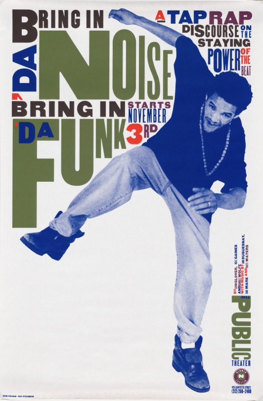
Poster for The Public Theater in NY, Paula Scher, 1995
1 note
·
View note
Text
WOII: Week 11 - Postmodernism
Postmodernism emerged in the late 20th century as a reaction to the ideals of Modernism, which valued progress, rationality, and universal truths. While Modernism sought clarity and order, Postmodernism challenged those foundations, asking: perfect for whom? truth according to who? and embraced contradiction, irony, and play.
In design, this meant rejecting minimalist ideals in favour of bold colours, layered typography, and chaotic compositions, as seen in the work of Paula Scher. Postmodernism is also deeply self-aware, often parodying itself, mixing styles, and leaning into fragmentation.

These ideas parallel poststructuralist theory, which similarly resists fixed meanings and questions the systems that shape our understanding. While poststructuralism operates through critique and theory, postmodernism expresses that skepticism culturally and visually—through design, architecture, and media like The Simpsons or BoJack Horseman, which break the fourth wall and critique their own narratives.
We explored these concepts in a class activity by creating postmodern-style advertisements in pairs or small groups. Starting with a personal object, we photographed it and designed an ad using principles like typography, fragmentation, plurality, and distortion. Through slogans, graphics, and unconventional layouts, we reflected on how our designs resisted traditional advertising logic.
As noted in What Is Postmodernism, “Postmodernism shattered established ideas about art and design, bringing a new self-awareness about style itself.” This reminds us that design isn’t neutral—it always carries cultural, political, or social meaning. Postmodernism invites us to examine the assumptions behind style, question whose perspectives are prioritized, and embrace ambiguity.
Ultimately, postmodernism doesn’t offer neat answers—it thrives in uncertainty and constant reinterpretation.
If Modernism asks: How can we make the world better through design?
Postmodernism replies: Whose world? Whose version of "better"? And isn’t it fun to mess with that question?
Word Count: 282
------------------------------------------------------------------------------
References:
“What Is Postmodernism? · V&A.” Victoria and Albert Museum, www.vam.ac.uk/articles/what-is-postmodernism?srsltid=AfmBOopGbaTVVlExTY3z0m6QP6lE4hwC_BRqRnQeOYo0s1_dyTGHLDjv.
------------------------------------------------------------------------------
1 note
·
View note
Text
Less is more and more is more. It's the middle that's not a good place.
Paula Scher
0 notes
Text
Connecting Theory & Practice (CTS-B Wk2)


My design process is spontaneous and energetic, often fueled by bold ideas and quirky twists that bring a whimsical, romanticized layer to my creative thinking. I’m drawn to vibrant, unexpected colour palettes and contemporary, playful elements, reflecting my love for quirky interiors and bold aesthetics. This approach shapes my design choices, leading me to create colourful, dynamic layouts that feel fresh and engaging, much like a good DJ set that keeps the energy high. With an appreciation for rhythm and harmony inspired by my love of pop R&B, I balance my risk-taking spontaneity with a "chill af" mindset, allowing ideas to breathe and evolve naturally.


One iconic designer whose personality and design align perfectly is Paula Scher. Her work often exudes confidence and boldness, traits that are clearly reflective of her fearless, outspoken personality. This unique combination has made her stand out in the design world. As Scher explains, “You can’t be timid in design, you have to own it. If you’re confident in what you’re doing, it shows in the work” (Scher, 2007). This approach inspires me to approach my own work with that same level of conviction and self-assurance. Just like Paula Scher, I need to learn to channel my strengths into my design with purpose and confidence.
To my advantage, I can lean into my creative risks and vibrant colour palettes to stand out in projects. Furthermore, I can use that spontaneity as a source of focused exploration, balancing creativity with structure to ensure my designs are both dynamic and cohesive.
Word count: 254 words References
Brown, Brené. Daring Greatly: How the Courage to Be Vulnerable Transforms the Way We Live, Love, Parent, and Lead. Gotham Books, 2012.
Erikson, Erik H. Identity: Youth and Crisis. W. W. Norton & Company, 1968.
Heller, Steven. Graphic Design Theory. Princeton Architectural Press, 2008.
Jung, Carl G. Psychological Aspects of the Self. Princeton University Press, 1987.
Scher, Paula. Make It Bigger. Princeton Architectural Press, 2002.
Scher, Paula. Interview by Debbie Millman. How to Think Like a Great Graphic Designer, by Debbie Millman, Allworth Press, 2007, p. 134.
1 note
·
View note
Text
Paula Scher: Nothing is timeless
‘You never can do what the kids do. What you do is look at yourself and find your own way to address the fact that the times have changed and that you have to pay attention. You can’t be a designer and say, “Oh, this is timeless.” Nothing is timeless!’ —Paula Scher.
View On WordPress
0 notes
Text

Rhythm of the City by Jeremy Witten 7/26/2016
0 notes
Link
0 notes
Text

Paula Scher Paris
1 note
·
View note
Text
PAULA SCHER – TYPE IS IMAGE: München bis 22.09.2023
Paula Scher (geb. 1948) ist die international einflussreichste und erfolgreichste Grafikerin ihrer Generation. Ihre Entwürfe haben Generationen von Designer:innen geprägt und sind zu Ikonen des Grafikdesigns geworden. Dabei steht für die Grafikerin die Schrift, also die Typografie im Zentrum ihrer Arbeiten. Die Neue Sammlung – The Design Museum zeigt mit „Paula Scher: Type is Image“ die erste…
View On WordPress
#Album Cover#Corporate Identity#Die Neue Sammlung#Grafik#Grafikdesign#Inszenierung#Paula Scher#The Design Museum#Type is image#Typographie
0 notes