
Statistics
We looked inside some of the posts by josephmyplace and here's what we found interesting.
Average Info
Notes Per Post
2
Likes Per Post
1
Reblog Per Post
1
Reply Per Post
0
Time Between Posts
1 month
Number of Posts By Type
Text
17
Last Seen Tumblr Blogs


Fun Fact
28.6 is the average number of monthly visits per US mobile user.
Text
[Age of the moon] Nita-Osuqare of Innana-ni
Cleaned up the line work woooo!
0 notes
Text
I tried repeatedly to have nice pretty line art but I’ve given up and am going with the scratchy ugly approach.
#artists on tumblr#digital sketch#digital drawing#original concept#lineart is hard#when will my suffering end
0 notes
Text

Drew this after reading about the cyborg artist Moon Ribas, who uses a vibrating implants to style her dances around earthquakes.
1 note
·
View note
Text
barren/verdant
in terms of art I have found that the genre of 'abstract minimalist landscapes' best capture something that is barren; they reduce an environment down to its barest meaning, because of this they often end up being extreme devoid and holding nothing.
vandana mehta: while minimal vandana's art still captures the details of a landscape, she often utilises a range of colour that is not seen in reality, meaning that while minimal the colour range can often be extensive, she also very frequently depicts large bodies of water in her paintings, which lend them a flatness typical of barren landscapes.
Louise Morgan: occupying the fringe of minimalism where its hard to say if what she's drawing is any kind of landscape, Louise's art is almost entirely empty, with only the most distant island of land in the distance, these artworks have that dreamy quality that reminds me of Brooks salzwedel's artworks from last project, you may remember his floating islands artworks.
barren environments such as deserts cover 33% of earth, however while deserts certainly classify as barren because of their lack of life, simple colours and flat/simple terrain, however the environment that I think is the most emblematic of 'barren' is the “Salar de Uyuni” salt flat, a massive area of over 10,000km square kilometres, the landscape is utterly devoid of life, or any form of terrain, it is almost entirely flat, the surface being bright white with no mountains or hills to rest on the vast horizon.
When rain does visit this place the thin layer of rainwater causes entire lake to become a reflective surface, making the place seem even more surreal, as if for a moment it exists a little less, as if the surface isn't real and only the empty, immaterial sky is left.
Verdant environments such as forests cover 31% of the earth, these are often lush ecological rich areas that support a huge diversity and population of both flora and fauna, some of the verdant locations on earth are the flood plains of south America, these huge expanses of dense forest play host to massive seasonal downpours of water, and where it odes not settle it flows into the many small threads of rivers that join the inexhaustible amazon river, meanwhile towards the north of America the ancient titanic redwood forests are not as green or as dense but for that they make up in the sheer Olympian scale of these trees, some are so old that dust and sediment has built up in between branches, allowing microcosms to build up, where far above the ground these communities of plants thrive in these recesses.
0 notes
Text
Towers in lockdown project
the first part of the project was the collection of ten images of towers, for this I mainly used real world towers, though in hind sight the inclusion of surreal and abstract depictions of tower-like figures might have helped.
I found that the biggest influence was towers as they are generally understood, tall modern man-made structures, cities in particular largely influenced the later artistic stage, with notable examples being, ryugyong tower, the ancient towers of Bologna and the Tokyo skytree.
The ancient towers of Bologna, a strong source of inspriration. (Twins, archaic, Lonley)
You will notice as a result of my inspiration being cities straight-line structures are common, as a result I feel that my towers are one note, with them often being just rectangles or very simple shapes (though modern towers can also look like this) however the towers that i constructed had to be made out of simple shapes in order to be stacked.

One of my sculptures. (Twisting, stacked, dark)
to make the artworks I used graphite for shading, pencils for drawing lines, watercolours for adding colouring (shocking, I know), acrylic paints for colouring as well, pens for creating more distinct lines than pencil, tape to create tower-like shapes and to experiment with and ink, which was used to crate ethe deep black colours.


A piece of independent work, I did it with towers in mind but it developed into something else (trapped, creeping, figure)
I did use some new techniques, in particular the use of tape was introduced in an online session, which I used in my other artworks, generally I have found that its blurring effects may be useful in creating a fog/mist effect or the creation of towers by using long strips additionally watercolours can seep into the edges around and underneath the tape, producing a thin highlight around it which may also be interesting.


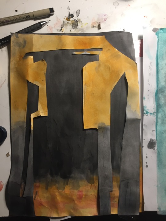
Secondly I layered a sheet of paper over another and cut holes in the top, that cutaway space would be the image, like a negative photo, however properly aligning the sheets was difficult, especially as the paper was wet and therefore creases became permanent, meaning that the paper ended up misshapen and unable to be properly overlayed, I don't feel the idea is bad, I will just need to keep in mind these issues in future.
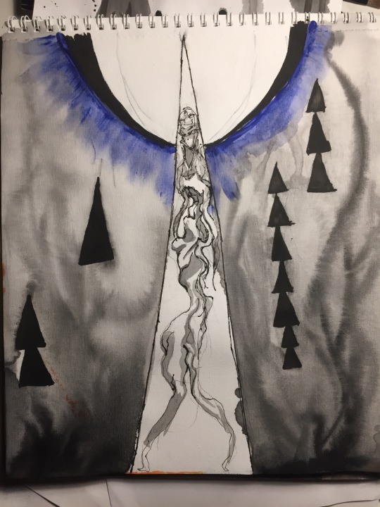
I found that my art generally had a dark appearance, often being only black and white, I worry that this may become too monotonous so I also included the use of colours, such as yellow and red, which are colours that often are used to give the appearance of warm lights in a city, though sometimes they can look like a fire where it is not intended, (it might however lend to there being multiple interpretations of an artwork, which is also a good thing) additionally the overuse of warmer colours is something that I felt was happening so I decided to use blue/teal in two, though in future creating a more diverse selection of coloured artworks will be important.
The themes are meant to be largely ambiguous, while I have my own ideas about what some mean, or what narrative is suggested, but I prefer it to be ambiguous enough to interpretation, however, some are made with the intent of just seeing what certain colours and techniques look like and most are attempts at setting a mood or tone.
In terms of inspiration I feel that I should keep a wider range of material to draw inspiration from, as I fixated on city-spaces which I feel may have reduced all the potential diversity of my art. I should keep in mind how wet my paper gets when painting, as this can not only lower the cleaness of a piece but also damage the paper itself. Over use of certain colours can produce a boring series of artworks, I should add a diverse array of colours in all my artworks. Additionally I still feel I have an issue with empty space, sometimes I feel there's just too much space left without anything in it, some solution to this may just be to simply make the subject larger or add a background colour.
0 notes
Text
An abstract art, I did it with the ‘towers’ theme in mind but I feel it derailed into becoming something else, either way it suffers from too much water being applied to the surface causing a fuzzy effect to occur.
I think Derek would appreciate it.
0 notes
Text

Here’s some personal artwork, I’ve been recently trying to improve on designs, simply feel like a lot of them aren’t interesting? The above peice was made specifically to look different but I’m not sure it feels right?


I’ve noticed I have a bad tendency to draw pen lines how I draw pencil lines, as short lines that overlap, this creates an unrealistic scratchy look that detracts from the art.
Also I still misproportion figures, this is becuase i fixate on a given area, resulting in it becoming out of line with the bigger picture.
0 notes
Text


So I just realised I made more than 10, 12 which I feel is a good thing. You will noticed these are sketched, it makes them look vague and less defined, and also as they were my initial drawings they feel less composed, more Unfocused.
0 notes
Text

My workplace, I remeber that posting this was important, as always it is complete chaos.
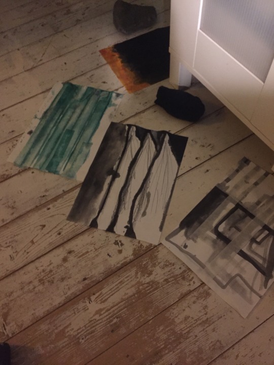
I had to dry the paintings on the floor, I mean this is part of the process so I figure I should post?

To be clear the black ink stains are unintentional and are just a result of me being careless, this image uses blue tones, as I feel I become too reliant on certain colours, causing a samey-monotone feeling to develop; stagnation.

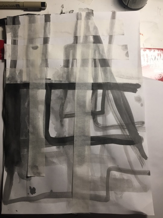
I though this was a cool idea, to have contrasting layers stuck onto each other, but I couldn’t find any glue so I used cello tape, which allowed the papers to pull away from each other

One of my “I’ll just throw things at paper and see how it looks” artworks, the end result suffers from feeling too empty

I could not tell you if this is even a tower anymore, which was the idea, what even is a tower anyway?
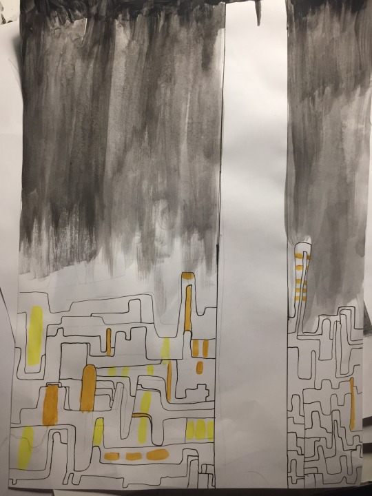
This was meant to be a representation of a city, the large upwards streaks are towers and the chaotic twisting lines below are the hollowed silhouettes of other buildings or roads or rivers

For this one I thought about mountains, but it looks artificial as well with the orderly straight lines and the single file nature of it, so it ended up looking like a little like both I think

Is the background representing the warm glow of street lights or a cataclysmic wall of flame?
Are the towers just shadowed or burnt out husks?
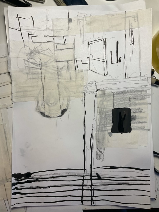
This is meant to be one huge tower over looking many smaller structures, like skyscrapers over slums.
8 out of 10 tower artworks
I feel that a lot of them lack, but then again these were meant to be quick, so I suppose it’s justified, and they all seem distinct enough.
0 notes
Text

So it was ment to be more minimal, less stuff on there- sometimes I feel like I add too much to a work, but I worry that this has too little.
I have no idea what the balance would be but hey ho.
Either way I like it, a little.
0 notes
Text

Made in today’s lesson, the two that I felt were the best, the others suffered from lack of direction and just emptiness, a lack of interest in what was there.
0 notes
Text
Three towers I made today


Sorry for all the background clutter, didn’t have any white sheets to use.


Digitally edited versions
0 notes
Text
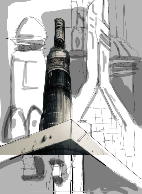
Towers part 2
Space elevator

The space elevator is a hypothetical superstructure that could transport cargo directly into geostationary orbit from a planet, for earth this would require a tower 35,786 kilometres tall, as it stands on earth this is impossible with current material technology, though on lower gravity worlds this is possible. (This image is taken from the game Halo 3)
1. Megalithic 2. Defiant 3.biblical 4. Testament 5. Future
Makkah clock tower

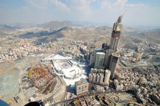
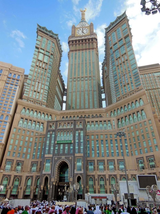
The Makkah clock tower stands 601 meters tall and is currently the world’s most expensive building, costing over £11 billion to construct, the tower is home to a hotel complex made for pilgrims to the holy city of Mecca, the construction of the tower began with the destruction of an 18th century ottoman fortress, gaining considerable ire from the international community.
1. Standardised 2. Zealous 3. Template 4. Opulence 5. Hierarchy
Ryugyong hotel

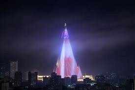
The ryugyong or “capital of willows” hotel stands at 330 meters tall, it’s construction began in 1987 however with the collapse of the Soviet Union South Korea entered an economic depression, halting construction and leaving a solitary crane present at the top of the tower for a decade however in 2008 due to financial support from the Oscracom group construction resumed, to this day the building is incomplete, with an extremely bare interior.
1. Fractal 2. Dreams 3. Folded 4. Grandeous 5. Knife
0 notes
Text
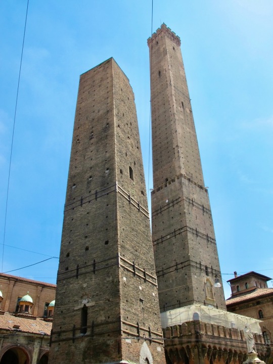
Ancient towers of Bolonga

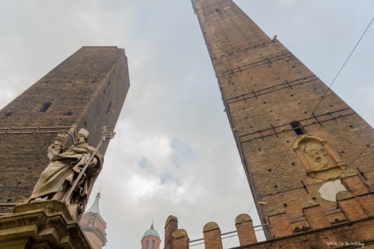
The two towers here are the 12th century Asinelli tower (97 meters) and Garisenda tower (48 meters). It is suspected that there were once 180-80 similar towers throughout the city, it is currently not understood why so many towers were created.
1.looming 2.lingers 3.Watching 4.stoic 5.rough
Devils tower

Devils tower is a 1.5 kilometer tall mass of igneous rock, there is debate over how exactly this came about in the landscape but it is generally believed to have a volcanic origin, Native American peoples tell stories of gigantic bears that tried to kill people, only for a divine intervention to occur, resulting in the manifestation of the tower.
1. Groves 2. Ropes 3. Ancient 4. Striking 5. Deific
Rudston monolith

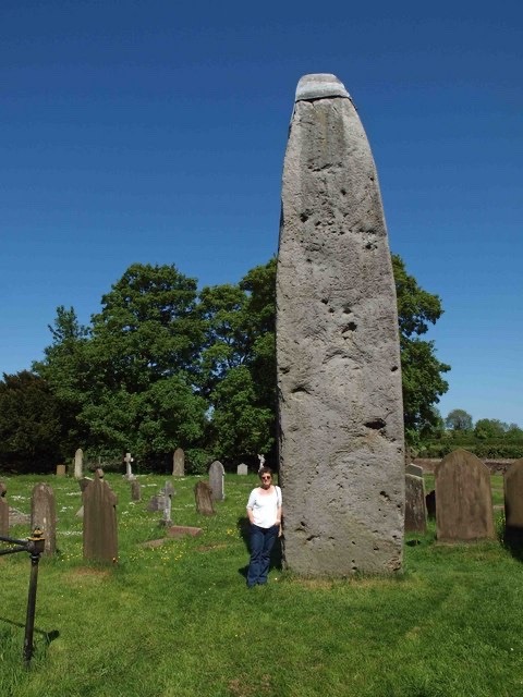
The rudston monolith stands at 7.6 meters tall, and is one of many similarly ancient structures around rudston, the monolith’s ‘hat’ is a lead cap placed there in the 18th century to preserve the monument from erosion.
1.lonely 2.displaced 3.otherworldly 4.stretched 5. Mysterious
Tower of Babel

The story of Babel occurs in the Old Testament, and surrounds the conflict of humanity and god, with humanity attempting to reach the heavens, to no surprise the omniscient, all powerful being wins the conflict by creating multiple languages, causing mass confusion and chaos, splitting humanity and ending Babel.
1.biblical 2.dense 3.apex 4.hive 5.esoteric
Natural chimneys of Mt Solomon

The chimneys are home to a considerable campsite complex, with a pool and playground, and somewhat more bizarrely the oldest jousting completions in the USA, beginning in 1821 the natural chimneys jousting tournament is the oldest continuously held sporting event in North America ( though the coronavirus pandemic may break its continuous record).
1.rural 2.beige 3.towering 4.watching 5.gathered
Tokyo skytree

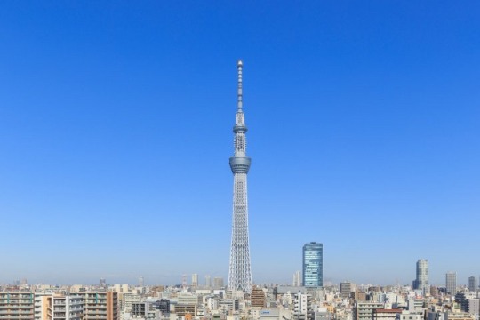
The Tokyo skytree stands at 634 meters, making it the second tallest tower in the world, first place being held by the burj khalifa, the Tokyo skytree is primarily a broadcasting tower, though it is also used as a place to watch the city below from by visitors.
1.revitalised 2.emergence 3.sceptre 4.futurism 5.frame
Tepui
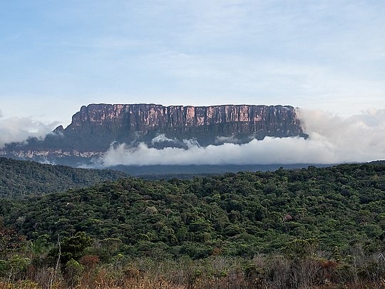
Tepui, or “house of the gods” are granite remnants of the ancient supercontinent Gondwana, these huge formations are home to a variety of unique endemic life, found nowhere else on earth (the tepui pictured here is the aprada tepui, in Venezuela).
1. Lost 2. Giant 3. Exploration 4. Mythic 5. Shrouded
0 notes
Text
wider world research
an analysis of science fiction in the wider world:
Science fiction fundamentally exists as a way to express how the creator views the future, measuring the popularity of a given work allows us to gauge how how the public perceives that rendition of the future.
Creative industries have always used sci-fi, its presence can be felt in books, board games, video games, movies and TV-series.
My own project work lacks any real presence of science fiction, this is partially because i have yet to be assigned a project that i feel it would be appropriate for, and also because i have difficulty of thinking how to put it into my projects, though i have made some attempts at doing so.

In this image I drew an eye with mechanical detailing as part of our last project, though I still dislike it as my projects book took place in roughly the 1900′s and sci-fi esque details clashed with that context. as for my previous project ‘my place’ I felt was a missed opportunity early on, my uncertainty over what i could do largely made me uncertain about expressing my interest in the subject, though i did make several artworks related to the subject.


overall id say that there is a large impact that science fiction has had on me, its just that i need to express my interest in the subject more in college work.
examination of science fiction:
one of the best qualities of scifi is the huge degree of creative expression it lends to the artist, the artist can then create any vision of the future they want to express, and because of this i find it to be an extremely interesting form of expression within media.
STAR TREK
Star Trek’s original series was notable for its highly political take on the future, the idea of multiple species working together for a greater goal, (an analogy for different cultures and races) unified under a federation that had no money; material goods were free, (a strong disavowment of capitalism), additionally of particular note here is the diverse racial cast depicted in the series, nichelle nichols as Nyota Uhura and George Takei as Hikaru Sulu, additionally it gave female characters powerful roles as captains and commanders, and acknowledged inequalities and societal maltreatment of women. Star trek’s success was likely due to a political shift at the 60′s where civil rights were being passed into law and a general increase in leftist ideology across the USA, however its clear that its reach extends far beyond that, with its optimistic view of the future continuing to draw in viewers
WARHAMMER 40K
the polar opposite of star trek, warhammer 40k depicts an awful future plagued by religious zealotry, fascism, prejudice, inept leaders, and an emperor that is nothing more than a corpse on a golden throne, such a terrible future was made as a direct (and perhaps satirical) critique of the conservative party, and of religious influence in politics, particularly of note is that Margret thatcher was in power at the time warhammer was launched, no doubt benefiting the game, however owing to the overbearingly dark tone it has remained relatively niche.
EXPANSE
Taking a more realistic approach, the expanse aims for a future that is more morally grey, where modern day problems still persist, only in a different setting with the ‘belters’ engaging in terrorist acts for their independence, corporate corruption, tensions between nations, espionage and famine. even the climate disaster is till present on earth; referencing on going events, and goes onto mention the mass deaths and famines that occurred and are still happening to this day, this direct, realistic acknowledgement of modern day issues is one of the reasons why i suspect its as popular as it is, and i personally suspect an increase of these types of narratives will develop.
VIRTUAL TOUR
British museum (England, London): The British museum is dedicated to the preservation of historical artifacts taken from around the world, and because of that i thought it’d be interesting to view artistically. Ancient Egyptian artifacts are curious, because they seem to depict everyday life, it shows they they seemed to revere the everyday as much as their gods and kings, tomb relief carvings even depict workers going about their lives, i find this interesting as art rarely seems to focus on these moments of mundanity, today the idea of painting huge walls or tablets with just everyday life would be seen as strange and perhaps boring.
Additionally the ancient Egyptian language is curious for its use of a pictograph language where images are words,and interestingly again we see the incorporation of everyday items into this language with rope, bolts, baskets and stool.
National museum of modern and contemporary art Korea (South Korea, Seoul):
large empty rooms, long corridors covered in strange imagery, harsh fluorescent lights, the museum felt even more bizarre than it usually would be, when crowded with people there would be some semblance of normality, even among the abstraction there is something recognizable, but it feels so much more alien to just be surrounded by strange shapes, bizarre caricatures of the human form and sculptures huddled together. while I’m aware this isn't the art itself per se the fact that i only feel this here is because of the art in this space, the art augments the absence into loneliness.
Uffuzi gallery (Italy, Florence) :
the first thing that struck me about the Uffuzi gallery was how the entire gallery’s ceiling was art, it’s coated in meticulously detailed paintings, which seemingly had no real reason for being, i felt like that was such an odd detail, having such a beautiful display put somewhere just out of view, It is that commitment to detail that i think i find interesting, the idea of putting so much effort into things that may never be taken notice of or fully appreciated, something that can be found in art generally, very few will ever take the time to appreciate every detail of any given work of art.
0 notes
Text
sectors within the creative industries:
Entertainment- a hugely economically important sector earning over 42 billion in the UK alone yearly, and over 100 billion globally. Entertainment includes many forms of media, movies, books, comics, board games and video games. not all forms of entertainment have a need for art, but many, especially comics, movies and video games have a pronounced need for it, for instance all three require art styles when designing assets, as comics, video games and animated movies have to be entire created by artistic direction.
Advertising- in 2016 advertising revenue globally reached 493 billion. advertising is a visual art at its core, and is full of nuance in every image, colour theory for example is used to inform what colours should be used in advertising,and can be even broken down into their associations and emotions; where association might be ‘loyalty’ or ‘freedom’ and emotions might be ‘calm’ or ‘warmth’, additionally shape theory can be used to inform advertisements, certain shapes similarly can invoke certain feelings.
Architecture- mostly focused on the structure/shape of buildings, architects are more focused on the aesthetics of a building rather than its function, though these two are not exclusive. architects will try to make people feel a certain way when in a space, typically it is one of comfort, modern architecture for instance has an open, bright aesthetic with an emphasis on minimalism, is designed to be inoffensive, comforting, freeing.
fashion- concerned with self-expression fashion has to be general enough to apply to a wide audience, but also specific enough to correctly express how those people want to be expressed. this can be done in a variety of ways from materials used, colours, patterns and shape of the clothing.
job that interests me:
the purpose of a concept artist is to take a brief, this brief will describe what is to be created, then the artist will convey the brief as best they as art, this art will then be taken and then used as the template for models, environments, characters etc.
the qualifications for concept art are less attached to academic achievements (of course there are employers that consider these) and more to the skills and creativity of its applicants, I believe this is because companies want creative, unique visual designs, and creativity has no academic courses. rather it seems to become a concept artist, there must be a high quality of work demonstrated in a portfolio for example, and then the employer considers whether that concept artists work would be ideal for whatever project they are doing. So it would seem there is no set career path, rather I would need to continuously perfect and hone my artistic ability and creativity to a level where businesses
Also becoming a freelance concept artist is an option, where you take on commissions by companies or private individuals to create art.
I think the course has done this that are good for pursuing a career compelling me to start an Instagram account was good, as that self promotion is important, having an easily accessible record of art you've created is useful for employers, additionally the course giving us briefs which as mentioned previously is what employers also do, additionally a vast majority of concept art is done on digital art programs, and as we will be largely using digital art in this course it will be useful experience.
0 notes
Text
ART EVALUATION - MULTIVERSE ASSIGNMENT
themes of the assignment
The multiverse assignment took us through a variety of artistic styles, drawing, printmaking, typography and collage, but there was also a narrative element introduced through the penguin book, we were tasked several times to draw inspiration from narrative elements from the book, or to depict scenes from it, this I felt was similar to fine art, however while on the computers we worked on 'postcards' (personally though I always felt their purpose was more like covers for our books), which again had inspiration taken from the book, this reminded me of graphic design; we were attempting to express a product through a visual means.
the three ‘postcards’ that had text added to them, overall i find that the first one below is my favorite, the central image i feel is a strongly emotive one, figures shrouded in darkness, almost in solidarity over some tragedy, which is why i annotated it “a reminder of better days”, as a reference to how i felt the image was tragic.

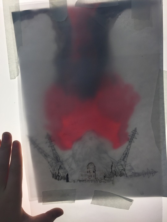
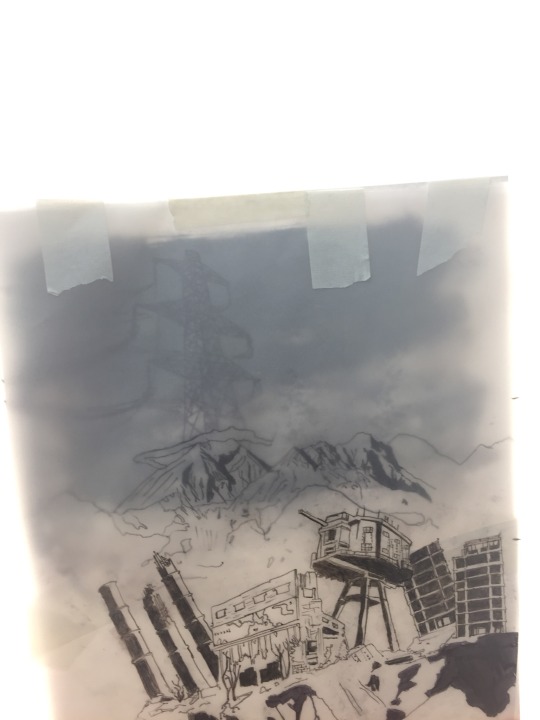
this image i annotated it with words associated with god, the drawing i used because i wanted it to resemble an old medieval representation of an angel, which i feels far more visually interesting, and below it is the shattered sky and broken buildings, riven by strange flames, all part of the ‘wrath’ and ‘profound fear’.

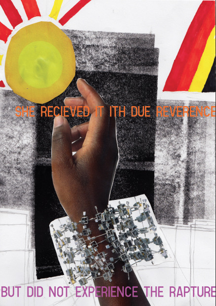
here was see the hand receiving what should cause ‘the rapture’ i used the sun as the object because i felt as though the sun’s connection to the heavens, and it being unreachable was going to add to the piece. i also inverted the colours of each of the annotations, to draw contrast between the statements.
This all being said I'm confused over how the multiverse plays into this, the assignment was about creating art based around a narrative, not around other universes.
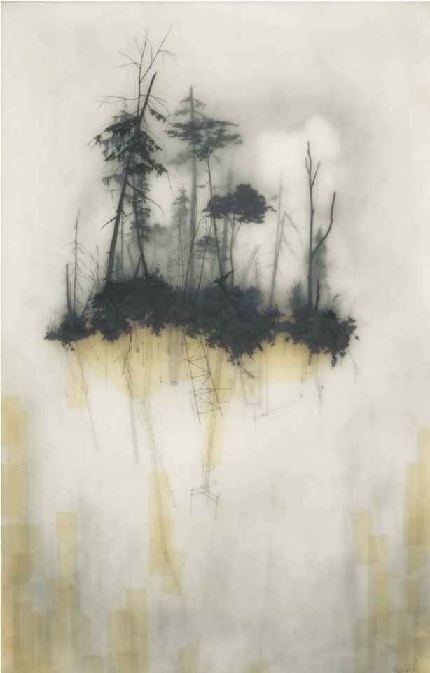
Two artists I felt influenced the art I made during the assignment were Brooks salzwedel and pokras lampras, Brooks' art I have already examined, still, he depicts floating land masses, and strange forested scenes obscured by mist, while pokras lampras is an asemic writing artist, his particular
Brooks salzwedel
style was structured and merged aspects of Cyrillic, English, Greek and Arabic creating an interesting visual style.
Pokras lampras

What did we learn in lesson
This assignment did not focus on new artisic methods (in comparison to the last unit we learnt screenrinting, intaglio, chalk, graphite etc.) but rather ways to express ideas through it, in this case through the aforementioned narrative.
Animation:
animation is relatively simple, animations are composed of several frames, then the amount of frames per second will determine how the animation plays put, generally the higher frame rates are used for smoother, more high effort animations, 24 fps (Frames Per Second) is industry standard.
In a programme the last frame can be viewed to better let the animator decide where they want to go with the animation.
Light box art:
our light box art used tracing paper, each piece of paper was drawn on, the penned, the most 'misted' paper would be at the back, giving an impression of dictance, the paper in fromt would similarly appear closer to the veiwer.
Though as for what we used, screen printing, digital, painting, drawing were all used, of note was the continued use of animations in digital atr.
the use of light boxe was interesting particularly the use of layered tracing paper to create a obfuscated image, though I personally wonder how I could use them in my own art.
Out of lesson
digital art became my focus, I've found my transition from traditional methods difficult, lines are less stable, and dealing with confusing interfaces has proven itself difficult.
The quality of my artwork has been reduced as a result, but this is expected when moving to a new, unfamiliar medium.
Though digital art has allowed me to use colours freely, which again is difficult, as I never developed any real sense over how to use colours using traditional drawing methods.
Inspiration
Additionally I asked each individual artist the same three questions about their work, which were
what is your source of inspiration? (meaning what initially inspired you and what continues to)
how did you start? (what did you draw initailly, when?)
what processes and materials do you use?
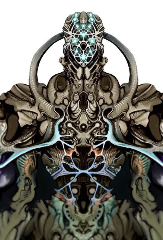
void_illustration - Richard Saunders Illustration
Richards art either is obviously biological, where a creature is depicted, or has a distinctly biological edge to it, metals seem to bend,twist and stretch like flesh, nothing seems to be truly just a machine or device, rather every ridge, bulge and groove hints at a more organic truth to his figures and objects.
1. im inspired by so many things, its good to pull from a wide range of inspirations.
2. Ive been drawing for a long time, im not professional but im hoping to change that, most of my work forms into narrative universes and then develops on from there.
3. For materials I use a range. My 'bio warrior' series is mainly pencil sketches with marker colours and white paint pen highlights. My brown paper dragons are watercolour on strathmore toned tan paper, lined digitally, though I will layer them up further with paint and markers.
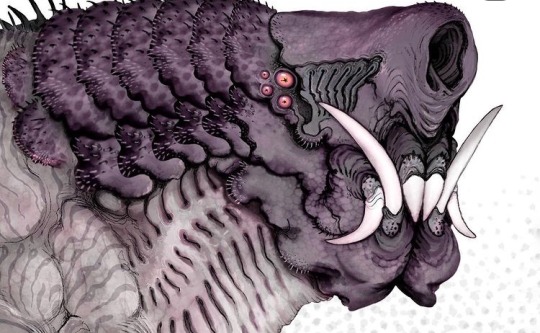
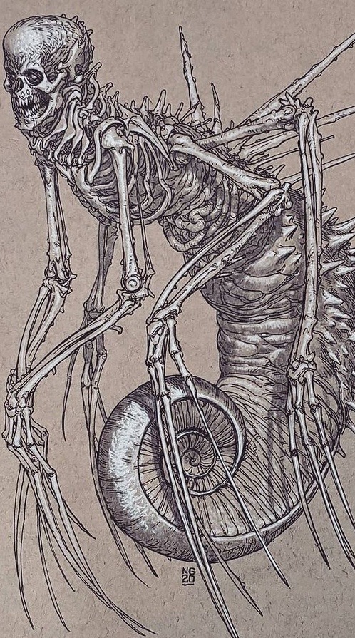
Fuelstains - Nikolay Georgiev
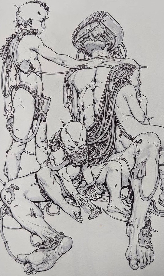
His work similarly to Richard's trends to directly be a creature or rather, monster, these organism often have strongly textured skin, often appearing to have many grooves, showing the musculature underneath, then there are his mechanical pieces, either directly depicting a machine of some kind, such as a robot, or depicting a human who has been massively altered by technological augmentations.
1.I was initially inspired by comics, as a kid, stuff like spiderman, bat man and transformers, but later on it could be anything that inspires me.
2.I started in primary school and it was mostly superheros or stuff from movies.
3.Pencil, ink fineliner, brushpen, watercolour, ballpoint pen, digital.
Milesr.art – Miles R art
miles' art focuses on creature drawings, particularly drawings of alien life, creating some truly bizarrely fascinating, most bearing little resemblance to earth organisms, if any. Another aspect of Miles' work that I appreciate is that it seems grounded, the animals, in spite of their bizzarreness still seem like they could exist.
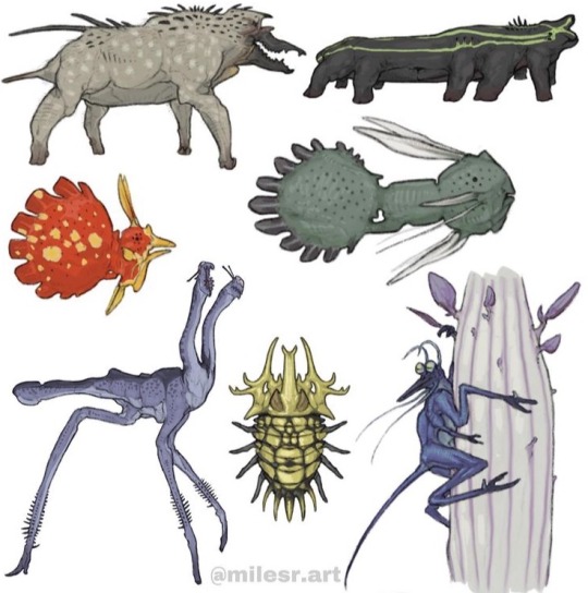
1.some of my biggest sources of inspiration:
- C.M koseman, Brynn metheny, and dougal dixon are some of my most inspiring artists
-just thinking about the natural world in general like on our planet
2.what initially inspired me to draw and that goes into number 2) in kindergarten I saw some kid drawing a honey comb pattern with neon markers and was like huh okay im going to do that but better.
And I always drew monsters and characters, always becoming more based on science overtime, and here I am now.
3.Now I exclusively make finished things digitally with my ipad pro and apple pencil using procreate, but I often make sketches on post it notes with just regular pencil. In terms of processes I feel like I just do what I do it, its hard to define ones process.
1 note
·
View note