
Don't wanna be here? Send us removal request.
Statistics
We looked inside some of the posts by julietterblog and here's what we found interesting.
Average Info
Notes Per Post
2
Likes Per Post
1
Reblog Per Post
1
Reply Per Post
0
Time Between Posts
18 days
Number of Posts By Type
Text
17
Last Seen Tumblr Blogs


Fun Fact
Tumblr Inc. has $15.1M in annual revenue.
Text
This is the original photo compilation without the text added. i slowed down the video so we can see the individual photos a bit better. In the final edit, the video is sped up to add more energy and dynamic.
0 notes
Text


Here are the animated GIFs i made for my intro on the Viva Voce project. The first GIF was the initial animation i made, but after overlaying it over my photo compilation, it looked very messy and unreadable. So i redrew over the original sketch and filled in the letters for better visibility. I left the animation simple by placing the glitch effect on procreate on individual layers of the title. At first, i was really excited to animate the title but after seeing how fast paced the photo compilation moved, i knew i had to keep it simple so as not to overwhelm the video. Still in the end of making the final video i was worried that the words would be unreadable to other people, but it worked quite well and most people understood the words so i was happy with the title outcome.
0 notes
Text
Final piece description
If you refer to my YouTube clips on the making of my final piece, you will hopefully get an idea of how I went about making my final animation. I wanted the main body of my animation to ‘boil’ since it wasn’t going to be moving. I wanted it to still have some movement so it didn’t look too odd being the only thing still. To do this I just went over my first drawing two more times to make it move. I labelled these layers 1 2 and 3. To keep the consistency of the movements i duplicated these layers as many times as I needed, making sure to keep them in the same pattern. I always made sure to have a blank copy of all 3 bodies so that I could duplicate it and sketch each frame over it. I started off by making a basic sketch of how my animation was going to work. I did these one limb/ metamorphosis at a time, going back on each layer to add each one. I ended up with 52 layers in total, which was a lot for my iPad to handle and created quite a lot of challenges for me as I had a limit to the amount of layers I could have. This meant that when it came to creating new layers for the line work after I finished the sketch was a little tricky to handle. After working on one of them I I had to erase the sketch on the layer underneath and merge the line work layer over the body. All the while making sure that any combining limbs had been correctly merged (meaning I had to make sure to erase each line that overlapped). Obviously, as the animation came further along, it became harder. Even though the main body does not move, her arms do, so having to rub out the arm and all overlapping lines on every layer consumed a lot of time. The sketch animation took me around 7 hours, which is a lot but nothing compared to the linework - which took around 14 hours! The linework was made especially time consuming due to having to modify each base layer. I found tricks to get around to make this faster, such as copy and pasting any layers that had stopped moving as my animation continued, so then I don’t have to draw them over and over again. After the linework I had to do the colouring. Coming close to the deadline, I knew I had to keep it simple. I did simple block colours without shadows and only adding white highlights to add a little dimension. Although I thought this would be simple, it ended up being extremely time consuming and the colouring process, and merging each layer took me around 17 hours. The colouring process was very annoying as throughout the whole project I had kept my background white and hadn’t realised there were areas underneath that weren’t transparent but white. So then I had to erase each white parts in the linework so that I could merge them with the coloured layer. Since I copied and pasted so many layers I had a lot of rubbing out to do! Finally, I added the background in frame by frame, merging it with the final animation. I originally wanted to make a new background for my final piece but had not time in the end, so i used one of my test animations and edited the hues after the halfway mark to make it darker. I did the same with my final animation, so that the colours also faded and became darker. This whole process took 2 hours, which puts my total time for this whole animation at 40 hours! It was probably the longest project I have worked on digitally. Although I wanted to make multiple animations, I realise that was unrealistic with the time I had. I am super proud of this.
0 notes
Text


Animated models for self directed project
Going into the project I never really anticipated to use collage. although I’m so glad that I did, at this point in the project I didn’t know if I wanted to include collage into my main animation or to just keep it in the background. But it was recommended that I make some more animated collages and so I decided to defer my attention away from backgrounds and look more at the metamorphosis process on a human. When making these I took a lot of inspiration from previous collages I did for the project. However once again I was stuck with how I could animate a still image effectively. Luckily, the first animation I made, I found the base model quite quickly and knew I could use her long arms to make an animation. Initially I just had a simple animation of the arms going up and down but decided to take it further by adding the two heads that pop up when they reach the top. Though simple, I am happy with this animation as it came in helpful for the later parts of the project.
My second animation was directly inspired from one of my collages I made for this project. I liked the ideas I put together in the still collage ans decided to take elements of it and animate them. The wings are not bat wings, like they have previously been in the project, but I liked the way they look and decided to try something other. All the animations for this were pretty straight forward movement, the part that always takes a while is cropping the backgrounds out of each image before starting the animation process. Having once again reused my butterfly collage from the beginning, I was pleased with this collage, it had a range of several movements and helped me visualise my animation better.
My last animation was quite simple, but I knew I wanted to do something with the head when it came to my metamorphosis, so I decided to try out animating a head over the original. I don’t hate the way it turned out but it could definitely be more fluid!
0 notes
Text


Second set of animated backgrounds for self directed project
After getting further along with the project and getting more comfortable with my concept and also getting more comfortable with animating, I was able to come up with some more background tests, these of which are a lot more final and complex. After a tutorial with Jeremy, he said I should explore collage further in this project and try animating some images, make a moving collage. I had dabbled in this concept a little bit in my previous background attempts but I never got satisfying results, I found it very hard to make a dynamic animation with pictures that cannot have movement. But then I thought, why can’t they? So I decided to take several images and find ways to make them move in a fluid way on top of my collages.
My first collage, the animated fish, turned out to be one of my favourite ones. I can’t quite remember how but I remember scrolling on Pinterest and seeing an image that inspired the idea of something splitting apart. This gave me the inspiration for this sequence. I first came up with the background image. Taking a photo of some buildings, changing the hue and layering on top the demon silhouettes. I then took the image of the fish and frame by frame took half of the picture further away to the left. When the main movement was done I went over each layer, connecting the two ends with stringy lines, that I made sure to blend smoothly into the image (adding this step cost me some time!). After that I layered the background under each frame and got my first final gif. If I could improve on this one I would have modified the hue of the fish to fit the colours of the background better.
My second gif leans more on the psychedelic aesthetic rather than horror, but I like it none the less. My process for coming up with collages is to usually roam Pinterest and find random images of all sorts of things. I sometimes have a particular idea of the collage I want to make going in, but this wasn’t one of those times. Animation is the result of simply putting together 3 images I found aesthetically pleasing. The 3 boys blended into the bottom half of the background is actually an art piece from the exhibition I did for the CCS brief. I really liked that artwork and decided to include it in a background for this module. The flying centipede baby didn’t animate as I originally planned. I wanted it to move across the screen like a centipede so I tried to distort the image from left to right to emulate this movement but in the end it just looks like a ghost floating across the screen. However it adds to the psychedelic effect of the background. Something I didn’t plan but I love the way it turned out.
Number 3 and 4 are the most simple sequences of the 5 animations. I decided to keep them simple because the backgrounds in themselves were already busy enough, but I liked that aspect. I used the same background two different ways, to experiment with colours and variation a bit more. Number 3 has a very cyber futuristic aesthetic to it, a concept I looked into during my research phase with the fashion designer Nixi Killick. I found the picture of the monsters and loved it straight away. The original picture included 2 more creatures in the distant background so I had to manually crop the background out of the image. Since the creatures were so complex and detailed, this process took over an hour. After cropping out the background, I loved how they stood against the background of my collage. I distorted the legs to move left to right ans adjusted the hues, then I was happy with the outcome. Number 4 utilises the background image a lot more. I had this image of the skeleton figures in my camera roll that I hadn’t used from a collage image hunt before and I wanted to use it. The animation is simple but having to crop each moving image to fit under the stairs was a long and tedious process! I was happy with the outcome but thought the metamorphosis element lacked, especially in colour, so I added a gradual fade into black and white over the animation.
The last animation is by far my favourite! Mostly for the fact that I found a creative way to make my animated background go from happy, cute aesthetics to something darker and creepy. I started by animating the cat at the bottom left. I wanted to use the springs to my advantage and create a left to right motion to emulate the movement of a spring. It could have turned out better but I am happy with the outcome. The moon in the top left was a simple turn sequence, but I loved this moon image and wanted to include it. The woman on the left added a lot of creepiness so I tried to make her come in later than the other animations. Finally I got an image of a skull and layered it with a negative colour filter, then made it grow until the colours filled the screen, changing the hues completely. I loved this idea, the contrast between colours was obvious and effective in changing mood.
2 notes
·
View notes
Text


Animated Backgrounds for Self Directed Project
I am still fairly new to animating and have not spent too much time on it in the past. Most of the work I have previously done was simple linework that rarely included colours or background, they were solely for practice. All this to say that I have never animated backgrounds before, so I was quite stuck as to what I should do. I didn’t want to make them too complicated so to take away from the main animation but they still needed to be a piece and look good on their own. Another challenge I faced was how I was going to turn the backgrounds from a happy and fashionable aesthetic to a darker horror background to support my concept of metamorphosis. My first animation was quite simple, or so I thought. The concept was to just have a drip of colour come over the peaceful pink sky and to turn the colours more eery. The concept was simple but due to this being an animation sequence the layering of colours over the original image didn’t work as I wanted. The more the colour washed over, the less visible the background was underneath. My plan was to keep it visible the whole time and just have the hues changed. I eventually figured it out by having to tediously overlay each layer on top of the original image. Overall I don’t hate this animation, it is very simple and was just a test on how I could go about animating backgrounds.
My second animation, in my opinion was even simpler than the last and it’s definitely not my favourite. I once again ran into some difficulties with the colours, something that came back to bother me a lot. I wanted these lines to slowly turn darker coloured as the background colour does too. I eventually got so bored with this idea that I gave it up completely, hence the reason it’s not finished. I wasn’t going to include it in my final presentation but I decided that it’s important to also show ideas that didn’t work out.
My last background is probably my favourite of them all. While still simple, I put more effort into this one than the others. While working on other aspects of the project I came across the idea of butterflies while researching some insects. I remembered I had previously made a collage of a distorted butterfly and thought it would be clever to use it in the background. But since I had to make the animation go from joyful to dark, I first found two pictures of a butterfly flying. I got two pictures so that the animation could have a little movement instead of just a picture moving across the screen. I wanted to keep that concept with my collage butterfly, so I went back to edit the wings to go a little higher than the original collage. This gave a vague illusion that it was flying, without completely ruining my collage. I put them both together flying in and out of the screen, while the background is a layering of the same pink hue at the beginning. The more layers it had, the darker it got, which worked completely in my favour!
0 notes
Text
Performance project,
When I first heard of the performance project I was quite nervous. I hate performing and was quite shy and anxious to do so. However when I fully understood the project I became quite excited to work in my team. I chose the costume design team as I’ve always been into fashion from a young age and had dabbled in sewing and making clothes in the past. After some group discussion we split into smaller teams and started working. I partnered up with Eddy, Alice and Gabi to create The Big Caterpillar, which was the main star of the performance. Making the mask was fun but definitely challenging. We had to make sure it wouldn’t be too heavy to fit on someone’s head, but sturdy enough to be able to move around freely. We decided to use a wire base to make the basic shape of the head. We then used chicken wire to create a solid base. This was a very challenging part as the wire was very hard to manage and shape, it was also quite sharp around the edges. Which meant we needed to find a way to get rid of that. Thankfully after we used paper mâché over the wire, it was no longer spiky and safe to wear. We used about 3 layers of paper mâché to establish a solid base for the head, this took quite a long time as we had to wait for each layer to fully dry before applying the next one. After using pipe cleaners and pom- poms to create the antennas, we started to paint the caterpillar. This also took a while due to having to wait for the paint to dry between layers. Originally we discussed with the script team about making the caterpillar yellow. However after mixing green and yellow paint together, we realised the green paint was a lot more opaque than the yellow, which completely overtook it, no matter how much yellow we added. This meant we ended up with a huge amount of greenish yellow paint, and thought it was better to settle for that colour rather than waste so much paint. After painting the base of the head and the face i added some small details in brown paint. However we later changed it to purple as it matched the fabric we found for the body of the caterpillar. Finally, we assembled the mask and the head together with thick string, stitching the two items together.
After having spent so much time making the head, we didn’t have much time to make the body. So we decided to find a long cloth that matched the head to use as the body. Thankfully we got lucky and found this long purple fabric which was just long enough to fit 3 people inside, which we decided as a class, would be the number of people inside the caterpillar. To match it to the colours of the head even more we used the same base colour to create various sizes of circles, that we then glued onto the fabric. I think this really brought the whole costume together. Overall I’m very happy with how our project turned out, despite all the obstacles we had to figure out, which was mainly figuring out the initial plan on how we’d make the head, also making sure we could see through it without ruining the design. Even though this isn’t quite what I expected to be making when joining the costume design team (I thought I would work more with fabrics and stitching etc) I still had a lot of fun and got to experiment a lot with 3D art, which is something I explored a lot during this semester. I’m not usually one to get my hands dirty but this was a change and definitely made me enjoy working more messily and creatively!
0 notes
Text
Narratives in motion, Making the Stopmtion! (+ practice animations)
As I mentioned in my previous post, I’m not too confident when it comes to stop motion, I find it hard to stabilise my images and get a clean video. Which is why I started off by making a series of small practice animations, just so I could warm up and get the hang of the application.
youtube
Now it was time to make the actual final animation. Having made the practice ones made me a little more confident in making the final thing. For me the main challenge with this was my camera, simply because I used my iPad to film and I didn’t have a tripod or anything to hold it still. Meaning I had to hold it with my hands, which ended up making the animation quite shaky, which I hated. I feel this took away so much of the quality and fluidity out of my work, but I did my best with what I had. The opening sequence was quite easy, it was just moving the waves back and fourth to create a wave pattern. Then it zooms into the fish swimming around. Navigating the fish swimming was quite tricky as I made them all moves in different directions, so I had to be careful with where they were going to in each frame. After shooting the first sequence I realised it was a lot shorter than I anticipated, so I simply duplicated some frames to make them last longer, which erased the problem! The second sequence was also quite simple, just the scene of the crow eating on the field and then flying away on top of the house. However when filming the crow flying there are some shots with both of the variations of the crow in the shot, which was a total accident, making it look like there was more than one in some frames! This was once again due to the fact that it was so hard for me to hold my iPad at a correct angle over my work and using my other hand to navigate the drawings. The hardest part came after though, when I had to use the doll. I didn’t want my hands to be showing in the animation when making her move, so I had to find good angles where we couldn’t see me whilst still having as much of her in frame. This once again led to some problems with my frames being very shaky and incoherent. To try and help myself I balanced the doll on my background so I could take each shot without me in it. However she kept on falling over, especially when I had to make her walk, and it was super tricky to get her back into the correct position in each frame. I was quite scared if the scene where I had to put her in bed, as it was already hard enough to create the walking sequence, surprisingly though, I managed to hold her weight onto the bed, making it a lot easier to make her get in without my hands in the shot. I think out of all the sequences this one is my favourite as it’s quite smooth and nicely executed. After that sequence, the animation turns black and white, to represent the fact that she had died in her sleep. To make only this part of my animation in B&W I had to crop my final animation into two videos, switch one to B&W then stitch them back together on Adobe Premier. After finishing the last scene of her looking in the mirror and finding herself dead, which was quite a quick and easy sequence to make, it was time to add sounds to my work. To do so I used the free sound effects found in Premier. I got quite lucky as I found all the sounds I was looking for - the waves, footsteps, crow pecking and the sad music when she dies.
Overall I’m not too displeased with my animation. Seeing as I’ve never made a stop motion so long before I was happy with the results, however if I could do it again I would definitely pay more attention to the small details like making sure each background is in frame and making the frames more fluid.
0 notes
Text
Narratives in motion, Making the props.
After finalising the storyboard it was time to get into action. My main obstacle with this project was figuring out what I would use as my main character, whether I’d make the doll myself or buy/find one. But after reviewing all the props I had to make, I knew it wouldn’t be a wise decision time wise to make the doll myself. So I decided to go out and buy one. I needed to ideally find something quite small, as my largest background were going to be A1 sized. I also wanted to find a doll with movable limps and joints so I could have more freedom when making the animation. I got really lucky and found a small barbie doll with movable joints. After purchasing it, I went home and started modifying the doll to fit in with the aesthetics of my stopmotion. I started by erasing her face and using acrylic to draw a new face. Since this story is quite dark and gloomy, I made sure to give her a dark and sad look, using neutral earthier tones. I had to remake her face about 2 times as I was not too happy with the first take, but after a second time I was happy with how she looked. The doll also had quite long hair which I thought would get in the way so I decided to cut it for practicality. Next step was her clothes, they were way too bright and definitely didn’t fit the theme so I decided to make her a simple black dress out of some fabric material I found at home. Sewing it was quite a challenge since it was so small, but I’m not too displeased with how it turned out. I used a ribbon around her waist to make it fit a little better, and add to the quality.
After making the doll, making the 3D props was my main priority as I knew this would take the longest and be the most important aspects of my animation. To create the bed I started off by painting a piece of card with some brown acrylic, leaving streaks in the paint to make it look like wood. I then folded it into a rectangle and added smaller card rectangles on one end to serve at the feet of the bed. The feet were not so sturdy so I had to be careful with it, but I still worked out. For the mattress I used a piece of foam I found and cut it to size, then used some fabric glue to lay over some fabric for the sheets. I used the same approach when it came to the pillow. The cover was simply a piece of fabric with one edge glued over, to give it more the appearance of a bed cover. Overall I was quite happy with the bed, it was the right size for the doll and I could easily move the cover and pillow within my animation. The last 3D prop I made was the mirror which we see at the end. This was quite easy to make, I found some thick card and simply added a think piece of card to the back to make it stand up. Then all I had to do was draw my main character as a skeleton on the surface. The only problem I had with this is that I made the mirror before making the outfit for my doll and they ended ou being 2 different outfits, but at that point I didn’t have time to change either of them!
Finally, all was left was the backgrounds and digital props. For the backgrounds I created a bedroom on A1 paper, the outside of a brick house and used the rye fields from the first project and edited some colour into it. Making the backgrounds didn’t take long, I didn’t want to add to much detail, since the main focus of this project was the actual animation, so used my time wisely. I then made several movements for the crow in Procreate, the wash line and some fish. If I had to improve these I could have made more moving variations of the fish and the washing line as I did with the crow to add dynamic, but I thought it would take too long so I left it. Lastly, I made different heights and variations of waves to use at the start of my animation and for the sequence when the house starts flooding. I did this using acrylic and A1 paper.
I was quite happy with how all my props turned out and confident I still had enough time for my animation!
0 notes
Text
Narratives in motion, storyboards
When I first read the project brief, I was a little anxious and unsure where to start. I think the fact that the stopmotion had to be 90 seconds long stressed me out, as to me that was quite long and I would need to find a good plot that would last long enough. I’m also not very confident when it comes to stopmotion, I find it quite tricky to navigate when I’ve done it in the past. I started off by making 3 simple 10 panel storyboards to kind of get my brain working and ideas flowing. Making these was actually quite fun and I easily found different paths to direct the text, but my main worry was how long my final animation would be. I think out of the 3 smaller ones, the first idea was definitely my favourite, i thought that I could have a lot of fun and experimentation with this idea. After coming up with the 3 storyboards I went ahead and created a larger, 20 panel storyboard which incorporated different ideas from each of the smaller ones. After finishing this one, I was a little more confident when it came to the time limit as the story was longer. The next thing to think about was how I was going to make this into an actual stop motion, how long each panel would last, what props would I use etc. I kept this in mind when making the final storyboard as to not over complicate or overestimate myself with the animation.


0 notes
Text
Making the invisible visible, making the coffins & drawings
After looking at different ways to navigate this project through my research, I decided to go with the coffins as I thought it was the most creative and experimental idea of them all. I’m very comfortable with working on flat surfaces and making posters so I thought I’d challenge myself to make some 3D art, hence the coffins. First thing I had to do was figure out how I was going to assemble them and make sure they were good and sturdy quality. I visualised it in my head first then tried to draw a plan as accurately as I could. I was quite confident that my approach would work and that it would be fairly simple to create. However I came across a few obstacles when it came to making them, particularly with my measurements. Since the coffins are made up of diagonal lines, it was really tricky for me to get the angles right on each of them, and making sure I still had the right length every time. During the process I had to tweak a lot of the measurements as they just didn’t add up when making the actual thing, so I edited my plan along the way, making sure to change the measurements on paper to make my research as accusas possible. Now that I think about it, using a protractor would have been really helpful for my accuracy, but I just didn’t think of that then! After mounting the initial base and making the lid from card, I went ahead and made separate 3D rectangles and cubes to serve as the edges of my coffin, which I would add to the lid of the coffin, to make it look more professional and aesthetically pleasing. To mount everything together I used double sided tape an d regular tape to have them as solid as possible. At first the main base of the coffin was quite flimsy as it was hollow, but when I glued my drawings on top of them, it made them a lot sturdier, which I was happy with.
Making the drawings was quite a simple process. I had already decided what to draw during my research stage and was happy to move forward with the ideas I already had. I tried to relate all the drawings to death and destruction, so it would fit in with the story and the concept of the coffins. The hand coming out of the water is to represent someone drowning, which is what i imagined happened at the end of the story I chose (a natural disaster). The person walking over the mollusks relates to death in the sense that the mollusks are being killed when the person walks over them . The crack in the wall represents destruction and almost the death of an era, since the house is falling apart and will be unliveable. Lastly, the icicle represents the cold and the deaths that came with it during the story. When making the drawings I made sure to at least have a small idea of what the animation was going to be before I made them, so I wouldn’t get stuck on what to do later on.
Overall I’m very happy with how the physical aspect of this project turned out. I thought it was an ambitious project idea to tackle, and even thought it was a little harder than I initially thought, I think my coffins were of good quality and I was very pleased with my drawings too.


0 notes
Text
Editing my partners zine
I exchanged my work with Puline - I loved editing her zine as she gave me a lot of fun things to work with. I loved the original zine, I thought it was very creative and colourful, definitely a lot of emotion in her pages. Quite the opposite of mine, which is what made it so interesting to work with. As mentioned in previous posts, I’ve been really getting into using Procreate, finding new ways to edit and change images. What I found challenging however was the fact that we had to edit every single page, not one could be left untouched. I found that quite unfortunate as there were some spreads in her zine which were really nice to begin with, so I tried to keep my editing simple on some pages to keep the original aesthetic as much as possible. Puline had a lot of interesting textures to work with, which I accentuated using features in Procreate such as liquify, crystallise, glitch and chromatic aberration. I also tried to make it more interesting by taking small drawings from different pages and adding them over the textured pages. Overall I’m very pleased with my work. I was scared to ruin her work ar the beginning because I already thought it looked so good, but I think my approach made it more interesting and visually pleasing.
0 notes
Text
My original zine
Working on my zine was fun yet challenging. It was a question of making interesting pages with the little I had made. At first I was quite stuck and didn’t know how to approach this project, seeing that most of my drawings were simple pencil sketches - which would end up being quite boring. I was also quite stuck on how to separate and edit my pages in a way that was interesting but still made sense. As I said in my previous post, the ink washes were definitely what saved my zine. I started by using different zoom ins of the washes, trying to find the most interesting patterns in the ink. Also trying to find zoom ins that almost looked like water or waves, which is what I tried to replicate when doing the original drawings. After that it was a matter of cropping and editing the sketches and finding ways to add them over the washes. I started by extracting the lines from the sketches so I could work more freely. I did this using a free app called MediBang paint, which has a feature that extracts lines and lets you save your work as a transparent pdf. I then went into Procreate to finalise the whole thing. Trying to use different overlays on top of the ink washes so that my sketches blended or stuck out of the pages more. Since a lot of my initial sketches were double A4 spreads, I decided to keep some as they are, such as the rye field and the waves, I liked the way these pages looked so to edit them I simply used my ink washes with them. With the rest of the pages I just cropped different parts of the sketches and organised them as best I could to make my zine aesthetically pleasing. As simple as it may be, I think my favourite page ended up being the skull with the red background. I like what I did with the overlay of the two toned line work and the red background was a good way to represent death, fitting in well with the skull. Overall, with the boring sketches I initially had, I’ve very pleased with the work I managed to create with this.
0 notes
Text
Work play work, initial drawings
I feel that when it comes to expressing my ideas and creativity, I sometimes get a little stuck in using the same medium all the time - which is mainly pencil. I want to try and find different ways of expressing myself and experimenting within my art but I think I get stuck because I don’t like messy mediums (paint, ink, charcoal etc) as I feel it gives me little control and I don’t like not having control of my work. I like to keep it neat and detailed. But looking back on my initial drawings, I feel the outcome was quite boring to look at, especially when I compared my work with my other classmates. So to try and make my pages a little more interesting, I used watercolour inks to try and add some life to my sketches, using colours I thought represented the text as best I could. I think those last two pages definitely saved me when working on the zine as it permitted me to add more life and variety to my pages. Overall I don’t hate my initial drawings but if I could go back and redo them, I would definitely take a more relaxed approach to it.
0 notes
Text
Visual diary part 7 (final part)


Here is my final entry for this project, with another collection of digital art pieces! I think drawings 4 5 and 6 are definitely by far my favourites out of these. Once again they are pieces I spent a significant amount of time on , but I enjoy spending a bit more time on some pieces as it lets me get carried away in the flow of the work and enjoy myself.
Overall this protest was super fun and really let me explore my own work and style which is something I really missed doing since we came to uni. I will keep developing my art in my free time so I can really explore my style and new ways of creating art. It’s pretty obvious that most of my work in this project was digital, so I think I want to explore traditional art more and get back into drawing and painting and also dabble into Lino printing, as it something I love too, but had no time this project.
0 notes
Text
Visual diary part 6


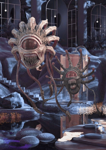
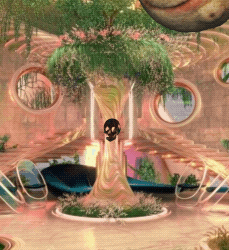
I love digital collage so I came up with a set of 10 collages to add a bit of diversity in my mediums during this project. I love horror and psychedelic aesthetics so this is the main theme I kept throughout my pieces. To generate ideas I went on Pinterest and tried to find as many pictures that more or less fit the aesthetic I’m looking for and just let my imagination take me from there! I think my favourites are definitely the second and fourth collages, I feel that my approach was quite creative and they make very cool art pieces.
0 notes
Text
Visual diary part 5


Some more digital entries for this project! I ended up spending quite a lot of time on the 3rd drawing so I had to think of simpler things to draw so I could finish this project in time and stay on schedule. I loved how it turned out though, I feel the way I drew the body shows nice fluidity and stays in art style.
0 notes