
julisastone-blog
Mastery Journal
Currently working on a MFA in Media Design at Full Sail University.
Received a BA in Visual Arts: Studio Art from Wells College (2011).
Received an AS in Studio Art and Design from Cayuga Community College (2009).
LinkedIn:
https://www.linkedin.com/in/julisa-stone-5281325b
33 posts
Don't wanna be here? Send us removal request.
Last Seen Blogs

hirokun0069
Untitled

vintagepromotions
Vintage Promotions

anti-altruism
Anti-Altruism

thirstywaffles
★喧嘩しよう★

dylantron
GUNDAM!!
Text
Month 12: Professional Practice
The end of the Media Design Master of Fine Arts program is approaching as Month 12 wraps up. It is a truly surreal feeling—after this assignment, there are no academic requirements. It is a bitter sweet end. After all my hard work, I finally obtained a Graphic Designer position at the Auburn Document Centre. It is part time, but it is a start. I am graduating with potentially high honors, according to my liaison. I am finally getting back into programs and events with the museum as I look for full time work within a non-profit or community based organization. However, as amazing as this program has been and all the doors it has opened, I find myself questioning if I had made this step at the right time. My grandmother would be upset if she knew I had that thought; but I wonder if I lost what could potentially be her last year on earth due to academic ambitions. Cancer was something I hoped I could avoid. Unfortunately, it found her.
Having just gotten off the phone with her, I know she is proud of me. I know that she does not think I have wasted my time. I also know that she would want me to do it even if we knew the circumstances a year ago. Therefore, it is my goal to finish the program strong.
Over the last month, a variety of ethical and moral reasoning topics have been covered as well as understanding and executing an Experience Map. For this month, the three biggest takeaways include: Reflection and Experience Mapping, Importance of Copyright, and Marketing to Children.
Takeaway #1: Reflection and Experience Mapping
Adaptive Paths writes that the “[h]uman experience is complex, and mostly intangible. Yet the challenge of experience mapping is to uncover, little by little, critical information about your… experiences” (pg. 9). For this course, the purpose was to discover the peaks and valleys of my journey through the Media Design Master of Fine Arts Program at Full Sail University. For me, the process of obtaining my Master’s has strained all parts of my being.
My mother, who had always been my biggest supporter, told me to quit the program because she found it to be a pointless endeavor. She and one of my sisters often discussed with my other siblings that I was making the “same mistake Matt did”. Matt, being the only other sibling who has obtained a Master’s, who also happens to be the assistant facilities manager at the UC Davis Center for Aquatic Biology and Agriculture. If having a job in my dream field is considered a mistake—sign me up.
To ensure I maintained good grades, I cut back on work. I had become so financially strained that I was talking about having to take a break from the program. My boyfriend offered to let me use his internet instead of taking a break. This, however, lead to me neglecting my incredibly affection Sophie cat. Probably the hardest part of the entire program was knowing that I was hurting her by not being around and recognizing that I would be a better pet owner by sending her to my sister’s house until after I finished the program. Although I lacked the internet bill, I was still financially unstable and I had to give up my apartment. Luckily, my boyfriend has allowed me to stay with him and we are looking for a house to move into by June so I can be reunited with Sophie.
In my 29 years, I never experienced four deaths in less than a year. My best friend also happens to be my ex-boyfriend and I had become very close to his grandparents and they both passed within 4 months of each other after 72 years marriage. During Christmas vacation, my sister-in-law lost her father and my youngest siblings lost their mother. It was hard to focus on school when all I wanted was to comfort my family and friends. However, as trying as those times were for me, it did not prepare me for my grandmother’s illness.
Thinking back on all of these awful experiences over the past 12 months, I reflect on Alyssa’s statement in her feedback of my Experience Map: “The “thinking” and “feeling” bar graphs showed more negative aspects than the “doing” graphs, which proves that as a designer, you cannot let your mind or emotions defeat you in the process of designing new material” (Kukonik, 2017). In terms of my successes over the past 12 months, I have learned to design within multiple programs including: Photoshop, Illustrator, After Effects, Premiere Pro, and KeyNote. I have elevated my design techniques and capabilities through extensive and reliable research. My ability to present ideas and projects has prepared me for educational opportunities within a future career in a non-profit. Most importantly, with some help from Prof. Argo, I have developed Creative Confidence.
Creative confidence is the quality that human-centered designers rely on when it comes to making leaps, trusting their intuition, and chasing solutions that they haven’t totally figured out yet. It’s the belief that you can and will come up with creative solutions to big problems and the confidence that all it takes is rolling up your sleeves and diving in. – David Kelly, Founder of IDEO
My Experience Map showcases my whole experience. I began my academic career as a darkroom photograph major, which is why the foundation is based on negatives and images. I went to Wells for my Bachelors of Art and as a requirement, I did an internship at the Cayuga Museum—the driving force behind my enrollment at Full Sail. My internship consisted of me organizing through thousands of historical photographs and negatives and properly storing them. During this internship, I developed a love for the museum and I went from intern, to volunteer, to Docent, and am now the Curatorial Assistant. The first exhibit I did on my own, believe it or not, was on glass plate negatives and prints. I chose to use the photograph style, not only because of its history and connection to my journey—the ability to use an alternative bar graph was a better representation of my Full Sail experience, as Alyssa pointed out.

Post-it-Note Exercise to uncover peaks and valleys of Mastery Journey.
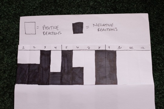
'Thinking’ bag graph to highlight the harder months using black and easier months with white.
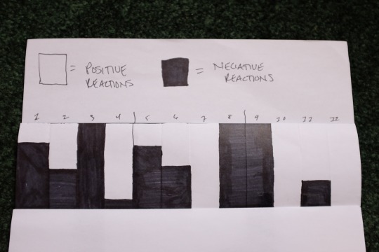
‘Feeling’ bar graph to highlight the harder months using black and easier months with white.

‘Doing’ bar graph that highlights the harder months in black and the easier months in white.
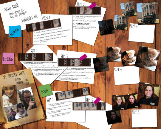
Project Version 1: Issues: No legend, large chunks of text.

Project Version 2: Included legend. But overall concept not explained thoroughly.
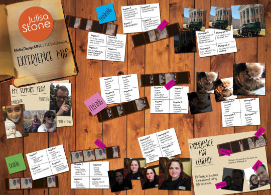
Project Version 3: Fixed the large chunks of text with quick bullet information. However, the lines are clearly defined.
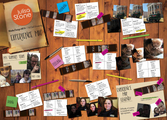
Project Version 4: Included pens and highlighters along with highlighted information to give the overall theme a ‘in progress’ look and feel. Also, changed ‘negative’ and ‘photograph’ all to month to avoid misunderstanding with the word ‘negative’.

Final Version: Adjusted the pens and highlighters to better define the lines by reinforcing the pathways rather than cluttering them up.
Takeaway #2: Importance of Copyright
As a designer it is imperative to understand the importance of copyright. According to the Copyright Office, original and creative property of designers is protected under both the 1976 Copyright Act and the 1998 Digital Millennium Copyright Act, both of which are grounded in the US Constitution for published and unpublished work (Copyright). Therefore, when creating work for a client, they only own the reproduction rights and the designer retains the copyright. This includes every creative outlet from illustrations, photographs, fonts, traditional arts, and more.
Also, it is important to understand that when creating work for a client, you are participating in a transaction. It is imperative to keep everything documented to protect the designer’s rights and ownership by clearly outlining intellectual property in legal contracts and agreements (AIGA, 2009). This creates an understanding between the designer and client that eliminates potential legal issues.
However, as Yerzil discusses, there are common trends within the industry that lead to inspirations and an understanding that copying elements is permissible if it is conducted in moderation (2015). This concepts falls under what AIGA (2009) considers as ‘Fair Use’—“limited exception to the exclusive power of the designer … to control the uses of designs” (pg. 82). Essentially, taking elements and inspirations is permitted, however, using tracing paper over the whole piece is not.
Should one commit copyright infringement, there are several legal punishments that he or she could be faced with. This includes paying for damages, reimbursing profits that were made by infringer or lost by artist, a fee up to $150,000 per infringed work, paying all legal fees, impoundment of illegal pieces, and incarceration of the infringer (Copyright Infringement, 2017).
Takeaway #3: Marketing to Children
My dream position would be Creative Director or Head of Development for a small (preferably local based) museum. Therefore, it is imperative to have and understanding of what is and is not permissible when marketing to children. During this course, it was discovered that in the US if the advertisement could not be confused with neither entertainment nor editorials, organizations could market to children 12 and younger—unlike most countries (Snyder, 2011).
Children are an ideal audience to target. Ultimately, children 14 and younger make up three separate markets equaling more than $200 billion. By marketing to children, clients develop a ‘cradle-to-grave’ consumer by implanting brand loyalty into their cores. However, this leads to age compression because marketers targeting children lure them with the concept of ‘adult’ activities and choices. Today, items that were once marketed to teenagers are now focused on tweens. (Christians, Fackler, Richardson, Kreshel, and Woods, 2015).
Snyder writes that “[a]dvertising ethics, however, must go a step above the law to ensure that consumers are treated appropriately” (pg. 478). Essentially, Snyder is stating that as designers, it is our obligation to respect that children are inexperienced, impressionable, and naïve; as well as, and more importantly, obligated to a happy and full childhood. Therefore, as a designer looking to work with the community, and children, it is imperative that I ensure the advertisement and design work created is clearly understood by children as either editorial for exhibits or advertisements for events and activities.
References:
Adaptive Path. (2013). Adaptive Path's Guide to Experience Mapping (1st ed.). Retrieved April 3, 2017, from https://assethub.fso.fullsail.edu/assethub/Adaptive_Paths_Guide_to_Experience_Mapping_d8181760-b61b-4c14-b8f6-54e6fe904d06.pdf
AIGA. (2009). Design Business and Ethics. Retrieved April 4, 2017, from http://www.aiga.org/design-business-and-ethics
Christians, C., Fackler, M., Richardson, K. B., Kreshel, P. J., & Woods, R. H., Jr. (2016). Media Ethics: Cases and Moral Reasoning (9th ed.). New York, NY: Routledge.
Copyright. (n.d.). Retrieved 4 April, 2017, from https://www.copyright.gov/
Copyright Infringement Rights. (March 16, 2017). Purdue University Copyright Office. Retrieved April 12, 2017, from, https://www.lib.purdue.edu/uco/CopyrightBasics/penalties.html
Kelly, D. (n.d.). Creative Confidence. IDEO.ORG. Retrieved April 22, 2017, from http://www.designkit.org/mindsets/3
Kukonik, A. (April 12, 2017). Written Communication. Retrieved from https://course.fso.fullsail.edu/class_sections/89357/discussions/1814587
Snyder, W. (2011). Making the Case For Enhanced Advertising Ethics: How a New Way of Thinking About Advertising Ethics May Build Consumer Trust. Journal of Advertising Research, 477-483. doi:10.2501/JAR-51-3-477-483 S
YEZRIL, F. (2015). SOMEWHERE BEYOND THE ©: COPYRIGHT AND WEB DESIGN. Journal Of Intellectual Property & Entertainment Law, 5(1), 43-71.
1 note
·
View note
Text
Month 11: Thesis: Presentation of Design Solution
As the last day of month 11 ends, panic and relief have settled in. Author, Kathryn Best, discusses that most people find standing before an audience and give a presentation as a daunting experience (2006). However, building a website without the opportunity to address questions and add supplemental information beyond what the presentation provides is, personally, far more nerve wracking. Although the program is exhilarating, receiving approval for the thesis presentation and entering the final month of the Media Design MFA program would be an amazing achievement.
Throughout the program there have been endless technical, research, creative, and personal skills that have elevated not only designer, but the personal I’ve become. All of which will play a tremendous role in who I am as a media designer. The Thesis Presentation is the summary of all of the work completed throughout the program. The execution of the project and its delivery is a practice run for the industry. Looking at how I have handled this month, showcases the type of media designer I am from the three takeaways from this month: Sykes, Malik, and West’s concepts Why and CAST (2012) as well as the RISE evaluation process.
Takeaway #1: Why
Sykes, Malik, and West (2012) write that “the greatest influencers and leaders in the world all start with “Why”… The people you want to influence will accept change more readily if they understand why they need to change” (Ch. 4). For the thesis presentation revisions, each piece of information was asked “why does ____ fit into this category?” This process truly elevated the presentation from the initial draft which was full of repeated information that crossed between the four Degree Learning Outcome (DLO) categories. It provided clarity of the concept to ensure that competency was achieved at mastery levels.

Screenshot of Problem Solving DLO. Focusing on each WHY by highlighting the question and the solution.
Takeaway #2: CAST
Content, Audience, Story, Tell (CAST) are the four steps to build an effective and persuasive presentation. Following and refining the CAST system allowed for an expository thesis presentation that highlighted the accomplishments and achievements earned over the past 11 months in the Media MFA program.
The initial draft was spent sorting the different projects into the DLO categories to ensure that each category had the appropriate content. The audience for the Thesis Presentation consists of professors and industry professionals, therefore the presentation did not spend time explaining jargon and technical skills (aside from within the Acquiring Competencies DLO). The presentation underwent a series of revisions to ensure that the story told the audience who I had become as a designer and how the program elevated not only my design skills but as a person over the past 11 months. In order to effectively tell the story, countess revisions were made to create a clean and well balanced presentation.

Screenshot of Connecting, Synthesizing, and Transforming DLO the showcasing the use of industry language within a story format to keep the presentation from becoming static and boring.
Takeaway #3: RISE
Reflect, Intrigue, Suggest, and Elevate are the four categories of the RISE evaluation system. To provide effective peer reviews, the RISE system was used. The RISE system provided the evaluator a set of standards and prompts to examine the work being reviewed. By following this system, the review evoked deep thought and provided suggestions that would help the project reach new heights.
Month 11, being the most important course of the Media Design MFA program, time was not available to ‘wait’ for a peer review. Being one of three people who did not received a peer review on the Friday due date, I understood the panicked frenzy my peers were facing. While providing my required peer review, by closer examination of the grading rubric to provide effective feedback, I realized that I had made some mistakes as well. Needing some instructional feedback, I decided to make my own via extra peer reviews to those who lacked one. By doing so, I not only help my colleagues, I elevated my own work.
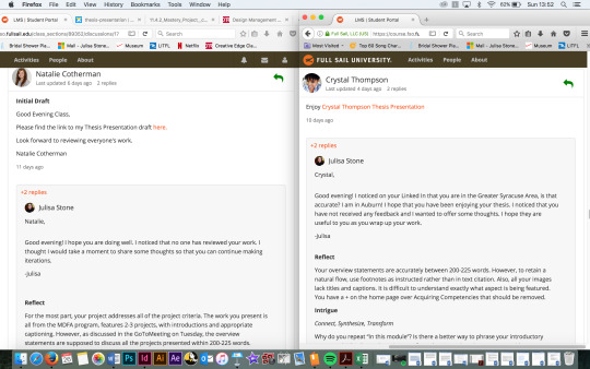
Screenshot of extra peer reviews that aided their presentations as well as my own by using the RISE evaluation method.
References:
Best, K. (2006). Design Management. Retrieved May 31, 2016, from http://ce.safaribooksonline.com/book/-/9782940439782
Sykes, M., Malik, A. N., & West, M. D. (2012). Stories That Move Mountains: Storytelling and Visual Design for Persuasive Presentations. Retrieved March 1, 2017, from http://ce.safaribooksonline.com/book/communications/presentations/9781118423998
0 notes
Text
Month 10: Measuring Design Effectiveness
The last few months of the program have been difficult for me. I am glad that I stuck out last month instead of taking it off. Although the woman I loved as a grandmother passed last week, I was able to remain focused on my studies.
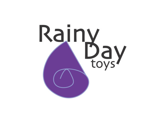
For Measuring Design Effectives, I developed a survey to examine the logo design created for Rainy Day Toys. This class has proven to be a great course to use in my ideal career. Ideally, I want to work in non-profit. Being able to effectively write surveys is extremely important within the non-profit field. At the Cayuga Museum, the curator wants to begin drafting a survey to determine who our current demographic is as well as where he or she hears about our programs and events.
Although there was an immense amount of information in this class, there were three key takeaways: Non Designers Do Not Get It, Measuring Design and Research, and Industry—Sample and Applications.
Takeaway #1: Non-Designers Do Not Get It
Throughout the program, I have struggled with my family understanding why I would go back to school for design. “It is something you can do or can’t do. Just learn it on your own.” My brother in California, who has been very supportive of my master’s journey (the only other member of my family who holds a master’s degree in marine science, his wife has a PhD in animal psychology) was proof reading my paper and wrote “I never really realized much effort and thought goes into a logo”. Being the most intelligent person I know, it really brought a different perspective to how I see this program.
Great design feels natural. It is not over thought—it’s based in research. Since I want to work in either development or communications in a non-profit, being able to create such trust worthy brands and campaigns, it will build the respect of the institution within the community.
Takeaway #2: Measuring Design and Research
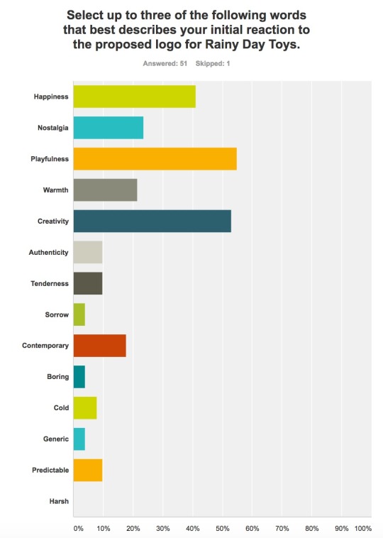
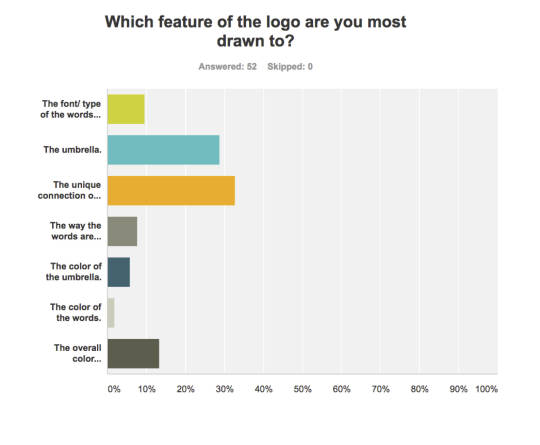
As discussed in takeaway #1, effective design work is based in extensive research. This course taught the importance of measuring design effectiveness. For Rainy Day Toys I created a questionnaire that examined the design based through nine questions. Overall, the reaction was positive among the participants. These results proved that the hours of research and design work to perfect the logo were effective in creating a memorable logo and brand identity.
The impression was positive in general, there were some surprising realizations such as one participant’s perspective of the logo being boring, predictable, and cold. In addition, that participant and another (both male) found 0% interest in the design. I happen to know that some of the participants who showed little interest, including the participant previously discussed, were childless men in their early thirties who purchases toys for relative’s or friend’s children.

First question designed to measure frequency of possible in-store visitors.

Second question designed to understand the psychology behind toy purchases.
Third question designed to evaluate the initial emotions and reactions of first time viewers of the logo itself.
Fourth question designed as an industry specific question to determine if the research devoted to the logo design was effective in reaching the target audience.

Fifth question designed to measure the level of overall interest of participants to determine if the logo presented with only the logo.
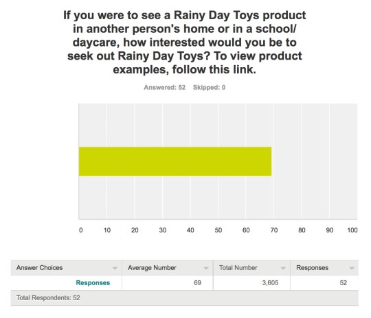
Once viewing the logo on different products and assets, question six examines the level of interest in the brand, products, and logo as a whole.
If the logo was a cereal brand, which would it be and why?
Lucky Charms. Reminds me of something the leprechaun guy would use.
General Mills Cheerios. Because it’s my favorite and I could see it raining Cheerios.
Captain crunch, eye catching.
Fruit Loops, because I feel like the logo is very loopy.
Don’t eat cereal.
Cheerios- wholesome goodness.
Frosted Flakes, because the colors in the logo remind me of it.
General Mills Kix, a classic kids cereal that is not too obnoxious.
Lucky Charms. I related the umbrella and rainbows.
Life Cereal, because cereal makes me think of children.
Lucky Charms because I used to eat them when it was raining and I couldn’t play outside.
I have no idea.
Oatmeal. People love the comfort food on a rainy day.
Umbrella Puffs.
Rice Chex? Light and easy going.
Kellogg’s dependable.
Kellogg’s variation in products
Cheerios… Classic, expected.
Quaker Oats.
Maybe Rice Chrispies mixed with Raisin Brand.
Fruit Loops, because of the way the logos connected the name of the brand to the product itself.
Lucky Charms. Fun and nostalgic.
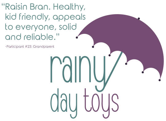
Raisin Brand. Healthy, kid friendly, appeals to everyone, solid and reliable.
Raisin Brand, because of the colors.
Raisin Brand. The purple calls to mind raisins, quite simply.
Fruit Loops attracts kids.
Fruit Loops. Colorful, whimsical.
Oatmeal, cream of wheat, something soggy.
Hot cereal to warm you up.
Trix, because it looks like mischievous fun.
Lucky Charms. Fun, playful, magical- just like the experience children have with toys.
Cheerios… Something about the umbrella and the British Cheerio.
Lucky Charms, because you’re lucky to have toys to play with on a rainy day.
Kellogg’s, they are popular.
I don’t have an answer for this question. Sorry.
Lucky Charms.
Honey Nut Cheerios
Cheerios.
Question seven was developed to determine if the brand identity was evident by asking viewers to compare it to a cereal brand.
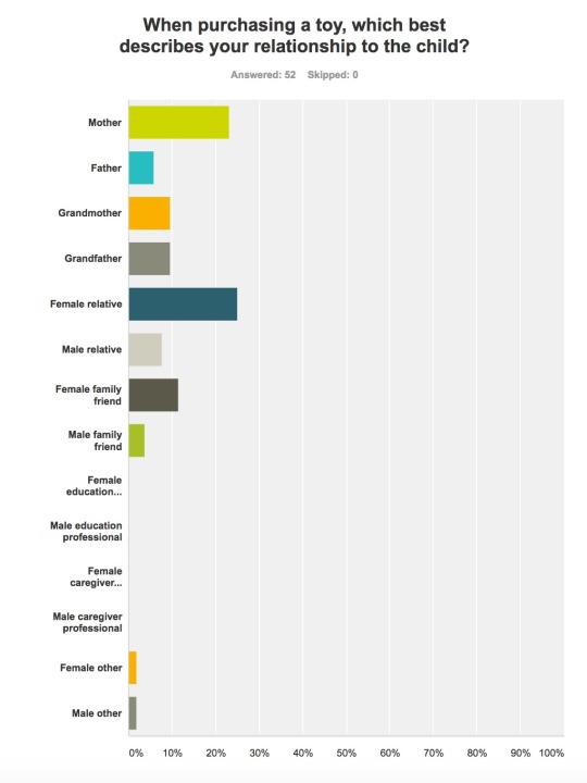
Question eight was to determine who were among the primary target audience based on gender and his or her relationship to the child.

Question nine was designed to understand the level of income among the target audience because it was theorized that those who made more than the national average of $50,000 would be more interested in the brand.
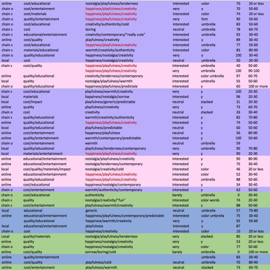
This chart was created to see who among the target audience provided which answers. It showed that the primary audience was females because they make up 70% of participants. They provided all 10 of the word combination answer happiness-playfulness-creativity. Also, all four of the 100% interest levels were selected by women.
Takeaway #3: Industry—Samples and Applications
As I am closing in on the end of the program, I was lucky to have a lot of one on one time with the professor before and after class. In this time, I learned the importance of portfolios and what it means to send in work samples. Earlier in the program I had applied to a position and sent the company, essentially, all my design work including sketches, drafts, and completed projects.
However, the point of samples is to just give them a taste of what I’m capable of. Show a spectrum of work, within three to five pieces, from print ads, logos, web, mobile apps, and more. Show the different steps of the process such as a fully rendered logo and brochure paired with a set of wireframes with one or two pages completed.
Also, it is imperative to be persistent. Especially since I want to remain local and in non-profit. It’s about showing your best—finished work, thought process, and building blocks.
0 notes
Text
Month 9: Multi-Platform Delivery
Tonight is the conclusion of month nine in the 12 month Media Design MFA program through Full Sail. It has been an intense month both in school and in life. I have faced several setbacks and many doors have opened to me. Although I am sad that the iteration phase of the program has come to an end, I am excited to enter the last phase. I look forward to measuring my designs to evaluate their effectiveness. However, before I move forward, I would like to reflect on the three biggest takeaways I’ve gain from month nine.
Takeaway #1: Life—Well It Sucks
On Christmas, my brother and sister-in-law lost her dad. I spent the first week of class out in Genoa cleaning their house to give them an easy transition home. On December 27th my little brother and sister lost their mom. I had to arrange for my brother to have emergency from the Peace Corps so that he could make it to the funeral. It had been two years since I last saw him. I opted to spend time with him while he was home, which strained my school work. I also spent this month packing my apartment and moving in with my boyfriend. I am very lucky to have him. I would have had to drop out of the program because I can no longer afford to live on my own and maintain the amount of time I need to devote to my studies and excel.
Several times over this month I questioned whether I should have taken the month off. I am glad I didn’t. I would have lost my momentum. More importantly, there are those in my family who believe that I am making a huge mistake by returning to school—they think I’m wasting my time and money. I fear that if I had taken the month off, they would have seen it as proof that I couldn’t do this.
I can. I am. Soon, I can say that I did.
What I have learned from this hellish month is that no matter how hard it gets—Keep designing. Keep moving forward. Keep growing, learning, and improving. Prove to myself that I am worth this effort. Make myself proud of the work I do. Believe in the work and skills that I’ve developed over the past nine months and the years to come. I am creative. No matter how hard it gets, I will never let this part of me be taken away again.
Takeaway #2: Research—I Love It
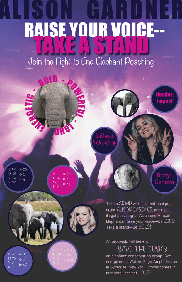
Over this iteration phase, I have realized that my favorite part of the design process is research. In the first portion of the program it was stressed over and over how crucial the research phase was in design. In month six I began delving deeper into research to develop the logo design for the RAISE YOUR VOICE—TAKE A STAND benefit concert.
This month, I worked on Rainy Day Toys and You Matter Mentorship. By doing extensive research, I was able to generate moodboards that needed little refining. Which is humorous considering the first three moodboards I ever made. To view the video presentation, please visit my Behance page at: https://www.behance.net/Julisa_Stone.

Final Moodboard for Rainy Day Toys.

Final Moodboard for You Matter Mentorship Program.
For Rainy Day Toys, this month I was creating the video, not the design. It was important to understand and research the type of information to present based on the audience. I started off presenting all of the design information—it was a six minute long video. However, with several revisions, I focused solely on the information clients wanted to know—research that proved the design was effective and appealing to the target audience and end users.
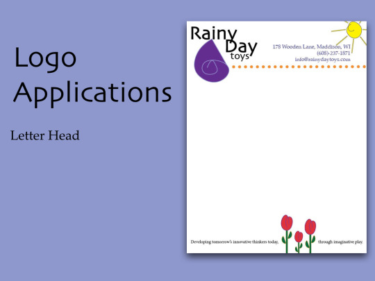
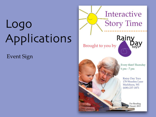
Final Logo for Rainy Day Toys.
You Matter consisted of researching several sites for mentoring as well as marketing to mentors, mentees, and parents of mentees. It required a deeper understanding because You Matter is a service rather than a product like Rainy Day Toys. I needed to research and unveil the core of the program: Stability. The colors were selected to evoke this important quality—blue= stability, aqua= emotional healing, and purple is appealing to the end users, teens (Parker). In addition, because of the protective nature of circles, they were emphasized throughout the design. The “icon” selected is the shorthand for the word “stability”. It is simple logo with a lot of deep and complex meanings that reflect the mission of You Matter.
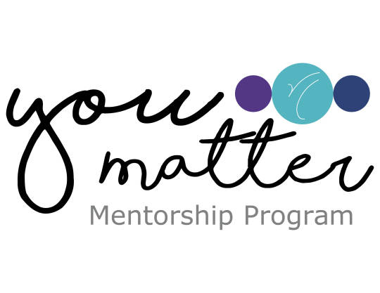
Final Logo for You Matter Mentorship Program. The three circles with the center circle housing the “stability” symbol. The use of three circles symbolizes community. The use of two circles the same size is to symbolize the mentor and mentee. The single large circle is a representation of growth and stability of the mentee.

Stationery Set using logo.
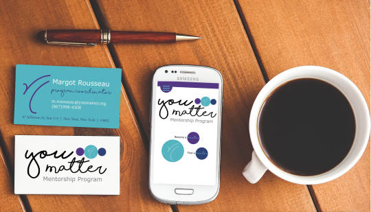
Close up of the front and back of a business cards and mobile.
Takeaway #3: Art—It Is My Calling
Since I began this program, I have been developing a brand for myself as an artist and designer. In September it was made clear that I had no opportunity for advancement at the Cayuga Museum. While in this transition period, I am still employed and the director and curator respect my creative abilities. I am being given more artistic and design responsibilities. I anticipate that over the year following graduation I will be doing a series of part time jobs to build up my portfolio. As part of the museum and our desire to be more relevant among today’s media outlets will be able to take over as a development associate by the time I leave.
I am still in contact with the Art Director at the local paper for a possible part time graphic design position. In addition, there is still the possibility of a part time design position at the Auburn Document Center. One prospect that I am extremely excited about is the possibility of creating a new logo for the Aquatic Center at a university in California. My brother is the facilities assistant manager and he asked if I would be interested in working with him and his director when I visit in May to begin the design process.
Although the prospects exist, I have been researching different design companies, printing companies, non-profits, and—of course, museums. Although I am studying design, my end goal is to be either a Director of Development or Creative Director in a non-profit—preferably a museum. This month has shown me that this is the path that I want to be on. Because of my excellent research skills and writing capabilities, I would prosper in either of those positions.
References:
Gregg, J. R. (1916). Gregg Shorthand Dictionary. Retrieved January 27, 2017, from http://gregg.angelfishy.net/gsd.pdf
Parker, R. (n.d.). The Meanings of Colors. Retrieved January 21, 2017, from https://resources.oncourse.iu.edu/access/content/user/rreagan/Filemanager_Public_Files/meaningofcolors.html
0 notes
Text
Month 8: Design Integration
Month 8 has been both stressful and exciting. Having gained some creative confidence, I have explored new ideas and learned several new skills-- particularly with Illustrator. Although I am behind my proposed schedule, the work I'm producing has been elevated to an industry quality level. My rationale behind the changes is strong due to my research which only further proves its importance in the design field. This month, the three biggest takeaways are simplicity of meaning, continuous learning, and portfolio construction.
Takeaway #1: Simplicity of Meaning
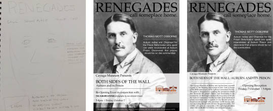
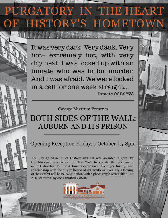
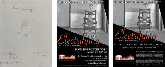
It may come from my poetic background, but I tend to overfill my work with symbolism with subtle connections. This was evident in two of the three projects I revised this month. My testimonial ads directly reflected the historical aspects by using a script typography to reflect the handwritten script of the death log. Although I still prefer the look and feel of the script typography, I understand how it would be lost on most viewers therefore taking away from the haunting voice and tone of the ads. By using a distressed typography, it conveys the dark and brutal history of the Auburn Prison while looking professional and of museum and industry standards.
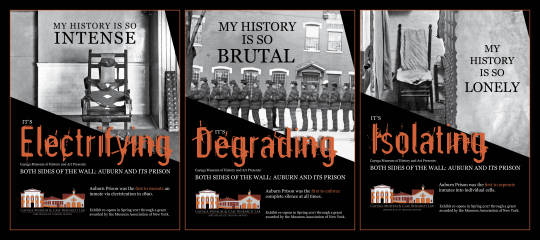
Finalized cohesive marketing strategy for the testimonial ads to promote the reopening of Both Sides of the Wall: Auburn and Its Prison at the Cayuga Museum of History and Art.
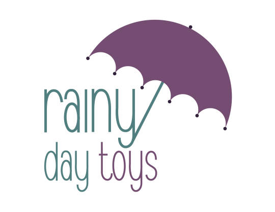
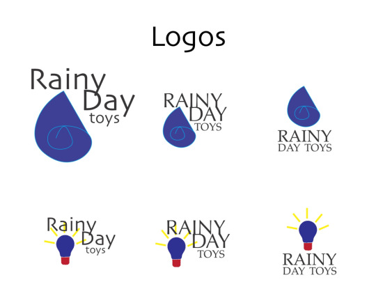
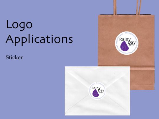
The other project was the redesign of the Rainy Day Toys logo. The redesign icon is an umbrella. Early renderings included a seedling as well. The idea was that the rain supported the seedling just as play supports learning for children. However, this was considered too deep of a concept and the final logo consists of a just the umbrella.

Finalized proposed logo design for the fictitious specialty shop in Madison, Wisconsin: Rainy Day Toys
Takeaway #2: Continuous Learning
Having struggled with creative confidence for years, I was very timid I try new things and explore different possibilities. Prior to this program I couldn't create anything in Illustrator. However, much of the work I've done this month has forced me to begin learning the program. As we begin our holiday break, I feel as if it would be in my interest to utilize my Lynda.com subscription to watch the tutorials for Illustrator, Photoshop, and InDesign. As for see myself spending a year working a string of part time positions (as I do now) and contracting freelance work to gain a design background, experience, and a portfolio. Although I don’t have an advancement opportunity at the Cayuga Museum, I plan to stay for as long as I can because I believe in their purpose and mission to Cayuga County and the world. I will be devoted to producing a lot of the marketing designs once I've competed this program. For this month, Prof. B challenged me to vectorize the Museum's logo. The curator was impressed with the quality of the work and has requested that I vectorize an image of our Ginkgo Tree.
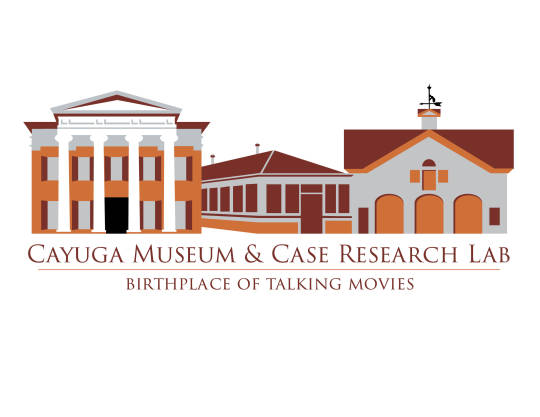
Vector copy of the Cayuga Museum & Case Research Lab. (I did not create the logo, I simply made the vector version to clean up the image).

Alternate vector image to accommodate media outlets with dark backgrounds. (I did not create the logo, I simply made the vector version to clean up the image).
Takeaway #3 Portfolio Construction
When I graduated with my BA, the importance of a portfolio was never stressed and it was hardly discussed. I feel, now, this hindered my employment opportunities because I never had a well-constructed portfolio. I would present work like the format my Behance page was constructed for the committee review-- showing the progression. Gregg discusses that it is crucial to have the right amount of work in one's portfolio (2015). Too much work is overwhelming and usually shows a spectrum of mediocre work to well developed and professional pieces. Whereas not enough work makes the portfolio look empty and doesn’t provide enough information about your work and style (Gregg, 2015).
Given the possible opportunities I have at the Auburn Document Center and the Citizen newspaper, it is imperative to make sure I have a well-developed portfolio featuring only my best work.
--------------------------------------------------------------------------------------------
Reference:
Gregg, R. (February 4, 2015). 5 Graphic Design Portfolio Mistakes to Avoid. Retrieved December 15, 2016, from http://blog.creativelive.com/5-graphic-design-portfolio-mistakes/
0 notes
Photo
I entered to win a PS4, Xbox One, GoPro and more in Full Sail's #12DaysofGear Giveaway. Enter here:
0 notes
Text
Month Seven: Design Strategies and Motivation
In the Media Design Program months seven through nine are considered the iteration phase. It is the opportunity to review the work generated in months two through six based on a committee review. The purpose is to elevate the pieces to meet industry expectations. I have been honored with the opportunity to develop a new campaign after four weeks of revisions. As I’ve progressed through this program, and this month I have witnessed myself growing not only in my abilities to design, but in all aspects of my life.
In month five my lack of creative confidence was brought to my attention. In part, this is the result of who pushed me to follow my creative dreams. Unfortunately, it was the man who sexually assaulted me when I was 16. Art and design had become a part of I was—am. However, it would cause me immense pain to begin and complete projects. The question always haunted me “am I actually creative? Or did he just say that because he wanted to get close to me?”
The answer—I am creative.
From this point, I plan to pursue a career in the design field, ideally as part of a non-profit. Last month I learned that advancement at the Cayuga Museum was impossible for me now, so I’ve begun to look elsewhere. I applied to Chase Design in Skaneateles, NY. I am constantly looking for positions that compliment my new skill sets. Currently, my plan is to remain at the Cayuga Museum and apply my new abilities to promote it and it’s purpose. Also, I have an agreement with a local business owner to begin doing work for her next year. She owns multiple and diverse businesses which include: Smiley’s Town and Country, Kings and Queens/ Genesee West Apartments, and Suds and Buds Car Wash. This opportunity will allow me to greatly expand my portfolio.
Month seven has been structured different than previous months. It was primarily independent work and research. However, the three biggest takeaways include creative confidence, Human Centered Design, and balance.
Takeaway #1: Creative Confidence
I spent an entire year deciding if I should enroll in this program. I am glad that I did. Once I realized that I was creative, I knew I had to get out of the position I am in and I enrolled. When I look at my work from month two and see what I’ve created since I am amazed. I work hard and it is being seen by my professors, my employers, and by possible future employers. Last night was the annual Holiday Party at the Cayuga Museum. The Advertising Director is one of our board members and he told me that their part time graphic designer put in her two weeks’ notice. Based on the work I did for the museum in month four, he thought of me immediately. After the holidays, he is going to talk to me about getting a portfolio together.
On Monday of week two I dreaded getting the review from the Design Committee. I thought I was going to spend the whole 10-week iteration phase working on past projects. I desperately wanted a second campaign. When Prof. Argo called me that Wednesday to offer it to me, I knew that I had made the right choice to come back to school for this program. I know that my design techniques need work, but every day I am becoming a better designer. I may not know how to work all the programs and it tends to take me a little extra time to figure something out, but I am getting there.
“Creative confidence will drive you to make things, to test them out, to get it wrong, and to keep on rolling” (IDEO, 2015; pg.19)
Below are images of the “Save The Tusks” page from my website design from the first to the most recent. I have come very far and I am proud of myself.

Takeaway #2: Human Centered Design
Human Centered Design is a contemporary design technique developed by IDEO and Frog Design. Although the techniques of the past are effective, by focusing on the human aspect, a design is elevated to a level beyond what a designer initially considered. Human Center Design processes that gets “you to learn directly from the people, open yourself up to a breadth of creative possibilities, and then zero in on what’s most desirable, feasible, and viable for the people you’re designing for” (IDEO, 2015; pg.13). Ultimately, human centered design is about making a real impact. To do that you must understand the target audience and the end user.
This month, my first set of revisions were for the multimedia campaign for a benefit concert to save Asian and African elephants. As seen above, my initial focus was on the concert. As the committee pointed out in my review, the focus is on the benefit—the elephants. Once I realized my faults, I reevaluated the work and produced pieces that were focused on raising awareness and funds for the organization Save The Tusks through an Alison Gardner concert. Ultimately I created a strong campaign with an innovative event website and an intriguing video, which can be viewed by visiting my Behance page: https://www.behance.net/Julisa_Stone.

Takeaway #3: Balance
This month has been intense, just as the rest have been. However, unlike the previous months, I had not yet faced personal hardships that distracted me from work. I lost a very close friend that I loved as my own grandfather. Until this month I had never lost anyone I’ve loved as much as Grandpa Van Brocklin. In addition, I was out of state for nearly a week. I had 15 hours in the car that I had planned on doing my design work during. Only to learn that I get extreme motion sickness when I look at a computer screen in the car. Due to both situations, I had to learn how to balance my time during personal hardships.
Coincidentally, learning to balance my schedule and account for personal activities was part of this month’s curriculum. During week two I developed a schedule to keep my projects on task and had to consider museum events, personal events, holidays, and deadlines. One of my struggles is over scheduling myself, which I tried very hard not to do. While in undergrad I worked three jobs and commuted to school where I was a full-time student. When I graduated, there was a point in time when I had five jobs. Balance is something I’ve always struggled with. This program has forced me to develop balance to succeed.
One thing that I have taken away from learning to balance is to learn from failure. The CEO of IDEO, Tim Brown, stated “don’t think of it as failure, think of it as designing experiments through which you’re going to learn” (IDEO, 2015; pg. 21). A large part of my previous issues with balance was the need to perfect everything. Through this program and especially this month I’ve learned to learn and press forward. If I don’t, that is when I fall out of balance—that’s when I fail.
-------------------------------------------------------------------------------------------Reference:
Ideo.org. (2015). The Field Guide to Human-Centered Design (1st ed.). Retrieved November 2, 2016, from https://assethub.fso.fullsail.edu/assethub/FieldGuidetoHuman-CenteredDesign_IDEOorg_18d7a740-7348-4dc8-8fb6-d75d4ff470c4.pdf
0 notes
Text
Month 6: Organizational Structures Reflection
Month 6 has been an intense month. Until this month I had never head of neither After Effects nor Premier Pro. Learning two animation programs in four weeks proved to be challenging given my limited computer experience. However, I believe that the experience has been immensely beneficial for my future career in either the design or museum world.
I entered this program after considering it for a year. I had tried for five years to find a job within the cultural sites in central New York to fall a close second choice to someone with more computer skills. Ideally, I wanted to advance within my beloved Cayuga Museum. However, within the last two weeks I learned that it was impossible for me to advance. My Curator and Director actually made a promotion proposal to the board to make me the Development Associate. They declined because they didn’t want to pay the additional salary. Therefore, I have to begin looking beyond the Cayuga Museum. I believe strongly in the mission of the museum. I would never entirely leave. I still intend to apply everything that I am learning to my work at the museum because I believe that the Cayuga Museum can and will prosper again.
Learning After Effects and Premier Pro while accepting that I will not be a full time staff member at the museum has led to a rough, yet, exciting month. I certainly never imagined myself learning how to do animation and creating a promotional video. In addition, I never considered that when I graduate, I will have to apply my new skills to another museum. However, everything I’ve learned this month has been incredible. I would like to focus on the three most impactful experiences from this course which include: logo design, Kevin Alloca’s “Why videos go viral”, and the impact of using moving imagery and or sound.
Takeaway #1: Logo Design
A logo is the symbol for institution or project it represents. Therefore, it is essential for it to reflect the brand. This is accomplished by getting an understanding of who the brand is. George Felton writes “[y]ou can’t talk a certain way until you know who’s talking and about what” (2013, pg. 97). All parts of the marketing campaign, including the logo, must reflect the brand identity.
A logo must be timeless. That is the most important lesson I learned. Often times, in order to accomplish this, a simple design is best. Simplicity allows the design to be adaptable. Adaptability is important because the logo will appear on anything from printed materials, web content, cups, zippers, and more. For the Cayuga Museum, we are planning to decrease the amount of exhibits we host next year to three. This will allow extended time for research to develop an all-inclusive exhibit. As a result, we want to make these larger exhibits stand out and have their own identities, particularly the lead exhibit. A lead exhibit is the primary display hosted during the summer because of the higher number of tourists. Developing a logo for at least the lead exhibit will establish the brand identity of the exhibit and indirectly, the museum. It will increase attendance because the logo will be utilized in many marketing outlets where it will be recognized.
During this class I created a series of logo sketches for the fictional benefit concert featuring Alison Garden. Below you will see the progression of the logo design.

Takeaway #2: “Why videos go viral”
Kevin Alloca states three key reasons why videos go viral: tastemakers, participation, and unexpectedness (2011). Alloca is speaking about videos, however, these concepts apply to conditioning the target group we want at the Cayuga Museum. The idea is to get people excited about the videos—the museum. Although some designers don’t put much emphasis on the taste makers, they are important in relation to the museum. We need someone to say “hey, go check out the Cayuga Museum because it is awesome”. Theodore Case invented the technology to put sound on film in the backyard of the museum. It deserves global recognition and support. However, we don’t know how to accumulate it.
Small museums such as the Cayuga Museum are fading away quickly because people don’t have the same attention span they once did. This week I attended a lecture by Zac Martellucci of Museum Hack. Martellucci asked “why would millennials choose to support one institution with so many options” (2016). Like Alloca, Martellucchi states that the key to getting people excited and making things viral is participation. People want to be a part of something by either spreading the word or doing something new with it (TEDYouth, 2011). Developing programs, events, and exhibits that allow audiences to participate is the key to sustainability.
Alloca’s third reason for viral videos is unexpectedness. Which is something we have at the Cayuga Museum. Often visitors are amazed at the history found in Auburn and Cayuga County. The city’s moniker is “History’s Hometown” because of the inventions, inventors, national leaders, agriculture, and more call Auburn home.
As stated in my Effective Copywriting paper that outlined my proposed marketing campaign for the upcoming reopening of Both Sides of the Wall: Auburn and its Prison, I outlined the use of videos to promote not only the history, but the Cayuga Museum. By following the ideas of participation and uniqueness to create these videos that speak to the museum’s brand, I have the opportunity to make them viral.
Takeaway #3: The impact of using moving imagery and or sound
Brand identity extends beyond the static imagery to include moving imagery and sound. Both of which are an essential part of developing the brand’s voice. A study by the University of Tasmania’s Medical School proved that moving images elicit more emotional responses versus static images (Matthews, 2012). Although the majority of the video pieces I would make would be comprised of static images, by having them move in or out of the screen will create more of a response than just going from slide to slide. The movement captures the viewers’ attention. For the prison exhibit, I would want to create a documentary series of 12 videos that range between 5 and 7 minutes in length that include b-roll and documentary feel with shots of the prison today, the guards changing, and (if possible) scenes from within the prison today—in addition to interviews.
Just as the visual identity is crucial to the brand, the sound identity is also important. Nick Metcalfe breaks sound design into three categories: atmosphere, Foley, and spot effects (2014). One thing we have begun doing at the Cayuga Museum is play music that is relevant to the primary exhibit at the time. This really ties in the importance of creating the atmosphere for the exhibits. Currently we are playing Haudenosaunee tribal chants for the contemporary art exhibit we are hosting through November 6th. It sets the mood for the exhibit and helps the viewers immerse themselves in the stories we have set out for them. Seeing the importance and the impact of this first had, I know that sound plays just as big of a roll in the brand identity as the visuals do. If I were to play pop, country, or any other genre during this exhibit, the connection would be lost and people would question the choice and the museum’s credibility. For the upcoming prison exhibit, I am proposing we try to establish a Foley track to play on loop in the gallery. During a series of interviews, Mueller discovered that the sounds of prison life were the most effective tools to deter ex-convicts from braking parole (2014). By mocking these sounds while viewers take in the exhibit, which includes a life-size replica of a cell, will develop a strong connection and a deeper understanding to the prison and its relationship with Auburn.
*** To view my promotional videos for the fictional benefit concert featuring Alison Gardner, please view my Behance page: www.behance.net/Julisa_Stone***
_______________________________________________________________________
References:
Felton, G. (2013). Advertising: Concept and Copy (3rd ed.). Retrieved July 31, 2016.
Matthews, A. J., Scanlan, J. D., & Kirkby, K. C. (2012). Online Exposure Treatment for Spider Fear: The Effects of Moving Versus Static Images on Treatment Adherence, Fear Elicitation and Habituation. Behaviour Change, 29(1), 15-24. doi:10.1017/bec.2012.7
Martellucchi, Z. (October 18, 2016). Museum Hack Lecture.
Metcalfe, N. (2014, August). Sound Design For Visual Media. Retrieved October 18, 2016, from http://www.soundonsound.com/techniques/sound-design-visual-media
Mueller, M. P. (2010, July 22). A Sound Approach to Marketing. Retrieved October 4, 2016, fromhttp://boss.blogs.nytimes.com/2010/07/22/marketings-forgotten-sense/?_r=1
[TEDYouth]. (November 2011). Kevin Alloca: Why videos go viral. [Video file]. Retrieved from http://www.ted.com/talks/kevin_allocca_why_videos_go_viral
0 notes
Text
Mastery Reflection Month 5: Design Research
As technology continues to evolve the way people learn and engage with museums is constantly changing. Not only are museums establishing themselves on social networking sites, they are creating larger and more complex websites to include virtual tours. Launching virtual tours is a means to reach visitors across the globe. At the Cayuga Museum, it is our hope to begin establishing virtual tours as part of our website to not only draw in visitors, but also as to preserve the history of Auburn and Cayuga County along with their artifacts. By having a virtual data base of objects, documents, and photographs it decreases the need to pull them from the archives. Less handling leads to better preservation of the physical artifact.
Having a virtual tour will also lead to an increase in physical visitation. When travelers are visiting the area and search our website, a sneak peek tour of what we have will help lure them to us. In addition, having virtual tours leads to increase hits on the website which leads to a higher standing in search engines. However, the most important outcome of virtual tours is that each hit to that page is counted toward attendance. Attendance records dictate which grants museums are qualified to apply for and receive. High attendance records leads to more grants with higher payouts.
By learning the design process of creating moodboards, wireframes, and comps for websites, I am able to assist with the creation of virtual tours for the Cayuga Museum. In addition, why my newly learned capabilities, I would be able to assist with all design aspects of the website. By having someone on staff who is capable of web design, it will decrease the amount the museum spends on an outside designer.
Since my ultimate goal is to remain in the non-profit sector (preferably at the Cayuga Museum), being able to develop, maintain, and execute a unified marketing campaign is crucial. As a non-profit employee, my competition would be not only other museums, but also all non-profits. As a result, this course has proven to be one of the most influential of the program in relation to my position at the Cayuga Museum.
Beginning with moodboards, it was imperative to establish the typography, imagery, color palette and their uses to properly establish the brand voice. George Felton writes that no matter what that message is, or where it appears, it should represent the brand’s personality and speak with the right voice” (2013, pg. 93). A moodboard is a tool that different members of the design team reference when creating media from print, broadcasting, and the web. By referencing the moodboard, the voice stays in tact as well as the design style and quality. For this class I created a moodboard for a pop concert by Alison Gardner as a fundraiser for the fictional organization Save The Tusks. The process of creating a moodboard is applicable toward my current position at the Cayuga Museum because we host several types of programs including First Friday, Final Friday, Word, Movies @ The Mack, and History Book Club @ The Cayuga Museum. By developing a moodboard for each program, all the marketing will be consistent and easily recognizable to the community.
Since this course focused on web design, the second step was to create wireframes. Winnie Lim writes that “[w]ireframing is important because it allows the designer to plan the layout and interaction of an interface without being distracted by colors, typeface choices or even copy” (2012). As the complete opposite of tech-savvy, wireframes were an important step that taught me the importance of information architectures and user interface and interaction. It allowed me to establish hierarchy of not only the information on a given webpage, but also within the entire website. Through a process of wireframe designing, I ultimately landed on using the navigation button size as a mean to dictate hierarchy of pages. Regarding my position at the museum, being able to create wireframes that demonstrate the relationship between webpages is essential for virtual tours. If I were to create a tour like that on the Hermitage State Museum, the browser can navigate through rooms on their bowser, similar to google maps.
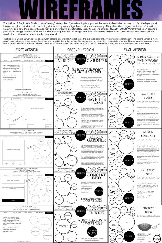
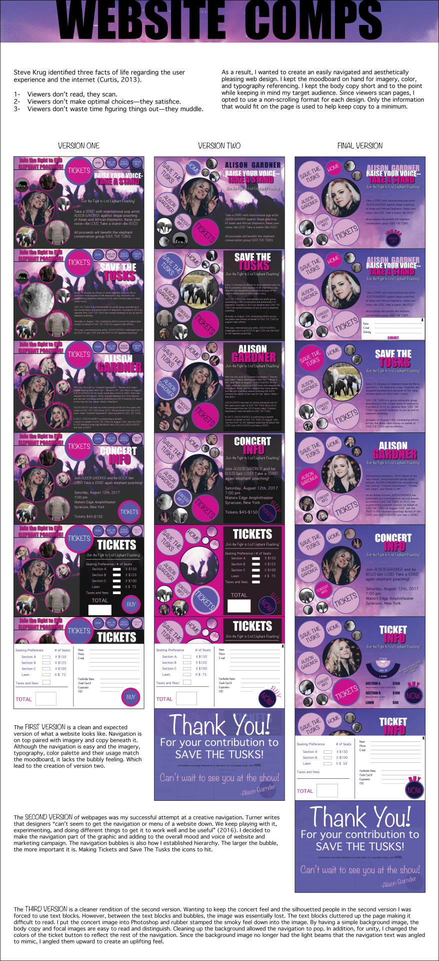
The final step was the design comp. While creating the design comps, I went through a couple different versions as I progressed through the month. Amber Turner discuss the challenge of navigation in her article “10 Web design trends you can expect to see in 2016” (2016). Although it is necessary, Turner address how navigation is still a tricky part of web design because there isn’t a simple solution for dealing with it. As a result, the navigation for the Alison Gardner website is part of the graphics. As I made changes to the aesthetics of the website I ended up with the smoky concert lights as the background for the website. In earlier versions I had the silhouette of people at the bottom to give it a more energized feel. However, the excessive background information took away from the navigation and image bubbles as well as the body copy. A joint study conducted by Harvard University, University of Maryland, and University of Colorado concluded that the only universal finding among demographics regarding aesthetically pleasing web design was that “the more visually complex a website was, the lower it’s visual appeal” (Walker, 2012). Through research and design experience and exploration, I have discovered that the most important lesson is to keep the design simple, legible, and clean while keeping the website creative and distinct among others in its category.
Currently we hire an outside designer/developer to build our website. However, upon the completion of this program, some of the design responsibility (hopefully) will be given to me. With this in mind, it brings me to the questions: “Do I learn how to code?”, “Do I learn to use design software applications that allow me to skip the coding step?” or “Do I rely on outside sources to code websites for me?” Given that as the field of media design becomes more inclusive, in order to find and keep a good position in the design or museum field, learning how to code or use special software is an essential part of development.
This change is evident in the job postings I found on different search engine sites. When I type in web designer, the majority of the positions require experience in HTML and CSS coding. There are a few positions that exist that do not require experience, but prefer it. Then there are also positions that are strictly graphic design where web design is included. I narrowed my search to web design museum. Here I found the first two types of postings, required and preferred coding experience. Considering my ambition is to remain in the non-profit and small community museums, having the ability to do basic coding is becoming a requirement of the field.
Working at the Cayuga Museum, our biggest goal is to preserve and share the history of Auburn and Cayuga County—Communication. Jason Beird and James George say in their text, The Principles of Beautiful Web Design, that the foundation for good design is communication (2013). As a museum professional, it is important to understand the importance of media design—yes. That is why I am in this program. The Cayuga Museum has a ten-year life expectancy. The history of this community has influenced not just Cayuga County and New York State. In fact, it hasn’t just impacted the United States, but rather the world via Theodore Case’s invention of sound on film. The focus of the Cayuga Museum—or any museum, is to share the history, culture, or art that is on display. Sharing is only accomplished through effective communication and design. As we progress technologically, it is important for museums to advance simultaneously in order to remain sustainable and current.
-------------------------------------------------------------------------------------------
References:
Beaird, J., & George, J. (2014). The Principles of Beautiful Web Design (3rd ed.). Retrieved August 29, 2016, from http://ce.safaribooksonline.com/book/web-design-and-development/9781457174353
Felton, G. (2013). Advertising: Concept and Copy (3rd ed.). Retrieved July 31, 2016
Lim, W. (2012, June 18). A Beginner’s Guide to Wireframing. Retrieved September 12, 2016, from http://webdesign.tutsplus.com/articles/a-beginners-guide-to-wireframing--webdesign-7399
Turner, A. L. (2016, January). 10 Web design trends you can expect to see in 2016. Retrieved September 12, 2016, from http://thenextweb.com/dd/2016/01/01/10-web-design-trends-can-expect-see-2016/
Walker, T. (2012). Why ‘Simple’ Websites are Scientifically Better. Retrieved September 15, 2016, from http://conversionxl.com/why-simple-websites-are-scientifically-better/
3 notes
·
View notes
Photo
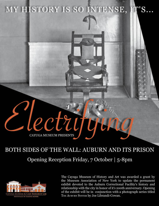

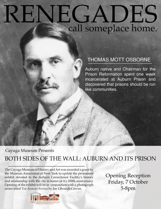

The Mastery Project for Effective Copywriting was to develop testimonial ads. I chose to develop ads that promoted the re-opening of “Both Sides of the Wall: Auburn and its Prison” exhibit at the Cayuga Museum of History and Art. Developing these ads required extensive research on the museum, exhibit, Auburn Correctional Facility, and the target audience. Above is a collection of the different projects and their development process to create the testimonial ads.
0 notes
Text
Three Takeaways from Effective Copywriting
When I was looking at this program, I was really excited about this course. Writing is an essential part of what makes me who I am. I was able to hone in on my skills and really begin to polish some writing techniques. Below are the three takeaways that have had the most impact on my career.
Takeaway #1: Voice and Tone
About 90% of this course, in my opinion, was about developing the company’s and the campaign’s voice and tone. In order to sell a product or service it is essential to know who is selling it and to whom. Therefore, to effectively develop the right voice and tone is to thoroughly understand the company, the product or service, and most importantly—the target audience. As a designer and museum professional, I have to understand what attracts my target audience, how to motivate them to care about my non-profit, and how to get them in the doors. I posted a link of my Behance site to the testimonial ads and those who are among our target audience have “Liked” the work.
Takeaway #2: Headlines and Copy—Not writing too much!
Once the tone and voice is established, talking to the audience in that persona is imperative when developing headlines and body copy. As I progress through this program and in my position at the Cayuga Museum developing marketing campaigns that draw in the target audience. Headlines are the hook to lure in the viewer. Effective headlines lead to an interest that may not lead to attendance to an event, but may lead the viewer will look up the museum and become involved in something else. Precise copy that describes the event, exhibit, or program is important because the viewer doesn’t want to read a lot. I was asked to design fliers for an upcoming Public Scholars Lecture and our monthly book club. As I move forward in my career the lessons and techniques I learned in Effective Copywriting will guide me in creating marketing campaigns. The most important lesson being, as George Felton writes: “Something is always at stake. Every word counts, often out loud” (2013, pg. 99).
Takeaway #3: Method
It wasn’t until I read chapter 15 in Advertising: Concept and Copy by Felton that I realized the importance of the Craig Smallish tutorial. During week two when working on the initial sketches I felt as if the method processes didn’t really reflect my project. However, after reading the chapter for the course reflection, the processes Smallish described is more or less how my personal process goes. A design process is imperative for any designer because it is a way to explore ideas and weed out the bad ones. At the museum this is imperative because financially we can’t afford to spend money on poor marketing. Taking the time to go through the process of developing a marketing campaign that draws in the target audience will be more cost effective than just throwing something together that doesn’t draw in the crowd.
References:
Felton, G. (2013). Advertising: Concept and Copy (3rd ed.). Retrieved July 31, 2016
Smallish, Craig. (Author). (2013). Developing Ideas and Design Concepts. [Video File]. Retrieved from https://www.lynda.com/Design-Business-tutorials/Developing-Ideas-Design-Concepts/126121-2.html?org=fullsailold.edu
#advertising#testimonial#Cayuga Museum#george felton#craig smallish#headlines#copy#copywriting#voice#tone
0 notes
Text
Course Reflection
George Felton, author of Advertising: Concept and Copy states that: “Creative skills, like any other, improve with practice, and creativity follows, however idiosyncratically, a method” (2013, pg. 186). Effective Copywriting, in my opinion, was a course devoted to developing a creative method that links the importance of good writing and intriguing imagery. This was established through the many projects and writing exercises required of the course. When developing a campaign, it is essential to research the institution as well as the product or service being sold. By doing so, the designer will develop a tone and voice to fit the institution and product.
Once the tone and voice of the institution and product is established, the designer can begin to do free association, brainstorming, freewriting, or develop lists to form an idea or concept marketing campaign. Early on in the development process, having a method is essential for creative genius to flow. For me, I am a list maker. I design and visualize the majority of my work through words. In undergrad I created altered book sculptures that all began as some form of written information such as personal poetry of passages from books. I had pages of lists the contained ideas for sculptures and as the narrowing process began thumbnails were drawn for the most promising concepts. This lead to rough sketches and execution of the sculpture. As I reflect on this course, I am reminded of the Craig Smallish tutorial “Developing Ideas and Design Concepts” and how my personal process aligned with his.
Having been out of creative practice for five years this program, and this course in particular, have really refocused the way I see myself in relation to my work at the Cayuga Museum and to my work as an artist. For years I separated the two. Now I am able to unify them. As a result of this class and being given the opportunity to develop testimonial ads for the Cayuga Museum, I have been asked to design two fliers for upcoming events. The opportunity of being forced to recognize and utilize a method of developing tone and voice through copy and compatible imagery has gone beyond making me a better designer and presenter. It has given me a new competitive advantage as a museum professional, which is the reason for my enrollment in this program.
References:
Felton, G. (2013). Advertising: Concept and Copy (3rd ed.). Retrieved July 31, 2016
Smallish, Craig. (Author). (2013). Developing Ideas and Design Concepts. [Video File]. Retrieved from https://www.lynda.com/Design-Business-tutorials/Developing-Ideas-Design-Concepts/126121-2.html?org=fullsailold.edu
0 notes
Photo


Here are the key slides from my master project for Brand Development. It shows the design process for the logo and tag line with a few of the logo applications. The project was based around a fictional wooden toy store in Madision, WI. The goal was to develop a brand based on the attributes of creativity, uniqueness, authenticity, and enjoyment. The logo encompass all of these qualities. It is a creative and unique take on a rain drop with a connection to being made of wood with the line creating a notch appearance. Connecting the logo to the wooden toys generates a feeling of authenticity because parents and grandparents can trust a the recognizable symbol of imagination. Due to the child rendered feel of the drop, it exudes the enjoyment of the end user (children) while providing a base for the target audience to reminisce on their youth.
0 notes
Text
Several topics were covered this month in Brand Development. I gained knowledge of useful tools and strategies that I’ve already begun applying toward my position at the Cayuga Museum. I look forward to the opportunity to develop plans and execute them with my director and curator in the upcoming months. In our attempt to evolve with the times we are adapting new and innovative techniques and design layouts for our exhibits. We hope to produce big, well received, and exciting changes next year. A perfect opportunity to apply what we’ve covered this month. Therefore, the three biggest takeaways for Brand Development are:
Takeaway #1- Alina Wheeler’s Brand Ideals
Brand ideals are the glue that holds the brand identity together whether it is launching an entrepreneurial venture, creating a new product or service, repositioning a brand, working on a merger, or creative a retail presence” (Wheeler, 2012; pg. 26). According to Wheeler there are nine brand ideals: authenticity, coherence, commitment, differentiation, flexibility, meaning, sustainability, value, and vision. The Cayuga Museum falls under the category of “repositioning”. By utilizing the ideas of the brand values, as we evolve a cohesive brand across the Cayuga Museum, Case Research Lab, and Theater Mack will form. It is important for the customer to us as a whole entity rather than three separate ones. This will add to the sustainability of the museum. With the threat of a 10-year lifespan, sustainability is a goal that we desperately need to obtain. We already exhibit the majority of the brands and have remained sustainable for the last 80 years (Happy Anniversary Cayuga Museum! 1936-2016). The real challenge is displaying the ideals in a way that draws in visitors, encourages memberships, and creates lasting relationships with the community.
Takeaway #2- Analysis and Action Plan
In this unit I had the opportunity to learn how to devise different types of analysis charts along with a brand strategy action plan. These are useful and key tools to developing a solid brand identity. During the course, I generated a SWOT analysis and a Competitive Analysis for the Cayuga Museum based on the limited information I have. The SWOT analysis allowed me to examine the museum’s strengths, weaknesses, opportunities, and threats. It made the difference between knowing these for aspects versus understanding them. Seeing the chart lead to a deep understanding of the threats facing the Cayuga Museum and the policies we have. I joined this program because I love the Cayuga Museum and I want to keep it from closing it’s doors. After developing the SWOT analysis, I am even more determined to excel in this program and make a lasting mark on the history of the Cayuga Museum (Best, 2006).
The second chart I create was a Competitive Analysis. I compared the Cayuga Museum to the other two historical museums devoted to the history of a single person: William Seward and Harriet Tubman. All three have a very unique onliness statement that can be used to their advantage (Neumeier, 2006; pg. 65). However, in my analysis, the Cayuga Museum’s history of Theodore Case and the invention of Sound on Film stands out because it changed the world, not just the US (Best, 2006).
The action plan and brand strategy chart is another essential tool that I plan on utilizing at the Cayuga Museum. For week four, I did not generate one for the Cayuga Museum simply because I feel like it should be a collaborative plan with the curator and director. “Collaboration is not consensus or compromise. It evolves from a thoughtful and genuine focus on problem solving, generating an interdependent, connected approach” (Wheeler, 2012; pg. 108). The action plan will provide us with a strategy to build and reestablish the brand of the Cayuga Museum. It is ultimately our goal to revitalize the museum to its former glory during the peak decades between 1950’s- 1970’s.
Takeaway #3- It’s What They Say It Is
My final takeaway for this unit is from consultant Marty Neumeier. He states that “a brand is not what you say it is. It’s what they say it is” (2005, pg. 2-3). Which really encompasses the entire class. Brand loyalty is achieved when a company understands its target (primary) audience. Experience is the key to a strong brand and as an institution it is essential for the Cayuga Museum to create a one-of-a-kind experience for individual visitor (Wheeler, 2012; pg. 18). This is something we strive for every day. This is evident in our reviews on trip advisors and personal messages sent to the museum e-mail address. Last summer, a couple from PA came to the museum and Case Research Lab and wrote the following on trip:
“We wanted to see the Case Museum because our son is interested in sound engineering. It is in a building located in back of the Cayuga Museum. The young lady who was in charge of the museum (sorry, can't remember the name!) took us back to it since there was no one else touring the Cayuga Museum at the time. She gave us a wonderful tour, giving as much information as if we had 30 people in the group, rather than just two. The building was the working lab of Case, and contains so many gadgets and inventions that represent the early days of sound engineering and film recording. Our guide was so well informed and so friendly and engaging--it made a very nice stop on our trip” (Kirish).
All of us at the Cayuga Museum do our best to present what the community wants to see. The museum has an ongoing forum requesting community input for future exhibits. Due the popularity and fourth grade curriculum, we are in the process of making a contemporary Haudenshone art work a biennial exhibit. With our new direction and desire to be innovative, we are paving a path to keeping our doors open. Especially if we continue to focus on what the community and its visitors want to see.
-----------------------------------------------------------------------------------------
References:
Best, K. (2006). Design Management. Retrieved May 31, 2016, from http://ce.safaribooksonline.com/book/-/9782940439782
[Kirish_12]. (n.d.). Cayuga Museum/Case Research Lab [Review of cayuga museum of history and art]. Retrieved July 31, 2016, from https://www.tripadvisor.com/PricefinderPopunder
Neumeier, M. (2005). The Brand Gap. Retrieved June 27, 2016, from http://ce.safaribooksonline.com/book/branding/0321348109
Neumeier, M. (2006). ZAG: The Number-One Strategy of High-Preformance Brands. Retrieved June 27, 2016, from http://ce.safaribooksonline.com/book/branding/0321426770
Wheeler, A. (2012). Designing Brand Identity: An Essential Guide for the Whole Branding Team. Retrieved 27 June 2016.
#Design#brand#brand identity#brand loyalty#onliness#marty neumeier#kathryn best#alina wheeler#Cayuga Museum
0 notes
Text
Design Directors in Senior Management
The branding experience begins with the design, therefore, it is essential for experienced design directors to join senior management. As a part of senior management, creative directors will be able to oversee the brand from all angles with access to the right people to redirect or change it. Wheeler writes that “[c]ompanies that value design as a core competency tend to be more successful in their marketing and communications (2012, pg. 114). The design expresses the feel of the product that encourages and draws in brand loyalty. This concept relates back to the lecture by Dr. Phillip Kolter: Marketing (2012). He discussed the four levels of marketing:
1P: Doesn’t like marketing but knows its necessary; only concerned with communication
4P: Likes to have a plan and focuses on: product, price, place, and promotion
STP: Understands market segments and has a 4P plan for each
ME: Marketing is Everything. Brand starts with the customer and in order to make money you have to spend it first.
An experienced design director in senior management puts the company in a ME category according to Dr. Kolter (2012). It leads to a solid and well defined brand. This is evident in the relationship between Margo Chase and Starbucks. Starbucks has their own strong design team that works with Margo Chase. The relationship reflects the “brand builder” level of Cohen Miller Consulting’s Maturity Model for Design Management (Wheeler, 2012; pg. 115). The design team understands the usefulness of having an outside design team brand the company to ensure that the brand remains focused. However, Margo Chase is unaware of how Starbucks will use their designs. Therefore, they must generate designs that can be applied to nearly any form of product (bags, cups, wall décor, clothing, etc.) It is a trust that Margo Chase understands and knows what Starbucks wants. Also, that Starbucks’ internal design team is capable to adhering to the standards and design rules laid out by Margo Chase (Chase, 2008).
References:
[Chicago Humanities Festival]. (2012, November 26). Philip Kolter: Marketing. [Video file]. Retrieved from https://www.youtube.com/watch?v=sR-qL7QdVZQ
Chase, M. (Author). (September 4, 2008). Typography Tutorials. Creative Inspirations: Margo Chase, Graphic Designer. [Video File]. Retrieved from http://www.lynda.com/Typography-tutorials/margochasegraphicdesigner/685-2.html?org=fullsail.edu
Wheeler, A. (2012). Designing Brand Identity: An Essential Guide for the Whole Branding Team. Retrieved 27 June 2016.
0 notes
Text
Defining Client Needs: Takeaways
Research
The biggest takeaway for me in Defining Client Needs is how important research is to validate your design choices. The text A Designer’s Research Manual states that “[b]y nature, designers are visual people. … They often understand intuitively what it takes to create attention grabbing artifacts that delight, inform, or inspire” (p. 89). This is how I have always functioned. However, as I’m going through this program and moving up at the Cayuga Museum of History and Art, I am learning more and more how important citing your resources is to great design work.
Multichannel Marketing
Another concept that stuck with me was the idea of multichannel marketing. Due to our low (rather nonexistent) marketing budget, we have few options at the Cayuga Museum of History and Art. We stick with the few things that we know work. However, the methods we currently use are geared toward our demographic, not toward our target audience. In order for us to survive, we need to shift our demographic and increase both our attendance and membership. Which, I believe is possible via the use of a multichannel campaign. The article “Multichannel Marketing: What it is and why it matters” claims that “multichannel customers spend three to four times more than single-channel customers do” (Multichannel Marketing). Once I understand my target audience, it is important to select the proper media channels. It essential to know which type of media will be seen by my target audience. Therefore, it is key to know what media options are available (Burtenshaw).
Presentation
A final takeaway from Defining Client Needs is the importance of an effective presentation. Of all the lessons in this course, this has been the most challenging for me to accomplish. I never really understood the importance of presentation until now. The presentation is what can either make or break a contract. Therefore, it is one of the most important aspects in the design process. In the video Simon Sinek: How great leaders inspire action, the best presentation focuses on the why: “People don’t buy what you do, they buy why you do it”. Being able to highlight why the Cayuga Museum is important rather than what it is would be a better marketing campaign. In this course, I have learned that it is essential as a design and museum professional, that I need to master Presentation skills if I want to succeed. In Justin Seeley’s tutorial Designing a Presentation I learned the fundamentals to creating an intriguing and memorable presentation. It should be a visual to aid what is being said, not a script to read from. People are more likely to remember an image versus a screen of text.
References:
Burtenshaw, K., Mahon, N., & Barfoot, C. (2006). The Fundamentals of Creative Advertising. Retrieved June 12, 2016.
Multichannel Marketing: What is it and why it matters. (n.d.). Retrieved June 1, 2016 from www.sas.com/en_us/insights/marketing/multichannel-marketing.html
O’Grady, J.V, O’Grady K. A Designer’s Research Manual: Succeed in Design by Knowing Your Clients and What They Really Need. Retrieved June 13, 2016, from http://ce.safaribooksonline.com/book/graphic-design/9781592535576
Seeley, Justin. (Author). (2013). Keynote Tutorials. Designing a Presentation. [Video File]. Retrieved from, http://www.lynda.com/Keynote-tutorials/Designing-Presentation/124082-2.html
[Ted]. (2010, May 4). Simon Sinek: How great leaders inspire action. [Video File]. Retrieved from https://www.youtube.com/watch?v=qp0HIF3SfI4
0 notes
Text
Defining Client Needs: Reflection
As a media professional, a designer is providing a service to a paying client. In a strictly business aspect, it is important to define client needs to ensure that the service meets and exceeds expectations. This leads to referrals as well as repeat business. In the design aspect of this transaction, defining client needs is essential to producing high quality work that will increase sales, audience, awareness, etc. The first step is to determine what the client “really” wants from this design which may not be evident in a design proposal (Neumeier). Questions should be asked understand the project. By establishing the client needs, the design team can begin thoroughly researching the client, the product, and the target audience. Research is the foundation for great design.
In order to create a great design, you have to understand every layer of the project. That includes the client’s brand values, visions, and goals. The design team has to understand the product or service to adequately display why customers should choose it over competing companies. Most importantly, you have to understand the target audience. The target audience dictates the direction of the design. Who are the customers? Are they elderly? Are they Generation Z? If you are creating a campaign toward an older generation, focusing media channels such as mobile apps or websites wouldn’t be the best option. In addition to knowing who the audience is, the design team has to identify where they are. By establishing who and where the audience is, the design team can create a multimedia campaign for the client. However, none of this can be accomplished without having thoroughly researched the client, product, and target audience.
In the text A Designer’s Research Manuel (2009) it states that “Research—the key to aiming creative impulses properly—provides the designer with documentation supporting aesthetic/design decisions” (p. 89). Research is how a designer articulates the value of design decisions. It is the rationale and proof behind all great design work. Research is fundamental because it is understood across all fields. There is often a language barrier between the client and the designer due to the way each thinks and operates. Research is the common ground that allows a designer to articulate his choices in a way that the client understands.
References:
Neumeier, M. (2008). The Designful Company: How to Build a Culture of Nonstop Innovation. Retrieved May 30, 2016, from http://ce.safaribooksonline.com/book/graphic-design/9780321620682
O’Grady, J.V, O’Grady K. A esigner’s Research Manual: Succeed in Design by Knowing Your Clients and What They Really Need. Retrieved June 13, 2016, from http://ce.safaribooksonline.com/book/graphic-design/9781592535576
0 notes