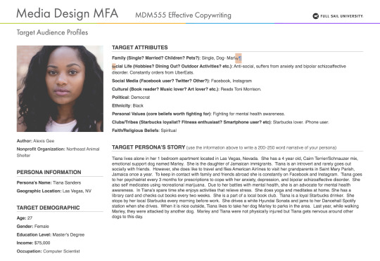
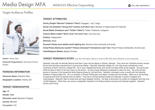
#Craig Smallish
Text
Jilted gay groom Michael to marry hunky intruder on MAFS
New Post has been published on https://qnews.com.au/jilted-gay-groom-michael-to-marry-hunky-intruder-on-mafs/
Jilted gay groom Michael to marry hunky intruder on MAFS
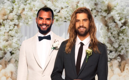
Married At First Sight Australia has revealed a batch of intruders, including the gay man who will soon marry jilted MAFS groom Michael for real this time.
Season 11 of the Australian version of the dating show has been running for three weeks now on Nine.
The show cast its first gay grooms in years this time around. But the two men didn’t even make it to the altar because one of them, Simon, quit.
Melbourne man Michael (above left) was devastated when he found out. And since then, MAFS season 11 has been nothing but heterosexual nonsense.
But that will change soon when Michael gets a second chance. He’ll walk down the aisle with hunky Perth hairdresser Stephen (above right).
Stephen told the show he’s after a serious and monogamous relationship which he’s struggled to find in Perth’s smallish gay dating pool.
The 26-year-old’s last relationship ended four years ago because of cheating, he says in his bio. But he’s back and ready to trust someone again on reality TV.
We don’t know exactly when the intruders will arrive on the show, but it will probably be soon.
View this post on Instagram
A post shared by Michael (@m.felix88)
View this post on Instagram
A post shared by Stephen (@stephenrstewart)
It’s the first MAFS gay wedding in years
This current season of MAFS filmed last year. Runaway groom Simon’s departure reportedly caused unexpected drama for producers behind the scenes at the time.
But photographers who staked out the MAFS set for spoilers spotted Michael and Stephen together later in the production.
Simon recently called out the show and said he was shocked his short time on the show made it to air at all.
Since premiering in 2015, MAFS Australia has only featured one gay male couple, season three’s Craig and Andy. That union ended disastrously.
In 2020, MAFS featured the first lesbian couple on the show. Amanda Micallef and Tash Herz got married.
Married At First Sight continues on Nine.
Read more on Married At First Sight:
MAFS groom crushed after husband-to-be does a runner
‘Anything for ratings’: Gay groom Simon slams MAFS
Gay man ‘dumped from MAFS just days before filming’
Gay singles aren’t signing up for MAFS, producers say
For the latest LGBTIQA+ Sister Girl and Brother Boy news, entertainment, community stories in Australia, visit qnews.com.au. Check out our latest magazines or find us on Facebook, Twitter, Instagram and YouTube.
3 notes
·
View notes
Text
Tagged by my bestest buddy @beebabycastiel
Name: Kimber. I was born Kimberly but no one calls me that. When I was 15, a friend started calling me Kimber and it just stuck. The only people that can call me Kim are the ones that knew me before I was 15. I am actually still friends with lots of people from my teen years of SCA and Rocky Horror, so they get a pass.
Age: 49
Height: 5’8
Zodiac Sign: Virgo, and my son says I am REALLY a Virgo, whatever that means.
Where do you call home? A college town about halfway between Atlanta and Birmingham. I bought my first home 7 years ago, and I love my 70’s brick ranch.
Any tattoos or piercings? Well, my ears used to be pierced, but it’s been so long since I’ve worn earrings that they’ve closed up. I want a tattoo SO BADLY. My plan is for my first one to be a smallish Franciscan starburst on my arm- it’s my favorite vintage china pattern. I’ll have it done at the shop owned by Craig Foster, who was on two seasons of Ink Master. It’s about 5 blocks from here, and my daughter has had two beautiful tattoos done there already.
Last song you listened to? Probably my daughter singing ‘Answer’ by They Might Be Giants.
Last movie you watched: Free Guy the other night. It was cute!
Last book or fanfic you read: I just finished the new chapter of Beautiful by @undisclosed69. It is a story that I think about every single day. I’m obsessed.
I’m also about to start my autographed copy of Here’s to Us by Becky Albertalli and Adam Silvera. It pays to live near your favorite author!
Do you collect anything? Vintage china and vintage Spring Blossom Pyrex. I only have ONE Franciscan starburst plate, because it’s hard to find and really expensive. But I have other patterns, like Taylor Smith Cathay Atomic Starburst, Blue Heaven, and Lute.
Night owl or morning person? Night owl, and now my job is perfect for that. It was rough when I was a teacher.
Optimist, pessimist, or realist? A big ol’ worry wart.
Extrovert, introvert, or ambivert? Introvert. I get social anxiety sometimes, and I am happy not leaving my house.
Do you believe in an afterlife? Yes, but I don’t know what. I have been burned by a strict religious upbringing, and prefer just being a good person than trying to follow a set of rules.
A weird or fun fact about yourself: The summer I was 16, my mother let me move into an apartment with 2 other teenagers and work at Six Flags. It sucked, but it was an adventure!
Someone you want to have coffee with, living or dead: Weirdly enough, Peter Falk. He died in 2011, but he seemed like such a nice guy. I think he would have been easy to talk to. (He was Columbo, btw)
A quote you live by: a former co-worker of mine used to say, “It ain’t nothing but a thing,” and that keeps me going on bad days.
Tagging @silvanshadow and @undisclosed69 but do not feel pressured to do this!

3 notes
·
View notes
Text
Mastery Journal: Project Reflection
The past four weeks in this Effective Copy Writing have been very interesting. All lot of the information was derived from George Felton’s Advertising Concept, and Copy. The readings in Felton’s book help illustrate and elaborate on the several assignments that needed to be done. “To develop a strong strategy, you need to understand three things: the product, the consumer, and the marketplace” (Felton, 2013, p. 12); this helped me understand that concept and copy write is much more than catchy titles or phrases. I was able to keep this in mind while working on the assignment. Creating comp sketches became an easier task to do, knowing that I needed to focus on creating a strategy that cut the work down and toned up the effectiveness.
The aforementioned quote from Felton’s book guided me to understand how to create target personas. By keeping this in mind I was able to focus on the demographics and details about my potential target audience. Another helpful tool that was very informative was the PDF article Creating Target Audience Profiles, provided by the instructor. Understanding what my potential target audience for the product or service can be, created a focus onto what that audience can relate to and understand. This ultimately helped shape the way I strategized in creating 6 comp ad sketches. After understanding the product, consumer, and marketplace these sketches began to make sense and become effective to get the message across.
While doing my sketches I was able to watch a video course on Developing Ideas and Advertising Concepts by Craig Smallish. Smallish's video Defining The Rough Sketch he states, “It's simply a rough image that's going to tell a story” (Smallish, 2013). Hearing Smallish say that helps me not focus on perfecting the idea but simply jotting it down a visual representation of the story being told. Thus far, this course has refined my creative side by adding the strategic aspect of what I design.
Overall, the course was very informative and has shaped the way I create things to just create them but to create with purpose and reason. After reading Felton's chapter on Testimonials I was able to sketch out comp ads for EarthJustice using extreme user, celebrity, expert, plain folks, President/CEO, founding mother or father, employee, and not the person but something associated with the person. Out of the 6 I sketched, I decided to create my rough comp ads for extreme user, expert, and plain folks. It has been a very informative and growth motivating course; the projects and reading materials helped me understand coy writing.

The aforementioned book, PDF file, and video course helped shaped the 6 testimonial ad sketches I created for EarthJustice based on 6 out of the 9 types of testimonials mentioned in Felton's book. The aforementioned types I used were chosen based on the ability to help me get my message across for EarthJustice and its target audience. With extreme user, I decided to go with the college student millennial as a testimonial because based on Felton's definition this person would demonstrate “hyperbole, how great the product is” (Felton, 2013. P. 241). The next is celebrity testimonial, because of so many types of celebrities publicly speaking out on environmental issues that occur globally. Giving a familiar face to the target audience. The expert user-made sense to use as a testimonial ad. What better way for “somebody who stands outside the brand and has the expertise to evaluate it” as mentioned by Felton (2013. p. 241). The usage of just plain folks was because the environment does not just affect celebrities or experts, but it affects everyone globally even the “normal people” (Felton, 2013. p. 246). The employee was used as a testimonial because being able to “find someone to personify the corporation” (Felton, 2013. p. 241) helps the audience relate to the purpose of the testimonial ad. Showcasing the employee advocating for their employer says to the audience that this employee is proud to work for a corporation that is focused on sustainability and the environment. Lastly, I decided to sketch a testimonial for not the person but something associated with the person. In this sketch I wanted to associate not protecting the environment or bringing justice can lead to a future where wearing a mask to breathe will happen if no one does anything about it. Associating a gas mask with not fighting for a better environment.

Another major project for Effective Copy Writing was creating a target persona profile. In the two target profiles, I created the target demographics were from the ages of 23-52. Everyone globally affected by climate change and environmental decay. These are millennials, college students and corporate professionals, aware of Earth’s injustices around the world. The target personas I created is a large range, speaking about demographics, however, the target audience is affected. Those young will have a shorten future and those older will have to worry about the future of their kids and future family generations. Knowing that the environment needs help being represented and achieving justice is something that can be done by everyone. This is how I was able to decide which testimonial types, by Felton, I was going to use for my initial comp ads.

For my initial comps, I decided to go with Felton’s testimonial types, extreme user, expert, and just plain folks. In the extreme user comp ad, it showcases a group of people studying and researching the environment with solar panels in the back. Directed at the millennial target audience. The environmentally aware millennials fighting for a better future by entering fields of work that improves the environment and sustainability by starting with school. The expert comp ad questions the target audience about possibilities of obtaining the basics and what would be done to find an alternative. The just plain folks' comp ad connects to the “plain folks” that enjoy the outdoors and nature in general. The question is used to draw them and asking them to help protect it for the future.

The revised testimonial ad comps were all done to have a consistent campaign. Each of the ads makes a statement or questions the target audience. In the body copy in them ties into the question or statement in the header with a way to show that there is no excuse for someone not to be involved in helping justice be brought for Earth. In the extreme user revised comp, I decided to use one student with a quote from them in the body copy to speak directly to the audience. The expert revised comp ad still has a question for the audience showing and telling the audience that a Hydrologist is not the only option to help protect and keep the water clean. Thus, directing them to donate and join EarthJustice. In the final comp, just plain folks, I revised by directing the ad to a specific audience, those that love and enjoy the outdoors. That target audience is now told that they can be a part of protecting the “Earth(With)Justice.”
Some of the major takeaways came from the material I was given. My first takeaway to place my attention on researcher a brand/product/person’s target audience and use that to generate something specific to them to draw them in. That something specific that needs to be generated is my second takeaway. I learned that the headline, body copy, and call to action are all important factors that help get the message across to the target audience, helps make ads relatable. Lastly, my final take away comes from Felton’s book, Advertising Concept, and Copy. It in chapter 9 of that book wehre Felton helps you understand how to build a brands personality, by asking questions and finding the answers to those questions.
References:
Felton, G. (2013). Advertising: Concept and Copy (Third Edition), 3rd Edition [VitalSource Bookshelf version]. Retrieved from vbk://9780393733921
Smallish, C. (2013). Developing Ideas and Advertising Concepts. Retrieved from https://www.lynda.com/Design-Business-tutorials/Developing-Ideas-Design-Concepts/126121-2.html
#copy write#comp ads#ads#effective copy writing#full sail university#orlando#atlanta#masters#media#design#gaphic design
2 notes
·
View notes
Note
13, 14, and 18 please!
I’ve already answered 13 ;)
14. Describe a place/room/situation that would be sensory heaven to youHmm. I like smallish rooms. Not to small, but just comfortably small. I tend to get a sense of security in small rooms. Having a fan is nice. A window open on a cloudy day with a gentle breeze coming in, the smell of rain in the air. Maybe even some actual rain. I love the sound of rain!! I love the smell of something baking to, like cookies or brownies. I find those smells to be so wonderful!! Being curled up in some blankets and even with one of my dogs can be really relaxing to me. I’ve actually had experienced all of these at once a few times in my life and it honestly feels like heaven to me!! Maybe there could be something different that could be better but I’ve always found that to be an amazing thing to feel. I should try it while listening to asmr someday. I really do enjoy quiet and calming stuff, its like the best sensory/stims out there for me
18. What are your autistic headcanons?Hmm… okay this is a really tough one because it doesn’t really say what I’m making headcanons for? I feel like its to vague for me to give a proper answer. That or maybe I just don’t really get the question? fduhjsfdagfd sorry xD
Okay so!! So I think its asking about characters or something soo... I think Craig Tucker from South Park alongside Clyde and Butters could be autistic!! There’s a lot of little things about them that remind me of myself or some other people I know. I also love to hc that Xefros from Hiveswap is autistic. But that’s mostly because he’s a big favorite xD Xefros has a lot of potential to become a big and important hero in his story and idk, having him autistic while accomplishing great things and overcoming his depression and low self-esteem would be pretty cool if you ask me. Hmm.. there’s honestly a lot of characters I hc as autistic, the ones I mentioned are the ones I’ve been thinking about the most lately. I tend to focus on characters who could possibly be canonically autistic. While I do occasionally just hc some as autistic just because I want to (like Xefros), its not something I normally do. It is really fun tho!
#molly answers#ask meme#redrapunzelinstead#sorry on that last one#if i knew what it was asking i could answer it#but thank you for sending the ask :D#edit: okay so i updated it fydhsgfd#i hope that was a good answer?#i don't often talk about hc characters as autistic#so i kind of like didn't know how to answer it properly#and i have so many in mind!!!#xefros was the easiest one for me to talk about tho#since he's like THE special interest favorite right now#i was gonna go on a bit about craig and stuff but#xefros man lol
4 notes
·
View notes
Text
The Band Melbourne Moves

It's a significant day, right? For certain couples, there could be no more noteworthy. What's more among all of the things that go together to make an amazing wedding experience, remarkable music can be the great to beat all… cake, or even a huge piece of impressive methodology. Whether or not you're looking for live capacity music that sets the attitude, a live band and live MC that will light the social affair, or all of the previously mentioned, look no farther than Craig Francis and his Melbourne based wedding music organizations.
Numerous merry couples across Melbourne and Victoria have boogied to this gathering of the outright by and large talented and sought after musicians you'll find in Australia. Is it your turn now?
Ask us any requests now or take a gander at our live accounts on the element page.
Arranged in Melbourne, Craig has worked over 10 years of live execution experience into an amazing live show. Regardless the party size, he by and large passes on a fiery show and attracts the group. He is a refined band frontman and performer and has a straightforwardness and master mindset that is fortifying. He passes on as a matter of course.
JESSICA
DSOUZA
Featured on The Voice 2017, Jessica's vocal reach should be portrayed as excellent. Her voice is warm, solid and enchanting. She gives everything to her shows, is attracting to watch and will daze and surprise as a matter of course. Her first love is R and B/Soul and she loves Jazz and Disco sets to keep the party bobbing.
ERIN
CAMPBELL
Erin is a developed jazz and soul entertainer with an original presence that is proficient by all who watch her. Her voice is smooth and ardent with a touch of old school and she conveys that energy to each wedding. She has performed with tremendous gatherings, jazz gatherings of four and corporate exhibitions and loves making uncommon minutes for affection birds.
GLENN
HOWARD
Glenn Howard is a velvet-voiced, multi instrumentalist, front man and musician. He reveres playing at weddings and his uncommon style and ability places him in a class totally isolated. Connecting with bunches in the corporate and wedding scene for north of 10 years, he is a quintessential performer and reliably knows precisely what to play to match each second on the evening. More here Craig Francis Music
A cultivated and lively performer, front man and musician who has played continually for the past 20 years with a part of Melbourne's most noticeable gatherings, Malcolm has visited both comprehensively and generally. It's safe to say he centers strongly around music and brings a specialist and exuberant presence whenever he shows up.
ALYSHA JADE
QUAN
Alysha has visited abroad and lives for music and execution. She can directly give an ideal understanding on an Etta James praiseworthy as she container of finishing the night with AC/DC. The quintessential smallish diva, she conveys energy and ability to every gig. She similarly sings a standard Mandarin tune or 2 to add a smidgen of home for multicultural events and guests.
MARTIKA
C
Martika is "astounding". From Etta James and Alicia Keys to AC/DC, she does everything and she does it with style. A contender on X-Component 2015, she astounded everyone with her front of "Bang" in the tryouts and just loves performing. She truly likes making a mind blowing air at weddings and knows how to faultlessly tailor her voice for every occasion.
VANESSA
GRILLO
Vanessa's vivacious and delighting energy is incredibly adaptable and securing. Her fundamental class, vocal presence and musicianship emanate through in everything that she does. Vanessa revives any limit or corporate event. Vanessa furthermore can add keys to her vocal execution further showing her surprising musical capacities.
BERNI
Lorem ipsum dolor sit amet, consectetur adipiscing elit
Berni's voice is hypnotizing, solid and will dumbfound up close and personal. She duplicates her 2017 outwardly debilitated tryout for The Voice 2017 in the association above. Having been driven into the public spotlight by making the last 12 that year, she by and by guides her focus toward performing for swarms Australia wide at weddings and limits something similar.
DAN
Dan is a developed guitarist, entertainer, band trailblazer, musician and producer. His set will stagger and he swings the chill sets and shakes the dance floor like no other. Covering everything from Sovereign to Bryan Adams and Stevie Wonder to Justin Timberlake, you will be bewildered at his vocal reach, nimbleness and guitar work.
0 notes
Text
Doctor Blake Mysteries: last season comes too soon
Thanks to @occasionallyclever for posting about this article.
http://www.theaustralian.com.au/arts/review/doctor-blake-mysteries-last-season-comes-too-soon/news-story/54723bb593699a5e19f5147b34d3ab4e
The much-loved period crime show The Doctor Blake Mysteries, starring Craig McLachlan as maverick country town doctor Lucien Blake, returns this week. Produced for the ABC by December Media, with production credits shared by creators George Adams and Tony Wright, with the redoubtable Stuart Menzies as executive producer, it was the ABC’s most popular Australian-made program last year, averaging 1.659 million viewers. The only regular ABC program to get a fractionally bigger audience was its rebroadcast of British show Doc Martin, which averaged 1.67 million nationally.
Somewhat inexplicably, this is the last season for Blake and his Ballarat police and medical colleagues, though a feature-length finale is promised later this year. Fans were outraged at the news of its demise, amid rumours earlier this year that the series might be picked up by Seven or Foxtel, which has had such success with the reimagined A Place to Call Home, uprooted from Seven. And the frustrated response of the outraged consumer was more than justified in Doctor Blake’s case, given the show’s success, its charm, its confident sense of self and all-round appeal. It’s easy to undervalue the craft and industrial intelligence behind the show’s concept and its cinematic execution.
Blakeis an appealing amalgam of the figure of the classical adventurer turned amateur detective, an investigator who knows about war and combat, an enigmatic figure with a healthy dash of charity.
At the beginning of the series, set in the late 1950s, Blake had recently returned, after decades abroad, to his family home in Ballarat, a Victorian town rich in colonial history, to take over his late father’s medical practice and to act as the local forensic examiner on cases investigated by the police, a team of four covering an area the size of an English county. He had left Australia in his 20s to study medicine in Scotland and, after graduating in 1931, joined the British Army as a medical officer.
He served in the Far East during World War II and married a Chinese woman with whom he had a child, but lost touch with both at the fall of Singapore. There’s an interesting moral ambiguity that colours his image; you always have the sense that, whatever his justifications, he is a killer of men, something constantly reinforced in McLachlan’s performance, the actor fond of the battle-weary soldier’s 1000-yard stare.
Like his Ballarat countrymen, he appreciates that his world is increasingly characterised by disorder and uncertainty at time when almost everything is being transformed as the 50s slides into the next turbulent decade, from comfortable torpor into the cultural unrest of the 60s. But Blake, unlike so many of the town’s more conservative citizens, knows the changes can be faced honourably and confidently.
“There is a feeling of the old moulds cracking, the stale and insular moulds which have kept the nation a backwater of late Victorian culture for so long,” Craig McGregor wrote of this period in his Profile of Australia, just a few years after Blake was pursuing his murderers around Ballarat’s Lake Wendouree, the Colonists Club or the Mechanics Institute. Blake represents the emerging Australia: more tolerant, less blokey, less heroic and more human. And his show is really about contrasts in society and the conflicts that arise as changes occur.
What Wright and Adams give us are shapely, atmospheric stories of psychological suspense mixed with the baroque ingenuity of the drawing-room mystery with some resonant dark underpinning in the way the stories reflect the cultural and political attitudes of a rapidly changing country. But they are not just logic problems, cryptograms to be assiduously worked out like an exercise in calculus, but stories of character and emotion and romance. As The New York Times’ Margaret Lyons puts it, “This is not the most original show I have ever seen, but it is a very good version of what it is.”
At times the series, represented internationally by ITV Studios, is reminiscent of Foyle’s War and Inspector George Gently with its regional settings and the way its writers pit old-fashioned prejudice and bigotry against emerging social change.
The resonance is quite deliberate and calculated, according to its producers, who believed that if they created “something indistinguishable from the best of these kinds of UK shows” they would find an international market. “Our instructions to the writers were to make our show indistinguishable from Inspector George Gently, Foyle’s War and the best shows that the ABC imports from the UK,” Wright told The Screen Blog recently. “We loved the idea of shipping coals to Newcastle.”
There were a couple of pitch meetings with the ABC, according to Wright, and the show developed quickly from there, although there was some resistance, as another period murder mystery was in the pipeline. “I wasn’t aware that Miss Fisher’s Murder Mysteries was in development,” Adams says. “I thought the resistance was like saying, ‘We have Prime Suspect so we don’t want Cracker’. We had a very clear vision of what the show was and stuck to that. If I’ve learnt anything it’s this: once you’ve got a good idea, stick to it — because there is a danger the idea gets diluted and the show becomes a smorgasbord of what different parties want. You’ve got to know what the show is in one sentence.”
The show has been sold to more than 130 broadcasters, including in the US, Canada, Britain, Germany, and France. It was the first show commissioned by the ABC to go out on BBC One (although there have been some co-productions) each season going out on afternoons every weekday over two weeks, and attracting more 1.5 million viewers. Doctor Blake also has a growing reputation in the US where it appears on some of the PBS stations.
As Ballarat surged into a new decade, with post-war change seeping through the cracks in old values amid fears about rock ’n’ roll, nuclear testing, “reds under the bed”, immigration and social breakdown, Blake accepted the additional role of police surgeon. He’s assisted by his friend Jean Beazley (Nadine Garner), with whom he became increasingly close, the unresolved sexual tension between them one of the shows enduring pleasures. Viewers avidly hung on for four seasons to see their first kiss.
Now, as season five gets under way in A Lethal Combination, Blake has finally popped the question to Jean and she has agreed, on the proviso that for now this happy secret stays between them. But, as Jean admits, “We might as well take an ad out in The Courier”, given their romance is now common knowledge. “About bloody time too,” says the dourly Protestant superintendent Matthew Lawson (Joel Tobeck), who has returned to run the local cops. “I thought you’d never get around to asking her.”
Things sour around them, though, when an exhibition boxing match — dubbed “Battle in Ballarat” — between Senior Sergeant Charlie Davis’s (Charlie Cousins) brother, Raging Ray Davis (Ethan Panizza), and “Mad Dog” Mickey Ellis (Troy Coward) results in the latter, the infamous local champion, seemingly beaten savagely to death by Davis. But when Blake becomes involved a medical inspection reveals a cardiac arrest, possibly brought on by poisoning. Lawson puts Charlie in charge of the investigation, complicated by the fact that their mother is in town with her new fiance, who happens to be Ray’s coach, the rather louche Bernie Thompson (John Waters).
It’s a strong episode to start this final season, its cultural subtext this time the continuing discrimination against people of colour (a superb performance in a smallish part by Greg Fryer as the Aboriginal cornerman and former boxing manager Lou Dixon) and the continuing problems of assimilation faced by post-war European migrants to Australia, many of whom dispersed themselves into rural areas.
Astutely directed by veteran Ian Barry (Police Rescue, A Place to Call Home), the brutal fight scenes, never easy to pull off successfully, are particularly well-realised by cinematographer Craig Barden, and Barry has a nice touch with performance. There’s also a delightfully sleazy performance from Waters as the charismatic but morally dodgy Thompson; one of the merits of this show is the way it has provided such a showcase for the work of our best character actors.
And once again there should be applause for showrunner Adams and his writing team, who shift the cards that bear the names of the scenes and sequences, further annotating them, until, as Clive James wrote about the work of TV writers’ teams, “the episode reveals the nervous system from which it will expand into a living fiction: that is, into a manageable reality”.
Why on earth would the ABC not want more of Dr Blake’s shenanigans?
41 notes
·
View notes
Photo

Dream Journal For Multiple Days: In Which Lame Excuses Are Employed
My Pathfinder game ran way late last night, and instead of making a sleep-deprived post that was only partially intelligble, I opted to hold off for a day and combine it with the next entry. It's also convenient since Saturday's entry would have been way too short. Observe:
Dream Journal 2017-10-14: Old Food And Phone Services
Went to a cafeteria to hang out with friends, but all the tables were covered in partially rotten salads. I didn't touch the food, but the conversation was good.
I ran a Voice Over IP (VOIP) phone system on an old Dell computer whose monitor couldn't stay in focus and I intentionally kept the whole setup hidden away in the back of my closet.
Dream Journal 2017-10-15: The Sleep Experiment
As part of a workforce improvement program (in the dream), my workplace contracted with a team of psychologists to study ways in which the employees could be made to work more efficiently. We were all going to participate in a double-blind study (which turns into an important detail in a moment), but the details of the study weren't made clear.
My coworkers and I were whisked off to an office building in the middle of the night, and we all had to wear identical white robes, cult-style. We were sequestered on an empty floor of an office building in a different city, and I think we were at least five floors up. Nobody knows why we're here (because double-blind experiment) other than that the participants in this experiment were going to be rewarded with some undisclosed incentive.
While we're all standing around in a massive room that is empty except for the gray industrial carpet on the floor, one of the psychologists appears. We are separated into groups and everyone has to fill out a survey. The questions on the survey do not provide any insight as to the nature of the experiment.
Our groups are subdivided further and we are issued an "Experiment Buddy" of the same gender. Once everyone had a buddy, we were instructed to sleep on the floor. I have zero problem sleeping on the floor in real life because I often unintentionally fall asleep that way. Per the rules of the experiment, we are required to sleep near our buddy.
My buddy is a placeholder person named Daryl Kevin. He is of indeterminate ethnicity and has short hair and lots of stubble. We are never supposed to be more than 20 feet from our buddy at any given time, and I find out the hard way that the proximity rule is strictly enforced even if someone has to go to the bathroom in the middle of the night.
A sleep technician is posted in the hallway outside our door, and he won't let Daryl leave to go pee unless I tag along. So I get roused from my slumber in order to watch a stranger pee. It was as awkward as it sounds, but I attempted to make the best of it and empty my bladder, too. DON'T WORRY, THIS ISN'T ONE OF THOSE DREAMS WHERE I END UP PEEING IN REAL LIFE.
I hear a commotion coming from further down the hall, and once Daryl's impressively large bladder is empty, I drag him down the hallway to investigate. The source of the noise is coming from my boss, who is apparently overseeing this part of the experiment. Since it's a double-blind experiment, my boss does not have any contact with the experiment designers.
This uncertainty has caused my boss to resort to crushing up prescription pills and snorting them. My boss is lamenting that the stress is causing him to turn to drugs, and now I have to switch to mother hen mode and plead the case that drugs aren't the answer. Also, I'd like to imagine that I made a pretty convincing case for proceeding with the experiment in spite of the uncertainty just so I wouldn't have to repeat this experiment again because of contaminated data.
I don't know if my plea worked, but I did get to go back to sleep and thus far, haven't gone back to that weird office building. I guess the sample size was large enough to offset any weirdness in the data. So that's a plus, I guess.
----------
Header image credit goes to Craig Smallish
3 notes
·
View notes
Text
Effective Copywriting Reflection
This month was very insightful for me. For someone who works in motion graphics and video, the copy has always been an afterthought. I have always known that copy is important, but since someone else always does it, I never really thought about how copy is the voice of the brand.
Reading George Felton's book Advertising: Concept & Copy has been very insightful. Felton says “Until you discover the real reasons that people buy this or that good or service, or identify with this brand instead of that brand, you create ads for no one”(p.8). It has helped me see the whole picture of a product's brand messaging and its voice and how to write copy the reflects that voice.
I really enjoyed the section about customer needs, and how Felton talks about Maslows hierarchy of needs. He talks about how to reach a consumer higher level of needs, you must satisfy the consumer's lower levels of needs first (Felton, p22). This really made me think more about products and how the product meets consumer needs in more ways than the product itself.
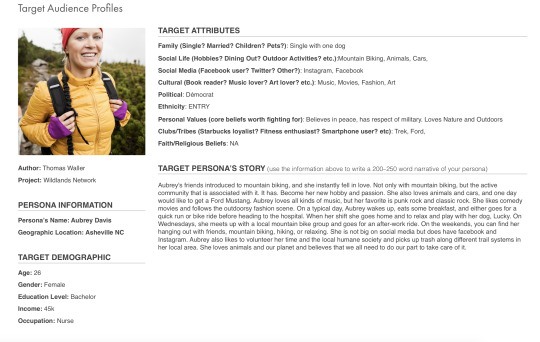
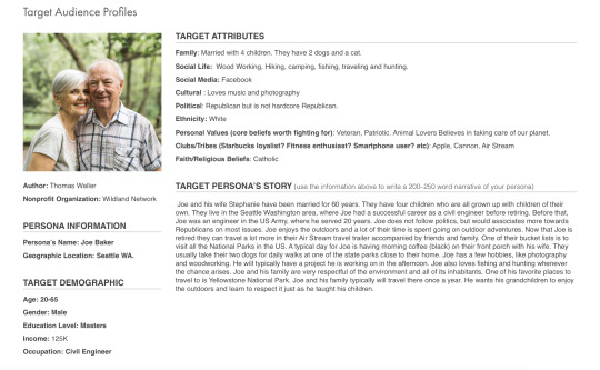
Researching Wildlands Network and what its mission is, I was able to develop the target audience profiles to help create the brand’s voice and messaging. Felton talks about becoming the consumer and how your ad messaging should not address the consumer but should speak to the consumer in a way that represents themselves (p.105).
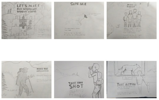
My strategy for the ad sketches was to explore the non-profit and because they have multiple campaigns currently going on, I focused these concept sketches on 3 of those campaigns. Craig Smallish talks about the core values of a product and how those values and beliefs can be related to the consumer (Smallish, 2013). I used the research conducted on the organization and applied their voice and core values into the concept sketches that will relate to the target audience.
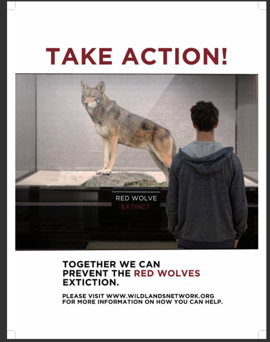
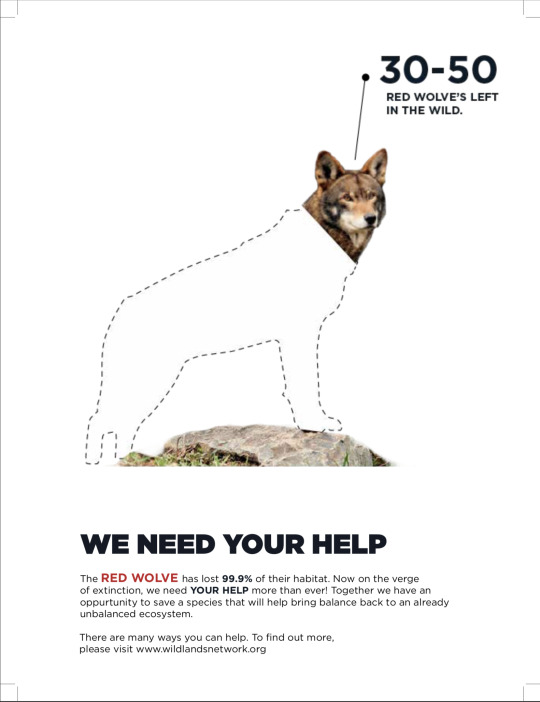
This concept is focusing on the campaign to save the Red Wolve’s from extinction. The message is sort of a warning. If we do not take action now then this animal will no longer be around. Craig Smallish talks about the importance of font selection and how the type can help attract attention (Smallish, 2013). I wanted to bring attention to the headline “Take Action” to help draw the viewer in and raise interest.
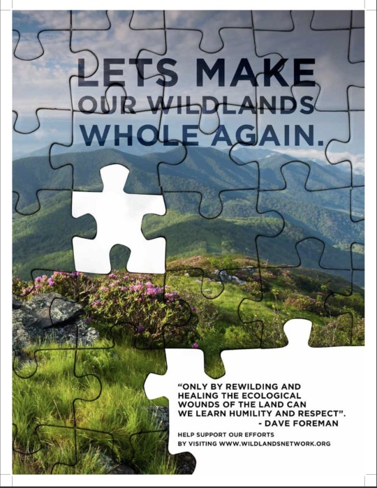
This concept is focused on the Wildlands Network campaign to heal the lands surrounding the Appalachian trails. Since the campaign is about healing and restoring these ecosystems, the concept is to show a puzzle of this beautiful landscape with puzzle pieces missing.
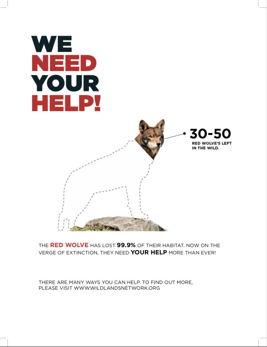
This is another concept for save the Red Wolve’s campaign. Using type and a graphic on a white background to create a dramatic effect. Craig Smallish states that contrast used right, can help direct the viewers eyes along with making elements dominate over others, creating heirarchy (Smallish, 2013).
After receiving feedback, I reworked the image to make it go full screen. I also wanted the visual of the Red Wolf in the display to be the hero and then the headline to follow.
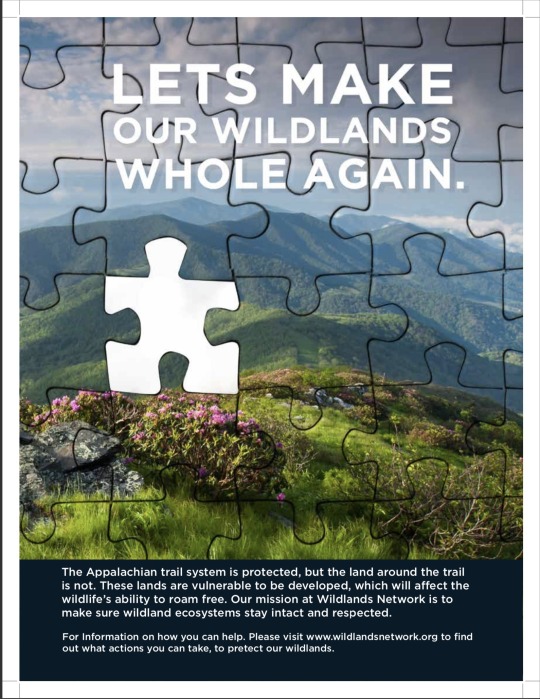
For this revision, I made the type more dominant and readable. I removed the missing pieces in the bottom right corner because it was distracting from the other elements. The viewer see the headline then their eyes move to the missing puzzle piece and then down to the body copy.
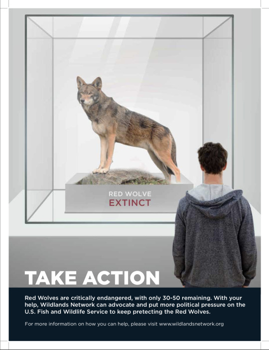
This revision I moved the type to the bottom. I made the graphic larger for a more dramatic effect. The graphic is the hero followed by the type. The contrast helps make the graphic pop.
My takeaways from this course are to really get to know the client and their product. Know the target audience and how why they like the brand and what needs the product fulfills. Knowing the brand's voice and tone can help communicate that message to the target audience.
References
Felton, G. (2013). Advertising: concept and copy(3rd ed.). [PDF Version] Retrieved from https://online.fullsail.edu/class_sections/46769/modules/177929/activities/1113172
Smallish C. (2013) Developing Ideas and Advertising Concepts [Online Course] Retrieved from https://www.lynda.com/Design-Business-tutorials/Using-storytelling-determine-core-values/126121/145393-4.html?srchtrk=index%3a3%0alinktypeid%3a2%
0 notes
Text
Mastery 4.4.1
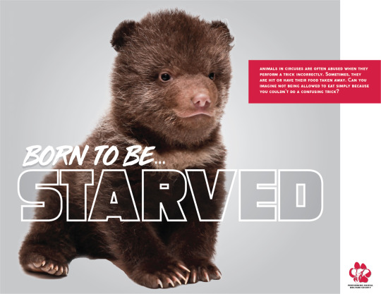
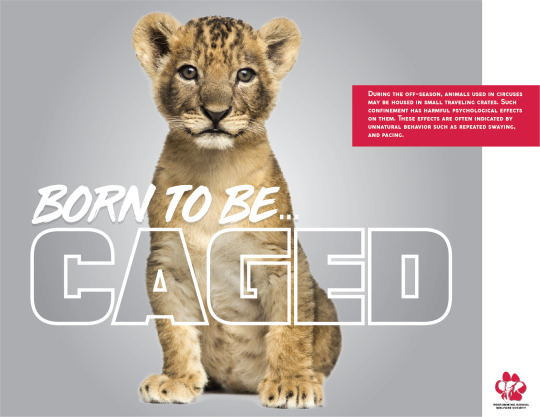
Effective Copywriting has been the most difficult course so far on my mastery journey due to the amount of writing in a short amount of time. This course not only taught me about creating and developing concepts for an ad campaign that is able to hold the same voice/tone but, how communication through writing is just as important as verbal communication. In Advertising Concept and Copy, Felton (2013) states, “Even if that message has no literal spokesperson, it always has a consciousness, and people’s response to this frequently invisible but everywhere apparent speaker becomes central to the success of the message and the brand behind it” (p. 93). The simple statement stuck with me all through this course when working on the testimonial ads and campaign paper for the Performing Animal Welfare Society (P.A.W.S).
Before I began to develop my concepts, I pictured what voice they needed to be in and if that voice would move me into action. I wanted to make sure the voice and tone were detected throughout the whole project campaign. To do that, I had to do what Smallish (2013) said in Developing Ideas and Design Concepts about working with the client and building a solid foundation to build the creative process on. I researched everything I could about P.A.W.S organization and learned everything about their mission to create the perfect voice and tone for the nonprofit. From there I moved to the target audience.
After deciding on the tone and voice to adopt, I began brainstorming on who would be targeted by these ads. “The Frame of Today- presented by Chaco and Huckberry” video helped me in this portion of the concept development and with deciding the target audience for the testimonial ads. I looked back at the list in Advertising Concepts and Copy, and one that I worked with throughout the project was nurturance: the need to provide care for others (Felton, 2013). The purpose was for the audience to feel a sense of a need to do something for animals falling victims to abuse. When I figured out my target audience, I began to do sketches.
“Rough sketches function as the first full visual prototype” (Smallish, 2013). I started by producing quick sketches. An example of my reasoning is I chose to test out all testimonials and eliminated the ones that didn’t connect with my organization or aimed demographic. For example, with the expert ad, I played around with different ideas of how to display abuse. Would it bring a shock factor or play it down? Most of the testimonials I made targeted people around their 30s. Two of the concepts where based off of family movies. I didn’t really stick to a pattern for the ads, I needed to layout all my ideas without limiting myself to a single pattern or category. Once the visual concept was developed I was able to move along to add the written copy to the ads.
My experience in writing copy was excellent. I worked on each ad slowly so once I produced a good concept for that testimonial voice I worked on a headline that would be just as impactful. I started by just writing down whatever came to mind, so for example, the testimonial had generic headlines like “no excuse for their abuse” and “trained but not tamed”. After I jotted down a variety of word combinations, I moved onto body copy because I knew the verbiage would better help me decide on a perfect headline. I made sure there was a balance of imagery and copy (Smallish, 2014). Each ad concept had one impactful image, a powerful headline, a sub-headline, the company logo. In week 3 I forgot to add the call to action but have updated it since.
Target Audience Profiles

In week two, the professor covered personas and target audiences. Being a self-taught graphic designer, I know little about this, through the intense research in this course, I learned the many essentials of copy. In Advertising Concept and Copy, Felton (2013) talked about Settle and Alreck’s 15 Catalog of Needs and knowing who finds the benefits of a product or service important when trying to sell said product or service (p. 31). Meaning, before I could begin my testimonial ads, I had to know who would find donating to P.A.W.S important and who would benefit from its services. From this research, I concluded my target audience is anyone who owns or works with animals, and people who no longer want to live in a world where animal abuse is allowed. I connected the research to my personas by determining which of the needs would speak to my target audience. I deduced that nurturance (the need to provide and care for others), succorance (the need to receive help from others), and security (the need to be free from fear) would speak loudest (Felton, 2013). With this knowledge, I not only could create my testimonial ads but, I also could decide the full message for P.A.W.S Born to be… ad campaign. I had a clear direction and specific people to speak to with the campaign.
Six Testimonial Ad Sketches
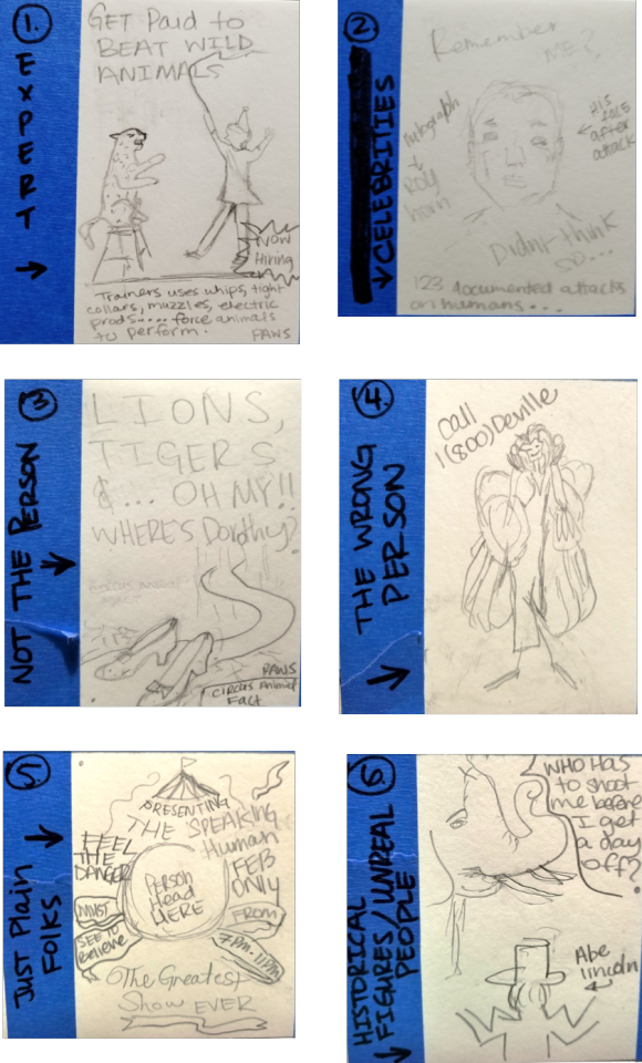
For concept one I used Felton’s (2013) expert testimonial (p. 241). The voice is from an animal trainer telling the viewers they get paid to beat animals. This is followed by a circus fact about trainers. In concept two the target market would see a celebrity as the speaker (Felton, 2013). With the celebrity as the voice, the viewer sees what famous people like them can do for animal welfare. Using a celebrity victim can also be looked at as an expert testimonial ad concept that Felton (2013) mentions. Concept three worked with what Felton described as using something associated with the person (Felton, 2013). Ruby slippers and phrase are some of the things associated with Dorothy from the wizard of oz, and a person has no change against one animal let alone two. This ad uses the shoes and memorable catch phase to show the audience that the animals aren’t the only ones that can get hurt. Concept four is what Felton (2013) called the wrong person and can also be unreal people. The viewer sees the iconic Cruella Deville and her hot line. As child we knew this person was a villain for kidnapping and abusing animals, as adult we need to be reminded. Using something familiar can create a connect with the viewer. The fifth concepted I used just plain folks which Felton (2013) stated was a person really helped by the product or service (p. 246) The purpose is to make the viewer do a double take. The onlooker sees a circus flyer event with a kids’ head in the middle instead of an animal. This helps people realize if it’s morally wrong for a child to be on display shouldn’t it also be for a defenseless animal. The sixth and final concept is historical figures used for their attention-getting quality (2013). The viewer is hearing the voice of the abused animal asking honest Abe a question he can’t answer. In the end they were all rejected because they didn’t have the shock, compassion or impact on the audience needed. I started from scratch and came up with these three comps.
Three Initial Comps

When I began developing my concept ideas, I focused on looking for the imagery that would catch the viewers eyes. Craig Smallish (2013) taught me all about hooking the viewer in through the use of great imagery combined with a headline. I looked for images that worked for the organization. Unfortunately, in week 2 there was a misunderstood with the assignment and the same sketches where turned in without formatting them on InDesign. It was hard to play catch up but the imagery along with the headline ended up turning out better than planned.
Three Revised Comps
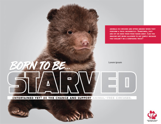
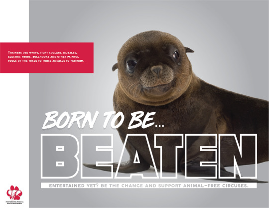

I had to rework the body copy, imagery and headline to reflect the testimonial concept, not to mention adding the call to action. The body copies were circus animal fact that got straight to the point, so the viewers wouldn’t decide it was too much to read. A hint of color used from the logo was used for the copy making the viewer eyes move around the entire ad. The call to action started with a question “Entertained yet?” This made the viewer question themselves and want to make the change. I felt it was mastery level to create a campaign without a pre-sketched testimonial that had been thought out. A professor or boss can’t always be around to make decisions, and it is left to the media designer. It was problem solving on the fly and made my project unique and cohesive.
Takeaways
How to write body copy. I came into this class not understanding the importance of copywriting and writing body copy. Through this course, I have gained a better knowledge and feel much more confident in not only writing copy but editing copy as well.
How to use voice and tone throughout an ad campaign. I always knew what voice and tone in design were. But with this course, I understood how to apply it to a full-fledged campaign. I believe the reason I did well this course design wise was that I acquired this skill and applied it in my work.
Skills in advertising. I had the basic know how with advertising or what was needed to create a great ad. Through effective copywriting, I learned how to write headlines and taglines that mean something. I learned how to combine all this information together to create a multi-media ad campaign.
Use graduate-level problem-solving skills. As I stated in three revised comps, I ran into an issue with the organization I was working with. This experience taught me how to take a problem and use graduate-level problem-solving skills to reach a solution.
References:
Adams, D. (2011, February 14). What is Copywriting and How is it Important for a Designer? Retrieved February 2, 2019, from http://www.instantshift.com/2011/02/14/what-is-copywriting-and-how-is-it-important-for-a-designer/
Felton, G. (2013). Words I: Establishing Voice. In Advertising Concept and Copy (3rd ed.) New York, NY: Norton & Company.
Smallish, C. (2013, August 16). Developing Ideas and Design Concepts. Retrieved February 2, 2019, from https://www.lynda.com/Design-Business-tutorials/Developing-Ideas-Design-Concepts/126121-2.html?org=fullsailold.edu
Smallish, C. (2014, May 27). Designing a Print Ad. Retrieved February 2, 2019, from https://www.lynda.com/Design-Page-Layout-tutorials/Designing-Print-Ad/155264-2.html?org=fullsailold.edu
0 notes
Text
Month 4 Reflection-Effective Copywriting
Effective copywriting and I are very familiar. Well the course, I mean. I’ll admit this isn’t my first jab at this course, but I will say this was my greatest effort. Previously when I took the course, I was not focused because of the nature of things that happen in life. But as you can see, I didn’t give up. Creating captivating headlines This time around I decided to use The National Network to End Domestic Violence (NNEDV) for this month. My three take away from this course are as follows:
Take away:
· Creating good copywriting content is essential for your campaigns brand.
· Researching and Understanding the history of the organization is very important in the development of campaigning.
· Know your audience. Creating personas helped me to understand the market that
__________________________________Personas


The NNEDV is an organization that connects and provides awareness for 56 domestic violence organizations that address domestic violence issues and legislation. The audience is most affected by domestic violence are women between the ages 19-25.
Young women, low-income women, and some minorities are disproportionately victims of domestic violence and rape. Women ages 20-24 are at greatest risk of nonfatal domestic violence, and women age 24 and under suffer from the highest rates of rape (Now.org)
But the effects of domestic violence can reach many. For the purpose of this of the effective copywriting assignments, I relied on the research and statistics available to determine my target audience.
__________________________________Sketches

Next task that was addressed was the sketching process. Throughout this process, I wanted the comps developed to attract not only the target audience but individuals who I coined “changemakers” (volunteers & Donors) throughout this project. While sketching I wanted to give range in terms of development. I wanted versatile sketches that had the ability to be easily evolved but containing the same context. When we produce a rough sketch we really need to…abandon any concerns we might have about our drawing ability (Smallish, 2013). I did my best this time around to display my concept ability visually in the best way possible.
_______________________Comps 1st Round


In my first draft of comp ads I tried my best to bring my sketches chosen to life. Generally, they're executed to a level that…clearly illustrates every aspect of a concept.…Including how the concept is going to play out across the selected media platforms (Smallish, 2013). I feel that in the first drafts I was able to find images that were perfect for the visuals in the comps I created. The feedback given by Prof. Rogalle is reflected in the final comps below. I attempted to make that comps more cohesive. Working as a blueprint our final comp will help us identify everything…we'll need along the way in order to make our concept publication ready (Smallish, 2013). By relying on the research of the brand and the elements of design, I was able to address some of the changes bases as feedback as well.
____________________________Final Comps


References
Now.org (2019). Violence Against Women in the United States: Statistics. Retrieved on February 2, 2018 from, https://now.org/resource/violence-against-women-in-the-united-states-statistic/
Smallish, C. (2013). Developing Ideas and Design Concepts with Craig Smallish. Retrived on Lynda.com on January 3, 2019 from https://www.lynda.com/Design-Business-tutorials/Developing-Ideas-Design-Concepts/126121-2.html?org=fullsailold.edu
0 notes
Text
4.4.1 Mastery Learning Project: Project Reflection
What I’m listing here, is my continuation to becoming a Creative Director. At least, that’s always been my dream job growing up as a teenager. When I’d started learning about Copywriting, being the art and science of writing a copy for advertising on a product or service. The copy writing workshops that I’ve taken when I was taking “Effective Copywriting” has influenced me to look further than just putting an image in front of a headline. Which the headline should serve as something that should not only appeal the potential customer, but also the tagline needs to match what the headline is targeting. This is incredibly important when your either campaigning for a non-profit organization or selling merchandises and products, with high-end quality designs that’re persuasive and call to action.
“That’s your first job as a copywriter; understand the character of your client’s brand.” (Felton,2006)
In the beginning of this course, we read George Felton’s Chapter 9 of “Advertising: Copy and Concept”, which is called “Finding your Voice” the main job of a copywriter is to understand the character of client’s brand. “Consumers are never just buying a product, but their also buying an ethos.” (Felton, 2006) The main takeaway is that customers don’t just buy products, but also an ethos that’s attached to it. It also has to not only represents the client’s or company’s brand personality, as well as add the right voice. They want to solve a problem through a product, and using Maslow’s “Hierarchy” and the “15
Some of the notes that I’ve taken, from the lynda.com course, I’ve learned that in order to make good concepts for ads, one has to make quick sketches, run with the ones that fit with your designs, and expand upon them. So, after taking both of them into account, I’ve decided to start drawing out sketches, both traditional and digital, and picked ones that’ll fit with the designs for my non-profit organization. Pushing further being a Media Designer/Creative Director, it’s really important that I have designs thats relevant to the client’s brand personality. Something that I’ll be learning further about when I go into “Design Research” in the next course.
Original Sketch Ideas:
These were the original sketches for the Testimonial Ads that I was working on during the time. The idea was to give them a brand personality to work with for the non-profit organization. (Felton,2006) The approaches that I’ve taken for them were short and few, since they’ve only have two websites that they operate on. When I’d googled “Blind Veterans Association” and looked them up on the main library, this was all the symbols that I could find for the organization that I’ve chosen. (Felton, 2006) So, I’d picked up my sketchbook and quickly sketch out the symbols that would fit best what it would look best for the client that I would be working with.


First Testimonial Ads Draft (:)
These were based on the pictures that I’ve searched through the internet, while drawing out the sketch ideas for the first draft of the Testimonial Ads. Using InDesign and watching the worse off of Lynda, learning what it means to create a print ad for your client. (Craig, 2013) Having went through the course, and practicing working with a sketchbook, to create sketches that would be compelling and fit with the narrative of the Blind Veterans. Using symbols like their canes, uniforms, and the star with a blade in the middle.


Testimonial Ads Revision:
These were based on the revisions that I've gotten back from my instructor. The new concept, based on Felton and Craig, is to precise them to be more like headlines. (Craig,2013) Adding taglines to them, was to not only appeal to the client, but also have them call to action for the funding of the campaign.


Target Audience project:
During Week 2 of the “Effective Writing” course, I’d started working the Target Audience, that correlates with the Blind Veterans Association project that I was working on. Each person that I’d picked not only appear as if their own person, but also they take the time to serve the Blind Veterans. Which gives awareness to how important it is to give your time & care in taking care of them. (Felton, 2006) It synthesizes, or makes coherent, the profiles that these Blind Veterans also have profiles that makes them unique, outside of their services of


Lastly, through acquiring competencies that's a running theme for the whole Media Design program, one of the takeaways is learning more about how to use InDesign, but also motivated to practice with InDesign CC and Photoshop CC more. Another takeaway is taking the time in practicing certain level of competencies can grow along with the new media. And the last takeaway is how effective copywriting functions, but to also practice writing taglines that stick with potential customers. From the concept of the first initial sketches, using Artflow digital sketchbook, to now putting it through it's final headline and tagline to match it.
Felton, G. (2006). Advertising Concept and Copy, Third Edition. New York, NY: W. W. Norton & Company, (Originally Published by Pearson Education, Inc.).
Smallish, C. (2013, August 16). Developing Ideas and Design Concepts. Retrieved January 28, 2019, from: https://www.lynda.com/Design-Business-tutorials/Developing-Ideas-Design-Concepts/126121-2.html?srchtrk=index%3a31%0alinktypeid%3a2%0aq%3aDeveloping+Ideas+and+Design+Concepts%0apage%3a1%0as%3arelevance%0asa%3atrue%0aproducttypeid%3a2
0 notes
Text
4.4.1 Mastery Learning Project: Project Reflection - Task 1: Reflection
During my four weeks of Effective Copy Writing, I worked to refine my persuasive writing techniques and bolster the nuances of my writing for advertising and corporate communications. I learned the power of a clear and compelling verbal message, gained a deeper understanding of developing target audience personas and writing with them in mind. I also explored and designed comprehensive layouts and worked to write headlines that inspire, and taglines that tantalize.
In Advertising Concept and Copy, by George Felton, I began by Establishing Voice, or rather, working to create a brand’s personality. In chapter nine Felton 2006, says “Once you understand a brand’s core values, you can begin to talk in ways that represent the brand” (Felton 2006, p.96). You cannot properly establish a brand voice and express it if you don’t have an understanding of the brand, its core values, and their target audience. Speaking of, by knowing who a brands target audience is, I can more effectively write for and design with, them in mind. In chapter three, Felton explains, Understanding Consumer Behavior. Felton discusses, Maslow’s Hierarchy of Needs, but digs deeper with Settle & Alreck’s 15 Catalog of Needs. Felton 2006, argues “When you’re trying to sell a product and begin listing benefits, from most important to least, you immediately ask yourself, “Important to whom?” (Felton 2006, p. 31). By understanding my intended target audience, I can persuade them with the benefits of my brand’s product or service, why it matters to them, and why it should matter to them.
In week two, I was tasked with reading Chapter 19, Testimonials: The Power of Personality in Advertising Concept and Copy and watching the video tutorials, Developing Ideas and Design Concepts and Designing a Print Ad both with Craig Smallish. In the chapter, Felton 2006, asserts “No matter what you’re selling, someone can testify for it. And since people find other people more fascinating than they do anything else, why not use them?” (Felton 2006, p. 241). It was with this concept in mind that I began to consider who my target audience is and completed developing two distinct target audience profiles. From there it was time to explore the tutorials with Craig Smallish and begin sketching. In Developing Ideas and Design Concepts, Smallish 2013, offers “When we produce a rough sketch we need to abandon any concerns we might have about our drawing ability” (Smallish 2013, [video transcript]). The point of the rough sketch exercise was to allow for a loose free form flow of ideas. Smallish 2013 again says it best, “Executing rough sketches like this, gives us a quick and valuable view of the different ways our concepts could be best depicted” Smallish 2013, [video transcript]). With more tweaking, refining editing, and seemingly endless erasing it was then time to explore my concepts and pick three of my six sketches to mock up with copy and content. After reviewing chapters one and three from, Designing a Print Ad, I was ready to begin playing with composition and implementing my concepts. Smallish 2014, argues “There’s a balance that needs to be maintained between the attention-grabbing part, and the message part” Smallish 2014, [video transcript]). Admittedly, my first iteration of my ads did not have any body copy! The call to action was neither clear nor did it specify what organization my ad was for or why my target audience should care to begin with.
Target Audience Profiles:


Testimonial Ad Sketches:


Testimonial Ads:


In week three, it was time for me to revise my ads and turn my campaign around. My feedback from Professor Rogalle informed me that my campaign needed to be cohesive, I needed to actually write body copy, and that my first image where the little girl’s foot is cut off, is well, disturbing! So, after reviewing the resources from weeks one and two and reviewing my target audience profiles, I knew I needed to scrap the first two concepts I had mocked up and completely re-work them. I realized that sticking with the vibrant primary colors and playful aspects of my third concept would be the best way to reach my audience. I decided to stick with a theme of building, to add layers of meaning to the partnership of my non-profit and the target audience working together to foster and adopt children. Then it was time to tackle my body copy and tagline. My body copy went through several iterations before I was satisfied that it hearkened to both needs of the campaign and the needs of the Child Welfare League of America. Felton 2006, declares “Remember, features belong to the product, but benefits belong to the people” (Felton 2006, p. 126). Keeping this in mind allowed me the opportunity to write copy that establishes both the long-standing legacy of service that the organization provides as well as declaring the benefits of the organization and leading my audience to the call to action to find out more.
Testimonial Ad Revisions:


In week four as I work on my final paper and reflect back on everything that I have learned in Effective Copywriting, three major takeaways that I need to keep in mind and apply as I move forward, both in my journey to mastery and in my career as a Media Designer are:
“Copy and design work go hand in hand, and neither should be undermined in the name of the other” (Adams 2011).
“--as a copywriter, you must never lose sight of each of the audiences that you are trying to influence” (Bowdry 2008, p. 172).
“People trust other people more than they do corporations. What people say is real, what corporations say is propaganda” (Felton 2006, p. 246).
References:
Adams, D. (2011). What is Copywriting and How is it Important for a Designer?. Retrieved from Instant Shift available at - http://www.instantshift.com/2011/02/14/what-is-copywriting-and-how-is-it-important-for-a-designer/
Bowdry, R. (2008). Copywriting. Retrieved from http://web.a.ebscohost.com.oclc.fullsail.edu:81/ehost/ebookviewer/ebook/bmxlYmtfXzI5NTc1Nl9fQU41?sid=a8309bcc-f9a4-4ae6-89b1-b33968c880bd@sessionmgr4010&vid=6&format=EB&rid=1
Felton, G. (2006). Advertising Concept and Copy, Third Edition. New York, NY: W. W. Norton & Company, (Originally Published by Pearson Education, Inc.).
Smallish, C. (2014, May 27). Designing a Print Ad. Retrieved January 28, 2019, from: https://www.lynda.com/Design-Page-Layout-tutorials/Designing-Print-Ad/155264-2.html?srchtrk=index%3a1%0alinktypeid%3a2%0aq%3aDesigning+a+Print+Ad%0apage%3a1%0as%3arelevance%0asa%3atrue%0aproducttypeid%3a2
Smallish, C. (2013, August 16). Developing Ideas and Design Concepts. Retrieved January 28, 2019, from: https://www.lynda.com/Design-Business-tutorials/Developing-Ideas-Design-Concepts/126121-2.html?srchtrk=index%3a31%0alinktypeid%3a2%0aq%3aDeveloping+Ideas+and+Design+Concepts%0apage%3a1%0as%3arelevance%0asa%3atrue%0aproducttypeid%3a2
0 notes
Photo

This the cover I designed from my testimonial ad campaign which I created for my Digital Media class at Full Sail University this past month. It was inspiring to see so many great projects done by my talented classmates. It was even more inspiring to know there are so many other people out there, who are as passionate about their chosen charity, as I am about mine.
Three things I will take away from this class (besides learning to practice even better time management) were:
1. I learning about Lateral and Vertical thinking and how to apply that to my own creative design job. The text states that, “You must exercise analytical skills—see what’s wrong with a headline and fix it, prune extraneous images to their essentials, take that half-idea and think it through (Felton 188). After reading this, I immediately thought of several ways that I can apply this to my current job as a graphic design for a newspaper.
2. I also learned more about creating logos and slogans, and choosing a good company name for your client. I was particularly fascinated by the use of inventing “portmanteau words” when you take “two words, or parts of them, fused to create a new word,” and how those are “easier to grasp since they contain identifiable parts, (Felton 228).
3. My final take away was from the “Exploring and Experimenting with Thumbnails” video by Craig Smallish on Lynda.com. The concept of creating thumbnails to help boost creative ideas is somewhat new to me, despite the fact that I have been a designer for many years. However, when Smallish referred to this as “A kind of brainstorming through picture making,” and also stated that, “One of the great benefits to producing thumbnail sketches is to explore and experiment with your ideas,” I could not ignore it, (Lynda.com - from LinkedIn, 2017).
All three of these helped my ad campaign evolve from rough sketch, to first draft, to completed final as you can see here:

My charity research also caused me to stumble upon this inspiration video by artist, Propaganda:
Felton, George. Advertising: Concept and Copy (Third Edition), 3rd Edition. W. W. Norton & Company, 20130805. VitalBook file.
Facebook.com. (2017). Samaritan's Purse. [online] Available at: https://www.facebook.com/SamaritansPurse/videos/10154335247331809/?hc_ref=SEARCH [Accessed 29 May 2017].
Lynda.com - from LinkedIn. (2017). Exploring with thumbnails. [online] Available at: https://www.lynda.com/Design-Page-Layout-tutorials/Exploring-thumbnails/155264/174697-4.html?srchtrk=index%3a2%0alinktypeid%3a2%0aq%3aDesigning+a+Print+Ad+with+Craig+Smallish%0apage%3a1%0as%3arelevance%0asa%3atrue%0aproducttypeid%3a2#tab [Accessed 29 May 2017].
0 notes
Text
4.4.1 Mastery
My target audience is composed of men and women ages 25-34. This segment of the population is often referred to as Millennials. Research was done to reveal what outlets would be best to direct the campaign messaging. Connecting the research to the project allowed me to institute a social media segment of the campaign to reach millennials. My personas were of Tiana and Deandre. Both are millennials that constantly use social media to start connected.
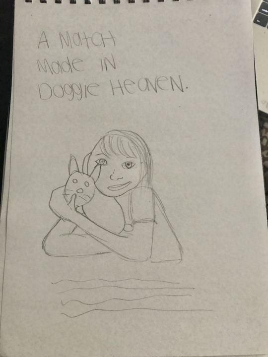
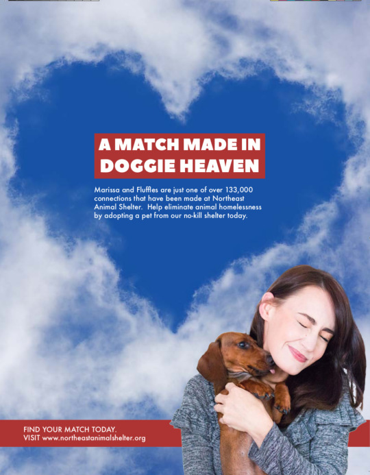
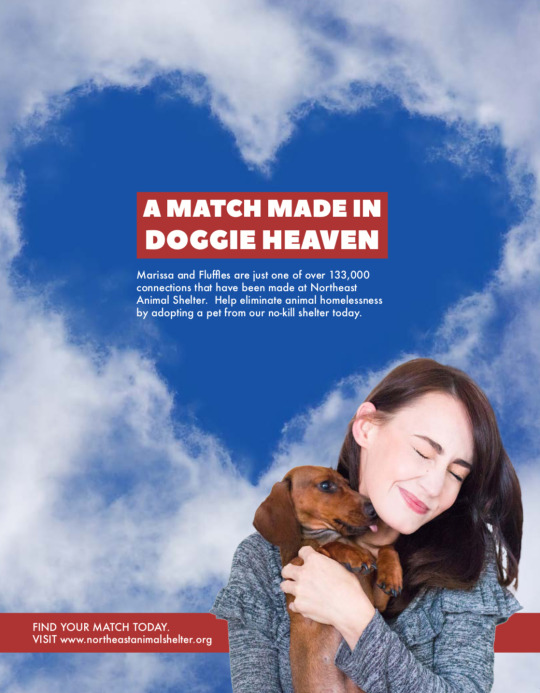
For the Northeast Animal Shelter advertising campaign, I selected six types of testimonials based on George Felton’s categories. The first type of testimonial was “Plain Folks”. For this ad I illustrated a regular young woman hugging a dog with a headline that reads “A MATCH MADE IN DOGGIE HEAVEN”. George Felton described why this is effective. He stated that “people trust other people more than they do corporations” (Felton, 2013, pg. 246). Word of mouth is stronger than claims from a brand.
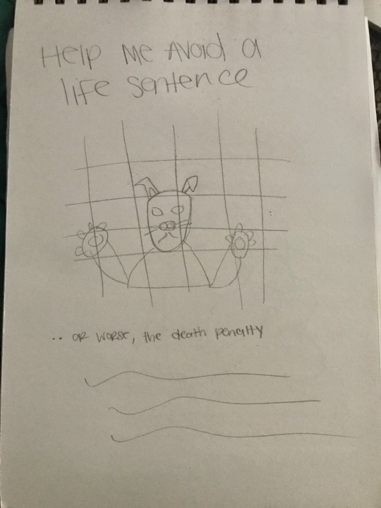
The next type of testimonial I chose was an “Expert”. The imagery is of a dog behind bars pleading “HELP ME AVOID A LIFE SENTENCE”. The dog is an expert because he is the one experiencing the shelter. Felton advised to “find somebody who stands outside the brand and has the expertise to evaluate it” (Felton, 2013, pg. 241).
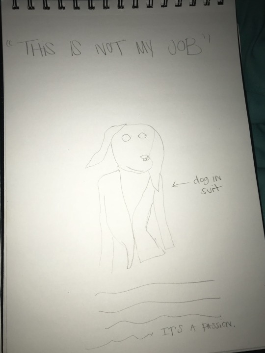
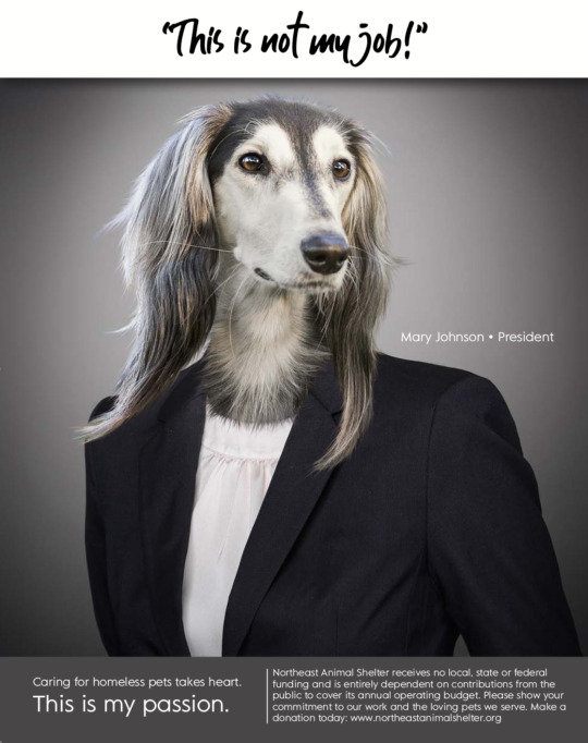
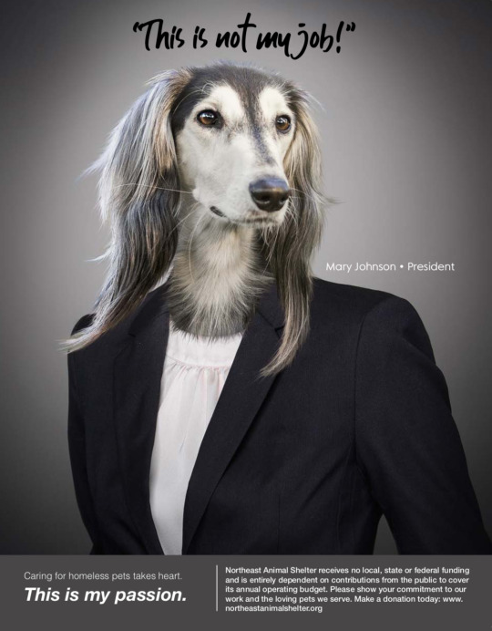
The “CEO” type of testimonial formed the basis of my next ad concept. It is of a dog in a suit representing the CEO stating “THIS IS NOT MY JOB….THIS IS MY PASSION”. CEO testimonials according to Felton “give the brand a human face” (Felton, 2013, pg. 241).
The next advertisement is an example of an “Ironic” testimonial. There is a large lumberjack guy that looks intimidating saying he isn’t a dog person, but he is an Andy person. You wouldn’t expect this type of guy to have an affectionate side for animals so that is why it is ironic. Felton states that “ironic testimonials gain absurdist power” (Felton, 2013, pg. 245).

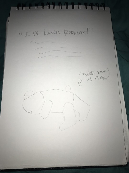
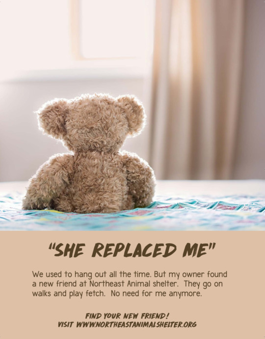
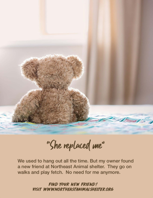
The next advertisement is an example of “Unreal People”. It is spoken from the angle of a teddy bear that has been replaced. He discusses being forgotten about because his owner found a new pet. This type of advertisement is utilizing an unreal person to make a point. Felton wrote that this type of character can be used “for their attention-getting quality as well as their unusual ‘relationship’ to the product” (Felton 2013, pg. 246).
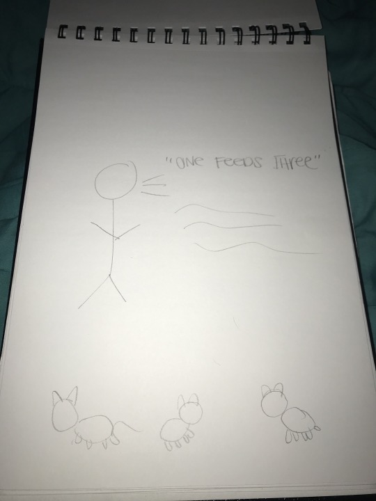
The last example was a hypothetical example of a “Celebrity” testimonial. People trust their favorite celebrities’ opinion when it comes to selecting brands. This ad’s imagery would be of a celebrity juxtaposed with 3 animals. It would say “Here at Northeast Animal shelter it cost only $1 to feed 3 shelter pets a day. Won’t you consider making a $30 donation: northeastanimalshelter.org“. This is to make the point that it doesn’t cost much to feed shelter pets when donations are made.
From the 6 sketches I chose 3 concepts to transform into my 3 initial comps. I developed the concepts by brainstorming the headlines first. For example, Ad A I chose to play with a cliché. Instead of using “A MATCH MADE IN HEAVEN” the headline reads “A MATCH MADE IN DOGGIE HEAVEN”. According to Felton traditionally cliché’s should be avoided. He does list an exception. He writes, “clichés can work in advertising, drawing people in with their familiarity but surprising them with your witty alterations of the expected langauge” (Felton, 2013, pg. 215). Therefore, inserting the word “DOGGIE” is a way to put a twist on an overused expression. I wrote the best body copy by adhering to tips by George Felton. He recommends ”all good copywriters read aloud (at least in their heads), solicit commentary, and then, invariably, rewrite” (Felton, 2013, pg. 128).
I found difficulty in making the ad campaign seem consistent across all 3 design solutions. This is because the ads are all three strikingly different concepts. I did attempt to make revisions that would make the campaign look somewhat consistent. Per market research, I changed some of the fonts to Helvetica to appeal to the target audience. Ads B and C were changed to share the same header handwritten font, while the body copy is in Helvetica. Doing the same to Ad A wasn’t successful so I left that font unchanged. On Ad A I enlarged the picture of the pet owner and puppy. As recommended, for Ad B I extended the gray area for the headline. This way the ad is no longer segmented into boxes.
However, the feedback from the instructor I received was positive. My professor suggested how I could turn Ad A into a cohesively branded campaign in the future. I can use different types of dogs and dog owners for the imagery on Ad A to make it cohesive.
3 TAKEAWAYS
The first takeaway that I learned from Effective Copywriting is that good copywriters need to read just as much as they write or even more. Exposing yourself to literature can improve writing skills. The second takeaway is from Craig Smallish. He advised that “one of the most important things a creative can do is produce as many different ideas as possible” (Smallish, 2013). Lastly, I learned that in APA formatting the title must go above the start of the body of the paper.
References
Felton, G. (2013). Advertising: Concept and Copy. New York, NY: W.W Norton & Company.
Smallish, C. (2013, August 16). Developing Ideas and Design Concepts [Lynda.com online course] Retrieved from https://www.lynda.com/Design-Business-tutorials/Developing-Ideas-Design-Concepts/126121-2.html
0 notes
Text
Earth Island - Personas, 6 Print Ad Sketches, 3 Initial Comps & Final Comps - Mastery 4.4.1


3 INITIAL COMPS


FINAL REVISED COMPS


Here are the 6 quick pencil sketches, 3 revisions, and final comps of the Earth Island print ad concepts that were created after watching the “Developing Ideas and Design Concepts” by Craig Smallish on Lynda.com. In this tutorial Craig goes over the in depth process of concepting, which includes avoiding cliches, pitfalls and mediocrity, researching the organization, experimenting with ideas, using free association, 180-degree thinking, developing rough sketches and finally revising the sketches to make the concepts stronger (Smallish, 2013). The concepts above were created after research was done on the history of Earth Island and the core values that the organization is founded upon. The primary audience was identified, and personas were developed using the templates giving to us by professor Rogalle. Based on reading about the mission statement of Earth Island, there were two main demographics that emerged as the target audience for this campaign. The first is the environmental non-profit sector, and the second is the passionate, grassroots environmental patron who wants to make tax-deductible donations in order to support these kinds of organizations.
The challenge with coming up with environmental copy is conjuring up something fresh, and alluring that doesn’t come across as cliché. There have been a lot of environmental ads over the years and a lot of them sound the same. Felton (2013) mentions the importance of testimonials when crafting eye popping copy that stands out, and gets the message across to the intended audience. The expert testimonial, along with perspectives of the animals were incorporated into thee initial sketch concepts. Three designs were then chosen to be developed further, and initial revisions were made using clip art, and photo manipulation in Adobe Photoshop.
While developing the final comps a lot of resources where gathered from exploring various royalty free photography sites. Smallish (2014) states that while you may have gathered a lot of materials in your search, it’s important to trim all of the content down to only those elements that will be included in the final comp. The images, legible text, font style, logo placement, and virtually everything else that a design envisions in the finished design, should be included in the Final Comp (Smallish, 2014). After receiving the first critique 180-degree thinking was applied and the entire design was thrown out for a new one. The nature lover concept was funny, but perhaps the core message of the campaign was lost in the humor. The upgraded imagery provided a strong imagery around the devastation that happens to our precious natural resources when sustainable business practices aren’t taken into consideration. In this case Earth Island is there as a potential solution to the environmental crisis, bringing justice to the dire situation at hand.
Based on the feedback I received from the first comps, I revised the final comps by using photo manipulation on all three print ad designs in order to create a more cohesive, unified style and delivery. Bold blues and greens were utilized in conjunction with beautiful wildlife and nature to represent mother nature in all her glory. A clean high definition look was chosen in order to reflect the pristine environment that eco activists are seeking in this world. The first ad asks a question that speaks directly to any organization that may need the legal power of a larger network like Earth Island. Essentially, this headline caters to the human need for “succorance”, which is found in the catalog of 15 needs by Alreck and Settle. The second uses a bold headline about how Lady Gaia needs your help. This one caters to the environmental patron who may be wanting to fulfill the need of “nurturance,” or providing care for others who need assistance. In this case it’s our entire planet that needs help. The final ad is designed to resonate with those who are in need of a deeper sense of “security” by having a powerful network of environmental activists standing up for those natural resources that sustain us all. It caters to both demographics, and really anyone who is interested in standing behind clean water, a vibrant healthy eco system, and a sustainable future for all.
The three big take aways I gained from this process is the power of research and concepts development, identifying the target audience, and maintaining an open mind as feedback is translated into new and improved iterations of the initial sketch designs. It’s also important to test the copy out using the split testing method that Ian Lurie mentions in Learning to Write Marketing Copy. With the internet these days we can break a group into 2 or 3 segments use analytics software to see how the copy performs. (Lurie, 2014). There are tools like Google Survey we can use to do this as well. The power of design is in the process of understanding how to best communicate with the target audience in an emotionally engaging way with copy, color, texture and imagery. It’s also essential that we understand the clients needs while using the tools of design to effectively capture their hearts and imaginations. It’s important to consider as many perspectives, and design possibilities as we can in order to deliver a wide array of options to the client. In the end the concept has to speak in a powerful way to the client, as well as the intended audience.
References
Smallish, C. (2013, August 16). Developing Ideas and Design Concepts. [Video File]. Retrieved from https://www.lynda.com/Design-Business-tutorials/Developing-Ideas-Design-Concepts/126121-2.html
Smallish, C. (2014, May 27). Designing A Print Ad. [Video File]. Retrieved from https://www.lynda.com/Design-Page-Layout-tutorials/Designing-Print-Ad/155264-2.html?org=fullsailold.edu
Earth Island Institute: Theory of Change. (2016, November 12). Retrieved from http://www.earthisland.org/index.php/aboutUs/welcome
Felton, G. (2013). Advertising Concept and Copy. [VitalSource Bookshelf]. Retrieved from https://fso.zendesk.com/hc/en-us/articles/202506070-VitalSource-eBook-Redemption
Lurie, I. (2014, May 30). Learning to Write Marketing Copy. [Video File]. Retrieved from https://www.lynda.com/Business-Online-Marketing-tutorials/Writing-Marketing-Copy/149250-2.html
0 notes
Text
November 28th 2018
A swelling blend of rain meets snow in these times of early transition. Whether you’re under the weather or bundled in sweaters here’s some sounds to sooth and lose you.
-hour1-
Thet Liturgiske Owäsendet - LBY (from.. Novemberregn - 2018 - Shimmering Moods Records)
Nonconnah - Laments Cross Open Land (from.. Winter III - 2019)
Milieu/Coppice Halifax - Orange Peel Downers (from.. A Dusty Box of Old Memories - 2018 - Illuminated Paths)
Stefan Will - Konsulat (from.. Transit- 2018)
Cédric D. Lavoie - Le Bout de l’ile (from 88 - 2018 - Preserved Sound)
Erik Griswold - Fallingwater (from.. Yokohama Flowers - 2018 - Room40)
Ekin Fil - Away (from.. Maps - 2018 - The Helen Scarsdale Agency)
Abul Mogard - Upon the Smallish Circulation (from.. Above All Dreams - 2018)
Rime Trails - Perigee II (from.. Perigee - 2018 - Afterhours ltd)
36 - The Illusion of Permanence (from.. Ego Death - 2018)
Diamont Dancer - Circle (from.. Shapes - 2018)
-hour2-
Tucker Theodore - LSG Movements 7-10 (from.. LSG - 2018 - Antiquated Future)
Alaskan Tapes - From Dust (from.. The Ocean No Longer Wants Us - 2018)
C.Diab & Ian William Craig - The Green Plain (from.. Exit Rumination Remixes - 2018)
Jessica Moss - Particles (from.. Entanglement - 2018 - Constellation Records)
Emilie Levienaise-Farrouch - The Only Water (from.. Epoques - 2018 - 130701)
Andrew Tuttle - Reflections on the Twilight (from.. ST - 2018 - Room40)
Roy Montgomery Music - Twilight Conversation (from.. Scenes From the South Island - 1995)
Vau - Nightfall (from.. Ways of Stillness - 2018 - Whitelabrecs)
*Check out the archives at cfru.ca!
*Photo care of the Cover for Erik Griswold's Yokohama Flowers out now on Room40

0 notes
Last Seen Blogs

oldschoolnewbody
Old School New Body

brandyplsjustfitme
Untitled

best-of-femdom
Best of Femdom

me-and-only-me2323
Ray @RL2345RL
foodaddict83
Food Addict