
LSAD Year 1Selected Discipline: Printmaking, Project: IdentityMy Identity project is centred around self-perception versus external perception of one's self.
Don't wanna be here? Send us removal request.
Statistics
We looked inside some of the posts by k00214627 and here's what we found interesting.
Average Info
Notes Per Post
20
Likes Per Post
17
Reblog Per Post
2
Reply Per Post
1
Time Between Posts
1 day
Number of Posts By Type
Text
17
Last Seen Tumblr Blogs


Fun Fact
Tumblr’s website traffic is steadily declining.
Text


End of Year 1 Exhibition
I included examples of my Riso prints, screen prints, relief prints, and intaglio prints - etching and aquatint.
The PCP exhibition can be found near the Sustainability Station, in the hallway on the way to the library.
1 note
·
View note
Text


Week 4: Riso print
I took a short detour in the project to create a card for a coworker. I separated the channels into separate documents and applied halftone textures to the images, rotated to different angles. I used the so-called identities of each flower from the original collage to create a legend, so as the meaning of the image is not lost.
1 note
·
View note
Text
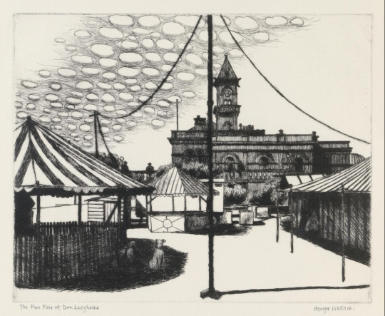
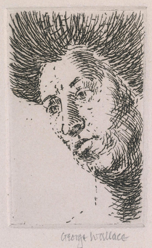

Artist research: George Wallace
On 24th April I, and a small group of other students, travelled to the Irish Museum of Modern Art and the National Gallery of Ireland. We were particularly taken by the printmaking exhibition that showcased George Wallace's etchings, especially his Fun Fair at Dun Laoghaire print. His work demonstrates the limitlessness of etching and how depth and shadow can be created though hatching and cross-hatching, no matter how haphazardous.
1 note
·
View note
Text

Week 5: Collaboration
I created this stamp to add to Kate's (K00292224) trading card project. This little critter is based on Baba Yaga's hut-on-chicken-legs.
0 notes
Text


Week 4 & 5: Aquatint
I furthered my copper etching plate design by incorporating aquatint into my next prints. The plate was covered in a thin layer of resin powder, which was then melted with a heat gun to create texture on the plate when it was electro-etched next. I covered up the areas in bitumen, starting from lightest to darkest, etching them in between at 2 Volts each. I used the timings of 1 minute, 2 and a half minutes and 12 and a half minutes. There was very little difference between the areas covered from the start and areas etched after 1 minute, so in the future I would like to adjust the timings. Unfortunately this resulted in little definition between the platform and the background in the print.
0 notes
Text


I designed the pages for this booklet on paper, with the use of a lightbox and Indian ink. I then scanned and edited these images digitally and printed them with the Risograph. I assembled these in order in hopes that it would resemble a tunnel, and glued them down onto cardboard. As it contains text, only one side is attached in a sort of book spine.
1 note
·
View note
Text


Artist research: Kit Davey
Kit Davey is a papercraft artist who creates interactive booklets in dozens of different configurations. I like her translation of 2D to 3D and want to incorporate something similar into my project.
1 note
·
View note
Text


Week 5: Zine Workshop
On Monday, I collaborated with Ciara (K00297635) on a zine about our personal experiences with the dentist. We had some discrepancies in our views, and the zine reflected that! The zine is a mix of collage, illustrations and text. We used different opacities and inversions on the printer to experiment with the resulting outputs, turning it into something chaotic. The inside of the zine has a poster.
On the back of one of the zines I used letterpress letters to inscribe a message. These were used with the typical relief print method with water-based ink and brayers.
2 notes
·
View notes
Text


I used the techniques I looked at in my artist research to create these pixelated collages. I used the black and white printouts as a trial run, but I ended up liking how they turned out. I still intend to produce a colour version.
3 notes
·
View notes
Text


Artist research: Tête au Carré
This artist (TÊTE AU CARRÉ (lama.co)) uses analogue collage to make pixelated portraits of celebrities. I wanted to experiment and use similar techniques. Their process is visible in their short videos, which I tried to replicate.
1 note
·
View note
Text


Week 3 & 4: Electro-etching
In week 3 we used copper plates to electro-etch. A ground was melted and spread over the plate, after which the design was marked out using a sharp tool. The ground protected the plate from being eroded when transferred to the etching solution, with a current running though it. My plate was in the solution for 15 minutes at 1 Volt. This method is safer, more consistent and environmentally-friendly compared to acid etching.
The plate is then cleaned with chalk and solvent. The ink is applied and then roughly removed with scrim - a waxy gauze. Newsprint is then used to clean up the rest of the plate to the desired look.
In week 4, I experimented with Chine Collé - coloured tissue paper glued into the wet paper alongside the print using wallpaper paste powder.
1 note
·
View note
Text


Secondary research: Käthe Kollwitz and Keiko Minami
To learn about the aesthetic of etching, I researched these two printmakers. Their styles vary greatly, with realistic monochrome on one end with Kollwitz and colourful child-like illustrations with Minami. Both of these artists were pioneers in their craft, Kollwitz for being a female artist who dealt with themes of societal issues, and Minami for choosing etching as her process of choice, as Japan is known for its woodblocking to this day.
2 notes
·
View notes
Text


Week 3: Zoo Detour
This week I went to Fota Island with the Animation group to do life drawing of animals. As I enjoy illustrating, even when it comes to printmaking I use these sketches to further my skills and feel like they will always be relevant. I'm still terribly disappointed in how the tigers turned out - they just wouldn't stay still enough to be captured!
0 notes
Text


PCP Project
Week 2 & Easter Break
I took another diversion from my chosen theme of self-identity to do a piece on the identity of Ireland through its flora and fauna. I created a modular magnetic stamp holder and 27 stamps that can be configured in a variety of ways to print unique bookmarks.
The designs feature native creatures and plants, and more stamps can be created to fulfil the inexhaustible definition of biodiversity.


2 notes
·
View notes
Text


PCP Project
Week 2
I made these lino prints as a project and CCS tie-in. The scene depicts the River Shannon from the back of the Hunt Museum. I took composition inspiration from our lecture on Japanese woodblock prints, specifically the elements in close foreground, as well as emphasis on diagonals and asymmetry. In particular I looked to Sudden Shower over Shin-Ōhashi Bridge and Atake by Hiroshige for inspiration.
This was intended as a gift to a friend who has recently moved from Limerick to remind her of the city, using the Shannon as an identity signifier.
0 notes
Text


Secondary research: Crash (1996)
As I was making my collages, I realised I was unwittingly taking inspiration from the film Crash by David Cronenberg, especially in my subjects of women and cars, cars and women. Though there are many differences in approach and intent to these two, contemplating it some more made me realise that the film also centres around identity, specifically how it unites people. In this case, the characters are united by their fascination with and arousal by car crashes.
4 notes
·
View notes
Text


Secondary research: Ahbin Choi
This is an artist who creates fantastical scenes through collage. As she posts videos of her process, it is fascinating to watch her choose images with purpose and arrange the cutouts in a way that makes them feel native to the final image.
Her works feature elements of fantastical amidst the mundane in a way that completely transforms the context of the original photographs.
Her work can be found here: https://notefolio.net/molar.voyelle.
0 notes