
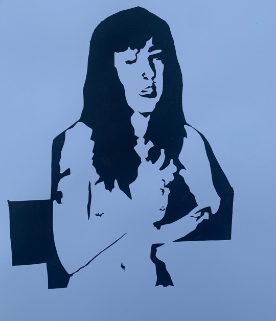
Fashion and Textiles brief: Mood and colour boards inspired by chosen artists (Louise Bourgeois). Leading to Swatch books of two chosen textile techniques.
Don't wanna be here? Send us removal request.
Statistics
We looked inside some of the posts by k00278300 and here's what we found interesting.
Average Info
Notes Per Post
30
Likes Per Post
28
Reblog Per Post
2
Reply Per Post
0
Time Between Posts
4 days
Number of Posts By Type
Text
17
Last Seen Tumblr Blogs


Fun Fact
Tumblr’s website traffic is steadily declining.
Text
Finished line up inspired by Louise Bourgeois using the textile techniques pleating and weaving.


2 notes
·
View notes
Text
Next we were tasked with creating a 6 piece line up inspired by our textile swatches while also keeping in mine our chosen artist.


Some sketch book and digital work working towards my line up.
1 note
·
View note
Text

Sketchbook and research work for the Swatch book. I related what I was doing and took inspiration from designers that use the same textile techniques I was learning. I also used paper as a tool to try out these techniques first.


2 notes
·
View notes
Text
Combined Swatches


Paper samples done using both pleating and weaving. First I pleated the paper by folding it and then I did a basic basket weave with the paper. I did one with horizontal and one with vertical pleats.
2 notes
·
View notes
Text
Swatch book
The next part of the Brief we were given was to creat a swatch book using two textiles techniques of our choice. I picked pleating and weaving. Here are the samples I made for my swatch book.


Single and double box pleats on cotton.


Rod pocket pleats and pinch pleats on cotton.


Triaxial Tumbling block weaving and basket weave using scrapes from the Cushendale Wollen Mills.


Ephemeral weaving with scrap cotton.
3 notes
·
View notes
Text
Finish mood and colour boards inspired by Louise Bourgeois.

0 notes
Text
Sketchbook pages and mark making exercises working towards mood and colour boards.


2 notes
·
View notes
Text
Research: Louise Bourgeois

Louise was born in Paris in 1911 to a family of textile restorers. Her father owned a factory in which her mother ran restoring textiles. Louise didn’t enjoy her childhood and was subject to a lot of torment from her father and english teacher and this is the subject in a lot of her work. Her english teacher who lived with the family had a 10 year long affair with louise’s father. Louise once stated that “she turned me into a wild beast I don’t always act like one but I am” in relation to her english teacher.

Louise created a series of sculptures that she named cells. She remarked that she was “a prisoner to my memories and I have to revisit and relive them so that I can forget them��. She felt trapped in her memories and created this cells to relive them.They were filled with reflective objects so pose the idea of looking at oneself and your past while being in the present.


Quite a lot of her work sculptures and drawing would contain spirals. Louise believed that they were a image of control and power. She once had a dream of strangling her english teacher and that lower she would work into her art. A lot of her work seemingly has sexual tones to it but if u take a step back you see that they are about motherhood and family relationships.


Louise started to create her spider sculptures in the early 1990s. They are to represent her mother that she lost in her twenties dew to the Spanish flew. Although she loved her mother deeply she was also scared of her. She feels the slider was a perfect representation of this. They are both weavers and they both protect with how spiders kill insects that carry disease. The slider sculptures are in a range of sizes from a couple feet tall to as big and 4 story buildings.


Louise also suffered from insomnia. It was said she was like a child and would burst into fits of anger and through tantrums. She struggled with depression and created these drawing for herself and not to be exhibited. They are countless of them with very repetitive patterns and image of males and females playing with gender roles and power and well as a mothers relationship with her children as Louise berried one of her sons.
What resonates with me most in Louise’s work is the exploration of her emotions and memories.
0 notes
Text
Fashion and Textiles
For are first brief we were tasked with picking a artist from a list given to us, researching them and creating a mood and colour bored inspired by there work. I choice Louise Bourgeois as I was instantly drawn to the unnerving atmosphere in her work as well as the wide range of mediums she works in.
0 notes
Text
These are the paintings after i added a second layer to them. I feel that the more I worked into them the sense of energy they had at the beginning was lost.


Although I wasn’t completely happy with how they turned out I do believe they are effective in showing the expression of joy. Here are the five paintings side by side.

I chose to work on them all at the one time instead of painting and finishing one them moving to the next as i want the colours to match and knew it would be very difficult to mix the same colour correct repeatedly.

This is the painting I thought to be most successful in capturing the likeness of the references.
4 notes
·
View notes
Text
After the live gesture drawing workshop I had the idea to create a series of painting showing the physical expression of joy through movement. The act of motion I chose to represent this was a leap of joy. Here are the references pictures I took and used for these painting.

For each one I did a very fast sketch and then went straight into painting, looking back on this now I wish i had spent longer on the sketch’s as the portions in some the painting are off. I painted them using the same method used during the life painting workshop.

Here are the painting once I had the under painting done.

These are some close ups of the paintings i though we’re most successful in showing the correct shade and light at this stage in the paintings.
0 notes
Text
These are some print where I layered the prints from the workshop on Monday and Tuesday with my studio work from Thursday.


3 notes
·
View notes
Text
Here are the print I layered with text to communicate the idea of expressing your emotions through movement.


0 notes
Text
Some variations of the same print on different coloured paper.
In these prints I just used the midtown and highlight layers.


For these ones it’s just the shadow layer as well as the two stencils i used layer over each other in the bottom right.


10 notes
·
View notes
Text
This is a print I worked on today inspired by Carol kennedys work. I wanted to capture a moment of intense emotion being expressed.


I did the print in 3 layers using a registration sheets. These are the references images i used for the stencils that i took of myself.


Here is a image of two of my stencils after printing and a image of the third layer printed as i didn’t get a picture of the stencil. First I started with the red mid tone the printed the bright pink highlights over it. Originally I was going to leave it with just the two layers but want to add a third to some of the prints.


Here are images of the two different prints i madeI feel I accomplished my goal of capturing a moment of sudden emotion.


I wanted to add some text to some of my prints. I used the book ‘4000 Alphabet & Letter Motifs| A Sourcebook’ by Graham Leslie McCallum for the font and added it over the prints.
0 notes
Text
Artist Research: Carol Kennedy

0 notes
Text
Laser cutting

Today we were shown how to laser cut the stencils for screen printing. We were told to have images in black and white. This is the photo reference i made with different pictures of my hands while dancing. I turned the image into a silhouette using photo shop.

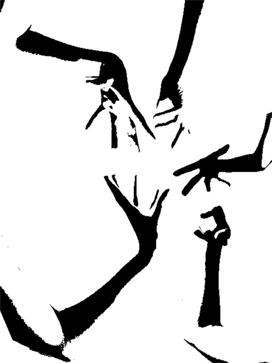
We used software on the computers to scan the image and turn it into a file the laser cutter can read. I learned that it’s best to either have a digital black and white image or else a picture drawn with a black marker so the computers could pic up the lines correctly.

When we were done this we sent the files to the laser cutter and cut them out, it only took 2 to 3 minutes for each design to be cut. Then we went back and used the stencils to print with. This is how my print came out.

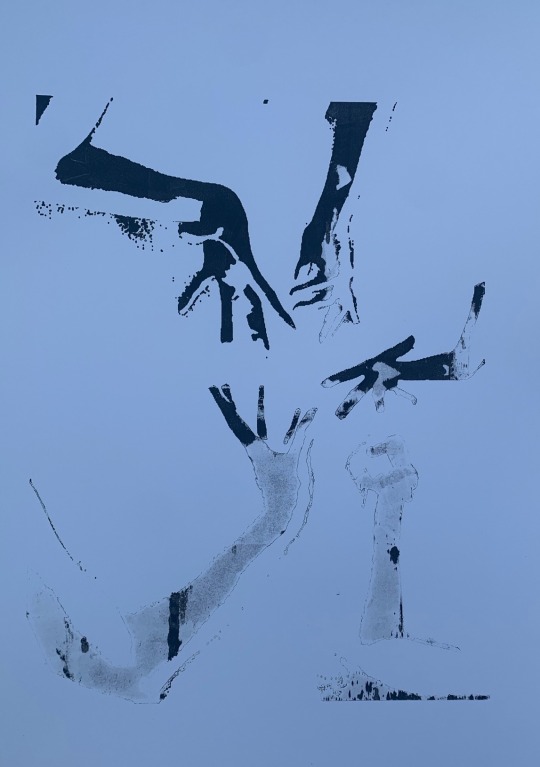
I started off with just yellow then scraped the excess off and used a Burgundy which created a two tone effect. I used black is well as I felt the yellow wasn’t bold enough.
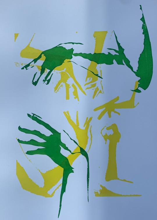

Finally I layered this over one of my prints from yesterday. I found this gave it a lot more energy and made the composition more interesting. Because I used a lighter colour over the green it changed the colour instead of covering it which I really liked. Once i was done printing I managed to pull the stencil off in one piece. It had a really interesting texture to it as i used multiple colours it is also the inverse of the design. 
1 note
·
View note